Chapter 2
Materials, Techniques and Processes
Introduction
This chapter introduces you to the various materials, techniques and processes used by artists and architects. It will allow you to compare and contrast art and architecture in various materials spanning more than five centuries, although examples may be drawn from the entire book, and beyond, from the time of Classical Antiquity. The term material is used interchangeably with medium to describe the physical elements used by artists and architects in the creation of works of art and architecture.
Painters have used a variety of painting materials through the ages, such as natural and, later, chemical pigment in fresco, egg tempera, watercolour and oil. More contemporary materials include acrylics, household emulsions and ‘mixed media’ – a range of different materials all in one work. Sculptors have traditionally used materials such as wood, marble and bronze, but contemporary artists also use ‘non-art’ materials, such as cardboard, plastic and everyday household items. In architecture, the form of a building is often dictated by an architect’s choice of materials, such as stone, brick, concrete, cast or wrought iron, reinforced concrete, steel, glass and aluminium. Various materials have been used to clad buildings such as glass, cedar shingles (thin wooden tiles which overlap) and titanium.
Techniques and processes describe the various methods used in the creative process. In painting, knowledge that oil can be applied thickly in impasto or thinly in glazes affects our understanding of the artwork. Brushwork may be fine and disguised, thickly applied with a palette knife or stencilled. In sculpture, it is important to know the differences between carving and modelling, and about the subtractive/reductive processes (removal of stone and wood) in direct carving, the additive process (modelling in a soft medium such as clay), and casting (lost-wax process), assemblage, and the lack of process involved in readymades and found objects. In architecture, we should be able to recognise whether a building has been erected brick by brick or largely prefabricated off site and moved to the location where they are assembled.
Painting: Timeless and Honoured
Painting is typically paint applied to a flat surface and comprises pigment mixed with a binder, to hold the particles of the pigment together, and a thinner (or vehicle), to render the substance liquid so that it can flow from the brush. The type of paint used, or its combinations with other materials, has a tremendous effect on the look of a painting and on our interpretation of it. The range of coloured pigments available during earlier centuries (before the advent of the chemical industry and when only natural materials were used) was limited and so the colour palette and relatively muted tones of fourteenth-century paintings are in stark contrast to the extensive colour range and vibrant tones of the early twentieth century. Every material has its own characteristics, but the effects of a material such as paint can vary, depending on the artist’s choice of technique and even the size and type of brush they use.
Fresco: all in a day’s work
Fresco, a method of painting rather than a material, has been around since before the time of Christ. Fresco is made using lime-proof pigments and water, and is painted into the surface of a freshly lime-plastered wall. The paint is then absorbed into the wall itself as the plaster (which serves as the binder) dries. This makes the finished artwork extremely durable and sufficiently stable to last for centuries. Part of its charm, though it may perhaps appear a disadvantage to an art-loving public, is that true fresco is not portable; we must make a pilgrimage to view the work in its original site.9 The particular materials, techniques and processes of fresco make it particularly susceptible to damage from damp, earthquake and subsidence. True fresco (buon), as opposed to dry fresco (secco), is a more time-consuming technique. The artist was able to paint the wet plaster only in sections, which became known as giornate, or a day’s work, because once dry the plaster would fail to absorb the pigment. Timing errors would have to be removed ready for the next giornate.
Close examination of The Lamentation of Christ by Florentine artist Giotto di Bondone (c.1267–1337) reveals the lines that distinguish one day’s work from another. It appears that one day equated, loosely, to one angel. Giotto has tried to match the blue colour of the sky in each section but the process was beyond his capability or that of science; the only pure blues available to him in fourteenth-century Italy were the minerals lapis lazuli and azurite. Lapis was too expensive for large areas and azurite reacted with the lime in the plaster and changed colour, so Giotto had to apply the blue azurite secco fresco, meaning he mixed the pigment with egg yolk and water and applied it to the wall when the plaster dried. Consequently, it has deteriorated more than the buon fresco areas, creating more of a ‘jigsaw puzzle’ than celestial effect. The painting’s imperfections provide us with tremendous insight into the processes and techniques behind its production. The limited colour palette available at this time (largely earth colours), coupled with the lime plaster, producing slightly insipid and pastel effects, may be regarded as detrimental, but fresco’s subtle chalkiness and prized longevity distinguish it from other mediums.
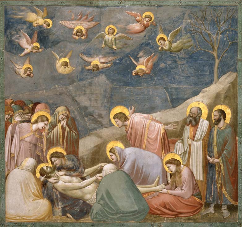
Figure 2.1 | Giotto di Bondone, The Lamentation of Christ, c.1305, from the series with scenes from the life of Mary and Christ, fresco, approx. 185 × 200 cm, Padua, Cappella degli Scrovegni.
Source: akg-images / Cameraphoto.
Tempera: jewel-like Madonnas
Sienese artist Duccio di Buoninsegna (c.1255/60–c.1318/19) painted the central panel, Maestà (Enthroned Madonna and Child with Angels and Saints), of the altarpiece for Siena Cathedral on poplar wood, a tree indigenous to central Italy. Wood panels were glued together, planed smooth and the surface stabilised using layers of gesso, sanded between coats. This acted as a primer for the application of tempera. The use of gold leaf was prevalent at this time and entirely fitting as a medium to mirror the status of the Virgin Mary. The artist’s use of gold, an expensive material, to represent the majesty of the scene would have caught nearby candlelight and made the image gleam with a seemingly divine light. Befitting the Virgin’s status, Duccio paints the Virgin’s blue-black robe using the ground material of the semi-precious stone, lapis lazuli.
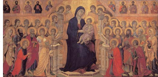
Figure 2.2 | Duccio di Buoninsegna, Maestà (Enthroned Madonna and Child with Angels and Saints), 1311, formerly the high altar of the Duomo in Siena, tempera and gold ground on wood panel, 211 × 426 cm, Siena, Museo dell’Opera Metropolitana. Source: akg-images / MPortfolio / Electa.
Duccio has made the Madonna and Christ Child larger than the surrounding figures to indicate their importance.What other techniques has he used to show this?
Highly valued as an expensive and rare material, gold was commonly reserved for use in the creation of sacred objects. Gold leaf application, known as gilding, was undertaken prior to painting on a dark red clay substance known as ‘bole’. The thinly beaten (and fragile) gold leaf adheres to the ‘bole’ and creates a warm marriage of colour. The gilded area is then burnished to a polish and also allows for the further adhesion to the bole underneath. At this point the surface is tooled or incised for decoration.
Tempera uses the yolk of an egg mixed with water and, like modern acrylic paint, it dries very quickly, making modelling particularly difficult. Shading is indicated by juxtaposing two slightly different tones using hatching and cross-hatching, and the outcome can be fairly two-dimensional and stiff. Tempera needs to be applied in thin layers, as impasto techniques are not suited to the medium. The flatness of the medium in Duccio’s work lacks verisimilitude but heightens its decorativeness.
Duccio uses a range of techniques to indicate the status of the Virgin and the Christ Child, including making them proportionally larger than other figures in the painting, positioning them on the central vertical axis, and making the Madonna’s head the apex of a compositional pyramid that is pointing heavenwards. The Madonna is flanked on either side by an equal number of heavenly bodies, every repeated face only enhancing the overall feeling of symmetry and balance.
Although the rules of linear perspective had not yet been codified, some attempt is evident in the Virgin’s throne, although the effect is quite illusory on the corners: unintentionally, they appear either to recede or to advance, according to the individual viewer’s perception. This lack of linear perspective, along with the incorrect anatomical proportion and foreshortening, make the work appear quite rigid and unnatural. However, as Duccio’s Maestà was primarily a sacred object intended to inspire devotion, its lack of naturalism was not considered a failing. In fact, Duccio was one of the first artists to aspire to naturalism, evident in the drapery of the figures in the foreground, which give the impression of falling away softly and naturally. And while the figures in the top row all face the front, those in the foreground move more realistically around the seated Virgin. The materials, techniques and processes render it so decorative, symbolic and compelling that even in these increasingly secular times their images endure, especially in the form of Christmas cards.

Figure 2.3 | Masaccio, The Virgin and Child, 1426, egg tempera on wood, 134.8 × 73.5 cm, London, National Gallery. Bought with a contribution from The Art Fund, 1916. Acc. no.: 1772.
Source: © 2015. Copyright The National Gallery, London / Scala, Florence.
Duccio’s style was influenced by the rich and decorative pattern of Byzantine mosaic. Its aesthetic is largely due to the artist’s use of a strong, clear line to define mass. A tempera and gilded version of a mosaic icon, the Virgin sits in an ‘otherworldly’ and hierarchical realm. Her symbolic might is not weakened by her two-dimensional simplicity. Duccio uses line rather than modelling to achieve the faint illusion of drapery.
Masaccio (originally Tommaso di Ser Giovanni di Simone, 1401–1428/29), a painter of the Early Renaissance, became well known for the polyptych altarpiece for a church in Pisa, of which this is the central panel. He uses a traditional pyramidal composition, symbolic colours and gold leaf applied to the surface, all of which are legacies of the style known as International Gothic. The gold has been tooled to provide a decorative pattern, in contrast to the ultramarine (lapis lazuli) of the Virgin’s robes. If you look carefully at Masaccio’s work, you can see the subtle variation of texture created in the halo and decorative trim of the Virgin’s robes. Tooling and possibly a stylus have been used to incise the gold surface (although not an innovation) and this decorative technique enables light to reflect off the small indentations and provide the impression of illumination.
Masaccio has used tempera, a quick-drying medium, which may account for the rather flat appearance of Mary’s face and neck. The tempera has been applied to create a smooth surface with crisply defined edges, providing the image with a characteristically enamel-like quality, well suited to the devotional nature of the scene. However, despite tempera’s limitations, Masaccio has managed to create a more naturalistic work than Duccio’s Maestà, painted 100 years earlier. Masaccio demonstrates the early use of linear perspective – evident in the realistic recession of the Virgin’s foreshortened throne, and Christ’s elliptical halo. The artist owed this technical accomplishment to the newly discovered laws of linear perspective.
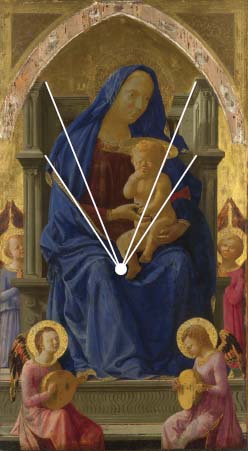
Figure 2.4 | Masaccio, The Virgin and Child, 1426, egg tempera on wood, 134.8 × 73.5 cm, with converging lines of single-point perspective on vanishing point, London, National Gallery. Bought with a contribution from The Art Fund, 1916. Acc. no.: 1772.
Source: © 2015. Copyright The National Gallery, London / Scala, Florence.
The Madonna’s weight is made more tangible by the shadow she casts within her throne, which convinces us that she is occupying a real three-dimensional space. The artist’s use of foreshortening – particularly in the lutes played by the angels in the foreground – aids the deception and is a technical change from the Gothic past. It makes the scene seem dramatically close. The Christ Child appears to have been drawn from a real baby, since he is shown realistically sucking his fingers and interacting with his mother. Do you think there is a family resemblance? The Christ Child’s body is anatomically correct, especially in comparison to Duccio’s. Masaccio has achieved this new level of realism using chiaroscuro – light and shade – to create a convincing roundness in the form of the body.
Artists during the Early Renaissance sought to emulate the art of Antiquity and increasingly aspired to achieve a realistic representation of the human form. This included persistent experimentation in the quest for three-dimensional realism. Early developments towards a greater realism were expressed in the works of Giotto and Duccio; however, it was Masaccio in the Early Renaissance who was one of the first to triumph in single-point linear perspective, daring foreshortening and chiaroscuro. When combined, these techniques gave his work an unprecedented level of realism. Effectively, however, Duccio and Masaccio are using the same materials, processes and techniques; however, they achieve different styles: broadly Gothic and Early Renaissance, respectively. The stylistic differences are largely as a result of Masaccio’s look back at Antiquity, and a shift in intention, towards naturalism, rather than significant technical developments.
Perspective relates to the fact that the size of an object appears to decrease with increasing distance from the eye. This is the phenomenon that makes the throne in Masaccio’s The Virgin and Child appear to recede in an illusory three-dimensional space. Foremost architect and engineer of the Renaissance Filippo Brunelleschi (1377–1446) is credited with formulating the first accurate rules of linear perspective (a formula based on the con-vergence of parallel lines to a single vanishing point). It is thought that Brunelleschi’s discoveries in perspective manifested themselves in Masaccio’s work because the pair were artistic contemporaries and friends. The lines of the throne converge on the vanishing point and locate our eye to create the illusion of a real, three-dimensional space.
Masaccio can be given the credit for originating a new style of painting; certainly everything done before him can be described as artificial, whereas he produced work that is living, realistic, and natural.
(Vasari, Lives of the Artists, p. 125)
Masaccio’s The Virgin and Child offers points of comparison and contrast with contemporary British artist Chris Ofili’s Holy Virgin Mary, 1996, examined later in this chapter: both represent religious subjects in a highly decorative manner.
The artistic limitations of tempera were not particularly problematic in the Middle Ages or in the Early Renaissance because artists were creating representations of the Madonna and saints for people to address their prayers to, rather than accurate portrayals of their likeness. However, the development of oil painting and its refinement in the fifteenth century allowed artists to achieve new levels of realism and likeness to the sitter.
Oil: versatile and enduring
In Chapter 1, we examined Jan van Eyck’s The Arnolfini Portrait, 1434, as an example of the portrait genre, and in this chapter it can be re-examined in relation to its materials and techniques. Jan van Eyck (c.1395–1441) did not invent oil paint, as suggested by the Renaissance biographer Giorgio Vasari in the sixteenth century and Dutch biographer Karel van Mander in the seventeenth century, although he can be credited with mastering its blend and application. The artist painted the double portrait on an oak panel – as was popular in the Netherlands – and its surface was treated with warm animal-skin glue and a chalk ground primer to provide a smooth surface and hide the wood grain. Van Eyck applied oil in thin layers from an opaque base to a translucent finish; shading is aided by paint layering insofar as the paint is thickest where it is darkest and thinnest where it is lightest – look at the original painting in the National Gallery, London, and see for yourself. Jan van Eyck has used the technique of glazing because when light travels through the transparent glaze and bounces back off the opaque layer it produces a brilliance and a glow unachievable in tempera painting.
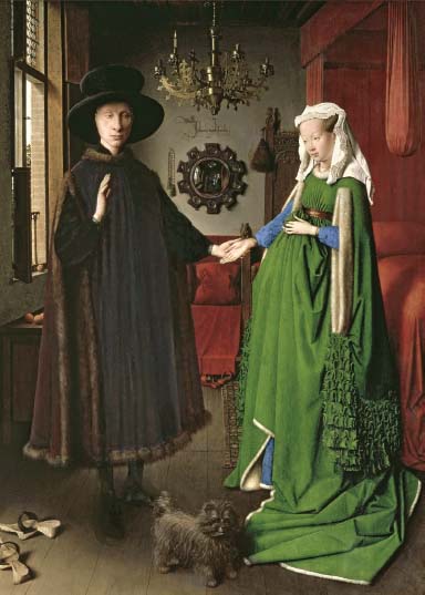
Figure 2.5 | Jan van Eyck, The Arnolfini Portrait, 1434, portrait of Giovanni (?) Arnolfini and his wife Giovanna Cenami (?), oil on oak panel, 82.2 × 60 cm, London, National Gallery.
Source: National Gallery, London, UK / Bridgeman Images.
The Arnolfini Portrait depicts its patron’s status so convincingly because the slow-drying medium of oil has allowed the artist to depict a catalogue of perfectly modelled material objects in meticulous detail and render their textures so believable that our disbelief is suspended upon sight of every object. The thick pile of the rug on the floor is easily distinguished from Mr. Arnolfini’s fur-trimmed coat, for example. Oil allows for smooth transitions in colour and tone, such as is evident in the believable folds of Mrs. Arnolfini’s green gown. The artist has painted this diminutive work using a small brush, probably made with squirrel or weasel fur, and painstakingly blended the medium in order to disguise his brush marks (unachievable in tempera). Van Eyck used the finest pigments to display the couple’s status. Mrs. Arnolfini’s sleeves are painted in lapis lazuli, her verdigris gown from ground copper and the rich red of the interior drapery from a mixture of silver and sulphur (Hicks, Girl in a Green Gown, p. 194).
All art works are made using materials, techniques and processes, and so any art work (whether featured in this book or a work of your choosing) can be worthy of examination under the heading of this chapter. The nineteenth-century Impressionists used oil paint in a very different way from northern Renaissance artist Van Eyck; not least, their centuries apart allowed for a revolution in chemical pigments. Look ahead to Chapter 3 where Impressionist painting Autumn Effect at Argenteuil, 1873, by Claude Monet is discussed in relation to its form and style. This time, however, you need to focus on its materials, techniques and processes. Discussion of oil also features in the next section, where its properties and application are compared to acrylic paint.
Acrylic: modern detachment
You may recall that in Chapter 1 we saw that the use of acrylic paint in David Hockney’s Mr and Mrs Clark and Percy gave the work a modern, graphic feel, entirely fitting for the fashionable lifestyle the couple led.
Acrylic paint was first used in the 1940s and made commercially available in the 1950s and while it is assumed to have greater durability than oil and a reduced tendency to discolour, its permanency is yet to be tested. Acrylic also dries much faster than oil, and so is less suited to images that require modelling or chiaroscuro. Acrylic paint, which uses an acrylic polymer emulsion as a binder, dries to a flexible paint film because it is comprised of interlocking molecules which shift without causing damage during expansion and contraction. While oil paint is referred to as ‘oil-based’ on account of its mix with linseed oil, acrylic is referred to as water-based on account of its dilution with water, if desired, although it is most commonly applied thickly to give an opaque finish.
Acrylic is also quite flat in terms of its light absorption which can render its subject fairly stark in contrast to the light-reflective qualities of oil. Consider Vermeer’s View of Delft, 1660–1661, for example; if this work had been executed in acrylic, then the atmosphere, the reflected sparkle, and the richness would all be lost. The Prussian Blue that Van Gogh described as ‘heavenly’ in the View of Delft, is not even possible in acrylic on account of a chemical incompatibility (De Leeuw, The Letters of Vincent van Gogh, p. 401). Vermeer’s renowned depiction of sunlight in some works, and the ‘spiritual’ glow in others, was achievable through his use of Indian Yellow, an oil paint made from the urine of cows fed upon mango leaves. Conversely, as liberating as the medium of oil was for artists like Vermeer, the acrylic paints exploited in Ofili’s contemporary works (examined later in this chapter) are not available in oils. Every material brings its own range of possibilities and limitations.
Figure 2.6 | David Hockney, a detail from Mr and Mrs Clark and Percy, 1970–1971, acrylic on canvas, 213.4 × 304.8 cm, London, Collection Tate. Source: ©Tate, London 2015 / © David Hockney.
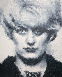
Figure 2.7 | Marcus Harvey, Myra, 1995, acrylic on canvas, 396 × 320 cm. Source: Image courtesy of Marcus Harvey and Vigo Gallery. © Marcus Harvey. All Rights Reserved, DACS 2015.
Oil paintings are prone to cracking over time, while acrylic paintings maintain a stable surface. This is because the binders (liquids mixed with the pigment) in oil and acrylic paint are different. Oil paint binders, such as linseed oil, dry to an inflexible, weak film that may crack as it expands and contracts with changes in external temperature.
Young British Artist (YBA) Marcus Harvey (born 1963) uses the medium of acrylic in a similar way to that of Hockney insofar as he shows an awareness of the limitations of the medium and uses the graphic properties of acrylic to lend a further dimension of meaning to his painting of child murderer Myra Hindley. How do you think the qualities of acrylic help to convey a sense of Hindley’s character?
Harvey’s large-scale portrait Myra uses acrylic with a hand-printing technique to create a mosaic effect, which, when seen from a distance, is reminiscent of her black and white police mug-shot on which the painted image is based. That Harvey used the plaster cast of a child’s hand to print the portrait catapults an already emotive image to new levels of explosive controversy. Primary school children, innocent and untutored, make perhaps their first personalised creations like this, only usually they adorn our kitchen walls and later become memories in parents’ scrapbooks. However, Harvey implements an unorthodox technique, causing the handprints to appear pixelated and mechanically detached from us.
Like so many artists before him, in a lineage that started with Caravaggio (originally Michelangelo Merisi da Caravaggio, 1571–1610) in the seventeenth century, Harvey paints the ‘ugly truth’: pointing directly to an unspeakable crime. While it has been argued that this work is astonishingly insensitive, others consider that children are too often without a voice in an adult world, and that in noting their tiny handprints, we become poignantly aware of their vulnerability.
Other Media

Figure 2.8 | Chris Ofili, The Holy Virgin Mary, 1996, acrylic, oil, polyester resin, paper collage, glitter, map pins and elephant dung on linen, 243.8 × 182.8 cm.
Source: Courtesy the Artist and Victoria Miro, London. Copyright: © Chris Ofili.
Modern mixed media
The materials used by Chris Ofili (born 1968) in The Holy Virgin Mary include paper collage (such as pages from pornographic magazines), acrylic, oil paint, glitter, polyester resin, map pins and elephant dung, built up in layers upon linen. Dried spherical lumps of elephant dung are applied directly onto the surface and used as foot-like supports to elevate the canvas. Arguably, the glittering rays that emanate from Ofili’s Black Virgin mimic those of Masaccio’s some five centuries earlier.
The versatility of acrylic paint, and particularly its enhanced adhesive qualities in comparison to oil, coincides with the extensive range of experimental materials, techniques and processes employed by artists from the second half of the twentieth century. Chris Ofili’s Holy Virgin Mary is depicted using acrylic paints that had only been developed in the early 1980s. The timing was perfect for Ofili, who exploited the properties of acrylic as a twentieth-century alternative to gold leaf; it’s certainly reminiscent of medieval icons, albeit with added ‘gangsta bling’.
Fast-drying and permanent, acrylic paint can easily be over-painted. Like oil, it can be applied straight from the tube or simply thickly if opacity is desired. Equally, it can be diluted with water and used like watercolour. Its fast drying time makes blending difficult in comparison to oil. In this sense Ofili uses the medium in its purest form, creating a highly decorative and vibrant effect. Its adhesive nature is also useful to a work like Ofili’s, where the technique of collage is used to create a multi-layered surface of imported materials. The rather unlikely combination of materials underlines the artist’s experimental perspective on materials, techniques and processes in art.
The sexually explicit close-ups of female genitalia are cut out from magazines and rather irreverently stuck onto an otherwise ethereal surface. Controversially, the close-ups of female genitalia are positioned swooping around the head of the Virgin, in the position traditionally assigned to seraphim – the highest order of angels. Here, Ofili uses them to refer to blaxploitation imagery in a bid to question racial and sexual stereotypes. The richly decorated complexity of Ofili’s surfaces may relate to the myriad references he makes to Black identity. However, because Ofili’s work draws attention to stereotypes and issues of ethnic hybridisation (the mixing of ethnic elements), we need to approach the compartmentalisation of the artist’s oeuvre cautiously, avoiding a simplistic and stereotyped reading.
Spray-paint: anti-art rebellion
Many artists in the twenty-first century have used modern materials and techniques to confront prejudice and expectation. French street artist JR (born 1983) and British artist Banksy (born c.1974) are notable examples. Arguably, Banksy is responsible for our changed perception of graffiti in the UK. A predominantly urban art, graffiti was initially dismissed as lacking in artistic merit, and practised by ignorant law-breakers, but it has recently been reassessed as an art form that is satirical, intelligent and relevant to contemporary society. As part of the Bristol graffiti scene, Banksy turned, like so many other graffiti artists, to stencils in order to speed up the process and create more precisionist images. Paint was added to aerosol technology in 1949, and in the decades that followed, the portability of the spray-can and its speed of application became an obvious medium for the illicit work of street artists; the link between technological advancement and artistic practice also became an obvious one.10 The anti-art materials and techniques Banksy uses are fitting for the anti-establishment statements his works convey. In Banksy’s case, even the site and location of his works – very often on the walls of public buildings – reinforce his intention to create an art accessible to us all.
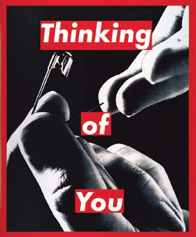
Figure 2.9 | Barbara Kruger, Untitled (Thinking of You) 1999–2000, photographic silk screen print on vinyl, 312.4 × 256.5 cm, New York, Mary Boone Gallery MBG#7969.
Source: Copyright: Barbara Kruger. Courtesy: Mary Boone Gallery, New York.
Screen printing: the language of signs
American feminist Barbara Kruger (born 1945) drew on her political values and experience as a graphic designer to produce a series of works juxtaposing photographic images with aggressive or ironic text. Her hard-hitting combinations raise issues of power, control and injustice. Her conscious borrowing of the traditionally male-dominated medium of advertising provides authoritative simplicity. You can stop, look and ultimately reflect upon her message. She overlays black and white photographs with white writing on a red background. Thinking of You, 1999–2000, has a similar effect to the monochromatic power of Picasso’s Guernica, only Kruger has achieved a powerful statement by juxtaposing the hard edges of Futura Bold Italic font (a common advertising font) with recognisably human conditions, such as being the victim of an abusive partner. Through her choice of material and technique she manages to destabilise the process of constructing identities. She challenges patriarchy and convention, if only for as long as we look at her work. So striking are her methods, we can hardly look anywhere else. Kruger’s work plays on the kitsch of greeting-card sentiment. ‘Thinking of you’ – a caring message – abruptly becomes ironic in juxtaposition with the suggestion of imminent male aggression: it is a recognisably male hand that is about to pierce the more passively positioned and upturned hand of what appears to be a female recipient. In this sense, the image may also be interpreted as suggestive of psychological control. The technique of photo-screen printing that Kruger uses is essentially a stencil method of printing which may be used to print on a variety of surfaces, including paper, fabric, wood and vinyl. A fine mesh fabric is stretched over a frame to form the screen. Then the screen is coated in a photopolymer emulsion (light-sensitive liquid). The film positive (in this case, the hands in this image) is then placed over the screen and exposed to UV light which burns the photopolymer emulsion, creating a stencil on the mesh screen (a further stencil would need to be used to create Kruger’s red border). Finally, Kruger has pushed ink through the mesh using a squeegee onto the vinyl to create the image. Kruger’s choice of materials and techniques created a signature style – red-framed text in a media-style font, printed across a black and white photograph – which tended to convey a powerful and satirical commentary on contemporary issues. Consider how Pop Art painter Andy Warhol used the screen printing technique in Marilyn Diptych, 1962, to signal the mass consumerism sweeping American culture (the social and historical context of this image is discussed in Chapter 4).
In the same way that Ofili’s Holy Virgin Mary examines racial prejudice, Kruger’s art forces the viewer to confront gender inequality and issues of patriarchy.
Sculpture
Marble and bronze are the traditional materials of the sculptor within the Western canon, and the entire Renaissance was based upon the perceived elegance and purity of the figures and buildings of Antiquity. It is ironic therefore that the classical white marbles of ancient Greece upon which the Renaissance based its style were, in fact, originally painted in many colours, and only became white as their ancient paint flaked and peeled away over time. Marble has been used for centuries and continues to impart connotations of nobility, purity and status to its subject.
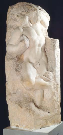
Figure 2.10 | Michelangelo, The Awakening of a Slave, 1525–1530, marble, height 267 cm, Florence, Galleria Dell’Accademia. Source: akg-images / De Agostini Picture Library / G. Nimatallah.
Sculptural techniques tend to be either subtractive (taking stone, wood or plaster away) or additive (building up a soft material, often prior to casting in bronze). The subtractive technique (sometimes referred to as the reductive technique) involves the direct or indirect carving of a block of stone, marble or wood. The actual process involved is evident in one of the unfinished Prisoners by Michelangelo (originally Michelangelo di Lodovico Buonarroti Simoni, 1475–1564), where the subtractive process is clearly visible. As if held captive by the stone, the figure appears to have emerged from the medium with every blow of Michelangelo’s skilfully led chisel.
Marble: traditional aesthetics
When viewing a sculpture it is helpful to consider how the sculptor has exploited the medium to represent the object, or been limited by it. Italian master of the High Baroque Gian Lorenzo Bernini (1598–1680) created such dynamic sculptures that they appear to have been moulded out of wax, rather than carved out of marble. His sculpture Apollo and Daphne, 1624, created by the subtractive technique, shows the mythological God Apollo chasing the nymph Daphne, as described in Ovid’s Metamorphoses. The life-likeness of this mythological duo is also examined from the perspective of their Baroque form and style in Chapter 3.
The moment is grippingly fleeting: the nymph Daphne transforms into a laurel tree before our eyes rather than face Apollo’s desire for her. She eludes him, her fleshy fingers metamorphosing into branches of laurel, a feat never before depicted in stone. Marble’s low-tensile properties are exploited to their limit in the delicate leaves between Daphne’s fingertips, but their carefully planned structure ensures their durability. Even her emphatically raised arms have their weight over the centre of gravity – a necessary counter-balancing technique that also aesthetically enriches the composition.
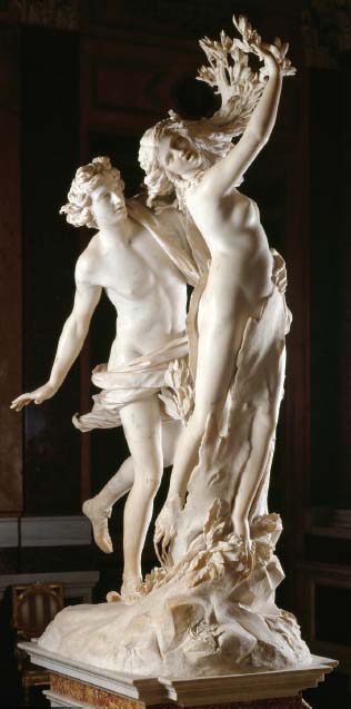
Figure 2.11 | Gian Lorenzo Bernini, Apollo and Daphne, 1624, marble, height 243 cm, Rome, Borghese Gallery. Source: akg-images / Andrea Jemolo.
Bernini had discovered a way to make marble movies.
(Schama, The Power of Art, p. 92)
Bernini’s technique for engaging the viewer was an innovative synthesis of pure theatre and sculpture; it is as if these figures are reaching out to us, physically and emotionally interacting with us. The highly polished stone renders flesh appealing to the touch; this provides a stark contrast with the rough-textured bark that sheaths Daphne’s lower body from Apollo’s grip. Their vitality contrasts with the inanimate and unfinished base they spring from. This allows us to see the reductive (or subtractive) process from which a block of rough marble is carved and polished. The stages are increasingly delicate, and finalised with a polish that creates a realistic portrayal of flesh.
The drapery around Apollo’s groin seems alive with his passion and billows unrealistically around him. The deeply carved folds lend dynamism to the scene and display Bernini’s miraculous technical skill. Take a closer look at Daphne’s long locks of hair which find volume in the gust that carries her aloft; it becomes leaf-like as it extends away from her. Her breasts and her cheeks are soft and voluminous with a sheen that is both enticing and wondrous, especially when seen in comparison to other sculpture of the time. Her scream seems almost audible from one of the most deeply hollowed mouths in sculpture.
A supreme master of the medium of marble, Bernini’s oeuvre is overflowing with examples for study in terms of materials, techniques and processes. The basic tools of the sculptor are the mallet (usually a hammer with a broad, barrel-shaped head) and chisel (a pointed metal tool with a sharp end). The pointed end of the chisel is placed against the marble at the desired angle, and the sculptor hits the blunt end with the hammer, with appropriate force.
Various weights and shapes of tool are used, depending on the amount of marble to be removed with each blow. For splitting off large pieces of marble the sculptor might use a flat ‘pitching tool’. Claw chisels, with notched ‘teeth’, may be used to add texture, and flat chisels provide a smoother finish. Rasps or files are used after the chiselling stage to render the chisel marks invisible, and sandpaper, wet or dry, is used to achieve varying degrees of polish.
The marks of Bernini’s tools are evident on the rough stone beneath Apollo and Daphne, but quite invisible on their highly polished bodies. It’s likely he sanded their flesh smooth using paper and marble dust from the floor of his workshop.
Bronze: timeless and dark
Metallurgy – the understanding of the properties of metal – has evolved over thousands of years, with different combinations of metals used to create alloys such as bronze, a mixture of tin and copper. Bronze sculptures are usually made initially using the additive process, which involves building up and modelling a form from a soft substance such as clay, plaster or sculptor’s wax (a malleable wax) before it is cast into bronze. The casting is done in a foundry by craftsmen, rarely by the artist, although the artist will oversee the process.
Bronze sculptures were considered prestigious in ancient Greece and the Riace bronzes (Riace Warriors), which date from around the fifth to the fourth century bce, are considered to be among the finest examples of bronze casting we know. (Penny, The Materials of Sculpture, p. 226)
Despite centuries of bronze sculpting and changes in the precise composition of the alloy used, most bronze sculpture is today created using the same cast-metal processes as those employed for the lifesize warriors of Antiquity. The twentieth-century bronzes of Romanian-born artist Constantin Brancusi (1876–1957) are arguably as exploitative of the medium and as timeless as those of ancient Greece.
Brancusi felt that traditional ways of representing forms could not satisfy the need for spiritual truths in art, and believed that purity in medium and form would provide the answer. In Bird in Space he therefore abandoned the realistic form of a bird and its characteristic attributes and concentrated instead on its form. Reduced to the swell of a chest and the aerodynamic form of an oval plane, this form is reduced to the essential idea of a bird.
Brancusi’s aesthetic of essentialism reveals the fundamental ‘essence’ of the subject to the point of its quasi-religious form in nature. All extraneous detail is omitted to leave only an elemental outline. In this instance, Brancusi’s bird is devoid of details such as eyes and feathers, but it is universally emblematic of the idea of a bird, any bird. He was fascinated by flight and the nearness of God’s creatures to the spiritual realm, and he sought to capture only the most universal and fundamental elements of a bird in this work: its vertical form is organically rhythmic and soaring.
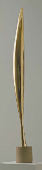
Figure 2.12 | Constantin Brancusi, Bird in Space, 1928, bronze (unique cast), 137.2 × 21.6 × 16.5 cm, New York, Museum of Modern Art (MoMA). Given anonymously. Acc. no.: 153.1934.
Source: © 2015. Digital image, The Museum of Modern Art, New York / Scala, Florence / © ADAGP, Paris and DACS, London 2015.
What is real is not the external form, but the essence of things. Starting from this truth it is impossible for anyone to express anything essentially real by imitating its exterior surface.
(Brancusi quoted in Hamilton, Painting and Sculpture in Europe, 1880–1940, p. 426)
Brancusi’s use of his medium, which may be described as ‘truth to materials’ (truth to medium), further aids his aesthetic ideal. Bronze is hard and easily made into a flawless and aerodynamic surface such as this. The ‘bronzeness of bronze’ is visible in the sculpture’s flawless, reflective surface, which lacks the usual patina that results from weathering. Although the surface appears to have all of the perfection of a machine-made object, Brancusi painstakingly polished this by hand with a fine emery board (see Lydiate, ‘What Is Art?’, p. 125).
Its extreme tapering and top-heavy form is only achievable using a metal substance that can endure elongation and load-bearing without breaking. At its uppermost point, the tip reminds us of the material’s ability to produce the sharpest of edges. Swords are made of metal compounds after all, and this bird looks capable of soaring through the air like a blade. So very thin, the bird’s base is reminiscent of legs on the one hand, and the high-tensile properties of the medium on the other.11 Its colour is important too: gold, signifying majesty. Brancusi has juxtaposed this metal with the matt, porous stone of its elegant base, serving as another reminder of the distinction between his materials, techniques and processes.
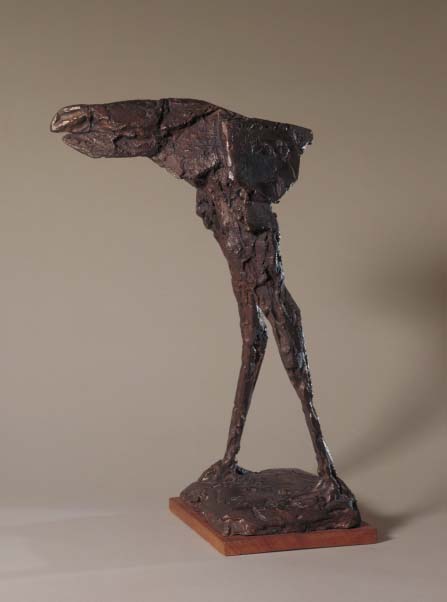
Figure 2.13 | Dame Elisabeth Frink, Harbinger Bird IV, 1961, bronze, 483 × 213 × 356 mm, London, Tate.
Source: ©Tate, London 2015 / © Estate of Elisabeth Frink. All Rights Reserved, DACS 2015.
Brancusi’s treatment of the subject of the bird in these materials can be compared and contrasted with the treatment and materials offered in Elisabeth Frink’s Harbinger Bird, 1961. While classical bronze prototypes and their resurgence during the Renaissance tended to disguise the materials and processes of their making by chasing or creating a patina on the surface after casting, many sculptures of the twentieth and twenty-first centuries have consciously revealed them.
British artist Elisabeth Frink (1930–1993) often began a sculpture using a light, chicken-wire construction. She then used a modelling technique, an additive process, applying wet plaster in layers as an initial process. The building up of plaster onto an armature is a technique called applied plaster and Frink attributes her use of it to the Swiss artist Alberto Giacometti (1901–1966), who was in her opinion the greatest artist of the twentieth century (Stevas, ‘Norman St. John Stevas in Conversation | Elisabeth Frink’). The spindly legs of so many of her works are clearly indebted to his post-1945 style.
Once modelled, Frink’s plaster was carved and scarred to achieve a rougher surface when it was subsequently cast in bronze. She would then further work the bronze sculpture with chisels, scrapers, rasps, even mallets, to distress its surface. The haunting texture that characterises her oeuvre functions on a number of levels; not least, it generalises the subject and reduces the form to a similar kind of essentialism that Brancusi achieved, although the aerodynamic grace of Brancusi’s Bird in Space offers an expressive contrast to the agitated surface of Frink’s Harbinger Bird.
This bird emanates a sense of the jerky, pecking dynamic associated with its species, and is likely to make anyone who shares Frink’s phobia of birds anxious. The degree of emaciation in Harbinger Bird’s demonic-looking legs can only be achieved in a high-tensile material such as bronze. Its dark colour suggests something sinister, unlikely to have been achievable in a light coloured or more malleable material such as wood. The low-tensile properties of stone would not have been compatible with the gravity-defying mass atop those emaciated legs. Its oversized beak, spindly legs and threatening aura provide a form quite different from Brancusi’s but, nonetheless, both reside on the spectrum of essentialism.
Turning a creation modelled in plaster or similar substance into a bronze replica is highly skilled, and is most commonly achieved by the lost-wax process. A negative plaster mould is made from the original wax, clay or plaster sculpture. This is frequently made in pieces, rather than one piece, unless the original is a simple, small form. Hot wax is poured in to form a layer inside each of the plaster moulds. The hollow wax copies are then removed from the negative plaster mould and joined to create a wax copy of the original sculpture. Foundry sand, a liquid mixture of sand and plaster that will set, is poured inside this copy to create a solid core. Wax rods are attached to the copy at one end and a wax funnel at the other. Small metal pins are inserted through the wax copy and into the solid core to hold it in place. A plaster mould is then put around the wax model and the wax rods, but not to the base of the funnel. The whole thing is then heated in a kiln, to melt the wax which flows out through the funnel. The wax areas are now empty, the core still held in place by the pins. Molten bronze is poured through the funnel, flowing through the channels vacated by the wax rods and into the space left where the wax copy was. When the bronze cools, the mould is broken open and the copy and rods are now bronze. The bronze rods are cut off, the metal pins are removed and the holes plugged with bronze, and the imperfections and details of the sculpture are filed and smoothed.
The advantage of the lost-wax process, used by both Frink and Brancusi, is that the surface texture of the finished sculpture is not limited by the bronze medium; through modelling, the artist can achieve a range of finishes. This is evident in the surfaces of Frink’s and Brancusi’s bird sculptures. Brancusi’s precisionist and light-reflective surface disguises human intervention, while Frink’s shows the physical impression made by her bare hands as she modelled and scarred the original plaster surface.
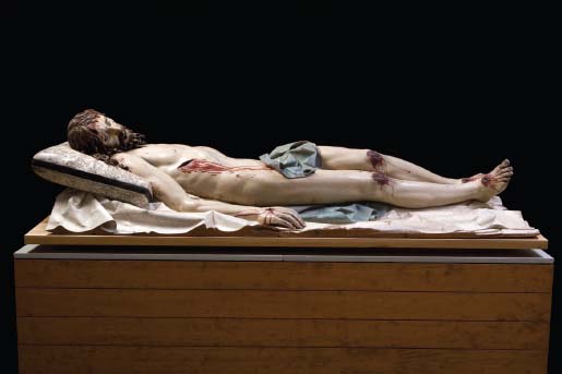
Figure 2.14 | Gregorio Fernández, Dead Christ, c.1625–1630, polychromed wood, horn, glass, bark, and ivory or bone, length 191 cm, Valladolid, National Sculpture Museum.
Source: Photography: © Imagen M.A.S.
Wood: in the service of devotion and expression
Unlike bronze, wood is carved through a subtractive process that involves material being taken away during the artwork’s creation. Like Giacometti, Spanish sculptor Gregorio Fernández (1576–1636) shows, in his life-size Dead Christ, c.1625–1630, a physically tortured body, but in this case the texture and colour of the flesh appears almost real. The Spanish were known for a more visceral level of realism than their Italian counterparts and this is evident not only in the congealed blood on Christ’s knees, achieved with a mixture of pigment and cork, but also in the polychromatic finish of this tortured cadaver.
The work of sculptor and polychromer were quite separate at this time. Although we have no documentation for the latter in this instance, Fernández often worked with the painter Valentín Diaz (Bray, The Sacred Made Real: Spanish Painting and Sculpture, 1600–1700, p. 64).
According to the National Gallery Exhibition Guide ‘The Sacred Made Real’, the preparation for the painting of the sculpture was as follows: Sawdust was removed, wood knots were pierced to expel sap and rubbed with garlic to enhance adhesion, and several coats of glue size and white ground applied (Bray, The Sacred Made Real: Spanish Painting and Sculpture, 1600–1700, p. 51). The polychromer used one of two types of flesh texture at this time: glossy or matt. Dead Christ’s flesh is a realistic matt finish, in contrast to the gloss (wet-looking) texture of his gaping wounds. The artists of Seville preferred matt finishes, and the latter is certainly closer to flesh than its highly polished counterpart (Bray, The Sacred Made Real: Spanish Painting and Sculpture, 1600–1700, p. 51).
The realism of the sculpture is arguably heightened with the use of glass eyes, horn nails and ivory teeth. It’s a technical and multi-media approach to verisimilitude but one that may appear vulgar from the perspective of certain artistic traditions. Painted sculpture was characteristic of the Spanish Baroque and yet presents quite a shock to unaccustomed eyes. Christ’s lifeless body feels contained upon its platform, giving it a restrained effect. Yet the work also feels theatrical, with Christ’s mouth hanging ajar in death and eyes lifelessly glossed over. Christ is presented as dying alone without his usual mourners – his mother and Mary Magdalene – we, the viewers, are the only witnesses to his sufferings. Fernández created this work to be prayed over, touched and kissed, and it was positioned close to the congregation in order to inspire piety. Fernández’s wooden Christ, his modesty protected by a loin cloth, can be compared to Ron Mueck’s work (Figure 2.16), in which the artist’s own father is laid bare in a miniaturised replica created using modern industrial media.
A sculptor’s technique can be so effective, as in the case of Fernández’s Christ that it disturbs our sense of what is real, or it can be so expressive that it forces a very real and urgent response from the viewer. Untitled (Figure with Raised Arm) by German artist Georg Baselitz (born 1938) is strong, vertical, emphatic and primitively carved. Indeed, the carving is so crude it appears forged by axe or chain saw. The angularity and wide-eyed appearance of the figure might be interpreted as threatening.
When I took up a piece of wood, it was not to go with the grain but against it.
(Duby and Daval, Sculpture from Antiquity to the Present Day, p. 1087)
The form of the figure is proportionate, but with little anatomical detail: rather than being hyperrealistic, the style is expressionistic. In fact, Baselitz contributed to a revival of Expressionism in the 1970s that shared the same subjective focus as the early twentieth-century German movement but was more self-reflective. His figure embodies the rawness of Neo-Expressionism, and the combination of direct carving and bold colour is both immediate and thought-provoking. The figure is clearly based on the human body, but even its gender is ambiguous. The splashes of primary colour may appear tribal but, from a Western cultural perspective, are also reminiscent of the two distinct circuits that carry blood around the body: one depicted in red, the other in blue in medical diagrams.
In a manner comparable to Brancusi’s essentialism, Baselitz also responds to the natural and inherent properties of the medium, demonstrating a certain truth to the medium of wood: the ‘woodness of wood’. The tree from which the wood was formed has a strong vertical emphasis and a natural roughness on account of its splintering, jagged qualities.
Figure 2.15 | Georg Baselitz, Untitled (Figure with Raised Arm), 1982–1984, lime wood and oil paint, 253 × 71 × 46 cm, Edinburgh, National Galleries of Scotland.
Source: © Georg Baselitz 2015. Photo by Jochen Littkemann, Berlin.
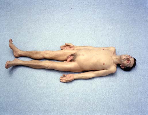
Figure 2.16 | Ron Mueck, Dead Dad, 1996–1997, mixed media, 20 × 38 × 102 cm, Stefan T. Edlis Collection.
Source: © Ron Mueck, Courtesy the artist, Anthony d’Offay, London and Hauser & Wirth. Photo:Anthony d’Offay, London.
Non-traditional art materials: deceptive perfection
Over three centuries after Fernández’s wooden sculpture Dead Christ, Australian-born contemporary artist Ron Mueck (born 1958) offers the viewer hyperrealism with a level of verisimilitude unobtainable by Fernández on account of its modern materials and techniques. That this diminished human form is a copy of Mueck’s own dead father draws a response similar to, if not as intense as, that evoked by Christ. Despite their polarity in style, material and technique, grief may be interpreted as resonating from both works and each achieves tremendous psychological effect.
The small scale of Dead Dad, 1996–1997, certainly has some effect on our interpretation of such a life-like naked male. A full-scale dead body has the potential to repel the viewer. However, Mueck’s use of diminished scale heightens the figure’s vulnerability and feebleness; we feel compelled to kneel down beside him, laid bare on the gallery’s floor.
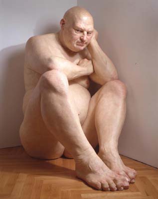
Figure 2.17 | Ron Mueck, Big Man, 2000, mixed media, 205.1 × 117.4 × 209 cm, Hirshhorn Museum and Sculpture Garden, Smithsonian Institution, Washington DC Museum, the Joseph H. Hirshhorn Bequest Fund, 2001.
Source: © Ron Mueck, Courtesy the artist, Anthony d’Offay, London and Hauser & Wirth. Photo:Anthony d’Offay, London.
The process of the making of Dead Dad is more technical than Frink’s chicken wire followed by plaster on an armature, but it provides a level of special effect found hitherto only in films and life-like dolls; indeed Mueck had worked as a model maker for television and film productions before becoming a professional artist. The diminutive Dead Dad was first sculpted in clay, in every tiny detail, before being cast in silicone, carefully tinted layers of which were hand painted into the mould to create the colour and translucency of skin and flesh. Finally each hair was individually inserted to complete the verisimilitude. A later work, the larger than life Big Man, 2000 (Figure 2.17), was made in a similar way but cast in resin.
Readymade: courting controversy
The artist’s choice of medium and its treatment is inextricably bound to its representation, and our subsequent interpretation of it. This is evident in the work of contemporary British artist Tracey Emin (born 1963) whose use of materials, techniques and processes supports the content of her work and enhances our understanding of its meaning on a number of different levels.
My Bed, 1998, is the infamous installation that Emin contributed to the 1999 Turner Prize Exhibition. It’s a readymade in the sense that it’s a real wooden bed; however, the assemblage has been constructed and, therefore, altered. This is a very literal work. Its space, its lighting and its close proximity to the viewer are all unrelenting.
Taking a look at My Bed, we read the debris slowly, almost chronologically, like the lines of a poem. We are drawn, perhaps despite ourselves, to noticing the most personal items that litter the crudely cut carpet to the bed’s side. We see the KY jelly, packet of cigarettes, dirty knickers, Tampax applicator, vodka bottles (empty, of course), and a used and bloodied condom. Furthermore, the apparently authentically worn slippers lend credence and perhaps a further pathos to the whole construction. The assemblage is powerfully evocative and suggests memories of past, emotionally loaded events. The floor is so cluttered with taboo objects that it may be hard to tear our eyes away, but finally our gaze is drawn up to those sheets stained with the full spectrum of bodily fluids. This is ‘scratch and sniff’ art – it is uncultured and indecent but our senses applaud it. The material – all of the above-mentioned objects, plus the bed itself – is ‘readymade’, but also made, constructed and layered by Emin’s assembly of them. The duvet, thrown back to reveal a space, implies her physical presence. The use of space is particularly effective in My Bed because it’s not illusionistic – we could indeed lie down where the artist lay.
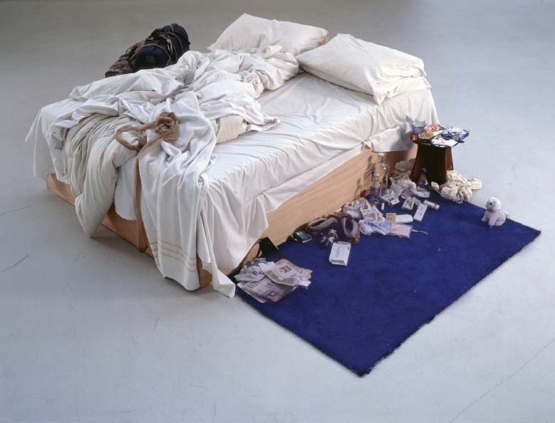
Figure 2.18 | Tracey Emin, My Bed, 1998, mixed media (mattress, linens, various memorabilia), maximum width 234 cm.
Source: ©Tracey Emin. All rights reserved, DACS 2015. Image courtesy Saatchi Gallery, London. Photo: Prudence Cuming Associates Ltd.
Unlike Andres Serrano’s use of urine as a medium to show Christ awash in sublime and ephemeral matter (see Chapter 1), Emin’s bed appears to be simply urine-stained and distasteful. Arguably, the work’s materials and techniques are highly effective in the extrapolation of our reflective engagement with the work. The closeness to someone’s personal detritus, selfharm, isolation and desperation feels like an uncomfortable invasion, akin to reading someone else’s love letter or secret diary entry. The question is: are we insulted by its coarseness or moved by gaining privileged insight into the artist’s psyche? Emin has described the work as looking like a ‘crime scene’, where someone had been fucked to death (Brown, TE: Tracey Emin, p. 99).
An hour later I was still there – Talking on neat vodka – A full ashtray by my side – I reluctantly put the receiver down – Drunk, spinning, I made my way To bed – My Bed – It smelt like I should change the sheets – but I kind of liked it –
(Emin, Always Glad to See You)
The very idea is repugnant and yet it provides an insight into the process of its construction: the meticulous placing of objects in the overall composition of the work. It all seems to be deeply encoded with autobiographical details. In a further possible layer of interpretation, the unprecedented level of her confession demonstrates courage; the courage to lay it all bare, under bright lights, and allow us to see and possibly feel this artistic construction of her pain. If the work is intended to provoke self-reflection in the viewer, do you think it successfully meets the objective?
Architecture
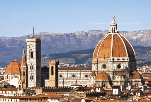
Figure 2.19 | Filippo Brunelleschi, Dome of Florence Cathedral, 1420–1436.
Source: © santof /i Stockphoto.
The materials, techniques and processes used in architecture often have a significant relationship with the building’s form, style and function. It is important to recognise the materials and methods used to construct a building because they so often affect a structure’s form, style and function (the thematic title of Chapter 3)
Wood, masonry and tile construction
Traditional materials such as brick and stone may be a thing of the past as new technologies enable buildings to double the height of skyscrapers in the future. However, the Florentine architect, goldsmith and sculptor Filippo Brunelleschi (1377–1446) became a major name in the architecture of Early Renaissance Italy when, in a remarkable feat of engineering, he managed to erect what is still the largest masonry dome in the world.
In 1418 a competition was announced for the construction of a huge dome to be raised for the partially built cathedral of Florence. The proposed dome would be the highest and the widest ever built, an unprecedented architectural challenge that called for an unprecedented architectural solution.
Renaissance biographer Giorgio Vasari wrote that in order to solve the problem of how to build the dome on the cathedral in Florence, Brunelleschi familiarised himself with Roman construction techniques and, in particular, investigated the colossal span and height of the dome of the Pantheon in Rome (125 CE), which had no visible means of support. How did the Roman builders counteract the ‘push’ and ‘pull’ forces on the dome and prevent its collapse? And how did they prevent the stone, brick and concrete at the base of the dome from being crushed by the weight of the materials above?
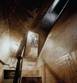
Figure 2.20 | Filippo Brunelleschi, Air space between the shells of the Dome of Florence Cathedral. The herringbone brickwork visible here on the inner and outer shell of the dome is self-supporting. The technique is borrowed from the Pantheon in Rome.
Source: © 2015. Photo Scala, Florence.
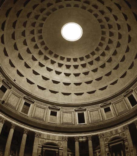
Figure 2.21 | Pantheon, Rome, 118–128 ce, interior of dome.
Source: © ROMAOSLO / iStockphoto.
Brunelleschi was aware that in a dome structure the weight of the materials is not just transmitted downwards, but also outwards, by a pull energy known as ‘hoop stress’. The Pantheon showed that a perfect hemispherical dome was possible, but only with massive abutment. (The Pantheon walls are 7.5 metres thick.)
Florence Cathedral’s double-skinned dome (used in medieval Islamic structures), coupled with its self-supporting brickwork and innovative hoop-tie, eliminated the need for Gothic flying buttresses; a welcome formula given the Italians’ disdain for them. The stone and wooden chains which encircle the belly of the dome like a giant belt are buried deep in the masonry and remain invisible to this day. Perhaps Brunelleschi’s greatest feat of engineering was raising the dome without the need for wooden centring. It was only with the use of modern industrial materials like plastic and high-carbon steel that wider vaults were raised some six centuries later, such as the Millennium Dome (now the O2) in London, the largest dome in the world, albeit a mast-supported structure.
The dome’s vault was seated on existing walls nearly 52 metres high and Brunelleschi developed an ox hoist, a ground-breaking innovation, to carry incredible weights up to the builders. The dome itself consisted of two layers. Four sandstone bands encircled the inner dome, linked by iron clamps. Their tensile strength prevented the bottom of the dome being forced outwards by the significant weight of the masonry. The herringbone brickwork used for the interior layer was ingenious in that it was self-supporting, with the weight of the bricks being transferred down onto the circumference. Brunelleschi resurrected the great and long-forgotten achievements of Roman engineering in this interlocking masonry technique. The outer layer becomes thinner as its rises, as do its eight vertical ribs. To dissipate the force exerted on the dome by the wind Brunelleschi included 72 small round windows on the outer skin of the dome, which not only prevent damage but bring light and air into a cramped and claustrophobic space. The dome is almost Gothic in outline and rib structure, thereby having stylistic integrity with the older Gothic cathedral.
The form of a building is largely dependent upon the architect’s understanding of the qualities of materials, the limitations, and the possibilities of techniques and processes. The most successful architects, at least in the past, had to be simultaneously structural engineers and artists willing to take risks. The next building looks back in time to the same Gothic period Brunelleschi was keen to leave behind.
Across the English Channel, and more than 400 years after Brunelleschi’s dome, William Morris (1834–1896), founder of the nineteenth-century Arts and Crafts Movement, commissioned the architect Philip Webb (1831– 1915) to design a home for himself and his new wife, Jane Burden, in Bexleyheath, Kent. (See 2.2 Let’s connect the themes: historical perspectives – the politics of Arts and Crafts.) Both men were committed to the resurrection of the applied arts. The result of their collaboration is Red House, constructed using masonry and exposed common red brick in a traditional, vernacular style.
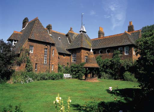
Figure 2.22 | Philip Webb, Red House, Bexley Heath, 1859–1860, east view with well. Source: © David Ball / Alamy.
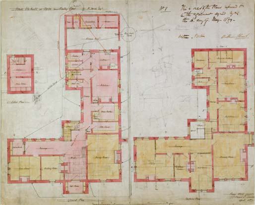
Figure 2.23 | Philip Webb, Red House, Bexley Heath, 1859–1860, L-shaped plan. Source: © Heritage Image Partnership Ltd / Alamy.
Philip Webb used a wide variety of different window shapes in Red House, including round ones for a passage-way on the first floor. How many other shapes can you see?
A domestic dwelling set in approximately one acre and built in plain red brick, Red House is robust, perhaps even a little austere. Its ground-hugging and horizontal two-storey construction is counterbalanced by the striking vertical emphases provided by the steeply pitched gables and chimneys. The ‘L’ shaped plan is irregular, as is the building’s roofline, fenestration, handmade clay tiles and individual bricks, but the uniform red of its exterior, the repetition of triangular shapes, and the undisguised nature of its materials combine to make a unified whole out of the disparate parts.
Upon closer inspection the building is surprisingly detailed and entirely organic, ‘home-made’ and warm. The entrance to Red House is approached from the side and has been described as hugged by the wide, low arch of the porch. Its pointed Gothic shape reminds us of the medieval period when craftsmanship was celebrated, something Webb and Morris were keen to return to in an age increasingly defined by modernity, as exemplified in new industrial materials and techniques. The twinned lancet arches of the oriel window on the northwest side epitomise the hand-crafted, labour-intensive construction of Red House. The lancet enjoyed resurgence during the Gothic Revival of Victorian times, when Augustus Pugin and his successors advocated the Gothic as a style capable of ‘moral reform’. The diamond detail in the leaded-light window is repeated in the series of triangular roof shapes and the corbels that support the oriel itself. However, the match is less poetic than it first appears because the leaded lights are in fact later substitutes for the original sash windows.
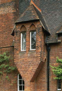
Figure 2.24 | Philip Webb, Red House, Bexley Heath, 1859–1860, detail of oriel window, west front of Red House, designed in 1859 by Philip Webb for William Morris. Built of red brick laid in ‘English Bond’ with a red tiled roof.
Source: © National Trust Images / Andrew Butler.
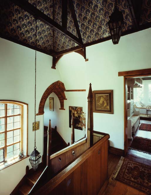
Figure 2.25 | Philip Webb, Red House, Bexley Heath, 1859–1860, oak staircase landing.
Source: © Arcaid Images / Alamy.
The furniture, textiles, wall hangings, bespoke door handles and hand-painted glass panes all contribute to the holistic and collaborative nature of Red House. Its fireplaces are all undisguised brick, possibly a reaction to the Victorian preference for disguising fireplaces and façades with plaster, paint and stucco. Red House’s staircase, with its exposed underside revealing the very mechanics of its joinery, deviates from the trend for ‘boxing-in’ and making neat. It is a feature that echoes the wooden-framed construction of the well situated between its wings. Another design feature of the close-boarded balustrade is its portholes, anecdotally described as ‘peeping holes’ for the Morris children.
Apart from the vernacular materials, techniques and processes employed in the construction of Red House, its form is arguably said to follow its function too: most rooms are orientated north, probably because Victorians disliked exposure to the sun. Sunlight pours into the hall through a series of windows and it diminishes as the day and season progresses, keeping the main rooms cool in the heat of the summer (Marsh, William Morris and Red House: A Collaboration Between Architect and Owner, p. 29). However, despite the building’s vernacular style, and Webb’s desire to use local materials, it has been pointed out that he ignored the yellow-brown bricks of the immediate area, and purchased red bricks from further afield (Marsh, William Morris and Red House: A Collaboration Between Architect and Owner, p. 30). Why do you think he chose red over yellow bricks if he desired to use local materials?
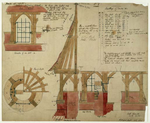
Figure 2.26 | Philip Webb, 1858, pen, ink and watercolour on paper, original architectural drawings for the conical wellhead at Red House, based on local Kentish oast houses, situated close to the house, in the east garden at Red House, Bexley Heath. Private Collection.
Source: Private Collection /The Stapleton Collection / Bridgeman Images.
The English Victorian art critic and theorist John Ruskin (1819–1900) wrote extensively on architecture, and his advocacy of the Gothic Revival style had a significant influence on Morris. In Ruskin’s essay The Seven Lamps of Architecture (published in book form in 1849), he set down seven principles (‘lamps’) of good architecture. Each ‘lamp’ has its own chapter, and the second of these was entitled ‘Truth’. This related to Ruskin’s belief that a good building was good if it was ‘honest’ to its materials. This effectually expounded a celebration of the natural and unchanged state of materials. Ruskin described the unnecessary cladding, painting or covering-up of the natural state of a material as an ‘[a]rchitectural deceit’ (Ruskin, The Seven Lamps of Architecture, p. 35). Morris and Webb’s Red House responds to Ruskin’s demand for ‘truth to materials’ in every irregular-shaped and multi-tonal brick and tile, although it was anathema to those who preferred the stuccoed villas of London that Webb and Morris saw as symptomatic of the ‘degradation’ of architecture. Where else does Red House reveal its materials and construction methods?
Red House embodies many of the architectural precepts set out by John Ruskin, including the functionality and desirability of steeply pitched roofs and gables. Various compositional elements of the house direct our gaze heavenward: those pointed arches, defining chimneys, conical wellhead in the east garden lead us to the weathervane carrying the owner’s initials ‘WJM 1859’ (William: Janey: Morris).
Continuing with the legacy of the medieval, Morris tops his home, or castle, with a medieval-style pennant. Its wrought iron frame supports a copper Architecture Materials, Techniques and Processes flag with a horse’s head and three horseshoes: his father’s coat of arms. This feature, coupled with the turreted newel posts of the staircase and minstrels’ gallery of the north reception room upstairs, suggests that Morris proclaimed this house his realm.
The house and garden were conceived as one, and the pilgrim’s rest (bench seat) accessed from the pointed arch leading from the east garden links the two. The wellhead is treated with the same materials and techniques as the house and they have a symbiotic relationship. Indeed, viewed from the east, the witch’s hat shape of the wellhead echoes the pyramid-roofed stair tower which acts like a hinge between the two wings of the main house. The well was a necessity and functioned to provide water but, in accordance with the philosophy of this entire conception, it was an object of value and beauty in itself. Red House was not just a family home but a space where the Pre-Raphaelites, with whom Morris was associated, gained inspiration and where local craftsmanship was celebrated
Steel, concrete and glass
The crafts-based materials, techniques and processes employed at Red House can be contrasted to those that epitomise the height of mechanisation in the Lloyd’s Building (1978–1986), designed by Richard Rogers (born 1933). Yet, in their distinctive ways, both are examples of the vernacular.
Lloyd’s Insurance is a commercial building (not open to the public) and a global beacon for commerce. Lloyd’s commissioned Rogers to redevelop their existing site. The building cost £75 million – in exchange for which Lloyd’s got one of London’s most iconic buildings.
Its skeletal frame and glass curtain-wall construction would not have been achievable without the use of steel. The windows have triple-layered solar-controlled glass, and there is a ventilated cavity to allow for the maximum refraction of artificial light into the interior – a functional and environmentally friendly feature. This 12-storey manifestation of engineering and industrial design draws a close comparison with Joseph Paxton’s Crystal Palace, 1851. Both represent great London buildings that were modular in construction and served the demands of British industry.
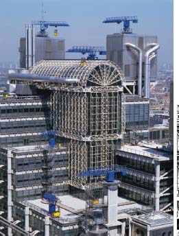
Figure 2.27 | Richard Rogers, Lloyd’s Building, City of London, 1978–1986, City of London, façade with atrium.
Source: © Robert Harding Picture Library Ltd / Alamy.
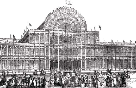
Figure 2.28 | The modular, prefabricated iron sections of the Crystal Palace, London, 1851, are discernible in this drawing, as is its inspirational role in the Lloyd’s atrium. Source: © FALKENSTEINFOTO / Alamy.
Lloyd’s Crystal Palace-inspired atrium draws inspiration from the Victorian period in the same way that Red House drew inspiration from medieval architecture. Despite being built of very different materials, both are truthful to their respective mediums. Lloyd’s effects proclaim the ‘metalness of metal’ – hard, durable, mechanised, light-reflective, futuristic and urban – while Red House proclaims the ‘clayness of clay’, seeming friable, perishable, handmade, light-absorbing, traditional and rural.
The Crystal Palace, London, 1851, designed by Joseph Paxton, a gardener and greenhouse builder, was constructed from cast iron, wrought iron, glass and timber to house the Great Exhibition, held to celebrate the achievements of the British Empire under one ‘temporary’ roof. It was symbolic of all that was deemed great about the Industrial Revolution and the emergence of new technologies.
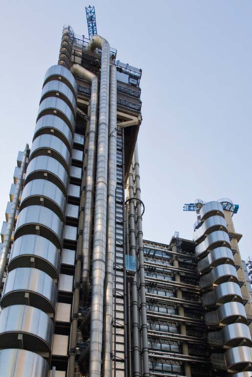
Figure 2.29 | Richard Rogers, Lloyd’s of London, exterior ducts.
Source: Images from www.lloyds.com have been reproduced with the kind permission of Lloyd’s of London.
The building was a kit-building project on a giant scale and testament to the ability to mass-produce metal modules or units that could be quickly and cost-effectively assembled on location. An innovative, steam-powered machine developed by Paxton standardised elements of the construction, enabling the building to be designed and constructed in eight months. It was hailed as the first architectural application of Adam Smith’s principle of the division of labour and became a crowd-drawing feat that would ultimately inspire Henry Ford’s automobile assembly lines of the future (Parkyn, Wonders of World Architecture, p. 136).
The Lloyd’s Building has its staircases, lifts, electrical power conduits and water pipes on the outside, enabling maintenance workers to easily access toilets, lifts, kitchens and fire-escapes. The prefabricated and modular construction offers a degree of flexibility to the interior design, highly suited to the demands of modern industry.
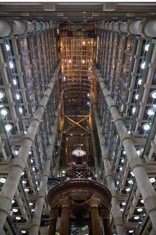
Figure 2.30 | Richard Rogers, Lloyd’s of London, interior of atrium.
Source: Images from www.lloyds.com have been reproduced with the kind permission of Lloyd’s of London.
Its style is modern and ‘high-tech’ on the one hand, and skeletal and unfinished on the other. Its steel frame allows for an open-plan interior and exposed exterior. It has been described as ‘a building on life-support’, ‘an oil refinery’ and ‘the inside-out building’. The brightly coloured cranes that crown the building are both decorative and functional (they serve as hoists for the window cleaning gantries). Lloyd’s choice of Richard Rogers as the architect and the fact that the 12 glass lifts were the first of their kind in the UK contribute to the value of the building as a high-status assertion.
Reinforced concrete columns soar through the cathedral-like space of the atrium some 200 feet to its glass roof and the exposed mechanics of the escalators criss-cross between two sides of the building (Figure 2.30). Their undisguised nature is reminiscent of the underside of Webb’s staircase in Red House: both buildings expose us to the materials and techniques and processes of their construction.
The focal point of the ground floor is the underwriting room: a large, openplan interior with a cathedral-like space rising up to the summit, visible on the outside as the segmental pediment of the atrium. As the escalators carry insurance brokers to every floor, their ascent and descent is visible for 360 degrees. In the Lloyd’s Building we can sense that the need for transparency in business is a philosophy that has manifested itself in its very materials, techniques and processes: its skeletal, see-through structure echoes its function as one of the few insurance trading floors remaining in the world where business deals are negotiated face-to-face.
Despite the human element of Lloyd’s face-to-face trading, the skeletal structure is a product of the kind of corporate evolution – automation – that Morris had so feared and rejected when he was having Red House built. Described as a beacon of capitalism within the city of London, and in Honor and Fleming’s A World History of Art as one of ‘High Tech’s finest achievements to date’, this approach to, and celebration of, precision engineering is evidently at odds with the emphasis on individuality and craftsmanship guarded Architecture Materials, Techniques and Processes by Philip Webb and others in the Arts and Crafts Movement (Honor and Fleming, A World History of Art, p. 869).
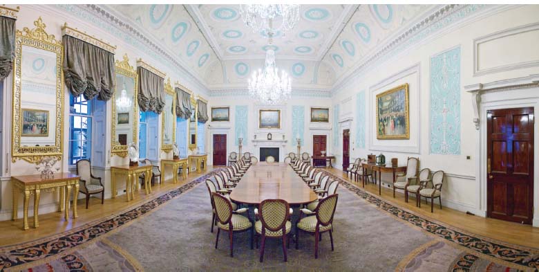
Figure 2.31 | Richard Rogers, Lloyd’s of London, elaborate plasterwork in Committee Room designed by Robert Adam, 1763.
Source: Images from www.lloyds.com have been reproduced with the kind permission of Lloyd’s of London.
Lloyd’s, along with architectural writers, describe the building as fundamentally postmodern; however, in architectural terms the Lloyd’s Building is modern because of its intrinsically functionalist design. Where it incorporates older elements, these are not pastiche, as in Postmodernism, but actual/real older elements. For example, there remain many physical relics of the old Lloyd’s Building, including a preserved wood-panelled Committee Room designed by Robert Adam in 1763 (see Figure 2.31) and the historic Lutine Bell on the ground floor relocated in its entirety. Lloyd’s subsidiary entrance on 12 Leadenhall Street (Figure 2.32) boasts a classical triangular pediment with richly decorated tympanum, juxtaposed with its twentieth-century polished steel body. These significant nods to Classicism clash with its predominantly high-tech exterior. Lloyd’s controversial design statement, eclectic ensemble and tremendous expense were all deemed risky at the time, but if Lloyd’s, the giant insurer, could not take a risk, then who could?
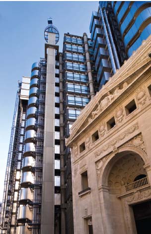
Figure 2.32 | Entrance to Lloyd’s Building, 12 Leadenhall Street, London, with classical triangular pediment.
Source: © Gregory Wrona / Alamy.
The term Postmodernism is far from straightforward and is used in many different ways. Marxist social theorist Fredric Jameson, in his essay Postmodernism, or, The Cultural Logic of Late Capitalism, describes the term as parasitical on all of the other ‘isms’ – Classicism and Modernism, for example (Jameson, Postmodernism, or, The Cultural Logic of Late Capitalism, p. xii).
Postmodernism is not pure, neither is it a break from the past, he suggests, but rather it is a continuum of late capitalism, a simple prolongation of more of the same under different sheep’s clothing (Jameson, Postmodernism, or, The Cultural Logic of Late Capitalism, p. xiii).
In fact, Jameson warns us against using the term altogether. Paradoxically, Postmodernism, in its rebuttal of any one true ‘ism’, such as Jameson’s Marxism incidentally, finds its position as a theory, or ‘ism’ itself, arguably untenable.