Chapter 3
Form, Style and Function
Introduction
This chapter introduces you to the concepts of form and style in relation to painting and sculpture, and form, style and function in relation to architecture. For ease of reference some of the most recognised styles or movements in the history of art, for example, Classical, Renaissance and Neo-classical will be examined chronologically in terms of the individual formal elements – line, colour, tone and texture – that constitute their respective style. Your teacher may decide to teach you the skills of formal analysis separately – perhaps before examining the six chapter themes – or may use each thematic example as an opportunity to pause and complete a formal analysis first. Help with conducting a formal analysis is provided explicitly in the ‘Formal Analysis Toolbox’ section at the start of the book. While it is beneficial for you to have an awareness of the evolution of styles in art history, only a partial and therefore unrepresentative sample of works has been selected for examination within this chapter.
Form
When conducting an analysis of form (in this context, a formal analysis in relation to the appearance of a work, be it two or three-dimensional), readers should pay attention to the following features:
- – composition in painting, sculpture and architecture
- – colour in painting, sculpture and architecture
- – pictorial space in painting and relief sculpture
- – light and tone in painting
- – pattern, ornament or decoration in painting, sculpture and architecture
- – line and shape in painting; line, shape and three-dimensional form in sculpture; three-dimensional form and space in architecture
- – scale in painting, sculpture or architecture
- – architectural elements or features in buildings
- – structures in architecture
- – volume and mass in architecture and sculpture
- – site or location in architecture
- – materials, techniques and processes in painting, sculpture and architecture, particularly as this theme overlaps with form, style and function.
Many of these formal elements are inter-related; for example, the arrangement of line, shape and colour may give us effects such as rhythm, balance and pattern which constitute the composition. In reality, most of us find it difficult to separate what is represented (the subject, and its deeper meaning, the content) from how it’s represented (form).
Style
Style can be easily understood when describing our clothes, furniture or domestic interiors because it denotes the features that they have in common. The same is true of paintings, sculptures and architecture. Perhaps it is easiest to think of style as relating to the way an artist arranges formal elements and the recognisable look these take.
Style is the distinctive visual appearance of a work of art or architecture. However, we cannot always ascribe a particular label to the set of visual characteristics with which we are presented. For example, Frank Lloyd Wright’s Fallingwater, examined later in this chapter, has a distinctive visual appearance but it is not distinctive enough to be identified strongly with a specific style; instead, it is discussed here as representing a variant on the Modern Movement style; although essentially, it has an individual style.
While the collective styles of artists are sometimes associated with a movement, before the twentieth century it was not all that common for artists to group together either to produce consciously crafted manifestos or to proclaim the characteristics of their artistic style. Most commonly, the history of art has been studied in accordance with a succession of styles: Gothic, Renaissance, Baroque, Neo-classicism, Romanticism, Realism, Impressionism, Fauvism, Expressionism, Cubism, Futurism and so on. These broadly correspond to particular historical periods. Art historians adopt these categorisations because it simplifies and clarifies our examination of art history, and the examination of style tends to necessitate a visual formal analysis from which shared or collective characteristics emerge. However, we must guard against the rigidity of this process because it may lead to the omission of some of the most iconic works of art and architecture ever made. Some works fall between styles and some are so innovative they seem to stand alone, such as Antoni Gaudi’s fantastical apartment block Casa Batlló, 1904–1906, for example.
Importantly, from the thematic perspective of this book, style creates the overall aesthetic effect, regardless of the subject matter and irrespective of the work’s social and historical context. Many of the following images are accompanied by a ‘What can you see?’ prompt to aid your understanding of the formal elements of art and architecture that comprise a work’s ‘style’.
Function
Function (purpose) is examined in relation to architecture alone (in addition to an examination of its architectural form and style) since architecture serves specific utilitarian/practical purposes that painting and sculpture do not. Functionalism can suggest a certain prioritising of function over decoration in accordance with the ‘form follows function’ slogan, which became common currency in the architectural vocabulary of the twentieth-century Modern Movement. However, not every functional building smacks of utilitarianism. Whatever the visual stimulus, we need to consider the relationship between the function of a building and its appearance.
The Beginning of Western Art
Classical style
It is commonly agreed that the tradition of Western art began in ancient Greece, and, although the term Classical can be a broadly used concept within an art-historical context, as a stylistic category, Classical refers to the culture of ancient Greece and Rome, with the period around c.480–323 bce, when Greece, and especially the Athenian state, achieved cultural and artistic supremacy, as the apogee of Classicism. During this period, Classical sculptors noted the way real humans stand – their pelvises tilt with unequal weight distribution, and that the human form can twist around its central axis. Translated into statuary, this counter-balancing is known as contrapposto, and it characterises the more naturalistic style of Classical sculpture, separating it from its more rigid and ‘unrealistic’ Egyptian and earlier Greek predecessors. Because harmony was believed to be found in nature, it was reasoned that it should be replicated in sculpture.
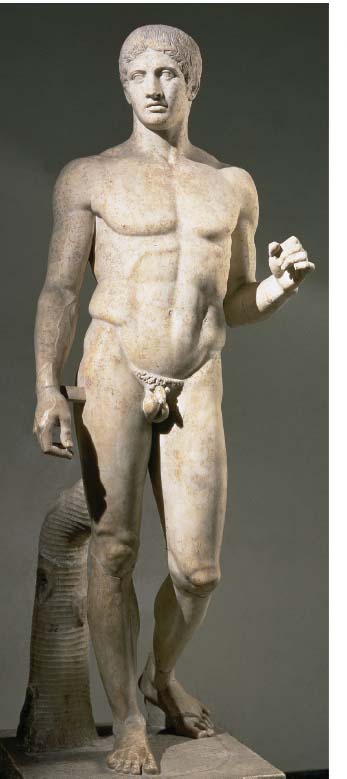
Figure 3.1 | Polykleitos, Doryphoros (Spear Bearer), 450–440 bce, copy of a Greek original, marble, height 212 cm, Roman, Naples, Museo Archeologico Nazionale.
Source: Museo Archeologico Nazionale, Naples, Italy / Photo ©Tarker / Bridgeman Images.
Look at Polykleitos’ Doryphoros (Spear Bearer). Is the figure idealised or anatomically correct? How is it posed? Is it contrapposto? What is the facial expression? Is it gesturing? Is it static or animated? Consider materials, techniques and processes in your analysis. You may want to refer to the discussion of marble sculpture in Chapter 2.
In terms of formal elements such as line, form, colour and texture, the appearance of Polykleitos’ Doryphoros (Spear Bearer), 450–440 bce, has a distinctive and rhythmically balanced outline; line contains the figure’s mass; that is to say, his body form is not disturbed by extended limbs or any other protuberances, which contrasts with modern works such as Boccioni’s Unique Forms of Continuity in Space, 1913 (mentioned in greater detail later in this chapter). These formal features help to convey a sense of harmony and stillness. His anatomical correctness and well-defined musculature is characteristic of the Classical style, a combination of realism and an idealisation of the human form. His pelvis tilts realistically in keeping with his bent knee and unequal weight distribution. Contrapposto is evident in the head turning in one direction and the hips in the other. The marble has been polished to mimic the smooth flesh of its subject and enhance the figure’s athletic form. His left arm is raised at waist level but maintains a reserved closeness to his body. His head tilts realistically, but despite his slightly parted lips – which lend a hint of animation – his face is idealised and sets a standard for natural beauty. Indeed, Doryphoros epitomises the ideal nude male and the anthropocentrism characteristic of the Classical style. This ‘type’ of nude figure would become a prototype for the Renaissance ideal nearly 2,000 years later. Also bequeathed to the Renaissance was humanism that led artists in the Western tradition to celebrate the virtues of humankind; in the renewed perspective of the Renaissance man would become the measure of all things.
Just as there was an ideal of the perfect human body, there was an ideal of a perfect proportional ratio used in art and architecture. Known as the Golden Section, it is thought to have originated in ancient Greece from the sixth century bce. The exact proportion cannot be expressed as a finite number but it approximates to 1:1.618. The proportions of the Parthenon Temple, 447–438 bce, Athens, were designed with tremendous precision to create a building whose separate parts achieve a perfect, mathematical harmony with its whole; the ratio of its height to its width is a Golden Section. The Golden Section was thought to have an inherent visual harmony and beauty and the Classical buildings of Antiquity that first used the formulae have become a blueprint for numerous architects throughout the history of Western architecture.
Classical art and architecture has been historically imbued with authority and beauty. Temples like the Parthenon in Athens have come to represent the pinnacle of Classical aesthetics and have established an architectural grammar in terms of scale, proportion and symmetry that has been imitated repeatedly over the last 2,000 years. Greek buildings are trabeated – that, is a post and lintel structure (the arch was a later, Roman invention). In the case of the Parthenon, the columns support the entablature, which in turn supports the roof beams. The sloping roof (now destroyed) has gables at each end (known as pediments). In Classical architecture (Greek and Roman) each different style of column, with its base, shaft and capital, and entablature, architrave, frieze and cornice, is known as an Order.
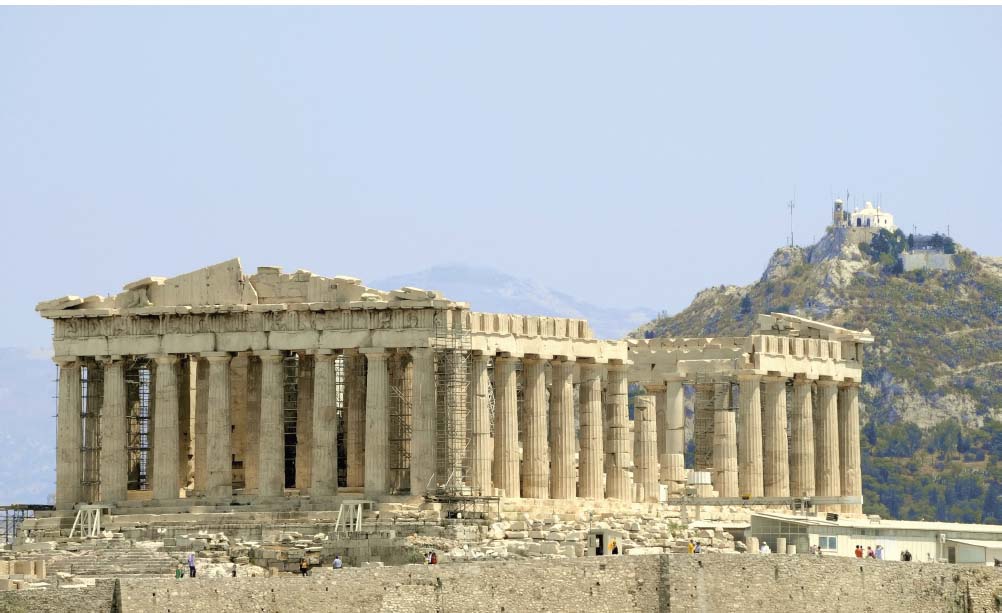
Figure 3.2 | The Parthenon Temple, 447–438 bce.
Source: © krechet / iStockphoto.
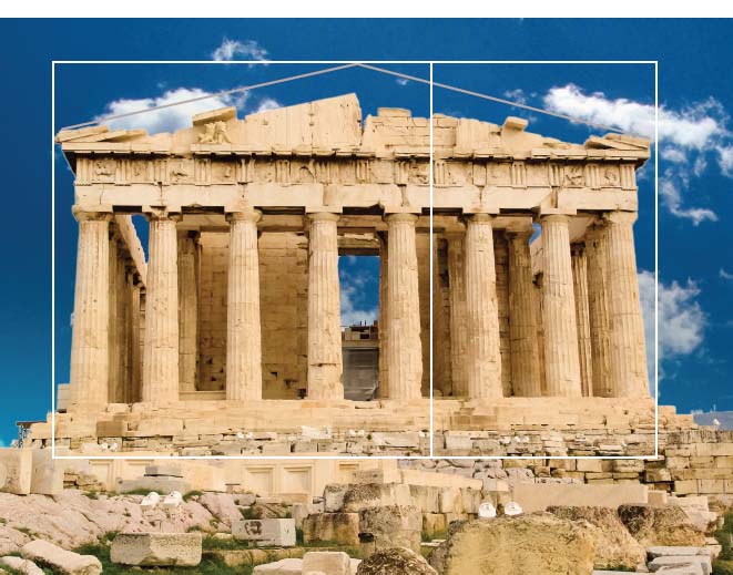
Figure 3.3 | The Parthenon Temple with Golden Section overlay.
Source: © Sergio Bettino / Shutterstock.
Much of a Classical building’s style comes from its choice of Order. Part of the Parthenon’s austerity and authority comes from its plain Doric Order. The Doric frieze is divided by alternating triglyphs (three vertical grooves) and metopes (the spaces between the triglyphs that could be decorated). The proportions of the Doric Order differ from the more delicate Ionic Order (the capitals of which have volutes) and, later still, the flamboyant Corinthian Order (with capitals based on acanthus leaves). The height of the Doric column is between four and usually six times its diameter; the slimmer Ionic column eight to ten times its diameter in height (Woodford, The Parthenon, p. 14).
Artists and architects in later periods used Classicism as an exemplary foundation for their work. For example, the revival of all things classical would characterise the Renaissance across Europe during the fifteenth and sixteenth centuries.
Discovery of Antiquity and Development of Sacred Art
The Early Renaissance
The Renaissance is best understood when it is divided between the Early Renaissance (essentially the fifteenth century) and the High Renaissance (specifically in Rome in the early sixteenth century, although it might be seen as having a longer existence in other locations, such as Venice, for example).12 The stylistic development from one to the other was noted by the Renaissance biographer Giorgio Vasari in his Lives of the Artists. While it is generally agreed that the Early Renaissance in art began in the 1420s with Masaccio (originally Tommaso di Ser Giovanni di Simone, 1401–1428/29) and ended, roughly speaking, at the close of that century, the High Renaissance that followed it drifted into a style called Mannerism around the time of the Sack of Rome in 1527. The prefix ‘high’ describes the height of Rome’s artistic and cultural ascendency under the guidance of Pope Julius II (1503–1513) and Pope Leo X (1513–1527) and, from the perspective of Vasari, marks the achievement of a long-awaited perfection.
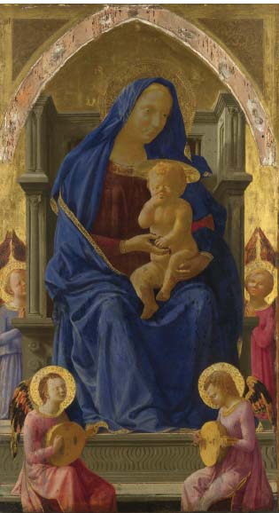
Figure 3.4 | Masaccio, The Virgin and Child, 1426, egg tempera on wood, 134.8 × 73.5 cm, London, National Gallery. Bought with a contribution from The Art Fund, 1916. Acc. no.: 1772.
Source: © 2015. Copyright The National Gallery, London / Scala, Florence.
The Early Renaissance in Italy marked a new beginning in art history and became characterised not only by the revival of Classicism but also the artists’ greater understanding of anatomical correctness and new ways to achieve naturalism. The Virgin and Child, 1426, by Masaccio, which has already been examined in Chapter 2, is widely considered to epitomise the aspirations of this period.
The Early Renaissance is often identified stylistically by its greater attention to anatomical detail in comparison to the Gothic period that preceded it, and its use of chiaroscuro and single-point linear perspective. The Virgin sits on the central vertical axis in a pyramidal composition (used by earlier artists such as Duccio di Buoninsegna (c.1255/60–c.1318/19) (see Chapter 2) with her head at the apex. Colour is used both naturalistically and symbolically – for example, flesh is recognisable as such, while blue and gold symbolise heaven; the use of gold leaf is one sign of the Gothic legacy from which the Early Renaissance style had developed. Linear perspective has been used to foreshorten Christ’s elliptical halo and the Virgin’s throne so that both appear to recede naturalistically. Chiaroscuro is used to develop the anatomical correctness of the figures, particularly evident in the musculature of the naked Christ Child’s torso, and the Virgin’s robes. Masaccio’s treatment of the Virgin’s drapery can be described as tonal insofar as the juxtapositions of dark, mid and light blues provide a convincing modelling effect. Tempera was not able to blend shades of colour indiscernibly and so the placing of varying tones side by side was the best that could be accomplished with this medium (see Chapter 2). The Virgin’s body appears solid and ‘weighty’, despite its depiction on a two-dimensional surface. She appears to sit back in her throne, which itself is a reference to classical prototypes, an illusion made all the more credible by the single light source from our left which casts her shadow to her right. Using perspective to foreshorten her thighs as they recede only heightens her human quality and separates her from countless earlier depictions of seated Madonnas, as noted by the Renaissance biographer, Giorgio Vasari: Masaccio also made more use than other artists of nude and foreshortened figures, which indeed had rarely been seen before (Vasari, Lives of the Artists, p. 126).
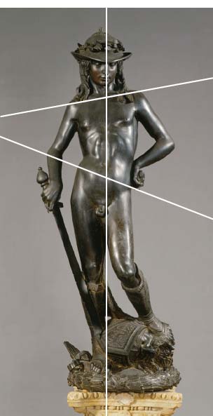
Figure 3.5 | Donatello, David (before restoration), 1440, bronze, Florence, Bargello Museum.
Source: © 2015. Photo Scala, Florence – courtesy of the Ministero Beni e Att. Culturali.
Is the figure idealised? Is it anatomically correct? How is it posed? Is it contrapposto? What is the facial expression? Is the figure gesturing? Is it static or animated? Consider materials, techniques and processes in your analysis. You may want to refer to the discussion of bronze sculpture in Chapter 2.
The Virgin and the Christ Child’s physicality are a result of the artist’s attention to anatomical detail and the pervading humanism that would mark the beginnings of the Early Renaissance.
The sculptor Donatello (originally Donato di Niccolò di Betto Bardi, c.1386–1466) was Massacio’s equal, in terms of his artistic status and embodiment of the Italian Early Renaissance style. A similar attention to anatomical accuracy and the realistic interpretation of form is demonstrated in the sculptor’s David, 1440.
In relation to the formal element of line, the composition of Donatello’s sculpture of the youth David, biblical slayer of the giant Philistine Goliath, loosely follows a vertical line down the central vertical axis of the figure. This grounds him, heightens his self-assurance and gives him a dignified air. His contours are both defined and fluid over his anatomically correct body. The shift in his weight distribution to the right leg is followed through in his tilted pelvis and demonstrates a naturalistic contrapposto derived from Classical sculpture and employed to heighten naturalism. His musculature is reminiscent of the Classical male nude Doryphoros by Polykleitos, discussed earlier in the chapter, and, of course, the Early Renaissance was largely inspired by Classical characteristics. The surface texture is smooth and highly light-reflective on account of its dark-bronze medium, the patina of which seems to suit the nature of his victorious and heroic stance. Despite the youth’s defiant hand on his hip, the overall impression is harmonious and static.
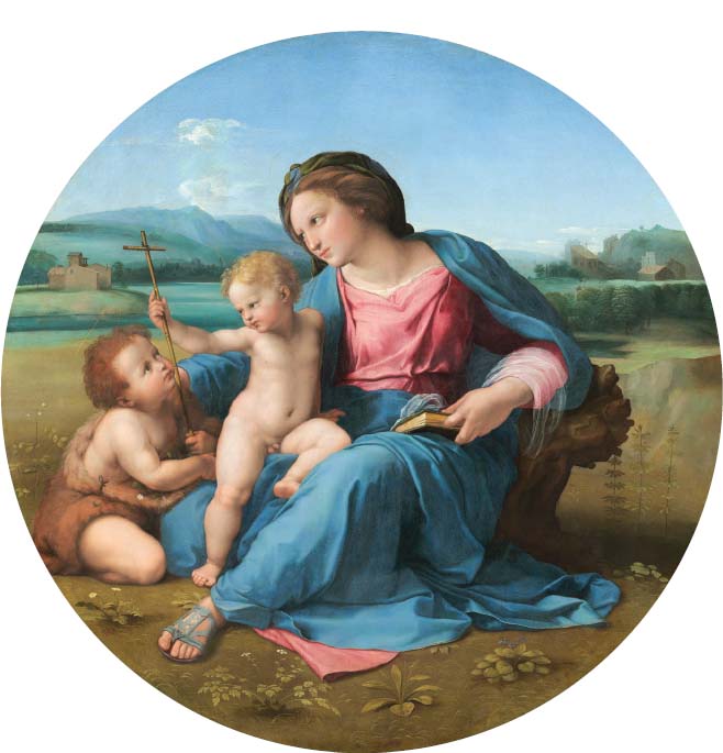
Figure 3.6 | Raphael, Alba Madonna, c.1510, oil on panel transferred to canvas, overall (diameter): 94.5 cm, framed: 139.7 × 135.9 × 14 cm, Washington, National Gallery of Art, Andrew W. Mellon Collection, 1937.1.24.
Source: Courtesy National Gallery of Art, Washington.
The stylistic developments that demarcated the Early from the High Renaissance can be examined by comparing this Early Renaissance sculpture by Donatello with the High Renaissance sculpture of the same subject by Michelangelo (originally Michelangelo di Lodovico Buonarroti Simoni, 1475– 1564), which can be seen in Chapter 5.
The High Renaissance
Is the composition of Raphael (Raffaello Sanzio da Urbino, 1483–1520)’s Alba Madonna, c.1510, symmetrical or asymmetrical? Do the Virgin and Child form a rigid pyramid shape? What effect does Raphael’s colour palette have on the scene? How is pictorial space conveyed? Also, consider materials, techniques and processes in your analysis.
The High Renaissance is distinguishable from the Early Renaissance on account of its greater sophistication, innovation and perfection. For example, the composition of Masaccio’s Virgin and Child with Angels is a strict pyramid, in contrast to the High Renaissance work the Alba Madonna, by Raphael. Both Madonnas are positioned on the central vertical axis, creating compositional symmetry, but Raphael’s demonstrates greater naturalism; his Alba Madonna twists in realistic contrapposto, creating an illusion of natural movement towards her lively son. This looser, organic pyramid, coupled with this level of interaction between the figures, and a convincing landscape, Discovery of Antiquity and Development of Sacred Art Form, Style and Function provides the viewer with an unprecedented sense of realism, as noted by the biographer Vasari, stating, for in his figures the flesh seems to be moving, they breathe, their pulses beat, and they are utterly true to life (Vasari, Lives of the Artists, p. 304).
The convincing modelling of form was attributable to artists’ use of oil paint, which could be manipulated and over-painted easily. The composition of the Alba Madonna is fairly complex: the Virgin holds onto Christ while simultaneously directing our gaze beyond St. John, and into the distance on the far left. This allows us to consider her contemplation of the future and empathise with her evident sense of foreboding – a sense underlined by Christ’s playful grip of the Cross, which may also be read as his acceptance of the Crucifixion at the end of his life. While Jesus looks at St. John, St. John looks heavenward rather than return his gaze – a complex series of compositional directions that lead us from the Virgin Mary to Christ, from Christ to St. John and from St. John to heaven above. A poetic circularity compositionally suited to its circular shape, known as a tondo.
Like Masaccio, Raphael uses colour symbolically to represent the Virgin but, unlike Masaccio, he is also concerned with realistic colouring, particularly in his depiction of flesh tones. The chiaroscuro which lent Masaccio’s earlier work an innovative realism has been perfected here to produce a porcelain-like skin quality. The whole scene is bathed in a gentle and diffused light. This device, together with Raphael’s clarity of line and execution, lend the entire work a sense of idealised beauty. The tonality is fairly bright and, despite its naturalism, the palette is fairly limited to blues, greens and pinks, and these hues are used repeatedly to create an overall harmony across the composition.
The Virgin’s classical dress falls away in a style reminiscent of antique relief sculpture. Raphael was in Rome at the time he painted this work and the influence of Antiquity would have been all around him. Despite the work’s naturalism, Raphael expresses divinity not only through the faintest of halos, around each holy figure, but also through the idealised beauty of the figures and their scenery.
A further characteristic of the High Renaissance style, at least in painting done in Rome, is the increasing rationalisation of space. Linear perspective is used to render Mary’s Bible foreshortened, and atmospheric perspective is evident in the diminishing vibrancy of colour and dominance of blue and green as it approaches the horizon, and in the way the landscape blurs realistically as it recedes. The influence of humanism is evident in the fact that Raphael’s Virgin, historically depicted seated on a throne (as in Duccio’s The Madonna Enthroned, 1311, in Chapter 2, or Masaccio’s, Figure 3.4), is represented as the Madonna of Humility: sitting on the ground, with only a rock or tree stump as support. In a manner that suggests a complex symbolism, but is nevertheless naturalistically believable, the Virgin’s outstretched limbs provide a makeshift throne for the Christ Child – a subtle device, entirely indicative of High Renaissance accomplishment.
The Baroque style that emerged in the century that followed the High Renaissance would deepen the palette, disrupt the symmetry and throw a spotlight on its actors to create scenes more theatrical than Western art had ever seen before. The style had its basic dynamic code but it also had a multitude of variants.
The Baroque
Baroque is a term used to describe a seventeenth-century style of art and architecture which extended from the late sixteenth to the mid-eighteenth century. The Baroque style originated in Rome, although it found various stylistic variants across Western Europe: from Italy to Flanders, Spain, France, the Dutch Republic and England. In every country the style took on a distinguishing form.
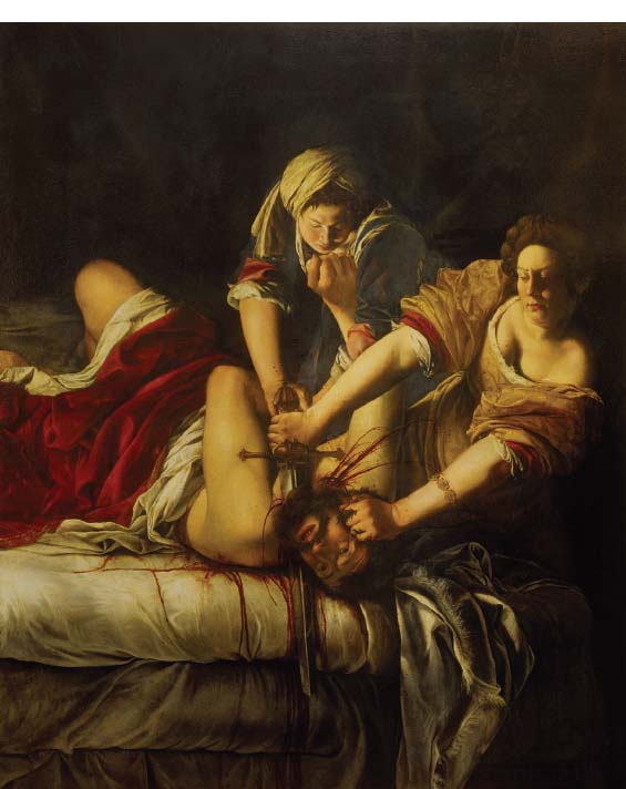
Figure 3.7 | Artemisia Gentileschi, Judith Slaying Holofernes, c.1620, oil on canvas, 199 × 162 cm, Florence, Galleria degli Uffizi.
Source: © 2015. Photo Scala, Florence – courtesy of the Ministero Beni e Att. Culturali.
The realism achieved by artists in Spain rivalled the quality achieved by Caravaggio in Italy, and both countries were driven by Catholic Counter-Reformation zeal. A comparison of the work of Gregorio Fernández’s Dead Christ, c.1625–1630 (examined in detail in Chapter 2), with Gian Lorenzo Bernini’s Ecstasy of St. Teresa, 1645–1652 (examined in detail in Chapter 4), provides a striking illustration of the different Baroque styles in Spain and Italy, respectively.
As a further illustration of the breadth of the term ‘style’, the Baroque style in Italy alone expressed itself in two separate ways: first, through the unprecedented realism of Caravaggio and his followers, the Caravaggisti, and, second, through the classical Baroque style typified by Italian artist and architect Pietro da Cortona (1596–1669). Cortona’s typically theatrical interior fresco The Glorification of the Reign of Urban VIII, 1633–1639, emulated the idealised style of Antiquity. Works such as Cortona’s experimented safely within the confines of decorum, whereas Caravaggio’s boldly innovative art made only the occasional nod to the decorous, but never at the expense of the ugly truth, especially if that truth was evident in scripture. In most manifestations of the Baroque style, dynamism was favoured over the static compositions of its Renaissance predecessor, and many artists set out to stir the emotions of the spectator.
Caravaggio exemplifies the early Baroque style characterised by pure theatre emerging from dark and psychologically charged backgrounds. His The Entombment, 1602–1604, was examined in detail in Chapter 1 as a religious subject, and may also be examined here in terms of the formal features that comprise its Baroque style.
The work of female painter Artemisia Gentileschi (1593–1656) exemplifies the Caravaggisti. Gentileschi’s Judith Slaying Holofernes, c.1620, is a good example of the way in which the formal elements of a style, in this case Baroque, can become so distinctive that they are instantly recognisable as such.
Gentileschi uses light and tone to render the subject theatrically for the viewer. Gentileschi, who had seen Caravaggio’s works, used similar tonal contrasts and raking light to create a dramatic atmosphere, in this instance, a haunting, night-time murder scene. Such tenebrism creates a psychological void, which focuses our attention on the deed. If the Baroque style was Discovery of Antiquity and Development of Sacred Art Form, Style and Function concerned with capturing the transient moment, then Gentileschi delivered. Blood spouts from Holofernes’ brutish neck as the gleaming sword slices through a main artery. He seems to take his last breath here, before our eyes. The dynamism of the style is reinforced formally with Judith’s arms, like murderous arrows, set on a diagonal which drives in from the right-hand side of the picture, leading us to the point of execution. The diagonals of her arms lend movement and are balanced by Holofernes’ less powerful legs, raised pitifully on the left. On the central vertical axis, Judith’s accomplice leads us to the point of death with her gaze and her arms to complete a complex intersection of diagonals and pyramid formations; all converge at the point of Holofernes’ slaying and provide evidence of the power of formal elements to tell a complex narrative.
Directional lighting not only lends a theatrical atmosphere but, more practically, functions to illuminate important elements of the scene: the heroines’ determined expressions, their arms, his face and the steely weapon used to bring about his demise. Light is also responsible for modelling the figures’ believable forms. Judith’s arms are strong and robust enough to carry out the job in hand. The colours, predominantly red, white and black, provide stark contrast with one another, and the blood-red doubles as a symbol for passion and destruction. That this bloodthirsty scene is enacted so close to the picture plane draws us unnervingly close to the action; we see his death a fraction before his killers do. According to the biblical Book of Judith, Holofernes was killed with two strikes from his sword, and it would appear that we have just witnessed the moment of the second blow. The scale of the women’s violent achievement is conveyed in a single juxtaposition: the mighty fist of Holofernes takes on a terrifying proportion against the maid’s comparatively small head.
The striking realism and unprecedented verisimilitude of the style is part of its rhetorical character – a truthfulness that was ironically staged. Its compositional dynamism, colour palette and lighting set it firmly apart from its Renaissance predecessors. Many of the formal devices used in Baroque painting are instantly recognisable in Baroque sculpture. The compositional use of the diagonal is a particularly characteristic device used by Baroque artists to create the feeling that we are witness to a dramatic and transient moment. For example, the marble sculpture Apollo and Daphne, 1624, by Gian Lorenzo Bernini (1598– 1680) is composed on a diagonal axis, skilfully suggesting the thrust of movement and a precise moment in the chase. This dramatic scene is also examined in greater detail in Chapter 2.
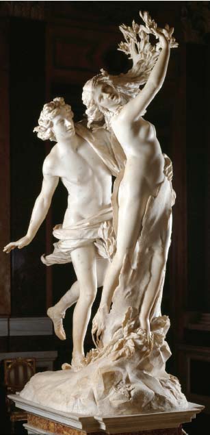
Figure 3.8 | Gian Lorenzo Bernini, Apollo and Daphne, 1624, marble, height 243 cm, Rome, Borghese Gallery.
Source: akg-images / Andrea Jemolo.
Is Bernini’s sculpted multi-fig-ure composition Apollo and Daphne idealised? Are they anatomically correct? How are they posed? Are they in contrapposto? What are their facial expressions? How can we read their gesturing? Are they static or animated? In addition, what is the purpose of the drapery? Does it fall away naturalistically, or does it have a life of its own? Consider materials, techniques and processes in your analysis. You may want to refer to the discussion of marble sculpture in Chapter 2.
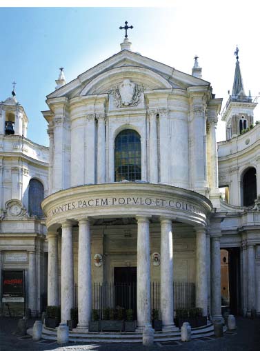
Figure 3.9 | Pietro da Cortona, Church of Santa Maria della Pace, Rome, 1656–1667, view of façade.
Source: © 2015. Photo Scala, Florence.
Baroque architecture of the seventeenth century is as recognisable stylistically as Baroque painting and sculpture. Cortona was one of three great Roman architects of the High Baroque, together with his famous contemporaries, Gian Lorenzo Bernini and Francesco Borromini. Cortona’s architectural features are rooted in Antiquity but their alteration and inventive use is characteristically Baroque. The Classical features of Cortona’s church include pediment, entablature and columns, but, while the true Classical temple of the Parthenon in Greece, constructed 2,000 years earlier, was flat-faced and static, Cortona’s church is voluptuous and dynamic. Its triangular pediment houses a segmental one, its frieze is inscribed – deviating from the true Doric Order – its columns are twinned. The convex cornice projects deeply to cast a dramatic strip of horizontal shade, sweeping onto the piazza like the welcoming arms of the Catholic Church, and even its upper tier supports subtle projections squeezed like putty between the pilasters and engaged columns that frame their swell. We have seen the interplay of light and shade before in great paintings and sculptures of the seventeenth century; here we see the same tonal theatricality played out in stone.
The classical models from which Bernini and Cortona would draw inspiration reappeared as the finest artistic standard some two centuries later in the style suitably known as Neo-classicism.
Neo-classicism
Neo-classicism was a prevalent artistic style in Europe from the mid-eighteenth to the early nineteenth century, and was characterised by a taste for Antiquity and academic sobriety. The Neo-classical style is epitomised in the painting Death of Marat, 1793, by Jacques-Louis David (1748–1825).
Form and style accentuate the narrative of the painting, which was discussed in both the ‘history’ and ‘portrait’ genres in Chapter 1. The formal elements that could be said to embody the Neo-classical style include crisply delineated forms and disguised brushwork. These elements create an illusion of reality. The painting is an important piece of propaganda and the artist does not intend us to question the version of events that he is portraying. The Discovery of Antiquity and Development of Sacred Art Form, Style and Function wooden box in the foreground, which doubles as a makeshift table and metaphorical headstone, is graphically demarcated from its green backdrop. The folds of the cotton sheet fall away so convincingly, so crisply, that we can almost feel their texture. Marat’s anatomically correct body appears solid, three-dimensional, as a result of the artist’s use of chiaroscuro. Yet, Marat’s idealised face is achieved through a classical treatment the artist has borrowed from Antiquity.
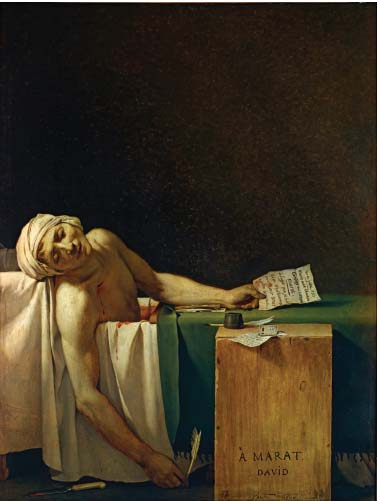
Figure 3.10 | Jacques-Louis David, The Death of Marat, 1793 (stabbed in his bath by Charlotte Corday, Paris, 13 July 1793), oil on canvas, 165 × 128 cm, Brussels, Musées Royaux des Beaux-Arts.
Source: akg-images / André Held.
Light is used not only to create three-dimensional form but to direct our gaze compositionally towards significant aspects of the work: the illuminated letter in Marat’s left hand that his assassin used to gain entry to his apartment, the quill-pen Marat used to send a letter of condolence to a widow of the revolution in his right hand, the assassin’s knife on the floor in the foreground and so on. Light is also used symbolically in this painting: Marat seems to bathe in the grainy illumination of a quasi-religious light, referencing historical scenes of martyrdom.
The whole composition is divided in two, and the emptiness of the upper half only focuses our eyes more intently on the murder scene in the lower half. Marat’s elevated head forms a diagonal which is used to guide our eye down his left arm to the letter, and a secondary path can be followed from his right arm which over-hangs the bath and acts as an arrow to the quill. In other words, the narrative is revealed through our understanding of the formal elements; the relationship between form and meaning is shown to be symbiotic, or complementary. The sum total of these formal elements could be said to comprise the Neo-classical style – a style that sought to suspend our disbelief and made for convincing propaganda images such as Death of Marat, which served the French Republic as a pro-Revolutionary icon.
A Move Towards Individualism
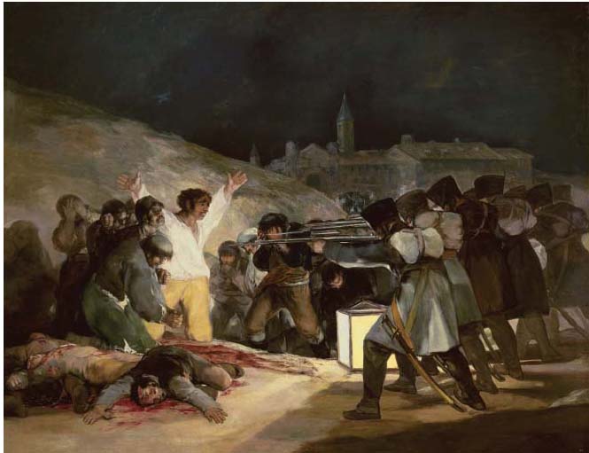
Figure 3.11 | Francisco de Goya, The Third of May 1808, 1814 (Execution of the insurgents on the Montana del Principe Pio), oil on canvas, 266 × 345 cm, Madrid, Museo del Prado.
Source: akg-images / Album / Oronoz.
Romanticism
Romanticism in the visual arts developed towards the end of the eighteenth century and is commonly understood to be a reaction against the Neo-classical tradition; both of these styles were parallel, if apparently antithetical. The stylistic elements that characterise Romanticism are exemplified in Spanish artist Francisco de Goya’s ‘history’ painting The Third of May 1808, already examined in some depth in Chapter 1. However, Romanticism took many forms, and styles were frequently more closely linked to individuals. In France, Romanticism represented a rebellion against Neo-classical order and control, and artists set free their imaginations and emotions in canvases such as Théodore Géricault’s The Raft of Medusa, 1819 and Eugène Delacroix’s Liberty Leading the People, 1830 (examined in Chapter 6). British Romanticism was encapsulated by the expressive skies in Turner’s The Fighting Temeraire, 1839, and Spanish Romanticism arguably became synonymous with the later work of Francisco de Goya (1746–1828), whose emotions seem to pour through the pigment in his highly individual and emotive take on warfare (Figure 3.11).
How does the composition of Goya’s The Third of May 1808, 1814, relate to the subject matter? (See Chapter 1 for help with this.) Is colour used descriptively and/or symbolically? How has the artist used light in the scene? Consider how the artist’s brushwork may have impacted the message Goya is trying to convey here?
Unlike his Neo-classical antithesis David, Goya paints modern people in a style as liberated and undisguised as his emotion. He uses light and tone dramatically to indicate the difference between good and evil and, in this sense, uses tonal contrast to convey meaning. The scene is enacted in front of a tenebrous background which sets the mood and silhouettes a church in the distance. The outstretched hand of the central protagonist directs us compositionally towards its spire, which could be interpreted as meaningful in the context of this image: God will judge these men. The flashes of white evident in the group of ‘innocents’ on the left are absent from the group of executioners on the right, who are painted in tones of grey, black and brown.
The forms (shapes) of the troops are identical, a homogeneity which seems to heighten their seemingly mechanistic and inhuman nature. The palette reserved for them is virtually monochromatic in comparison with their victims – the whitest and brightest of which is reserved for the central protagonist: a lone figure invested with the symbolism of innocence and Christ’s sacrifice. This is where raw emotion seems to surpass realism and Goya’s loose and painterly brushstrokes communicate an intensity of feeling rarely conveyed either before or since. The rapid application becomes a conduit for expressing suffering and the immediacy of the situation in Spain during the French occupation. The artist provides us with a mixture of acutely observed detail and an unfocused blurring, which is more evident in the extreme closeups provided as a result of Google Earth’s collaboration with Spain’s Prado Museum, where the work is housed.
A formal analysis of this work suggests it is constructed through a series of binary opposites: light versus dark tonality, faces revealed versus faces concealed; a chaotic huddle of innocents opposed to an orderly group of soldiers; defenceless victims opposed to armed executioners; and so forth. These formal extremes are used by the artist to simplify and heighten the expressive meaning of the painting. The Romanticism represented here by the Spanish artist Goya also developed along similar lines in France, as a movement representing artistic freedom and imagination. Consider the form and style of French Romanticism in The Raft of the Medusa, 1819, by Théodore Géricault (1791–1824) (Figure 3.12).
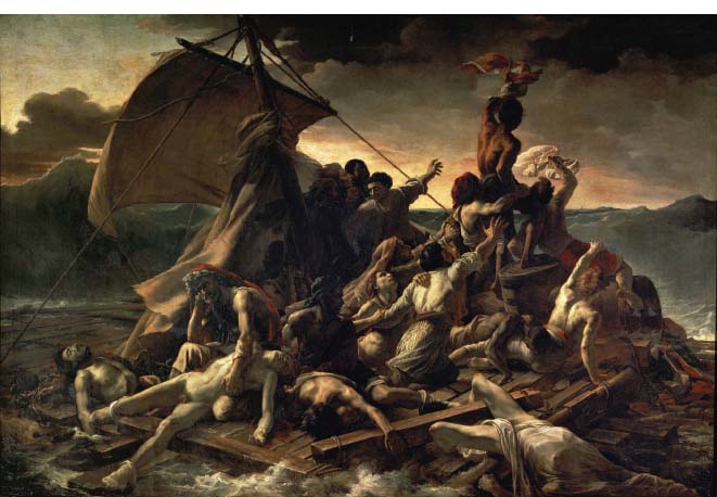
Figure 3.12 | Théodore Géricault, The Raft of the Medusa, 1819, oil on canvas, 491 × 716 cm, Paris, Musée du Louvre.
Source: akg-images / Album / Joseph Martin.
In 1816 the French ship Medusa sank off the coast of Africa, forcing the 150 passengers to take to a makeshift raft upon which they floated on the open seas for 13 days before they were eventually rescued. By the time help arrived, there were only 15 survivors. Géricault’s painting, based on these events, takes a loosely diamond-shaped composition, with the red flag held aloft at its apex and a corner loaded with corpses seemingly about to enter our space at lower left. These elements are balanced by the billowing sail on the left-hand side, sheltering the men from the menacing wave that threatens their already fragile existence. The horizontal or ‘landscape’ format Géricault chose for this monumental work serves to intensify the never-ending horizontality of the sea from the perspective of those shipwrecked.
Light has been used to model the figures’ forms – a particularly important feature given the jumble of bodies on the raft. Their asymmetrical formation creates an overlapping chaos that eschews the rigid order of Neo-classicism. The dark and threatening sky, shot through with light, is also employed to create a foreboding atmosphere, prompting us to wonder, can they survive another night adrift? Light also illuminates an important diagonal in the composition: it leads us from the corpse whose blue/green body hangs humiliatingly naked across an older man’s lap (we may perhaps identify this man as the boy’s father), bottom left, to the flag-waving men at the top right of the composition. Compare the gesture and facial expression of this grey-haired man in the red cloak (the father) with the gestures of those at the composition’s apex. How do their polarised positions help us to interpret their predicament? Perhaps we could describe the raft as rising through a hierarchy from desperate agony to hope – from death to life – which is embodied in the form of a tiny ship on the vast horizon. In actual fact, this ship did not see the raft and the shipwrecked survivors had to endure a further agonising day until they were finally rescued.
The power of form to elicit a response from the viewer has not been lost on contemporary artists, some of whom have referenced historic masterpieces in their own works. Théodore Géricault’s sweeping diagonal composition in The Raft of the Medusa, 1819, has arguably become the skewed pyramid of all pyramids in art history – if the number of its citations is a measurement. Acclaimed French photographer Gérard Rancinan remade Géricault’s epic masterpiece in his Raft of Illusions, 2008, and substituted the painter’s emaciated sailors with contemporary migrants in pursuit of Western commodities. Rancinan’s remake relies on the fact that we are sufficiently familiar with Géricault’s pyramid of false hope to make sense of his contemporary political statement about the illusion of wealth and prosperity in developed countries.
Look at all four of these works side by side (opposite). In each case, a turbulent composition sweeps upwards to a climactic apex and the structural skeleton of the work becomes an allegory for the disaster unfolding in each. From top to bottom, we see the false hope of the sailors paralleled in the false hope of the migrants, and the pre-emptive destruction of the king’s own court reinterpretation as the allegorical destruction of a woman’s life. In each case, the modern reinterpretation uses the same formal structure and jumble of bodies and clothes, similar sharp juxtapositions of light and shade, inertia and turbulence as the historical masterpieces that inspired them. In formal terms, the red-hooded man at the foot of Géricault’s raft may be seen as mirroring the Assyrian king in Delacroix’s literary subject; both figures remain still with resignation in tumultuous settings.
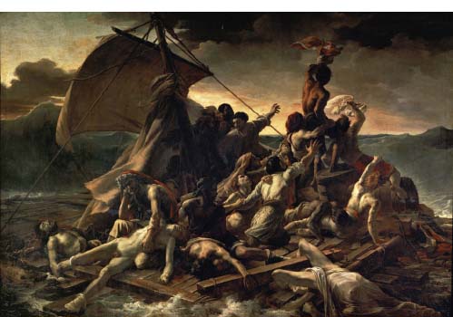
Figure 3.13 | Théodore Géricault, The Raft of the Medusa, 1819, oil on canvas, 491 × 716 cm, Paris, Musée du Louvre.
Source: akg-images / Album / Joseph Martin.
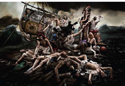
Figure 3.14 | Gérard Rancinan, Raft of Illusions, 2008, photograph.
Source: Fine Art Cube / © ADAGP, Paris and DACS, London, 2015.
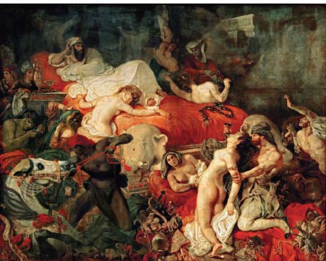
Figure 3.15 | Jeff Wall, The Destroyed Room, 1978, transparency in lightbox, 159.0 × 229.0 cm, Collection of National Gallery of Canada, Ottawa.
Source: Courtesy of the artist and White Cube.
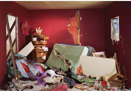
Figure 3.16 | Eugène Delacroix, The Death of Sardanapalus, 1827, oil on canvas, 395 × 495 cm, Paris, Musée du Louvre.
Source: akg-images / Erich Lessing.
The loose brushwork that characterised Géricault’s Romanticism became an equally defining feature of Impressionism a few decades later; however, the Impressionists’ brush touched the canvas with rather less focus on the expression of emotion and rather more focus on capturing the transient effects of light in landscapes and leisure scenes.
Impressionism and after
The art critic Louis Leroy coined the term ‘Impressionism’, which he intended derisively, when he reviewed the painting Impression, Sunrise by Claude Monet (1840–1926) on its first exhibition in 1874. Monet’s seascape (a sub-genre of the landscape) neither idealises nature nor, arguably, expresses the artist’s emotional feelings towards it; instead, Monet’s canvas renders the impression of the artist’s visual experience of the scene. Leroy thought that Monet had not presented a finished work, but rather a sketch and, as such, an impression of the subject, not a valid representation of it.
Although the term ‘Impressionism’ was originally derisory, it stuck and came to describe a style of painting that developed in France from the middle to the end of the nineteenth century. Impressionism became associated with a group of artists including Claude Monet, Pierre-Auguste Renoir (1841–1919), Alfred Sisley (1839–1899), Camille Pissarro (1830–1903), Edgar Degas (1834–1917), Berthe Morisot (1841–1895) and Mary Cassatt (1844–1926). They sought to achieve a modern (meaning different from the contemporary conventions) style by rendering the play of light as naturalistically as possible and by blurring at the edges the line which had for centuries defined form and contained colour so rigidly. A high tonality, achieved using contrasting colours close together, and the rapid application of paint with broad visible brushstrokes came to characterise the style.
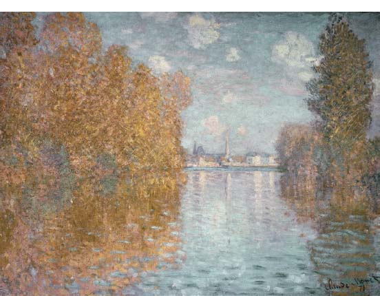
Figure 3.17 | Claude Monet, Autumn Effect at Argenteuil, 1873, oil on canvas, 55 × 74.5 cm, London, Courtauld Gallery.
Source: © Samuel Courtauld Trust, The Courtauld Gallery, London, UK / Bridgeman Images.
Impressionism was affected by the invention of new chemical pigments and pre-packaged tubes of oil paint that made painting plein air possible. Painting outdoors allowed the group to capture the fleeting impressions of light upon water or in the landscape, and the typically small scale of Impressionist canvases is largely attributable to the artists’ desire to paint in outdoor locations, since smaller canvases were easier to transport. They were also more suited to the domestic market for which the Impressionists painted.
Monet’s Autumn Effect at Argenteuil, 1873, was exhibited in the first Impressionist exhibition of 1874, and the vibrancy of its unfamiliar palette brought it to the critics’ attention. Light is of unprecedented importance in this work: light disintegrates form and alters colour; light, together with the rapid application of paint, is also the means through which the sense of a fleeting and particular moment in time is conveyed.
This landscape imitates the sensory impressions nature makes on us, rather than simply imitating the appearance of the scene. The palette is a blend of cool blues and warm oranges (complementary colours), communicating the overall impression of autumn hues. Ask yourself what clothes you would select from your wardrobe were you to enter the scene. Can you gauge the weather? How has Monet used light and colour to create such a tangible temperature? The variegated foliage is rendered through a juxtaposition of yellow and orange dabs, which are not blended on the painting’s surface but ‘mix in the eye’ and consequently seem to vibrate and quiver as autumn leaves do in the wind. The tall tree on the right, perhaps less sheltered, appears to have been whipped by the wind, an effect achieved by scratching through the pigment in diagonal strokes with the sharp end of a brush.
Colour rather than tonal modelling creates light and shade, as conventional shadow effects are abandoned. The artist’s free and visible brushwork defines the style as unequivocally Impressionist, each stroke capturing the character of the form it represents, whether ripples on the water or leaves in the tree. Colour can also be muted and turned bluish to convey a sense of recession or atmospheric perspective, as we see in this painting.
The composition is arranged in terms of its balance between the complementary blues of the water and the orangey colours of the trees. The trees also act as a framing device and an anchor point for the dark blue horizon line that forms a compositional bridge, unifying the disparate parts of the arrangement.
Mary Cassatt (1844–1926), the American painter who exhibited with the Impressionists from 1879, provides a good example of the way a painting’s formal and stylistic elements convey meaning and aid our interpretation in her Lydia at the Tapestry Loom, c.1881. The interior scene may be atypical of the Impressionists’ oeuvre but its style is unequivocally Impressionist in this particular painting of the artist’s sister, Lydia.
The physical qualities of the paint itself and the way it is applied are more important than the draughtsmanship (line) which preoccupied the painters of the Neo-classical style, for instance. The leg of Cassatt’s loom appears to melt away at the far end and Lydia’s skirt’s edge is very roughly handled. Lydia’s hand is so ill-defined that the viewer needs the context of the whole work to recognise it as such. However, the handling of paint becomes more precise in the sitter’s face and informs us of the subject’s concentration on her domestic task. Despite the painterly nature of this work and the artist’s rapid application of paint, the impression of the scene is complete. The way Lydia’s floral dress merges with her equally floral chair could be interpreted as referring to the sitter’s ‘feminine’ role in this interior, domestic scene: she literally blends in with her surroundings.

Figure 3.18 | Mary Cassatt, Lydia at the Tapestry Loom, c.1881, oil on canvas, 64.7 × 92.7 cm, Collection of the Flint Institute of Arts, Flint, Michigan; Gift of the Whiting Foundation, 1967.32.
Source: Flint Institute of Arts, Flint, Michigan.
Compositionally, the scene is cluttered and, despite the chest in the background that convinces us of the room’s three-dimensional volume, the space is uncomfortably contracted – claustrophobic even. This feeling is heightened by the compositional intrusion of the loom into the viewer’s orbit; arguably, it overpowers the scene and acts like a frame, trapping Lydia behind it. The window to the sitter’s right is covered over. A multitude of interpretations could be offered as to why. What do you think?
The affiliation of Edgar Degas (1834–1917) with the Impressionists was marked by the free handling of paint and its transient application; he tended not to share their interest in painting plein air. He did, however, share their desire to capture the fleeting aspects of modern life. He was particularly interested in the form (shape) and the movement of dancers – off duty, backstage or rehearsing – and tried to capture their spontaneity. The hallmarks of the Impressionist painterly style – its fleeting sketchiness – may also be seen in Impressionist sculpture. In Edgar Degas’ Dancer Looking at the Sole of Her Right Foot, the transience of the dancer’s form is conveyed by Degas’ treatment of the figure’s surface.
Is Degas’ sculpted figure idealised? Is it anatomically correct? How is she posed? Is she contrapposto? Can we see a facial expression? Is she static or animated?
Her body outline is dynamic and indicative of a fleeting moment – she cannot possibly hold this pose for much longer, despite the arm she has hooked up high as a counterbalance. The one grounded foot gives the impression it’s about to hop from side to side, and her bent knee seems about to provide the momentum. She is a dancer, full of movement, and the surface of the bronze seems to dance too. Light falling on its dark surface activates the form, and this dynamic is aided by the artist’s rough handling of the clay medium before it was cast. The kinetic form of the dancer, preoccupied momentarily and precariously with the inspection of her foot, is far more important than her identity; her face is anonymous, blurred in the Impressionist style.
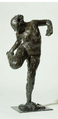
Figure 3.19 | Edgar Degas, Dancer Looking at the Sole of her Right Foot, cast 1920 from a plaster cast c.1900, bronze, 476 × 267 × 216 mm, London, Tate.
Source: ©Tate, London 2015.
By the mid-1880s, Impressionism was changing. The term Post-Impres- sionism, invented by the British art critic and painter Roger Fry in 1912, is used to distinguish those artists who both drew upon the Impressionist style and reacted against it by adapting aspects of other contemporary approaches, such as Symbolism. The artists most commonly labelled as Post-Impressionists are Vincent van Gogh (1853–1890) – who never exhibited with the Impressionists – and Paul Cézanne (1839–1906) and Paul Gauguin (1848–1903) who did. Since each of these artists exhibits differences in the way they painted, Post-Impressionism is, strictly speaking, not a style. However, the work of these artists may be broadly characterised as tending to render objects more sculpturally, with more structured investigations of form, and using more vigorous and muscular textures than the shimmering light and painterly surface of Impressionism.
Dutch artist Vincent van Gogh’s Wheatfield with Crows, 1890 (examined in detail in Chapter 1 as an example of the ‘Landscape’ genre), also provides a rich study of the formal elements that constitute Post-Impressionism.
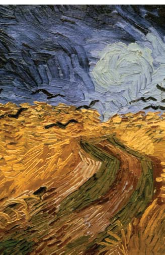
Figure 3.20 | Vincent van Gogh, Wheatfield with Crows, 1890, detail, Amsterdam, Van Gogh Museum.
Source: © 2015. Photo Art Media / Heritage Images / Scala, Florence.
In this work, colour is used both as a means of expression and to convey meaning. The vibrancy of the hues energises the work while the addition of black in the blue sky creates a sense of foreboding and anxiety; black crows executed with angular wings intensify that feeling.
Van Gogh used an intense colour palette and a rapid, emotionally charged technique to express his innermost feelings. The formal elements of Van Gogh’s work that have categorised him as a Post-Impressionist also make him representative of Expressionism, a fact that illustrates the necessary fluidity required for an analysis of works in terms of their form and style.
The Formalist approach to Wheatfield with Crows seeks to analyse the artist’s use of colour, line, texture and so forth. We notice that this menacing landscape tilts up unnaturalistically towards us. The colour intensity achieved is aided by Van Gogh’s use of complementary colours: red and green in the paths that lead us nowhere and orangey-yellow in the wheat that thrashes wildly beneath a cobalt-blue and black sky. Colours bulge onto the canvas straight from the tube and heighten our feeling of immediacy.
Characteristically, every single brushstroke can be distinguished, the paint thickly applied and standing proud to create a viscerally textured surface. Line only partially demarcates form; in its wildness, line also conveys the artist’s tormented perspective, from which nature has become inimical. Rather than using conventional linear perspective, van Gogh has used brushwork to suggest depth, the strokes of yellow ochre becoming shorter as they recede towards the horizon.
instead of trying to reproduce exactly what I see before my eyes, I use colour more arbitrarily, in order to express myself forcibly.
(Quoted in Chipp, Theories of Modern Art, p. 34)
Colour can be used naturalistically and descriptively, as it was in Hobbema’s Avenue at Middelharnis, 1689; emotionally and psychologically, as it was in Van Gogh’s Wheatfield with Crows; or reduced to a narrow range of earthy tones, as we will see in the painting we discuss next, Portrait of Daniel-Henry Kahnweiler, by Spanish artist Pablo Picasso. Our job is to ask why, and to what effect?
New and Divergent Ways of Seeing in the Twentieth Century
Cubism
Invented by Pablo Picasso (1881–1973) and French artist Georges Braque (1882–1963), the style known as Cubism evolved between c.1907 and 1914. Cubism developed through three distinct phases: Proto-Cubism, Analytical Cubism and finally, Synthetic Cubism. Picasso’s Portrait of Daniel-Henry Kahnweiler, 1910, exemplifies its Analytical phase.
Daniel-Henry Kahnweiler was one of the foremost art dealers of the twentieth century, and was an early champion of Cubism. In Picasso’s portrait of him, the form of the subject seems to have been dismantled, only to be reconstructed using small faceted planes to create a sense of shallow three-dimensional space. In a manner characteristic of the Analytical stage of Cubism, the ‘contour’ lines that traditionally contained the figure have been broken, helping to produce the overall fragmented formal effect of the painting.
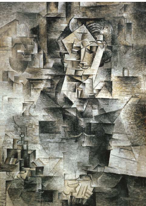
Figure 3.21 | Pablo Picasso, Portrait of Daniel-Henry Kahnweiler, 1910, oil on canvas, 100.6 × 72.8 cm, the Art Institute of Chicago.
Source: The Art Institute of Chicago, IL, USA / Bridgeman Images / © Succession Picasso / DACS, London 2015.
Describe the colour palette Picasso uses in his Portrait of Daniel-Henry Kahnweiler. Is colour used descriptively? Is colour used to create and model form? Is colour more important than line? Is the subject located in a realistic pictorial space? Is traditional linear perspective used? Does the image appear two-dimensional or three-dimensional?
Linear perspective has been almost entirely abandoned, and it is as if we see the subject from multiple, contradictory viewpoints simultaneously. Nevertheless, a sense of volume and depth is suggested using isolated portions of shading and modelling. A sense of the fourth dimension (in this case, meaning time) is suggested in perpetually shifting planes. Kahnweiler’s form is broken to the point of being nearly unrecognisable save for details such as his moustache, watch-chain and hair. The traditional distinction between foreground, middle ground and background has been eliminated. Just as the Impressionists had done before him, Picasso sets forth a ‘new reality’ – a reality so ground-breaking that to use colour in this painting, or in any other Analytical work, seemed distracting. The image is drained of colour (with its spatial implications) and light is neither used naturalistically or perspectively to create form or to strategically highlight important elements of the painting. As Daniel-Henry Kahnweiler stated:
Of these paintings one can no longer say, ‘the light comes from this or that side’, because light has become completely a means. The pictures are almost monochromatic; brick red and red brown, often with a grey or grey green ground, since the colour is meant only to be chiaroscuro. (Quoted in Chipp, Theories of Modern Art, p. 248)
Decades later, Picasso’s famous black and white anti-war painting, Guernica, 1937 (examined in detail in Chapter 1), displayed the influence of collage (a characteristic of Picasso’s Synthetic Cubism of 1912–1914), which had developed from the faceting of Analytical Cubism. Guernica is another example of an iconic painting to which it is quite difficult to ascribe a stylistic label; however, devoid of style it is not. Previously examined in terms of its narrative and response to a real historical event, here the focus has narrowed to an analysis of its formal features.
In this work, the figures are not rendered naturalistically. They are presented as flat, simplified and unmodelled, with a clear linear outline (something that is not a feature of real visual appearances). Instead, a different type of reality has been conveyed using flat, shattered shapes and overlapping forms that heighten the sense of chaos associated with war. In this sense the formal elements that comprise Guernica aid our interpretation of the scene and lend a further layer of meaning to the image.
In this detail of the work, the mother is cartoonishly outlined by the artist, and yet the message Picasso conveys is far from simplistic. Picasso shows the power of line in this work: the mother’s dagger-like tongue is forged from two straight lines, so simple and yet so forceful in conveying her agonising, shrill cry. Line is used to distort her body: her head is thrown back as if her neck were on a hinge. We follow the line of her arm, up through her chest and neck until we fall into her gaping mouth and hear her cry. The line of the mother’s arm on the left is comprised of relatively straight lines, and these contrast with the curvilinear sweep of the baby’s arm, which hangs, lifelessly, limply in a formal syntax we recognise from images of the pietà. This line has the power of expression and provocation.
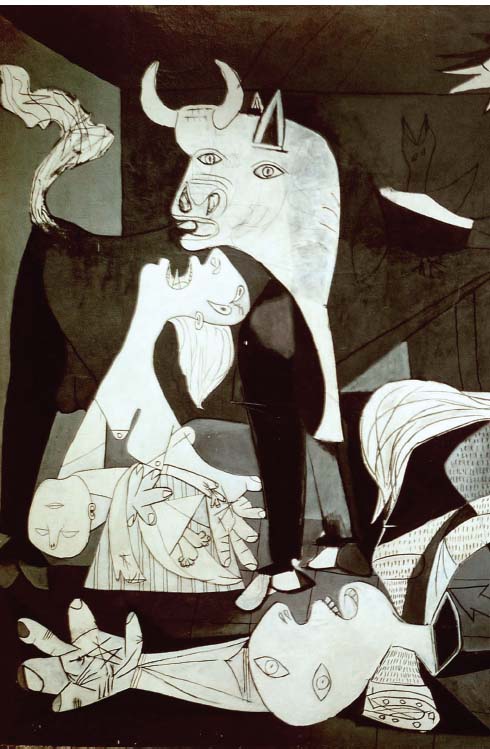
Figure 3.22 | Pablo Picasso, Guernica, 1937, detail, oil on canvas, 349.3 × 776.6 cm, Madrid, Museo Nacional Reina Sofia.
Source: akg-images / Erich Lessing / © Succession Picasso / DACS, London 2015.
The Futurist movement, founded by writer and poet Filippo Marinetti (1876–1944) in 1909, employed the language of Cubism to express a celebration of speed and power. See Chapter 4 for more detail on the social and historical context of the Futurist movement, its manifestos and its powerful expression of the modern world.
Futurism
The Futurists embraced technological innovation for its promises of dynamism at the dawning of a new era. Marinetti’s fellow Italian Umberto Boccioni (1882–1916), was one of the first to respond to its demands.13 (see Figure 3.23)
Boccioni’s Futuristic creation abandons the traditional use of line used to define and contain the body’s form (as seen in Donatello’s David, 1440, for example). Instead, as in many Cubist paintings, this figure’s outline is faceted, opened-up and begins to penetrate the space around it. The way the outside flows in and the inside flows out describes the inter-penetration of form that characterises much of the Futurists’ oeuvre. The effect of smashing through the body outline is dynamic, creating flame-like projections from powerful and robotic legs. The figure appears armoured and indestructible. Its swift motion through space is aided by its highly polished surface and sharp, jagged edges; the viewer’s eye is made to move ceaselessly over its dynamic form. The figure strides, almost audibly, on block-like bases and strikes a threatening, albeit transient, pose. A loose pyramidal form has been shifted forward to create a diagonal composition which, coupled with the opening between the legs, is further suggestive of force and movement. The play of light over the figure’s surface is dramatised by the deep recesses that harbour shade and create an interweaving of tonal contrasts across its body.
A close analysis of the formal elements of Unique Forms of Continuity in Space tells us a great deal about the Futurist movement it embodies: its militarist aesthetic appears entirely capable of the ‘destructive gesture’ the movement fostered, and its very dynamism becomes both its subject and its form.
Boccioni’s abstracted figure may have been futuristic for the period, but subsequent styles looked to a future based upon the purely abstract and the spiritual; a path far more absolute and avant-garde.
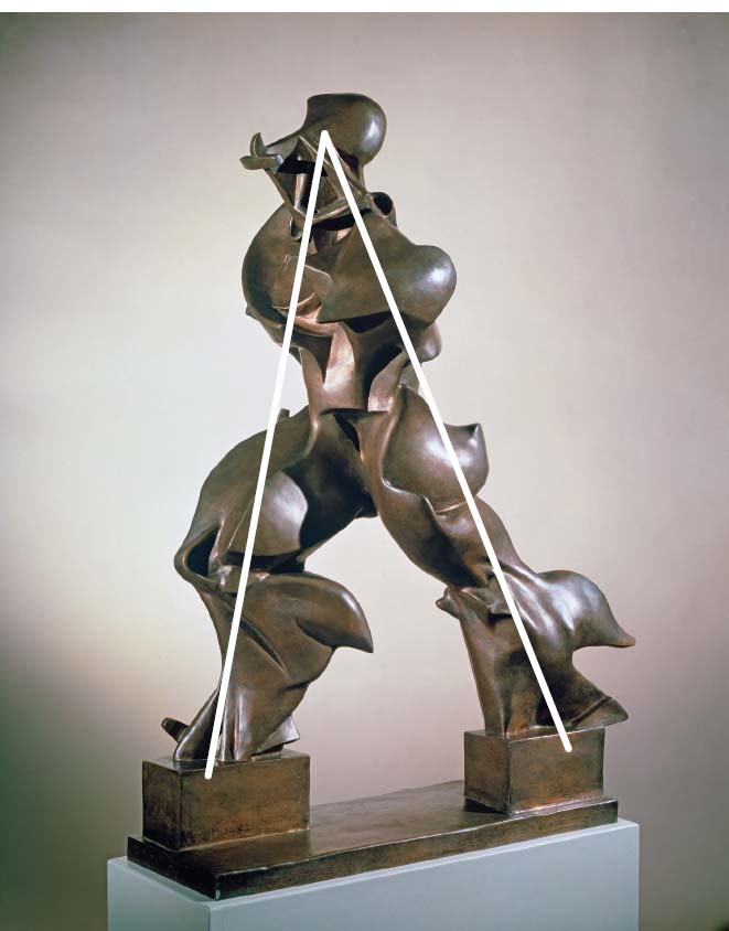
Figure 3.23 | Umberto Boccioni, Unique Forms of Continuity in Space, 1913, bronze, 1175 × 876 × 368 mm, cast 1972. London, Tate.
Source: ©Tate, London 2015.
In Umberto Boccioni’s Unique Forms of Continuity in Space is the figure idealised? Is it anatomically correct or abstracted? How is it posed? Is it contrapposto? Is there any facial expression? Is it gesturing? Is it static or animated?
European Modernism: In Search of an Elemental Truth
Modernism and abstract art
The turmoil of the early twentieth century caused some artists to seek various ways to model and express utopian ideals in artistic forms. Suprematism and Constructivism in Russia around the time of the October 1917 revolution, and the De Stijl group in the Netherlands sought to eliminate all traces of the external world, sometimes in pursuit of a higher spiritual consciousness. These new styles attempted to reflect the dawn of a new age: a generation emerging from World War I and rejecting imitation and subjectivity in pursuit of an underlying, elementary and objective language. To these artists, imitative art seemed inadequate to express the era and an abstract language seemed better able to express their hopes for a new, universal visual language. Artist Piet Mondrian (1872–1944) christened this approach Niewe Beeldung, usually translated as Neo-Plasticism but probably better understood as ‘new image-making’. This style was intimately associated with the journal De Stijl and the like-minded artists and designers based in the Netherlands who contributed to it, including Theo van Doesburg, Bart van der Leck, Georges Vantongerloo and Gerrit Rietveld. Mondrian’s art was still about reality, but a deep and underlying reality; below the surface of that with which we are usually preoccupied.
The formal means of neo-plastic expression comprised the primary colours (red, yellow and blue), with the addition of white, grey and black, pure geometric shapes and grids of black vertical and horizontal lines. Together, these elements composed a formalism that was thought to correspond to and express the underlying, ideal geometry found in the universe. Dutch painter, Piet Mondrian, stated:
The new plastic idea cannot, therefore, take the form of a natural or concrete representation, although the latter does always indicate the universal to a degree, or at least conceals it within. This new plastic idea will ignore the particulars of appearance, that is to say, natural form and colour. On the contrary, it should find its expression in the abstraction of form and colour, that is to say, in the straight line and the clearly defined primary colour. (Quoted in Chipp, Theories of Modern Art, p. 322)
In accordance with Mondrian’s neo-plasticity, his paintings are reduced to horizontal and vertical lines interspersed with geometric blocks of primary colour. Thus, these formal elements become the subject matter of the painting, not simply accessories to the content; they alone comprise the style, a style recognised by its pure and abstract form.
The development towards abstract form became a universal means of expression for artists such as Mondrian. His individual style sought, through the balance of forms and colour, to establish a unity through relations of equivalence; formal relations quite literally weighed up in accordance with their shape, size and colour values.
The German chemist Wilhelm Ostwald’s book The Colour Primer, 1916, influenced the paintings of Piet Mondrian and De Stijl. From a wholly scientific perspective, Ostwald believed that colour needed to be described in quantifiable terms. He found four ‘psychological primaries’: red, yellow, blue and green. He also examined the complementary pairs: black and white, blue and yellow, green and red (Gage, Colour and Meaning: Art Science and Symbolism, p. 258).
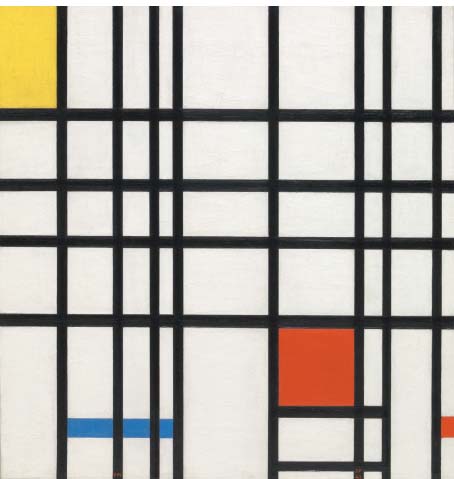
Figure 3.24 | Piet Mondrian, Composition with Yellow, Blue and Red, 1937–1942, oil on canvas, support: 727 × 692 mm, frame: 917 × 882 × 63 mm, London, Tate.
Source: ©Tate, London 2015.
Despite the appearance of its flat, unmodulated planes, Piet Mondrian’s Composition with Yellow, Blue and Red, 1937–1942, does not appear entirely two-dimensional. The colours compete with space in accordance with their various colour values: red advances, blue recedes and the tension between them is held in an overall equilibrium by a black trellis-like grid. The balance of these various forms and primary colours are held in position by black lines of various widths, every formal element playing its part in the whole. The off-white areas balance the intensity of the large red square, smaller blue square and smaller-still yellow rectangle. The yellow area seems to be frustratingly cropped and suggestive of a continuation beyond the confines of the canvas, perhaps into infinity, the ultimate natural phenomenon. Mondrian’s ‘new’ geometric austerity was a style as pure as the promises of the machine age. Yet, this type of formalism also compels us to look inward, towards a higher spiritual reality – Mondrian’s highly ordered abstract paintings were about God’s highly ordered universe.
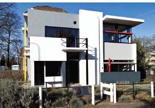
Figure 3.25 | Gerrit Thomas Rietveld, Schröder House, Utrecht, Netherlands, 1924. Source: © Julian Castle / Alamy; © DACS 2015.
Evidently, the various formal elements combine to form a style: the formal elements that comprise Donatello’s David are recognisable as belonging to the Early Renaissance style, while the formal elements that comprise Goya’s The Third of May 1808 are recognisable as belonging to the style known as Romanticism, and the formal elements that comprise Mondrian’s compositions are recognisably a Neo-Plasticist style, and so on. Mondrian’s abstract art provided a new formal language for describing the world.
Form, style and function in architecture
In the same way that the formal elements that comprise a painting or a sculpture can be said to have a style, architectural styles are also distinguishable by the common visual language they share. In this chapter, architecture is also examined in terms of its function as well as its form and style, as all three elements are related.
In search of purer forms
As we have seen in our examination of painting and sculpture, in the first quarter of the twentieth century, naturalism was relinquished by artists such as Wassily Kandinsky (1866–1944), Kazimir Malevich (1878–1935) and Piet Mondrian, who each pursued spirituality and purity in the form of abstract composition. Mondrian’s belief that pure geometric shapes led to some higher universal consciousness in the viewer filtered into many works of art and architecture at the time. The Schröder House, built in 1924 by Gerrit Thomas Rietveld (1888–1965), is arguably considered to be the finest architectural manifestation of De Stijl, its structure being dominated by planar forms held in perfect equilibrium to achieve an overall unity.
This small domestic dwelling in Utrecht was built for Mrs. Truus Schröder, and it embodies a number of familiar neo-plastic principles: horizontal/vertical lines; a dominant off-white palette combined with grey, black and primary colours. The same primary colours reappear in the interior furnishings to create an overall harmony. The basic design of the house was entirely modern, and as stripped-back as the Netherlandish Calvinism that provided its social context. Its formal purity relates to its functionality – an observation made by architectural historian and critic Kenneth Frampton:
The new architecture is anti-cubic, that is to say, it does not try to freeze the different functional space cells in one closed cube. Rather it throws the functional space cells (as well as the over-hanging planes, balcony volumes, etc.) centrifugally from the core of the cube. And through this means, height, width, depth and time (i.e. an imaginary four dimensional entity) approaches a totally new plastic expression of open spaces. In this way architecture acquires a more or less floating aspect that, so to speak, works against the gravitational forces of nature. (Frampton, Modern Architecture: A Critical History, p. 145)
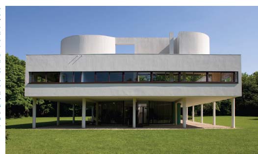
Figure 3.26 | Le Corbusier, Villa Savoye, Poissy, France, 1928–1931, exterior view from the north. Built for Pierre and Eugénie Savoye.
Source: akg-images / Schütze / Rodemann; © FLC/ ADAGP, Paris and DACS, London 2015.
Analyse Le Corbusier’s Villa Savoye in relation to its formal features such as: composition, colour, volume/mass/void, line/shape, architectural decoration/ features. How does its structure (loadbearing frame) affect its appearance? How do its modern industrial materials affect its appearance?You should also consider the extent to which these formal elements underlie the function of Villa Savoye as a domestic weekend retreat away from Paris for the Savoye family.
Form follows function: Modern Movement
In the same way that Rietveld’s Schröder House is an icon of De Stijl in architecture, the Villa Savoye, 1928–1931, designed by Le Corbusier (1887–1965) may be described as an icon of the Modern Movement, a style that, like the Schröder House, eschewed ornament and decoration and emphasised geometric shapes and forms.
This three-bedroom dwelling designed for the Savoye family in France arguably demonstrates the symbiotic relationship between form, style and function in architecture. Its style is clearly indebted to the materials, techniques and processes of its construction. Stylistically it can be described as modern, minimalist, machine-age, sleek, weightless, open-plan and geometric. Line is an important formal element in its modern syntax: it has a flat roof because a pitched one would spoil its clean hard edges, a geometrical form, and a simplicity that is uninterrupted by surface decoration.
Prefabricated ferroconcrete has been exploited for its appearance as well as the structural freedom it affords to the planning of their interior. The structure of the building is a series of columns (Le Corbusier called them pilotis) that support floors and roof. This then allows free positioning of both exterior and interior walls since the columns support the building and the walls are not load-bearing. Moreover, it allows for continuous lines of the ribbon windows that allow for the optimum flow of light inside and a view of nature outside. The concrete surface maintains a truth to materials with the addition of brilliant-white paint, which provides a sanitised and pure appearance.
The building has a ‘masculine’ squareness, set off against the curved lines of its organic form at roof-terrace level. Its predominantly horizontal emphasis is counterbalanced by the vertical pilotis and the upright organic structure on top.
The main living area is on the first floor (a piano nobile), allowing the villa’s inhabitants to respond to their natural environment. The villa’s flat roof maintains the clean geometric lines of the building and also functions as a roof terrace. The villa’s functional interior also boasts an open-plan bathroom with built-in recliner for Madame Savoye to rest upon.
The enclosed ground level has a curved glass-end wall (a curtain wall) containing a garage and service functions. The Savoye family could drive right under the house and the curve of the wall matched the turning radius of their car. In this respect the house is in tune with a ‘machine aesthetic’, since the car was seen as the ultimate machine at the time.
The Villa Savoye became the prototype for functional architecture. Its form, style and function are a manifestation of Le Corbusier’s ‘Five Points of a New Architecture’, published in 1926:
- pilotis – thin columns that support or appear to support a building
- the ‘free plan’ for the elimination of load-bearing walls
- the free façade – a non-supporting wall as skin
- horizontal ribbon windows, to provide maximum illumination
- the roof garden.
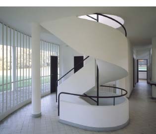
Figure 3.27 | Le Corbusier, Villa Savoye, Poissy, France, 1928–1931, entrance hall showing pilotis and glass wall.
Source: © Paul Raftery / Alamy; © FLC/ ADAGP, Paris and DACS, London 2015.
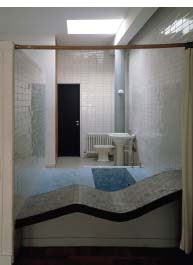
Figure 3.28 | Le Corbusier, Villa Savoye, Poissy, France, 1928–1931, bathroom with built-in recliner.
Source: © Paul Raftery / Alamy; © FLC/ ADAGP, Paris and DACS, London 2015.
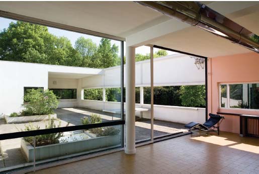
Figure 3.29 | Le Corbusier, Villa Savoye, Poissy, France, 1928–1931, interior living space leading onto enclosed terrace.
Source: © Bildarchiv Monheim GmbH / Alamy; © FLC/ ADAGP, Paris and DACS, London 2015.
Le Corbusier described houses as ‘machines for living’ and yet the Villa’s stark geometry and industrial construction have been described, perhaps justifiably, as dehumanising. Since the 1960s many architects have deliberately sought to move away from the strict syntax of the Modern Movement (or International Style – an alternative style label created after an exhibition of that name in 1932) in favour of more eclectic styles such as that demonstrated in the Lloyd’s Building, 1978–1986 (discussed in Chapter 2).
The Bank of England was designed at the same time as Villa Savoye but in a completely contrasting style. However, both buildings could be scrutinised in terms of the idea that their form follows their function (i.e. that they were designed primarily for their functional purposes and that their form – appearance/style – was a secondary consideration).
The Classical vocabulary in architecture
Founded in 1694 to act as the government’s banker, the Bank of England has performed a variety of functions over its long history. Its role in maintaining the UK’s economic stability and public confidence is vital to the effective functioning of the economy itself. The impressive façade of the Bank of England building, constructed between 1929 and 1935 by Sir Herbert Baker (1862– 1946), suitably conveys the institution’s economic gravitas by adopting elements of Classical architectural vocabulary (not to be confused with the more formalised Neo-classicism of the late eighteenth and early nineteenth centuries). The façade’s regular fenestration and equally spaced columns certainly lend a sense of order to a building that is the public face of England’s banking. While the lower tier retains its classical elegance, its smooth rustication and small-barred windows also establish a secure and slightly uninviting entrance level.
The mass of the building lightens as it ascends above the interrupted balustrade, and caryatids borrowed from the classical style of Antiquity; they stand like guards either side of the central Roman arch, a feeling heightened by the fact that these features do not perform their traditional load-bearing function. Attending the uppermost story is a bright and airy loggia formed with twinned columns. Its form and style suit its function, and yet it is ironic that its rather static façade belies the constant state of flux within.
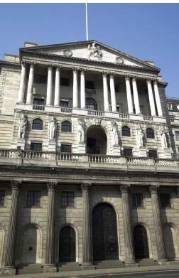
Figure 3.30 | Sir Herbert Baker, The Bank of England, London, 1929–1935.
Source: ©Tony Baggett / iStockphoto.
Identify the architectural features on the façade of the Bank of England. Does the decoration have a function? How do these features, together with its stone construction, affect its appearance? Is the Bank on a grand scale? Is the scale of the building functional? Does the decoration have a function? Compositionally, how is the building divided? Is it symmetrical or asymmetrical? We should also consider the extent to which these formal elements underlie the function of the Bank of England as a commercial symbol of the UK economy.
The Bank’s architectural decoration is individualistic and symbolic: Britannia, whose image is carved in relief, resides in the tympanum of the building’s pedimented apex. Britannia is an ancient personification, or symbolic figure, of Great Britain. She has appeared on coinage as far back as Roman Antiquity, on British currency for centuries, and is found on modern bank notes, where she is depicted, as on the building, seated with her shield. The Bank of England is sometimes referred to as the ‘Old Lady of Threadneedle Street’, where the Bank is located. While Baker used stone to create a grand façade and guard the treasures of the Bank of England within, the American architect Frank Lloyd Wright (1867–1959) designed his Fallingwater building around the pre-existing rock face of a waterfall, opening up its façade as an invitation to nature.
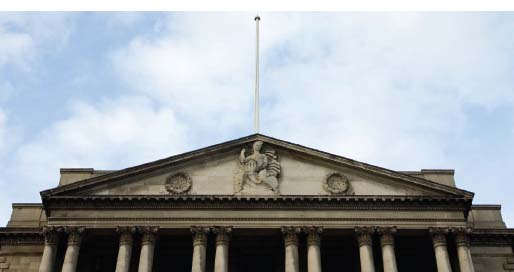
Figure 3.31 | Sir Herbert Baker, The Bank of England, London, 1929–1935, Britannia on tympanum.
Source: ©Biff Boff Biff / iStockphoto.
A style of its own
Frank Lloyd Wright’s Fallingwater, 1935–1938, conveys a form not all that dissimilar to those expressed in De Stijl or other modern creations, although Wright’s infinitely more organic-looking structure is best described as a variant on the Modern Movement. In its sympathetic siting and use of local materials, Fallingwater illustrates aspects of Wright’s notion of organic architecture, although its reinforced concrete balconies suggest an influence from the European Modern Movement. Its overall appearance, however, is firmly rooted in Wright’s desire to create an innovative American architecture, independent of past styles; moreover, Wright created nothing quite like it again, so if it has a style it is its own.
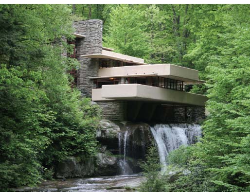
Figure 3.32 | Frank Lloyd Wright, Fallingwater, Mill Run, Pennsylvania, 1935–1938, southwest view with tower acting as cantilever for the over-hanging terraces.
Source: © Nick Higham / Alamy; © ARS, NY and DACS, London 2015.
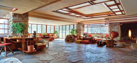
Figure 3.33 | Frank Lloyd Wright, Fallingwater, Mill Run, Pennsylvania, 1935–1938, interior with flagstone flooring.
Source: Christopher Little, courtesy of the Western Pennsylvania Conservancy; © ARS, NY and DACS, London 2015.
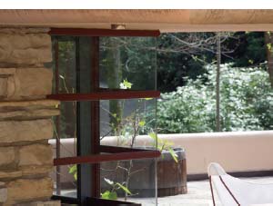
Figure 3.34 | Frank Lloyd Wright, Fallingwater, Mill Run, Pennsylvania, 1935–1938, detail of mitred window. Source: Christopher Little, courtesy of the Western Pennsylvania Conservancy;
© ARS, NY and DACS, London 2015.
This house, built for the department store magnate Edgar Kaufmann Sr., may not be recognised as belonging to any specific stylistic movement, other than what some have loosely called ‘Organic Modernism’, but it is certainly recognised as a building brimming with style in terms of its visual appearance.
Fallingwater is both a modern icon and a rejection of Modern Movement principles: Wright valued craftsmanship and truth to material over industrialisation and mass production. While he exploited modern materials such as reinforced concrete in order to achieve the cantilevered balconies, he used them less for their minimalist purity and more for their formal resemblance to tree-like structures, entirely at one with their natural environment; he even rounded their edges off, a small but significant detail illustrating Wright’s propensity towards organic form. Fallingwater appears to grow out of the rocks, its volume emanating from a natural core into which are embedded massive reinforced concrete supports for the cantilevered balconies and the main body of the house, creating the ultimate synthesis between site and building.
Compositionally, the building is constructed using smooth horizontals and rough-hewn rock verticals. While this house may be described as an extension of Wright’s more familiar Prairie Style of architecture, it is a unique synthesis between the Modern Movement with its ‘industrial’ look, and its opposite, the Arts and Crafts style (see more on this in Chapter 2). Its cavelike interior reveals open-plan living spaces with low ceilings, rough stone columns and flagstone floors that create a comforting level of intimacy, reminding us of nature with our every footstep over their irregularly mortared joins. The floors are treated to provide an almost wet appearance which is reminiscent of the bottom of the river bed itself. This building may be interpreted as sacred, not least in the special and reverent exposure and treatment of its site’s materials and natural forms.
Glass is framed in steel painted in a Cherokee red that blends in with its environment. The expansive areas of glass help to create a symbiotic relationship between the inside and the outside.
Fallingwater functions as a reminder to its inhabitants of the importance of a human being’s relationship to nature, and of the architect’s duty to deliver a dwelling whose form and style respond to its environment. Wright’s staircase on the east of the house leads its occupants from outside the main living area directly to the stream below, and literally closer to nature. Its inhabitants are thus able to flow through the house via interconnecting spaces like the rhythmic flow of water itself – humane living in the machine age reconciled in accordance with Wright’s Usonian vision.
The solidity of Wright’s Fallingwater coupled with its inter-penetration European Modernism: In Search of an Elemental Truth Form, Style and Function of form and space could be interpreted as the antithesis of the closed, lightweight and precarious-looking form of the Lord’s Media Centre, in London; however, both buildings represent formal, stylistic and technological innovation, and form appears to follows function in each.
New forms from new technologies
Czech architect Jan Kaplický and his wife Amanda Levete of architectural and design practice Future Systems were commissioned by Marylebone Cricket Club to design Lord’s Media Centre (known by various names depending on sponsorship) for a contract price of £5 million. The building had to be finished in time for the 1999 Cricket World Cup – and it was. Future Systems designed a building that innovatively announced the new millennium and heralded a new formal aesthetic – biomorphic – potentially alien in the context of a ground steeped in tradition. Seeming to hover 15 metres above the ground, its form appears to defy gravity. Its construction techniques were equally ‘blue sky’: boat builders were sub-contracted to develop the structure and its aerodynamic form and fluid surface seem not just ship-like, but spaceship-like.
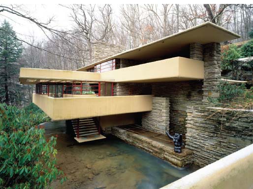
Figure 3.35 | Frank Lloyd Wright, Fallingwater, Mill Run, Pennsylvania, 1935–1938, staircase from living space to stream below.
Source: © H. Mark Weidman Photography / Alamy; © ARS, NY and DACS, London 2015.
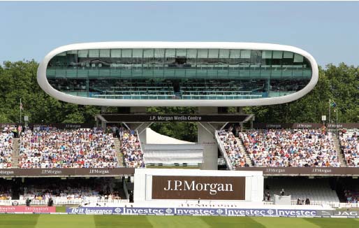
Figure 3.36 | Future Systems, J.P. Morgan Media Centre, Lord’s Cricket Ground, London, 1999.
Source: © Clare Skinner / MCC, reproduced by kind permission of MCC.
Is the composition of Future System’s Lord’s Media Centre symmetrical or asymmetrical? Is it decorated or undecorated? How does its colour and shape affect its appearance? Was it constructed on site or off site? We should also consider the extent to which these formal elements underlie the function of Media Centre as a private commercial space for the media to report on the ground’s cricket matches.
Described as the world’s first all-aluminium building, undoubtedly the materials, techniques and processes of its construction have had a significant impact on the building’s aerodynamic form and futuristic style. The building has also been described as semi-monocoque on account of its external skin being singular and load-bearing. Interestingly, the term is used in the aviation industry to describe fuselage construction and shipbuilding when the hull of a boat is made in one continuous piece. The building was designed to be prefabricated and largely assembled off site to avoid unnecessary disruption to the venue’s cricketing fixtures.
Built to accommodate the media (journalists, radio and television broadcasters, etc.), the building’s aluminium skin needed to fulfil both thermal and acoustic functions. These were aided by padded ceilings (a technique borrowed from the shipbuilding industry) and carpeting. The aluminium shell is coated in glass reinforced plastic (GRP) – a boat-building material – and its white colour maintains a lower surface temperature than alternative colours. Similarly functional, the use of pale blue in the building’s interior absorbs rather than reflects the light.
As the exterior of the building warms up it swells, and as it cools down it contracts, but the entire structure is designed to accommodate this acclimatisation and even the shell meets its legs on bearings described by its creators as ‘free-rolling’. The legs, sitting at the back of the building, were thought inadequate to carry their crowning biomorphic form but, despite its unbalanced appearance, the Media Centre is prevented from toppling forward because those same legs travel some 26 metres below ground level, functioning as tension piles that more than adequately cope with its cantilevered mass. The legs also function as a fire escape, power supply and lift housing. Made with reinforced concrete, they gain further strength from the steel staircases they house. The functionality of the Media Centre was noted by David Glover, engineer at Ove Arup Partners:
The final shape, size and volume came from the brief – putting the brief down and arranging it in a very functional form, which is what Future Systems are absolutely fantastic at. They will take all these obscure requirements and arrange them really functionally. You go in there and it’s clear where the writers go – you don’t have to ask. If you want to eat, you can see which area to go to. (Quoted in Kaplický, Unique Building: Lord’s Media Centre, p. 77)
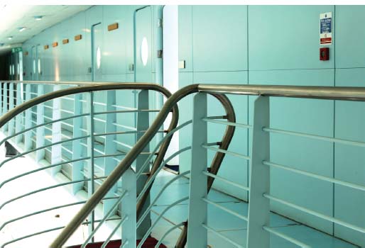
Figure 3.37 | Future Systems, J.P. Morgan Media Centre, Lord’s Cricket Ground, London, 1999, interior handrail and balustrade on mezzanine.
Source: © Clare Skinner / MCC, reproduced by kind permission of MCC.
Figure 3.38 | Future Systems, J.P. Morgan Media Centre, Lord’s Cricket Ground, London, 1999, porthole window.
Source: © Clare Skinner / MCC, reproduced by kind permission of MCC.
Figure 3.39 | Future Systems, J.P. Morgan Media Centre, Lord’s Cricket Ground, London, 1999, interior view of system for holding glass panes in place.
Source: © Clare Skinner / MCC, reproduced by kind permission of MCC.
The sky-blue interior is coupled with nautical-style balustrade, handrails, mezzanine floor and porthole-style windows, all of which provide the feeling of being on board a boat.
Despite the Media Centre’s modern style, it still responds to the more traditional elements of the site: its oval contours reflect the shape of the ‘hallowed ground’ it overlooks and, coupled with the fact that it rests at the same height as the Victorian Pavilion opposite, lends a harmonious feeling to the ground’s composite parts. Cricket matches are conveyed globally and often simultaneously through its eye-shaped lens. This could, perhaps, be interpreted as a metaphor for the power of the media itself. The building is also functional: the expanse of glazing on the west façade is tilted at 25 degrees to avoid glare (a significant functional benefit given that glare has forced play to stop on other grounds), while simultaneously providing an unprecedented and uninterrupted view of play.
The enormous glass viewing façade is made up of a number of large glass panes, held together almost invisibly by interior alloy bolts (see Figure 3.39). Narrow rubber bands ensure almost seamless joints between the panes, aiding the fluid and high-tech appearance of the exterior façade.
Perhaps in its ultimate expression of functionality, the elevated position of the structure provides panoramic views of the ground for the newspaper journalists in its lower tier, and television and radio broadcasters situated in private commentary pods in its upper mezzanine tier; its purpose and navigation once inside are effortlessly communicated.
As well as the buildings examined in detail in this chapter, buildings discussed in other chapters, such as Philip Webb’s Red House, 1859, and Richard Rogers’ Lloyd’s Building, 1978–1986, are equally worthy examples to study in terms of form, style and function. The choice of works of art and architecture available to consider under such a broad heading is innumerable, and you are encouraged to find your own examples through which to explore the ideas discussed here.