Compare the usual static presentation of many textbook graphs with the dynamic process that instructors actually use to teach this material, and it becomes clear: An economics graph is not a static object for students to look at and memorize; it’s something students need to work through . That’s why we’ve reimagined these graphs in a way that emphasizes the process of graphing.
▲ Step-by-step breakdowns of key graphs We crack the curves open by breaking economics graphs down into carefully formulated steps.
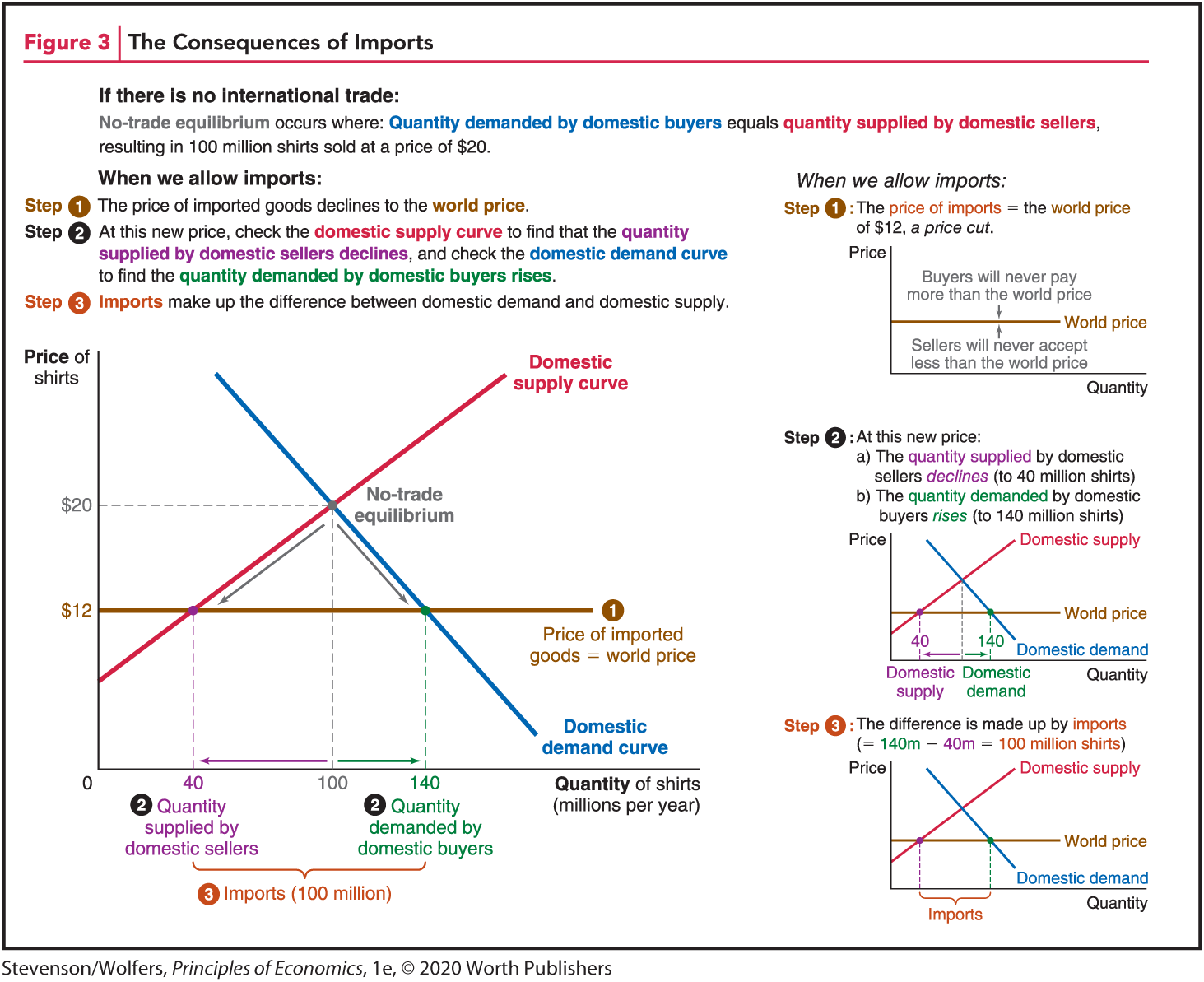
The text at the top left portion reads, Figure 3, The Consequences of Imports.
The introductory text reads,
(bold) If there is no international trade: (end bold)
No-trade equilibrium occurs where: Quantity demanded by domestic buyers equals quantity supplied by domestic sellers, resulting in 100 million shirts sold at a price of 20 dollars.
When we allow exports:
Step 1. The price of imported goods declines to the world price.
Step 2. At this new price, check the domestic supply curve to find the quantity supplied by domestic sellers declines, and check the domestic demand curve to find that the quantity demanded by domestic buyers rises.
Step 3. Imports make up the difference between domestic demand and domestic supply.
The first graph plots Quantity of shirts (millions per year) along the horizontal axis and Price of shirts in dollars along the vertical axis. A domestic supply curve with a positive slope and a domestic demand curve with a negative slope are plotted on the graph. The point (100, 20) at which the two curves intersect each other is labeled No-trade equilibrium. A horizontal line labeled Price of imported goods equals world price is drawn from the point 12 dollars on the vertical axis and runs parallel to the horizontal axis.
The points 40 and 140 along the horizontal axis represent Quantity supplied by domestic sellers and Quantity demanded by domestic buyers respectively. The space between these two values on the horizontal axis is labeled as Imports (100 million).
The next column reads,
When we allow exports:
Step 1: The price of imports equals the world price of 12 dollars, a price cut.
The second line graph plots Quantity along the horizontal axis against Price along the vertical axis. A straight line parallel to the horizontal axis labeled world price is drawn on the graph. A downward arrow above the world price reads, Buyers will never pay more than the world price. An upward arrow below the world price reads, Sellers will never accept less than the world price.
Step 2: At this new price:
a) The quantity supplied by domestic sellers declines (to 40 million shirts)
b) The quantity demanded by domestic buyers rises (to 140 million shirts)
The third graph plots Quantity along the horizontal axis against Price along the vertical axis.
A domestic demand curve with a negative slope and a domestic supply curve with a positive slope are drawn on the graph. The two curves intersect each other at a point that lies in between 40 and 140 along the horizontal axis. A horizontal line labeled World price starts from a point on the vertical axis above the starting point of the domestic supply curve and runs parallel to the horizontal axis. The domestic supply curve intersects the World price line at a point that corresponds to 40 along the horizontal axis and the domestic demand curve intersects the line at a point that corresponds to 140 along the horizontal axis. Text below the point 140 along the horizontal axis reads, Domestic demand. Text below the point 40 along the horizontal axis reads, Domestic supply.
Step 3: The difference is made up by imports (equals 140 million minus 40 million which equals 100 million shirts)
The fourth graph plots Quantity along the horizontal axis against Price along the vertical axis. A domestic demand curve with a negative slope and a domestic supply curve with a positive slope are drawn on the graph. The point of intersection of domestic demand and domestic supply graph is marked. A horizontal line labeled World price starts from a point on the vertical axis above the starting point of the domestic supply curve and runs parallel to the horizontal axis. The difference between the points of intersection of both the curves on the horizontal World Price line is labeled Imports.
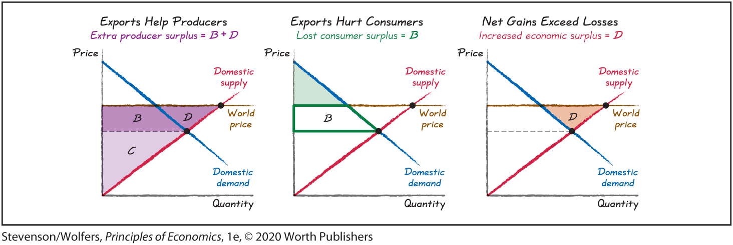
▲ Casual graphs model good economics habits We encourage students to embrace the process of graphing—to see themselves doodling in the margins—by sketching thumbnail graphs in the margins, on the backs of envelopes, or wherever they prefer to thoughtfully doodle. These graphs model the process of transforming an idea that’s described verbally in the text into its graphical counterpart.
The first graph, titled Exports help Producers plots Quantity along the horizontal axis against Price along the vertical axis. Text below the title reads, Extra producer surplus equals B plus D. A domestic supply curve with a positive slope and a domestic demand curve with a negative slope are drawn on the graph. A line labeled World price starts from a point on the vertical axis and runs parallel to the horizontal axis. The quadrilateral formed by the point at which the Domestic demand curve meets the line World price, the point of intersection of the two curves and the point corresponding it on the vertical axis, and the starting point of the world price line is labeled B. The triangle formed by the origin (starting point of the supply curve), the point of intersection of the two curves, and the point corresponding to it on the vertical axis is labeled C. The triangle formed by the point of intersection of the two curves and their points of intersection on the world price line is labeled D.
The second graph titled Exports hurt Consumers plots Quantity along the horizontal axis against Price along the vertical axis. Text below the title reads, Lost consumer surplus equals B. A Domestic supply curve with a positive slope and a Domestic demand curve with a negative slope are drawn on the graph. A line labeled World price starts from a point on the vertical axis and runs parallel to the horizontal axis. The quadrilateral formed by the point at which the Domestic demand curve meets the World price line, the point of intersection of the two curves and the point corresponding to it on the vertical axis, and the starting point of the world price line is labeled B. The area above B enclosing the Domestic demand curve is shaded.
The third graph titled Net gains exceed losses plots Quantity along the horizontal axis against Price along the vertical axis. Text below the title reads, Increased economic surplus equals D. A Domestic supply curve with a positive slope and a Domestic demand curve with a negative slope are drawn on the graph. The triangle formed by the point of intersection of the two curves and their points of intersection with the world price line is labeled D.
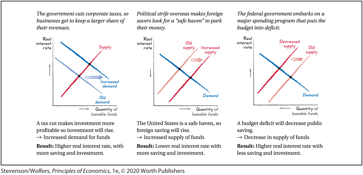
▲ Practice, practice, practice Through constant repetition, students will come to think graphically whenever they encounter new economic questions.
Text above the first graph reads, The government cuts corporate taxes, so businesses get to keep a larger share of their revenues.
The graph plots a negative Increased demand curve and a negative Old demand curve from right to left respectively on the graph.
A positive Supply curve intersects the demand curves. A shift is indicated from the Old demand to the Increased demand curve.
Text below the graph reads A tax cut makes investment more profitable so investment will rise. This leads to Increased demand for funds.
Result: Higher real interest rate, with more saving and investment.
Text above the second graph reads Political strife overseas makes foreign savers look for a ‘safe haven’ to park their money.
The graph plots a positive Increased supply curve and a positive Old supply curve from left to right respectively on the graph. A positive Demand curve intersects the supply curves. A shift is indicated from the Old demand to the Increased demand curve.
Text below the graph reads The United States is a safe haven, so foreign saving will rise. This leads to Increased supply of funds.
Result: Lower real interest rate with more saving and investment.
Text above the first graph reads The federal government embarks on a major spending program that puts the budget into deficit.
The graph plots a positive Decreased supply curve and a positive Old supply curve from left to right respectively on the graph. A negative Demand curve intersects the supply curves. A shift is indicated from the Old supply to the Increased supply curve.
Text below the graph reads A budget deficit will decrease public saving. This leads to Decrease in supply of funds.
Result: Higher real interest rate with less saving and investment.