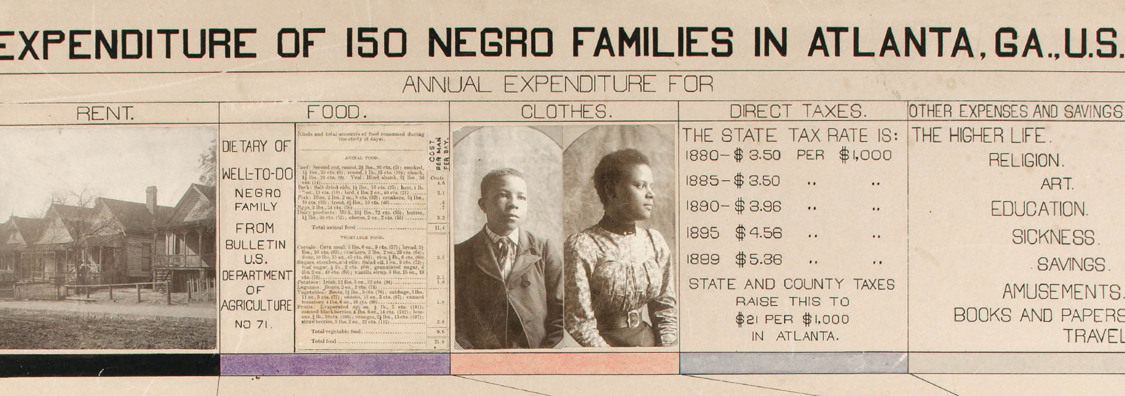
Detail of plate 31: Income and Expenditure of 150 Negro Families in Atlanta, GA, U.S.A.
Silas Munro
A prolific author, renowned sociologist, fierce civil rights advocate, co-founder of the NAACP, and a historian of black lives, W. E. B. Du Bois was also a pioneer of data visualization. The plates that follow are grouped into two distinct but highly related sets. The Georgia Negro: A Social Study consists of twenty-nine brightly colored diagrams, plus three maps and four tables. A Series of Statistical Charts Illustrating the Condition of the Descendants of Former African Slaves Now Resident in the United States of America includes a group of twenty- seven additional diagrams. Working in ink, gouache watercolor, graphite, and sprinklings of photographic prints, Du Bois and his collaborators at Atlanta University generated crisp, dynamic, and modern graphics as a form of infographic activism. Instead of solely relying on the diorama, a table-top model presentation often used at world’s fairs during the time, Du Bois and his team used information design as a rhetorical device.1 Extant photo documentation shows at least half of the present diagrams mounted in wing frames set on movable standards that allowed fairgoers to flip through large, double-sided plates of the rich data at eye level.2 Tracing from the slave trade, through the Middle Passage, to Emancipation and beyond, Du Bois’s datasets used a unique visual form to make arguments for the equality and sophistication of black Americans living under Jim Crow and the shadow of enslavement.
Made a decade before the rise of dominant European avant-garde movements, these works predate modular design elements often considered to have their origins in Russian constructivism, De Stijl, and Italian futurism. These modular elements are typically composed of abstract shapes built from circles, triangles, and rectangles in bright primary colors or black and white. The Du Bois infographics were published twenty years before the founding of the Bauhaus, a German art and design school famous for a rigorous foundation, in part focusing on modular design elements. The colors, shapes, and typography of the charts also foreshadow critical developments in the history of data visualization, including simplified pictographic form defined in the Isotype picture language, minimal typographic palettes used by the International Typographic Style, and visual narratives in chart form explained in the research of Edward Tufte.3
Detail of plate 31: Income and Expenditure of 150 Negro Families in Atlanta, GA, U.S.A.
The Georgia study utilizes data gleaned from state census data as well as original research from the department of sociology at Atlanta University, while A Series of Statistical Charts Illustrating the Condition of the Descendants of Former African Slaves Now in Residence in the United States of America zooms out to include a wider set of facts and figures on black populations across the United States. Both sets use a range of visual strategies including geographic maps, circle and spiral diagrams, bar and area charts, and complex tables and grids, giving a vivid variety to the data. In multiple instances across the two sets, the Atlanta University team took similar subjects, such as education, colorism, and economic class, and reproduced them twice, with different visual structures. There are considerable differences between the two series of images, including different typographic treatments, level of finish, and consistency of visual language. Yet Du Bois and his team clearly intended a specific reading order to both sets that builds a persuasive narrative through visual data over time.
The diverse chart types show that the Du Bois data portraits are part of a long lineage of visualizing statistical data. The Scottish statistician William Playfair pioneered the bar chart and the line graph (1786), and the pie chart (1801), all of which deeply inform the visual structure of the Du Bois plates.4 Building on Playfair’s work, Florence Nightingale (1820–1910) linked data visualization to social action with her own novel form, the rose diagram (1858), to convince the British government to improve the care of its wounded soldiers.5 As a well-read and well-traveled intellectual, Du Bois would have had exposure to these and other examples of data in graphic form.
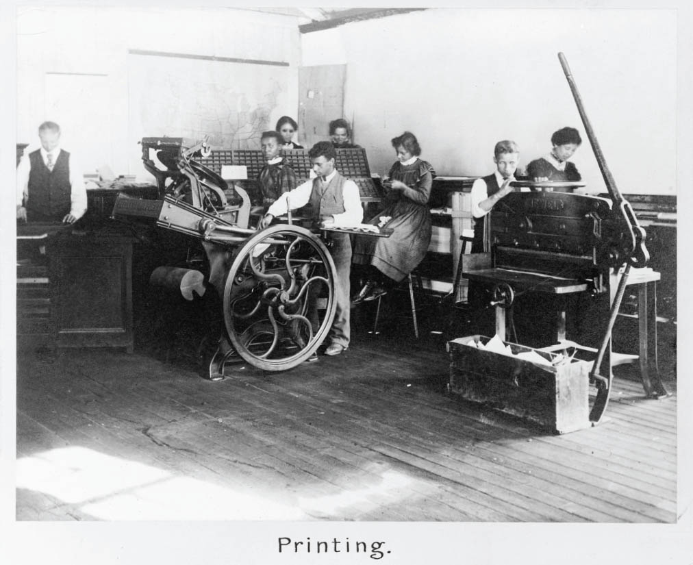
The infographics were the product of multiple forms of collaboration and co-creation. Across the diagrams there are many references to Atlanta University, and the lead infographic of the second series of images explicitly states that it was “prepared and executed by Negro students under the direction of Atlanta University.” Contemporary sources suggest that an Atlanta University alumnus, William Andrew Rogers, who had recently received his bachelor’s degree in sociology, was the point person responsible for making and coordinating the design and production of the actual graphics.6 Few records remain about the working methods of Rogers, who may have been living in Petersburg, Virginia, when he worked on the project. Based on the volume of the designs, each piece’s complexity and detail, and the compressed project timeline of only a few months to prepare their portion of the American Negro Exhibit, it seems implausible that Rogers and Du Bois worked alone to complete the project.7 Rogers and Du Bois no doubt facilitated renderings and typesetting from additional unnamed Atlanta University students and alumni, who also assisted with the collection of field data.
Although Du Bois and his team were hardly the first to visualize data with this level of rigor in the pre-computation era, these designs are unique and important. The rhetorical innovation in the social sciences coupled with a visual aesthetic very much at home in the twenty-first century makes for a prescient body of design work. These visualizations offer a prototype of design practices that were not widely utilized until more than a century later, anticipating the trends—now vital in our contemporary world—of design for social innovation, data visualization in service to social justice, and the decolonization of pedagogy.