Chapter 16. Logistic Regression
A lot of people say there’s a fine line between genius and insanity. I don’t think there’s a fine line, I actually think there’s a yawning gulf.
Bill Bailey
In Chapter 1, we briefly looked at the problem of trying to predict which DataSciencester users paid for premium accounts. Here we’ll revisit that problem.
The Problem
We have an anonymized dataset of about 200 users, containing each user’s salary, her years of experience as a data scientist, and whether she paid for a premium account (Figure 16-1). As is typical with categorical variables, we represent the dependent variable as either 0 (no premium account) or 1 (premium account).
As usual, our data is a list of rows
[experience, salary, paid_account]. Let’s turn it into the format we need:
xs=[[1.0]+row[:2]forrowindata]# [1, experience, salary]ys=[row[2]forrowindata]# paid_account
An obvious first attempt is to use linear regression and find the best model:
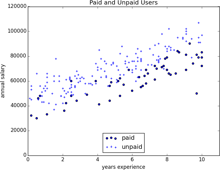
Figure 16-1. Paid and unpaid users
And certainly, there’s nothing preventing us from modeling the problem this way. The results are shown in Figure 16-2:
frommatplotlibimportpyplotaspltfromscratch.working_with_dataimportrescalefromscratch.multiple_regressionimportleast_squares_fit,predictfromscratch.gradient_descentimportgradient_steplearning_rate=0.001rescaled_xs=rescale(xs)beta=least_squares_fit(rescaled_xs,ys,learning_rate,1000,1)# [0.26, 0.43, -0.43]predictions=[predict(x_i,beta)forx_iinrescaled_xs]plt.scatter(predictions,ys)plt.xlabel("predicted")plt.ylabel("actual")plt.show()
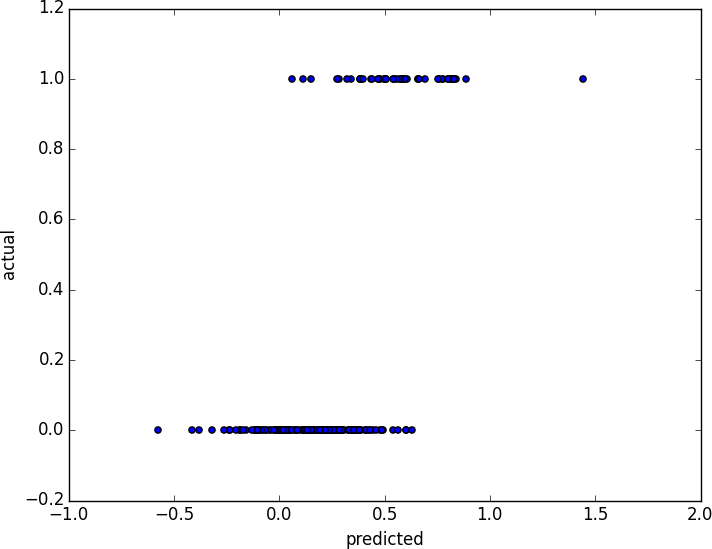
Figure 16-2. Using linear regression to predict premium accounts
But this approach leads to a couple of immediate problems:
-
We’d like for our predicted outputs to be 0 or 1, to indicate class membership. It’s fine if they’re between 0 and 1, since we can interpret these as probabilities—an output of 0.25 could mean 25% chance of being a paid member. But the outputs of the linear model can be huge positive numbers or even negative numbers, which it’s not clear how to interpret. Indeed, here a lot of our predictions were negative.
-
The linear regression model assumed that the errors were uncorrelated with the columns of x. But here, the regression coefficient for
experienceis 0.43, indicating that more experience leads to a greater likelihood of a premium account. This means that our model outputs very large values for people with lots of experience. But we know that the actual values must be at most 1, which means that necessarily very large outputs (and therefore very large values ofexperience) correspond to very large negative values of the error term. Because this is the case, our estimate ofbetais biased.
What we’d like instead is for large positive values of dot(x_i, beta) to correspond to probabilities close to 1,
and for large negative values to correspond to probabilities close to 0. We can accomplish this by applying another function to the result.
The Logistic Function
In the case of logistic regression, we use the logistic function, pictured in Figure 16-3:
deflogistic(x:float)->float:return1.0/(1+math.exp(-x))
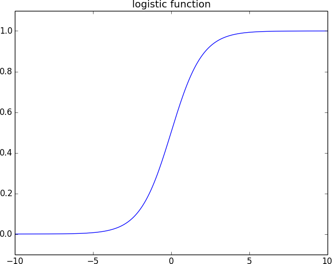
Figure 16-3. The logistic function
As its input gets large and positive, it gets closer and closer to 1. As its input gets large and negative, it gets closer and closer to 0. Additionally, it has the convenient property that its derivative is given by:
deflogistic_prime(x:float)->float:y=logistic(x)returny*(1-y)
which we’ll make use of in a bit. We’ll use this to fit a model:
where f is the logistic function.
Recall that for linear regression we fit the model by minimizing the sum of squared errors, which ended up choosing the β that maximized the likelihood of the data.
Here the two aren’t equivalent, so we’ll use gradient descent to maximize the likelihood directly. This means we need to calculate the likelihood function and its gradient.
Given some β, our model says that each should equal 1 with probability and 0 with probability .
In particular, the PDF for can be written as:
since if is 0, this equals:
and if is 1, it equals:
It turns out that it’s actually simpler to maximize the log likelihood:
Because log is a strictly increasing function, any beta that maximizes the log likelihood also maximizes the likelihood, and vice versa. Because gradient descent minimizes things, we’ll actually work with the negative log likelihood, since maximizing the likelihood is the same as minimizing its negative:
importmathfromscratch.linear_algebraimportVector,dotdef_negative_log_likelihood(x:Vector,y:float,beta:Vector)->float:"""The negative log likelihood for one data point"""ify==1:return-math.log(logistic(dot(x,beta)))else:return-math.log(1-logistic(dot(x,beta)))
If we assume different data points are independent from one another, the overall likelihood is just the product of the individual likelihoods. That means the overall log likelihood is the sum of the individual log likelihoods:
fromtypingimportListdefnegative_log_likelihood(xs:List[Vector],ys:List[float],beta:Vector)->float:returnsum(_negative_log_likelihood(x,y,beta)forx,yinzip(xs,ys))
A little bit of calculus gives us the gradient:
fromscratch.linear_algebraimportvector_sumdef_negative_log_partial_j(x:Vector,y:float,beta:Vector,j:int)->float:"""The jth partial derivative for one data point.Here i is the index of the data point."""return-(y-logistic(dot(x,beta)))*x[j]def_negative_log_gradient(x:Vector,y:float,beta:Vector)->Vector:"""The gradient for one data point."""return[_negative_log_partial_j(x,y,beta,j)forjinrange(len(beta))]defnegative_log_gradient(xs:List[Vector],ys:List[float],beta:Vector)->Vector:returnvector_sum([_negative_log_gradient(x,y,beta)forx,yinzip(xs,ys)])
at which point we have all the pieces we need.
Applying the Model
We’ll want to split our data into a training set and a test set:
fromscratch.machine_learningimporttrain_test_splitimportrandomimporttqdmrandom.seed(0)x_train,x_test,y_train,y_test=train_test_split(rescaled_xs,ys,0.33)learning_rate=0.01# pick a random starting pointbeta=[random.random()for_inrange(3)]withtqdm.trange(5000)ast:forepochint:gradient=negative_log_gradient(x_train,y_train,beta)beta=gradient_step(beta,gradient,-learning_rate)loss=negative_log_likelihood(x_train,y_train,beta)t.set_description(f"loss: {loss:.3f} beta: {beta}")
after which we find that beta is approximately:
[-2.0,4.7,-4.5]
These are coefficients for the rescaled data, but we can transform them back to the original data as well:
fromscratch.working_with_dataimportscalemeans,stdevs=scale(xs)beta_unscaled=[(beta[0]-beta[1]*means[1]/stdevs[1]-beta[2]*means[2]/stdevs[2]),beta[1]/stdevs[1],beta[2]/stdevs[2]]# [8.9, 1.6, -0.000288]
Unfortunately, these are not as easy to interpret as linear regression coefficients. All else being equal, an extra year of experience adds 1.6 to the input of logistic. All else being equal, an extra $10,000 of salary subtracts 2.88 from the input of logistic.
The impact on the output, however, depends on the other inputs as well. If dot(beta, x_i) is already large (corresponding to a probability close to 1), increasing it even by a lot cannot affect the probability very much. If it’s close to 0, increasing it just a little might increase the probability quite a bit.
What we can say is that—all else being equal—people with more experience are more likely to pay for accounts. And that—all else being equal—people with higher salaries are less likely to pay for accounts. (This was also somewhat apparent when we plotted the data.)
Goodness of Fit
We haven’t yet used the test data that we held out. Let’s see what happens if we predict paid account whenever the probability exceeds 0.5:
true_positives=false_positives=true_negatives=false_negatives=0forx_i,y_iinzip(x_test,y_test):prediction=logistic(dot(beta,x_i))ify_i==1andprediction>=0.5:# TP: paid and we predict paidtrue_positives+=1elify_i==1:# FN: paid and we predict unpaidfalse_negatives+=1elifprediction>=0.5:# FP: unpaid and we predict paidfalse_positives+=1else:# TN: unpaid and we predict unpaidtrue_negatives+=1precision=true_positives/(true_positives+false_positives)recall=true_positives/(true_positives+false_negatives)
This gives a precision of 75% (“when we predict paid account we’re right 75% of the time”) and a recall of 80% (“when a user has a paid account we predict paid account 80% of the time”), which is not terrible considering how little data we have.
We can also plot the predictions versus the actuals (Figure 16-4), which also shows that the model performs well:
predictions=[logistic(dot(beta,x_i))forx_iinx_test]plt.scatter(predictions,y_test,marker='+')plt.xlabel("predicted probability")plt.ylabel("actual outcome")plt.title("Logistic Regression Predicted vs. Actual")plt.show()
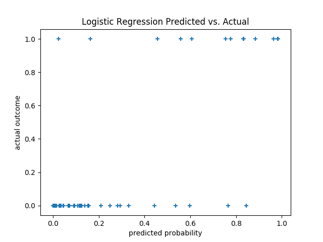
Figure 16-4. Logistic regression predicted versus actual
Support Vector Machines
The set of points where dot(beta, x_i) equals 0 is the boundary between our classes. We can plot this to see exactly what our model is doing (Figure 16-5).
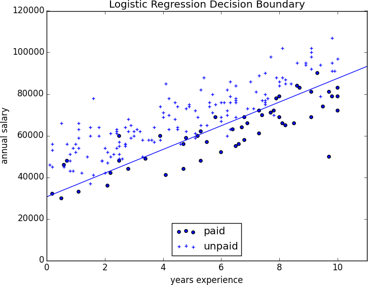
Figure 16-5. Paid and unpaid users with decision boundary
This boundary is a hyperplane that splits the parameter space into two half-spaces corresponding to predict paid and predict unpaid. We found it as a side effect of finding the most likely logistic model.
An alternative approach to classification is to just look for the hyperplane that “best” separates the classes in the training data. This is the idea behind the support vector machine, which finds the hyperplane that maximizes the distance to the nearest point in each class (Figure 16-6).
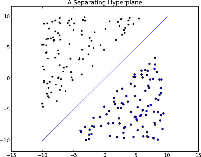
Figure 16-6. A separating hyperplane
Finding such a hyperplane is an optimization problem that involves techniques that are too advanced for us. A different problem is that a separating hyperplane might not exist at all. In our “who pays?” dataset there simply is no line that perfectly separates the paid users from the unpaid users.
We can sometimes get around this by transforming the data into a higher-dimensional space. For example, consider the simple one-dimensional dataset shown in Figure 16-7.
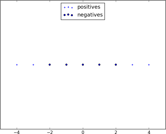
Figure 16-7. A nonseparable one-dimensional dataset
It’s clear that there’s no hyperplane that separates the positive examples from the negative ones. However, look at what happens when we map this dataset to two dimensions by sending the point x to (x, x**2). Suddenly it’s possible to find a hyperplane that splits the data (Figure 16-8).
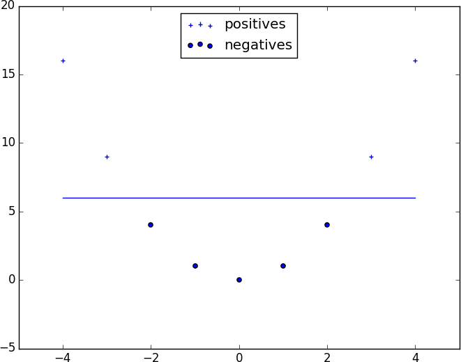
Figure 16-8. Dataset becomes separable in higher dimensions
This is usually called the kernel trick because rather than actually mapping the points into the higher-dimensional space (which could be expensive if there are a lot of points and the mapping is complicated), we can use a “kernel” function to compute dot products in the higher-dimensional space and use those to find a hyperplane.
It’s hard (and probably not a good idea) to use support vector machines without relying on specialized optimization software written by people with the appropriate expertise, so we’ll have to leave our treatment here.
For Further Investigation
-
scikit-learn has modules for both logistic regression and support vector machines.
-
LIBSVM is the support vector machine implementation that scikit-learn is using behind the scenes. Its website has a variety of useful documentation about support vector machines.