COLOR BASICS
When asked what my favorite color is, so many colors come to mind that I often struggle to pick just one. My favorite color changes all the time depending on my mood, inspiration, whereabouts, and current work projects. However, I do have certain preferences—and chances are you do too! Just like choosing clothes or home décor, you will have your own color and style choices, and these will come through in your art.
Understanding color can be confusing if you are not used to working with it. Over the following pages, we’ll explore basic color theory and useful tips for finding color balance and harmony. With these techniques, you can start to build your own color palettes.
Color Wheel
The color wheel is a helpful tool for learning about colors and color harmony. This wheel shows primary, secondary, and tertiary colors.
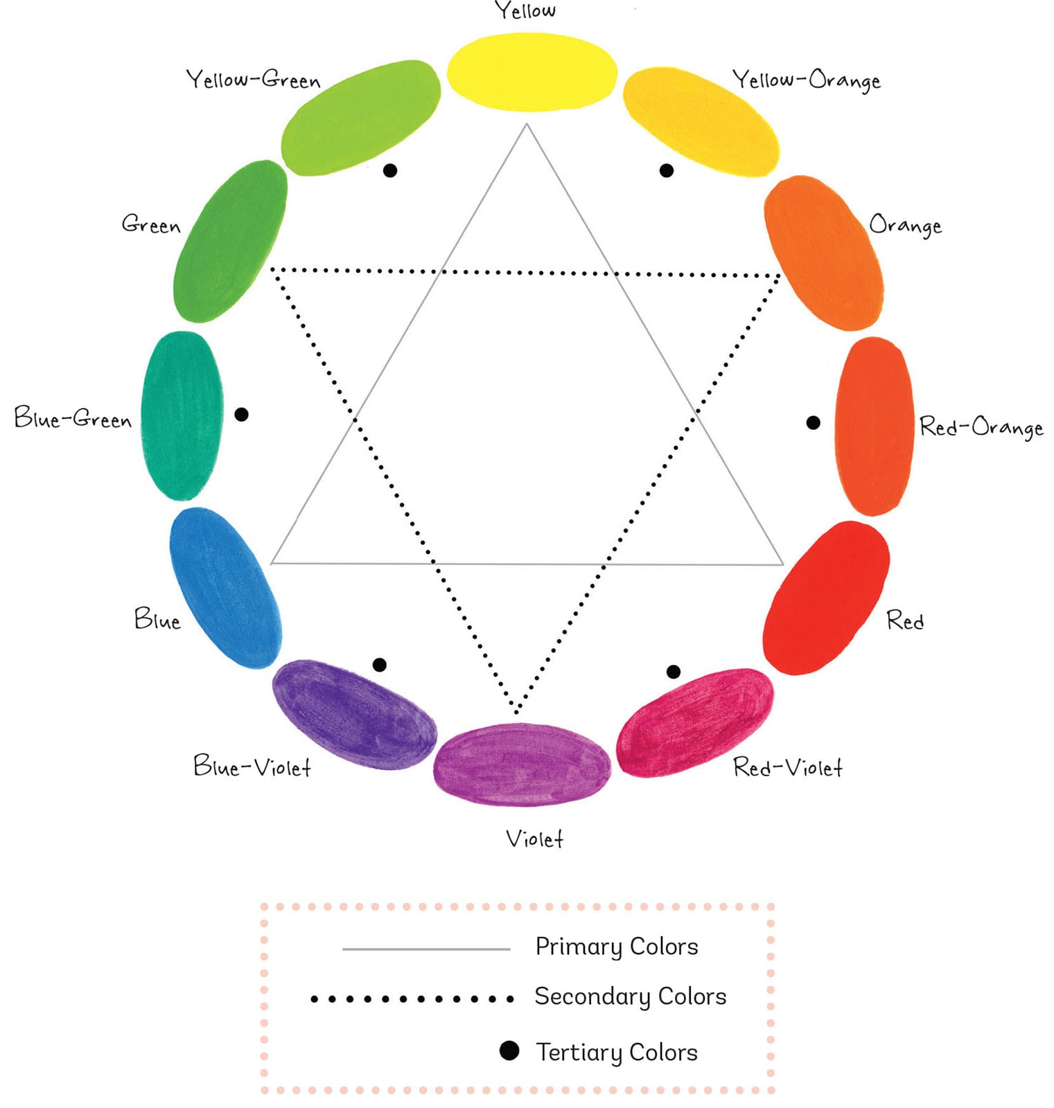
Primary Colors
All colors are derived from the three primary colors: yellow, red, and blue.
Secondary Colors
You can create the secondary colors—green, orange, and violet—by mixing the primary colors on either side of them, according to the color wheel. Mix blue and yellow to make green, yellow and red to make orange, and red and blue to make violet.
Tertiary Colors
The tertiary colors are yellow-orange, red-orange, red-violet, blue-violet, blue-green, and yellow-green. Mixing a primary and a secondary color creates a tertiary color.
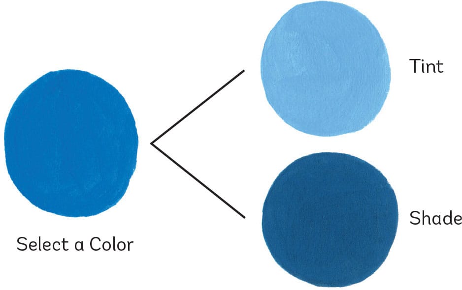
Tints & Shades
When you wish to lighten or darken a color, use a tint (to lighten) or a shade (to darken). Create a tint by adding white to a color, or a shade by adding black. The lightness or darkness of the final color depends entirely on the ratio of white or black to the main color.
Color Harmony
Here I’ve included some basic formulas for creating color harmony, or colors that are used together for a pleasing and harmonious look. These are not meant to be rules that you must follow; however, the principles are important and will help guide you if you’re new to matching colors.
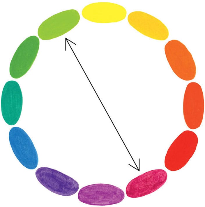
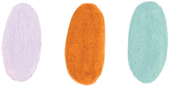
Complementary Colors
Complementary colors sit directly across from each other on the color wheel. When placed next to each other, they create a high level of contrast, as you can see here.
In these examples, I chose tints of red and shades of green.
Analogous Colors
Analogous colors sit side by side on the color wheel and can give a design a calm, serene look.

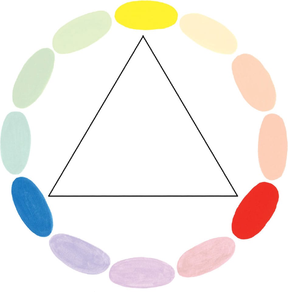
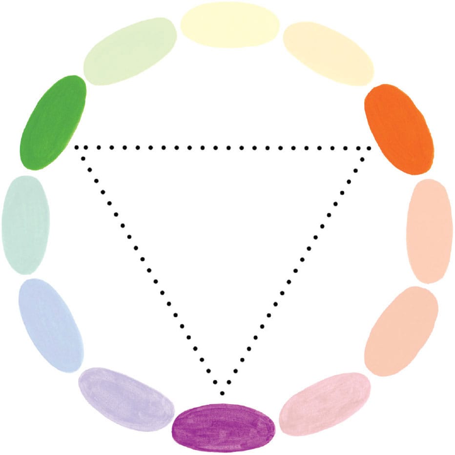
Triadic Colors
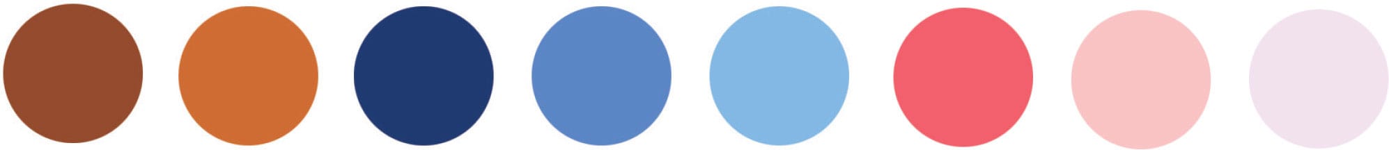
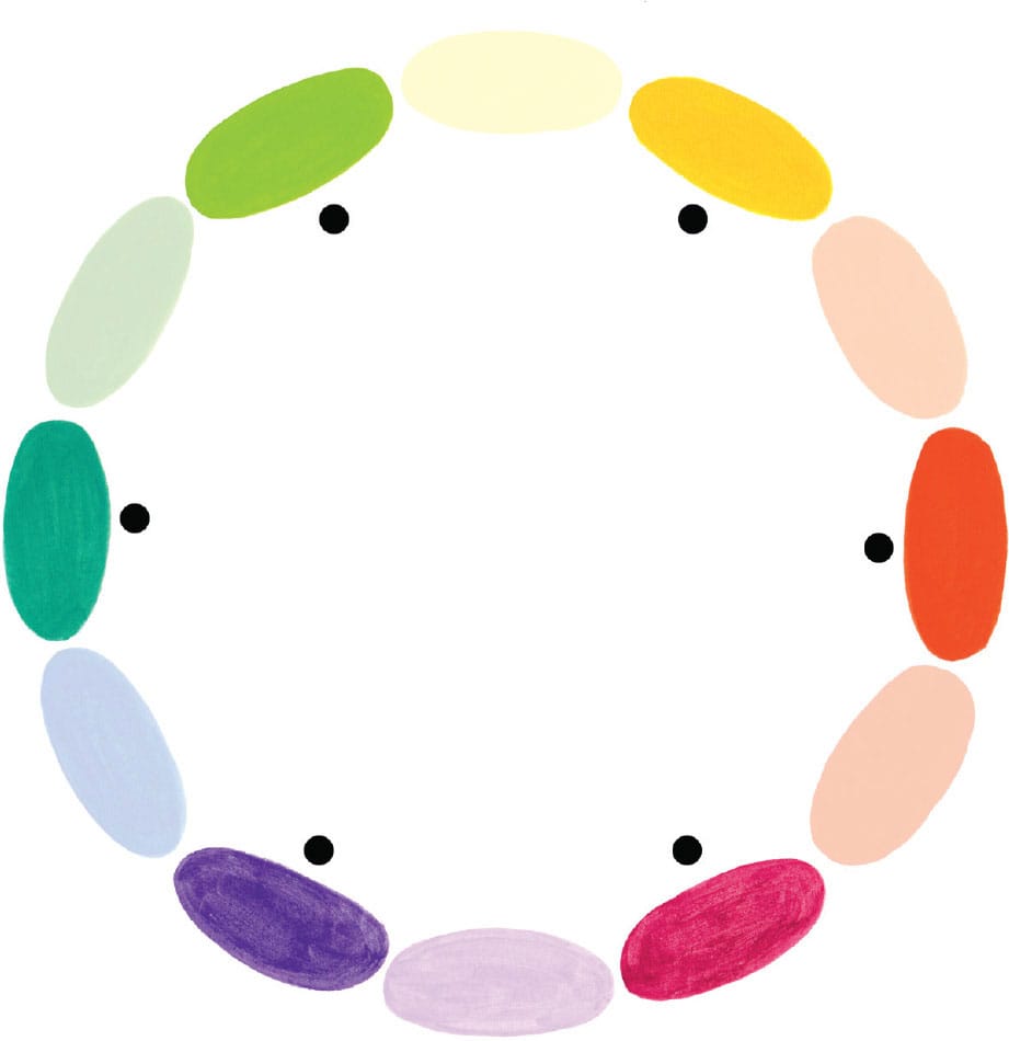
Triadic colors are evenly spaced around the color wheel. They tend to display a high level of contrast, so I like to create my own hues using tints and shades and by mixing my own versions of colors from around the wheel.
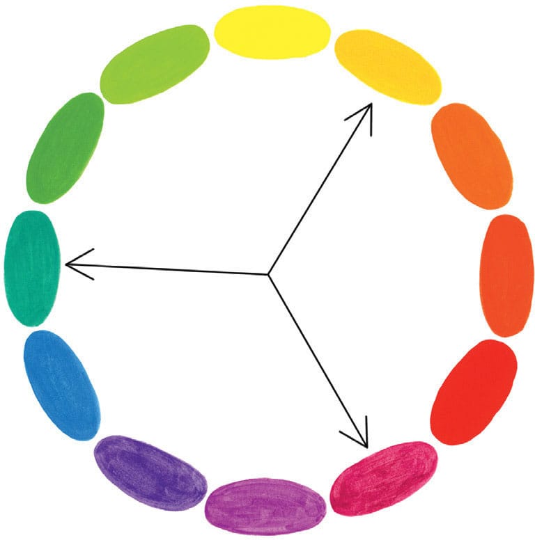
I often work with these three colors. Try creating your own color combinations using these color harmony basics.
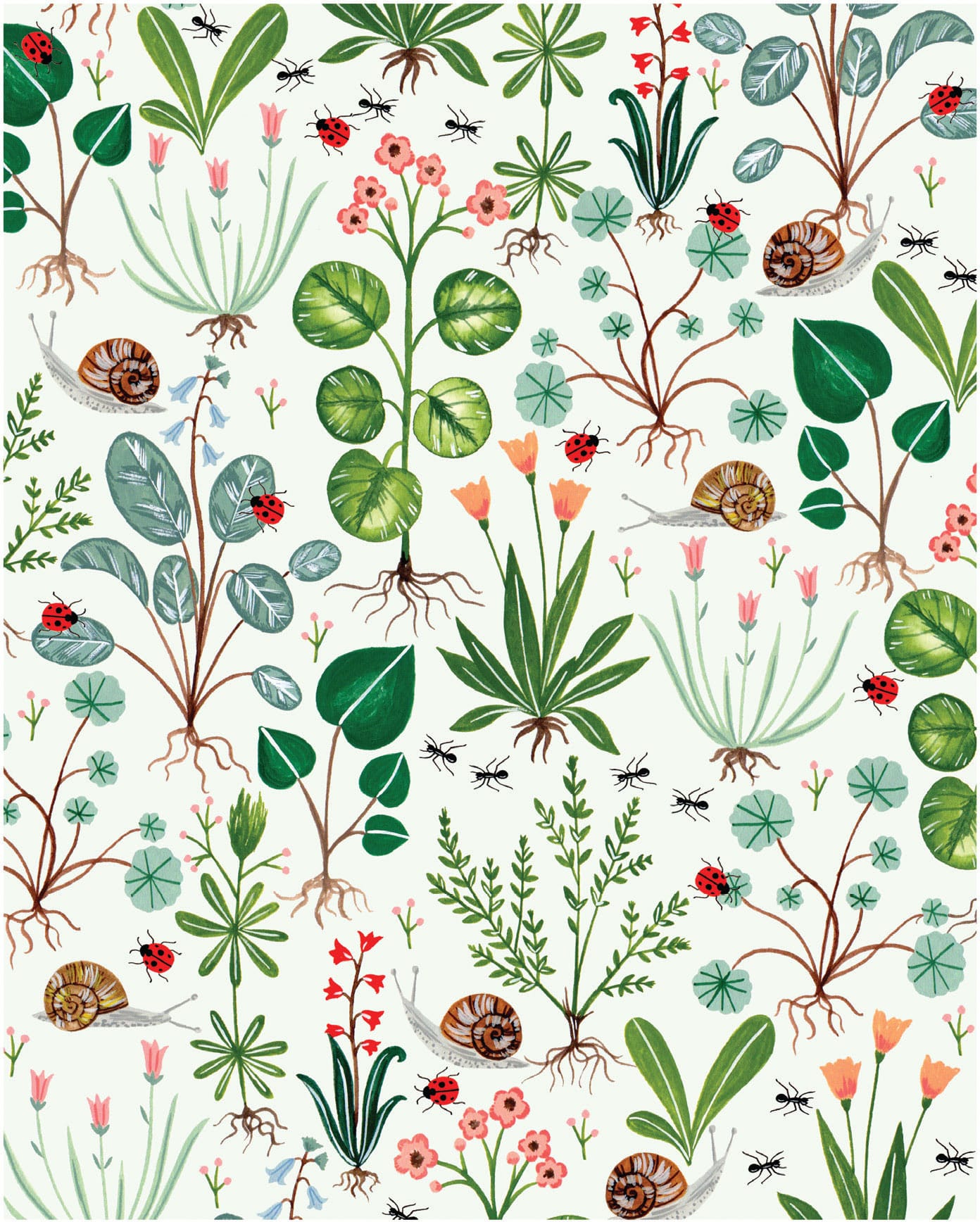
Color Palette Examples
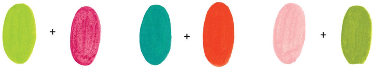
The color balance in this garden pattern creates a calm, harmonious feeling thanks to the many green hues used together. Notice how the complementary shades of peach, bright pink, and red are used sparingly around the design, providing interest without overwhelming the senses.
Play around with mixing cool colors (such as blues and greens) with warm colors (red, pinks, and oranges). Experiment with using dark as well as light tones to create maximum contrast.

Although these designs show high levels of contrast, their color palettes are limited and carefully chosen to keep the artwork sophisticated and refined.