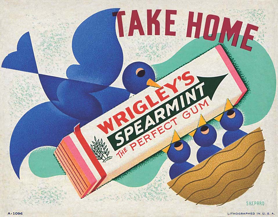
Shep and Dorothy’s mid-1930s design for a Wrigley’s spearmint gum counter display used one of Dorothy’s favorite motifs: a modernist cartoon of a bird.
Shep and Dorothy’s mid-1930s design for a Wrigley’s spearmint gum counter display used one of Dorothy’s favorite motifs: a modernist cartoon of a bird.
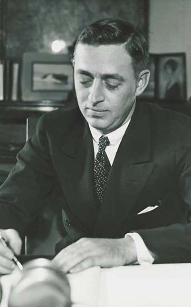
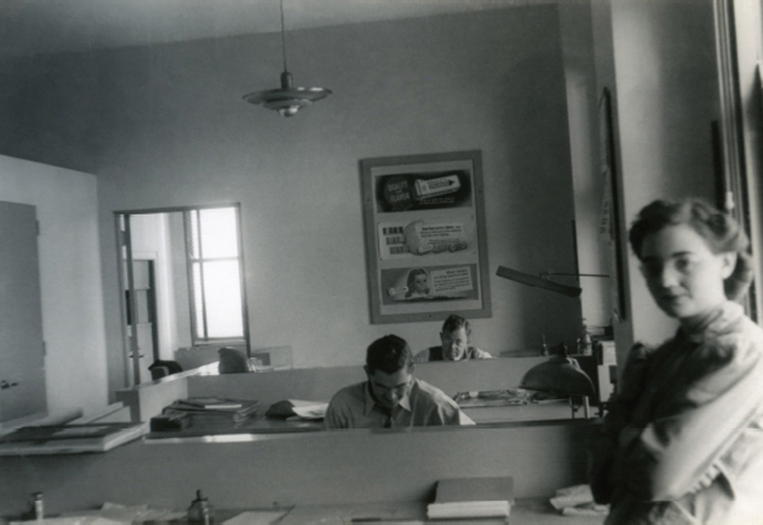
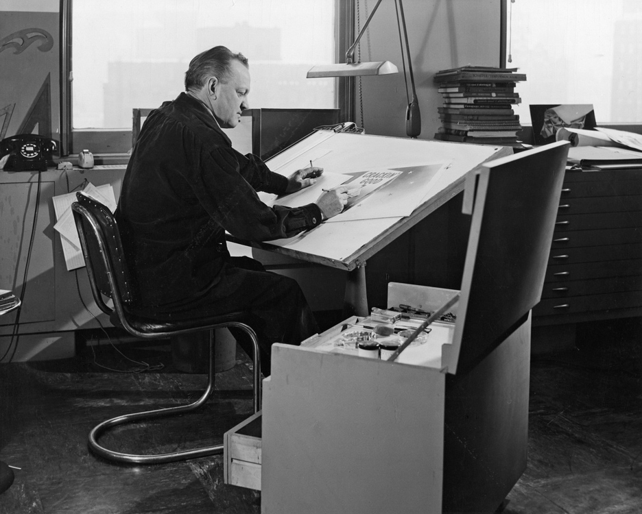
P.K. Wrigley in his office, mid-1930s.
Philip Knight Wrigley was the owner of the Chicago-based Wm. Wrigley Jr. Company, which by 1932 was the largest chewing-gum maker in North America. It was founded in 1891 by P.K.’s father, William, a boisterous, P.T. Barnum–esque figure. When it first opened, the company sold scouring soap, and—as incentive for vendors to carry his products—William offered free baking powder for each soap purchase. Soon the baking powder was more popular than the soap, so he began selling that instead. In 1892—as incentive for vendors to carry the baking powder—he began offering two packs of chewing gum for every can of baking powder bought. Soon the gum was in greater demand than the powder, so that became Wrigley’s primary product. William went wherever the money was, adapting his industrial capabilities as needed. He also set about building a small empire. Like many industrialists, he bought a baseball team, the Cubs; built his own building to house his company; and eventually acquired Catalina Island.
In 1932 William Wrigley died, and P.K. assumed the reins of the company. P. K. was quiet, ambitious, and, according to a 1943 profile in Fortune, a proponent of communication as an art form. He went about his work meticulously; he had once said he wanted to be an auto mechanic, and his leadership showed his skill in making the company’s whole engine run smoothly. He was also a believer in the importance of having a relationship with consumers, and he would hire researchers to advise how he could improve the public’s opinion of his company. This is somewhat ironic, since P. K. rarely gave interviews and usually refused to be photographed. But it was the product, not the man, which he wanted the public to know.
Dorothy described the first meeting in New York of Shep and P. K., who would become lifelong friends.
Shep said he wanted to submit something to P.K. Wrigley, who he’d heard was coming to town. They were introduced with the understanding that Shep had “five minutes.”
We made up dummies of some of Shep’s ideas and he showed them to P.K. right off. He loved them. Much more so than the work the Outdoor Advertising Association men had prepared. He wanted to buy one or two of Shep’s pieces. “Not for sale!” insisted Shep. “The only sensible thing to do is to have continuity,” he says. “You can’t get a job like this even started with a piece here and a piece there,” Shep explained to him. They worked up a letter right there that Shep would come to Chicago for half of his time and remain in New York the rest of the time.13
In his meeting with the Wrigley company, Shep wasn’t just trying to get a one-off gig. He believed in long-term visual plans for maximum effectiveness. P.K. likely connected with Shep for this reason: they both thought about the big picture, long-term sales and revenue. In speaking about his first job for Wrigley, Shep later recalled:
I’ll never forget the first poster design I made for the Wrigley Company. Mr. Wrigley looked at it and said, “I don’t like it.” And I said, “Mr. Wrigley, what has that got to do with it?” I said, “Are you selling chewing gum or are you going to hang this in your parlor?” He looked at me for a minute, and then he said, “I think you’ve got something there.” I think that cemented our relations right there and then. I don’t think I’ve ever made one since that he did like. As long as the sales curve went up, that was all that was necessary.14

Shep’s first design for Wrigley, a 1932 billboard. Image courtesy of Duke University David M. Rubenstein Rare Book & Manuscript Library.
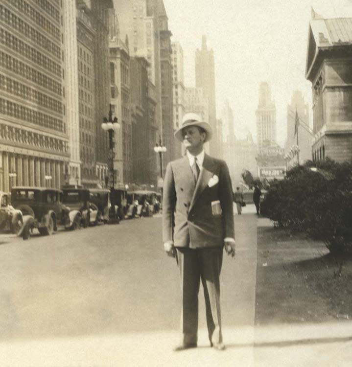
Shep on Michigan Avenue during his first visit to Chicago.
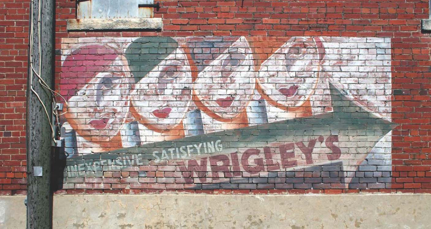
An original wall sign that still exists in Texas.
Otis gave up his freelance work and went full-time with Wrigley, while Dorothy did uncredited assists and continued her freelance work. Five years after that first job for Wrigley, a journalist caught up with Shep on the sixteenth floor of the Wrigley Building in Chicago. He described the scene in a 1937 issue of Art and Industry:
At least 12 hours a day he thinks, talks, and chews Wrigley’s. He sketches almost continuously throughout the day. Perhaps it’s a poster, a new package wrapper, a box design, or an electric spectacular. Sketch—sketch—sketch—on tablecloths, telephone pads, important letters and even smoky office windowpanes. . . . Throughout the vast Wrigley offices wherever Shepard goes, invariably there is a trail of pencil sketches (his cigarettes, tie, coat, or hat), for with Shep the idea comes first. His personal belongings will catch up with him. But an idea—that is something to hold on to.15
Shep was charged not only with creating outdoor advertising for Wrigley but with running the entire art department, which in the beginning consisted only of himself. His assignment was to design everything Wrigley-branded from top to bottom. He had 9,500 salesmen, one million retailers, and countless consumers to please, and for them he produced counter displays, chewing gum boxes, retail pamphlets, a salesman’s pamphlet, and advertising images for billboards, streetcar cards, newspapers, trucks, and posters.16 At the height of Wrigley’s 1930s market penetration, Shep’s designs appeared on twenty thousand billboards across the country in a single year. Every visual element of these objects was created or approved by him. This even extended to the décor of the Wrigley building’s restaurant and its menu, done in glowing modernist forms in bright red and white.

Consumer magazine ad.

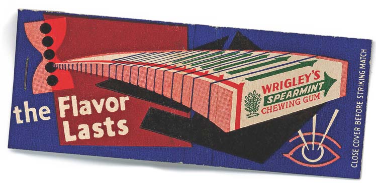
Wrigley Building Restaurant matchbook.
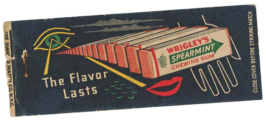
Two abstract matchbook covers.
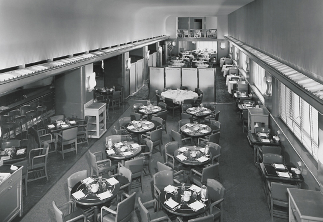
Interior design for the Wrigley Building Restaurant.
A view of the Wrigley art department, circa late 1940s.

Hubert Nelson in Shep’s office.

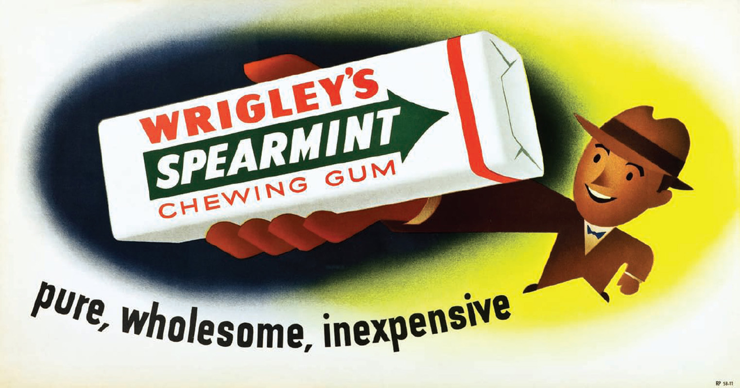
Gum counter display.

Wrigley billboards by Shep from 1937 and 1938. These are strong examples of both Shep’s airbrush technique and his emphasis on quickly grasped symbols of the boisterous energy of Wrigley’s gum.

Early 1930s billboard by Shep, emphasizing the homespun appeal of Double Mint gum.
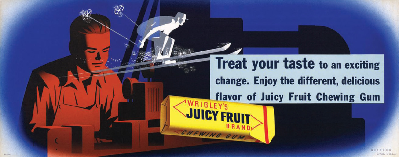
Shep’s criteria for a successful advertisement was that its meaning should be grasped by the viewer in five seconds or less. He used prodigious areas of flat color, which he felt made an image look clean, and he airbrushed details to make them look luminous. His figures possessed generic features so that anyone could see themselves or their friends in the characters. He also insisted on minimal verbiage. If he had it his way, he said in 1952, there would be no words at all.17 Shep refused to use photography at Wrigley, insisting that it was too literal and didn’t allow the imagination of the viewer to take flight. In his opinion, the openness of the handmade image and the continuity between campaigns that it afforded made it superior to photography.
Shep’s innovative designs were both celebrated for their imagery and successful in their results. An article in the August 2, 1937, edition of Time noted that, “Helped by the modernistic chewing gum advertising designed by Artist Otis Shepard, William Wrigley Jr. Co. showed profits of $4,354,000 for the first half of 1937, compared to $3,428,000 in the same period of last year.”18
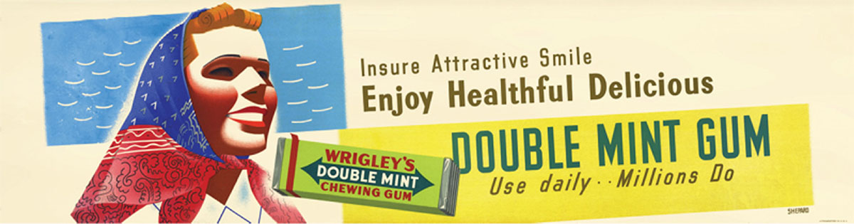
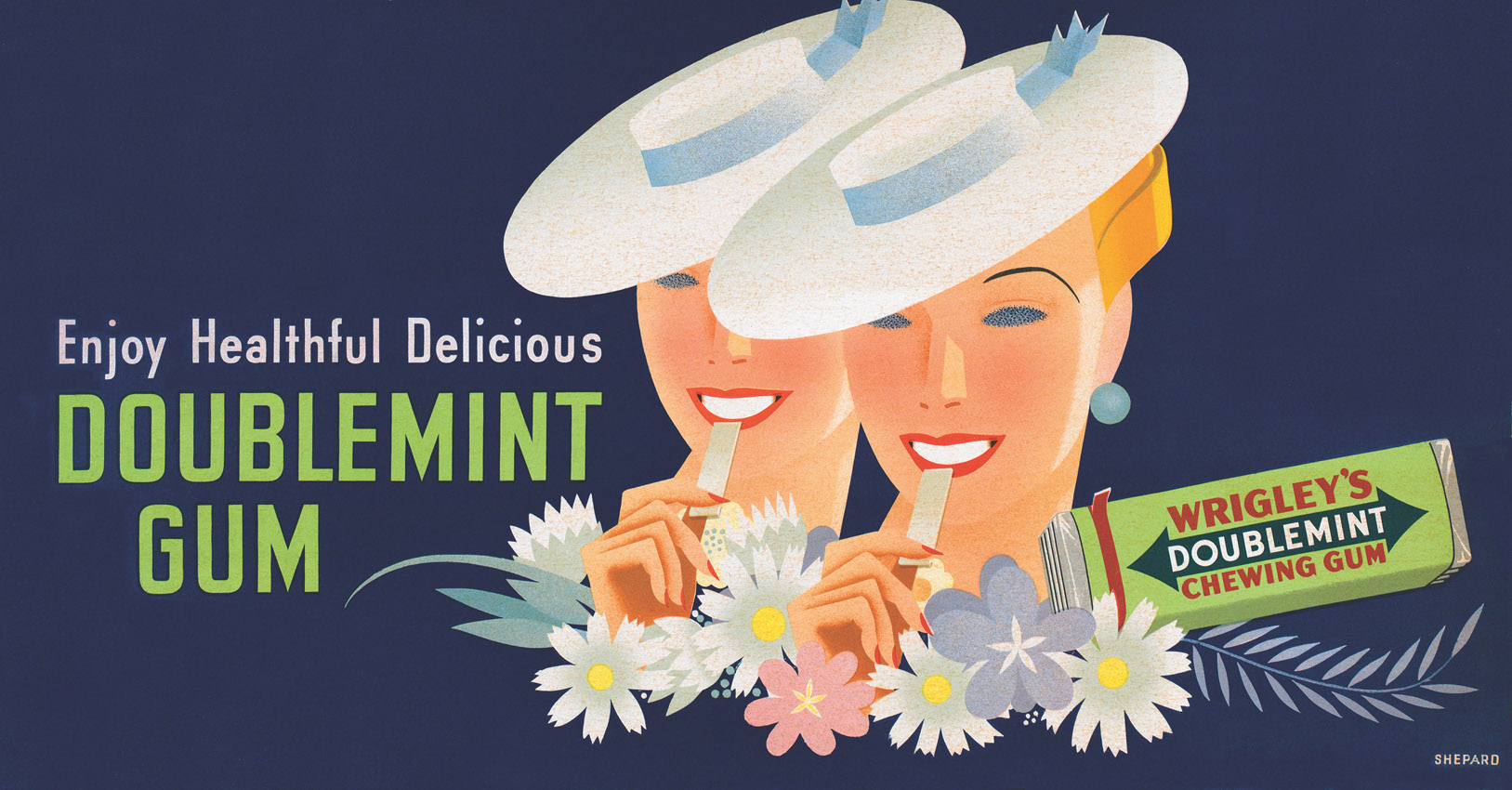
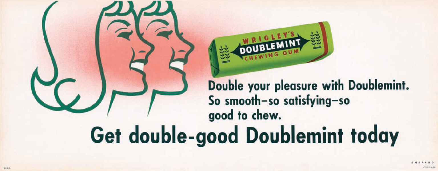
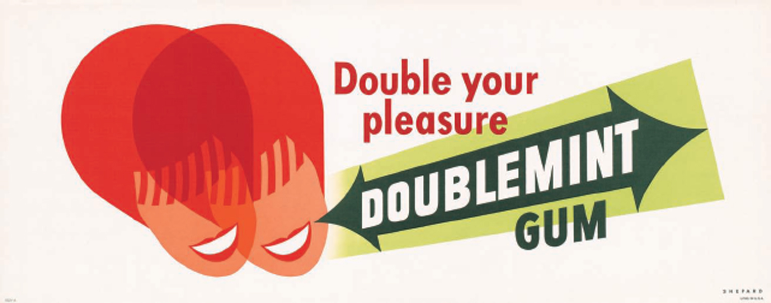
In 1939, Shep introduced the Doublemint twins to go with the gum brand: two elegant women beaming out from his posters, their faces rendered as smooth, nearly abstract planes of color, each just about to bite into a stick of gum. In the beginning, in keeping with the fashion of the time, the characters wore wide-brimmed, stylish hats. They were so popular in their first year that they inspired the trade newspaper Millinery Research to proclaim Shep’s ads a seller of hats—even more so, in their opinion, than gum. “After all,” the article read, “a hat is certainly more dramatic, more dynamic, more desirable than a stick of chewing gum. A woman may give five cents for a package of gum, but she would give her soul for an intriguing hat.”19 Nonetheless, with this advertisement, Wrigley chewing gum sales again soared.
A 1939 billboard by Shep featuring the Doublemint twins.


Late 1930s Wrigley designs appealed to suburbanites across the country.
Dorothy’s Spectacular
On March 28, 1936, Dorothy’s largest work was unveiled: the Wrigley’s Times Square Spectacular. At the time it was the largest neon display in the world: eight stories tall and one block long, running up Broadway from Forty-Fourth to Forty-Fifth Street on the east side of Times Square. Gigantic abstract tropical fish in orange, red, yellow, and blue flashed continuously, their tails and fins undulating as though they were in ultramarine electric water, while white bubbles would appear at the mouths of the fish and then woozily blink to the top of the display. At the center of it all, sitting atop a package of spearmint gum, was the Wrigley’s Spearman Elf, whose arms spouted alternating slogans, including “Steadies the Nerves” and “Keeps the Taste in Tune.” The scale was immense: The elf was twenty-three feet tall and thirty-nine feet wide. The eleven fish varied in size from fourteen to forty-two feet long. Dorothy’s design was based on unused drawings of hers that Shep spotted in her studio on Catalina. He recommended that she pitch it to P.K. for the Spectacular and she went for it. The Times Square Spectacular had all of Dorothy’s trademarks: multiple forms and colors arranged harmoniously to gently bring an idea to life. Water and fish had no literal relationship to Wrigley, of course, but Dorothy was expressing the idea of pleasure as she was then experiencing it on Catalina Island. It was less about selling and more about the joy of life. Dorothy received a tremendous amount of publicity for the work and also won the National Advertising Council Award, which consisted of a very heavy plaque and the then-large sum of $4,000.
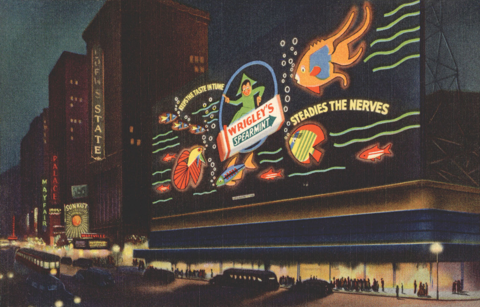
A postcard image of Dorothy’s Times Square Spectacular.
In the 1940s, Wrigley contributed to the war effort by supplying G.I.’s with enormous amounts of chewing gum for free, packed into their ration kits, which were largely packaged in Wrigley plants at a reduced rate. Before the war, gum was considered déclassé; but when the men returned home with chewing gum habits, it became widely accepted. Shep’s posters from this time called to mind the shortages the nation was experiencing—particularly aluminum, which was used in the gum wrapper. His haunting image of an enormous empty wrapper floating in a dark space became an icon. It was also his most avant-garde billboard design. The wrapper is radically foreshortened and crinkles in a forbidding manner. The dark gradient behind it emphasizes the seriousness of the matter. Even a chewing gum wrapper, the ad implied, could make a difference. In one image Wrigley reinforced its market dominance and its patriotism.
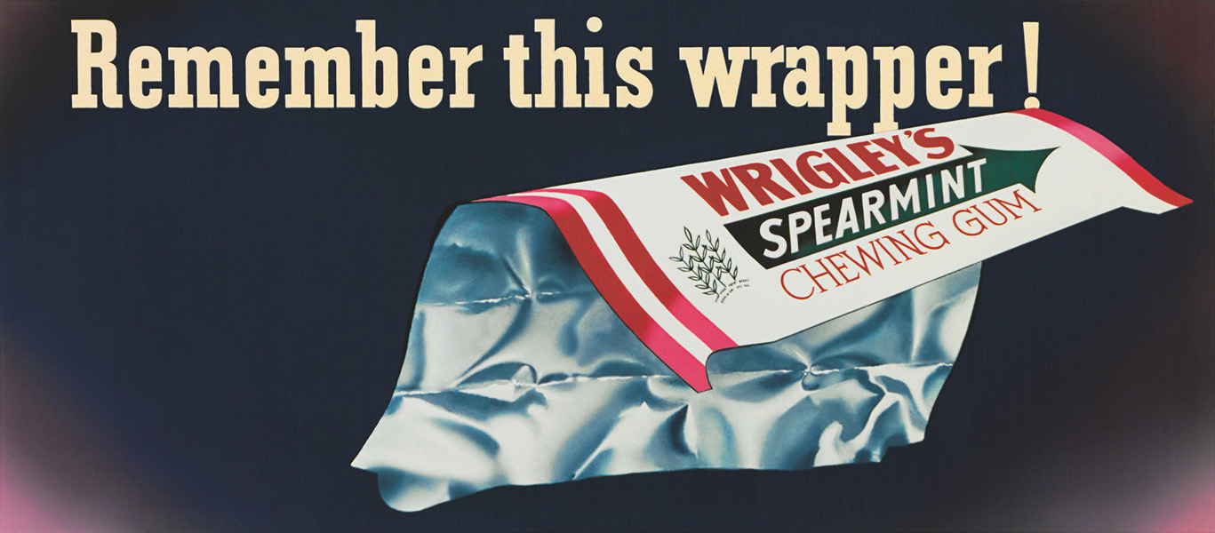
Shep’s memorable World War II empty wrapper billboard design, 1945.

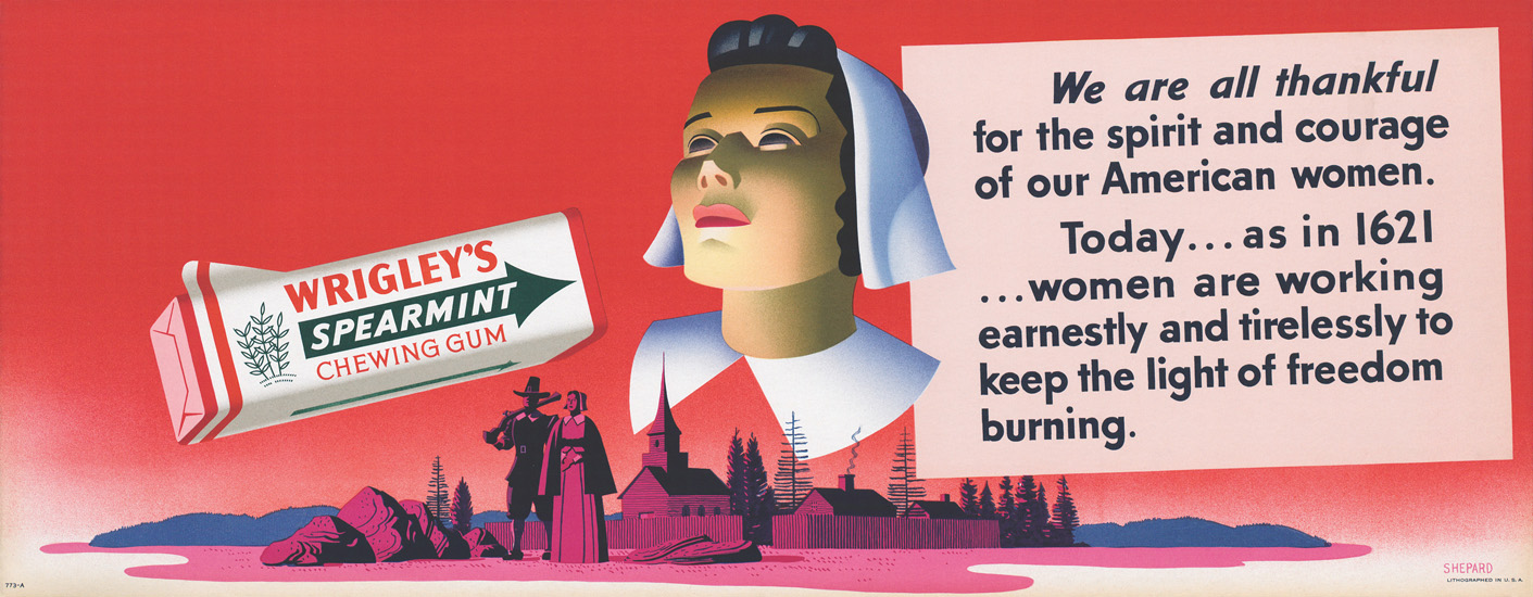
Shep frowned upon the lengthy text on these wartime billboards, but it came from P.K. and he could only argue so much.
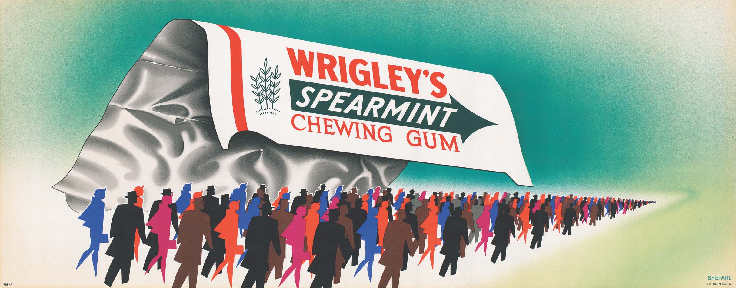
A 1945 variation on the empty wrapper theme. Shep brilliantly used hard-edged abstractions of people against the softer, glowing wrapper to emphasize the importance of the community in the wartime rationing effort.
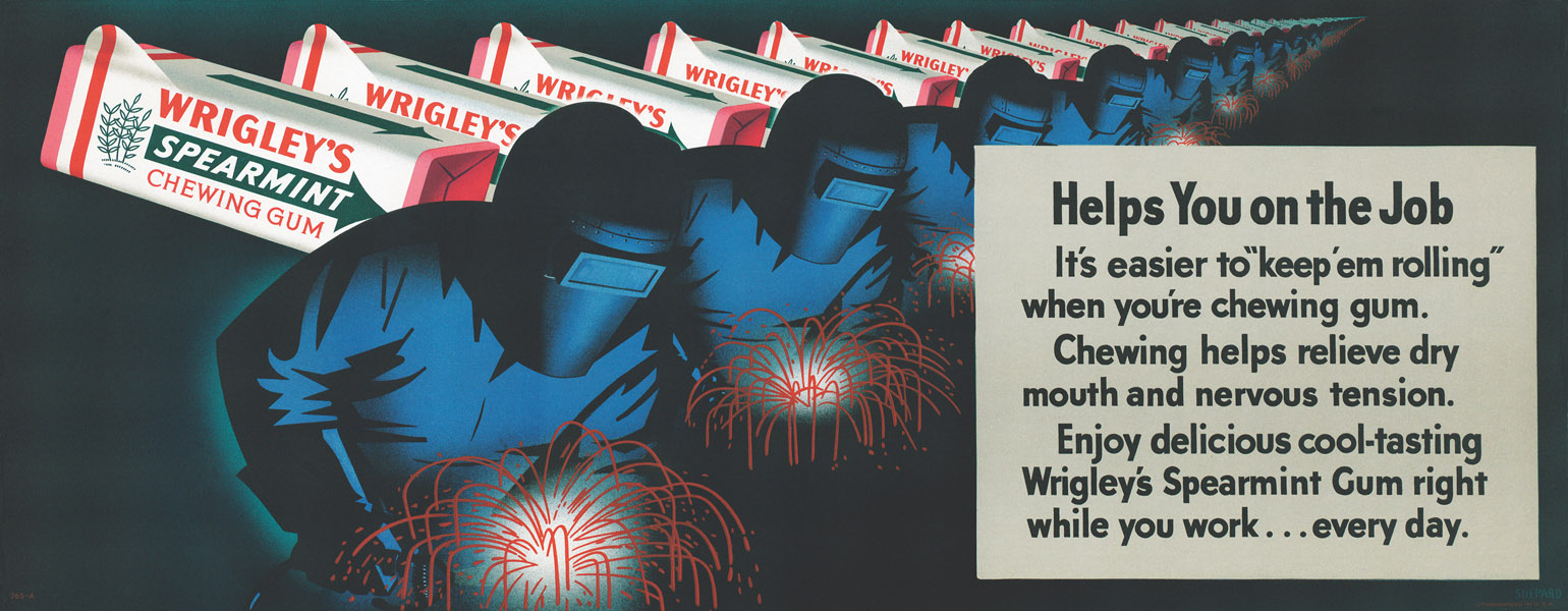
In this 1943 billboard, Shep emphasizes the wartime industry of America, particularly the women who worked in factories while the men fought overseas.
The daydreams of a factory worker, as envisioned by Shep in this 1943 billboard.

After the war, Shep shifted into a bright optimism characterized by the sunny faces of his dream America . . .

. . . which was also exported around the world.
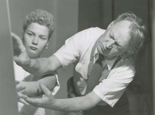
Shep working with the model for the above 1953 billboard.

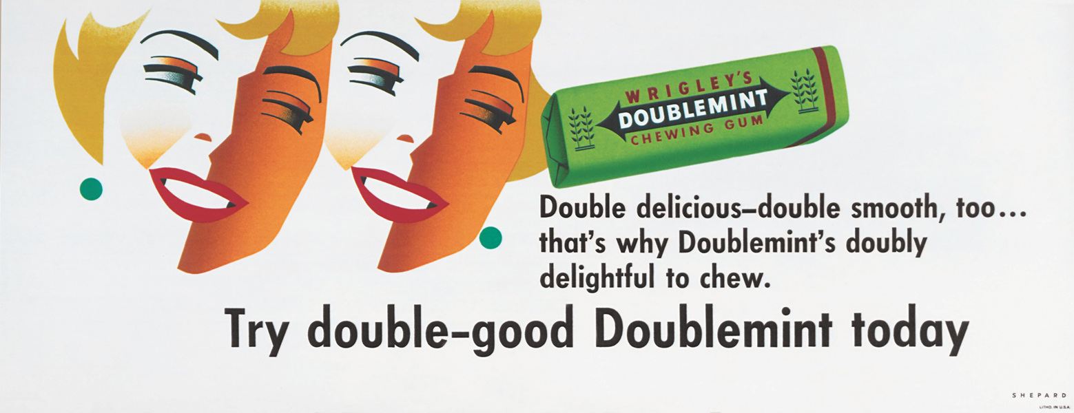
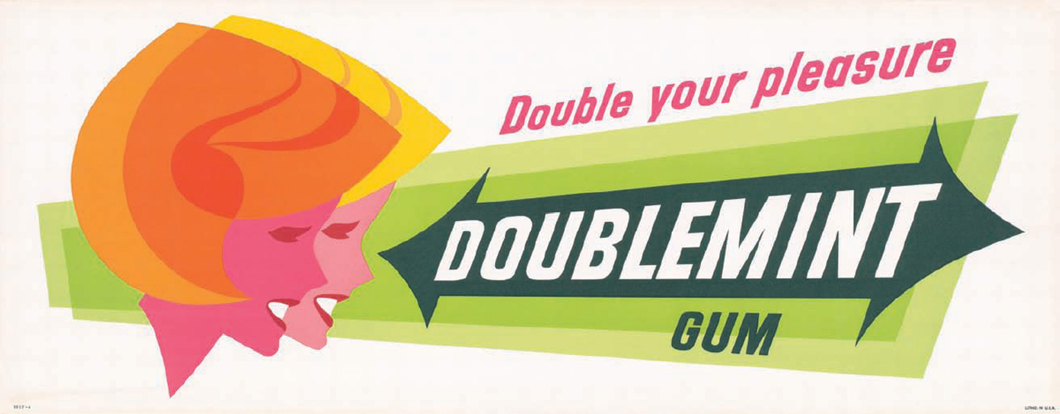
A mid-1950s Doublemint billboard by Shep, featuring period hairstyles and fashion.
Not just advertising
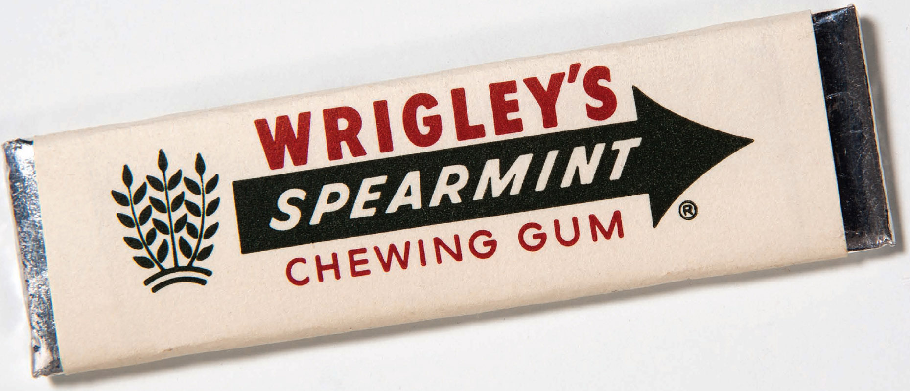
The most important of Shep’s designs for Wrigley was, of course, the gum packaging. When Shep redesigned the gum packaging, he went, as was his style, to theatrical lengths to present it. He hired a teenager, dressed him as a pasha complete with a turban and slippers, and had him bring out a box on an ornate cushion. Shep lifted the lid of the box and there, before P.K., was the new gum packaging. Against the overly ornate, text-heavy packaging of Wrigley’s competing brands, the new design was a model of aesthetic economy. It consisted of horizontal stacked words: the company name, the brand name, and “Chewing Gum.” Those words were offset by an arrow form. Taken together, it was a modular and uniform structure. The company name could shift as needed based on the shape of the brand word and the arrow could assume different positions and shapes, but the basic elements would remain consistent. This was a step into modernism and would become a classic American design.
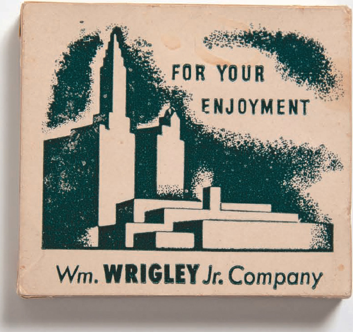
The presentation box designed by Shep to reintroduce Wrigley’s gum line after its wartime absence.
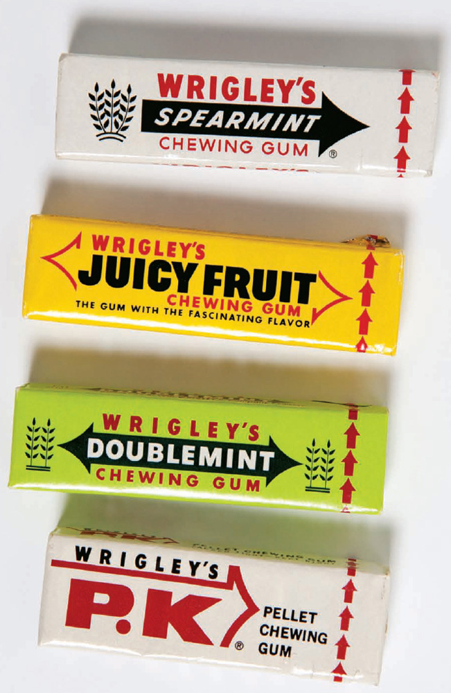
The family of redesigned packages.
Shep’s archetypal design for the spearmint gum stick.
After the war, Shep used Wrigley advertisements to project American optimism. From snowball fights to swimming to horse wrangling, his cheerful, colorful, and all-American images came to represent the Wrigley brand. As always, the posters embraced form and continuity. Each featured no more than two figures, always in motion, with the gum package seeming to collide in midair with that motion—making it integral to whatever fun was happening. His delicate airbrush blends made the figures and background colors gently glow.
Shep and P.K. Wrigley had an unusual relationship. They were born the same year, both served in World War I, and both rebelled against outlandish fathers. More than just the art director of the company, Shep became a close adviser to P.K. and the man in the company whom Wrigley sought out for an honest opinion. In return, Shep brought P.K. out of his shell and set him at ease. One day, while Shep’s son Kirk was visiting the office, a man came in and asked Shep a question, and Shep gave an answer the man didn’t like. They argued furiously, cursing horribly at each other until the man stormed out. Kirk, understandably shaken, asked his father who the man was. Shep casually responded, “Oh, that’s Mr. Wrigley.”
A rare photograph of Shep at work on an illustration. Sadly none of his original art survives today.
One of many awards given to Shep for his graphic design work.
More recreational optimism from Shep, with the focus on couples enjoying gum and fun in the late 1940s.


A mid-1950s image of all-American fun by Shep, calling to mind his own horseback days on Catalina Island.

An abstract mouth awaits a Wrigley treat in this late 1949 billboard.
Wrigley also relied on Shep for a good laugh. The two were out for dinner one night with a group of Wrigley executives. When the waiter arrived, the other men, as they tended to do, waited to order what Wrigley ordered. But Shep intervened, insisting that the whole table have the restaurant’s special. Dinner was served on a silver tray with a domed lid. The waiter lifted the lid to reveal a plastic dog turd in a bed of parsley. The room was speechless until P.K. began to laugh.
Outside of work, they also had a close, personal relationship. P.K. owned an airplane, and when the pilot complained that it was too slow and old hat, Shep and P.K. got up on the scaffolding and painted zoom lines on the plane’s tail. They also shared a love for big, flashy cars. After they attended an automobile show together, P.K. bought Shep a 1942 light–blue Lincoln Continental with red leather upholstery. This was not Shep’s first extravagant ride. His previous cars included a white Cord Roadster and a Packard Roadster, so beautiful that Dorothy used to joke that she married Shep for the car.
P.K. and Shep’s friendship was built in Chicago, furthered later on Catalina Island, and continued for the rest of their lives, with Wrigley bringing Shep and often Dorothy as well into all the visual aspects of his businesses. As Shep put it to The Sporting News, “Phil is the ‘WHAT to do’ man and I’m the ‘HOW to do it’ feller.”20
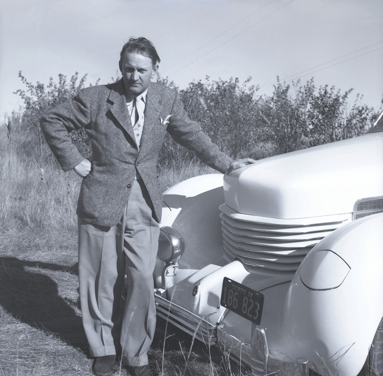
Shep in front of his 1938 Cord convertible.

Dorothy in the Lincoln Continental convertible given to Shep by P.K. Wrigley in 1942.
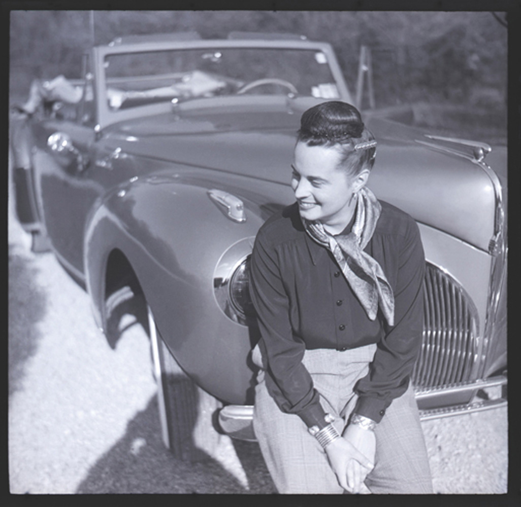
Shep’s photo of Dorothy sitting on the bumper of the Lincoln.
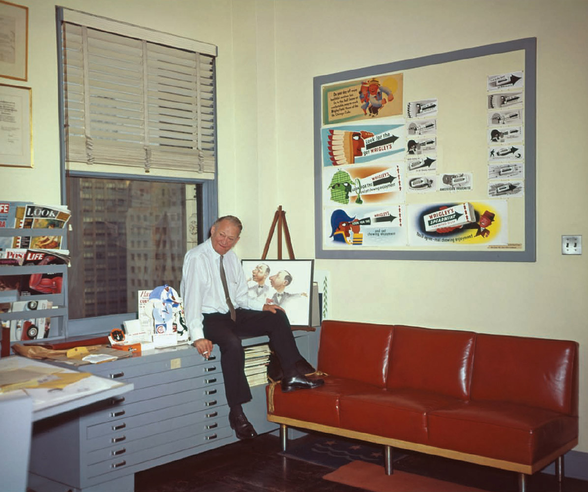
Shep in his office in 1962, the year of his retirement. On the bulletin board are mock-ups of a new transit card campaign. Beside him are Cubs game schedules adorned with his graphics.
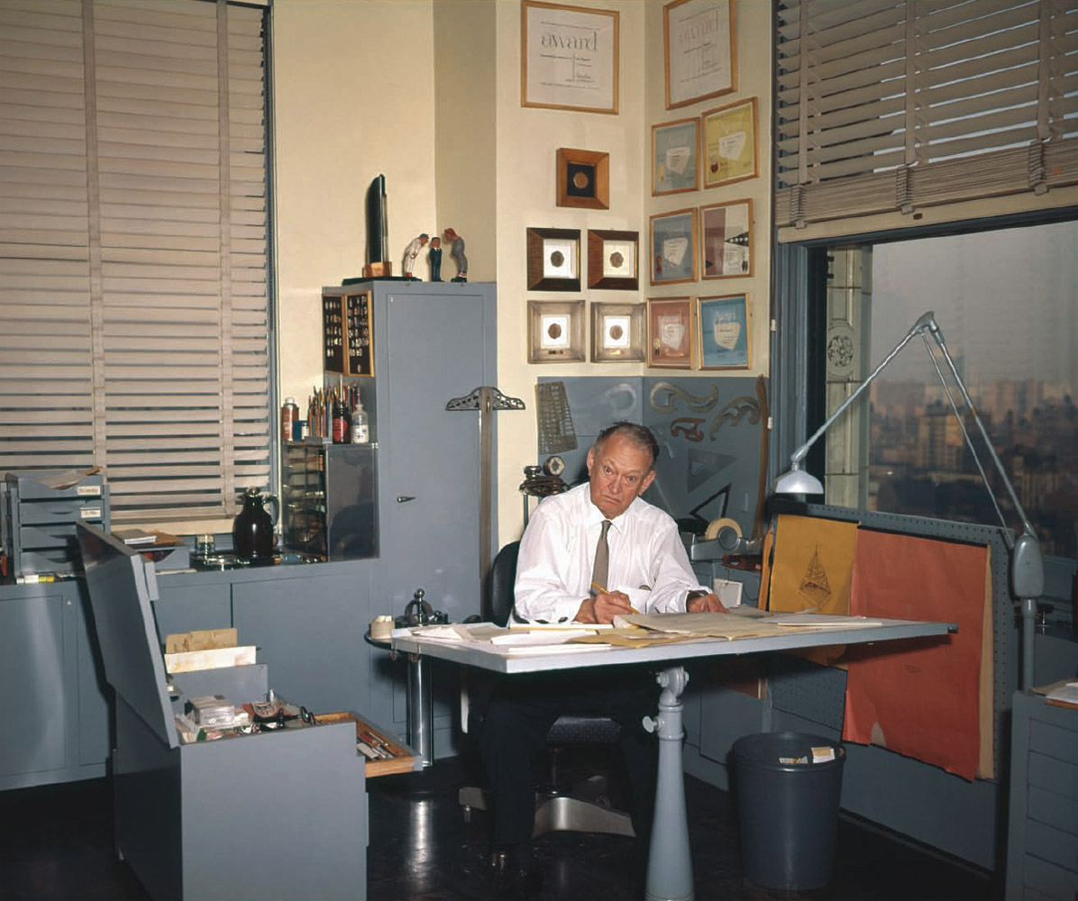
At the drawing table surrounded by tools and awards. On top of the filing cabinet stands Shep’s sculptures of Cubs players arguing with an umpire.
A transit card from 1958, done in a more cartoonish style.
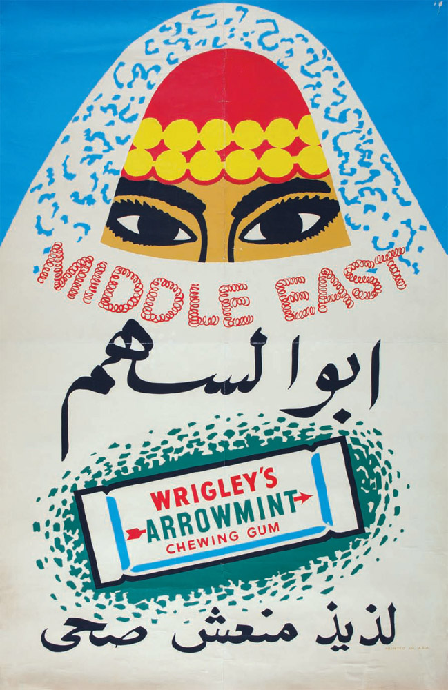
One of a range of promotional posters created for the foreign market, 1950s.
An example of how Shep’s style transitioned from softer, modeled airbrush work to a more reduced style, 1960.
An unusual piece from 1960 with a complete lack of rendering or shading, yet with a design still unmistakably made by Shep.
Completely abandoning the airbrush, Shep embraces a hard-edged pop style to keep up with the visual-culture trends of the day. These were among Shep’s final pieces for Wrigley, printed in 1963.

A rare fragment from an actual printed panel of a Wrigley billboard. Wrigley transit cards and billboards were printed in custom color lithography, as opposed to today’s more limited four-color offset printing. Lithography allowed for perfect color matching and faithful imitations of Shep’s airbrushed original artwork.
Shep worked very closely with all of his printers, developing new techniques in order to achieve the highest–quality printing at an unprecedented scale.

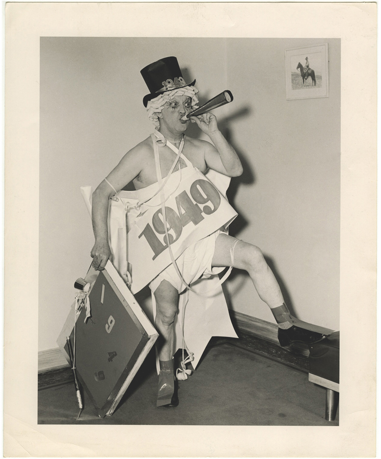
Many New Year’s Eves, Shep would dress up like the New Year’s Baby, cloth diaper and all. He would gather bottles of liquor and, starting at the sixteenth floor of the Wrigley Building, work his way down, pouring booze for staffers along the way. It was quite a ways to the ground, and he could never make it all the way down without getting too drunk, at which point he was packed into a car and sent home.