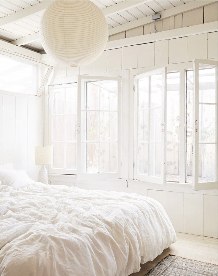
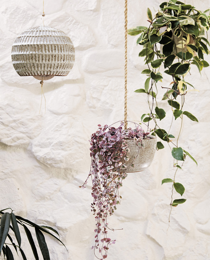
Our bedroom is essentially a white cloud of our own making, with linen sheets, a Victoria Morris bedside lamp, and a Noguchi pendant lamp.
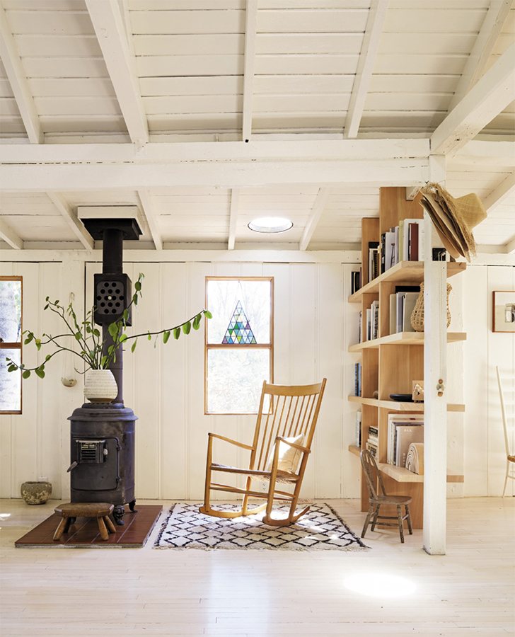
You may have noticed that when it comes to design, we don’t rely on color for impact. Serena’s unofficial mantra is: The only option is white. That’s not to say that we don’t appreciate color—we have seen some amazing spaces that fully embrace all things bold and polychromatic—but it brings up an important point about our approach. For us, it’s not about the wall, or the floors, or the counters or the cabinets. It’s about everything together. We want to draw attention to the whole, not the part, and a cohesive neutral palette helps us achieve this.
It’s something that’s worth keeping top of mind at this phase of the process, when material layers come into play. Whether you’re in a “now what?” situation, having excavated the strata of your existing floor and reached a dead end; or you’re looking to harness the power of white walls; or you just want an easy upgrade for your lackluster countertops—it all comes back to the same idea: unifying your home and setting the scene for a tranquil, productive living space.
By now you’ve established the nature of the surface you’re working with and are in a position of either refinishing your floor or remaking it. We’ll deal with the former scenario first.
All wood fades over time. Sometimes it grays out, sometimes it can go very yellow, or, if your floor was the product of a remodel in the eighties or nineties, when it was popular to use a thick, shellacked finish, it may even have a glowing orange effect. Whatever the scenario, sanding your floor down and adding a clear coat is a great, easy step to dull the effects of all of the above. (FYI, while an engineered wood floor can only be sanded once or twice, a hardwood floor can be sanded multiple times—the exact number will depend on a few variables, including the thickness of the floorboards. Consult with an expert to find out the particularities of your floor.) There may still be remnants of the undesirable effect in question—but it will be significantly less obvious.
In our Topanga home we wanted a double-white effect. Our old maple floor had a mixed bag of ailments: Its finish was chipped, some boards were missing, several bits were raw, and other areas had been painted dark brown. After removing the damaged level through sanding, we bleached the wood (read: hired a professional to do it, as it is definitely labor-intensive). We let it dry for twelve hours, then bleached it again, then let it dry for another twelve hours, and added a whitewash (a clear coat with white pigment in it).
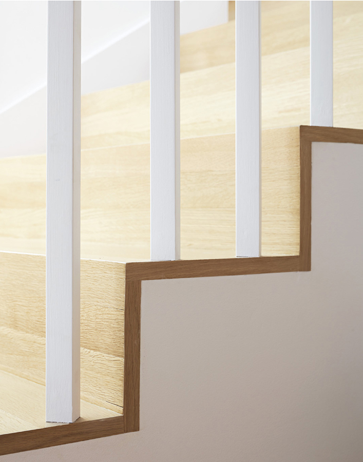
In the open space between our living room and dining area, a round skylight shines a spotlight on the labor of love that is our floor.
A compare and contrast of wood and concrete floors, courtesy of our Topanga floor and the refinished concrete floor at our original store in San Francisco
This process is as light as you can go with your floors without just painting them white, which, of course, is also an option. If your wood floor is just too far gone and, even after sanding, still looks really patchy due to mismatched boards or the like (and you don’t want to start over with a new floor), painting it white with floor paint is a great option.
Depending on your floor and how white and opaque or translucent you want to go, you can also do any combo of what we did with ours: whitewashing the floors and adding a clear coat, for a more translucent, subtler white; or bleaching the floors and adding a clear coat for something more saturated. The “after” will depend on your “before”—if, like us, you are starting with a dark floor, it will take more interventions to get it to a super-light place.
And if, unlike Serena, you don’t care for white, you can add a gray wash, with or without bleach—or go dark, the total opposite direction. In that case, the beauty lies in contrast, so try an ebony stain, or paint your floors black.
A Word About White Floors (and Bad Raps)
White floors have a reputation for showing dirt. But in our experience, the lighter the floor, the easier it is to maintain. As far as dirt and animal hair go: You see it, so you clean it.
That said, white floors are admittedly trickier when it comes to liquids: A drop of coffee or even a water spill can become unsightly if not promptly removed.
Very dark floors tend to show everything, and are trickier to maintain. If your floor color decision is based purely on choosing a hue that hides the most, you are best off with gray.
Refinishing Concrete
If you have an existing concrete floor, either slab on grade (meaning the concrete has been poured directly onto the ground without a crawl space as a separator) or a topping slab, all you need to do to refresh it is to sand and polish the concrete and seal it.
You also have the option to add fades of color to the sealer to create a lighter or darker effect. If you unearthed the concrete beneath another material like tile, it may sometimes contain a “visual memory” or imprint: It’s worth considering retaining this look and simply sealing the surface rather than sanding it.
If All Else Fails
Paint your floor white using floor paint, which is thicker and more durable, as it’s intended for high-traffic areas. Got ugly-looking linoleum? Paint it white. Loud seventies-era tiles that mess with your scheme? Paint them white. You get the gist.
To reveal the concrete floor at General Store in Venice, which we polished and sealed with a clear coat, we first had to remove carpet and tiles glued down with tar.
Here’s a for-instance we get asked about a lot: You’ve ripped your floor apart and discovered that the buck stops with plywood. And you don’t want plywood floors (not that there’s anything wrong with plywood floors, for the record, which we’ll address later on in the chapter).
It can be discouraging to go through the work of tearing apart your floor in search of a diamond in the rough, only to discover that there wasn’t one to begin with—not to mention that the whole thing is going to cost you more money. The upside? This situation presents a certain freedom: the power to choose and invest in exactly what you want, rather than being forced to work with a choice someone else has selected for you.
It’s also an opportunity to dissolve or establish new thresholds in your home—connecting rooms or blending indoors and outdoors by using a cohesive material and color; or introducing a threshold by virtue of a change of material (tile in the entryway, for example, where you ask guests to leave shoes or jackets).
With wood, the choices are abundant. Our favorite is hardwood white oak flooring, which is durable, long-lasting, and on the lighter end of the color spectrum. And though it’s less expensive to work with thinner pieces, our size of choice is four-inch-wide continuous-length boards, because they are more consistent in appearance and less likely to look patchy.
The most common types of hardwood for floors are oak, maple, mahogany, and birch. Visually, there are subtle differences between the four: Mahogany is the darkest; oak, which also leans dark, shows more grain than its alternatives; maple is on the lighter, plainer, more uniform side; and birch is also light, with an inherent geometric pattern to it.
Keep in mind that wood looks dramatically different finished than it does unfinished, and time will alter its appearance. (This is an obvious advantage to using prefinished material, as you can see what it looks like before you install it. The downside is that prefinished wood tends to be engineered and, as a result, less sustainable and reusable.) People often stain wood, but just as we do when we refinish floors, we always prefer a clear coat or treatments that result in a lighter shade. Ask to see samples of aged wood from your carpenter or design professional so that you have a clear understanding of what it will actually look like over time.
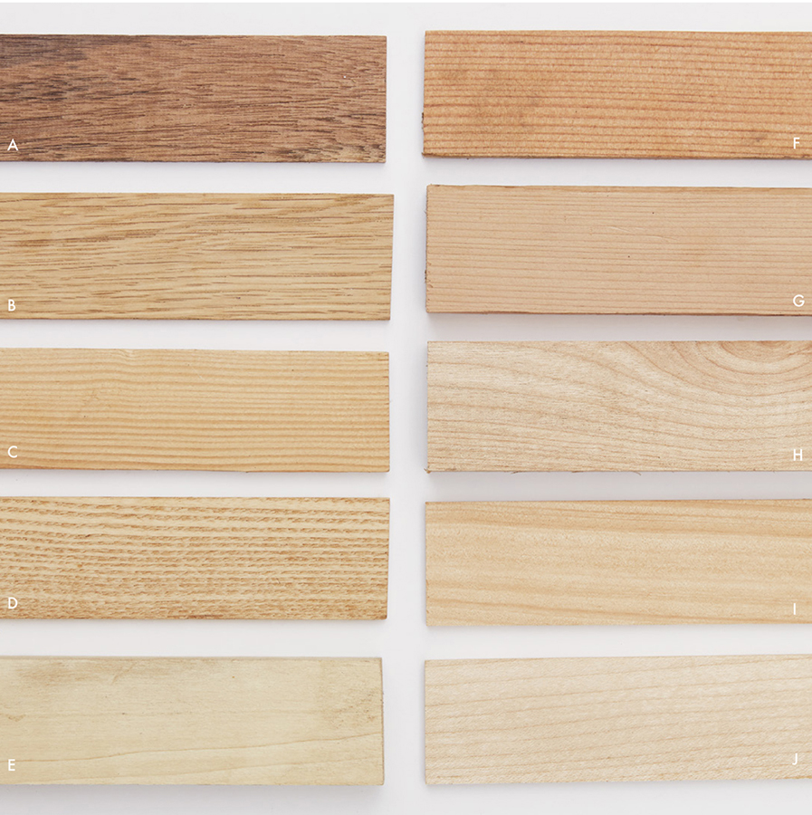
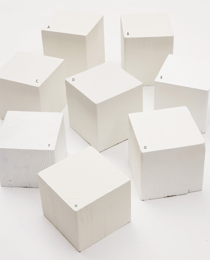
When shopping for hardwood floors, it’s a good idea to wet wood samples with water to see what they will look like when they are finished with a coating. Here, a few of our favorites: (A) mahogany, (B) oak, (C) ash, (D) beech, (E) poplar, (F) fir, (G) redwood, (H) birch, (I) cypress, (J) maple.
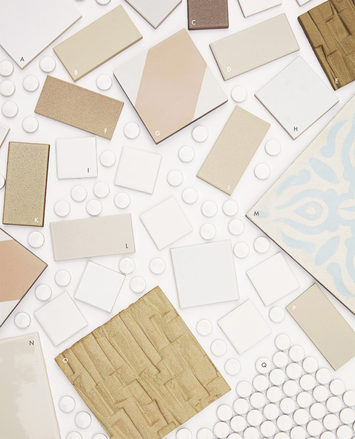
Yes, white grout gets dirty. To fix this, you can use hard-core cleaning chemicals or scrub for days with all-natural hippie products (we use the all-natural hippie products). Another solution? Choose a colored tile with colored grout to match. Here, a few of our favorite tiles across the spectrum: (A) Heath Ceramics 4" × 4" Classic Field Tile, M18 Chalk White; (B) Heath Ceramics, M09 Chamois, Variation 3; (C) Heath Ceramics, M64 Steam, Variation 3; (D) Heath Ceramics, M01 Canvas, Variation 1; (E) Heath Ceramics Stan Bitters Tile, Recycled Clay Natural, Variation 5; (F) Heath Ceramics, M97 Alder, Variation 5; (G) Zia 4" × 4" Bishop Tile, Pink; (H) Heath Ceramics 3" × 3" Classic Field Tile, M18 Chalk White; (I) Merola Tile Boreal Quad, Matte White 2" × 2" (J) Heath Ceramics, M46 Muslin, Variation 2; (K) Heath Ceramics, M61 Barley, Variation 3; (L) Heath Ceramics, M03 Parchment, Variation 5; (M) Badia Design 8" × 8" Hand Painted Moroccan Cement Tile; (N) American Olean 6" × 6" Starting Line Biscuit Gloss; (O) Heath Ceramics Stan Bitters Tile, XN Mixed Clay Natural, Variation 5; (P) Heath Ceramics, NW2 Natural White, Variation 2; (Q) Bliss Penny Round Matte White Tile
Depending on how you do it, putting in new concrete floors can be prohibitively expensive. If your heart is set on this material, we advise a cost-saving approach that involves pouring a topping slab of concrete over the existing floor. This process offers the opportunity to add radiant heating by embedding tubing in the concrete—the most seductive, value-adding kind—an option well worth considering.
Tile
A versatile, water-resistant option for kitchens, bathrooms, entry spaces, and mudrooms, tile can add warmth and texture to a room. As a rule we shy away from bright, graphic tile in larger areas because it can overwhelm a space. Instead, we favor smaller tile, neutral concrete Moroccan tile, and matte white subway tile (an inexpensive, easy-to-install option).
Review your grout preferences with your installer ahead of time: Keep the lines as thin as possible, and match the color closely with the tile to create a seamless, flush appearance. (When you use a contrasting color for grout it emphasizes the grid over the material, which means you’re looking at the grout and not the tile.)
“I like wood to be unfinished, and I love the way that it looks over time when you touch it and it acquires a patina. To protect it, rub on a coating like tung oil that lets the wood breathe and live, as opposed to a coating that seals it.” —MSP
Plywood
A very affordable option for flooring, plywood, if done well, can look very professional (and long-lasting too). Opt for clean-faced fir or maple plywood, which is sanded and finished with a clear coat of paint. You can buy a four-by-eight-foot sheet and have it cut into scalable, dimensional sizes to achieve a more conventional look if desired. Seal it with a low-VOC floor sealer like Bona ClassicSeal, to make sure it lasts.
Upstairs at General Store Venice, we covered the existing subfloor with clean-face Douglas-fir plywood and cut it into 1′ × 8′ strips to create a pattern.
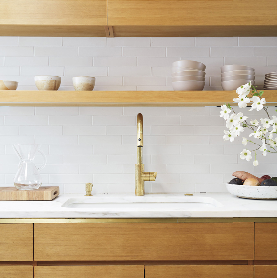
Rather than using a mitered edge on a client’s marble countertop, which creates the illusion of a thicker material, Mason added a brass strip, filling the void between counter and cabinet and incorporating a unique transition between material changes.
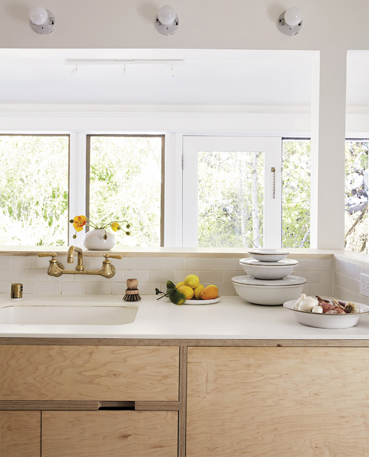
How to solve the problem of counters that don’t look the way you want them to? You can install new ones, of course. Our preferred materials are simple and authentic: marble, hardwood, or concrete. But if you don’t want to go through the time and expense of starting over, you can employ a shortcut: Transform your counter by essentially covering it up. Buy the appropriate-size slabs of marble from a reuse or marble yard (which often has offcuts and remnant piles in standard countertop sizes), or milled wood (sanded and treated with mineral oil) from a lumberyard, cut to size so that it lies flush to your cabinets on top of your existing counters. The effect is akin to an oversize cutting board and can work wonders.
Tile is among the least functional counter materials—it can’t be used as a cutting surface and is hard to clean—so in our San Francisco apartment, we use an oversized cutting board to create a new surface.
For Mason’s Noe Valley clients, marble countertops contrast cabinets with exposed-edge plywood framing and drawers made accessible by kerf-cut handles.
“Swiss Coffee by Behr is the color we have used in our home and in General Store Venice. It’s a warmer white, which complements our scheme, from our eggshell-colored sheets to the light natural wood of our furniture. It’s creamy and mellow on the eyes with slightly yellow-gray undertones, and pretty failsafe.” —SMM
“I use Benjamin Moore’s Super White in my residential projects. We use a 1 base and tint with only titanium white—usually 4 ounces per gallon—which makes for the purest white without any color shift.” —MSP
PAINTING YOUR WALLS, AND FINDING “THE ONE”
There are not as many shades of white as there are stars in the sky. But it can feel that way. If we were to pick a favorite, most versatile (and widely available) hue from the multitude, it would come down to two low-VOC shades: Swiss Coffee by Behr and Super White by Benjamin Moore. Be advised when choosing paint that different brands often have the same name for a color, but every brand has a different formula and so the actual hue will vary. Also, don’t forget to add base. We recommend 4X base of titanium white to achieve the whitest white you can get.
A selection of Serena and Mason’s favorite paints on the white spectrum, with input from our go-to painting expert, Stefan Simikich of Full Spectrum Painting: (A) Swiss Coffee by Behr (used in our Topanga house and General Store Venice), (B) White Dove by Benjamin Moore, (C) Swiss Coffee by Benjamin Moore (used in our Bay Abode rental property), (D) Cloud Cover by Benjamin Moore (used in General Store on Irving Street), (E) Ultra Pure White Gloss by Behr, (F) Chantilly Lace by Benjamin Moore, (G) Ultra Spec Pure 500, 3X Titanium by Benjamin Moore (favored by Mason for his architectural projects), (H) custom blend by Benjamin Moore (used in our Great Highway apartment)
We painted the rock wall surrounding the fireplace with Behr’s Swiss Coffee, and the process was a true test of will. Because rocks are porous, and these rocks happened to be dusty and crumbly, we went through sponges, brushes, and all sorts of other tools before discovering what worked: a thick-bristle brush for dabbing, layering, and getting in the cracks.
When selecting your paint, keep in mind that the fluorescent lighting of the store will differ from your own environment. You won’t truly know what a paint color will look like until it is on the surface in question, so it’s prudent to test a color before committing. And, if you’re going to go to the trouble of testing, it’s best to select a good chunk of a wall—a patch that measures at least a couple of feet in each direction, so that you can really get a sense of it (forget the paint chips or swatches; they won’t do the job). If you’re deciding between colors, paint them right next to each other to see how they compare. In general, we use a flat finish on walls and a semigloss on doors, cabinets, trim, and anything that’s not flat, to protect against dirt and fingerprints and scuffs.
As much as it might be tempting to make a decision in five minutes, give yourself time—at least a few days—to live with the color and witness the way it changes throughout the day so that you can make an informed decision.
And whatever shade you end up choosing, be loyal to it. Avoid the trap of using different shades of white to accent trim, or varying shades of white from room to room. If you hire a painter, he or she may very well try to push you in this direction, but resist: It will compromise the potential benefits of monochromatic white—its calming, peaceful effect, and its ability to make less desirable elements fade into the background.
Make a plan for all architectural elements: If there is a support post in the middle of your space, painting it white is the best way to minimize it. The same applies to kitchen cabinets you’re less than crazy about—choose a finish that will stand up to oil, grease, and all things culinary, like Insl-x Cabinet Coat. Another common element is a fireplace, which tends to be either nicely designed and worth preserving in its original state, or very much the opposite. In our house, for example, the fireplace was an afterthought, cobbled together with leftover B- and C-grade materials to form a crumbling rock wall. Painting it white helped to modernize it and make it less of an unsightly thing. If you are lucky enough to have a beautiful rock or brick wall that’s really elegant and, say, crafted by a master mason, this is a different story. The decision to paint such a feature white is not easily reversible, so make sure you are 100 percent certain before proceeding.
In our Irving Street apartment, we removed contemporary tiles from the fireplace but left the trim: Painting it white softened up the fussy details while preserving its character.
Use new, clean instruments to apply your paint: a roller (a wide one for large spaces and a narrow one for smaller spaces) and brushes (for the details).
Ask to have your paint mixed and shaken at the store, and stir it gently yourself at home before starting.
Buy a separate material-specific primer to use for your base layer if you want your finished result to match the color in the can. (And, if you have a rough surface that needs evening out, hire a professional to apply a skim coat.)
Clean your brushes with hot water, and don’t overload the brush so you can ensure an even application of paint.
Put down a drop cloth and tape the corners. Keep a wet rag or washcloth handy for wiping off drips, cleaning overloaded brushes, or saving any other surface you don’t want paint on.
Finally, while we’re big fans of improvisation as a rule, when it comes to painting it always pays to read the directions on the bucket. (There’s plenty of time for artistic license down the road.)