“COLOR IS MY DAY-LONG OBSESSION, JOY AND TORMENT.”
—Claude Monet
Painter and teacher Josef Albers once said that if you asked a group of people to imagine the color red, every person in that group would have a different hue of red in mind.
Color is elusive. Take that same color, red. A heart is red, but so is a stop sign. It is a color equally capable of arousing pleasure as it is of warning of danger ahead. Across different cultures and religions, red symbolizes feelings and concepts as varied as happiness, bravery, luck, sin, and mourning. There are also psychological effects—seeing red can alternately make us irritable and elicit happiness—and physiological effects—studies have shown that the color red stimulates brain-wave activity, increases heart rate, and causes blood pressure to rise.
The mutability of a single color, with its infinite variations of tint, shade, and tone, and, further, the way it is viewed in relation to its neighboring colors, makes color an effective tool for expressing a variety of moods and emotions. Its nebulous nature also gives way to personal interpretation, as when Van Gogh wrote that he was trying “to express the terrible passions of humanity by means of red and green” in his famous painting The Night Café.
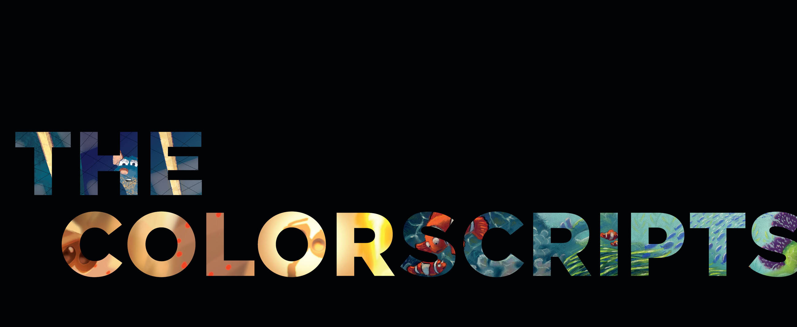
For the artists who create animated films, color is integral in setting the tone of a film and conveying the right atmosphere to support the characters and plot. Few studios have explored its possibilities as the artists at Pixar have, and it all begins with a colorscript.

Ralph Eggleston had spent weeks thinking about the story in Toy Story, Pixar’s first feature film, and discussing its themes with director John Lasseter and other key members of the filmmaking team. In an inspired spurt of a week or so, he painted the colorscript, a roadmap for the way the color (and thus emotion) would be applied throughout the film. The colorscript, which also suggested lighting ideas for scenes, had been undertaken on Eggleston’s own initiative, and he was apprehensive about how it would be received by the crew.
As Eggleston tells the story, Lasseter stood there in silence staring at the colorscript for a minute or two. Then he walked over, threw his arms around Eggleston, and gave him a hug. Eggleston, who was in his late twenties at the time, nearly a full decade younger than Lasseter, had impressed the first-time feature director by giving him a new way of seeing the film. “It was a highlight of my life,” Eggleston said. “He was in another world. Honestly, it was thrilling, because he could begin to see the whole movie.”
Lasseter spread the word around the studio, and soon everybody was popping into Eggleston’s office for a look. One Saturday morning after having pulled an all-nighter at the studio, Eggleston returned to his office, freshly showered, to find a stranger looking at the colorscript. The scruffy, bearded man, dressed in a dowdy jacket, blue corduroy shorts, and socks pulled up to his knees, was studying the script intently. “I said, ‘Umm, can I help you?’ And he goes, ‘Oh, I’m sorry, is this your office?’ It was a little awkward because he thought I knew who he was and I didn’t,” Eggleston recalled. “And then he said, ‘Oh, my name’s Steve Jobs.’” The resoundingly successful reception of Eggleston’s work, which had originally been just another piece of exploratory art, cemented the colorscript as a cornerstone of the production design process at Pixar.
Prior to Pixar, no animation studio consistently mapped out color and lighting in relation to story and character through a formal colorscripting phase. The process, however, is more than seventy years old, having begun with the early 1940s Disney animated features. The artistic choreography of certain musical sequences in Fantasia, like “Toccata and Fugue” and “Nutcracker Suite,” required dozens of color conceptual sketches that effectively served as colorscripts for those sequences. Later, the production design by Tyrus Wong for Bambi advanced the use of color further. Wong’s evocative inspirational artwork added an emotional dimension to color and aimed to “create the atmosphere, the feeling of the forest,” instead of the largely literal and utilitarian expression of color in the earlier full-length Disney features.
A similar colorscripting process was employed in Hollywood’s live-action films beginning in the mid-’30s when Natalie Kalmus, the former wife of Technicolor founder Herbert Kalmus, supervised Technicolor’s color-control department. As part of her duties, she and a group of consultants would create “color charts” for live-action features after analyzing the script to “ascertain what dominant mood or emotion is to be expressed.” The comprehensive charts account for every scene, set, sequence, and character in a film. “This chart may be compared to a musical score, and amplifies the picture in a similar manner,” Kalmus wrote in a film industry journal.
The idea of presenting an entire animated film’s color structure in a single piece of artwork didn’t fully materialize until the films made at United Productions of America, the modernist animation studio that revolutionized the design and content of Hollywood animation. Building upon the Disney process, and employing many artists who had worked there, UPA created “color continuity sketches” for their films beginning in the mid-’40s. The studio’s color continuity sketches most closely resemble Pixar’s colorscripts in their goal of conveying the sweeping, panoramic flow of color throughout a film’s span. The biggest difference between the UPA and Pixar colorscripts is length; UPA’s shorts were between six and eight minutes long, and Pixar’s features are upward of ninety minutes.
The modern resurgence of the colorscript may be traced again to Disney, and one artist in particular, Richard Vander Wende. When Vander Wende painted a colorscript for Aladdin, he had never before seen one. His inspirations were a series of color keys that Eyvind Earle had drawn for a romantic nighttime scene in Lady and the Tramp, as well as color bars [an abstract cousin of the colorscript] that had been painted for Beauty & the Beast, which was in production at the same time as Aladdin. On a single piece of 81/2-by-11-inch paper, Vander Wende painted a couple of dozen thumbnail-sized gouache paintings capturing scenes from the entire film. “I painted it small so I could get it done quickly, as there were always more design decisions to be made than I had time for,” he said.
There is enduring ambiguity about what constitutes a colorscript in animation or at what stage in the pre-production process it should be done, with as many versions of the process as there are artists who create them. Even the term colorscript has only recently become canonized, and that is largely due to Pixar’s amplification of its role in their filmmaking process.
Directors, in particular, like colorscripts. For the first time in the production, they are able to see their entire film in color, in one place, on a single board. Seeing things in one place is a rare event in the fragmented computer-animated filmmaking process. The goal for both the director and colorscript artist, however, isn’t to dress scenes in the prettiest or most harmonious color combinations, as Eggleston made clear while describing his relationship with Andrew Stanton, the director of Finding Nemo and WALL•E. “What I really like about working with Andrew is that he doesn’t care about the specifics of the color too soon. It’s ‘What’s the story and is this feeling right for the story?’ And if he sees something odd, he goes, ‘What’s going on in the story there?’ He doesn’t ask, ‘What’s that color?’ And that’s heaven to me, because that’s all I want to try and focus on. It’s all about the story; it’s all about the characters. If you stay focused on those things and you’re in tune with the director, then you can actually make anything work and make anything happen.”
Colorscripts evolve in an organic manner as directors and production designers refine their thinking about a film. While developing a sequence in Up, in which we see Carl as a young man, enjoying married life with his wife, Ellie, lighting art director Lou Romano and production designer Ricky Nierva envisioned draping the sequence in nostalgic sepia tones. After seeing the colorscript, John Lasseter, who executive produced the film, suggested a different approach; instead of desaturation, those scenes should be as vibrant “as when you first fall in love.” This kernel helped establish the color framework for the rest of the film, while reinforcing the dramatic arc of the story. After Ellie’s death, Carl’s world becomes dark and gloomy. Color is slowly reintroduced in the form of the balloons that lift him into the sky, Russell and his rainbow sash of Wilderness Explorer merit badges, and Kevin, the colorful bird of Paradise Falls. Magenta, which is Ellie’s color, remains absent from the film until Carl reaches Paradise Falls.
The idea for colorscripting an entire feature fermented in Eggleston’s mind long before he was hired as Pixar’s first art director in 1992. An animator by training, Eggleston had helped art direct an early-1990s animated feature, Fern Gully. During a particularly tight production crunch, the filmmakers needed a couple of hundred background color key paintings from Eggleston, and he had exactly three days to paint them. Realizing the impracticality of the deadline, he decided to make quick-and-dirty pastel drawings on thin horizontal strips of paper that would convey the colors for multiple scenes in broad strokes. Eggleston indicated general ranges of color in a linear progression, giving the background painters who followed him a guide for arranging their palettes.
By the time Eggleston was ready to begin his colorscript for Toy Story, he had also seen Vander Wende’s colorscript for Aladdin in a “making of” book about the film. That artwork validated his own approach on Fern Gully, opening the door for expansion of a technique that he’d originally conceived in desperation.
The colorscript, Eggleston feels, is akin to composing a symphony, which is comparable to Kalmus’s assertion that the color chart is like a musical score. And like a composer who arouses aural interest through variations of tempo, rhythm, and instrumentation, Eggleston heightens the emotions in a film by varying his color palettes. In Finding Nemo, as Marlin and Dory descend into the murky depths of the ocean, Eggleston shifts to an increasingly minimalist and ominous palette—a graphic intensification of Marlin’s neuroses. He will often choose a piece of music to listen to while drawing the colorscript—a composition unrelated to the film except that it captures the moods he’s trying to convey. For Finding Nemo, he listened to George Solti conducting the Chicago Symphony Orchestra’s performance of Liszt’s “Faust Symphony.” Albert Roussel’s ballet score Bacchus and Ariadne served as a source of inspiration for another colorscript.
Bill Cone, the artist charged with creating the colorscript for A Bug’s Life, the studio’s second feature, had a tough act to follow, and not only because Eggleston’s Toy Story colorscript set such a high bar. Prior to joining Pixar, Cone had spent the better part of a decade creating editorial illustrations on the staff of the San Francisco Chronicle. Most of his work appeared in black and white, and he had only occasionally done color illustrations.
During the production of Toy Story, Cone was hired by Eggleston to work in the art department, where he drew sketches and made paintings of key locations, like Andy and Sid’s homes and Pizza Planet. The studio was operating on such a shoestring budget in those days that Cone would be hired for a few weeks, laid off, and then rehired.
The color work he had done up to that point had been almost exclusively in gouache and acrylic, but for A Bug’s Life he aspired to recreate the pastel look of Eggleston’s colorscript, which he felt was a masterful accomplishment. “It literally lit this fire,” Cone said. “I wanted to do one of those. If I ever wanted to get better at color, what could be a more interesting, rewarding field of study than to do a colorscript for a feature film?”
He struggled at first, especially when he tried to recreate the soft gradients that Eggleston achieved so gracefully, and found it difficult to mimic Eggleston’s idiosyncratic style of drawing with pastels on black paper. “I never put down enough color, so my colors were dying against the black,” Cone recalled. “Then, John [Lasseter] would say, ‘I love color. Give me color. Make it brighter.’”
Cone worked tirelessly to improve his command of the technique. During lunch breaks, he would take bike rides with other Pixar crew along the shoreline of San Francisco Bay, and he’d whip the pastels out of his daypack to paint quick studies of the ever-shifting sunlight and its impact on the natural environment. “I became more aware of how dynamic and complex nature is. It began to affect how I felt about light, and how to describe it. How to get the sense of the way light from the sky illuminates the world even when you can’t see sun, or to understand the nature of shadows. I think I became more sensitive about how to use these effects in film, which was of great value for my work. I went out to explore nature and get away from work, but what I learned came back to work with me.”
Whereas a colorscript by Eggleston will usually have a theatrical quality of color, in the tradition of earlier animation production designers like Mary Blair and Maurice Noble, Cone found his authentic voice and style in the world of natural light. One of his earlier pieces of development artwork on A Bug’s Life, which went a long way toward convincing Lasseter to make Cone the film’s production designer, was a quick marker and colored pencil sketch on tracing paper that showed ants walking across a “leaf bridge,” their bodies silhouetted behind the translucent leaves. The unique way that light interacts with nature, such as creating translucency in certain objects, informed Cone’s approach to color and gave him “a lot of confidence about how to think on that movie.”
Cone discovered that sometimes a scene’s strength is derived not from how many colors are added but from how many are subtracted. During A Bug’s Life, Cone and Sharon Calahan, lighting director of photography, were inspired by a menacing fog scene in Federico Fellini’s Amarcord and wanted to emulate the stark atmosphere of those shots in a scene where the grasshoppers return to menace the ant colony. Sucking the color out of a sequence wasn’t an easy idea to sell to Lasseter, though. “John has some things that he’s very consistent about,” Cone explained. “One is he tends to love or push saturation and just take pleasure in it. And so sometimes I’m trying to pull him away from that or create a better dynamic so it’s not just up all the time.” As Cone pondered how to present the fog sequence colorscripts, the crew watched a nature documentary about insects, and, as luck would have it, there was a fog scene in that film, too. Walking out of the screening, Lasseter remarked to Cone, “Did you see the fog?” Cone seized the moment and rushed Lasseter into his office to show him his own fog studies.
Bill Cone also did colorscripts for Toy Story 2, along with Jim Pearson, but his most triumphant turn came as the production designer of Cars. By the time Cone began working on Cars, he had become a dedicated plein air painter outside of the studio, and he relished the idea of exploring color and lighting possibilities for a film set in the majestic expanse of the Southwest. Even when the palette was limited, as in the film’s numerous night scenes, he found opportunities for color. The pitch-black darkness when Lightning McQueen barrels through Radiator Springs chased by Sheriff is lit with the tense orangish-yellow glow of the streetlights and the turquoise fluorescence of Flo’s V8 Cafe, whereas the cool blue moonlit sky of Lightning and Mater’s tractor-tipping escapades conveys a relaxed and light-hearted mood. The jubilant atmosphere of Radiator Springs with all its neon lights flipped on brings out yet another facet of nighttime. “This was some of the funnest stuff I did,” Cone said. “It’s night, but it’s the night I want it to be.”
Although its function remains consistent, there is no single correct way for producing a colorscript. Harley Jessup conjured up his own “nutty version” for Ratatouille. Jessup is a born experimenter and learned about color by working with backlit papers and theatrical gels on earlier cut-out animated films. On Ratatouille he worked small, creating a series of cut-out style illustrations that graphically showed the color for the sets. For the rat character palette, he gathered bunches of dyed yarns, arranging them onto black card stock to create a range of stylized fur colors from violet-gray to cinnamon. Jessup resists following established color patterns—for example, the use of red to evoke danger or evil. Color schemes should “grow out of what the mood needs to be and the natural colors of that setting,” Jessup explained. “Sometimes the climax could be black and white or it could be colored very cool, and still get across the sort of climactic emotions that you’re supposed to be feeling.”
“Harley has good taste,” Cone said. “He manages to make it look good without going overboard in terms of effect or expression, just playful and lovely designs.” Jessup, like Cone, never anticipated winding up in animation. While earning a master’s degree in graphic design from Stanford, he created a typographically oriented animated short that showed words arguing with one another. The piece caught the eye of Oscar-winning Bay Area filmmaker John Korty, who hired Jessup to work on a series of Sesame Street segments and made him the art director on a quirky cut-out animated feature called Twice Upon a Time. He later became a visual effects art director at Industrial Light and Magic, where he worked on films like Innerspace, Ghostbusters II, and The Hunt for Red October, before ending up as production designer of the stopmotion/live-action feature James and the Giant Peach. It was there that he met Joe Ranft, who brought him to Pixar.
When Jessup joined Pixar in 1996, he drew upon a wealth of production design experience and discovered similarities to his earlier work. “I think there are definite correlations between computer animation and live-action,” Jessup said as he described the complex lighting and cinematographic decisions involved in both mediums. “Everything about CG animated features is still pretty new, but as in live-action films where color is concerned, there is a really close collaboration between the production designer and the director of photography.”
For Jessup’s two most recent films, Ratatouille and Cars 2, Sharon Calahan created the master lighting studies (a more detailed version of the colorscript that communicates specific lighting and color instructions for individual scenes). Typically, the master lighting studies are created by the art director or production designer, but Jessup works differently with Calahan: “Like a great live-action cinematographer, Sharon has a crystal clear vision for the lighting design on the films we’ve done together. We work hard at the beginning of the process to trade ideas and watch films together, and we feel completely on the same wavelength by the time the film is in production. Sharon is an excellent painter and has a wonderful sense of color besides her brilliant lighting talent. My goal is to design a world that is sculpturally interesting as well as being beautifully colored and textured. We try to give the lighting team something strong to work with, so I’ll always be designing with the lighted scenes in mind.”
Jessup’s discerning taste as a designer is reflected in the way he sets up universal color relationships that exploit contrasts and heighten tensions inherent in the stories. On Monsters, Inc., he teamed with art director Dominique Louis and lighting director Jean-Claude Kalache to explore the visual contradictions between a drably colored, workaday industrial town setting and its population of bright, candy-colored monsters straight out of a child’s imagination. In Ratatouille, Jessup and Calahan fashioned a coolly colored underground rat world against the warm, rich tones of the human world. Jessup explained, “This color dynamic supported the idea that the rats are always on the outside looking in and made Remy’s yearning to be part of the human world even more understandable.”
More recently, Pixar has turned to a younger generation of artists to create colorscripts: Lou Romano (b. 1972) created the colorscripts for The Incredibles and Up, while Dice Tsutsumi (b. 1974) was responsible for scripting Toy Story 3. Romano was a natural choice to create the colorscripts for The Incredibles. His first job in visual development had been on Ray Gunn, an unmade film that The Incredibles director Brad Bird had developed in the mid-’90s. Later, Romano helped Bird create pitch artwork for The Incredibles while he was still working on The Iron Giant.
Romano created three very different versions of the colorscript for The Incredibles, each distinct in style and tone, before he considered the job to be finished. The evolution of his thought process is fascinating to see. His first script, from 2000, was painted in gouache and is a fairly static representation of individual settings and characters. The transitional colorscript was created with a combination of gouache and digital illustration. The sixty horizontal panels contain multiple scenes, reflecting how the story has been fleshed out in the intervening years. His saturated palette is joyous, its tone almost too happy for the story being told. The final colorscript, finished in 2004, was drawn digitally into the computer, a first at Pixar. Romano’s assertively large fields of solid color unveil a superheroic Matisse. Juxtaposed against punchy colors are stark areas of black and white. His riveting, high-contrast approach to color, which were faithfully recreated in the film to the extent that computer animation allows, reinforces the adventurous and dramatic elements of the story in pure color.
The colorscript for Toy Story 3 painted by Tokyo-born artist Dice Tsutsumi follows in the painterly footsteps of Bill Cone, albeit painted digitally. Tsutsumi’s first job out of the School of Visual Arts was at Lucas Learning, during which time he saw a lecture by Bill Cone about colorscripting. “I became interested in colorscripting after seeing Bill’s work,” Tsutsumi said. “His attention to light and color has influenced me more than anyone in the business.”
Prior to arriving at Pixar, Tsutsumi worked at Blue Sky Studios on the East Coast. The colorscript he created for Horton Hears a Who! is among the more unconventional examples of the form. Tsutsumi infused certain colors with meaning specific only to the film. So, pink became the unlikely embodiment of devastation, and during Horton’s climactic third act, the entire palette is driven by pink, magenta, and violet before shifting to yellow (a complementary color to the others) as the film reaches its happy resolution.
Tsutsumi continued this unique approach of associating emotions with specific colors when he began working at Pixar. In Toy Story 3, the color blue has special significance. The film’s director Lee Unkrich explained, “We came up with the concept of blue connoting safety and home. At the beginning of the film, Andy . . . his bedroom is blue, the sky is blue, his T-shirt is blue. He is in blue jeans, he’s got a blue car—these are not accidents. These are conscious choices. Everything in the movie is there for a reason. We are making a commitment to say that blue will connote safety and trying to avoid that in situations where we don’t want the audience to feel safe.”
The manner in which Tsutsumi combines rigorous studies of painterly light with an emotional application of color suggests a melding of the styles of Cone and Eggleston. He acknowledges the influence of Eggleston’s colorscripts on his own process. “When I studied Toy Story to learn more about what was done on the original film, I could not believe how much thinking went into Ralph’s colorscript. His scripts are about cinematic thinking, and made me consider more than just painting. I turned to his approach when I made my Toy Story 3 colorscript.”
Colorscripts can be painted in a multitude of formats and styles, but there is one tenet that every artist agrees on: “Colorscripting is not about how well you can paint,” Tsutsumi said. “Your job is not to make beautiful pictures. It’s about how you can support the story with these images and lighting concepts.” Which is an alarming thought: if these colorscripts represent the caliber of work that these artists create when they’re not trying to make beautiful pictures, imagine what they can do when they’re actually trying.