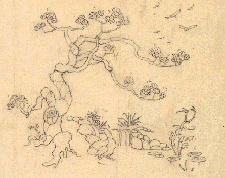
Poems of Wood and Light
“Every great architect is — necessarily — a great poet. He must be a great original interpreter of his time, his day, his age.”
FRANK LLOYD WRIGHT
God is in the details.” These words are often attributed to modernist architect Ludwig Mies van der Rohe though it is unclear if he ever actually spoke them.1 This fact hardly matters, however. The brilliantly brief phrase conveys to the listener an instantly understood, if previously unrealized, meaning: we get to the beauty of something by delving beyond the surface. That this concept is ascribed to a modernist, to the man who said, “Less is more” is intriguing. Architecture of the Modernist Movement is typically austere, minimalist. One tends to think of such designs not in terms of details but rather form. Practitioners of modernism, however, are no different from designers before and since in this regard: details are critical.2
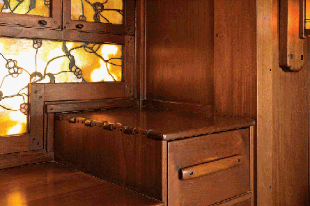
Afternoon sun through art glass windows throws a wonderful light and makes the silky mahogany glow. Detail, dining room server, 1908-09, David B. Gamble house, Pasadena, 1907-09.
It might seem that modernism has little to do with the work of Greene & Greene. The Arts & Crafts movement was decidedly anti-modern. It was, in part, a rejection of the industrial age, whereas modernism was conceived as an architecture for the industrial age. Despite this apparent diametric opposition, there are sympathetic aspects to the movements. Recall that Arts & Crafts was also a repudiation of the overly ornate characteristics of the Victorian era, a move toward more honestly expressed construction with less adornment. A philosophy of less is more, if you will. One must be careful not to carry such analogy too far as clearly the reigning attitudes of the two schools were vastly dissimilar but it is an interesting line of inquiry.3
Of course, the modernist notion of architecture as transcending regional identity is completely antithetical to the work of Greene & Greene, whose houses were heavily influenced by their locale. It is also the case that the Greenes were highly aware of the people who would inhabit their buildings. No one-size-fits-all solution could have held any appeal for them. Despite the allure of Arts & Crafts for its emphasis on natural materials, honest construction and simple forms, modernism won, at least for a time. It made Arts & Crafts seem irrelevant and anachronistic, a throwback to the era of horses and buggies at a time when automobiles were screaming about the countryside.
Putting aside differences and similarities between these movements, “God is in the details” applies as well, perhaps, to the Greenes’ designs as to any others. Details define Greene & Greene. As Morgan Yost noted, “The time spent by the brothers on each of their later jobs must have been enormous. Every detail was obviously supervised in execution after having been individually designed.”4 Thus, to understand the work of Charles and Henry Greene, one must gain an appreciation for the details that appear in their work and the extraordinary effort devoted to them.
To gain this appreciation, this understanding, a degree of deconstruction is required. However, deconstructing a masterpiece is likely to be less than completely satisfying. We can describe the component parts, but any such narrative is sure to be incomplete — a work of genius is always more than the sum of its parts. But because those parts are essential, even a partial understanding of them, of the design vocabulary, is valuable.
The Greene & Greene design vocabulary is rich and varied with a number of well-recognized elements. Among the best known are cloud lifts, ebony pegs and breadboard ends. Lifts and pegs, in particular, have been the subject of countless words — and rightly so. They are beautiful and essential to the look. There are other elements, however, that are equally important but less widely known. These include finger joints, tsuba shapes (a tsuba is a Japanese sword guard), carvings, shop-made handles and pulls, and intricate inlays. All contribute significantly to the signature style.
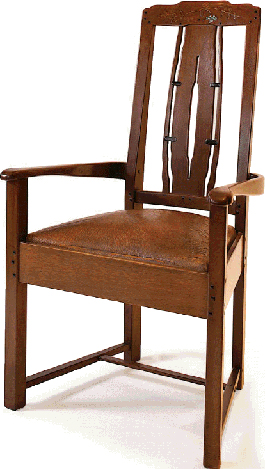
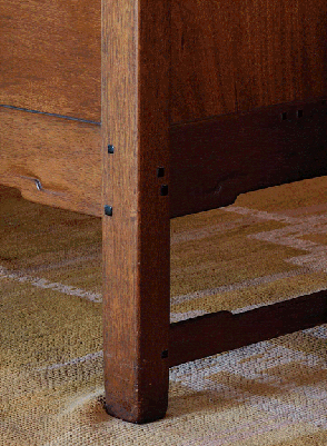
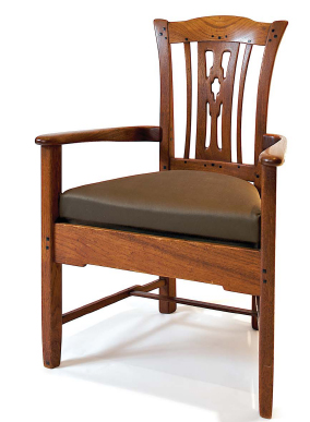
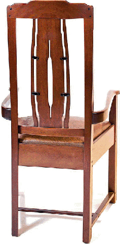
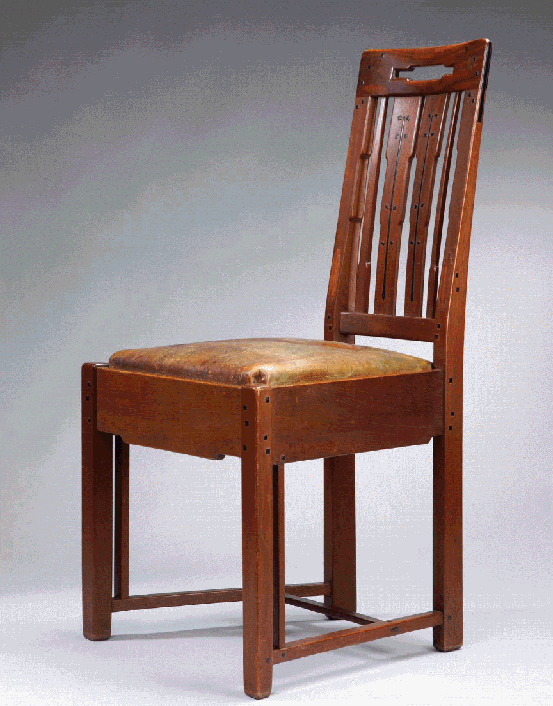
Flawless in design and execution. Dining room armchair, 1909-10, William R. Thorsen house, Berkeley, 1908-10.
Greene & Greene were obsessive in their pursuit of detail nirvana. They would expend thought, effort and their clients’ money on elements that few but the servants would ever see. The backs of cabinets are prepared and finished with the same care as the fronts.5 The most trivial features were designed by the architects rather than allocated from the parts bin. Doors and windows were designed anew for each commission. Furniture, interiors and structures were equal recipients of this attention.
There is, in effect, no distinction between furniture and woodwork. The woodwork and built-ins are so beautiful in design, execution and materials that they are elevated to the level of the best furniture. It’s as if the rooms themselves are exquisite furnishings. That furniture and architectural details share common elements serves to enhance the effect. In fact, every piece of furniture was designed to occupy a particular place in a particular room, and each was a unique creation. There was no need for general designs that could fit into many settings. This fact allowed for a unity of design that has seldom been seen before or since. The same device, repetition of design elements, was also used to unify interiors and exteriors, a practice for which Greene & Greene were pioneers.
In the final analysis, it’s impossible to express a formula for a well-designed Greene & Greene piece. Adequate evidence for this claim exists in the form of very poor imitations. Even many “reproductions” are lacking. Though the style is hard to define, there are some adjectives that begin to capture the feel. Graceful is the first that comes to mind. This derives from the scale and proportion of the pieces but also from the easy interplay of components. Nothing seems forced or overdone. It is said that a good melody is inevitable. So it is with Greene & Greene furniture. What to add or remove to improve a piece? The answer is nothing. It’s difficult to imagine it any other way.
This piece was designed for a small alcove where the back would never be seen, and yet the finish and detailing are perfect. Living room bookcase, 1908-09, Robert R. Blacker house, Pasadena, 1907-09.
Which brings us back to obsession; devotion to even the most trivial details. It’s part of the Greene & Greene mystique. It’s part of the Greene & Greene genius. It’s part of the reason Greene & Greene continue to be relevant after more than 100 years.
This inlay, closer to work for the Pratts than the Gambles, demonstrates how well and how quickly Charles Greene mastered this craft. Detail drawing, living room letter box, 1914, David B. Gamble house.
Unifying Themes
“The furnishings and gardens were their province in the later houses for the wealthier clients and they produced a unity that has never been surpassed.”6 This quote, by Morgan Yost in 1950, succinctly expresses one of the most important aspects of Greene & Greene design, the nearly total unification of every aspect of a project: exterior, interior, furniture, furnishings and landscape.
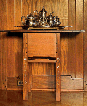
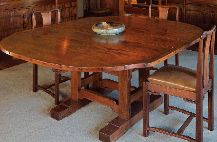
Attention to detail defined by example. One wonders if David and Mary Gamble ever saw these ebony pins. Detail, dining room table, 1908-09, David B. Gamble house, Pasadena, 1907-09.
Every piece of furniture was designed for a particular place in a particular room. The lifts on this table mirror the woodwork below. Dining room serving table, 1908-09, Robert R. Blacker house, Pasadena, 1907-09.
The Robert Blacker house is certainly one of the “later houses” to which Yost refers. In the dining room in that house, there are two small serving tables of the same design, a design that duplicates, in reduced scale, the dining table. The bottom stretchers of the tables include a pair of lift details symmetric about the center. Amazingly, the moldings on the wall behind the tables duplicate this lift element.
In a Greene & Greene home, it can be difficult to determine exactly where interior woodwork ends and furniture begins. Materials and execution are similarly beautiful, common themes serve to enhance the effect. The only practical difference is that the furniture can be moved. Or can it? Recall that each object was designed for a specific position, information that was sometimes included on original drawings. There were no generic forms designed to fit into many settings. This allowed for, even promoted, commonality of design, as dictating the position of a piece allowed the architects to fully integrate their creation.7
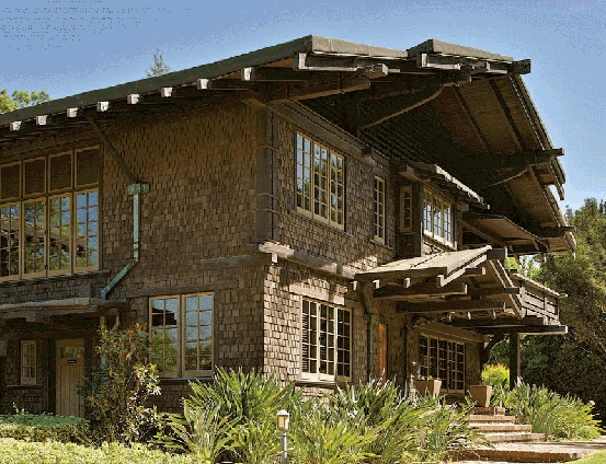
John Ruskin described “unity of feeling” as “the first principle of good taste … the basis of all grace, the essence of all beauty.”8 He argued that a building must be true to itself and to its location and purpose. It is no great leap of logic to extend this reasoning to the furniture and other decorative objects in a house, to expect that the furnishings are true to the building, their location and purpose, to expect that the interior is in harmony with the exterior. Greene & Greene excelled at using common themes to unite interior with exterior, blurring the distinction between indoors and out. One example, a trademark feature common in many Greene & Greene exteriors, are wide eaves that overhang a house’s walls. Many pieces of furniture mirror this trait with dramatic overhangs that are one of the defining features of the Greenes’ style. Examples such as the Gamble entry hall table and the Freeman Ford server, both iconic pieces, beautifully illustrate the thesis. The Ford server is, in fact, defined by the wonderfully exaggerated overhang at each end.
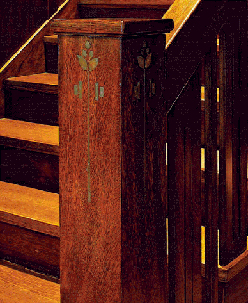
Scrolls are a recurring theme in the entry hall, even carrying over to beam ends on the patio. Detail, hall stairs, Robert R. Blacker house.
A different scroll form is found on much of the furniture in the hall and less prominently on the stairs. Detail, hall plant stand, 1908-09, Robert R. Blacker house.
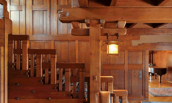
Two less widespread examples, each from one of the Ultimate Bungalows, further illustrate this wonderful aspect of the work of Greene & Greene. Chinese cloud scroll patterns are a recurring theme in the entry hall of the Robert R. Blacker house. They appear on the legs of each of the many pieces of furniture. They appear on the top surface of at least one piece of furniture. And they appear on the ends of large, overhead beams that span much of this impressive space. These beams pass through the rear wall of the room, terminating on the patio at the back of the house, where each supports a copper and art glass lantern. Above each lantern, on the exterior end of the beam, is a scroll mirroring that found on the interior end. The effect, despite the simplicity of the device, is the feeling that each element works with every other. The scrolls do not accomplish this task alone, but they certainly amplify the effect.
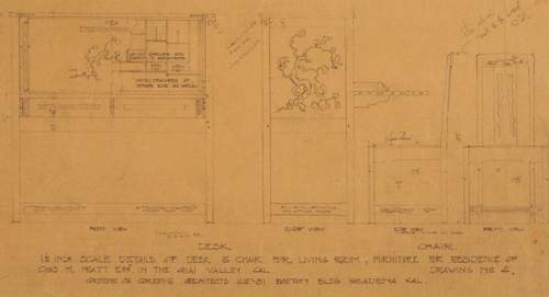
Notations on this drawing provide insight into the working relationship between architects and craftsmen. Drawing, living-room desk, c. 1912, Charles M. Pratt house, Ojai, 1908-10.
The Blacker house was the second of the Ultimate Bungalows, the William R. Thorsen house, constructed in Berkeley in 1909-1910, was the last. One of the astounding facts about the Ultimate Bungalows is how little they have in common. To be sure, there are stylistic similarities — present are many of the most identifiable elements of the Greene & Greene style — but each is a new and distinct plan, a fresh design from the ground up. The Thorsen house, an urban mansion, contained fewer visible interior beams than some of its predecessors but included a large quantity of exquisite teak and mahogany trim and built-ins that are the rival of any designed by the brothers. The west-facing house, when built, had spectacular views of the San Francisco Bay, a nod to William Thorsen’s maritime interests. Continuing the nautical theme, the living room and two bedrooms each have a wall that forms an obtuse angle, giving the impression of a ship’s prow. In the living room, “At the V-end can be seen the massive redwood beam which extends through to support the porch roof. This is another indoor-outdoor motif used to break down the barrier of the separating wall and one which they used many times.”9 Completing the theme, the redwood beam resembles the bowsprit extending from the bow of a sailing ship, as if to lead the house on a sail through the Golden Gate.
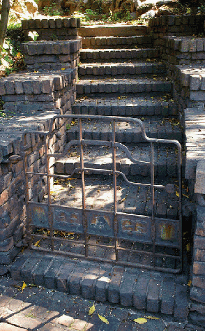
The nautical theme at the Thorsen house continues all the way to the sidewalk. Gate, 1908-10, William R. Thorsen house, Berkeley, 1908-10.
Some themes recur throughout an interior. The primary motif in the David B. Gamble house is the mokko-gata tsuba form (see the section on tsuba). This lobed shape is ubiquitous in the Gamble dining room, appearing in art glass, chair backs and, most significantly, the dining table top. The shape is carried throughout the house via the switch plates. It appears famously in inlays in the furniture in Mr. and Mrs. Gamble’s bedroom. In the living room, there are mokko-gata ebony pegs on the library table drawer pulls, which themselves include the shape. In the first floor guest bedroom the profile is recalled in the metal frames of the custom-made beds.
The dining table and chairs for the Laurabelle Robinson house marked a turning point in Greene & Greene furniture designs, a move toward more elegant, less severe forms with more refined ornamental elements. The chairs, based on a Chinese Ming dynasty design, are particularly graceful, the reverse-arched crest rail and arms defining the piece. That concave rail/arm shape is an unusual element that is repeated in the arms of some living room furniture. The backs of the living room sofas also repeat the rectilinear shape of rails used, in various forms, in doors, both interior and exterior, throughout the house.
Even without the unifying features highlighted here, further evidence of the obsessive attention to detail that is a hallmark of their work, Greene & Greene houses would be considered, without question, at the highest level of American architecture and design. What the unifying themes provide is the additional touch, the je ne sais quoi that convinces one, perhaps subliminally, that they are in the presence of genius.
Ebony Pegs
Greene & Greene furniture is distinguished by a number of details: lift elements, breadboard ends, small reveals where components meet, broad overhangs, sinuous surfaces; the list is long. Perhaps the most iconic element of all, however, is the ebony peg. From the earliest pieces, Greene & Greene incorporated pegs in their work. Initially, they were round and made of oak, ash or other woods similar to the primary woods of the furniture. The square ebony peg first appeared in furniture for the Dr. William T. Bolton house (1906).10
Not long after first employing the material as ornament, Greene & Greene became expert in the use of ebony. Detail, dining room chair, 1908-09, Robert R. Blacker house, Pasadena, 1907-09.
By the time the Greenes began using ebony pegs11 in their furniture, the primary wood was typically, though not always, mahogany. The deep black luster of the highly polished ebony pegs is set off wonderfully by the satin finish of that reddish-brown wood. The use of ebony is by no means limited to square pegs. Ebony splines often decorate the joint between the breadboard ends and a tabletop and more whimsically shaped pieces were used in some furniture, such as concave diamonds in chairs for the Freeman Ford house. In most cases the peg surface is pillowed and protrudes slightly from the member that contains it.
Though in some cases pegs are purely decorative, in many instances they hide a screw that reinforces a joint or attaches a breadboard. Some might assert that a purely decorative peg runs counter to the Arts & Crafts philosophy that argues for largely functional forms. It is certainly true that many of the Greenes’ furniture designs are less austere, more ornamented than the designs of most of their contemporaries, but we should note that even Gustav Stickley pieces included inlays that served no purpose other than decoration.
Most woodworkers who have attempted to make a piece in the Greene & Greene style have struggled with the question of how to cut mortises for ebony pegs so that they are accurately sized and square to the piece. While no consensus exists — there are nearly as many solutions to this problem as there are woodworkers working in that style — Darrell Peart provides a very helpful discussion in his book on the topic of Greene & Greene details for woodworkers.12 It is interesting for anyone who has confronted this dilemma to see the original pieces. Many of the pegs are not quite square, they are very slightly angled either side of vertical. We will likely never know if this was born of the expediency necessary in a commercial workshop or if it was a conscious decision made to give the arrangements of pegs a more natural, less formal feel.
Greene & Greene continued to use ebony pegs in their furniture designs for only a brief time. Pegs are present throughout the period of the Ultimate Bungalows including a desk constructed for the Gamble house living room around 1914, much after other furniture for that house. At about the same time, the Greenes were designing furniture for the Cordelia Culbertson house. Furniture for that house is quite distinct from earlier forms and ebony pegs are largely, though not entirely, absent and ebony does appear around the perimeters of doors and drawers for some pieces.13 Many would agree that the use of the ebony peg reached its zenith quite early on, in chairs for the living room of the Robert R. Blacker house.14 Pegs at each end of the crest rails on those pieces seem to dance due to their varied sizes and wonderful arrangement.
A difficult material to work because it is brittle, ebony’s use as accents are quite playful. Detail, dining-room chair, c. 1908, Charles S. Greene.
Designed after other Gamble pieces, this desk has a sleeker look. Detail, living room desk, 1914, David B. Gamble house, Pasadena, 1907-09.
Cloud Lifts
If ebony pegs are the most recognizable element of Greene & Greene furniture, then certainly cloud lifts are a close second. The cloud lift, a rise in a horizontal element such as a stretcher or apron, is a Chinese form, appearing for centuries in furniture from that country. It was first employed by Greene & Greene in furniture and decorative arts for the Adelaide Tichenor house (1904). One sure way to create a Greene-inspired piece of furniture is to design a rather generic form and then adorn it with pegs and lifts. Many lackluster (or worse) commercially available results attest to just this inclination. This fact reveals several truths. First, Greene & Greene were extremely sensitive in their use of the details in their design vocabulary. In their furniture, nothing seems superfluous or out of place. The details relate to one another, they are part of a cohesive whole rather than a collection of disparate elements. This, of course, is true at the meta-level as well: the elements in a house could be described in the same way.
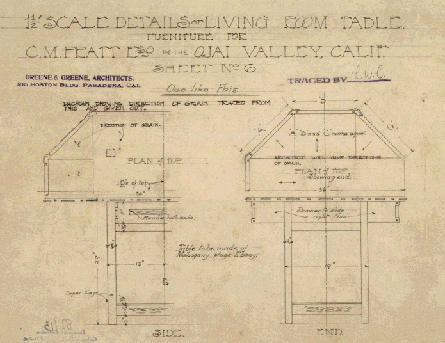
Greene & Green never failed to find interesting ways to incorporate construction methods as design features. Drawing, living room table, c. 1912, Charles M. Pratt house, Ojai, 1908-10.
Another fact revealed by the many poor imitations is that the seemingly simple features employed by the Greenes are actually quite difficult, and time-consuming, to implement well. This is likely not a revelation to anyone who has attempted to design and build something in the Greene & Greene style, though it might surprise a more casual observer. The cloud lift is a modest detail in terms of its complexity — even so, it can give fits to a designer. Countless posts on internet forums demonstrate that getting just the right form for a lift can be a challenge. Charles and Henry Greene may have thought so as well, given the broad variation of this element as used in their furniture.
How is it that such a simple detail could appear in so many varied forms? One answer is that, of course, it didn’t have to be so. The Greenes could have created a single cloud lift boilerplate and used it injudiciously everywhere. That didn’t happen because of the Greene & Greene propensity for extreme attention paid to the most minor design details. Thus, on the Gamble entry hall table we see on the upper aprons very small lifts that rise perhaps 3/16″ with a very gentle radius while on the chairs in the same room we see lifts that are significantly more pronounced. In the examples above, the radii are smooth and gentle while in the Blacker dining room the transitions are much sharper.
On some pieces, the lift serves to lighten as when an apron is wider where it meets the legs — allowing for larger tenons — and narrower at the center after a series of lifts. The effect is quite similar to that achieved by arches on many Arts & Crafts pieces. On other pieces lifts serve to widen a member at its center, adding visual weight. In some cases, the detail appears on a vertical element. While technically not a lift, which is defined with respect to a horizontal element, the form is the same. Examples of this use appear on the base of the Gamble dining table and the legs of the Thorsen living room table (the latter complete with decorative scrolls at each lift). Perhaps the most inventive use of a lift detail exists on the beautiful Bolton gateleg table. To accommodate the gates when closed, the stretchers and aprons on the ends of the table are heavily sculpted with a cloud lift form, demonstrating that, at least in this case, this detail can be both decorative and functional.
Lifts in this room are echoed by these marvelous, simple carving details. Detail, Living room sofa, 1908-09, David B. Gamble house, Pasadena, 1907-09.
Lower rails, which appear to be subtly curved, accent the lifts on this dining table. Detail, dining-room table, 1908-09, Robert R. Blacker house, Pasadena, 1907-09.
Is it or isn’t it? This is certainly not a traditional lift though it serves the same purpose. “Dovetail lift” seems an apt description. Detail, dining room cabinet, 1905-06, Laurabelle A. Robinson house, Pasadena, 1905-06.
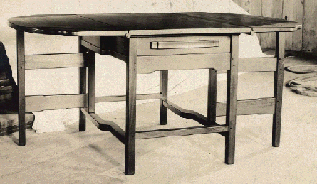
A little known piece, this table provides another example of beautiful, inventive design. Living room gateleg table, 1907, William T. Bolton house, Pasadena, 1906.
To drive home the point of variation, one last example, this from the Laurabelle Robinson house. On built-in cabinets in the dining room are lifts unique in the Greene & Greene world. Far more angular than typical lifts, they resemble nothing so much as a half dovetail and are a wonderfully inventive variation on the theme. These “dovetail lifts” are echoed, if only faintly, by elements in the main staircase, yet another example of using details to unify design.
Asymmetry
There was a time when symmetry was revered in Western architecture. Greek temples, Gothic cathedrals and American colonial houses each exhibit a high degree of symmetry on the exterior. In some cases, the concept is carried into the interior as well with central entries flanked by living and dining rooms. A search for new forms led eventually to a relaxed symmetry in which it was no longer necessary to have windows and doors in precise balance. The massing of the structure was still largely regular.
Quite distinct from the Western model, the Japanese have an affinity for asymmetry. Because symmetry is seldom found in nature, they believe, man-made structures should not be entirely symmetric. Tansu provide a beautiful example of this impulse.15 These traditional cabinets are never symmetric. In the case of a step tansu (kaidan-dansu), shaped like a flight of stairs, the asymmetry is immediately obvious. However, even tansu with a regular overall shape always include some asymmetry, typically in the arrangement of drawers. This is an aspect of the aesthetic concept wabi-sabi, based on imperfection and impermanence.16 Asymmetry is a form of imperfection, which is a sign of modesty, allowing for growth and improvement.
Asymmetric drawer arrangement and tsuba placement help make this piece one of the best by Greene & Greene. Bedroom chiffonier, 1908-09, David B. Gamble house, Pasadena, 1907-09.
Asymmetry is not common in Greene & Greene furniture and furnishings. Certainly, many of their leaded glass motifs are asymmetric as are many, though by no means all, inlays. However, this derives largely from the natural inspirations for these designs. There are subtle asymmetries in some pieces, such as the leading in the Tichenor sconces (a geometric rather than natural design). In bedroom furniture for David and Mary Gamble the Greenes exhibit an unusual degree of asymmetry. The beautiful mokko-gata tsuba forms on the headboards and footboards of the beds are off center. In the matching chiffonier, there are two such shapes on one door and only one on the other. Most obviously, taking a cue from tansu design, drawers on that piece are not entirely symmetric. Perhaps it is not coincidence that this is one of their most successful furniture designs.
In Greene & Greene architecture asymmetry is much more common. It is sometimes subtle as in the firm’s U-shaped houses, in which the legs of the U have different lengths. This detail is repeated in all of their houses of this form. Often however, the effect is more apparent as is the case with the porte cochere of the Blacker house. While the primary exterior form of the Blacker house is largely symmetric, the porte cochere is only partially balanced by the covered patio opposite — there is no mate to the massive clinker brick pier in the center of the circular driveway. The massing of the Gamble house is quite asymmetric with the sleeping porches and porch all to the right of the entrance. Similarly, the Robinson house has unbalanced massing and angles that are not matched opposite the main axis. And, of course, Charles Greene’s own house is highly asymmetric and irregular. The octagonal living room is unbalanced by any other exterior feature.
The asymmetry in these designs creates visual interest. To a greater extent, however, it allows for a more natural interior plan as the architects were not constrained by the artificial requirement of a symmetric footprint. That is, the architects were free to fit the interior to serve the needs of the family, their interests and the environment in which they lived, rather than answering the dictates of traditional architectural rules. In this sense, asymmetry is a liberating influence not only for the architect but also for the homeowner.
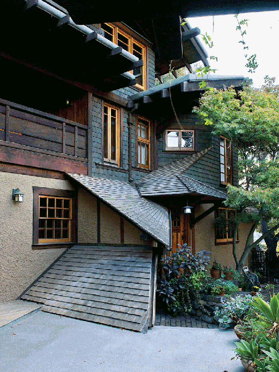
Charles Greene’s home was a test bed. This elevation is unusual, perhaps even quirky. Detail, north façade, Charles S. Greene house, Pasadena, 1902-15.
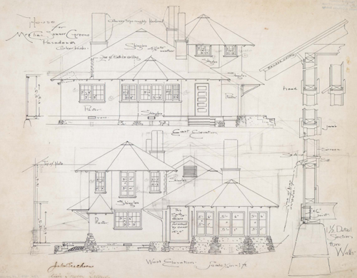
The house Charles Greene designed for his family is unique and fascinating. These elevations depict an early use of unusual forms and massing. East and west elevations, Charles S. Greene house.
Broad Eaves
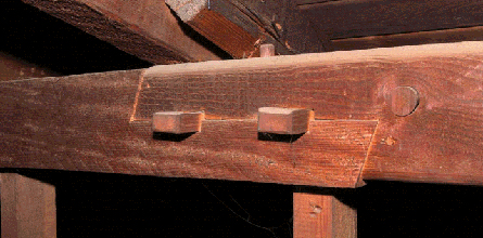
One of the most recognizable features of Greene & Greene architecture, perhaps the most recognizable and most imitated,17 is broad eaves supported by exposed rafter tails. These are, in fact, two distinct attributes of the firm’s vocabulary. Broad eaves, dictated by the often harsh sun present in Southern California, appeared first. Exposed rafter tails, in point of fact, projecting rafter tails, made their first appearance several years later. Earlier houses, such as the chalet-style house for Mrs. Lucretia Garfield (1904), included broad eaves but without exposed rafters (though roof-supporting beams, perpendicular to the rafters, project from the gables). Absent protruding rafters, the effect is less satisfying.
A wonderful feature of broad eaves in a climate such as that in Pasadena, is that they are most functional exactly when they are most needed. In the summer months, when the weather is hottest, the sun is highest in the northern sky. It is then that the eaves are maximally effective at reducing the quantity of direct sunlight entering through windows. In winter, when temperatures are lower and the sun is lower in the sky, the overhanging eaves are less preventive.
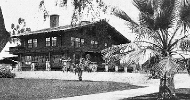
Perhaps the broadest overhang on any Greene & Greene house, this gable with brackets and beams is stunning. View of southwest corner, Robert Pitcairn, Jr. house, Pasadena, 1906.
Farther north, where the sun is less intense, broad eaves are less welcome. In particular, in the San Francisco Bay region, where temperatures are lower and fog performs the task of reducing sunshine, eaves are typically far less wide. Adapting to this climate for the William Thorsen house, Greene & Greene employed narrower eaves for the first time in more than six years. They did not adopt that region’s practice of indenting the eaves above windows. The iconic rafter tails still make their appearance and still cast “beautiful shadows” as Charles Greene explained to Mrs. Garfield years earlier.
The eaves employed by Greene & Greene were not, of course, purely functional. If protection from the sun was the only goal, awnings could be bolted on above the windows, particularly on the western and southern elevations. No, the eaves serve a decorative purpose also. Their width adds a horizontal aspect to some designs, such as the chalet houses, and enhances that dimension on others, such as the Gamble and Blacker houses. The former with a strong horizontal presence due to the sleeping porches that dominate the north side of the house, the latter due also to the porte cochere that is a signature feature of that house.
While Greene & Greene surely incorporated broad eaves into their houses in response to the climate, it is interesting to note that two of the styles that influenced them also included this feature but for different reasons. Swiss chalets typically have widely overhanging eaves so that snow falling from the roof does not accumulate too close to the house where it could block doors and windows. Broad eaves are present in much Japanese architecture as well, where one purpose is to protect delicate paper walls from rain and snow.
Sidney Gamble, the second son of David and Mary Gamble, was a teenager when his parents built the Gamble house. While the house was under construction, Mr. and Mrs. Gamble took Sidney and younger brother Clarence on a trip to the Orient. Sidney was smitten with what he saw. After graduating from Princeton, he undertook graduate study in sociology and economics and entered the relatively new field of social economics. His interest in Asia, China in particular, led him to make several professional visits to that part of the world. An avid photographer, he studiously chronicled his travels. His photos, which appeared in National Geographic as well as a number of books, were largely forgotten until rediscovered by his daughters after his death.18 In a truly wonderful quirk of fate, among the photographs19 are several from Japan including at least one that perfectly illustrates the Japanese precursor to the Greene & Greene use of broad eaves, such as those found on the house that still bears his family’s name.
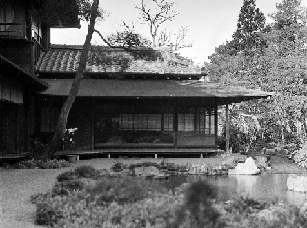
The Gamble children were not members of the idle rich. Sidney Gamble became a prominent scholar, expert in China, where he traveled extensively. He traveled less widely in Japan, seen here.
Shadows
Shadows are ubiquitous. Even as children we see them, and notice them everyday. We gain an understanding of them from a very early age. We learn to make shadow puppets, and we learn that shadows change as the sun’s position in the sky changes. Given that even young children have a reasonable understanding of this phenomenon, it may be unexpected that shadows are a design feature for architects, one that can significantly alter the character of a building.
Charles Greene certainly understood the decorative quality of shadows. In 1903-04 the firm was involved in designing a house for Mrs. Lucretia Garfield, widow of assassinated President James Garfield. Mrs. Garfield was quite active in the design process. In a letter of June 5, 1903, Charles Greene addresses his client’s question regarding the beams that project from the house’s gables. He writes, “The reason why the beams project from the gables is because they cast such beautiful shadows on the sides of the house in this bright atmosphere.”20
The element in Greene & Greene architecture most responsible for casting beautiful shadows are exposed rafter tails. At the time the Garfield house was being designed, this feature had not yet appeared in their work. The first house to include exposed rafter tails was for Dr. Arthur Libby in 1905 though several smaller structures included them before that.21 Watching the sides of a Greene & Greene house as the sun moves through the sky, there can be no doubt that Charles Greene was entirely correct. The projecting beams and rafters do indeed cast wonderful shadows that serve as simple but elegant ornament.
Charles Greene was not alone in his assessment of shadows. Clay Lancaster wrote of the Charles M. Pratt house in Ojai, California, “Shifting shadows cast by these diversified shapes transfigure the house into a sentient being that changes moods with the hours of the day or night.”22 Contemporaneous with the Greenes, Charles Keeler wrote, “The decorative value of shadows cannot be well overestimated…”23
An early masterpiece that included features, interior and exterior, that became iconic elements for Greene & Greene. Southeast corner, Arthur A. Libby house, Pasadena, 1905.
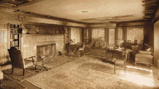
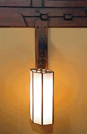
The decorative value of shadows is not limited to the exterior. Charles Keeler was, in fact, writing of the shadows created by exposed joists/beams in a house’s interior. At the dawn of the 20th century, interior shadows were far more prominent than today. While electric lighting was universal in Greene & Greene houses, it was much dimmer than what is currently common. Docents at The Gamble House like to highlight the moth-shaped, stained glass shade on the living room table lamp. They point out that the purpose was to shield Mrs. Gamble’s eyes from the powerful 15-watt bulb. While said somewhat in jest, this illustrates the far different character that rooms had in the evening at the turn of the last century.
In Greene & Greene Masterworks, Bruce Smith wrote about this element. He described the Gamble house living room quite eloquently and poetically, “At night these hanging lamps in the living room cast their strongest light, a gentle warmth that moves upward to reflect on the ceiling and then in all directions. Shadows remain in corners, under tables, and on the upper walls of the bay and inglenook, where the light cannot reach around the trussed beams.”24
Greene & Greene furniture exhibits the same trait in miniature. Many small reveals create shadow lines that are almost as vital to the Greenes’ style as any other element. Broad overhangs on tabletops throw their bases into shadow and draw the surroundings in as well. In some cases, as in the Gamble and Robinson dining rooms, table bases are themselves the sources of interesting shadowy detail. Intricate art glass lighting serves to enhance these effects.
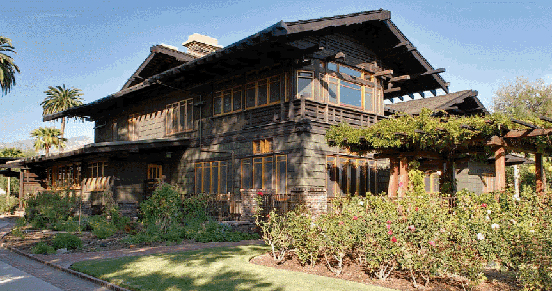
Beautiful shadows indeed, and not solely from exposed rafters and beams. The gardens and massing of the house play with sunlight as well. View of southwest corner, Robert R. Blacker house, Pasadena, 1907-09.
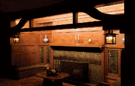
One can imagine the subdued lighting of 100 years ago created a wonderful ambience in the evening. Living room inglenook, David B. Gamble house, Pasadena, 1907-09.
Chalets
The need to categorize seems deeply ingrained in the human psyche. When confronted with something new, the natural tendency is to try to fit it neatly into some pigeonhole with which we are already familiar. So it was that the Arroyo Terrace neighborhood, home to a significant number of Greene & Greene homes, came to be known as “Little Switzerland.” It isn’t difficult to see a Swiss chalet character in some of the firm’s houses.25 The broad eaves, projecting beams or brackets, cantilevered second stories and wooden construction are obvious common traits. Charles denied the influence some years later: “People of Pasadena called my first group of successful houses little Switzerland — from my own understanding there was nothing Swiss about it — It all started from my interest in Japanese early temple design.”26
It is undoubtedly true that the way in which Charles used exposed, extended rafters to support broad eaves was influenced by Japanese forms. One cannot, however, ignore the evidence — a number of Greene & Greene houses, such as the Arthur Libby, John Phillips and Lucretia Garfield, bear more than a passing resemblance to the iconic Swiss houses.27 One might reasonably conclude that this is mere coincidence except that Charles and Henry Greene were both exposed to the chalet style. At the Columbian Exposition
in Chicago, the brothers surely saw the Idaho building, a rustic log cabin with a definite chalet-like appearance.28 Chalet forms also commonly appeared in architectural literature of the day, where the Greenes would certainly have encountered them.29
The number of Greene & Greene houses with a strong similarity to the commonly held view of a Swiss chalet is rather small. The chalet style, however, is not as narrowly defined as is commonly believed.
While we may view the chalet as fundamentally foursquare with a single main gable, there is wide variation in the details, and even basic form, of houses viewed as chalets in Switzerland.30 William Dana describes chalets quite poetically in The Swiss Chalet Book.
“The chalet motive is not Swiss; it is not Tyrolean, nor Himalayan. It is universal. And by reason of its inherent beauty it is adaptable to any site and any condition where land is plentiful, and where picturesqueness and harmony with the natural surroundings are the first consideration. The chalet is especially adaptable as a country house.”31
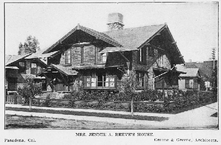
This house represents an important step for Greene & Greene — it is one of their earliest complete designs, including furniture and fixtures. Southwest corner, Jennie A. Reeve house, Long Beach, 1903-04.
Before the Ultimate Bungalows, Greene & Greene designed several chalet-style houses. View of south façade, John B. Phillips house, Pasadena, 1906.
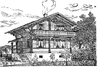
There is no one chalet form; there is great variation. This example from Bûlach, Switzerland, contains most of the canonical elements.
Though not Swiss, the Idaho building at the 1893 Columbian Exposition certainly looks like a chalet. Charles and Henry Greene likely encountered the building while headed to California.
Thus, we may see a Swiss influence in a wider variety of Greene & Greene houses. Even the Gamble house has been described as “a chalet in the Japanese style.”32 Dana goes on to note the similarity in materials between the chalets common in California and their Swiss antecedents (red pine in Switzerland vs. redwood in California). It may be then that the similarity has as much to do with the approach to building and the general philosophy of what a home should be as it does with the outward appearance of the structure. In the end, it appears that those who coined, and perpetuated, the “Little Switzerland” label got it right after all, even if they didn’t quite understand why.
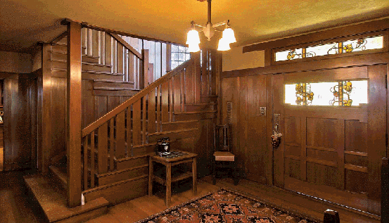
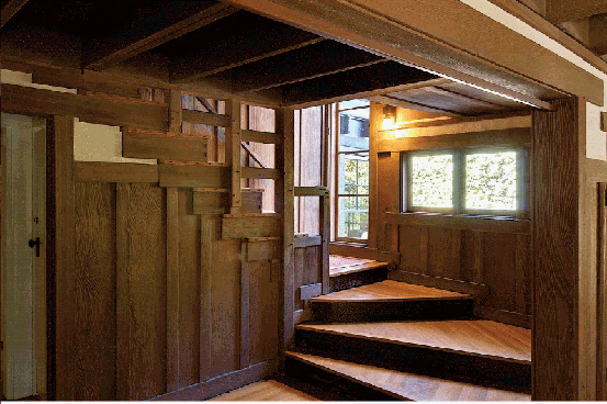
Stairs
Greene & Greene interiors, particularly those for the Ultimate Bungalows such as the houses for David B. Gamble and Robert R. Blacker, are wonderlands for anyone with an affinity for a surplus of beautiful elements, complementarily arranged to provide the viewer with a sense of marvel and calm. Even in environments such as these, replete with the most astonishing wooden works of art, there is one facet of the interior that often stands apart: the staircase.
Stairs are, of course, primarily utilitarian, allowing one to move easily among the various levels in a building. Aesthetics and convenience aside, we could simply arrange ladders around the house to facilitate access to upper stories. One can, in fact, easily imagine many frontier homes with just such an arrangement. However, our homes are not strictly utilitarian. This leads us away from a strict interpretation of functionalism toward a philosophy in which we indulge our need for beautiful things. At its best, this philosophy allows for aesthetics without sacrificing function — a marriage with co-equal partners.
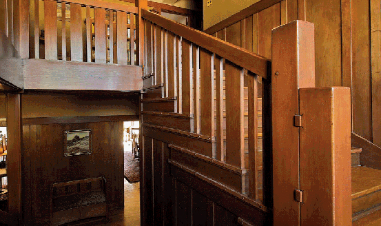
Greene & Greene stairs serve as perfect examples of this marriage, of the synthesis of the functional and the aesthetic. Those fortunate enough to have viewed the interiors of the Gamble and Blacker houses must certainly attest that the stairs in each are focal points; works of art that happen to serve a useful purpose beyond mere ornament. While it is obvious that these stairs are advanced expressions of the stair-maker’s art, it is also true, if less obvious, that they are exemplary in their function as well. Stairs in a Greene & Greene home almost always include a landing, breaking the run of treads, and typically a window to provide natural light (both features serve an aesthetic purpose as well).
Beautiful simplicity describes this stair and entry. Entry hall, William T. Bolton house, Pasadena, 1906.
Interestingly, landings and windows were not reserved exclusively for wealthy clients. Even relatively modest commissions included these features. One often reads that Greene & Greene eventually priced themselves out of the market because of the materials and detail in their designs. While there is some truth in this, we must recognize that many details were implemented in earlier, much less costly houses. One of the first rediscoverers of the Greenes, Jean Murray Bangs addressed this point, commenting on the democratic aspect of the firm’s output. “While many, especially the later, Greene & Greene houses were large and expensive it could not be said that the architects designed only for the well-to-do. Rather they created the type form from which sprang the most delightful little houses we have ever had.”33
In the grand commissions, the stairs take on a magical quality with banisters, balusters and newel posts combining to play the part of functional sculpture. As on the exteriors, individual elements are identifiable but the key effect is that of a cohesive whole rather than a collection of parts. In more modest homes, there is always some piece that is interesting and unexpected. Quite often this manifests itself via the balusters which are frequently implemented quite creatively.34
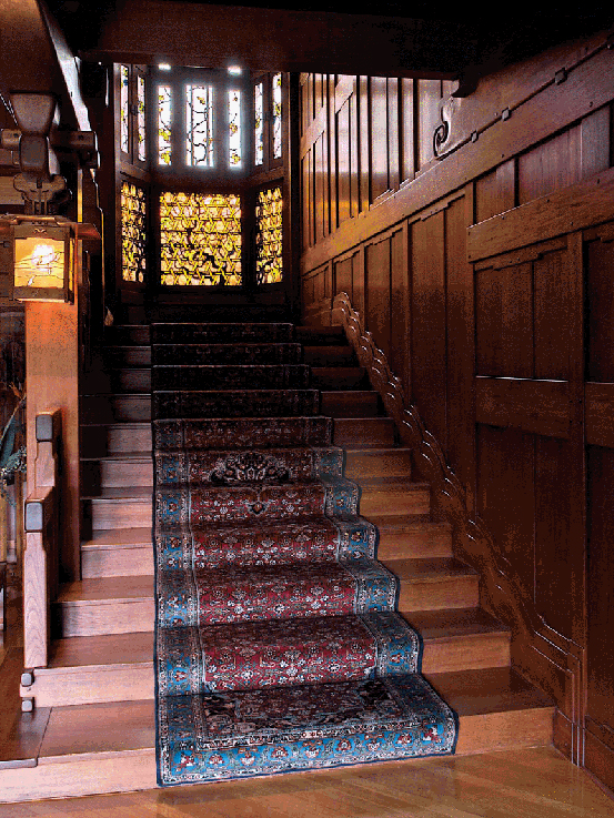
Lovely wood, art glass and wonderful detailing help make this stairway a masterpiece. Hall stairs, Robert R. Blacker house, Pasadena, 1907-09.
Even relatively early Greene & Greene houses have stairs that are interesting, even if modest. Stairs, Josephine Van Rossem house #1, Pasadena, 1903.
This inlay, very much an Arts & Crafts form, is highly unusual for Greene & Greene. Detail, stairs, Arthur A. Libby house, Pasadena, 1905.
It is worth noting that Peter Hall was an accomplished stair builder, which may have provided Greene & Greene with the confidence to attempt such intricate compositions. As the designs increased in complexity, Peter and John Hall, and the team working with them, rose to the occasion, answering the challenges set forth by Charles and Henry Greene and in the process providing us with some of the most exquisite interiors ever constructed.
Straightforward details, such as rectangular pegs in the newel posts and round pegs in the treads, create interest. Detail, stairs, William T. Bolton house.
Like pointillist painters, Greene & Greene created masterpieces by combining many elements, each quite simple in itself. Detail, hall stair, David B. Gamble house, Pasadena, 1907-09.
Chairs
From the time of the William Bolton house in 1906 to that of the Cordelia Culbertson house in 1913, Charles and Henry Greene designed hundreds of pieces of furniture.35 That would stand as an impressive feat if it was their only accomplishment during that time. Of course, they also designed numerous decorative objects and about 30 houses during the period and shepherded most from conception to completion.36 This fact only makes more remarkable the incredible variation found in the furniture designs during that span.
Some variation was inevitable if only as a result of evolution. Charles Greene was an artist, one who was not content to take the expedient course, to churn out designs that were largely unchanged from one commission to the next. He played in a world of the new and unexplored, his goal to create rather than recreate. This, however, provides only a partial accounting, for we see significant intra-house differences in addition to the more expected inter-house distinctions. This point is perhaps most obvious in an examination of chairs created by Greene & Greene.
The Greenes had ample opportunity to practice chair design. Historic photos show the living room of the Blacker house with at least five chairs and as many again in the entry hall. The Gamble house living room currently contains 10 chairs. Furniture drawings for the Ford house show three distinct chair designs for the living room alone. With the addition of chairs for bedrooms and dining rooms, the total can become quite large. Thus, we may find four or more chair forms within a single home even ignoring armchair/side chair/rocker variants. At some level, of course, a chair is just a chair, an arrangement of legs, a seat and a back. This constraint of functionality helps make the variation more wonderful, and in the hands of Greene & Greene, wonderful is exactly what it was.
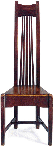
As with many traditional chair styles, crest rails and back splats are the most obvious features of the majority of Greene & Greene designs. Chairs by the firm typically include a broad, heavily curved crest rail that is often ornamented. Backs usually incorporate a wide central splat sometimes flanked by narrower splats. Arms are quite sculptural, counter to the Arts & Crafts norm. Crest rail joints with rear legs are almost always adorned with ebony splines. There are exceptions to these rules of thumb. The Bolton hall chairs have a broad top rail, but, like all elements in that design, it is straight. Chairs for the Robinson dining room include curved but very narrow crest rails. The design for the Bolton dining room does not contain splats but rather pierced horizontal slats.
Perhaps somewhat more traditional than typical for the Greenes, this chair includes a crest rail that sits between the rear legs rather than atop them. Living room armchair, 1907-08, Freeman A. Ford house, Pasadena, 1906-08.
Decoration for splats and crest rails derives in part from the unusual forms they often take with additional embellishment provided via inlay and ebony. Thorsen dining room chairs provide one of the best examples. The pierced splat grouping is brilliant, the shape accentuated by the narrow elements to either side of the main splat. Ebony and brass are subtly incorporated as the only applied decoration. The crest rail displays an inlay design that is continued in the top of the dining table. Arms are sinuous and transform from tall and narrow to wide and thin. In this design, the elements below the seat are quite plain with only delicate, pinned, through mortise-and-tenon joints on the H-stretcher for ornament.
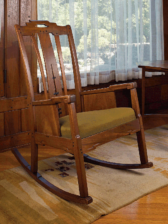
A deceptive, beautiful piece that appears simple at first reveals wonderful details on closer inspection. Note the carving that mirrors the lifts. Living room rocking chair, 1908-09, David B. Gamble house, Pasadena, 1907-09.
This form brings to mind chairs by Frank Lloyd Wright more than Greene & Greene. This furniture was the beginning of their best work. Hall chair, 1907, William T. Bolton house, Pasadena, 1906.
The lack of inlay on the back allows one to focus on the form of this chair. The arms flow wonderfully, and the splats are a work of art. Dining room armchair, 1909-10, William R. Thorsen house, Berkeley, 1908-10.
In some cases, seat rails and stretchers are quite interesting. For the Blacker dining room chairs, stretchers between the front and back legs are tiered on their outer surface, a subtle effect that is lovely. The same components on the Ford living room arm chairs have lifts on both top and bottom edges creating a purely decorative offset effect. In both designs, the cross stretcher attaches via pinned, through mortise-and-tenon joints, as in the Thorsen chair. This stretcher arrangement was commonly employed by the Greenes. Often referred to as an H-stretcher for the obvious reason, the Greene & Greene version is closer to an “A” with a truncated top due to the extreme change in seat width from front to back. To help facilitate this, chair legs are parallelogram in cross section with edges parallel to the seat rails (the seat rails form an isosceles trapezoid).
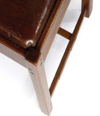
The parallelogram shape of these legs is dramatic. Note also the round pin in the through mortise and tenon joint on the stretchers. Detail, dining-room chair, 1908-09, Robert R. Blacker house, Pasadena, 1907-09.
One of the most interesting chair designs from Greene & Greene is not well known relative to pieces for the Blacker, Gamble and Thorsen houses. Dining-room chairs for the Freeman Ford house are superb, demonstrating the Greenes’ ability to combine multiple elements into a seemless whole. Charles Greene must have thought so as well for he kept a chair of the same design, with different finish, in his studio. The basic form of the chair is quite straightforward; however, a number of details make it remarkable. The most obvious extraordinary feature is the ebony detailing on the splats. The pegs are playfully placed while dramatically long ebony accents run nearly full length. Viewed from the front, the rear legs are stepped above the seat rail, gaining width with height. The crest rail is pierced to create a handle, a device the Greenes used elsewhere. The front of each rear leg displays a geometric inlay in mahogany, also the primary wood for the chair. Front and rear seat rails are lifted, wider at the center than the ends. Side rails are lifted only at the back and surprisingly close to the rear leg, creating an unexpectedly beautiful effect. A narrow stile mirrors each front leg running from seat rail to stretcher. The overall impression created is one of harmony despite the numerous details.
This piece is a compact laboratory for Greene & Greene details. The ebony is more playfully used here than on most of the firm’s work. Chair, c. 1908, Charles S. Greene (same design as dining room chairs for Freeman A. Ford).
Three distinct chair designs for the living room, each a minor masterpiece. Very little of this furniture is available for public view. Drawing, living room furniture, 1908, Freeman A. Ford house.
Hijiki
The Greene & Greene design vocabulary is quite rich and complex. Even so, a number of elements are reused often, sometimes in slightly different versions or new combinations. This provides an effect that is both familiar and fresh. The living room of the William R. Thorsen house in Berkeley contains a stunning Arts & Crafts frieze that incorporates a marvelous Asian element that is unique in the Greene & Greene canon. It serves as testament to the lengths to which the brothers would go to meet the needs of their clients and achieve a pleasing, coherent environment.
In an architectural interior, a frieze is the section of wall above the picture rail. In the Arts & Crafts idiom, it is often distinguished by a wall covering or paint color distinct from that on the wall below. Charles and Henry Greene often used the frieze to very good effect. In the living room of the Gamble house, the frieze contains relief-carved panels. In the Blacker house living room, gold leaf covers lotus forms molded into the plaster. Even in less grand houses a frieze is almost always present though it may contain less decoration. In the Thorsen house, hand-painted dogwood branches grace the subtly colored plaster framed by exquisite wood trim.
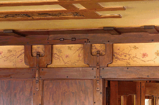
This frieze is representative of the Arts & Crafts form, if somewhat more sophisticated. The hijiki are rather stylized, not unlike some Japanese examples. Detail, living room frieze, William R. Thorsen house, Berkeley, 1908-10.
Use of wooden elements in the frieze is certainly not unique to the Thorsen house. What differentiates the composition in that house is that the form of one feature is likely based on a traditional Japanese structural device. The device, known as hijiki, or bracket arm, is repeated throughout the frieze. Hijiki, literally translated as “elbow wood,” were originally used as structural elements to support eaves in Buddhist architecture.37 They evolved to become more elaborate, and in some cases purely decorative. Such is the case in the Thorsen house.
Hijiki are actually just a component of a larger, more complex system known as a tokyou (bracket system). Between the hijiki and the rafters were small bearing blocks known as makito. The hijiki itself rests on a large bearing block called a daito which is set upon the top of a pillar. Hijiki come in many forms. Closest to that used in the Thorsen frieze is hakarihi-jiki. 38Hakari means balanced and, thus, hakarihijiki are balanced elbow brackets.
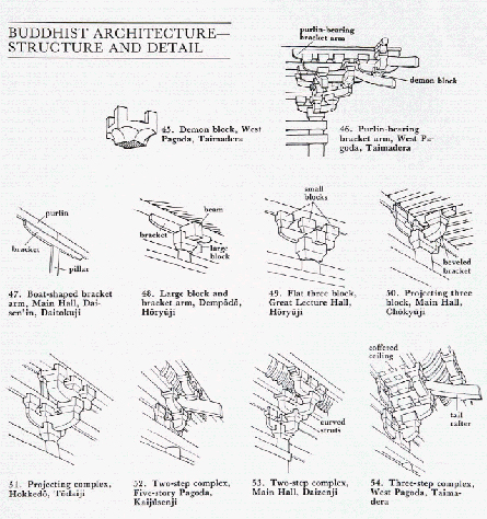
Functional antecedents of the element appropriated by Greene & Greene. Even in Japan this component evolved significantly.
Not surprisingly, the Greenes didn’t use an exact replica of the traditional form. The variant they included is somewhat simplified and includes a small central vertical element. There are similar Japanese forms that are sometimes described as resembling a pitchfork. One could also see in this form a stylized version of Neptune’s trident, the central vertical element extending below the bracket as if forming a handle.
William Thorsen was a lover of ships. The Greenes incorporated their client’s interest into the design for his house. The iron front gate includes a ship in relief. The south end of the living room is constructed to recall a ship’s prow, complete with beams that extend through the wall to the exterior. Thus, Neptune’s trident is a fitting symbol for that room. It may at first seem dubious to consider such an interpretation. However, recalling the Greenes’ penchant for obsessive attention to detail, gives one cause to consider the possibility.
Tsuba
Influences can manifest themselves in various ways. In some cases, the result is a very direct and literal application of source material. This could take the form of creating a near reproduction, or perhaps simply borrowing substantially from a piece. In other instances, the effect is more subtle. One may pay homage to a source, or make allusion to it, without explicitly making use of the original. Another category exhibits influence in a still less direct way. This might involve significant abstraction or use of some element in a context very different from the original. This latter case applies to the incorporation of the tsuba form into the Greene & Greene vocabulary.
Every detail attended to, this room represents the culmination of the period of the Ultimate Bungalows. Living room, William R. Thorsen house, Berkeley, 1908-10.
The tsuba lends its shape to this tabletop, the first large-scale application of the form. Dining room table, 1906-07, Laurabelle A. Robinson house, Pasadena, 1905-06.
A tsuba is the hand guard on a Japanese sword. Primary, among the several tasks they perform, is preventing the swordsman’s hand from sliding onto the blade during a thrust. Additionally, they aid in the balance of the sword and allow the owner to convey status.39 Most functional tsuba are constructed of forged iron (rather than cast iron which is more brittle) 40 though other metals are sometimes employed. Japanese swords consist of a number of separate components.41 Thus, tsuba can be separated from the sword, which they often are, and collected. It is through Charles Greene’s interest in, and collection of tsuba, that they are relevant to the work of Greene & Greene.
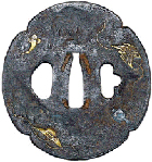
One of the tsuba from Charles Greene’s collection. The mokko-gata form appears repeatedly in the work of Greene & Greene.
The shape of this ebony peg is amazing. Note that the form is repeated in relief on the drawer pull. Detail, living room table, 1908-09, David B. Gamble house, Pasadena, 1907-09.
One often reads that a piece of furniture is “tsubashaped” or that the form of an element is derived from tsuba. Such statements are not entirely accurate since there is no single shape for tsuba. The most common shape is round, though it would be senseless to describe round elements as referencing tsuba. No, the tsuba favored by Charles Greene are characterized as mokko-gata, or lobed shape.42
The first use of this form by Greene & Greene is in lighting for Adelaide Tichenor. The shape is not a dominant element in that house. In fact, the furniture is largely rectilinear and a little severe, similar in fundamental form to the Arts & Crafts archetype. Though furniture for the Bolton house demonstrates a leap forward in sophistication, it is still more rectilinear than organic. One point of departure is a gateleg library table with a mokko-gata top. The base is also quite sophisticated and original. Designed slightly before the Bolton furniture, however, the dining room table for the Laurabelle Robinson house provides the first appearance of the mokko-gata form as a substantial element in Greene & Greene furniture. The Robinson table is a point of departure for the Greenes — it is the first piece of furniture designed by the firm to exhibit an organic, sensual form due not only to the mokko-gata top, but also the elements in the pedestal base.43
With Robinson furniture constructed in 1907,44 the possibilities for Charles Greene’s designs going forward were nearly limitless. Over the next two years, he created an astounding number of pieces for his masterpiece, the Robert R. Blacker house, where the tsuba is used very sparingly, and his best known commission, the David B. Gamble house. In the Gamble house, the tsuba makes a return, this time as a significant design theme. For the Gamble dining table, Greene & Greene revisit the form of the Robinson table, but with the addition of ebony highlighting the hand-rubbed mahogany. The mokko-gata form appears throughout the dining room, turning up in leaded glass, chair back splats and switchplates (which carry the shape through the house).
It would be difficult to chronicle every appearance of tsuba influence in the Gamble house, but it is quite easy to identify the most elegant, indeed one of the most beautiful decorative elements in the Greene & Greene canon. In furniture for Mr. and Mrs. Gamble’s bedroom, there are mokko-gata ebony inlays and ebony-ringed mokko-gata cutouts, in each case fitted with brass pins. One marvels at the genius that conceived of such a detail and the craftsman that so expertly executed it. And with that, having perfected the form, Greene & Greene abandoned it — the mokko-gata tsuba all but disappeared from their designs.
Perhaps the most elegant and challenging use of the mokko-gata form appears in the Gamble bedroom. Detail, bed footboard, 1908-09, David B. Gamble house.
As a unified suite of furniture, this set may be the supreme expression of the Greene & Greene aesthetic. Drawing, bedroom furniture, 1908-09, David B. Gamble house.
Hidden Construction Details
Knowledge changes the way we perceive things. A deep understanding of music, for example, certainly alters the listening experience. Thus, a musician surely hears music differently than does one to whom it is a mystery. Similarly, woodworkers see furniture differently than do others. They are deconstructionists. They may admire the aesthetic qualities and craftsmanship of a chair or a table, but the admiration is certainly accompanied by thoughts of what the eye cannot see, of the hidden details that help make the piece what it is.
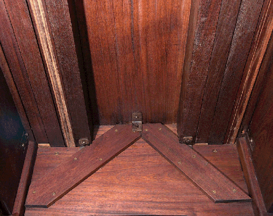
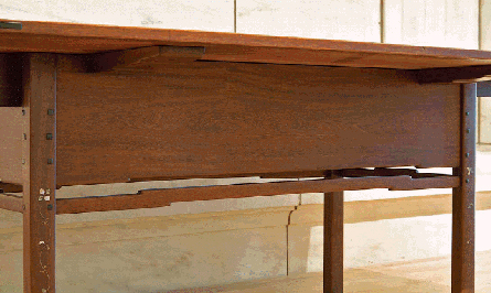
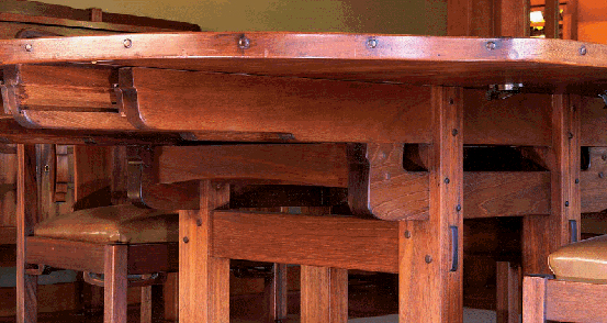
This rare view reveals the working of table extensions. The two scuffed members extend through the apron to support leaves. Other details of construction are apparent as well. Detail, dining room table, 1908-09, Robert R. Blacker house, Pasadena, 1907-09.
British author Douglas Adams had an interesting view of the world and a very entertaining way of putting ideas into words. He said, “If you try and take a cat apart to see how it works, the first thing you have on your hands is a non-working cat.”45 That is a valid point, and undoubtedly true. There is an obvious corollary for furniture. While it would be fascinating to disassemble a piece of furniture by Greene & Greene to determine how it was constructed, the end result would be a pile of wood, a non-working piece of furniture. Of course, the cat analogy breaks down at this point because we are likely to have much greater success reassembling the furniture than the cat. That is also a valid point, and I’ll be the first to wish you good luck in arguing that position to the owner of a Greene & Greene original.
All this is to say that we are somewhat restricted in the methods by which we can determine the construction of historic furniture. We can, if we are fortunate, crawl around, peer under and behind. If we are very fortunate, we may even be able to open and look inside. Experts can employ technology such as X-rays to reveal hidden secrets.46 And we can rely on those with experience building furniture to explain the techniques, if only somewhat speculatively.
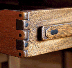
A simple, effective joint that remains tight after 100 years. On this drawer, the sides are stepped both front and back. Detail (full view on p.128), drawer from bedroom desk, 1907-09, Robert R. Blacker house.
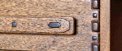
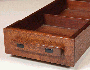
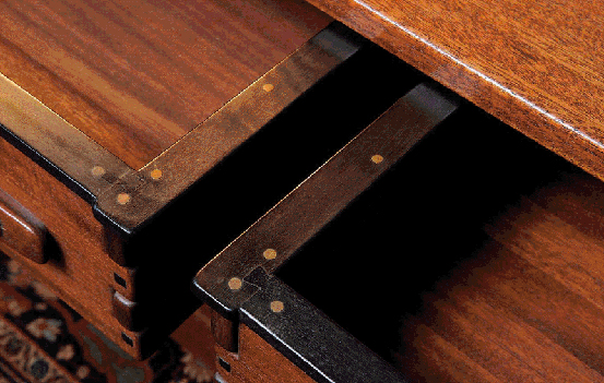
A variation on the better known finger joints on the entry table, the side fingers include round ebony pins. The sides are stepped top and bottom. Detail, living room table, 1908-09, David B. Gamble house, Pasadena, 1907-09.
Drawers provide a reasonably easy entry point to the interior of a case piece. A drawer rather quickly reveals its details of construction. It is well known that Greene & Greene drawers are not dovetailed but rather are built with a type of lock joint. (Finger joints, also used on many drawers, are discussed elsewhere in this chapter.) This joint, in which a tongue on each end of the drawer front fits into dadoes on the drawer sides, is strong and not labor-intensive. Drawer backs fit into dadoes in the sides and are secured with screws. Bottoms are typically solid wood and mate with grooves in the drawer front and sides but extend below and beyond the drawer back. Excluding those with more creative systems for movement, drawers typically have one or two oak runners attached to the bottom with screws. One interesting detail is that drawer sides are usually stepped at front and back to provide smaller bearing surfaces. This allows for easy movement while also preventing the drawer from tipping as it is pulled out. In some cases, the steps appear on the top and bottom edges of the sides. The back is sometimes stepped as well.
Furniture for the William Thorsen house in Berkeley was not constructed in Peter Hall’s Pasadena shop. Instead it was made on-site in a makeshift shop in the house’s basement. For this reason, construction of Thorsen furniture is slightly different from its Pasadena cousins. Drawers there, in both freestanding furniture and built-ins, are constructed with half-blind dovetails at the front. Drawer backs are secured with wooden dowels — as many as ten dowels are employed on each side of a drawer.
It is worth noting that all of the methods discussed here appear on furniture designed and built during the Greenes' collaboration with the Halls. Some techniques, such as the lock joint used on drawers, certainly came from the craftsmen rather than the architects. If detailed shop drawings ever existed, none survive today. Thus, we cannot be certain about the origins of some of these details. About one thing we can be certain: the collaboration was synergistic and benefited everyone involved.
The varied colors and textures of mahogany, ebony and brass are combined to great effect in this beautiful table. Detail, hall table, 1908-09, David B. Gamble house.
One of the most intriguing details in any Greene & Greene furniture are the brass “pins” that secure ebony runners to the drawers for the entry hall table in the Gamble house.47 These pins are, in fact, brass screws that have been filed to remove enough of the head to give them the appearance of pins. This provides the holding power of a screw but with a more elegant, less utilitarian, appearance than would be afforded by a screw. A close examination shows just the hint of a slot on several of the screws, just enough to alleviate one’s disbelief that such a labor-intensive method was used to construct an element so seldom seen. The result, of course, is striking, with the brass beautifully accenting the dark ebony. The Greenes continued to use this detail. It appears repeatedly in furniture for the Cordelia Culbertson house, for example. Interestingly, this detail does not appear on the ebony-wrapped doors of the sideboard from the William R. Thorsen house.48 This despite the fact that furniture for the Thorsen house was designed and built in the period between the Gamble and Culbertson houses. This argues that use of this technique was an aesthetic choice rather than purely a method of construction.
The title of this section applies particularly well to one construction detail employed by the Greenes and the Halls. Quality furniture has been constructed using mortise-and-tenon joints for a very long time. This form of joinery provides for significant long-grain surface area for glue, and it can be easily augmented, via drawboring, for example, for additional mechanical strength. One minor problem with traditional mortise-and-tenon joints is that visible gaps can develop over time due to wood shrinkage. A construct that combats this is the housed mortise. A housed mortise is really a mortise within a mortise. More specifically, the primary mortise resides within a much shallower secondary mortise. The secondary mortise does not fit a tenon but rather the entire end of the tenoned member. While this reduces the probability of visible gaps arising in the future, it increases significantly the work required. It is a visible joint — no shoulder hides it — and, therefore, it is difficult and time consuming to implement well.
A modern housed mortise on a recreation of a Blacker dining room chair. It creates significant additional labor in the name of aesthetics. Detail, mock-up of dining room chair, Jim Ipekjian.
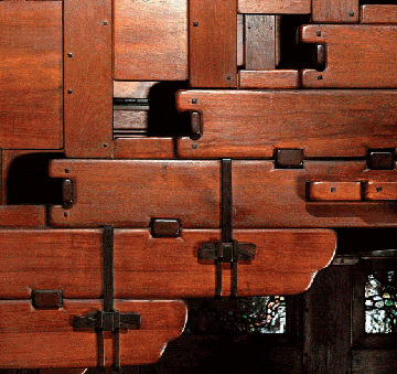
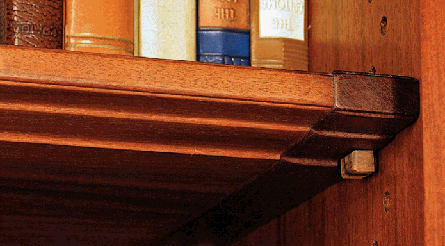
A study of construction secrets: glass installation, shelf breadboards and supports, hinges, and brackets on the interior of the piece. Detail, living room bookcase, Robert R. Blacker house.
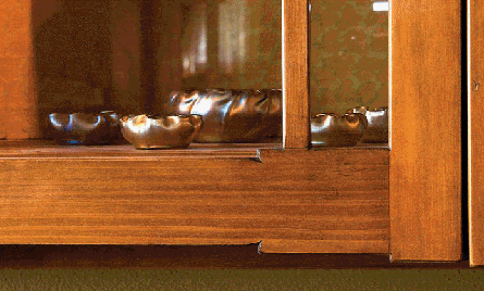
As we have seen, Greene & Greene used art glass often. While it appears most frequently in lighting and grand entries, clear leaded glass is also found in furniture and built-ins. It may seem like a minor point, but something has to hold the glass panels in place. For the very small panels typical in lighting, the solution is often as simple as small nails into the frames bent slightly to contact the glass. Clearly this method is not suitable for much larger panels. A common technique is to use thin wood strips to hold the glass into rabbets in their frames. The strips are typically screwed or nailed in place to allow for removal should repair of the glass become necessary. This technique becomes somewhat more complicated when, as is the case in the Blacker house living room bookcase, the glass is divided in the frame and some components are quite small and have curved shapes.
Exposed Construction Details
Arts & Crafts furniture is distinct from preceding styles in a number of significant ways. Incorporation of less applied decoration while simultaneously creating ornament by highlighting joinery and construction details is, perhaps, most interesting. In many pieces, in fact, joinery is the dominant feature. Think of the wonderful through-tenons on many pieces. Recall the more dramatic keyed tenons on some bookcases and tables. Or pegged joints in which the peg is left dramatically proud of the surface. In each case, the joinery attracts attention and honestly announces its purpose.
Exposed joinery is certainly quite common in Greene & Greene furniture (and architecture) though the forms may differ somewhat from those used by other designers of the era. Pegged joints are standard and through-tenons appear on some pieces, but the Greenes took exposed joinery to a higher, more elegant level and expanded beyond typical joinery. In fact, when describing a Greene & Greene piece, it is insufficient to discuss exposed joinery. In order to fully capture this aspect of their work one must be more comprehensive; the discussion must include the broader topic of exposed construction details.
This, of course, begs the question, “What are exposed construction details?” In Greene & Greene furniture this term applies to traditional joinery in addition to features such as stacked hinges and drawer runners that are creatively incorporated into the design. Use of the word “feature” in the previous sentence is deliberate — as with exposed joinery, these exposed construction details are critical to the visual effect and are central elements in the final result. They may even be the primary focus, intended to draw the viewer into the piece and the process of its creation.
Through-tenons figure less prominently in Greene & Greene furniture than in that by some other Arts & Crafts designers, but, when used, are used well. Detail, dining room table, 1907-08, Laurabelle A. Robinson house, Pasadena, 1906-07.
Shelves are often quite simple, not much more than a plank of wood. Greene & Greene shelves are somewhat more complex. They often incorporate breadboard ends, and, despite being concealed, the breadboards include ebony pegs. Incredible details once again. Long shelves, particularly those that will support heavy loads, present a design dilemma. If made sufficiently thick to prevent sagging, the shelf will appear heavy. If made sufficiently thin to give a pleasing appearance, the shelf will sag. One solution employed by the Greenes was to step the shelf along its length. Thus, at the front edge the shelf has a pleasing profile, but across most of its width it is thick enough to provide sufficient strength.
Shelf support mechanisms range from very simple to quite interesting. The simplest form is familiar to anyone old enough to walk — a series of holes with pegs inserted to support the shelves. Of course, the pegs are often made of ebony and sometimes engage shallow mortises on the shelves. An uncommon take on a common solution. In other versions, the holes are replaced with sawtooth standards that engage the shelf. Shelves for some furniture in the Cordelia Culbertson house have “pegs” built in. These are actually very small legs that pivot on a pin and engage rectangular holes in the standards. One wonders whether this arrangement solved some recognized problem or was merely a flight of fancy.
Imagine the added complexity of constructing a shelf in this way. The detailing is flawless and awe-inspiring. Detail, livingroom built-in case, 1909-10, William R. Thorsen house, Berkeley, 1908-10.
Some details are quite humble. Such is the case with board-and-batten construction of doors and cabinets. Greene & Greene neither originated nor significantly altered the board-and-batten archetype. What they did, as with many other construction details, was put their unmistakable stamp on it. In the case of board-and-batten construction, this consisted of ensuring that the slots of all of the pan head screws, used to attach the battens, were aligned. Typically, the slots run with the grain, vertically on stiles and horizontally on rails, though in some instances the slots are vertical regardless of the grain direction. It is surprising to see that in many cases these slots are still aligned more than 100 years later.
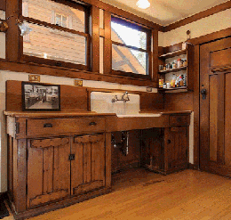
An intact kitchen, now more than 100 years old, is rare. Even the wood counters are original. Kitchen, Caroline S. de Forest house, Pasadena, 1906.
Screw slots still aligned, these cabinets are much the same now as when built. Detail, kitchen cabinet, 1906, Caroline S. de Forest house.
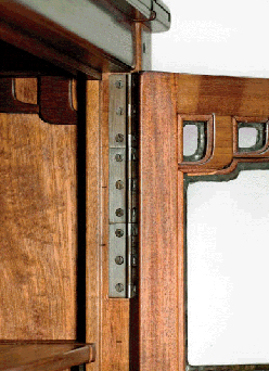
Certainly not necessary to support this small door, stacked hinges, used often by Greene & Greene, were likely a design statement. Detail, secretary, c. 1911, Cordelia A. Culbertson house, Pasadena, 1911-13.
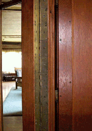
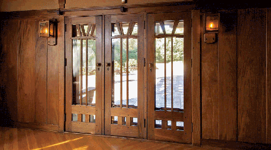
Not used exclusively on furniture, stacked hinges also appeared in architectural contexts. Detail, living room doors, William R. Thorsen house.
This level of attention to detail, while nearly unthinkable today, is common in the work of Charles and Henry Greene and Peter and John Hall. One must wonder whether this practice originated with the Greenes or with the Halls. There does not appear to be any documentary evidence to answer the question. We can, however, speculate based on available facts. In this case, the relevant data take the form of board-and-batten doors in houses that predate the Halls’ association with Charles and Henry Greene. For example, doors in the Jennie Reeve house (1904) include screws with slots aligned. The same is true in the Charles Greene house (1902) and the house for Martha, Violet and Jane White (1903). That all were originally constructed prior to the Greene/Hall association, suggests that this particular compulsion belonged to Greene & Greene. However, we cannot ignore the fact that these houses have been modified. The screw heads could have been aligned years later by subsequent homeowners aware that this detail exists in other houses, though this seems a far less likely explanation.
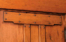
Nineteen. That’s the number of hinges on each door of the curio cabinet designed by Greene & Greene for Belle Barlow Bush.49 With no context, this single data point might lead one to believe that this is a large, imposing piece of furniture. It is not. It has an imposing presence due to the elegant design and flawless execution, but is a diminutive piece, measuring just over 2 feet tall. Stacking butt hinges, in resemblance of piano hinges, was a common practice for Greene & Greene (the only furniture on which they used an actual piano hinge was, appropriately enough, pianos). While certainly providing a great deal of strength for doors with heavy leaded glass panels, this arrangement was just as certainly overkill from an engineering perspective. Consider that the main entrance doors in many Greene & Greene houses weigh a great deal. Most, however, are hung in more conventional fashion, using only three, or perhaps four, hinges. For example, the massive entry doors to the Gamble and Blacker houses do not utilize stacked hinges. Certainly these doors contain enough mass to have warranted use of the technique. The only explanation is that this was a design element, and a most unexpected one at that.
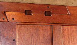
The golden ratio would certainly have been known to Charles and Henry Greene. Surely, it is no accident that it describes the distances between these hinges. Dining room patio doors, David B. Gamble house, Pasadena, 1907-09.
Scarf joints as used by the Greenes in interior trim were almost entirely decorative. Detail, hall woodwork, William R. Thorsen house.
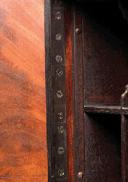
It is worth noting that larger pieces didn’t necessarily incorporate more hinges — hinge dimensions increased with furniture dimensions. Hinge lengths varied from roughly one inch to several inches. The French doors separating the living room from the entry hall in the Thorsen house provide an interesting case study. Each of the two bifolding doors is hung using five hinges: two at top, two at bottom and one in the center. The bifold joint, however, incorporates 26 hinges (each 3″-long) in a stacked arrangement running the length of the doors. Once again, we see evidence that use of large numbers of hinges is not purely functional. If it were, certainly it would have been used to hang the doors in their opening as well as to hinge the sections of each door.
Another interesting detail concerning hinges is also quite surprising. When touring the Gamble house, one can easily suffer sensory overload. There are simply too many gorgeous objects present for one’s brain to fully process all of the visual stimuli. Some things simply must go unnoticed. So it is not unexpected that many visitors don’t see this detail. It is not visually beautiful, though there is a conceptual beauty and elegance. On doors with only three hinges, the middle hinge is not centered between the top and bottom hinges. Imagine the middle hinge as a fulcrum. Gravity, and leaning house guests, try to move the door toward the floor. The hinges fight these forces with the upper hinge doing much of the heavy lifting. Moving the middle hinge up reduces the torque applied to the top hinge. Now for the surprising part: The distance between the middle and lower hinges is 1.618 times the distance between the upper and middle hinges. The figure 1.618 just happens to be a common approximation for the golden ratio, a factor that has for centuries been used to define pleasing proportions and sound design.50 Of course, in that context it is typically used to determine the aspect ratio of a tabletop or cabinet door. Its use for spacing hinges inspires a certain degree of awe.
This scarf joint is enhanced by the addition of a lantern to light a stairway. Detail, stair woodwork, Freeman A. Ford house, Pasadena, 1906-08.
Greene & Greene also made use of structural scarf joints, used when timbers of sufficient length are not available. Detail, attic, Mary E. Cole house, Pasadena, 1906-07.
A scarf joint is used to join two elements, such as wood planks, end-to-end allowing for the creation of longer pieces than those available in the stock on hand. Often, though not exclusively, used in architectural trim, this joint, if oriented appropriately, offers the advantage of near invisibility even if the joined elements separate slightly. In keeping with the Arts & Crafts philosophy of honest, exposed joinery, Greene & Greene made no effort to conceal scarf joints. On the contrary, they incorporated them into the design and put them on display.51
For scarf joints commonly employed in trim work, angled cuts are made on the front of one element and the back of the other so that the joint is minimally visible as only a line running across the grain. In the variant employed by Greene & Greene, the top and bottom edges of the members are cut so that when joined, the entire joint is visible. Thus, Greene & Greene scarf joints are more like those used for joining structural timbers. Use of such joints was common and increased as the old-growth forests were depleted, and availability of the massive timbers they yielded declined.
The form of scarf joint most commonly used by the Greenes is similar to a halved and undersquinted scarf. This joint is quite similar to a half-lap. Undersquinting refers to angling the vertical cuts of the joint, a practice that helps resist twisting of the members. Greene & Greene also used, on occasion, a stop-splayed and undersquinted joint. In this version, the laps are cut at an angle rather than parallel to the lengths of the members.52 In either case, the joints were keyed or pegged.53 Additionally, Greene & Greene had the edges of the joined members eased, thus eliminating the possibility that the joint would disappear into the wood grain.
Scarf joints are another detail for which there may have been a Japanese influence. The keyed version employed by Greene & Greene bears a resemblance to the Japanese kanawa-tsugi.54 Defined as a housed, rabbeted, half-blind, tenoned scarf joint, the kanawa-tsugi is actually a more complex joint than those Greene & Greene used. However, this joint appears similar to Greene & Greene examples due to the key (komisen) used to lock the members in place. Particularly in architectural trim, the Greenes used a joint more like the okkake daisentsugi except for the oblique, rather than parallel, nature of this joint.55 Okkake daisentsugi lack the tenons, top and bottom, of the kanawa-tsugi permitting it to slide together from the side. Also missing is the key through the face of the joint. Rather okkake daisentsugi are pinned, less obviously, through the top and bottom surfaces.56
Perhaps no joinery element was more transformed at the hands of Greene & Greene than the simple finger joint. Usually a utilitarian method of joining boards at the corner of a box (such as a drawer or case), the finger joint provides great strength due to the large amount of gluing surface. However, it is not typically very decorative. Therefore, its use in fine furniture had always been limited. Perhaps the exposed end grain, on both front and side, also plays a role in the low esteem afforded the finger joint. Even in applications where hidden, as in drawer construction, its more respected cousin, the dovetail, was far more common and considered a hallmark of well-constructed furniture. This is the point in the narrative where one expects to read that Greene & Greene changed all that, raising this lowly joint to high status and common use. Constrained by fact rather than Hollywood license, our tale doesn’t take that turn.
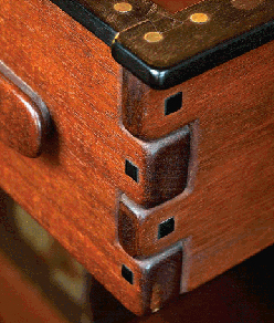
Each finger in this joint is a different width, creating additional interest in a beautiful feature. Detail, hall table, David B. Gamble house.
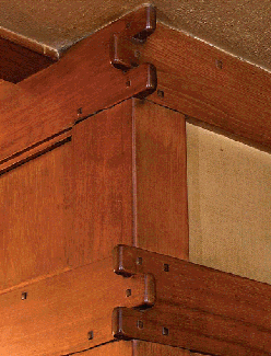
The exaggerated reveals on this finger joint add appeal where typically there would be none. Detail, hall woodwork, William R. Thorsen house.
The truth is that Charles and Henry Greene did transform the finger joint into a featured element, perhaps even the featured element on several of their furniture designs. Also true, however, is that the transformation was neither long lasting nor widespread. The dovetail continues to this day to be the gold standard for drawer construction and, to a lesser degree, for carcass construction as well. But for those few wonderful years, the Greenes’ joinery creation graced furniture and architectural trim. There are several distinguishing characteristics of the Greene & Greene finger joint. Not all are present in all examples. The fingers are wider than in the traditional, utilitarian version; fingers can have variable sizing within a joint; and the fin-gers typically stand proud of the surface of the mating board. In some trim the fingers extend significantly, while on most drawers the effect is far more subdued and on some drawers, as in the Blacker house, only the fingers on the drawer sides are proud, those on the front are flush with the sides. In some cases, as in the mantels in several houses, there are only several fingers — two on one board and one on the other. The single finger can be quite large, perhaps as much as several inches. Despite the many variations, the common heritage is obvious as is the wonderful effect this feature creates.
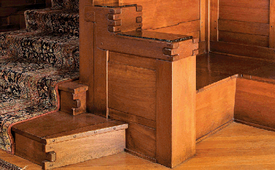
Every aspect of the Gamble stairs is exquisite. Here, finger joints, scrolls, pegs and beautiful materials work together beautifully. Detail, hall stairs, David B. Gamble house.
A relative of the finger joint, the bridle joint makes an appearance in several Greene & Greene designs. Bridle joints are a form of open mortise-and-tenon.57 This means that a through mortise is cut at the end of a board resulting in a mortise that is open on three sides. The mating tenon is visible on two sides, one side being hidden by the closed end of the mortise. This joint is particularly attractive in frame construction as in the Gamble house fern table and living room bookcase. In both pieces, bridle joints are used in frame construction of the tops. In these instances, the joint is adorned with square ebony pegs.
In some cases, several of these details are combined in a single masterpiece. Such is the case with the entry hall table from the David B. Gamble house. Two drawers in this table combine perhaps the ultimate expression of finger joints found in the Greenes’ work with a wonderful example of brass “pins” and yet another original detail: imaginative and beautiful drawer runners. Typical drawer runners are purely functional. They are often made of a secondary wood and are fully hidden from view until the drawer is removed. Greene & Greene brought drawer runners out of hiding and into full view. Two examples, in particular, merit discussion.
Not least among the wonderful details in the Gamble entry hall table are sensual, sculptural ebony drawer runners that are a highlight of the design. In this table, the drawers hang from their runners. Ebony strips, dovetailed at the corners, are attached to the top edges of the drawers (with the aforementioned brass pins). The strips are wider than the drawer sides, overhanging them to the outside of the drawer box. Two-tiered ebony runners attach to the table, adjacent to the legs on either side and in the center, between the two drawers. These runners engage the drawers, supporting them just above the upper stretchers. Because of the deep black color of the ebony, the runners are not immediately obvious, and the drawers appear to float. On closer inspection, the true nature of this mechanism is apparent and becomes a key feature of the table.
A very different but equally creative drawer arrangement is found on the living room library table from the Charles M. Pratt house (design for the house began in 1908 but the living room furniture was not designed until 1912). In this design, the single drawer is supported directly by the legs. Drawer construction utilizes finger joints in which the drawer front has one centered finger and the sides have two fingers top and bottom. The drawer runner is integral to the side: the drawer side is stepped across its width, much thicker in the center than at the edges. This step corresponds exactly with the finger on the front so that in elevation view it is concealed. The step engages a mating, subtle cutout in the legs suspending the drawer and providing a beautiful, unexpected solution to this ubiquitous design dilemma.
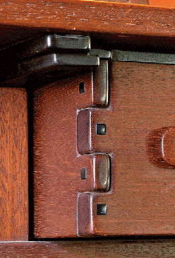
Even lowly drawer runners are elevated to high art, a sculpture in ebony. Detail, hall table, David B. Gamble house.
A study of detailing in a small piece, this clock must have had a commanding presence. Sadly, it is unknown if it still exists. Mantel clock, 1908, Belle Barlow Bush (William T. Bolton house), Pasadena, 1906.
Blacker House Details
Charles and Henry Greene considered the Blacker house to be their masterpiece. Built beginning in 1907 for retired lumber baron Robert R. Blacker and his wife, Nellie Canfield Blacker, the Blacker house is commonly considered the first of what are now known as the Ultimate Bungalows.58 Aesthetics are quite personal, but one can hardly argue with the Greenes’ choice. The Blacker house is a masterpiece in every respect.
Thanks to the considerable efforts of the current owners, the magnificence of this house, never far below the surface, is once again fully evident. The past, however, was not always kind to the pride of the Oak Knoll neighborhood.59 Nellie Blacker lived in the house until her death in 1946. Throughout her life the house remained in excellent condition. Henry Greene, who maintained a working relationship with Mrs. Blacker, visited as late as 1945 or 1946.60 In a 1942 letter to brother Charles Greene, he reported happily on the fine condition of the house.61
After Mrs. Blacker’s death, the house’s fortunes changed dramatically. There was a yard sale in which much of the furniture was sold. The magnificent 5-acre parcel was subdivided, leaving the house on a significantly smaller lot. The garage and keeper’s house were sold off. Finally, in the well-known “rape of the Blacker house,” the house was purchased by investors with the sole intention of stripping it of original lighting fixtures and art glass. To see the house in its current condition, one couldn’t believe that it had suffered such indignities.
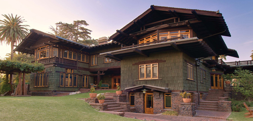
Interior and exterior are both fantastic. Note the beams projecting not only in the gables but below as well. View of South façade, Robert R. Blacker house, Pasadena, 1907-09.
For the Blacker house, Greene & Greene inherited a footprint and floor plan from fellow Pasadena architects Myron Hunt and Elmer Grey. While the Greenes made only minor changes to the physical dimensions of the structure, the elevations and materials they chose are dramatically different.62 One significant exterior addition is the powerful porte cochere that juts at an angle from the front entrance to the circular terminus of the driveway, providing cover for arriving guests. Presaged by a more modest version on the Mary Cole house (1906), the porte cochere, supported at the outboard end by a massive clinker brick pier, is perhaps the signature element of the house. The roof for the terrace at the opposite side of the house provides balance for the porte cochere while allowing for a degree of asymmetry as well.
The 1905 commission for Henry and Laurabelle Robinson gave Greene & Greene the opportunity to create a large estate including furniture for several rooms. This move toward creating a complete environment was an important development but ultimately only a step along the path to even more complete designs to come. The Blacker house represents a quantum leap in this regard. Designs for this estate include the 12,000 square foot main house, a garage, the groundskeeper’s house, gardens — with a substantial pond — and furniture and decorative arts for almost every room. In the interval between these two projects, Charles Greene developed and refined the firm’s trademark style, particularly with regard to furniture design.
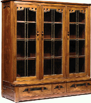
The Blacker living room is home to several details not seen elsewhere. This piece includes them all. Living room bookcase, 1908-09, Robert R. Blacker house.
In the Blacker house we find a startlingly cohesive collection of objects each of surpassing beauty and quality. This does not mean that there is a sameness in these objects. Quite the contrary is the case — there are a number of different themes in various rooms of the house. Despite the variation, rooms flow one into another and are unified through use of materials and subtle recurring elements such as the rounded corner brackets in windows throughout the house.
In addition to a number of details that we now recognize as elements of the Greene & Greene vocabulary, the Blacker house contains several features seldom or never used in other works by the firm. Some, such as tree of life inlays in the bedroom and scrolls in the magnificent entry hall, are discussed in other sections. The double brackets used in the interior corners of living room furniture are among the most striking details in the Greene & Greene repertoire and one of the most recognizable today. Certainly, Charles and Henry Greene must have understood the success of this detail. Why then did it not appear in other houses when many other details were used more commonly? Perhaps even then they understood that in the Blacker house they had created a unique environment, one that would define their careers. Befitting that status, they may have chosen to retire details used there.
The double brackets mentioned above, sometimes referred to as “Blacker brackets,” are nearly ubiquitous in the living room furniture. They appear on chairs, a sofa, tables and a magnificent bookcase with leaded glass doors. So frequently do these brackets appear in the living room that it is somewhat astonishing that they do not appear in any other room of the house. Typically used in the void at the right angle meeting of a leg and a rail, brackets were also used in the frame and panel sides and the leaded doors of the bookcase. The brackets on the bookcase may be the best illustration of the underlying nature of this form: The Blacker bracket is, in effect, a modified, exaggerated form of cloud lift — one that is applied rather than integral to the rail. While the open center of the bracket form is clearly distinct from cloud lifts, the result is the same — a rise in a horizontal line.
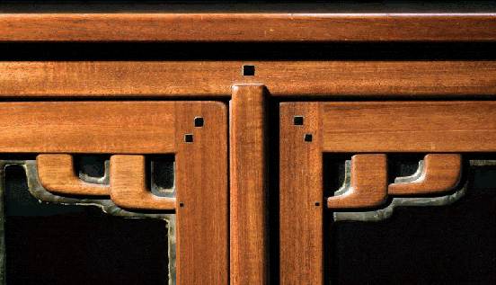
Blacker brackets in mahogany and lead. This iconic detail didn’t stay long in the Greene & Greene arsenal. Detail, living room bookcase, Robert R. Blacker house.
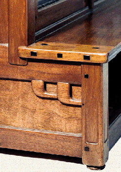
High detail density — leg indents, brackets, breadboard ends, splines, pegs, all in a couple of square feet. And it all works together seamlessly. Detail, living-room bookcase, Robert R. Blacker house.
Another detail unique to the Blacker house living room is much more subtle but quite beautiful and clever. Near the bottoms of the legs on every piece of furniture in the room, there is a small indent, nearly as wide as the leg. Several inches in length, the indents increase in depth and stop short of the leg bottom. The surface of the indent is slightly pillowed at the edges, mirroring the eased edges of the legs. The indent detail adds visual interest to the legs by creating shadow lines and texture. In some cases, they also serve to lighten the leg, similar to a slight taper, but without the exceedingly traditional appearance that detail imparts.
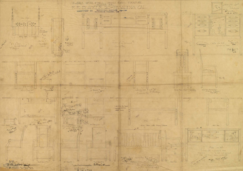
Notations and marks on these drawings allow us to imagine Charles Greene and Peter Hall poring over them together. Drawing, dining room and hall furniture, 1908-09, Robert R. Blacker house.
Inlay
As is surely plain by now, wonderful details are often the highlights of Greene & Greene furniture. Consider the crest rails on the Blacker living room chairs or the finger-jointed drawers on the Gamble chiffonier or the carved elements on the Thorsen living room desk. Each of these features greatly enhances the pieces on which they appear without dominating or overwhelming. Even in the context of such considerable beauty, one form of detail frequently stands out as simply incredible: the inlays that often grace tabletops, door panels, legs and chair backs.
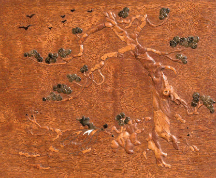
Certainly among the best Greene/Hall inlay work, this piece shows an amazing sensitivity in design and implementation. Stock selection is inspired. Detail, living room letter box, 1914, David B. Gamble house, Pasadena, 1907-09.
While Greene & Greene inlays are unusual in some ways, they share at least one important attribute with other Arts & Crafts varieties: they are inspired by, and depict, natural forms. This is consistent with Japanese and Arts & Crafts influences as both emphasize nature, not only with respect to inlays but in general. This subject is distinct from the common historical Western forms which were predominately geometric. Despite the common theme, Greene & Greene inlays are distinct even from others by Arts & Crafts designers. Consider the beautiful examples on pieces designed by Harvey Ellis for Gustav Stickley. Ellis’ designs helped bring a new grace and delicateness to Stickley’s offerings. Inlays certainly play a significant role in conveying this effect. These inlays typically depict flowers in highly stylized form. As with many Greene & Greene inlays, they often stand out as a defining element.
In contrast, inlays by Charles and Henry Greene are usually quite realistic with a three-dimensional appearance. There is little need for imagination to deduce what is being depicted. On the living room table (circa 1910) from the William Thorsen house, for example, the inlays, in the form of long-stem roses, are extraordinarily lifelike. The thorns appear ready to draw blood. Veins in the leaves are inlaid ebony, a remarkable achievement given their delicate dimensions and the brittle nature of the material. Shading on the leaves is achieved by singeing the wood in hot sand, adding to the three-dimensional quality. Flower petals are of vermillion — heart wood for darker petals and sap wood for lighter. The stems are primarily of koa. The overall effect is quite spectacular.
The conveyed three-dimensionality is the result of trompe l’oeil (as in the shading mentioned above) but more importantly to the fact that the inlay is, indeed, three-dimensional. Most Greene & Greene inlays are, in actuality, three-dimensional in that the inlaid elements stand proud of the field in which they are inlaid. These bolection inlays are able to convey a realism that would be otherwise impossible. Another benefit is a tactile quality that further summons fingers to surfaces that beg to be touched due to the silky finish.
Such extraordinary results can arise only from a synergistic relationship between designer and craftsman. Neither alone can achieve the goal. The craftsman needs the inspired design from which to begin, while the designer must rely on the skill and intuition of the craftsman. Clearly, both elements were present in the collaboration between the Greenes and those in the workshop of Peter and John Hall. Not only did Charles Greene sketch the inlay for the Thorsen table, he called out on the drawing the species of wood for each element. Even so, the success of the final result was largely dependent on decisions and execution at the bench by the craftsman. Inlays of this type are brought to life by appropriate stock selection and shaping. The best design cannot succeed except via these skills.
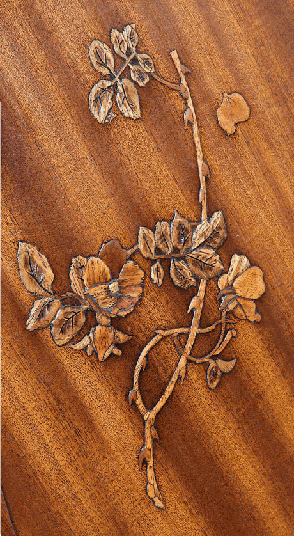
For this very literal inlay, every species is called out by the architect and is expertly handled at the bench. The result speaks for itself. Detail, living room table, c. 1910, William R. Thorsen house, Berkeley, 1908-10.
Another exceptional example of the designer/ craftsman relationship appears in the living room desk made for the Gamble House in 1914. A true work of art, it invokes one of Charles Greene’s favorite motifs: trees and birds in flight. The inlays seemingly come to life due to extreme care in selecting stock that is sensitive to the intended effect. This is especially evident in the tree trunk that crashes through the two-dimensional barrier to draw the viewer into the scene. The swirling grain of the background is also an important element — straight grain would have provided a less natural appearance. It is worth noting that the desk and letterbox for the Gamble living room were designed well after most other furniture for that house. In the intervening years, Charles had further developed, perhaps perfected, his inlay designs. This work bears a stronger resemblance to furniture for the Charles M. Pratt house than to any other for the Gambles.
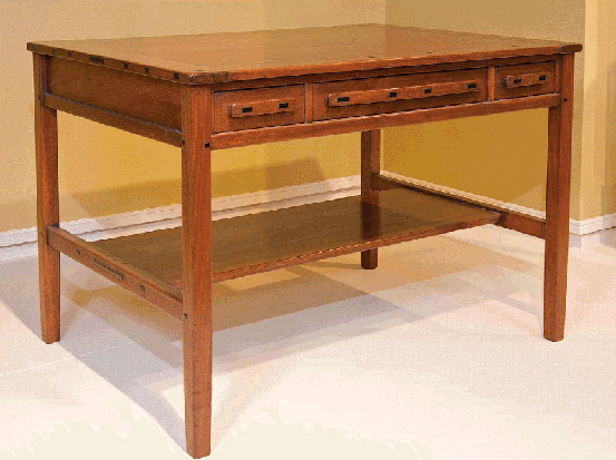
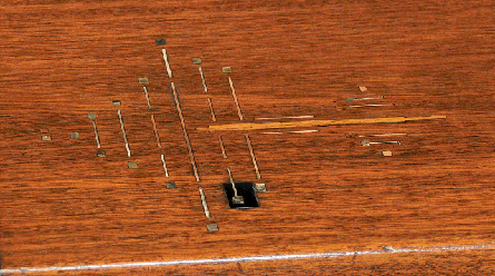
More abstract and stylized than most Greene & Greene inlays, this depiction of the tree of life (opposite top) is a recurring theme in the Blacker bedroom, including the desk above. Detail, bedroom desk, c. 1908, Robert R. Blacker house, Pasadena, 1907-09.
Not all Greene & Greene inlays are so literal and lifelike. Many of their earlier inlays are more stylized, in keeping with the typical Arts & Crafts form. Some inlays in the Robert R. Blacker house fall into this category — abstract forms inspired by nature. In the owner’s bedroom, the inlay motif is a depiction of the tree of life. This theme, symbolic of the interconnectedness of all life-forms, is consistent with Charles Greene’s interest in Eastern philosophies, an interest he indulged heavily later in life. The rather abstract form he designed (circa 1908), implemented in copper, silver, mother-of-pearl and fruitwood, appears on many pieces in the room — in some cases the tree trunk is several feet long, in others merely inches. Furniture for the bedroom is of mahogany with ebony accents.
As the Blacker inlays illustrate, Greene & Greene used many materials other than wood in their inlay designs. In addition to copper, silver and mother-of-pearl, all mentioned above, semi-precious stones, lapis lazuli, for example, and brass were used. Of course, the more expected broad assortment of woods also appear. The effect of the unexpected materials is both startling and immediately pleasing. Mother-of-pearl is used to particularly good effect in a number of pieces. The almost iridescent quality of the shell material unites very well with stained glass elements used liberally throughout many Greene & Greene houses.
Silver is brought to life in inlays for furniture in the Gamble house guest bedroom. The spidery metallic forms, accented with ebony and vermillion, appear surprisingly natural. To help achieve this effect, the width of the silver varies and the surface has a subtle texture. Smooth and uniform material would not be at all effective. In some cases, the lines are punctuated with silver dots, adding to the variability.
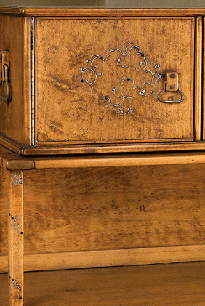
An illustration of the incredible variety in Greene & Greene inlays. Like some other details, this appears in only one room. Bedroom letter box, 1908-09, David B. Gamble house.
Carving
“Wood carving was a near religious experience for Charles Greene.”63 It was a lifelong avocation, one that yielded beautiful results for a number of clients. One can easily imagine that the bench work performed by a designer would best serve as a prototype rather than the finished product. This was certainly not the case with Charles Greene’s carvings. He displayed a genuine talent for both design and execution of carved panels.
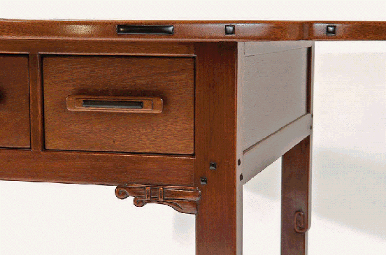
Gamble and Blacker furniture gets more attention, but this piece is one of the firm’s best. The carved feature at the rail/leg joint is simply wonderful. Detail, living-room table, c. 1910, William R. Thorsen house, Berkeley, 1908-10.
After moving to Carmel in 1916, Charles Greene devoted significant time to building and modifying the studio that became his refuge and his canvas. Few aspects of the small structure escaped Charles’ touch. On approach, the whimsical brickwork and wonderfully carved front door announce their pedigree. Inside, the carved doors are the highlight, though the plaster above, stamped by the Greene children while perched on Charles’ shoulders, are also very interesting. The mental image of the younger Greenes stamping the wet plaster with their father as their ladder casts Charles in an endearing, familial light.
The carving on the doors varies between lighthearted and impressive. There are several scenes, including one depicting Susannah and the Elders, that well illustrates Charles’ skill. Perhaps most remarkable are the doors between the small entrance hall and the spacious main room. Here we see symbols carved on the rails and stiles alongside pencil and chalk sketches of planned but never executed additions. This glimpse inside the creative process is fascinating. Being in that place, one has a palpable sense of Charles Greene’s presence, as evidence of the mind, and hand, of the master are everywhere.
Carving took hold of Charles Greene at the Manual Training School of Washington University in St. Louis. There, as part of the woodworking course, both brothers had hands-on training. While it would be some time before Charles would make professional use of this preparation, clearly it served him well. As with furniture design, knowledge of the process likely aided him in the design of carved panels and details, allowing him a high degree of empathy for the craftsmen who would implement his ideas.
In the James Culbertson house (1902) we see the first significant use of carved panels. Given that James Culbertson and the Greenes collaborated to create the firm’s initial Arts & Crafts house, the maxims that appear on a number of the panels come as no surprise. Natural themes also appear frequently, carved in deep relief. It is unfortunate that many of the panels were removed from the house during a renovation, making it impossible to experience the full impact of seeing them en masse and in situ as the architects intended.
The story of Susannah and the Elders as carved by Charles Greene. Charles may not have been a master carver, but he was certainly talented. Detail, bathroom door, 1923-57, Charles Greene studio, Carmel, 1923-24.
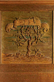
Relief-carved panels were often employed by Greene & Greene. This example is particularly lifelike. Entry hall panel, c. 1907, James A. Culbertson house, Pasadena, 1902-14.
Carved details found in Greene & Greene houses vary greatly in form. From the very literal and detailed panels in the Culbertson house to much less detailed low-relief carvings found in the Gamble house living room to the abstract, almost art deco frieze in the Robinson house sunroom, each project offers something unique. In yet another example of using details to unify various aspects of a design, we see in the Robinson house, carving details carried from the frieze into the wonderful square table also found in the sunroom. Similarly, in the Gamble house we find exceptionally simple carved details on the rails of living room furniture. They echo not only the cloud lifts on the same rails but also the amazing beams that are a primary feature of that room.
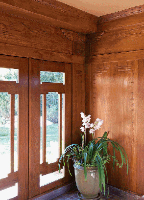
Reportedly carved by Charles Greene himself, these wall panels combine natural subjects, such as the rising sun, with a motif that could be described as art deco. Detail, sunroom, Laurabelle A. Robinson house, Pasadena, 1905-06.
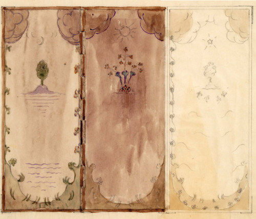
For this piece, and others in this house, nearly every aspect of design was a departure from the signature style, with the exception of quality and attention to detail. Drawing, living room screen, c. 1911-15, Cordelia Culbertson house, Pasadena, 1911-13.
Table Extensions
It has been well documented that one hallmark of Greene & Greene commissions is extreme attention to detail. No aspect of a design was considered too trivial to receive the designer’s touch. Even so, one could easily imagine that in some cases overwork and inertia might have led to repeated use of an established design element, particularly if that element was not central to the overall effect of the piece. Consider the extension mechanism for a dining room table. While it is certainly important to plan for this detail early in the design process due to the impact it could have on structural elements, it is not, in most cases, an aesthetic feature. Why not simply perfect one form of slide and use it whenever possible, saving considerable effort in the process? One might have asked that question of Charles Greene as he developed a number of interesting extension mechanisms and found creative ways to integrate them as design features, in some cases to stunning effect.
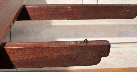
The Blacker extension mechanism is simple and efficient. Note the ebony used for the alignment pin. Detail, dining room table, 1908-09, Robert R. Blacker house, Pasadena, 1907-09.
The dining room table for the Robert Blacker house serves as a good example, not simply of an imaginative extension mechanism but also of the Greenes’ attention to detail. The top of the table is solid mahogany. Viewed from above, it does not appear to allow for expansion. Running beneath the tabletop, flush with the underside of the top, is a set of four beams or arms, each of which slides to extend from one end of the table. Thus, a pair of beams pierce the wide apron at each end to support leaves. In a delightful surprise, the outermost leaf at each end is held in place by an ebony and brass pin concealed in each arm. The pins could have been made of any common wood. That the Greenes chose ebony further demonstrates their obsessive nature. The pins are rotated into position after the arms are extended.64 Each end could accommodate multiple leaves, which were fitted together with indexing pins.
The dining room table designed by Henry Greene for the Richardson house is a study in simplicity, befitting that house’s rural setting on a working citrus ranch. Similar to the Blacker dining room table, the top is not divided — extension occurs at the ends rather than in the center. In this case, however, the leaves are integrated into the table, one hinged at each end. Ingenious brackets, two at each end, serve to hold the leaves in place when folded under and support them when raised. It is the brackets that distinguish this mechanism from others of similar form.65
While not technically an extension mechanism, the gateleg table designed for the living room of the William Bolton house and built for Belle Barlow Bush, the house’s first occupant, merits discussion. Like the other mechanisms under consideration here, gatelegs did not originate with Greene & Greene. As with many other design elements, however, they found a way to take a known form and improve on it, making it more graceful and beautiful. A classic problem with gateleg tables is how to accommodate the gate when closed. Greene & Greene solved the problem by introducing offset stretchers and rails, allowing the swinging leg to easily nestle in place.66
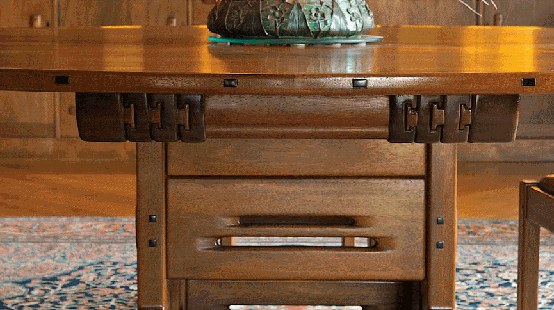
Possibly the most exquisite table extension mechanism ever devised. It glides effortlessly even today. Detail, dining room table, 1908-09, David B. Gamble house, Pasadena, 1907-09.
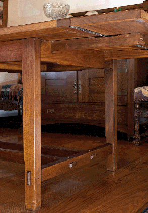
Though in continuous use for more than 80 years, this table is in impeccable condition. A simple design, it contains several trademark elements. Dining room, Walter L. Richardson house, Porterville, 1929.
Certainly the most elegant implementation of an extension mechanism graces the dining room table in the David B. Gamble house.67 For this table, Charles Greene took a typical sliding almost effortlessly extension mechanism and sculpted it into a truly spectacular, sculptural design element that serves as one of the dominant features. The slides consist of a series of nested runners, implemented in mahogany, each allowing the table to extend farther. The parts are expertly fitted in a wonderful marriage of engineering and craftsmanship. After 100 years the movement is still silky smooth and reassuringly precise, the elements sliding almost effortlessly to the fully extended length of 123 inches. At the center of the table, polished ebony indexing pins serve to align the table halves as they glide together. It is difficult to imagine that a more beautiful solution to this problem exists anywhere.
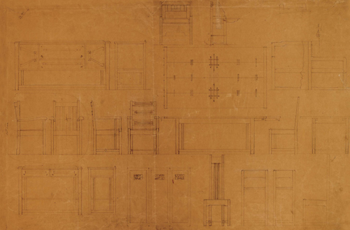
Sometimes overlooked, furniture for the William Bolton house is a significant achievement. Together with furniture for the Robinson house from about the same time, it marks the beginning of the zenith of Greene & Greene designs. Furniture drawing, c. 1907, William T. Bolton house, Pasadena, 1906.
Lighting
Lighting was an important and integral aspect of Greene & Greene houses with designs adding significantly to the aura of both interiors and exteriors. This is quite distinct from the modern practice of lighting design in which professionals seek to optimize lighting patterns and locations for dramatic effect. It seems unlikely that anyone considered such installations a century ago, perhaps due to the limited selection of lighting options — 15-watt incandescent bulbs don’t afford many choices.
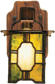
Subtle asymmetry and the first use of a tsuba shape by the Greenes are just two of the features that make this sconce interesting. Living room sconce, 1904-05, Adelaide M. Tichenor house, Long Beach, 1904-05.
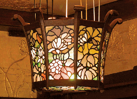
For this magnificent re-implementation, Kokomo Opalescent Glass reformulated the green glass — the original formulation is no longer available as it requires hazardous chemicals. Living room lantern, 1908-09, Robert R. Blacker house, Pasadena, 1907-09.
No, for the Greenes’, lighting design meant creating beautiful fixtures that were at once complementary with the overall design of the house and, in some cases, expressive works of art. Lighting designed by the firm appeared in many more houses than did furniture. In wonderful homes such as those for Mary Reeve Darling, Edgar Camp, Jenny Reeve, Adelaide Tichenor and F.W. Hawks, we see interesting, if sometimes simple, designs that presage the more elaborate fixtures to come. Sconces in the Hawks house include round pegs that protrude significantly, perhaps as much as any others in a Greene & Greene design, a dramatic touch on a straightforward fixture. In the Ultimate Bungalows, we see lighting fixtures that are truly definitive statements of the Greene & Greene aesthetic.
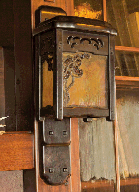
By 1909, Greene & Greene had designed many sconces. Yet they found ways to make each unique and worthy of note. Living room sconce, 1909-10, William R. Thorsen house, Berkeley, 1908-10.
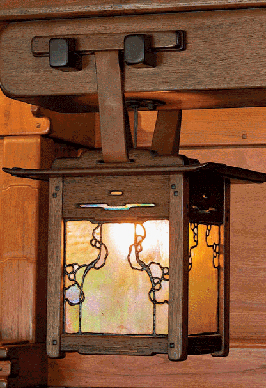
The inglenook is flanked by a pair of wonderful lanterns suspended from impressive beams. The upturned ends of the top set an Asian tone. Living room lantern, 1908-09, David B. Gamble house, Pasadena, 1907-09.
Greene & Greene lighting falls into several categories not at all unique to the firm: sconces, lanterns (hanging and mounted), chandeliers, ceiling fixtures and table lamps. While none of these types originated with the Greenes, they adapted each type to their own purposes and in the process created forms that are unmistakably theirs. There is incredible variation in Greene & Greene lighting, much of which is not attributable to evolution. Consider dining room chandeliers in the Blacker and Robinson houses. While there is a hint of familial resemblance between the two fixtures, they are quite distinct. The chandelier from the Duncan/Irwin house, with individually suspended, fluted glass shades on black chains, is almost completely dissimilar. Perhaps the only clue to common heritage is the wooden ceiling treatment.
Among the most distinctive lighting elements from Greene & Greene are the sconces and hanging lanterns in the Ultimate Bungalows. Even within a house there is considerable variety in lighting fixtures. In the Thorsen house living room, sconces are rectangular forms with heavily sculpted tops and art glass sides. Though it may be overactive imagination, the glass appears to depict a marine plant, playing to the nautical theme. Also in the living room is a form of lighting very unusual for its day — flush-mounted ceiling fixtures. A hanging lantern at the upstairs landing includes cutouts similar to those on the flower stand designed for that house.68
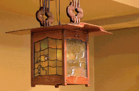
Teak, ebony, silver, leather and art glass melded into a beautiful, functional work of art. Hall lantern, 1908-09, Robert R. Blacker house.
The Gamble house includes a large number of wonderful lighting fixtures. Perhaps best known are the hanging lanterns that flank the living room inglenook. These are an iconic Greene & Greene design. The basic form is standard but the thin top with upturned ends distinguishes the piece and lends an Asian feel. The cleats from which the piece is suspended, via leather straps, are quite sculptural.69 Another well known fixture, one that is a real departure from most interior lighting designed by the Greenes, is the pair of hanging lanterns in the entry hall. Constructed primarily of brass, the top is arched in the manner of the roof over the entrances of many Japanese temples, appropriate given the location of these lanterns.70 A crane and red rose motif is used above the panels to include elements from the Gamble family crest.
The Blacker house contains fixtures that nearly span the spectrum of complexity. In several rooms are sconces with fabric skirts as shades and wooden forms that are relatively simple. The dining room is among these. The dining room chandelier was designed to include a skirt as well, though it appears that this aspect of the design was not implemented. The entry hall hanging lanterns are one of the most pleasing decorative arts elements designed by Greene & Greene. The sinuous top provides a rare use of the lift form. The art glass panels on two opposing sides depict birds in flight while the other pair show flowers and have an unusual peaked shape, perhaps evocative of mountains. Subtle silver inlay on the bottom rails echo the themes. In the living room we find what may be the most stunning lighting element in any Greene & Greene home: six mahogany and intricate art glass basket lanterns. In old black-and-white photographs of the living room, these lanterns appeared, in my opinion, bulky and uninspiring. Viewing them in person quickly changes that view. They are quite remarkable and a highlight of an amazing room. They are also unique. With less immediate presence than the basket lanterns, the living room table lamp is quietly spectacular. The shade, in particular is a testament to the woodworking skills of the Halls’ craftsmen. A flared octagon, each side consists of a mahogany panel beautifully carved to depict flowers and whimsical geometry. The shade is topped with an amazingly carved octagonal ebony cap.71
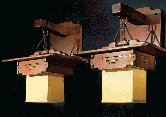
An informality, attributable to silk skirts, alters the effect of the otherwise standard Greene & Greene elements. Bedroom sconces, 1908-09, Robert R. Blacker house.
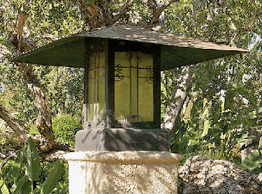
Greene & Greene lighting is not exclusive to interiors. Since at least the Jennie Reeve house, the brothers designed wonderful exterior fixtures as well. Exterior lantern, 1906-08, Freeman A. Ford house, Pasadena, 1906-08.
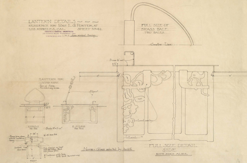
An impressive degree of detail, in this case for a lesser commission. One notation reades, “Note - glass selected by Archt’s.” Drawing for lantern, c. 1905, Mrs. L. G. and Miss Marion Porter, Los Angeles, 1905.
Art Glass
Museums are home to many unusual objects. At the Rock & Roll Hall of Fame and Museum, one can see the clothes worn by Bruce Springsteen for the cover shot of the “Born in the USA” album. In the National Museum of American History, one finds the kitchen from Julia Child’s Massachusetts home. On display at the American Museum of Natural History is a 1,000 pound hunk of stibnite adorned with hundreds of naturally formed, sword-like crystals. And in a Dallas museum, one can see the front door of a house. In a history museum this might not be a particularly unusual exhibit. In this case, however, the door is in the Dallas Museum of Art. Yes, a front door as art. Strange. That is until one sees the door in question: the front entry to the Robert R. Blacker house.
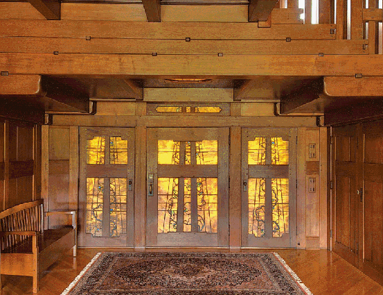
This recreation of the main entry is an important part of the restoration of the Blacker house. No photo can do justice to the wonderful light coming through the glass. Set of doors (reproduction), c. 1985-87, Robert R. Blacker house, Pasadena, 1907-09.
Clearly, this is no ordinary door. In fact, it is not a single door but rather three doors grouped into a single entry. The main door, much broader than is typical, is flanked by two smaller doors, each playing the role of an oversized and entirely functional sidelight. The design is seamlessly integrated into the overall scheme of the house and the detailing, fit and finish are equal to that of fine furniture. Even with these impressive qualities, the doors are defined by a different element: the art glass.
Art glass is a frequent sight in Greene & Greene houses. In addition to appearing in entry doors, it turns up in windows, cabinets, furniture and lighting fixtures as well.72 Its use in doors is not limited to entries as some interior doors include glass panels. The door from the dining room to the butler’s pantry in the Gamble house includes a glass panel that continues the primary theme in that room — the mokko gata tsuba. The same is true of windows — in several cases, there are art glass windows between two interior spaces, for the purpose of promoting airflow, something to which the Greenes paid special attention. For example, the owners’ bedrooms in the Pratt and Gamble houses include this feature.
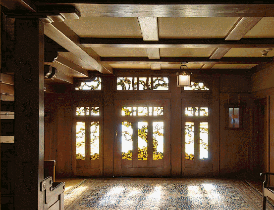
Roughly 30,000 visitors each year pass through this door. More than a century after construction, it is still exquisite. Set of doors, c. 1908, David B. Gamble house, Pasadena, 1907-09.
Lighting certainly provides the most frequent use of art glass with some truly spectacular examples: the Robinson dining room chandelier is a marvel not only for the intricate leaded glass but also for the remarkably inventive counterweighted fixture; the marvelous form of the Blacker entry lanterns, executed in teak and accented with iridescent and opaque glass, is one of the most compelling designs by Greene & Greene. However, doors provide the most spectacular use of glass, perhaps due to the scale, perhaps due to the exceptional beauty in an unexpected place.
As with every device employed by Greene & Greene, their art glass is unusual but not outlandish, innovative but not alien. Large panels, in particular, resemble paintings. There are large expanses comprised of a single piece of glass punctuated by fine details executed with many small pieces. The glass work exhibits an organic quality that derives, in part, from the natural subject. The Blacker house entry depicts flowering vines climbing a trellis, the foliage and flowers providing glimpses of blue, red and green against the golden brown background. The trellis, represented in the lead lines of the panels, angles upward from the bases of the three doors and is echoed by stiles in the doors’ wooden construction. A small trellis above the main entry continues the theme, drawing the eye up toward the magnificent tiered ceiling and flush light fixture.
The Ford house entry is a departure for Greene & Greene. The subject is inspired by nature and by man. The frame of the single door portrays a rather abstract human figure with broad, sculpted mullions for legs and torso and a wide rail providing the outstretched arms. This form is not immediately apparent but once discerned is entirely obvious.73 The art glass portrays a Native American ceremonial dress comprised of peacock feathers. The feathers continue into the transom above the door and above the panels that flank it. Two broad doors on either side of the entry hall, one to the living room, the other to the dining room, contain small glass panels that carry the feather motif of the entry into the house’s interior. Outside the entrance hang two metal lanterns with wonderful iridescent glass panes.
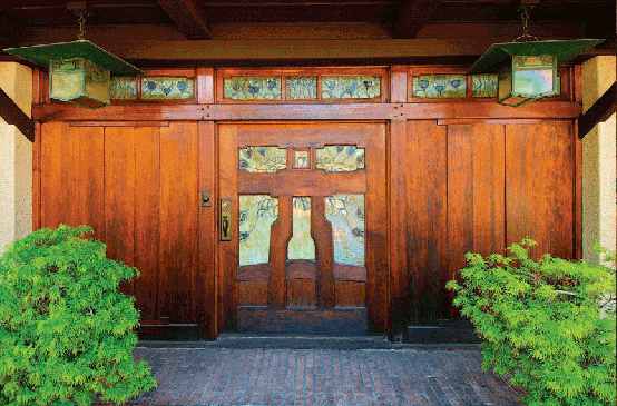
A different, less natural theme is found in this glass. Native American forms were common in arroyo culture. Door, 1907-08, Freeman A. Ford house, Pasadena, 1906-08.
The entry to the Gamble house is certainly the best known in the Greene & Greene canon. One might imagine that this results from that house being open to the public and the subject of countless photographs. Certainly that is the case, at least in part. However, the eminence of the Gamble doors just as certainly derives from the doors themselves for they are the most beautiful in any Greene & Greene house. Thought for years to illustrate a California live oak tree, the art glass is now believed to depict a black Japanese pine, its broad canopy spanning the main door and two smaller doors on either side.74
The branches also continue into the transom which is large and interesting. Those above the smaller side doors are nearly triangular with a beautifully-formed hypotenuse breaking the largely rectangular form. This element was likely suggested by the hall stairs which project from the entry hall ceiling meeting the door wall at the north transom and providing one more example of a wonderful, decorative solution to a design dilemma.
With their extremely high level of craftsmanship, Peter and John Hall allowed Charles and Henry Greene to mature and evolve as designers, to create increasingly intricate and complex pieces, comfortable in the knowledge that their contractor could implement them with sensitivity and expertise. Some believe that the Greenes and Halls pushed each other in a good-natured game of chicken, each pair trying to make the other blink first. There is no evidence that anyone blinked — the houses, furniture and decorative objects attest to the skills and creative growth of designer and craftsmen. The Hall shop could provide most of what Greene & Greene required but not everything. For art glass they turned to Emil Lange, from whom they were able to assume excellence on a par with woodwork from the Halls.
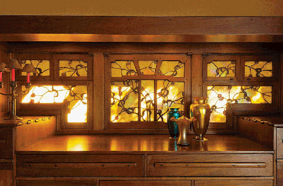
During winter months, when the sun is low in the sky, the afternoon light in the dining room glows with the color of this amazing window. Dining room window, c. 1908, David B. Gamble house.
Lange, a former employee of Tiffany Studios, was a supremely talented artist. The organic character of Greene & Greene art glass, attributed above to subjects drawn from nature, is also due to Lange’s methods. That is perhaps the primary reason for the exceptional feel conveyed by his pieces. Several techniques serve to distinguish the works he created for Greene & Greene. Layering of glass to achieve variation in light transmission and color is one such technique. In some cases, one can see the layered elements in a rare opportunity to peer behind the curtain. Another technique, perhaps the most notable, is the high degree of variability in the width of the lead work. Rather than serving only to connect glass elements, the lead itself is integral to the aesthetics. It serves purposes both functional and decorative, a recurring trait in the work of Greene & Greene. The effect, achieved by manipulating lead solder with a variety of soldering iron tips,75 increases the textural quality of the work in what is typically a highly textural medium. The result is an informality and brilliant organic character that fits perfectly with the country houses that were the Greenes’ domain.
Evidence of this approach appears in the form of a drawing for a lantern for a commission that is not very well known. In 1905, Greene & Greene designed a residence in Los Angeles for Mrs. L.G. and Miss Marion Porter. The lantern in question includes panels with a foliage motif and corner brackets similar to those on the Robinson dining room chairs and Blacker windows. The drawing calls out this detailing as “Lead overlay.” The overlay ignores the boundaries of the panel, making the scene appear spontaneously alive. This lovely piece serves to reinforce the democratic aspect, described by Jean Murray Bangs, in the work of Greene & Greene: even relatively modest houses received many of the same touches that make the Ultimate Bungalows, as well as many other houses designed by the firm, masterpieces of American architecture.
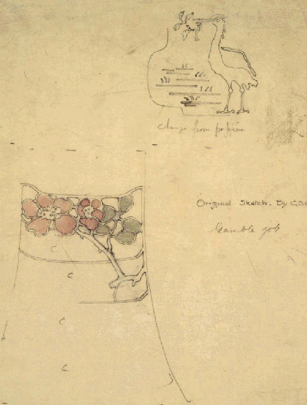
Sketches for hanging lanterns (crane and rose) and guestroom sconces provide a glimpse of the creative process. Sketch, lighting fixtures, c. 1908, David B. Gamble house.
Pulls & Escutcheons
It is not particularly surprising that in high-end custom furniture even small details are designed and made by the craftsman. This is one of the perqs for clients willing and able to spend large sums of money for functional art. Drawer pulls, door handles and even escutcheons76 are fully integrated into the design since they are part of the design rather than an off-the-shelf addition selected from a catalog and glommed on. Thus, Greene & Greene are not unique in their use of custom elements such as these. It is surprising, however, that they were able to continue this practice even during their busiest period, that several year span during which they designed the Ultimate Bungalows and several hundred pieces of furniture.
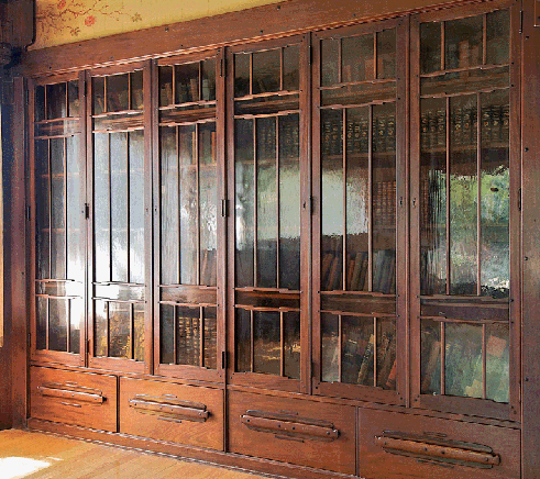
Two of these imposing bookcases flank a window that once had a view of the bay. Shelves are stepped to provide strength and a lighter appearance. Living room bookcase, 1908-10, William R. Thorsen house, Berkeley, 1908-10.
Shop-made pulls and escutcheons appeared in Greene & Greene furniture and built-ins beginning with the earliest pieces. These are rather simple in keeping with the furniture, but even at the outset the Greenes attended to the small details. In the living room of the Jennie Reeve house, there is a wonderful built-in curio cabinet that backs to the bench of the well-known inglenook. On each leaded glass door is a simple pull that complements the piece and echoes the through tenons on the upper and lower rails. Pulls for furniture in the Adelaide Tichenor house are more complex, incorporating a lift motif, though still crude when compared to the firm’s later work. Simple, oversized, rectilinear wooden escutcheons appear on pieces in both houses as well.
Custom escutcheons are absent from many projects, not reappearing regularly until the Ultimate Bungalow period. At that time, the escutcheons included in most of the Greenes’ pieces were quite small, barely proud of the door or drawer surface and of a stepped geometric shape. It is tempting to see in that shape a form of mokko-gata, though one stylized and comprised entirely of straight line segments. However, another likely inspiration can be found in the arroyo culture that existed along the dominant geographic feature of Pasadena’s western edge. The rusticity that was a key element of this culture was wonderfully complemented by Native American styles, which were common then as now. One can easily recognize in Greene & Greene escutcheons throughout this period, Native American geometric forms.
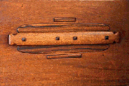
This drawer demonstrates the wonderful variety achieved with relatively simple building blocks. A similar flange, behind the pull, was used in the Blacker house entry hall. Detail, living-room bookcase, William R. Thorsen house.
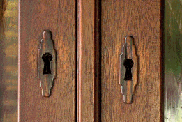
Significant effort expended for a very small detail. This shop-made escutcheon is a wonderful accent. Detail, living-room bookcase, William R. Thorsen house.
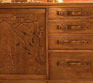
Are those tsubas? In the Blacker house? The pull on the central door grows out of the carved scene. Entry hall chest, 1908-09, Robert R. Blacker house, Pasadena, 1907-09.
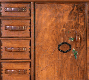
Pulls must be interesting to be noticed amidst so much beauty. These are particularly sculptural. Detail, bedroom chiffonier, 1908-09, David B. Gamble house, Pasadena, 1907-09.
Development of drawer pulls follows that of the firm’s furniture. Designs became increasingly sophisticated and sculptural. In some cases the pulls are a significant design element. Even within a single house there is often significant variation. Using the Gamble house as a case in point, we see very sparse pulls on the first floor with those in the entry hall exhibiting a particularly modern appearance. By way of contrast, in David and Mary Gamble’s bedroom the three-tiered pulls are rather whimsical and a noteworthy feature of that furniture.
One should almost expect that the Blacker living room would contain a drawer pull form not found elsewhere, in keeping with the unique details present in that room. The ebony and mahogany pulls on every drawer in the room do not disappoint. Each pull consists of three horizontal ebony bars, increasing in length top to bottom, and a mushroom-profiled mahogany grip set atop them. It is difficult to imagine these pulls on other Greene & Greene furniture, but it is difficult to imagine this furniture without this distinctive feature. Two case pieces in the Blacker entry hall each contain two different pull forms. Those on the drawers consist of a horizontal bar-style pull over a lobed backplate. A similar form was used later in the Thorsen house. The doors on these pieces are carved with a mountain scene. The pull takes the form of a gnarled tree, a vestigial branch providing purchase for fingers.
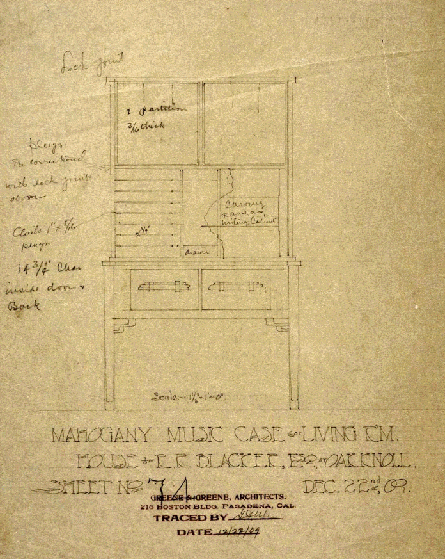
A drawing that depicts many of the details for which Greene & Greene are famous. Drawing, living room music case, 1909, Robert R. Blacker house.
Culbertson Sisters’ House Details
Charles and Henry Greene are best-known for a number of very beautiful houses designed and built during a very brief period. The houses, furniture and decorative items created during that time, and the style they defined, are now considered the quintessential Greene & Greene typeforms, and for good reason. Even so, the Greenes designed a number of important houses before and after that very productive period: the James Culbertson house, the D.L. James house, the Fleishhacker estate and the Culbertson Sisters’ house are examples.
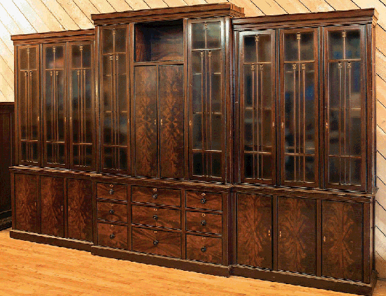
Monumental size doesn’t preclude elegance. Beautiful stock and typically attentive detailing instill grace in this 12-foot wide behemoth. Hall bookcase, 1911-13, Cordelia A. Culbertson house, Pasadena, 1911-13.
James Culbertson was a notable early client for Greene & Greene Architects. In 1911, his three maiden sisters, Cordelia, Kate and Margaret, commissioned the Greenes to design a substantial house in the fashionable Oak Knoll neighborhood.77 The project included designs for gardens as well as a large number of pieces of furniture. It was their largest commission to that time. In 1917, the Culbertson sisters sold the house to wealthy widow, Mrs. Elisabeth Allen. Mrs. Allen, who would later marry Francis F. Prentiss, would continue to engage the Greenes for 20 years.
Looking beyond the surface reveals the pedigree of this piece. Shelf with breadboards and ebony pegs. Detail, bookcase, Cordelia A. Culbertson house.
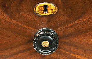
Pulls of this form are unusual for Greene & Greene, who usually preferred broader handles. Though the style is atypical, the detailing remains superb. Detail, bookcase, Cordelia A. Culbertson house.
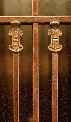
This furniture causes one to wonder what furniture Greene & Greene would have designed through the years had their practice continued undiminished. Detail, bookcase, Cordelia A. Culbertson house.
The Cordelia Culbertson house represents both a departure and a return for Greene & Greene. For the basic form of the house, they returned to the U-shaped courtyard style used to great effect for several previous clients including Arturo Bandini and Freeman Ford. Similarities end there. The Culbertson house bears little resemblance to the “wooden style built woodenly”78 of most of their earlier masterpieces. An increased formality is perhaps the best way to describe the different character found here.
Furniture for the Culbertson house is similarly distinct from the trademark style associated with the Greenes. Both more formal and more traditional, the pieces are striking and, like all Greene & Greene furniture, perfectly fit their environment. But these pieces do not immediately announce their heritage. One piece, an immense, wonderful bookcase comprised of six separate units and measuring roughly 12-feet wide and 7½″-feet tall, is, interestingly, in the possession of the Property Department at Warner Bros. Studios. No one knows exactly how or when it arrived there.79 Some years ago, department managers undertook to inventory and appraise pieces in their warehouse. An appraiser suggested, quite impressively given the dissimilarity from their trademark forms, that the bookcase might be by Greene & Greene. She contacted Randell Makinson who, upon viewing the imposing piece in the company of Ted Bosley and Jim Ipekjian, quickly verified its pedigree.
From basic form to detailing to finish, these pieces are unusual in the Greene & Greene catalog. Yet there are clues to their lineage. Shelves are constructed with breadboard ends complete with ebony pegs. Doors and drawer fronts are wrapped in ebony secured with brass screws, heads filed to remove the slot.
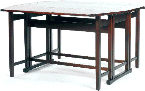
Ebony accents and cloud lifts on the gate rails tie this piece to the better known Greene & Greene style. Garden room gateleg table, c. 1912, Cordelia A. Culbertson house.
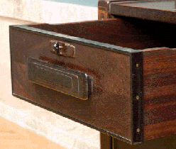
This escutcheon may be the firm’s best. An absolutely brilliant form, beautifully executed. Detail, living room secretary, Cordelia A. Culbertson house.
Bookmatched veneers are a dominant feature of the Culbertson house furniture. Greene & Greene occasionally used this device but rarely put it so prominently on display. The perfectly prepared surfaces shimmer showing off the figure of the mahogany. Inlays on these pieces are a departure from the highly expressive, naturally inspired examples common over the previous several years. Restraint, abstraction and symmetry are the watchwords here. Some aspects of these designs exhibit an art deco feel. Escutcheons on the secretary may show this most strongly. Rectangular with a slightly rounded surface, they have a top edge that is stepped at each end and subtly engraved with horizontal lines. As is so often the case with Greene & Greene details, this is delicate and beautiful. Interestingly, the escutcheons are not uniform throughout the case pieces. Those on the bookcase described above differ from those on the secretary in form and material. Both are unique for Greene & Greene and are quite wonderful.
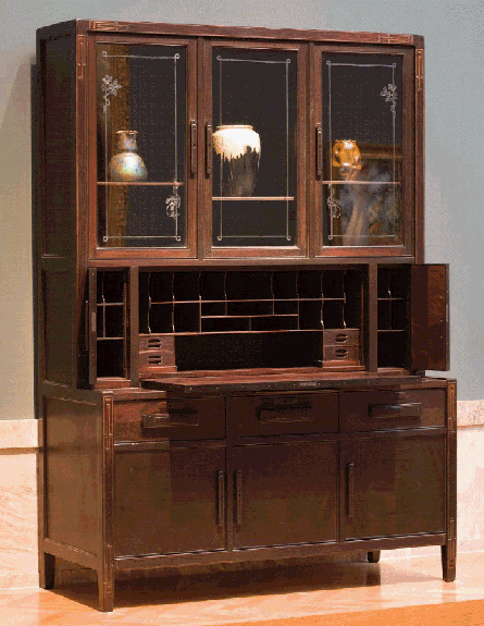
Restrained lines serve as the backdrop for Greene & Greene ornament: rather reserved inlay, wonderfully shaped pulls and ebony banding with beheaded brass screws. Living room secretary, c. 1911, Cordelia A. Culbertson house.
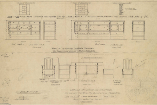
These pieces are about proportion and inlay. Note the rough sketches in the margins. Drawing, dining room furniture, 1911-13, Cordelia Culbertson house.