
Long before they were ever written down, poems were organized in lines. Since the invention of the printing press, readers have become increasingly conscious of looking at poems, rather than hearing them, but the function of the poetic line remains primarily sonic. Whether a poem is written in meter or in free verse, the lines introduce some kind of pattern into the ongoing syntax of the poem’s sentences; the lines make us experience those sentences differently. Reading a prose poem, we feel the strategic absence of line.
But precisely because we’ve become so used to looking at poems, the function of line can be hard to describe. As James Longenbach writes in The Art of the Poetic Line, “Line has no identity except in relation to other elements in the poem, especially the syntax of the poem’s sentences. It is not an abstract concept, and its qualities cannot be described generally or schematically. It cannot be associated reliably with the way we speak or breathe. Nor can its function be understood merely from its visual appearance on the page.” Printed books altered our relationship to poetry by allowing us to see the lines more readily. What new challenges do electronic reading devices pose?
In a printed book, the width of the page and the size of the type are fixed. Usually, because the page is wide enough and the type small enough, a line of poetry fits comfortably on the page: What you see is what you’re supposed to hear as a unit of sound. Sometimes, however, a long line may exceed the width of the page; the line continues, indented just below the beginning of the line. Readers of printed books have become accustomed to this convention, even if it may on some occasions seem ambiguous—particularly when some of the lines of a poem are already indented from the left-hand margin of the page.
But unlike a printed book, which is stable, an ebook is a shape-shifter. Electronic type may be reflowed across a galaxy of applications and interfaces, across a variety of screens, from phone to tablet to computer. And because the reader of an ebook is empowered to change the size of the type, a poem’s original lineation may seem to be altered in many different ways. As the size of the type increases, the likelihood of any given line running over increases.
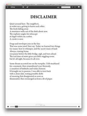
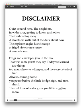
Our typesetting standard for poetry is designed to register that when a line of poetry exceeds the width of the screen, the resulting run-over line should be indented, as it might be in a printed book. Take a look at John Ashbery’s “Disclaimer” as it appears in two different type sizes.


Each of these versions of the poem has the same number of lines: the number that Ashbery intended. But if you look at the second, third, and fifth lines of the second stanza in the right-hand version of “Disclaimer,” you’ll see the automatic indent; in the fifth line, for instance, the word ahead drops down and is indented. The automatic indent not only makes poems easier to read electronically; it also helps to retain the rhythmic shape of the line—the unit of sound—as the poet intended it. And to preserve the integrity of the line, words are never broken or hyphenated when the line must run over. Reading “Disclaimer” on the screen, you can be sure that the phrase “you pause before the little bridge, sigh, and turn ahead” is a complete line, while the phrase “you pause before the little bridge, sigh, and turn” is not.
Open Road has adopted an electronic typesetting standard for poetry that ensures the clearest possible marking of both line breaks and stanza breaks, while at the same time handling the built-in function for resizing and reflowing text that all ereading devices possess. The first step is the appropriate semantic markup of the text, in which the formal elements distinguishing a poem, including lines, stanzas, and degrees of indentation, are tagged. Next, a style sheet that reads these tags must be designed, so that the formal elements of the poems are always displayed consistently. For instance, the style sheet reads the tags marking lines that the author himself has indented; should that indented line exceed the character capacity of a screen, the run-over part of the line will be indented further, and all such runovers will look the same. This combination of appropriate coding choices and style sheets makes it easy to display poems with complex indentations, no matter if the lines are metered or free, end-stopped or enjambed.
Ultimately, there may be no way to account for every single variation in the way in which the lines of a poem are disposed visually on an electronic reading device, just as rare variations may challenge the conventions of the printed page, but with rigorous quality assessment and scrupulous proofreading, nearly every poem can be set electronically in accordance with its author’s intention. And in some regards, electronic typesetting increases our capacity to transcribe a poem accurately: In a printed book, there may be no way to distinguish a stanza break from a page break, but with an ereader, one has only to resize the text in question to discover if a break at the bottom of a page is intentional or accidental.
Our goal in bringing out poetry in fully reflowable digital editions is to honor the sanctity of line and stanza as meticulously as possible—to allow readers to feel assured that the way the lines appear on the screen is an accurate embodiment of the way the author wants the lines to sound. Ever since poems began to be written down, the manner in which they ought to be written down has seemed equivocal; ambiguities have always resulted. By taking advantage of the technologies available in our time, our goal is to deliver the most satisfying reading experience possible.