
FIGURE 9. A simplified map of the Boston subway system.
Paul Kim, adapted from Michael Kvrivishvili (CC BY 2.0).
DESCEND INTO THE SUBWAY TUNNELS that lie beneath Boston, Massachusetts, and you will find maps everywhere: framed on station platforms, plastered inside train cars, and printed on flyers. For the city’s 1.3 million riders, the subway map serves equally as resource and decor. But it also illustrates a surprising fact that is as true for maps in brains as it is for maps in subways: sometimes distorting a map actually makes it better at representing what people need to know.
The lines of the Boston subway system are laid out like the spokes of a wheel, with its hub at the heart of the city, as you can see in Figure 9. Transferring from one subway line to another can happen at four stations in the hub. I once rode the Red Line from one hub station (Park Street) to another (Downtown Crossing), only to discover that I had traveled just a single city block. Compare that to the distance between the Davis and Alewife stations, two adjacent stops at one end of the Red Line. Although the dots representing Davis and Alewife on the map are closer together than those representing Park Street and Downtown Crossing, the physical Davis and Alewife stations are separated by more than a mile. In short, the map’s representation of the subway system is warped with respect to reality. If 1 centimeter’s distance between Park Street and Downtown Crossing on the map represents 10 meters of actual track distance, then 1 centimeter on the map between Davis and Alewife represents a whopping 140 meters of track.
Remarkably, this inaccuracy actually makes the subway map more useful. When you are riding away from the hub, you need to know only the serial order of stations along that track in order to anticipate and disembark at your destination. But when you’re riding toward the hub and preparing to transfer, you also need spatial information. Can you get to the airport with one transfer, or do you need to make two? At which stations do you make these transfers and, when you reach them, in which direction should you ride on each new line? By magnifying the representation around transfer points, the subway map gives you spatial clarity where you need it most.
FIGURE 9. A simplified map of the Boston subway system.
Paul Kim, adapted from Michael Kvrivishvili (CC BY 2.0).
Many brain maps, including your visual map in V1, employ the same trick. The part of the V1 visual map that represents visual information from your foveas, corresponding to where you are directing your gaze, is dramatically magnified compared to the rest of the map. In fact, this magnification lies at the heart of one of Inouye’s discoveries: although the bullets for the Mosin-Nagant guns were exactly 7.6 mm in diameter, they created patches of blindness that varied widely in size. Blind patches at his patients’ center of gaze were quite small, while those in the periphery were far larger. These size differences show that the representation of foveal information is grossly expanded in the V1 map, just as the representation of the hub is magnified in the subway map.
Why is foveal information in particular magnified in the V1 map? In essence, because it pays to invest in one’s strengths. Light receptors are packed more tightly together at the fovea than anywhere else in the retina. Because we have more receptors at the fovea, we collect more information about the part of the visual scene we are looking at directly. This difference creates an inequality within the retina, making the fovea a little better than other zones. But that inequality is only the beginning.
Imagine two of the light receptors in your retina, one located in the fovea (“Florence”) and the other off on the periphery (“Perry”). Let’s say that these receptors each detect a photon, or packet of light, at the same instant and send the same signals announcing their discovery. In less than one-twentieth of a second, these signals will travel through other cells in the retina, make a brief stopover at a relay station nestled deep in the brain, and reach V1 at the back of your head. Along the way, the signal from Perry is combined with signals from his neighboring receptors, while the signal from Florence is faithfully preserved. Although the two signals were identical when they began their journey, by the time they reach V1 they are nothing alike. There, information from Florence gets a hundred times more space in the V1 map than information from Perry. The fact that input from Florence and her neighbors at the fovea claims grander territories in the V1 map has real consequences for what you can perceive. Larger territories mean more V1 neurons devoted to representing the fine-grained detail of patterned light detected at the fovea.
The story of Florence and Perry raises obvious questions: Wouldn’t we see better if we preserved signals from Perry just as faithfully as we preserved signals from Florence? Why magnify just one part of the map when you might magnify all of it? The same questions could be asked about the subway map. Why not give the map a consistent scale and then just print the whole thing bigger, so that it is accurate and clear? The answer is that if the Boston subway map represented the entire system at the same scale as the hub, the map would have to take up roughly a hundred times the area overall. Displaying such a map at an underground platform, much less printing it on flyers, would be all but impossible. The subway map is a compromise: it provides detail where it is needed while keeping the overall map reasonably sized.
The same compromise applies to the visual cortex. In a perfect world, V1 could equitably represent foveal and peripheral inputs alike. But you could never afford to have such a map; your V1 would have to be thirteen times larger to accommodate it. Worse still, that extra information would have to be processed in other brain areas, meaning that they too would have to be larger. If the brain were organized in this way, areas dedicated to vision alone would be too large to fit inside the human skull.
Forced to play favorites and make sacrifices, your brain went all in on the fovea, at the expense of the periphery. This sacrifice was possible and even prudent because your eyes are remarkably agile. Humans make about five quick eye movements per second pretty much every waking moment of their lives. These eye movements are so frequent, so familiar, and so beautifully stitched together by the brain that we are typically not even aware of them, although we can consciously detect them when we pay attention. If you try to read this sentence without moving your eyes, you will see the impact of this specialization in action.
We use the fovea as we would a single telescope tasked with collecting information about the entire night sky. We point it here and there, to one place after another, collecting details about areas of interest and then compiling these snapshots into a fuller portrait of the heavens. Making one high-resolution telescope and swiveling it to take consecutive snapshots of the sky gives us a happy compromise between seeing clearly and seeing a lot.
Information from the visual periphery is also valuable to us, but we use it for a different purpose and it has been specialized accordingly. Peripheral vision is not as sharp as foveal vision, but it is good at detecting movement, and it operates well in dark or dim settings. It gives us the coverage we need to detect the unexpected. When Perry and his neighbors pick up a surprising movement in the periphery and send their report on to the brain, your eyes will move swiftly to lock onto the source of the motion. Then Florence and her cousins take over, sending details to help you determine the cause of the motion and whether it is a threat.
Magnification is a mainstay of brain maps. It reveals the tough physical and neural tradeoffs that lie at the heart of each creature’s anatomy, perceptual abilities, and behaviors. In the case of V1, foveal magnification makes sense because our eyes can swivel. In turn, we rely heavily on eye movements, day in and day out, because of that magnification. Our brains, like those of all creatures, invest in our strengths, specializing and adapting to leverage what we perceive or do well at the expense of what we do poorly.
How does magnification in a brain map affect what we perceive? It provides the neural manpower to represent more stuff. Often that extra stuff is fine-grained detail, like the flourishes of ornate filigree or the wending lines that form the letters on this page. The ability to perceive fine detail is called spatial acuity. Testing a person’s spatial acuity typically involves presenting two things that are spaced close together and asking whether the person perceives them as one thing or two. For example, look at these parallel lines: ||. When you stare straight at them, you use your receptor-dense foveas and the expansive foveal representation in V1 to view the two lines. If your vision is normal, it will be obvious to you that the example shows two separate lines. But if you look at them out of the corner of your eye, you must make do with far lower acuity. Now, they will look like a single line . . . if you can make them out at all.
People with normal vision always have better visual acuity near the center of their visual field than in the periphery. But the details of how much better depends on the person. A pair of scientists set out to test whether these person-to-person differences in visual perception could be due to the idiosyncrasies of people’s V1 brain maps. The team tested people’s spatial acuity at different places in their visual field and also used functional MRI scans to see how each of their V1 maps were warped by magnification. They found that people differed in how much the foveal representation of their V1 map was magnified relative to the representation of the periphery. People also differed in how much better their spatial acuity was for details presented at their center of gaze than in their peripheral vision.
When the scientists compared people’s foveal magnification in V1 and their changes in acuity across the visual field, they found that the two were linked. People whose V1 maps had greater foveal magnification also had the best spatial acuity for items viewed at the center of gaze, relative to items viewed in the periphery. Those with less dramatic V1 magnification showed less of a difference in their spatial acuity for items viewed at the center of gaze versus at the periphery. In other words, differences in how each person’s V1 map is warped affect what each person can perceive and where they can perceive it.
It might take a moment to process what these findings actually show. What you can detect and perceive across the expanse of your visual field is different from what your best friend, sister, or neighbor can detect and perceive. Moreover, how and where you each detect well or poorly need not be determined by any failings of your eyes, but rather by the unique layout of your brain maps.
Scientific findings spanning more than a century have linked activity in the V1 visual map to what we consciously see. This does not mean that V1 independently constructs our conscious experience of vision; a wealth of evidence suggests that conscious experience arises from the coordinated activity of many different regions of the brain. Still, there is an undeniably strong link between what happens in V1 and what we consciously perceive. Consider the evidence thus far. The V1 map fills in the representation of the blind spot based on surrounding information, just as the white background of the page filled in the missing bird. Damage to the V1 visual map, like that suffered by Inouye’s patients, creates zones of blindness in one’s conscious visual experience. Both of these observations suggest a special link between the brain map, on one hand, and conscious perception on the other.
Observations like these are invaluable, but the most direct way to learn about this link is to intentionally muck around with a person’s V1 visual map and then ask them what they see. It would be unethical, of course, to damage a person’s brain in order to satisfy scientific curiosity. Luckily, neuroscientists are now blessed with ways of temporarily altering activity in a person’s brain without damaging it. In a technique called transcranial magnetic stimulation, scientists apply a brief but powerful magnetic pulse at a spot on the surface of the scalp to make the neurons just beneath the skull more likely to fire. If I were to aim this instrument at the back of your head, centering the field on a part of your V1 map, you would see a point of light called a phosphene. The location of the phosphene in your visual field would correspond to the location in the V1 map that I stimulated. In other words, by momentarily zapping your brain map, I could make you consciously see a light that isn’t really there.
A more invasive way of zapping the V1 map is to open up the skull and send electricity directly into the neurons within it. In 1968, Giles Brindley, a physician working on prosthetic devices for the blind, ambitiously attempted this. Brindley and his colleague placed an array of eighty radio receivers and eighty electrodes on the surface of V1 in a fifty-two-year-old patient who was blind in both eyes. When the scientists stimulated parts of her V1 map with the electrodes, the blind patient also saw phosphenes. Of course, due to her failing eyes, the woman would not have been able to perceive an actual spot of light. Yet by interfering with her V1 map, Brindley made the woman see light that did not exist.
Dr. Inouye’s patients had perfectly good eyes and nonetheless were not conscious of seeing anything in their scotomas. Brindley’s patient was conscious of seeing light even though her eyes no longer functioned. These are strange facts, leading to an even stranger takeaway: vision as you know it is born in the darkness at the back of your skull, reflecting what is happening in your visual brain maps more than what is happening in your two eyes.
That is why it matters so much exactly how your maps are warped: these maps, in turn, warp your conscious perception. This astonishing fact lies at the heart of this book and underpins the idea of a brainscape. A brainscape is the landscape that a brain map depicts. It is the distorted version of reality as it is mapped inside our heads. If the Boston subway map were a brain map, its brainscape would be the city of Boston stretched and distorted to proportions that matched those in the map. Likewise, your V1 brainscape is a version of the visual scene before you that is warped by magnification.
The illustration in Figure 10 attempts to render the V1 brainscape visible. Think about looking at the famous painting Mona Lisa. When you view this image, what you ultimately see is warped by your brain maps. In the figure, the thought bubble shows how an observer perceives more information and detail for the region of the painting at the center of gaze.
The resulting Mona Lisa in the thought bubble might strike you as wrong—of course you don’t perceive a massive nose or lips every time you look at someone squarely. Instead, you glean a massive amount of information about the nose and lips: vital details for recognizing the person’s identity and emotional state. Thankfully, your visual system has ways of correcting the effects of map magnification on the perceived size of objects. Imagine playing sports or using tools if you didn’t make this correction. Objects would appear minuscule until you turned to look straight at them—at which point they would inflate to up to a hundred times their previous size. How would we ever grasp a coffee mug or catch a ball in such a world? Other areas of the brain help adjust your perception of object size, so that the magnification in your V1 brainscape does not make objects appear to inflate and deflate every time you shift your gaze. This arrangement allows you to detect all the fine details of Mona Lisa’s subdued smile without actually perceiving that her lips are as big as a room.
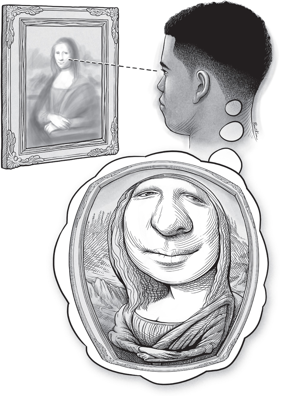
FIGURE 10. A conceptual illustration of the warped V1 visual brainscape. The visual detail you perceive depends upon distortions in your V1 map—specifically, a magnified representation of visual detail at your center of gaze.
Paul Kim
Despite this welcome arrangement, we still fall prey to some errors in judging size, which appear to stem from magnification in our brain maps. When psychologists actually measure people’s judgments about the size of objects shown in different locations of the visual field, they find that our perception of object size is subtly influenced by where in our visual field the object is shown. Although we do quite well at judging the size of objects presented at our center of gaze, we consistently perceive objects presented in our visual periphery as smaller than they actually are. The farther out in your peripheral vision you see an object, the smaller you perceive that object to be. In short, magnification in your V1 map has a major impact on your perception of detail and might have a small effect on your perception of size as well.
Wilder Penfield was a pioneer of neurosurgery and neuroscience in the early twentieth century. He broke new ground in the treatment of patients who suffered from destructive epileptic seizures and, in the process, he became the first to chart the S1 touch map in the living human brain.
To treat seizures, Penfield took his scalpel right to the source: the brain itself. Patients were given a local anesthetic to numb the skull, allowing Penfield and his colleagues to open up the bony covering and reveal the serpentine folds of the cerebral cortex beneath. Before Penfield could excise the tumor or damaged tissue that was causing the seizures, he had to determine where that tissue was. He also had to determine the functions of the cortex surrounding it, so that his scalpel would spare tissue that the patients would need in order to feel, speak, and move for the rest of their lives. To do this, he inserted an electrode directly into the surface of the patient’s brain. The brain itself has no receptors to signal pain, so Penfield’s patients did not feel any discomfort from the probe.

FIGURE 11. A schematic illustration of the human S1 touch map. The drawing shows half of the map, which represents touch on the opposite half of the body.
Paul Kim
Penfield used his electrode to deliver a mild electric jolt to each spot probed in the brain. This jolt interfered with the natural activity of the neurons in ways that could reveal what they did. When he stimulated part of the S1 map, a patient might feel a tingle or some numbness in a part of the body. Patients were kept alert throughout the surgery because they had an active role to play in this process, from reporting the sensations that they experienced to following the surgeon’s instructions to speak, read, or move on cue. They also needed to tell him if they started feeling the onset of a seizure, which would mean that Penfield’s probing might have encountered the damaged tissue that triggered the attacks.
When the process was done, Penfield and his colleagues knew where the seizure-prone tissue was and which essential brain functions lay nearby. Using this knowledge, he could take out as much of the problem tissue as possible while sparing the patient’s ability to speak and move. This technique of stimulating the brain during surgery gave patients the best chance of emerging from the experience able to move, talk, and function as before, but with fewer or even no more debilitating seizures. In fact, the technique was so successful that it is still widely used today.
In the process of probing hundreds of people’s brains, Penfield and his colleagues learned about the layout of brain maps for movement and touch, including the S1 touch map. In humans, as in other animals, the right side of the body is represented on the left side of the brain, and vice versa. In each hemisphere of your brain, the map stretches from the side of your brain (roughly behind your ear) up to its top. The basic layout of the map and its location in the brain are shown in Figure 11. Out on the far side of the map, on the side of your brain, lies the representation of one side of your inner mouth, tongue, and lips. As you move inward and up, toward the top of the brain, the map represents the outer surfaces of that side of the face, then, for that side of the body, the thumb, the fingers, the rest of the hand, and at last the arm. Finally, beneath the tippy-top of your skull are the map representations of your torso, pelvis, leg, and foot on that side of your body.
The illustration shows something strange about the human S1 map: it appears to be scrambled, like a puzzle that was incorrectly assembled. Its grossest infraction is an abrupt transition from representing the forehead to representing the thumb, even though no functional construction of the human body could make such a leap.
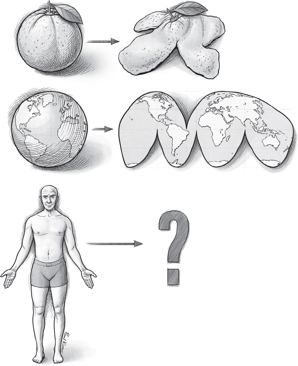
FIGURE 12. An illustration of the challenges inherent in creating twodimensional maps of three-dimensional surfaces.
Paul Kim
The strange adjacency of face and thumb in your S1 map is an example of a discontinuity, or a point where the map breaks from an ideal, high-fidelity re-creation of your body’s layout. At a discontinuity, the notion that neighboring inputs from the world (such as pressure on neighboring patches of your skin) are represented by neighboring bits of tissue in your brain falls apart. These lapses are small in most brain maps, but in certain cases, like the human S1 touch map, they can be dramatic. To understand these discontinuities, just think of the peel of an orange. (See Figure 12.) There is no way to flatten its spherical surface without cutting or tearing it. Mapmakers face the same problem when they make two-dimensional maps of the earth. You have to make a cut somewhere, ruining the sphere’s continuity. If you read a world map literally, the eastern half of the Pacific Ocean and its western half are as far from each other as possible, whereas in reality they share the same waters and exchange the same waves.
To convert the surface of a sphere into a flat rectangle, cartographers also have to stretch out the parts of the globe closer to the poles, exaggerating the size of Europe, North America, and Australia relative to South America, Africa, and other landmasses that lie close to the equator. One kind of map—the Goode homolosine projection—avoids this pitfall by eschewing a rectangular map and making more cuts, as shown in Figure 12.
Of course, the human body is not a sphere. It features lanky protrusions (like your arms, legs, and fingers) and deep, complex caverns (like your inner mouth and throat). And so the challenges of cleanly transforming its surfaces into a two-dimensional map in the cerebral cortex are great indeed. As happens when flattening the peel of an orange, judicious cuts and discontinuities are unavoidable.
These discontinuities aside, the human S1 map that Penfield unearthed is also dramatically warped. Like the V1 map, the representations in some parts of the map are magnified relative to others. The human finger, thumb, and hand are enlarged, as are the tongue and face. Just as V1 magnification affects visual spatial acuity, S1 magnification affects tactile spatial acuity. To measure your tactile spatial acuity, an experimenter might ask you to feel tiny bumps and detect whether they are aligned or misaligned. Alternately, they might press points on your skin and ask whether you detect one touch or two. People have better spatial acuity on parts of their bodies that are magnified in the S1 map. For instance, you can probably distinguish between two pressures on the tip of your index finger if they are spaced about a millimeter apart, or less than the thickness of a dime. That distance would have to be seventy times greater—roughly the width of a woman’s hand—for you to resolve them on your back.
These are just averages, of course. Like visual acuity, people’s tactile acuity differs. The same scientists who studied people’s visual acuity and V1 warping also tested people’s tactile acuity on four fingers and used functional MRI scans to examine the warping of the finger region of the S1 touch map. They found that people who had more unequal acuity across the four fingers also had more unequally sized finger territories in S1, with the index fingertip getting the grandest estate and the pinky receiving a far smaller plot. People who demonstrated more equivalent acuity across their four fingertips had fingertip zones in S1 that were also more equally sized. In short, the results were the same for S1 as for V1: people’s idiosyncratic abilities to perceive fine detail corresponded to the idiosyncrasies of magnification in their brain maps.
In fact, several parallels exist between V1 and S1. As Penfield’s work revealed, stimulating neurons in S1 causes people to perceive tactile sensations when nothing is touching their skin. Distortions in the S1 map drive differences in how and where people can perceive fine detail with touch. People even exhibit errors in estimating size based on touch, just as they do with vision. Two prongs spaced a fixed distance apart will feel farther apart if you touch them with your index finger (which has a magnified S1 representation) than if you touch them with your forearm, thigh, or back. Here too, perceived distance is generally accurate when people feel with a body part graced with ample representation in their brain map. Yet they underestimate distance when using body parts that get short shrift in the S1 map. For vision and touch alike, perception as we know it is born inside our skulls. And for V1 and S1 alike, the limits of what we are capable of perceiving and the accuracy with which we perceive it is largely determined by the way our brain maps are warped.
These experiments beautifully demonstrate the basic relationship between magnification in the human brain map and our perceptual abilities. In fact, neuroscientists have predicted this connection for quite some time. This extraordinary link has profound implications. If what someone is capable of consciously detecting and verbally reporting is determined by the layout of representations within this person’s brain maps, then we can hope to learn about their subjective perceptual experience by studying the objective, observable layouts of these brain maps. In essence, I can learn something about how it feels to be you by looking at your brain maps. Even if we do not speak the same language, or you do not speak any language at all, I can peer inside your head and gain real purchase on how you see and feel and sense.
But this ability to infer the subjective experience of others based on their brain maps is not limited to members of our species. If evolution were a poem, it would certainly rhyme; many motifs of brain and body organization resound across the animal kingdom, brain maps among them. An array of species, including all mammals, possess S1 maps that receive touch information from receptors in their skin in virtually the same way that your S1 map receives information from receptors in your skin. The same basic principles of touch representation and processing apply in the S1 of a rat as they do in yours. Of course, you have a different body layout than a rat does, and thus your skin surfaces have a different topography. That alone makes your S1 different from a rat’s. But the starkest differences in S1 across different creatures stem from exactly how each map is warped.
Although each individual’s S1 map is subtly warped in its own way, human S1 maps are far more alike than they are different, with fingers and lips grossly magnified relative to other regions of the body, such as the back and legs. The result is that we all generally have our best spatial acuity in the same places on our bodies—particularly our fingertips. Blessed with extra touch receptors in the skin and outsized representation in the S1 map, the human fingertip is to touch what the fovea is to vision. It is the human sweet spot for feeling things. But what about other creatures with other bodies and other ways of life? How are their S1 maps warped, and what can that tell us about how that animal feels? Just as I can make some educated inferences about how it feels to be you by looking at your brain maps, we can do the same for a monkey, a rat, or a raccoon.
One of the pioneers in this undertaking was Edgar Adrian, a professor at the University of Cambridge who tackled the subject in the early 1940s. A lean and energetic man, Adrian was equally comfortable tinkering with an electrometer, facing down a fencing opponent, and blazing through quiet streets on his motorcycle. A decade prior, Adrian had won the Nobel Prize for his work demonstrating how neurons communicate with one another. Now, as political storm clouds gathered and erupted into the havoc of World War II, Adrian focused his scientific curiosity on the subject of touch. The skin sends signals about pressure on to the brain, but how? And what does the brain do with them? He tackled these questions in his laboratory, a dusty basement filled with antique scientific equipment that one visitor called “the most glorious clutter ever seen.”
First, the cats arrived at the professor’s laboratory. Then rabbits, dogs, and a few monkeys—nothing the university’s School of Physiology hadn’t seen before. When the sheep, goats, and pigs started coming, they surely drew some attention. By the time the Shetland ponies appeared, even the professor’s dedicated assistant might have raised an eyebrow. But this motley assortment of creatures was eclectic by design. It was all part of Adrian’s plan to unlock the secrets of their S1 maps.
Adrian had an electrical recording rig that allowed him to probe the brains of living creatures directly with an electrode. The setup was something like Penfield’s, except that Adrian used his electrode to listen in on the ongoing activity of neurons rather than zap them to make them artificially active. Adrian’s rig was attached to a loudspeaker, so that when his electrode detected blips of electrical activity from neurons firing, the loudspeaker signaled the event with a sound. By listening, Adrian found it easy to distinguish what the cells he probed were doing. When the electrode tapped neurons that were ready and waiting to receive information, but not signaling a sensation, he heard a “dull thud” from the cells. But when cells were excited, he heard what he called “a rushing noise”—a flurry of clicks indicating a rapid volley of neurons firing.
When the professor brought an animal—whether a cat, rabbit, dog, or monkey—into his laboratory, he put it to sleep with anesthesia so that it would remain still and not feel pain. Then he opened up a part of its skull and inserted an electrode, to listen in on the incoming touch signals arriving in S1. Each time he placed the electrode in a new spot, he would move around the animal, methodically touching it all over its body, and noting when he heard the rushing noise that meant the cells were excited. For each such noise, he noted where the electrode was in the brain and which areas of the skin, when touched, made those neurons fire. In this way, with his hands and his ears, his pen and his patience, Adrian could detect and reveal each animal’s S1 touch map.
When it came time to study Shetland ponies, Adrian’s assistant helped him arrange each anesthetized pony in a standing position supported by a wooden bench, its sleek head resting on sandbags. Once the animal was asleep and thus situated, Adrian excused his assistant and began the slow work of probing its touch map. He made his way over the animal’s body again and again, touching the muzzle, the flank, the narrow pastern just above the hoof. He touched it with his hands, stroked it with a feather, or pressed its skin with a glass or wooden rod. It would have been a strangely intimate scene: the professor alone with the sleeping creature, prodding every surface of its body and listening to the music of its brain.
Adrian found that the nostrils reigned supreme in the S1 map of a pony. He wrote, “The area is divided into two parts of about equal size. The part in front is solely concerned with sensory messages from the area round the nostrils; the part behind deals with all the rest of the body surface—an area many thousand times as large as that of the nostrils.” The pony’s warped S1 touch brainscape is illustrated in Figure 13. The professor marveled at the blistering inequality of the pony’s brain map and wondered at its significance. He noted that these animals bring their nostrils, and not their lips, into contact with fresh grass before deciding whether to consume it. Could the pony’s nostrils be like our fingertips—a sweet spot for feeling through touch?
Among the creatures Adrian studied, he found dramatic warping in all of the S1 touch maps. But the specific patterns of warping—which parts of the body were magnified, and by how much—appeared to be uniquely tailored to the species that a given brain map served. For the sheep and goat, their prominent lips dominated the S1 map. In monkeys, the hands were magnified. In the dog and cat, the face, especially the whisker endings, was enlarged. The professor was particularly impressed with the pig’s snout, which, as far as he could tell, occupied the animal’s entire S1 touch map. He noted this body part’s singular importance to the creature: “The pig’s snout is its chief executive as well as its chief tactile organ, spade as well as hand, whereas the legs are little more than props for the body.” Later studies revealed another region of the pig’s S1 map, which Adrian had apparently missed because it lay hidden inside a fold of the brain. This hidden portion of the map represented the rest of the pig’s body in its entirety; it was only about half the size of the territory devoted to the animal’s snout. (See Figure 14.)
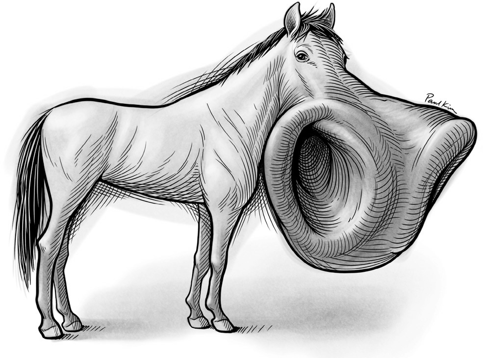
FIGURE 13. An illustration of the pony’s S1 touch brainscape, showing its magnified nostrils.
Paul Kim
Adrian observed one universal factor among all the species that he studied: some part of the head or face was magnified in the S1 touch map, presumably because, for four-legged creatures, the head and face stick out in front and are the first parts of the body to encounter new objects in the environment.
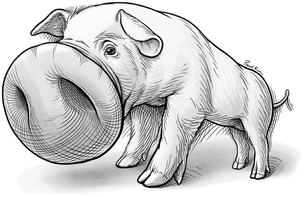
FIGURE 14. An illustration of the pig’s S1 touch brainscape, with its supremely magnified snout.
Paul Kim
But what about monkeys and their fellow primates, humans? We rarely use our nostrils or lips to explore the world, yet we have faces and lips that are packed with extra touch receptors, and these features are represented by large zones in our S1 maps. Why is that? Adrian concluded that “the explanation is probably that we are descended from animals without hands, animals using the snout and the long [whiskers] of the face as their most delicate tactile guides.” In other words, we feel more than we need to with our faces because our distant ancestors walked on four feet, like the pig, and survived better with faces packed with touch receptors. In this way, our perception of touch is shaped not just by our human bodies and human needs, but by the bodies and needs of the creatures from which we evolved.
Since Adrian’s early work, scientists have procured examples of warped S1 brain maps from a variety of exotic animals living under a variety of conditions. My personal favorite is the naked mole-rat, a relative of the rat that has carved out a life for itself underground in arid Africa. In the darkness of its burrows, the mole-rat knows the world by how it feels against its four protruding teeth. The mole-rat’s incisors are its sweet spot for tactile exploration. When it comes upon an unidentified object in its burrow, it will tap its teeth against the object to find out what it is. Although the creature’s four incisors combined make up no more than about 1 percent of the animal’s total body surface, the representation of those teeth takes up nearly a third of its S1 map.

FIGURE 15. Photographs of the star-nosed mole (left), a close-up of one of its nostril stars with appendages labeled (top right), and a stained brain slice from the creature’s S1 touch map, showing the corresponding representations of appendages in the map (bottom right).
From PNAS, vol. 109, supplement 1: “Evolution of Brains and Behavior for Optimal Foraging” by Kenneth C. Catania. Copyright © 2012 by the National Academy of Sciences.
Another subterranean creature, the star-nosed mole, enjoys a damper habitat in North America. This creature has a wondrous star-shaped nose, with eleven tentacle-like appendages fanning out from each of its nostrils. It uses this exquisitely sensitive nose to navigate dark, muddy tunnels and forage for worms, insects, and other food. When it finds something promising, it touches the item with one of those stubby appendages (called Appendage 11) that flank its mouth, to determine if the item is edible. The importance of the mole’s spectacular touch organ is reflected in its S1 map: about half of it is devoted to representing the creature’s tiny nose. But magnification doesn’t stop there. The S1 map of the star-shaped nose represents all eleven appendages that surround each nostril, but it does not treat them equally. Although Appendage 11 is one of the smallest rays on each of the mole’s stars, it claims five times the space in S1 than several of its larger appendages do. (See Figure 15.)
An obvious theme emerges from these warped maps. Brain maps in each creature become specialized to capitalize on the features the animal has in order to best meet its needs. The animal is born with certain inequalities in its skin; some zones are more conveniently placed for key tactile tasks and, thanks to evolution, these areas of skin tend to contain more touch receptors than others do. But just as your visual system takes a small inequality in the retina, between fovea and periphery, and magnifies that inequality a hundredfold in your visual brain maps, brain maps for touch build upon the inequalities in your skin to create even greater inequality in your brain.
These inequalities guide our actions and choices. If you want to know whether a fabric is cotton or polyester, do you feel it with your elbow or with your hand? If you want to know whether a pear is ripe or lettuce is crisp, do you press it with your knuckles or the pads of your fingertips? Reaching to touch with your fingertips is just like shifting your gaze to place objects of interest on your visual sweet spot, the fovea. Your warped brainscapes spur you to move your eyes to look or to extend your hands to touch because you can feel, see, and discern so much more when using these perceptual sweet spots. Thanks to inequality and magnification, your fingertips allow you to tell cotton from polyester, just like the star-nosed mole’s Appendage 11 allows it to discriminate between a worm and an inedible stone. From the lips of the sheep to the nostrils of the pony and the teeth of the mole-rat, inequalities provide all creatures with sweet spots for discerning the world around them through touch.
Since brain maps operate under the same basic principles across species, they can be used as guides to relate our own perceptual experiences to those of other animals. There isn’t an exact calculus for transposing one creature’s perceptual experience to that of another. But Adrian took a stab at it when he was studying hoofed animals in his basement laboratory. He wanted to get a handle on just how impressive the pig’s snout is relative to the human hand. He compared the physical surface area of the pig’s snout to the surface area of its snout’s representation in its S1 brain map. For every square centimeter of cerebral cortex that represented the animal’s snout, there were about 10 square centimeters of skin on the surface of the snout itself: a ratio of 1 to 10. Then he worked out the numbers for the human hand. For every square centimeter of cerebral cortex representing the human hand, there were 75 square centimeters of hand surface: a ratio of 1 to 75. These rough numbers suggested that the pig can feel more fine detail with its snout than you can feel with your hand.
Armed with the pig’s S1 brainscape, the human’s S1 brainscape, and your perceptual experience, it is possible to make some reasonable inferences about what it feels like to be a pig. When the pant leg of a farmer brushes against the face of the pig, it wouldn’t feel like what you feel when fabric brushes against your face. It would feel like more. And the best you can do at approximating that feeling is to imagine that you had your hand, rather than your nose, growing out of the middle of your face, with your palm open to the fabric and the world. You would feel the weave of the fabric, the path of its stitching, the fabric’s warmth, and its weight. And if your porcine brain had any inkling of such things, you would know in an instant if the slacks were made from polyester or cotton.
If this is your first time imagining how it feels to be a pig, you have almost certainly never imagined life as a rat. Whiskers are to a rat what the snout is to a pig. The skin at the base of each whisker is exquisitely sensitive to any slight deflection of these stiff, specialized hairs. Whiskers are an ingenious invention because they allow animals to extend their sense of touch outward, beyond the face. The nocturnal rat can navigate sewers, fields, or basements quickly in the dark because of the whiskers that stick out in front and to the sides of its muzzle. As the animal approaches objects or obstacles in the darkness, the whiskers are disturbed, telling the rat where things are in its immediate environment. Using their facial muscles, rats can also sweep their whiskers back and forth in long, regular strokes that allow them to collect different types of tactile information, including details about the shape, texture, and identity of objects in their path.
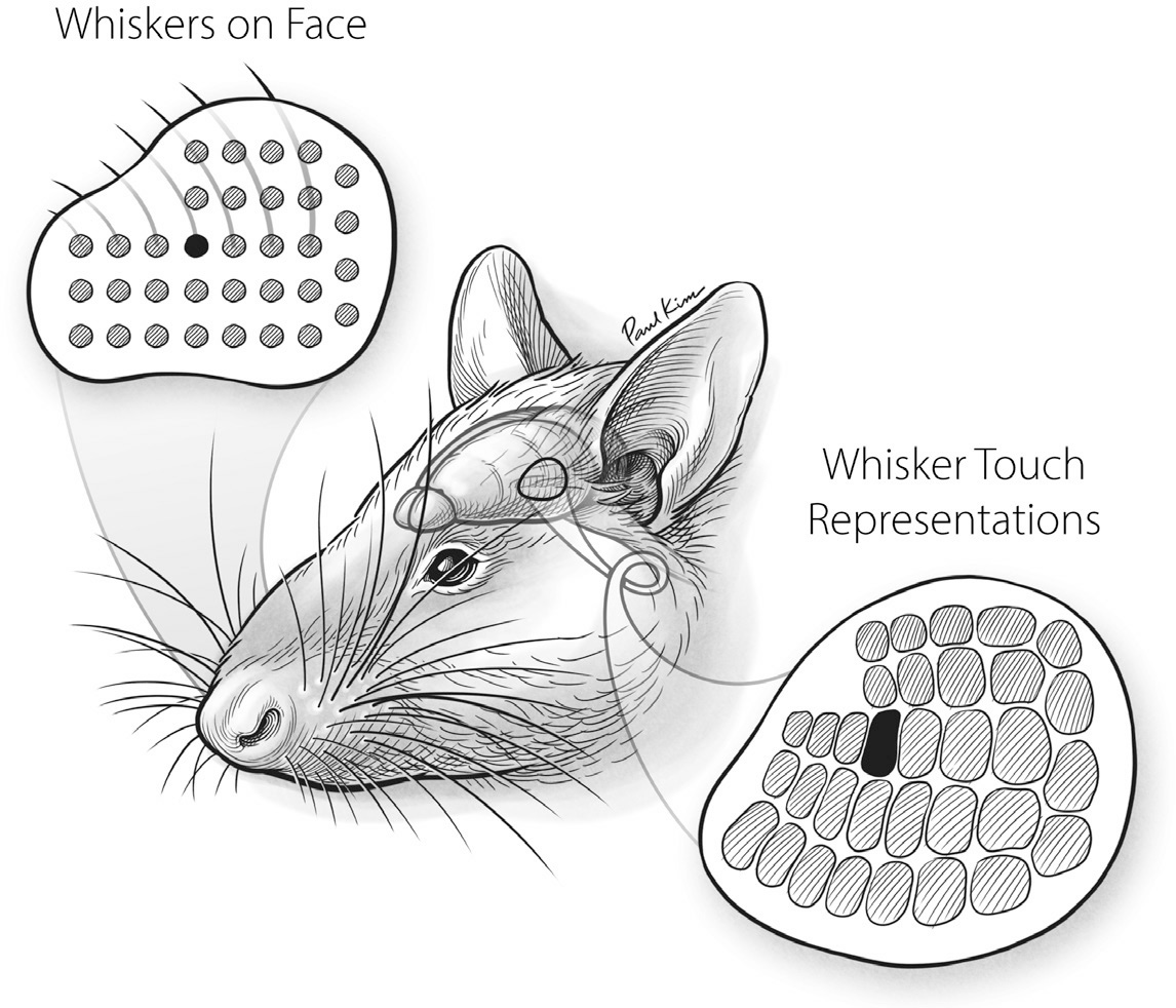
FIGURE 16. The layout of whisker representation in the rat S1 touch map reflects the layout of whiskers on the creature’s face.
Paul Kim
The whisker domain of the rat’s S1 touch map dwarfs everything else, taking up at least a fourth of the overall map. This whisker area contains zones, and each zone represents the deflections of a single whisker. As Figure 16 shows, the layout of these zones in the S1 map beautifully mirrors the layout of whiskers on the animal’s face. The illustration in the first panel of Figure 17 shows how the rat’s S1 touch brainscape is dominated by its representation of the whiskers. The second panel is a photograph of a rat’s brain stained to render its S1 touch map visible.

FIGURE 17. The rat’s S1 touch brainscape (left) reveals the outsized importance of its whiskers and snout. A photograph of a stained brain slice from a rat’s S1 touch map (right) shows the layout of its body map, including its tail, paws, back, and some of its whiskers.
Illustration by Paul Kim. Photo from Current Biology, vol. 26, no. 1. Copyright © 2016 by Elsevier Inc.
We don’t have rodent-like whiskers, but our fingernails and hair are in many ways similar to them. Like whiskers, they don’t contain touch receptors, which is why you can trim your nails or hair without feeling pain. But you can certainly feel with your scalp when your hair is pulled or feel with the bed of your fingernail if that nail is lifted or torn. Rats probably experience movement of their whiskers in a similar way, but with far greater acuity and sensitivity. Imagine that you have long, flexible nails growing out of the pads of your fingertips. As you move your hands around, those nails bend and deflect, which tugs your fingertips in different directions and to various degrees. If those fingertips were embedded in the flesh around your nose rather than swinging about at the ends of your arms, you would have some idea of how having whiskers feels to a rat.
This exercise in rodent embodiment takes on a new dimension when you consider how rats use their whiskers to interact with other rats. You could call it the rat version of a handshake, but that might be understating its importance and intimacy. In the process of meeting or greeting, two animals line up, nose to nose, so that their noses touch and whiskers overlap. Instead of moving their whiskers in long, regular sweeps, the rats make small, irregular whisker movements. They are, in a sense, twiddling each other’s whiskers, which intensely stimulates the most sensitive touch organs of both rats. During this social touching, neurons in the whisker region of the rat S1 map fire at especially high rates. The rat’s warped S1 map and the activity of the neurons within it provide a bridge between the rat’s humble behavior and its sensations, giving us an inkling of the intensity experienced during this simple social act.
Brain maps shape our perception of our world in powerful ways. Together with the brainscapes they represent, brain maps have a lot to tell us about why we feel and see and act the way we do. They render visible the ways in which our own perception is warped, underpinning how we interact with the wider world and collect information from it. They offer us a view of what is universal and what is unique about our senses, our minds, and our behaviors. They bridge the objectively visible and the subjectively felt, across individuals and even across species.
Brain maps of touch and vision show how information about space on the surfaces of the skin or space within the visual field can be translated and transformed by the brain. But that is just the beginning of the story. Although maps are inherently spatial, your brain maps are not limited to representing space. For instance, your ability to cull information from sound depends on the invisible spectrum of frequency. As you will see, you are privy to this spectrum only because of a brilliant anatomy and the wonders of brain maps.