It’s possible to customize the colors in your view by performing the following steps:
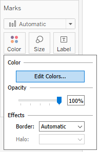
- Click on Color in the Marks card, and then click on Edit Colors…:
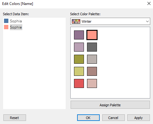
- In the Edit Colors[Name] window that opens, you can select a color palette from the drop-down menu that appears and click on the Assign Palette button. This will assign colors from the palette that you chose to the categories of your dimension. You can also manually assign specific colors to a category by selecting it in the Select Data Item pane, and by clicking on the desired color on the right-hand side:
- When you are satisfied with the colors, click OK to exit. Note that this will only affect the colors in the particular view you created.
- You can also hardcode a color palette for a specific measure or dimension. Hover over the field pill under Measures or Dimensions and click on the white arrow that appears on it. In the drop-down menu, navigate to Default Properties | Color...:

This will launch the Edit Colors window, where you can choose the color palette. However, once you assign your desired color palette to a field this way, it will be used by default every time you add this field to Color in a view.
If you plan to use a field in Color in more than one visualization, it's a good practice to hardcode the color palette for it. Using colors in your visualizations consistently makes them cleaner and easier to follow, especially as they get more complex.