In this example, we are ranking the teams of the South American Soccer Confederation. Use the Bump Chart.twbx workbook to follow along:
- Since we want to color our visualization lines by country, put Country Full on Color, as follows:

- Add Rank Date and Rank to the Columns and Rows shelves. Set Rank Date to Year and Rank to Sum, as follows:

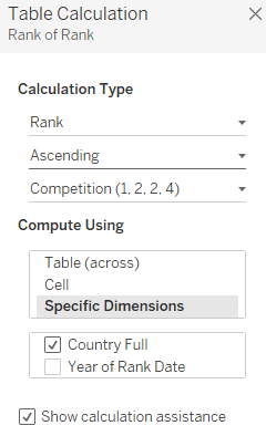
- Rank in our current dataset is the actual global ranking of each soccer team. Because we want these to show up as 1-10 instead of their country rankings, we apply the Rank Table Calculation to the rank field, as follows:

- Edit the Table Calculation to Rank in Ascending order, and under Compute Using, select Country Full, as follows:
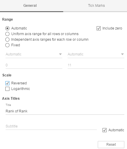
- Reverse the axis of rank so our top performer is first, as follows:
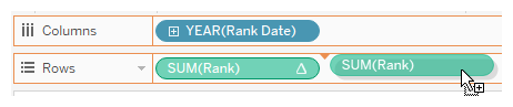
- Duplicate Rank on the Rows shelf to create the dot points in our visualization, and make this a dual axis by right-clicking and choosing the option, as follows:
- Change the default mark for the second rank to Circle, as follows:

- Reverse the axis.
- We now have a basic bump chart, which we can see in the following screenshot:
