In the preview on the Data Source page, we see that the format of the data has changed. The original column names—Belgrade, Central Serbia, and Vojvodina—have now become labels in a new column—Pivot Field Names.
On the other hand, the values from the three original columns have all been merged into one new column—Pivot Field Values:
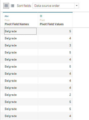
What happened is that we've simply transposed the table, so that we have values from all three columns placed into one column (one beneath the other), while the labels in the Pivot Field Names column denote the original column each value (row) originates from.
If we navigate to Sheet 1, we'll see that we now have Pivot Field Names as a dimension, and Pivot Field Values as a measure. For ease of use, we can rename them into something more intuitive. We can do this by right-clicking on the field and selecting Rename from the drop-down menu. We can then type in the desired name. For example, we can rename Pivot Field Names to Region and Pivot Field Values to Satisfaction with internet:

This new structure of the data source is much handier than the original one, because it allows us to make visualizations containing all three regions. Let's see how:
- Drag and drop Region from Dimensions into the Columns shelf.
- Drag and drop Satisfaction with internet from Measures into the Rows shelf:
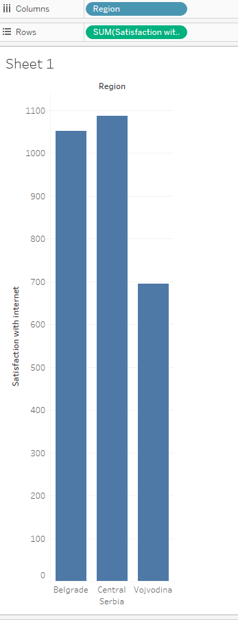
We've created a chart with a single measure and single dimensions that we'd previously created by pivoting our data source.