- Drag and drop State from Dimensions into the worksheet workspace so that a basic map appears.
- Drag and drop Latitude (generated) from Measures into the Rows shelf to the right of the Latitude (generated) pill, which is already there:

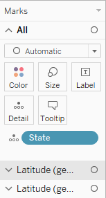
Now we have two maps, one beneath the other. Also, notice how new sections have appeared in the Marks card. There is the All section, followed by Latitude (generated), which refers to the upper map, and Latitude (generated) (2), which refers to the bottom map:
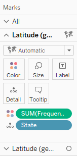
- Click on the second section, Latitude (generated), in the Marks card to expand it.
- Drag and drop Frequency from Measures onto Color:
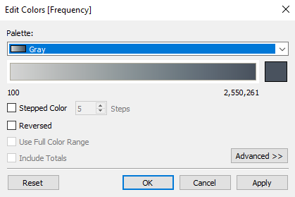
- Click on the Color button and select Edit Colors….
- From the Palette drop-down menu, select Gray, and click on OK:
- Click on the Color button again, and use the slider to decrease the opacity to around 51%:

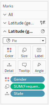
- Click on the third section, Latitude (generated) (2), to expand it. In it, drag and drop Gender from Dimensions onto Color.
- Drag and drop Frequency from Measures onto Size.
- Click on the Automatic drop-down menu and change the mark type to Pie:
- Let's set the dual axis. In the Rows shelf, hover over the second Latitude (generated) pill so that a small white arrow appears on it:
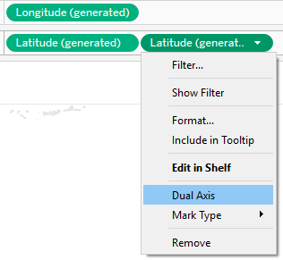
- Click on the arrow, select Dual Axis, and you will get the following result:
