Take a look at the red chips on the top two Rubik’s cubes on the opposite page. They are actually orange on the left and purple on the right, if you look at them in isolation. They only appear more or less equally red across the images because your brain is interpreting them as red chips lit by either yellow or blue light. This kind of misperception is an example of “color constancy,” the mechanism that allows you to recognize an object as being the same in different environments, and under very diverse lighting conditions.
Color constancy is a remarkable skill, because an object’s surface can be colored only by virtue of the photons it reflects from a light source. That is, every object is tinted by both the color of its surface (defined as its ability to reflect light of a particular wavelength distribution) and the color of the light source (which limits which wavelengths are actually present to be reflected). A tricky prospect for the brain.
The two cubes also demonstrate another perceptual principle. See the blue chips on the top of the left cube, and the yellow chips on the top of the right cube? They are identical, and appear as plain gray when the surrounding colors are removed. This phenomenon, called “color contrast,” causes red apples to appear redder against a background of green leaves. More generally, it makes equal colors look different because of context.
Color contrast and color constancy show that our perception of color is not all that is seems. This chapter presents several of the color illusions that competed in the contest, as well as their neural bases.
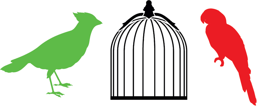
When you stare at a color image, its afterimage takes on a shade of its own. Afterimages are the consequence of a neural process called adaptation, by which neurons decrease their responses to unchanging sensory inputs. Once neurons have adapted, it takes a while for them to reset to their previous, responsive state. It is during this period that illusory afterimages appear. We see such images every day when we experience a temporary dark spot in our field of vision after briefly looking at the sun or at a bright lightbulb, or after being momentarily blinded by a camera flash. Gazing at any colored surface can also induce a vivid afterimage of the complementary color—that is, red versus green, or blue versus yellow. Imagine staring at a red surface. The cells in your retina that respond to red light will reduce their activity to save energy and to prepare themselves for detecting any future changes in redness. So, when you look away to a white background, your retina remains adapted to the red environment for a few seconds. With the red “subtracted” from the white, you will see red’s opposite: green.
To try it out, stare at the red parrot for thirty seconds, then immediately look at the center of the empty birdcage. You should see a ghostly greenish parrot inside. Try the same with the green cardinal, and you should see a pink bird. A similar illusion is part of an exhibit at the Exploratorium museum in San Francisco.
BY YUVAL BARKAN AND HEDVA SPITZER
TEL AVIV UNIVERSITY, ISRAEL
2009 SECOND PRIZE
Positive afterimages—which have the same color as the inducing image, rather than its opposite—can be captured from a surrounding color. Stare for about thirty seconds at the “target” on the bird in the left panel. While you keep your eyes on the dot, you may notice that the red background causes the white bird to fill in with a complementary blue-green color. Then look immediately at the same spot on the bird in the right panel. Removing the red background gives rise to a surprisingly strong and long-lasting red afterimage of the bird. To experience an even more striking version of this illusion with a “flying” bird, visit the Best Illusion of the Year Contest website.

BY ROB VAN LIER AND MARK VERGEER
RADBOUD UNIVERSITY, NIJMEGEN, THE NETHERLANDS
2008 FIRST PRIZE

In this illusion, a single multicolored image produces two afterimages of different colors, with each afterimage confined to a different shape. Fix your gaze on the black dot between the colored stars in the middle panel and stare at it for a full minute without moving your eyes. Then look at the empty outlines in the top panel. The left one fills in with a ghostly blue-green, and the right one looks reddish. When you look at the bottom panel, the colors are reversed. How does one image produce two afterimages of different colors? And how does the shape of the outline determine the filled-in color? This illusion demonstrates that patches of an afterimage can spread and merge to fill the contours of an outlined shape. The shape on the upper right takes on a reddish hue because it has the same outline as the complementary blue-green patches in the original color image. Likewise, the blue-green-tinged shape on the upper left matches the red patches in the original color image.
BY MARK VERGEER, STUART ANSTIS, AND ROB VAN LIER
UNIVERSITY OF LEUVEN, BELGIUM; UNIVERSITY OF CALIFORNIA, SAN DIEGO, U.S.A.; RADBOUD UNIVERSITY, NIJMEGEN, THE NETHERLANDS
2014 SECOND PRIZE
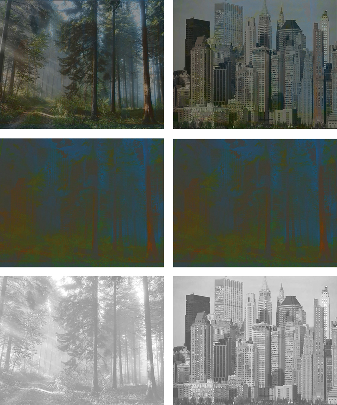
Six years after they bagged the 2008 first prize for their work with afterimages, Vergeer and his colleagues extended the focus of their research to study how the contours of an image influence the way we see its colors. Paintings by Pablo Picasso and other artists suggest that coloring within the lines is not a strict requirement for our ability to assign color to shape. Vergeer and his colleagues set out to explore this in detail, and proved that our brain has an extraordinary ability to ascribe colors to relevant shapes in an image. Their illusion shows that a single image can lead to diametrically different color impressions. The left and right colored images in the middle row are identical, constructed by combining the color profiles of a picture of a forest and a picture of the Manhattan skyline. When semitransparent grayscale images (images in monochromous gray shades ranging from black to white—as seen, for instance, in black-and-white movies) of the forest or the skyline are overlaid on the color images (top row), our visual neurons seamlessly match the appropriate colors to the relevant outlines, ignoring the dissonant colors, and we clearly see one or the other—a suitably colored forest or a skyline—even though the color profiles of both scenes are still present in each image.
WHITE’S EFFECT AND THE ILLUSION OF THE YEAR LOGO
In 1979, the vision scientist Michael White described an illusion that changed visual science. In the top image, the gray bars on the left look darker than the gray bars on the right. In fact, all the gray bars are identical. Before White discovered this effect, brightness illusions were thought to result from opponent processes—that is, a gray object should look dark when surrounded by light, and light when surrounded by dark. But in this illusion, the darker-looking gray bars are surrounded by black, and the lighter-looking gray bars are surrounded by white. Although the brain mechanisms underlying White’s Effect remain unknown, the illusion has bolstered new research avenues in visual perception—pioneered by the neuroscientist Dale Purves—based on the idea that we see things according to our brains’ expectations.
Purves’s idea is that the visual system has evolved to interpret the world according to empirical probability. In other words, our perception is consistent with the way things are most likely to be. Our experience of illusions such as White’s Effect, it follows, depends on the context in which we view them, and the probability of all the possible interactions that our ancestors had with similar scenarios.
White’s Effect also changes the appearance of colors. The logo for the Best Illusion of the Year Contest is an homage to both White’s Effect (the trophy appears to be different colors behind the two curtains, though it’s actually the same color throughout) and the famous Face/Vase Illusion, but with a trophy in place of the vase.