One of my favorite mantras is “Garbage in, garbage out.” It’s a popular saying among computer scientists, logicians, and statisticians. In essence, an argument may sound very solid and convincing, but if its premise is wrong, then the argument is wrong.
Charts are the same way. A chart may look pretty, intriguing, or surprising, but if it encodes faulty data, then it’s a chart that lies.
Let’s see how to spot the garbage before it gets in.

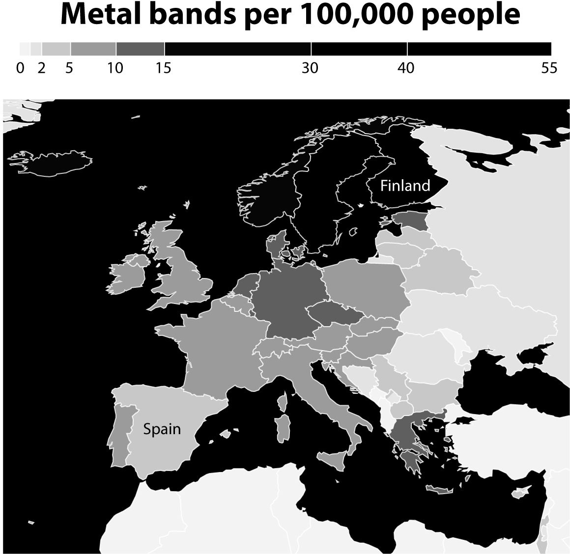
If you like charts, social media can be an endless source of exciting surprises. A while ago, mathematician and cartographer Jakub Marian published a map displaying the density of heavy metal bands in Europe. Below is my own version of it, highlighting Spain, where I was born, and Finland.1
Being a fan of many hard rock and (nonextreme) metal bands, I loved the map and spread the word about it through my contacts on Twitter and Facebook. It confirmed something I’ve always suspected: many bands are based in northern countries, with Finland being what we could call the Metal Capital of the World.
But then I thought twice and asked myself: Is the source for this map trustworthy? And what does the source mean by “metal”? I felt some skepticism was warranted, as one key lesson of this book is that the charts most likely to mislead us are those that pander to our most deeply held beliefs.
The first thing to look for when reading any chart is whether its author or authors identify sources. If they don’t, that’s a red flag. We can derive a general rule of media literacy from this:
Distrust any publication that doesn’t clearly mention or link to the sources of the stories they publish.
Fortunately, Jakub Marian is aware of good transparency practices, and he wrote that the source for his data was a website called the Encyclopaedia Metallum. I visited it to see whether its data set comprised just heavy metal bands.
In other words, when checking a source, we must assess what is being counted. Is the source counting just “metal” bands or is it counting something else? To do this verification, let’s begin by thinking about the most paradigmatic metal band you can evoke, the one that embodies all the values, aesthetics, and style we commonly associate with metal. If all bands in the Encyclopaedia Metallum are more similar than not to this ideal band—if they share more features than not with it—then the source is probably counting just metal bands.
Go ahead, think of a band.
I bet you’ve thought of Metallica, Black Sabbath, Motörhead, Iron Maiden, or Slayer. Those bands are very metal indeed. Being from Europe and having grown up during the ’80s, however, I thought of Judas Priest. These fellows:

Photograph by Jo Hale © Getty Images
Judas Priest has everything that is metal about metal. I think of them as the most metal of the metal bands because they have every single feature metal is recognizable for. To begin with, the clothing, attitude, and visual style: long hair (with the exception of front man Rob Halford, who’s bald), tight leather clothes, shiny spikes on black pants and jackets, scowling facial expressions, and defiant poses.
What about the performing and musical features? They are also pure metal. Search for a few Judas Priest video clips, maybe songs such as “Firepower,” “Ram It Down,” “Painkiller,” or “Hell Bent for Leather.” You’ll notice the endless guitar riffs and solos, the thundering drums, the headbanging—synchronized, which is even more metal—and Halford’s vocals, which make him sound like a banshee.
If all the bands in the Encyclopaedia Metallum are more similar than dissimilar to Judas Priest, then this source is counting only metal bands. However, being familiar with the scholarly literature (yes, there’s such a thing) and the history of metal as well as the Wikipedia entries about the genre, I’ve sometimes seen other kinds of bands being called “metal.” For instance, these folks, who almost certainly are not metal:

Photograph by Denis O’Regan © Getty Images
That’s a glam rock group called Poison, which was very popular when I was a teenager. Some sources, including Wikipedia, label it as “metal,” but that’s quite a stretch, isn’t it? I’ve also seen melodic rock bands such as Journey or Foreigner being called heavy metal in some magazines. Both Journey and Foreigner are fine bands—but metal? I don’t think so.
In any case, I spent a few minutes taking a look at the Encyclopaedia Metallum’s database, and none of those bands were in it. I took a look at some of the tens of thousands of groups listed, and they all look pretty metal to me, at least at a quick glance. I didn’t verify the source thoroughly, but at least I made sure that it looks legitimate and it didn’t make gross mistakes.
I felt safe to send the map to friends and colleagues.
When reading charts, it is paramount to verify what is being counted and how it’s being counted. My graduate student Luís Melgar, now a reporter based in Washington, DC, did an investigation titled “A School without a Roof” about homeless children enrolled in school in Florida. Their number increased from 29,545 to 71,446 between 2005 and 2014. In some Florida counties, a bit more than one in five students are homeless:
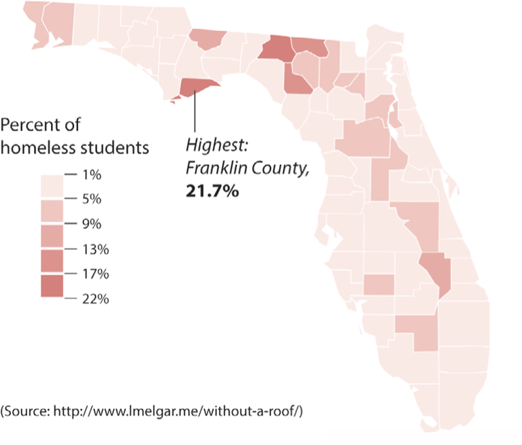
I was shocked. Did this mean that so many students were living on the streets? After all, that was my assumption as to what “homeless” means, but it’s far from reality. According to Luís’s story, Florida’s public education system says that a student is homeless when he or she lacks “a fixed, regular, and adequate nighttime residence,” or shares a home with people who aren’t close relatives “due to loss of housing” or “economic hardship.”
Therefore, most of these students don’t live on the streets, but they don’t have a stable home either. Even if the picture doesn’t sound so dire now, it still is: lacking a permanent place, moving from home to home frequently, greatly lowers school performance, worsens behavior, and may have negative long-term consequences, as Luís’s investigation showed. A debate about how to solve homelessness is critical, but to have it, we need to know exactly what the charts that plot it are measuring.
The internet and social media are powerful tools for creating, finding, and disseminating information. My social media streams brim with news and comments written or curated by journalists, statisticians, scientists, designers, and politicians, some of them friends, others unknown. We are all exposed to similarly endless spates of headlines, photos, and videos.
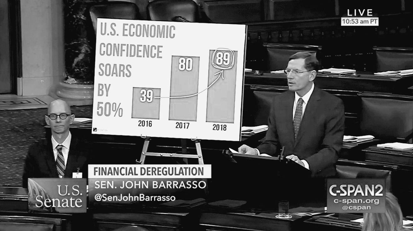
I love social media. It has helped me discover charts by many designers I’d never heard of and the writings of many authors I wouldn’t have found otherwise. Thanks to social media, I can follow plenty of sources of good and dubious charts, such as FloorCharts, a Twitter account that collects bizarre visuals by members of Congress. Take a look at this one by Wyoming senator John Barrasso, which confuses percentage change and percentage point change: the increase between 39% and 89% isn’t 50%, it’s 50 percentage points—and also a 128% increase:
However, social media has its dark side. The core prompt of social media is to share, and to share quickly whatever captures our eyes, without paying much attention to it. This is why I promoted the heavy metal map mindlessly. It resonated with my existing likes and beliefs, so I re-sent it without proper reflection at first. Feeling guilty, I undid my action and verified the source before sending it out again.
The world will be a much better place if we all begin curbing our sharing impulses a bit more often. In the past, only professionals with access to publishing platforms—journalists and the owners of newspapers, magazines, or TV stations—controlled the information that the public received. Today, every single one of us is a curator of information, a role that implies certain responsibilities. One of them is to make sure, whenever we can, that whatever content we read and help spread looks legitimate, particularly if that content seems to confirm our most strongly rooted ideological beliefs and prejudices.
Sometimes, even lives may be at stake.
On the evening of June 17, 2015, a 21-year-old man called Dylann Roof entered Emanuel African Methodist Episcopal Church in Charleston, South Carolina. He asked for the pastor, Reverend Clementa Pinckney, a respected figure in the city and state and a legislator for nearly two decades.2
Pinckney took Roof to a Bible study session in the church basement, where the pastor discussed scripture with a small group of congregants. After a heated interchange, Roof pulled a handgun and murdered nine people. One victim pleaded with Roof to stop, and he replied, “No, you’ve raped our women and you are taking over the country. I have to do what I have to do.” Roof’s “you” meant “African Americans.” Mother Emanuel, as the church is also known, is one of the oldest black congregations in the United States.
Roof was arrested and he became the first federal hate crime defendant to be sentenced to death.3 In both his manifesto and confession, he explained the origins of his deep racial hatred. He referred to his quests for information about “black-on-white crime” on the internet.4 His first source was the Council of Conservative Citizens (CCC), a racist organization that publishes articles with charts like this to make the point that black offenders target a disproportionate number of white victims because they are white:5
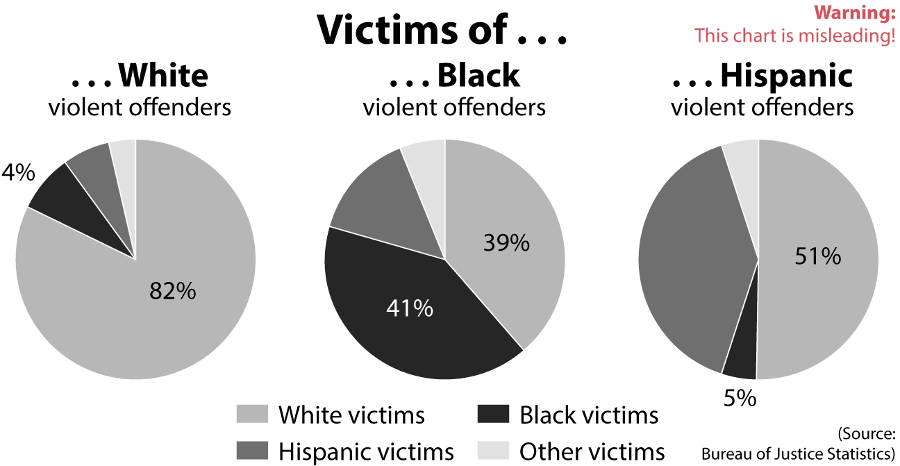
Human nature dictates that what we see is largely shaped by what we want to see, and Roof is no exception. His manifesto revealed a mind infected by racial grievances developed in childhood and adolescence and later solidified with data and charts twisted for political interest by an extremist organization. CCC’s charts, designed by white supremacist Jared Taylor, were inspired by a confusing article by National Review’s Heather Mac Donald.6 This case is a potent example of how crucial it is to check primary sources and read the fine print of how chart designers came up with the numbers they present.
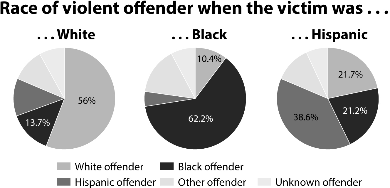
Taylor’s data came from the Victimization Survey by the Bureau of Justice Statistics, which can be easily found through a Google search. More specifically, it came from the table below. I added little arrows to indicate the direction in which you should read the numbers; the percentages inside the red boxes add up to 100% horizontally:

The table displays violent crimes with the exception of murders. Notice that “white” and “black” exclude Hispanic and Latino whites and blacks. “Hispanic” means anyone of Hispanic or Latino origin, regardless of color or race.
Understanding the difference between the numbers on the table and the figures Taylor crafted is tricky. Let’s begin by verbalizing what the table tells us. Trust me, even I would have a hard time wrapping my head around the numbers if I didn’t explain them to myself:
•There were nearly six and a half million victims of violent crimes—excluding murders—in both 2012 and 2013.
•Of those, a bit more than four million victims (63% of the total victims) were whites and nearly one million (15% of the total victims) were blacks. The rest belong to other races or ethnicities.
•Focus now on the “White” row: 56% of white victims were attacked by white offenders; 13.7% were attacked by black offenders.
•Let’s move to the “Black” row: 10.4% of black victims were attacked by white offenders; 62.2% were attacked by black offenders.
What the table says—and what is true about this data—is the following:
The percentage of victims who are non-Hispanic whites and blacks is very close to their presence in the U.S. population: 63% of the victims were non-Hispanic white, and 61% of people in the United States were non-Hispanic white, according to the Census Bureau (and more than 70% if we count whites who are also Hispanic or Latino); 15% of the victims were black, and 13% of the U.S. population is African American.
When people become victims of crimes, it’s more likely than not that their aggressors are of their same demographic. Let’s do a chart with the same format as Taylor’s but displaying the numbers as they should be:
How is it that Taylor’s figures are so different from those reported by the Bureau of Justice Statistics? The reason is that Taylor played an arithmetic sleight of hand to serve a preconceived message intended to spur racial animus. In his own words, “When whites commit violence they choose fellow whites [most of the time] and almost never attack blacks. Blacks attack whites almost as often as they attack blacks.”
To come up with his numbers, Taylor first transformed the percentages on the Bureau of Justice Statistics table into the number of victims. For instance, if the table shows that there were 4 million white victims and that 56% of them where attacked by white offenders, then roughly 2.3 million white victims were attacked by other whites.
The first table Taylor designed probably looked like the one on the top of the following page.
Race/ethnicity of victims |
Annual average number of victimizations |
White offender |
Black offender |
Hispanic offender |
Other offender |
Unknown offender |
Total |
6,484,507 |
2,781,854 |
1,452,530 |
959,707 |
784,625 |
505,792 |
White |
4,091,971 |
2,291,504 |
560,600 |
486,945 |
433,749 |
319,174 |
Black |
955,800 |
99,403 |
594,508 |
44,923 |
143,370 |
73,597 |
Hispanic |
995,996 |
216,131 |
211,151 |
384,454 |
115,536 |
68,724 |
Other |
440,741 |
177,619 |
85,063 |
46,719 |
89,470 |
41,870 |
Taylor then read this table column by column, from top to bottom, and used the figures on the “Total” row as denominators to transform all other numbers into percentages. For instance, take a look at the “Black Offender” column. The total number of victims of black offenders was 1,452,530. Out of those, 560,600 were white, which is 38.6% of 1,425,530. Here are the results that Taylor got and that he represented in his pie charts:
Race/ethnicity of victims |
Annual average number of victimizations |
White offender |
Black offender |
Hispanic offender |
Other offender |
Unknown offender |
Total |
6,484,507 |
2,781,854 |
1,452,530 |
959,707 |
784,625 |
505,792 |
White |
63.1 % |
82.4 % |
38.6 % |
50.7 % |
55.3 % |
63.1 % |
Black |
14.7 % |
3.6 % |
40.9 % |
4.7 % |
18.3 % |
14.6 % |
Hispanic |
15.4 % |
7.8 % |
14.5 % |
40.1 % |
14.7 % |
13.6 % |
Other |
6.8 % |
6.4 % |
5.9 % |
4.9 % |
11.4 % |
8.3 % |
(Notice that the only small discrepancy between my calculation and Taylor’s is that I have 82.4% of white victims of white offenders and he had 82.9%.)
Arithmetically speaking, these percentages may be correct, but arithmetic isn’t the main factor that makes a number meaningful. Numbers must always be interpreted in context. Taylor made at least four dubious assumptions.
First, he ignored the racial makeup of the United States. According to the Census Bureau, as of 2016 the U.S. population was about 73% white (including Hispanic and Latino whites) and about 13% black. Based on this fact, my University of Miami graduate student and data analyst Alyssa Fowers did the following back-of-the-napkin calculation for me:
If a hypothetical (and very active!) white offender committed crimes against people of his or her own race half the time, and then committed the other half of their crimes randomly among the entire population, they would commit 86.5% of their crimes against white people and 6.5% against black people.
Meanwhile, if a black offender did the exact same thing—half against people of their own race, half randomly against the entire population—they would commit only 56.5% of their crimes against black people and 36.5% of their crimes against white people. That makes it look like the black offender is intentionally targeting white victims more than the white offender is targeting black victims, when in fact there are just many more potential white victims and many fewer potential black victims because of the population makeup of the United States.
The second dubious assumption Taylor made is that his aggregation is better than the one by the Bureau of Justice Statistics. The opposite is true because of the nature of these violent crimes: offenders often victimize people who are like them and live nearby. Many violent crimes are the product of domestic violence, for instance. The Bureau of Justice Statistics explains that “the percentage of intraracial victimization [is] higher than the percentage of interracial victimization for all types of violent crime except robbery.” Robbery may be the exception because if you’re a robber, you’ll try to assault people who live in wealthier areas than you do.
This last fact is related to Taylor’s third wrong assumption: that offenders “choose” their victims because of their race, that blacks “choose” whites as victims more often than whites “choose” blacks. Unless is a crime is premeditated, criminals don’t choose their victims at all, much less by their race. In the most common kinds of violent crimes, offenders attack victims because they are furious with them (domestic violence) or because they expect to get something valuable from them (robbery). Do black offenders rob white victims? Sure. But that’s not a racially motivated crime.
The fourth assumption is the most relevant one. Taylor wanted readers to believe that truly racially motivated crimes—hate crimes—aren’t counted. They are, in fact, counted, and they would have been more appropriate for his discussion, although these figures are quite inconvenient for him: In 2013, law enforcement agencies reported that 3,407 hate-crime offenses were racially motivated. Of these, 66.4% were motivated by antiblack bias, and 21.4% stemmed from antiwhite bias.7
These are the numbers that should have appeared in Taylor’s charts. As George Mason University professor David A. Schum wrote in his book The Evidential Foundations of Probabilistic Reasoning,8 data “becomes evidence in a particular inference when its relevance to this inference has been established.” The fact that many offenders are black and many victims are white is not evidence for the inference that offenders choose their victims or that this potential choice is racially motivated.
It’s hard not to wonder what would have happened if Dylann Roof had found numbers like these instead of those fudged by the Council of Conservative Citizens. Would he have changed his racist beliefs? It seems unlikely to me, but at least those beliefs wouldn’t have been further reinforced. Dubious arithmetic and charts may have lethal consequences.
Economist Ronald Coase once said that if you torture data long enough, it’ll always confess to anything.9 This is a mantra that tricksters have internalized and apply with abandon. As the charts that confirmed Dylann Roof’s racist beliefs demonstrate, the same numbers can convey two opposite messages, depending on how they are manipulated.
Imagine that I run a company with 30 employees, and in the annual report that I send to shareholders, I mention that I care about equality and employ the same number of men and women. In the document, I also celebrate that three-fifths of my female employees have higher salaries than male employees of the same rank, to compensate for the fact that women in the workforce tend to make less money than men. Am I lying? You won’t know unless I disclose all the data as a table:
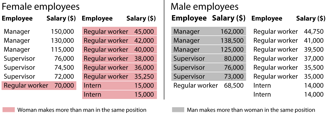
I may not have told you a complete lie, but I’m not disclosing the whole truth, either. A majority of my women employees have higher salaries than the men, but I concealed the fact that, on average, men in my company make more than women (the means are $65,583 and $63,583), because managerial salaries are so unequal. Both ways of measuring equality are relevant if I want to provide a truthful picture of my company.
This is a fictional example, but similar ones in the news media abound. On February 22, 2018, BBC News wrote, “Women earn up to 43% less at Barclays—Female employees earn up to 43.5% less at Barclays than men, according to gender pay gap figures it has submitted to the government.”10 This isn’t a lie, either. The pay gap at Barclays Bank is indeed large. However, as data analyst Jeffrey Shaffer pointed out,11 that 43.5% difference doesn’t tell the entire story. We need to take a look at charts like this because they reveal an angle we may have overlooked:

Barclays does have an equality problem, but it isn’t a pay gap at the same levels in the hierarchy—men and women in similar positions earn nearly identical salaries, according to a report by the bank. Barclays’ challenge is that women employees are mostly in junior positions and managers are mostly men, so the key to solving the problem may be its promotion policies. Jes Staley, CEO of the bank, said, “Although female representation is growing at Barclays, we still have high proportions of women in more junior, lower paid roles and high proportions of men in senior, highly paid roles.”
Numbers can always yield multiple interpretations, and they may be approached from varied angles. We journalists don’t vary our approaches more often because many of us are sloppy, innumerate, or simply forced to publish stories at a quick pace. That’s why chart readers must remain vigilant. Even the most honest chart creator makes mistakes. I know this because I’ve made most of the mistakes I call out in this book—even though I didn’t wish to lie on purpose!
On July 19, 2016, the news website Vox published a story with the title “America’s Health Care Prices Are Out of Control. These 11 Charts Prove It.”12
Here’s a mantra I like to repeat in classes and talks: Charts alone rarely prove anything. They can be powerful and persuasive components of arguments and discussions, but they are usually worthless on their own. The charts Vox mentioned in the title look like this:
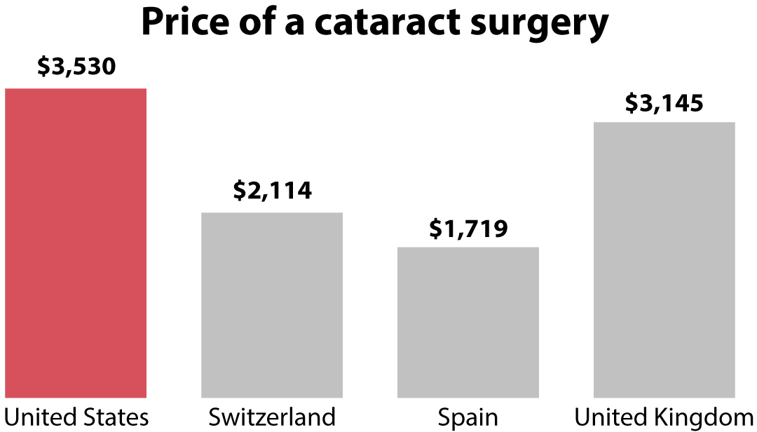
Vox’s story is the type of content I’d feel tempted to promote in social media, as it confirms something I already believe: I was born in Spain, where health care is largely public and paid for through taxes, as in many other western European countries. Of course I believe that health care prices in the United States are “out of control”—I’ve suffered them myself!
However, how out of control are they, really? Vox’s charts made my internal baloney alarm ring because the story didn’t mention whether the prices reported were adjusted by purchasing power parity (PPP). This is a method to compare prices in different places taking into account cost of living and inflation. It’s based on calculating what quantity of each country’s currency you need if you want to buy the same basket of goods. Having lived in many different places, I can assure you that $1,000 is a lot of money in some of them and not so much in others.
I thought about PPP also because many members of my family in Spain worked in health care: my father was a medical doctor before retiring, and so was my uncle; my father’s sister was a nurse; my mother used to be head of nursing in a large hospital; my paternal grandfather was a nurse. I’m familiar with the salaries they used to make. They were less than half of what they would have made if they had moved to the United States to work in the same kinds of jobs, which is the proportion I saw in some of Vox’s charts.
Curious about where the data had come from and about whether prices had been adjusted to make them truly comparable, I did some digging online. Vox’s source, mentioned in the story, was a report by the International Federation of Health Plans, or IFHP (http://www.ifhp.com/), based in London. Its membership is 70 health organizations and insurers in 25 countries.13
The report contains an Overview page explaining the methodology employed to estimate the average price of several health care procedures and drugs in different countries. It begins with this line:
Prices for each country were submitted by participating federation member plans.
This means that the survey didn’t average the prices of all health plan providers in all countries but rather those from a sample. This isn’t wrong in principle. When estimating anything—the average weight of U.S. citizens, for instance—it’s unlikely that you’ll be able to measure every single individual. It’s more realistic to draw a large random sample and then average the measurements taken from it. In this case, a proper sample would consist of a small set of randomly picked health plan providers per country. All providers should be equally likely to be selected.
If random sampling is rigorously conducted,14 it’s likely that the average you compute based on it will be close to the average of the population the sample was drawn from. A statistician would say that a carefully selected random sample is “representative” of the population it was drawn from. The average of the sample won’t be identical to the population average, but it’ll be similar. That’s why statistical estimates are often accompanied by an indication of the uncertainty that surrounds them, such as the famous “margin of error.”
But the sample that the IFHP used isn’t random. It’s self-selected. It averages the prices reported by organizations that chose to be members of the IFHP. Self-selected samples are risky because there’s no way to assess whether the statistics calculated from them correspond to the populations they stand for.
I bet you’re familiar with another egregious example of self-selected sampling: polls on websites and social media. Imagine that the leftist magazine The Nation asked on social media whether respondents approve of a Republican president. The results they’d get would be 95% disapprove and 5% approve, which would be unsurprising, considering that readers of The Nation are likely progressives and liberals. The results of such a poll would be the opposite if conducted by Fox News.
It gets worse. Next on the IFHP report’s Overview page we find this paragraph:
Prices for the United States were derived from over 370 million medical claims and over 170 million pharmacy claims that reflect prices negotiated and paid to health care providers.
But prices for other countries . . .
. . . are from the private sector, with data provided by one private health plan in each country.
This is problematic because we don’t know whether that single private health plan in each country is representative of all plans in that same country. It may be that the price for a cataract surgery reported by the single Spanish health plan provider in the sample coincides with the average price of a cataract surgery in Spain. But it may also be that this specific plan is either much more expensive than the country average or much cheaper. We just don’t know! And neither does the IFHP, as they openly acknowledge in the last line of the overview:
A single plan’s prices may not be representative of prices paid by other plans in that market.
Well, yes, indeed. Surreptitiously, this sentence tells us, “If you use our data, please warn your readers of their limitations!” Why didn’t Vox explain the data’s many limitations in the story, so readers could have taken the numbers with a grain—or a mountain—of salt? I don’t know, but I can make a guess, as I’ve done plenty of flawed charts and stories myself: a crushing majority of journalists are well intentioned, but we’re also busy, rushed, and, in cases like mine, very absentminded. We screw up more often than we like to admit.
I don’t think that this should lead us to mistrust all news media, as I’ll explain at the end of this chapter, but it ought to make us think carefully of the sources from which we obtain information and always apply commonsense reasoning rules such as Carl Sagan’s famous phrase “Extraordinary claims require extraordinary evidence.”
Here’s an example of an extraordinary claim: People in states that lean Democratic consume more porn than people in Republican states. The exception is Kansas, according to data from the popular website Pornhub.15 Jayhawkers, on average, consume a disproportionate amount of online porn:
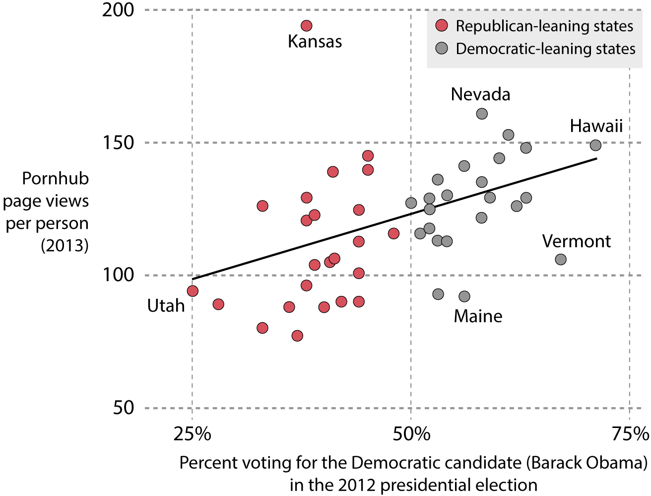
Oh Kansans, how naughty of thee! You watch much more porn (194 pages per person) than those northeastern heathen liberals from Maine (92) or Vermont (106).
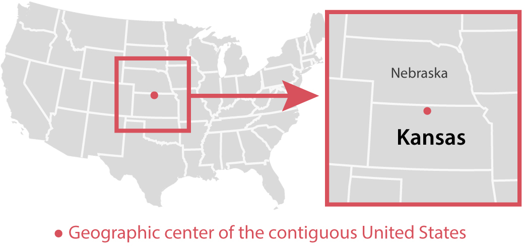
Except that you don’t. To explain why, I first need to show you where the geographic center of the contiguous United States is:
The preceding scatter plot is based on one designed by reporter Christopher Ingraham for his personal blog about politics and economics, WonkViz. Ingraham’s scatter plot and the Pornhub data it used got picked up by several news publications. They all had to issue corrections to their stories later on.
The data and the inferences made from it are problematic. First, we don’t know if Pornhub views are a good reflection of overall porn consumption—it may be that people in different states use other sources. Moreover, the reason why porn consumption per capita in Kansas looks so high is a quirky glitch in the data. Unless you use tools such as a virtual private network (VPN), the people who run websites and search engines can pinpoint your location thanks to your internet protocol (IP) address, a unique numerical identifier assigned to your internet connection. For example, if I visit Pornhub from my home in Florida, the Pornhub data folks will know roughly where I am.
However, I do use a VPN that redirects my internet traffic to servers located in different parts of the world. Right now, my VPN server is in Santa Clara, California, even if I’m comfortably writing from my sunny backyard in Florida. If I’m added to Pornhub’s databases, I may be added to either “Santa Clara, CA,” or, as they’d probably know I’m using a VPN, to “Location Not Determined.” However, this is not what happened in this case. If I can’t be located, I won’t be removed from the data, but I’ll be automatically assigned to the center of the contiguous United States, making me a Kansan. Here’s Ingraham pointing out the erroneous message of the scatter plot:
Kansas’ strong showing is likely an artifact of geolocation—when a U.S. site visitor’s exact location can’t be determined by the server, they are placed at the center of the country—in this case, Kansas. So what you’re seeing here is likely a case of Kansas getting blamed (taking credit for?) anonymous Americans’ porn searches.14
When journalists and news organizations acknowledge errors and issue corrections, as Ingraham did, it’s a sign that they are trustworthy.
Another sign of trustworthiness is whether a journalist explores the data from multiple angles and consults different sources. Out of curiosity, I casually delved into the literature about the relationship between porn consumption patterns and political leanings—there’s such a thing—and discovered a paper in the Journal of Economic Perspectives titled “Red Light States: Who Buys Online Adult Entertainment?” by Benjamin Edelman, a professor of business administration at Harvard.16
If Pornhub showed that, on average, people in states that leaned liberal in 2012 consumed more porn from its website, this paper reveals the opposite pattern: it’s red states that consume more adult entertainment. Here’s a quick chart I designed based on Edelman’s data (note: Edelman didn’t include all states, and the inverse association between the variables is quite weak):
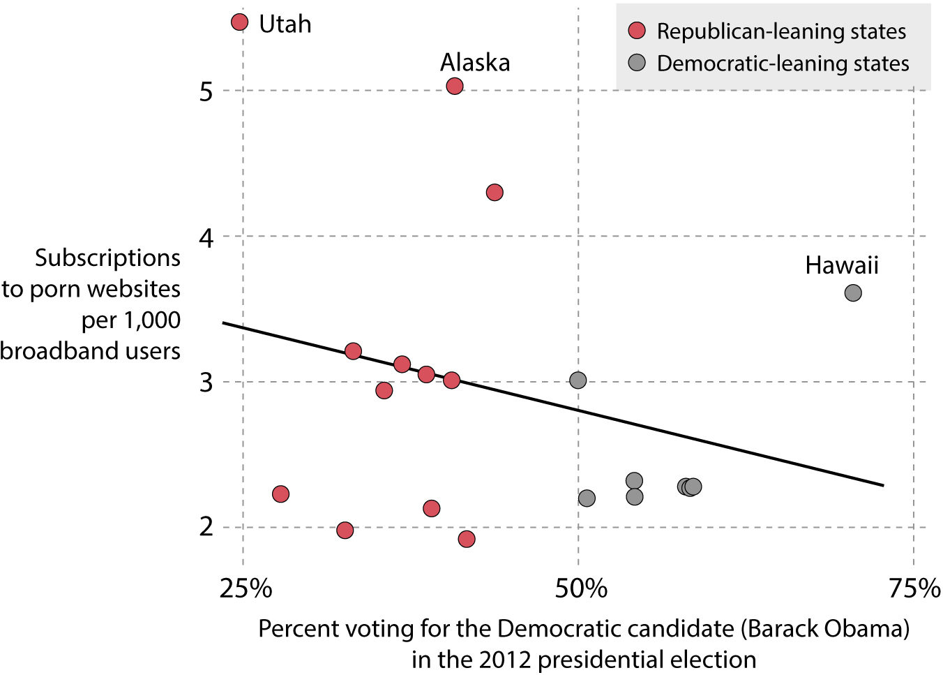
Some outliers in this case are Utah, Alaska, and Hawaii. The key feature to pay attention to when comparing this chart with the one before is the label on the vertical axis: on Ingraham’s chart, it was Pornhub pages per person; here, it’s subscriptions to porn websites per 1,000 broadband users.
To read a chart correctly, we must first identify what exactly is being measured, as this may radically change the messages a chart contains. Just an example: I cannot claim from my latest chart alone that Alaska, Utah, or Hawaii consume more porn; it might well be that people in those states watch less porn but get it more often from paid-for websites, rather than from freemium ones such as Pornhub. Also, as we’ll see in chapter 6, we can’t claim from a chart displaying state figures that each individual from those states consumes more or less porn.
Being an attentive chart reader means being a critical reader of data. It also requires you to develop a sense of what sources you can trust. Both these goals are beyond the scope of this book, but I’d like to offer some tips.
There are books that will help you to become better at assessing the numbers we see in the media. I personally recommend Charles Wheelan’s Naked Statistics, Ben Goldacre’s Bad Science, and Jordan Ellenberg’s How Not to Be Wrong. These books alone may help you avoid many of the most common mistakes we all make when dealing with everyday statistics. They barely refer to charts, but they are excellent books from which to learn some elementary data-reasoning skills.
To be a good media consumer, I suggest the Fact-Checking Day website (https://factcheckingday.com). It was created by the Poynter Institute, a nonprofit school dedicated to teaching information literacy and journalism. The website offers a list of features that may help you determine the trustworthiness of a chart, a news story, or an entire website or publication.
On a related note, everyone who has an online presence today is a publisher, a role that used to be played just by journalists, news organizations, and other media institutions. Some of us publish for small groups of people—our friends and family—while others have big followings: my own Twitter following includes colleagues, acquaintances, and complete strangers. No matter the number of followers we have, we can all potentially reach thousands, if not millions, of people. This fact begets moral responsibility. We need to stop sharing charts and news stories mindlessly. We all have the civic duty to avoid spreading charts and stories that may be misleading. We must contribute to a healthier informational environment.
Let me share my own set of principles for spreading information so that you can create your own. Here’s my process: Whenever I see a chart, I read it carefully and take a look at who published it. If I have time, I visit the primary source of the data, as I did with the heavy metal map and Vox’s story about health care prices. Doing this for a few minutes before sharing a chart doesn’t guarantee that I won’t promote faulty content every now and then, but it reduces the likelihood of that happening.
If I have doubts about a chart or story based on data, I don’t share it. Rather, I ask people I trust and who know more about the subject. For example, this book and all the charts it contains were read by a few friends with PhDs in data-related fields before being published. If I can’t asses the quality of a chart on my own, I rely on people like them to help me. You don’t need to befriend any eggheads to do this, by the way; your kids’ math or science teacher will do just fine.
If I can explain why I believe a chart is wrong or can be improved upon, I publish that explanation in social media or in my personal website along with the chart. Then I call the author’s attention to it and do my best to be constructive in these critiques (unless I’m certain of ill intentions). We all make mistakes and we can learn from each other.
It’s unrealistic to expect that all of us can verify the data of all charts we see every day. We often don’t have time, and we may lack the knowledge to do so. We need to rely on trust. How do we decide whether a source is trustworthy?
Here’s a set of very personal rules of thumb based on my experience and what I know about journalism, science, and the shortcomings of the human brain. In no particular order, they are:
•Don’t trust any chart built or shared by a source you’re not familiar with—until you can vet either the chart or the source, or both.
•Don’t trust chart authors and publishers who don’t mention the sources of their data or who don’t link directly to them. Transparency is another sign of appropriate standards.
•Try a varied media diet, and not only for charts. No matter your ideological standpoint, seek out information from people and publications on the right, in the center, and on the left.
•Expose yourself to sources you disagree with, and assume good faith on their part. I’m convinced that most people don’t want to lie or mislead on purpose and that we all loathe being lied to.
•Don’t assume ill intentions when haste, sloppiness, or ignorance is the more likely explanation for a bad chart.
•Needless to say, trust has its limits. If you begin spotting a pattern of misdeed in a source on your list, erase it.
•Follow only sources that issue corrections when they ought to and that do it visibly. Corrections are another sign of high civic or professional standards. To co-opt a common saying: To err is human, to correct is divine. If a source you follow doesn’t issue corrections systematically after being proved wrong, drop it.
•Some people think that all journalists have agendas. This happens in part because many relate journalism to raging pundits on TV and talk radio. Some of those are journalists, but many aren’t. They are either entertainers, public relations specialists, or partisan operatives.
•All journalists have political views. Who doesn’t? But most try to curb them, and they do their best to convey, as famed Watergate reporter Carl Bernstein likes to say, “the best obtainable version of the truth.”17
•This obtainable version may not be the truth, but good journalism is a bit like good science. Science doesn’t discover truth. What science does well is provide increasingly better approximate explanations of what the truth may be, according to available evidence. If that evidence changes, the explanations—either journalistic or scientific—should change accordingly. Beware those who never change their views despite acknowledging that their previous views were driven by incomplete or faulty data.
•Avoid very partisan sources. They don’t produce information but pollution.
•Telling the difference between a merely partisan source—there are reliable ones all over the ideological spectrum—and a hyperpartisan one can be tricky. It will require some time and effort on your part, but there is a very good clue you can begin with: the tone of the source’s messages, including whether that source employs ideologically loaded, bombastic, or aggressive language. If it does, stop paying attention to it, even if it’s just for entertainment.
•Hyperpartisan sources, particularly those you agree with, are similar to candy: A bit of it from time to time is fine and fun. A lot of it regularly is unhealthy. Nourish your mind instead, and push it to be exercised and challenged rather than coddled. Otherwise, it’ll wither.
•The more ideologically aligned you are with a publication, the more you should force yourself to read whatever it publishes with a critical eye. We humans find comfort in charts and stories that corroborate what we already believe and react negatively against those that refute it.
•Expertise matters, but it’s also specific. When it comes to arguing over a chart about immigration, your judgment as a layperson is as valid as that of a mechanical engineer or someone with a PhD in physics or philosophy. And your opinion is less likely to be accurate than are the ones expressed by statisticians, social scientists, or attorneys who specialize in immigration. Embrace intellectual modesty.
•It’s become fashionable to bash experts, but healthy skepticism can easily go too far and become nihilism, particularly if for emotional or ideological reasons you don’t like what certain experts say.18
•It’s easy to be overly critical of charts that depict realities we’d rather not learn about. It’s much harder to read those charts, to assume that their creators likely acted in good faith, and then to coolly assess whether what the charts show has merit. Don’t immediately snap to judgment against a chart just because you dislike its designers or their ideology.
Finally, remember that one reason charts lie is that we are prone to lying to ourselves. This is a core lesson of this book, as I’ll explain at length in the conclusion.