To avoid lying, charts need to be precise; but sometimes too much precision is detrimental to understanding.
Data is often uncertain, and this uncertainty should be disclosed. Ignoring it may lead to faulty reasoning.

On the morning of April 28, 2017, I opened my copy of the New York Times to the Opinion pages to find Bret Stephens’s first column. Stephens is a riveting conservative columnist who had been recruited from the Wall Street Journal to add some ideological variety to the Times’s commentary roster.
The title of Stephens’s first piece was “Climate of Complete Certainty,”1 and some of its lines were music to my ears: “We live in a world in which data convey authority. But authority has a way of descending to certitude, and certitude begets hubris.” Unfortunately, other passages weren’t that impressive. Later in the column, Stephens attacked the consensus on the basic science of climate change with bizarre arguments. For instance, he wrote (emphasis mine):
Anyone who has read the 2014 report of the Intergovernmental Panel on Climate Change knows that, while the modest (0.85 degrees Celsius, or about 1.5 degrees Fahrenheit) warming of the earth since 1880 is indisputable, as is the human influence on that warming, much else that passes as accepted fact is really a matter of probabilities. That’s especially true of the sophisticated but fallible models and simulations by which scientists attempt to peer into the climate future. To say this isn’t to deny science. It’s to acknowledge it honestly.
We’ll get to the part about “fallible models and simulations” in a minute. For now, let’s focus on the claim that an increase of 0.85 degrees Celsius worldwide is “modest.” It sounds right. I don’t think that anybody would feel any warmer if the temperature increased from 40°C to 40.85°C. The temperature would be perceived as equally hot.
However, if there’s something that every citizen ought to know by now, it is that weather is not climate. That’s why politicians who say that climate change isn’t real because it’s snowing heavily in their vicinity are either fooling you or ignorant of elementary school science. Stephens’s “modest” increase of 0.85°C isn’t modest at all if we put it into proper historical perspective. A good chart like the one on the opposite page can enable an informed conversation (BP stands for “before the present”).2
Here’s how to read this chart: on the horizontal axis are years, measured backward from the present year (year zero, on the right). The vertical axis is temperatures measured against the average temperature in degrees Celsius between the years 1961 and 1990, a common baseline in climate science; this becomes a horizontal dotted line on the chart. That’s why we have positive temperatures (above that baseline) and negative temperatures (below that baseline).
The red line is the critical one; it’s the result of averaging the temperature variations of plenty of independent historical estimates done by competing researchers and teams from all over the world. The grey band behind it is the uncertainty that surrounds the estimate. Scientists are saying, “We’re reasonably certain that the temperature in each of these years was somewhere within the boundaries of this grey band, and our best estimate is the red line.”
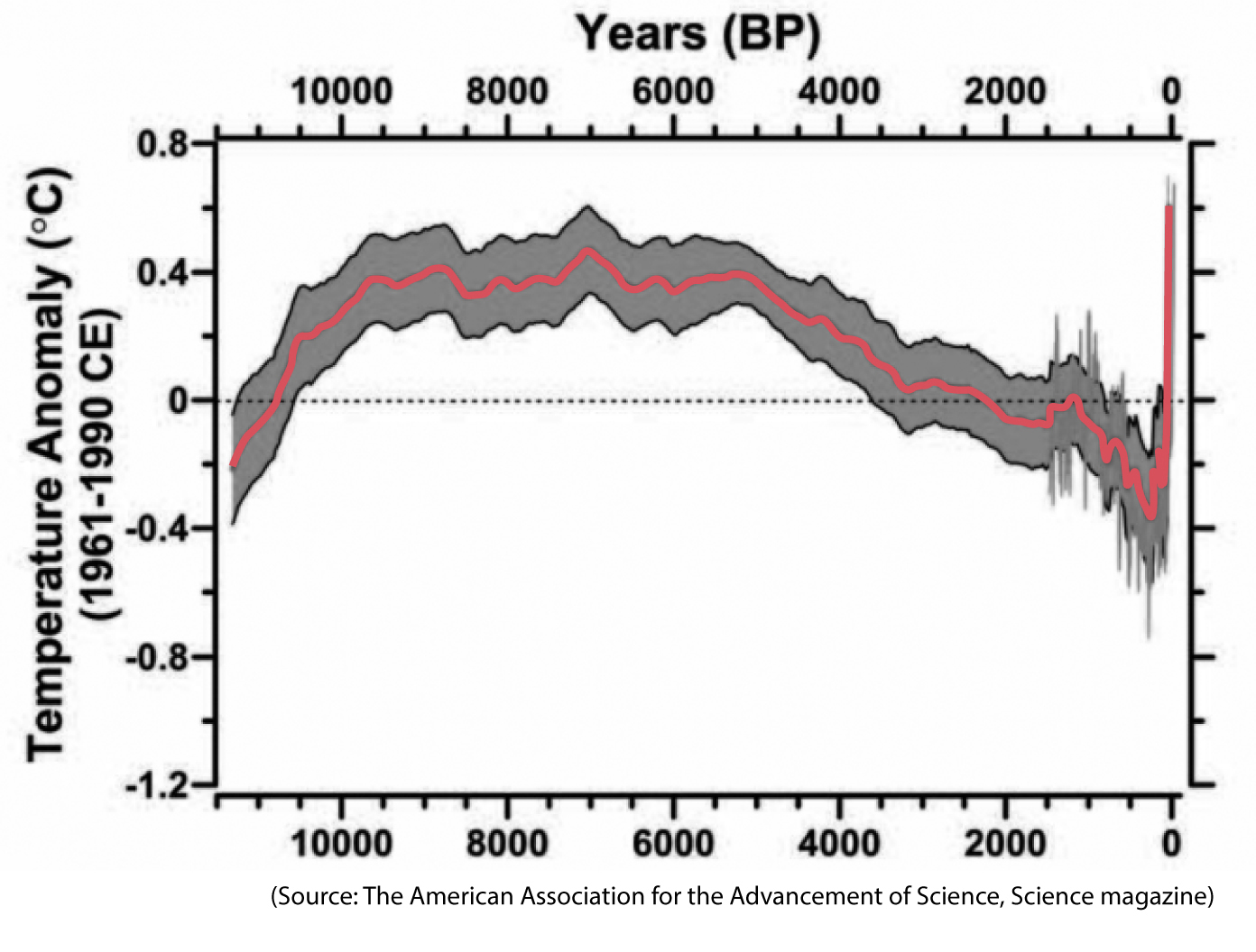
The thin grey line behind the red one on the right side of the chart is a specific and quite famous estimate, commonly called the hockey stick, developed by Michael E. Mann, Raymond S. Bradley, and Malcolm K. Hughes.3
The chart reveals this: Contrary to what Stephens claimed, a 0.85°C warming isn’t “modest.” Read the vertical axis. In the past, it took thousands of years for an increase equivalent to the one we’ve witnessed in the past century alone. This becomes clearer if we zoom in and notice that no temperature change in the past 2,000 years has been this drastic:
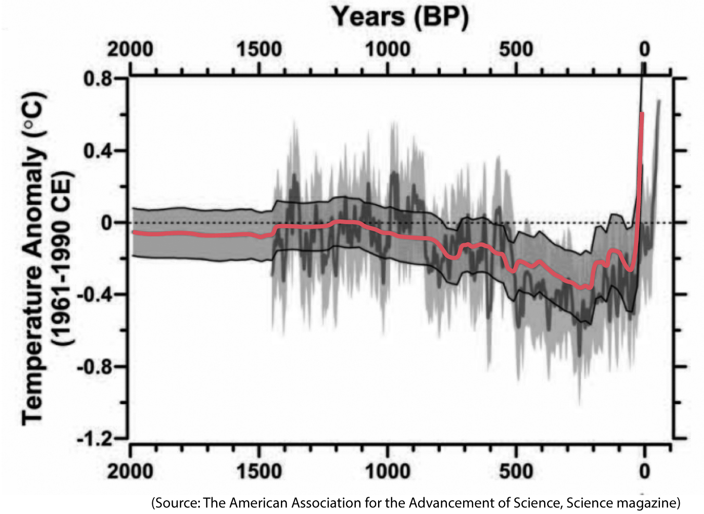
There is no “modesty” after all.
What about Stephens’s second claim, the one about the “fallible models and simulations”? He added:
Claiming total certainty about the science traduces the spirit of science and creates openings for doubt whenever a climate claim proves wrong. Demanding abrupt and expensive changes in public policy raises fair questions about ideological intentions.
This all sounds like good advice at an abstract level, but not when we apply it to reality. First, climate models have been not only reasonably accurate but in many cases too optimistic.
The world is warming rapidly, ice sheets are melting, ocean and sea waters are expanding, and sea level is rising to the point that it may soon make life in regions like South Florida hard. Already, floods are becoming much more frequent in Miami Beach, even during good weather. This is leading the city to discuss those “expensive changes in public policy” that Stephens so much distrusts: installing huge water pumps and even elevating roads. This kind of conversation isn’t based on “ideological” science—liberal or conservative—but on the facts, which can be observed directly.
See the following chart by the Copenhagen Diagnosis project.4 It compares the forecasts made by the Intergovernmental Panel on Climate Change (IPCC) in the past to the actual recorded increase in sea levels:
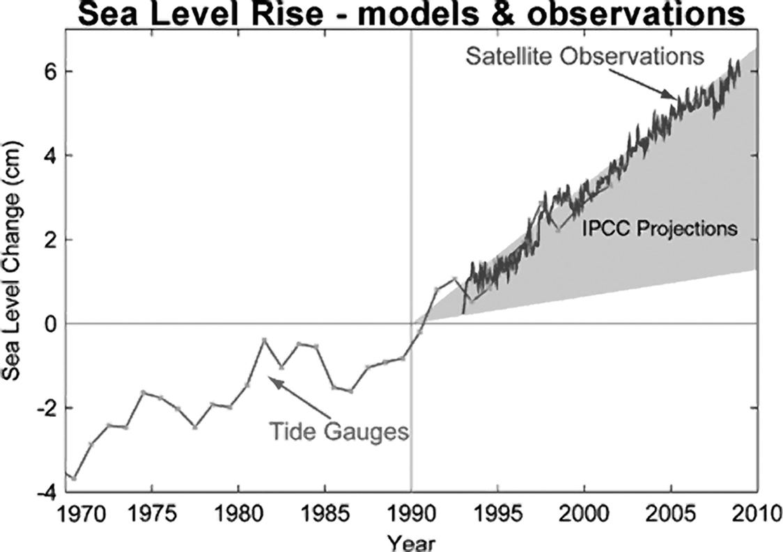
The grey band is the range of forecasts by the IPCC. Scientists were suggesting back in 1990 that sea level could rise roughly between 1.5 and 6.5 cm by 2010. Satellite observations—not “fallible models and simulations”—confirmed that the most pessimistic projection had turned out to be right. Have climate models been wrong in the past? Absolutely; science isn’t dogma. Nonetheless, many of them have been grimly correct.
Finally, a critical point that Stephens failed to mention in his opening column at the New York Times is that even if data, models, forecasts, and simulations are extremely uncertain—something that climate scientists always disclose in their charts—they still all point in the same direction, with no exception. Here’s one final good chart from the IPCC that Stephens could have showcased:
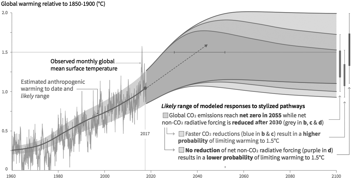
The chart shows several forecasts with their corresponding ranges of uncertainty. If you want to be extremely optimistic, the best available evidence suggests that global temperatures may increase as little as 1°C by 2100. That is a big increase; but worse, it’s also possible that they will increase 2°C or more. There’s still a possibility that we’ll witness no further warming in the future, but it’s equally likely that global temperatures will increase much more than 2°C, which would make the diminished parts of the Earth not covered in water much less habitable, as they’d be punished by extreme weather events, from monstrous hurricanes to devastating droughts.
An analogy would be useful here: if these weren’t climate forecasts but probabilities of your developing cancer in the future calculated by several independent groups of oncologists from all over the world, I’m certain you’d try to take precautions right away, not ignore the imperfect—and only—evidence because it’s based on “fallible models.” All models are fallible, incomplete, and uncertain, but when all of them tell a similar story, albeit with variations, your confidence in them ought to increase.
I’m all for discussing whether the expensive changes in public policy mentioned by Stephens are worth it, but to have that conversation in the first place, we must read the charts and understand the future they imply. Good charts can help us make smarter decisions.
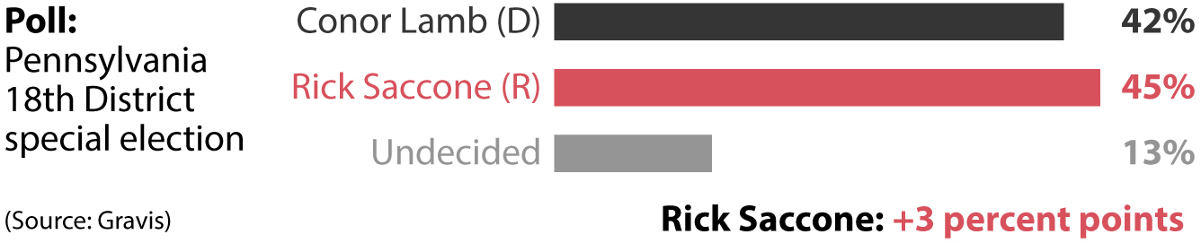
Bret Stephens’s column is a good reminder that whenever we deal with data, we must take into consideration how uncertain estimates and forecasts are and then decide whether that uncertainty should modify our perceptions. We’re all used to seeing polls reported like this:
And then we are surprised—or upset, depending on the candidate we favored—when the final results look like this:
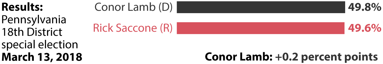
This comparison between a poll and the final results of a special election is useful for explaining that there are two different kinds of uncertainty lurking behind any chart: one can be easily computed, and another is hard to assess. Let’s begin with the former. What these charts don’t show—even if it’s discussed in the description of the research—is that any estimate is always surrounded by error.
In statistics, “error” is not a synonym for “mistake,” but rather a synonym for “uncertainty.” Error means that any estimate we make, no matter how precise it looks in our chart or article—“This candidate will obtain 54% of the vote,” “This medicine is effective for 76.4% of people 95% of the time,” or “The probability of this event happening is 13.2%”—is usually a middle point of a range of possible values.
There are many kinds of error. One is the margin of error, common as a measure of uncertainty in polls. A margin of error is one of the two elements of a confidence interval. The other element is a confidence level, often 95% or 99%, although it can be any percentage. When you read that an estimate in a poll, scientific observation, or experiment is, say, 45 (45%, 45 people, 45 whatever) and that the margin of error reported is +/−3 at the 95% confidence level, you should imagine scientists and pollsters saying something that sounds more like proper English: Given that we’ve used methods that are as rigorous as possible, we have 95% confidence that the value we’re trying to estimate is between 42 and 48, that is, 3 points larger or smaller than 45, which is our best estimate. We can’t be certain that we have obtained a correct estimate, but we can be confident that if we ran the poll many times with the exact same rigorous methods we’ve used, 95% of the time our estimate would be within the margin of error of the truth.
Therefore, whenever you see a chart accompanied by some level of numerical uncertainty, you must force yourself to see a chart like the one below, always remembering that there’s a chance that the final results will be even larger or smaller than the ones shown. The gradient areas represent the width of the confidence interval, which in this case is +/−3 points around the point estimates.
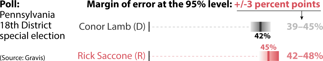
Most traditional charts, such as the bar graph or the line graph, can be misleading because they look so accurate and precise, with the boundaries of the bars and lines that encode the data appearing crisp and sharp. But we can educate ourselves to overcome this design shortcoming by mentally blurring those boundaries, particularly when estimates are so close to each other that their uncertainty ranges overlap.
There is a second source of uncertainty on my first chart: the 13% of people who were undecided when the poll was conducted. This is a wild card, as it’s hard to estimate which proportion of those would end up voting for either of the candidates. It can be done, but it would involve weighing factors that define the population you are polling, such as racial and ethnic makeup, income levels, past voting patterns, and others—which would yield more estimates with their own uncertainties! Other sources of uncertainty that are hard or even impossible to estimate are based on the soundness of the methods used to generate or gather data, possible biases researchers may introduce in their calculations, and other factors.
Uncertainty confuses many people because they have the unreasonable expectation that science and statistics will unearth precise truths, when all they can yield is imperfect estimates that can always be subject to changes and updates. (Scientific theories are often refuted; however, if a theory has been repeatedly corroborated, it is rare to see it debunked outright.) Countless times, I’ve heard friends and colleagues try to end a conversation saying something like, “The data is uncertain; we can’t say whether any opinion is right or wrong.”
This is going overboard, I think. The fact that all estimates are uncertain doesn’t mean that all estimates are wrong. Remember that “error” does not necessarily mean “mistake.” My friend Heather Krause, a statistician,5 once told me that a simple rephrasing of the way specialists talk about the uncertainty of their data can change people’s minds. She suggested that instead of writing, “Here’s what I estimate, and here’s the level of uncertainty surrounding that estimate,” we could say, “I’m pretty confident that the reality I want to measure is captured by this point estimate, but reality may vary within this range.”
We should be cautious when making proclamations based on a single poll or a specific scientific study, of course, but when several of them corroborate similar findings, we should feel more confident. I love reading about politics and elections, and one mantra that I repeat to myself is that any single poll is always noise, but the average of many polls may be meaningful.
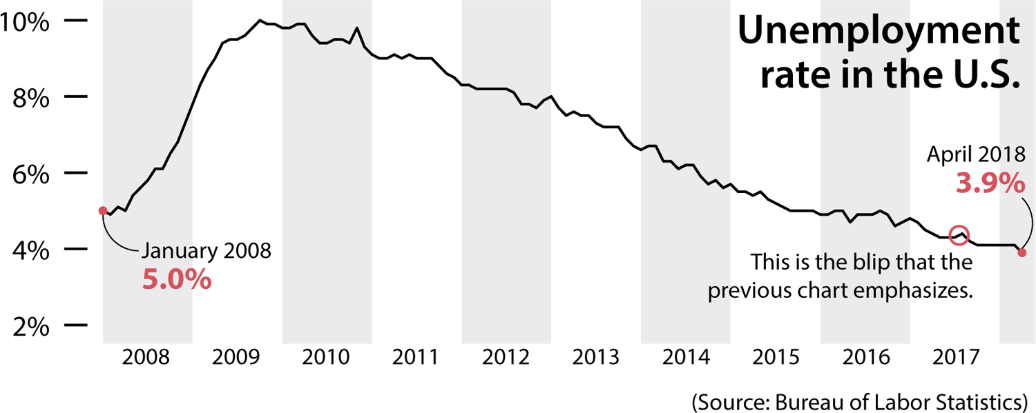
I apply a similar principle when reading about unemployment, economic growth, or any other indicator. Usually, a single week’s or month’s variation may not be worth your attention, as it could be in part the product of reality’s inherent randomness:

Zooming out enables you to see that the trend is exactly the opposite, since unemployment peaked in 2009 and 2010 and declined from there, with just some blips along the way. The overall trend has been one of steady decline:
Even when confidence and uncertainty are displayed on a chart, they can still be misinterpreted.
I love coincidences. I’m writing this chapter on the very same day—May 25, 2018—that the National Hurricane Center (NHC) announced that subtropical storm Alberto was forming in the Atlantic Ocean and approaching the United States. Friends began bombarding me with jokes quoting NHC press releases: “Alberto meandering over the northwestern Caribbean Sea” and “Alberto is not very well organized this morning.” Well, sure, I haven’t gotten enough coffee yet today.
I visited the NHC’s website to see some forecasts. Take a look at the chart below, plotting the possible path of my namesake storm. Down here in South Florida, we’re very used to seeing this kind of map in newspapers, websites, and on TV during hurricane season, between June and November every year:
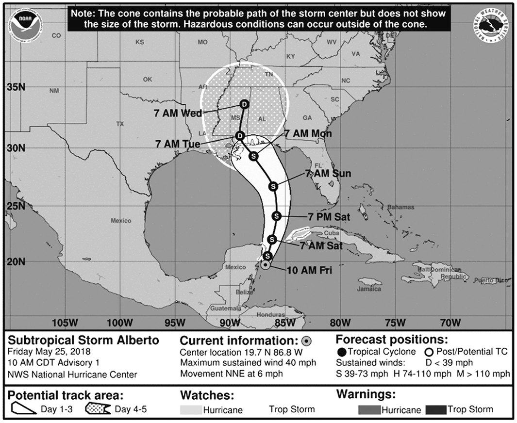
Years ago, my University of Miami friends Kenny Broad and Sharan Majumdar, experts on weather, climate, and environmental science, opened my eyes to how nearly everybody who sees this map reads it wrong; we’re all now part of a multidisciplinary research group working to improve storm forecast charts, led by our colleague Professor Barbara Millet.6
The cone at the center of the map is popularly known as the cone of uncertainty. Some folks in South Florida favor the term “cone of death” instead, because they think that what the cone represents is the area that may be affected by the storm. They see the cone and they envision the scope of the storm itself, or the area of possible destruction, even if the caption at the top of the chart explicitly reads: “The cone contains the probable path of the storm center but does not show the size of the storm. Hazardous conditions can occur outside of the cone.”
Some readers see the upper, dotted region of the cone and think it represents rain, although it simply shows where the center of the storm could be four to five days from now.
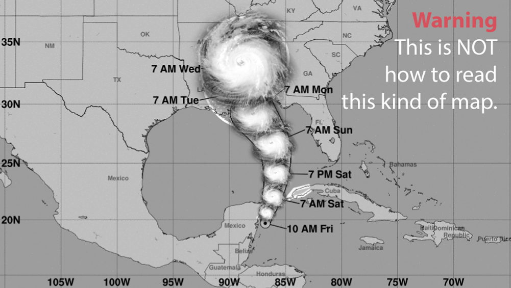
One good reason many people make these mistakes is that there’s a pictorial resemblance between the cone, with its semicircular end point, and the shape of a storm. Hurricanes and tropical storms tend to be nearly circular because the strong winds make clouds swirl around their center. When seeing the cone of uncertainty, I always need to force myself not to see the following:
Journalists are also misled by the cone-of-uncertainty map. When Hurricane Irma was approaching Florida in September 2017, I remember hearing a TV presenter saying that Miami may be out of danger because the cone of uncertainty was on the west coast of Florida, and Miami is on the southeastern side, and therefore it was outside of the cone boundaries. This is a dangerous misreading of the map.
How do you read the cone of uncertainty correctly? It’s more complicated than you think. The basic principle to remember is that the cone is a simplified representation of a range of possible paths the center of the storm could take, the best estimate being represented by the black line in the middle. When you see a cone of uncertainty, you should envision something like this instead (all these lines are made up):

To design the cone, scientists at the NHC synthesize several mathematical models of where the current storm could go, represented by the imaginary lines in the first step (1) of the explainer below. Next, based on the confidence the forecasters have in the different models, they make their own prediction of the position of the center of the storm over the following five days (2).
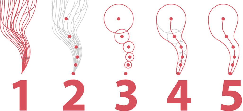
After that, they draw circles of increasing size (3) around the position estimates for each point. These circles represent NHC’s uncertainty around those predicted positions. This uncertainty is the average error in all storm forecasts from the previous five years. Finally, scientists use computer software to trace a curve that connects the circles (4); the curve is the cone (5).
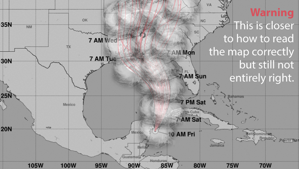
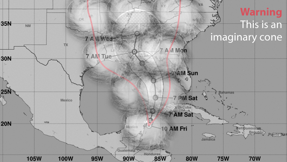
Even if we could visualize a map that looks like a dish of swirly spaghetti, it would tell us nothing about which areas could receive strong winds. To find that information, we would need to mentally overlay the sheer size of the storm itself, and we would end up with something that looks like cotton candy:
Moreover, we could wonder, “Will the cone always contain the actual path of the storm?” In other words, are forecasters telling me that out of the 100 times a storm like this moves through, under the same conditions of winds, ocean currents, and air pressure, the path of the storm will always lie within the boundaries of the cone of uncertainty?
Knowing a bit about numbers, that wasn’t my assumption. Mine was something like this: 95 times out of 100, the path of the storm center will be inside the cone, and the line at the center is scientists’ best estimate. But sometimes we may experience a freak storm where conditions vary so wildly that the center of the storm may end up running outside the cone:
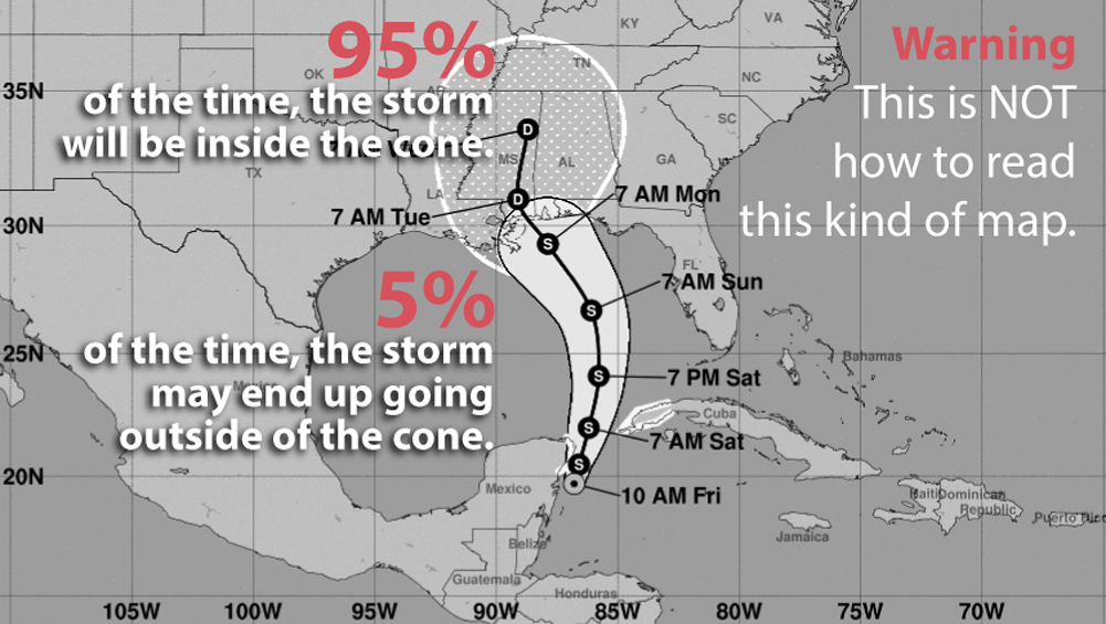
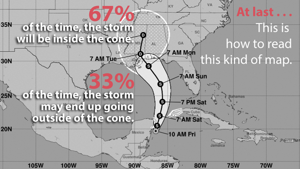
This is an assumption most people trained in science, data, and statistics would make. Unfortunately, they are wrong. According to rates of successes and failures at predicting the path of tropical storms and hurricanes, we know that the cone isn’t designed to contain the central location 95% of the time—but just 67%! In other words, one out of three times that we experience a storm like my namesake, the path of its center could be outside the boundaries of the cone, on either side of it:
If we tried to design a map encompassing 95 out of 100 possible paths, the cone would be much wider, perhaps looking something like this:
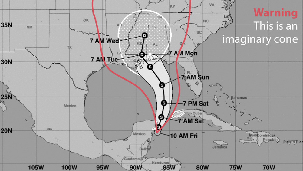
Adding the size of the storm on top of that, to offer a more accurate picture of which areas may be affected by it, will yield something that would surely provoke pushback from the public: “Hmm, this storm can go anywhere; scientists know nothing!”
I warned against this kind of nihilism a few pages back. Scientists do know quite a bit, their predictions tend to be pretty accurate, and they get better every year. These forecast models, running on some of the world’s largest supercomputers, are continuously improving. But they can’t be perfect.
Forecasters always prefer to err on the side of caution rather than overconfidence. The cone of uncertainty, if you know how to read it correctly, may be useful for making decisions to protect yourself, your family, and your property, but only if you pair it with other charts that the National Hurricane Center produces. For instance, since 2017 the NHC releases this page with “key messages” about all storms:
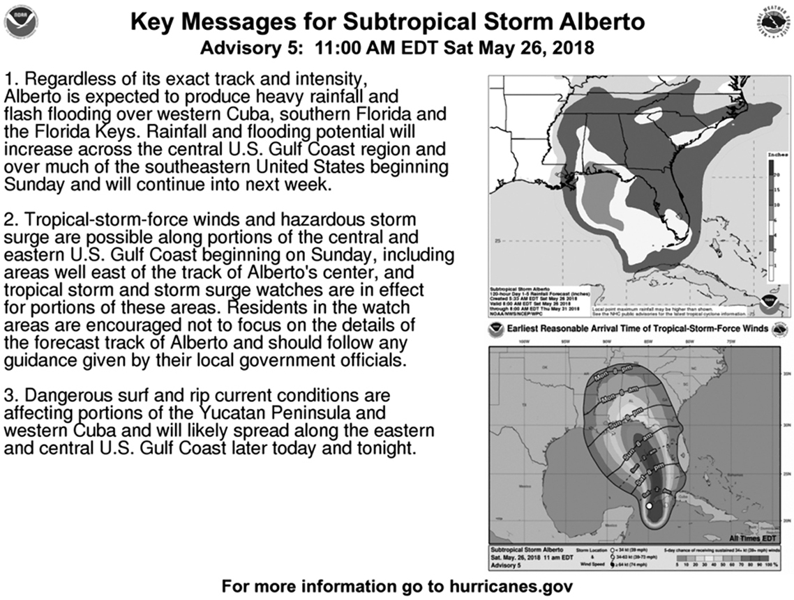
The page contains a map of probable rainfall (top) measured in inches, and another one of “earliest reasonable arrival time of tropical-storm-force winds” (bottom) that also displays the probability of experiencing them at all—the darker the color, the higher the probability.
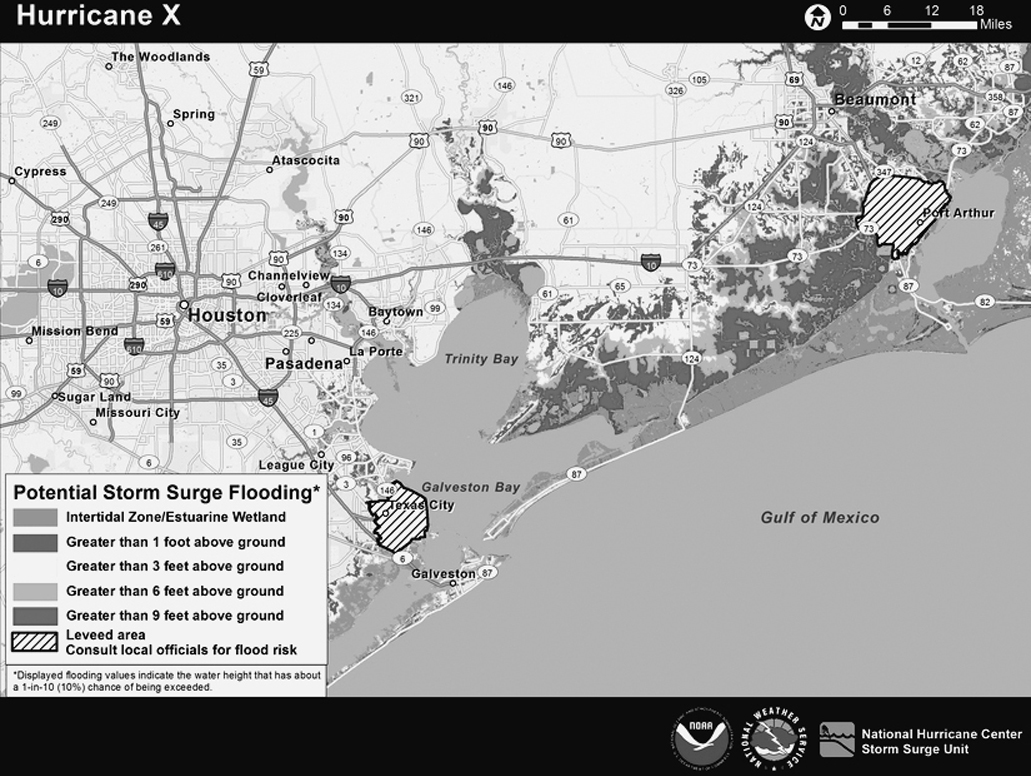
Depending on the characteristics of each storm, the NHC includes different maps on the Key Messages page. For instance, if the storm is approaching the coast, the NHC may include maps showing the probability of experiencing storm surge and flooding. On the following page is a fictional map that the NHC provides as an example (and that is better seen in full color).7
These visuals aren’t perfect. As you may notice, they don’t reproduce well in black and white, and the color palettes and labeling they employ are sometimes a bit obscure. However, when seen side by side, they are much better than the cone of uncertainty as tools to help us decide what to do when facing a storm.
These additional forecast charts are rarely showcased in the news, particularly on TV. I’m not sure of the reasons why, but my conjecture is that journalists favor the cone because it looks so simple, clear-cut, and easy to understand—albeit deceptively so.
The cone-of-uncertainty map lies to so many people not because it misrepresents uncertainty, but because it depicts data in a way that was not designed to be read by the general public. The map’s intended audience is specialists—trained emergency managers and decision makers—even though any regular citizen can visit the NHC’s website and see it, and news media uses it constantly. The cone is, I think, an illustration of a key principle: the success of any chart doesn’t depend just on who designs it, but also on who reads it, on the audience’s graphicacy, or graphical literacy. If we see a chart and we can’t interpret the patterns revealed in it, that chart will mislead us. Let’s now turn our attention to this challenge.