
Chapter 1 discussed how nature scenes never get abruptly cropped, but rather gradually fade into blurry forms in the peripheral vision of the human eye. Due to the limited space in a rectangular canvas format, we need to budget the space of pictorial areas, so whatever fits in the constricted area must be well planned.
When approaching a subject, the best thing is to first decide what the painting’s main setting will be. Just like with movies, they are categorized into action, drama, suspense, etc., and the movie director emphasizes one of those to be the general theme.
Landscapes can be sorted into the following categories:
To simplify even more, you must determine whether the sky, the vertical plane or the horizontal plane takes up the most space. They should not be similar in size to each other. A well planned composition will show one of these areas (here on referred to as a mass) to be the predominant one in size, and the masses will be designed into abstract masses. When possible that mass should take up roughly two-thirds of the space in your painting. A common mistaken procedure is to try to show several masses competing in sizes in one painting, which will result in those areas competing for attention. For example, if your theme is a skyscape, then everything else should shrink in size. The mountain peak should not be higher than one-third of the way up from the bottom.
If you decide to make your main theme about a rocky mountain, then the peak of that mountain should be close to the top of the painting in order to stretch its mass as far as possible to gain square inches and reduce the sky. The surrounding trees should get a “haircut” and diminish in size. The horizon line of the lake should be just a few inches up from the bottom.
When you decide which mass will be predominant in size, there should be sufficient interest to make it attractive for the viewer. For example, if you have a clear blue sky and decide to make the painting about the sky showing it to be the largest mass, you will end up with lots of dead square inches because you won’t have enough variances. On the other hand, a sunset or a cloudy sky with weather effects may merit dedicating a large percentage to that mass and make everything subordinate to that. The same will apply to a lake mass. If there are no reflections or boats to fill the void, a lake mass can be quite boring if most square inches are just showing flat water. If a lake does have reflections and boats, however, then it may merit being the main mass of your composition and dominate in size.
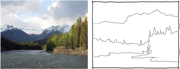
This is a good reference photo to work from for creating a thumbnail sketch (about the size of a playing card) to plan the sizes of the masses and make them abstract. If the masses were painted as they are in the photo, the mountain would be minimized.

Thumbnail sketches will help you catch weak lines and shapes. They do not have to be detailed. They are great for working out the bugs in your composition so you don’t hit obstacles during the painting process and can anticipate them early in your painting strategy. It is not necessary to indicate the smaller shapes within the masses. The purpose is to visualize the masses as abstract puzzle pieces and check the predominance or subordination of the surrounding masses.
In the reference photo, all the masses are competing for attention. The lake is void of visual richness because too many square inches are equal and take up most of the space. This will work better as a mountain scene. The evergreen trees can be reduced in height. The sky does not need to take up so much space either.

Your eye is now wandering around the mountain and it appears to be large and majestic due to its predominant mass. The lake, trees and sky are just supporting actors.
It is very easy to fall into the trap of taking a photo at face value. However, if you apply the concepts of mass planning, you will be able to crop out the other competing masses.

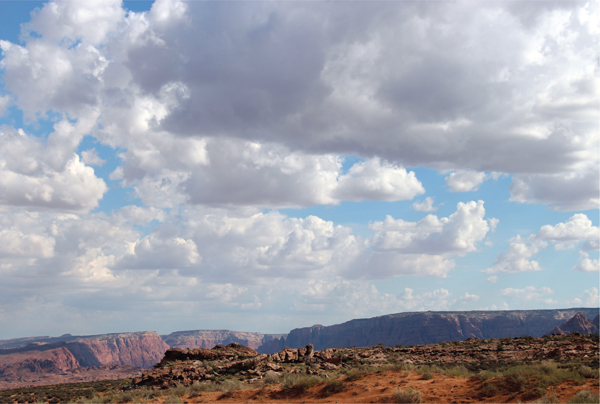
An example of a poor cropping and mass design is the photo on the left. The terrain and sky are both demanding the same attention. One of the two masses should be obviously smaller. This photo on the right will make an interesting skyscape. There are interesting lines and forms because of the rain clouds. You may even want to add rain pouring down. The sky mass takes up about 70% of the space which definitely establishes predominance.

Avoid the temptation to say everything in one image. It may be better to do two or three paintings of the same reference, each emphasizing a different mass.

You can use a graphics program to edit your photo to get a better idea how it will look. In this example, the mountain was trimmed and the sky was reduced as much as possible without suffocating the painting. After the cropping, do a thumbnail sketch to correct things. The most important mass would be the river in this case.

Here is an alternate take on the same photo. The mountain becomes the main mass and this time the river is subordinate in size. A painting based on either of the last two photos would work.
To favor the composition, you will often need to stretch or reduce the size of masses. This is a good reference photo but even if we crop out some of the water, the mountain will still seem tiny because of the sky mass and the size of the evergreens. This gets solved in the thumbnail sketch.

Bow River
Oil on canvas, 24" × 30" (61cm × 76cm)