
Which do you prefer? Most people prefer warm hues like yellow-orange to cooler palettes of greens or blues.

This winter scene predominantly has orange and yellow-orange. As such, it is classified as a warm painting, which is pleasing to the majority of people. As a word of caution: Paintings can be too warm or too cool. The cool gray-blue water and shadows on the snow help soothe the hot oranges. Pictorial temperature balance includes the correct ratio of warm vs. cool temperature. Only one should predominate.

I did this plein air painting at the Teton National Park. The mountains were much bluer, but I had to distort reality and turned them more towards a blue-violet. The sky is a turquoise blue. Adding green, because it has yellow, warms the blue. Even the left cloud has some Ochre in it to avoid a cool gray.
Judging a precise color can be difficult when it is in context with surrounding colors. If you close your hand and leave just a small tunnel to peek thru, the local color will be more faithful.
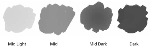
When dealing with mixing color, it is easiest to reduce the ten main values on the gray scale down to only four grays. (In this specified scale, we leave out most white and black since they are easy to determine.) An almost white would only be used for clouds, water foam, buildings and sunlit snow. The key is to distinguish each value between those four grays only when mixing and applying color by thinking how they would appear if you took a black-and-white photo.

When it comes to the major shapes, simplify by thinking in light, mid-light, mid-dark and dark when mixing paint for daylight scenes. Make a clear separation between them. After all the mixing, the final painting will inadvertently end up with the ten values anyway. On a side note, I tend to stay away from the dark value if I can help it and work with only three main gray values and will resort to the darker gray if only needed to separate planes. The idea is to work with predominately mid values for daylight scenes. In most cases, skies tend to be a mid-light value, horizontal planes will be a mid value and vertical planes will be mid-dark values. The general values are:
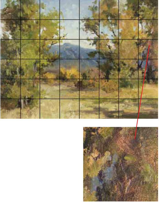
To avoid replicating the monochromatic colors of nature, a great technique to keep in mind while painting is to imagine your painting is subdivided, like a chessboard, into eight squares in width and eight squares in height. In each square there should be a subtle color shift, and when possible a value shift.
The application of this concept will help you make skies become more exciting. While you are painting, if there is one square with a blue color only, you will feel compelled to add some hints of clouds. You will detect the moment your summer trees are becoming boring and will feel the need to add a variance of color. You will notice when your grass is too monotonous and add more green or yellow as needed. It will pressure you to echo the surrounding color in your snow shadows.
After a while, this will become second nature. Because of this chessboard visualization tactic, you will sense something is missing when you leave out the color variegation. When the viewers scan your painting, they will appreciate the interesting shifts. Be careful not to over variegate or your painting will become busy.