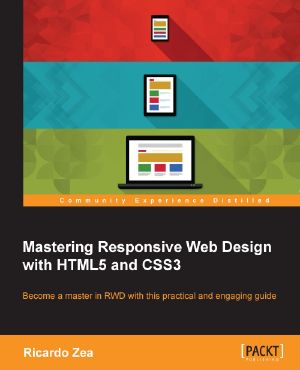
Mastering Responsive Web Design With HTML5 and CSS3

- Authors
- Zea, Ricardo
- Publisher
- Packt Publishing
- ISBN
- 9781783550234
- Date
- 2015-08-24T00:00:00+00:00
- Size
- 5.94 MB
- Lang
- en
About This BookBuild responsive designs with solid yet simple HTML5 and CSS3 best practicesUse CSS preprocessors (Sass) to speed up the creation of CSSEach chapter covers a different feature of RWD with carefully chosen, interesting examples, including the latest developments in responsive designWho This Book Is ForIf you already know some HTML and CSS and understand the principles of responsive web design, this book is for you. There's something here for you to learn regardless of whether you're a web designer or web developer, or whether you're a seasoned expert web professional.What You Will LearnInstall and use Sass with the SCSS syntax to create your CSSUse HTML5 tags the right way for the right type of contentEnhance the experience of users with assistive technology with ARIA rolesDesign with a desktop-first approach but implement with mobile-first methodologyFor your layouts, either create and use your own scalable CSS grid or use FlexboxCreate three types of navigation for small screen devicesFind the best way to serve the best type of image and how to make videos responsiveBuild custom responsive e-mails to ensure the message gets across regardless of the deviceIn Detail
The book is designed in a way that each chapter will take you one step closer to becoming an expert in RWD. It begins with introducing you to the power of CSS preprocessors, Sass in this case, to increase the speed of writing repetitive CSS tasks, then use simple but meaningful HTML examples and add ARIA roles to increase accessibility. You will also understand why a mobile-first approach is ideal.
Next, you will learn how to use an easily scalable CSS grid, or if you prefer, use Flexbox instead. Create navigations for small screen devices using the "drawer navigation," "Off-Canvas" or "Toggle" navigation patterns, and also implement images and media in both responsive and responsible ways.
Finally, you will build a solid and meaningful typographic scale and make sure your messages and communications display correctly with responsive e-mails.