Tables and graphs portray relationships between changeable quantities known as variables. Tables and graphs show how the values of variables compare with, and in some cases affect, one another. When a table or graph is well composed, it can reveal phenomena that would otherwise be impossible to see.
Consider the following statements. Each of them represents a situation that could occur in everyday life.
• The outdoor air temperature varies with the time of day.
• The time the sun is above the horizon on June 21 varies with the latitude of the observer.
• The time required for a wet rag to dry depends on the air temperature.
All of these expressions involve something that depends on something else. In the first case, a statement is made concerning temperature versus time; in the second case, a statement is made concerning sun-up time versus latitude; in the third case, a statement is made concerning time versus temperature. Here, the term versus means “depending on.”
An independent variable can change in value, but its value is not influenced by anything else in a given scenario. Time is often treated as an independent variable. A lot of things depend on time.
When two or more variables are interrelated, at least one of the variables is independent, but they are not all independent. A common and simple situation is one in which there are two variables, one of which is independent. In the three situations described above, the independent variables are time, latitude, and air temperature.
A dependent variable can change in value, but its value is affected by at least one other factor in a situation. In the scenarios described above, the air temperature, the sun-up time, and time are dependent variables.
When two or more variables are interrelated, at least one of them is dependent, but they cannot all be dependent. Something that’s an independent variable in one instance can be a dependent variable in another case. For example, the air temperature is a dependent variable in the first situation described above, but it is an independent variable in the third situation.
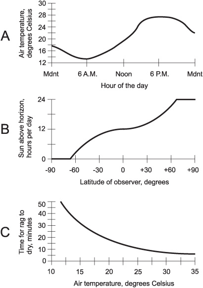
The three scenarios described above lend themselves to illustration. In order, they are shown crudely in Fig. 2-1.
Figure 2-1A shows an example of outdoor air temperature versus time of day. Drawing B shows the sun-up time (the number of hours per day in which the sun is above the horizon) versus latitude on June 21, where points south of the equator have negative latitude and points north of the equator have positive latitude. Drawing C shows the time it takes for a rag to dry, plotted against the air temperature.
Fig. 2-1. Three “this-versus-that” scenarios. At A, air temperature versus time of day; at B, sun-up time versus latitude; at C, time for rag to dry versus air temperature.
The scenarios represented by Figs. 2-1A and C are fiction, having been contrived for this discussion. But Fig. 2-1B represents a physical reality; it is true astronomical data for June 21 of every year on earth.
All three of the graphs in Fig. 2-1 represent relations. In mathematics, a relation is an expression of the way two or more variables compare or interact. (It could just as well be called a relationship, a comparison, or an interaction.) Figure 2-1B, for example, is a graph of the relation between the latitude and the sun-up time on June 21.
When dealing with relations, the statements are equally valid if the variables are stated the other way around. Thus, Fig. 2-1B shows a relation between the sun-up time on June 21 and the latitude. In a relation, “this versus that” means the same thing as “that versus this.” Relations can always be expressed in graphical form.
A function is a special type of mathematical relation. A relation describes how variables compare with each other. In a sense, it is “passive.” A function transforms, processes, or morphs the quantity represented by the independent variable into the quantity represented by the dependent variable. A function is “active.”
All three of the graphs in Fig. 2-1 represent functions. The changes in the value of the independent variable can, in some sense, be thought of as causative factors in the variations of the value of the dependent variable. We might re-state the scenarios this way to emphasize that they are functions:
• The outdoor air temperature is a function of the time of day.
• The sun-up time on June 21 is a function of the latitude of the observer.
• The time required for a wet rag to dry is a function of the air temperature.
A relation can be a function only when every element in the set of its independent variables has at most one correspondent in the set of dependent variables. If a given value of the dependent variable in a relation has more than one independent-variable value corresponding to it, then that relation might nevertheless be a function. But if any given value of the independent variable corresponds to more than one dependent-variable value, that relation is not a function.
In graphs of functions, independent variables are usually represented by horizontal axes, and dependent variables are usually represented by vertical axes. Imagine a movable, vertical line in a graph, and suppose that you can move it back and forth. A curve represents a function if and only if it never intersects the movable vertical line at more than one point.
Imagine that the independent and dependent variables of the functions shown in Fig. 2-1 are reversed. This results in some weird assertions:
• The time of day is a function of the outdoor air temperature.
• The latitude of an observer is a function of the sun-up time on June 21.
• The air temperature is a function of the time it takes for a wet rag to dry.
The first two of these statements are clearly ridiculous. Time does not depend on temperature. You can’t make time go backwards by cooling things off or make it rush into the future by heating things up. Your geographic location is not dependent on how long the sun is up. If that were true, you would be at a different latitude a week from now than you are today, even if you don’t go anywhere (unless you live on the equator!).
If you turn the graphs of Figs. 2-1A and B sideways to reflect the transposition of the variables and then perform the vertical-line test, you’ll see that they no longer depict functions. So the first two of the above assertions are not only absurd; they are false.
Figure 2-1C represents a function, at least in theory, when “stood on its ear.” The statement is still strange, but it can at least be true under certain conditions. The drying time of a standard-size wet rag made of a standard material could be used to infer air temperature experimentally (although humidity and wind speed would be factors too). When you want to determine whether or not a certain graph represents a mathematical function, use the vertical-line test, not the common-sense test!
Figure 2-2 represents fluctuations in the prices of two hypothetical stocks, called Stock X and Stock Y, over a portion of a business day. Do either or both of these curves represent stock price as functions of time?
Both of the curves represent stock price as functions of time. You can determine this using the vertical-line test. Neither of the curves intersects a movable, vertical line more than once. Thus, both curves represent functions of the independent variable (time).
Suppose, in the situation shown by Fig. 2-2, the stock price is considered the independent variable, and time is considered the dependent variable. Do either or both of the curves represent time as functions of stock price?
To determine this, plot the graphs by “standing the curves on their ears,” as shown in Fig. 2-3. (The curves are rotated 90 degrees counterclockwise, and then mirrored horizontally.) Using the vertical-line test, it is apparent that time can be considered a function of the price of Stock X, but not a function of the price of Stock Y.
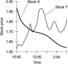
Fig. 2-2. Illustration for Problems 2-1 and 2-2.
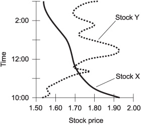
Fig. 2-3. Another illustration for Problem 2-2.
When the variables in a function can attain only a few values (called discrete values), graphs can be rendered in simplified forms. Here are some of the most common types.
Fig. 2-4. Vertical bar graph of hypothetical stock price versus time.
In a vertical bar graph, the independent variable is shown on the horizontal axis and the dependent variable is shown on the vertical axis. Function values are portrayed as the heights of bars having equal widths. Figure 2-4 is a vertical bar graph of the price of the hypothetical Stock Y at intervals of 1 hour.
In a horizontal bar graph, the independent variable is shown on the vertical axis and the dependent variable is shown on the horizontal axis. Function values are portrayed as the widths of bars having equal heights. Figure 2-5 is a horizontal bar graph of the price of the hypothetical Stock Y at intervals of 1 hour. This type of graph is used much less often than the vertical bar graph. This is because it is customary to place the independent variable on the horizontal axis and the dependent variable on the vertical axis in any graph, when possible.
A histogram is a bar graph applied to a special situation called a distribution. An example is a portrayal of the grades a class receives on a test, such as is shown in Fig. 2-6. Here, each vertical bar represents a letter grade (A, B, C, D, or F). The height of the bar represents the percentage of students in the class receiving that grade.
Fig. 2-5. Horizontal bar graph of hypothetical stock price versus time.
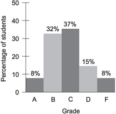
Fig. 2-6. A histogram is a bar graph that shows a statistical distribution.
In Fig. 2-6, the values of the dependent variable are written at the top of each bar. In this case, the percentages add up to 100%, based on the assumption that all of the people in the class are present, take the test, and turn in their papers. The values of the dependent variable are annotated this way in some bar graphs. It’s a good idea to write in these numbers if there aren’t too many bars in the graph, but it can make the graph look messy or confusing if there are a lot of bars.
In some bar graphs showing percentages, the values do not add up to 100%. We’ll see an example of this shortly.
A nomograph is a one-dimensional graph that consists of two graduated scales lined up directly with each other. Such graphs are useful when the magnitude of a specific quantity must be compared according to two different unit scales. In Fig. 2-7, a nomograph compares temperature readings in degrees Celsius (also called centigrade) and degrees Fahrenheit.
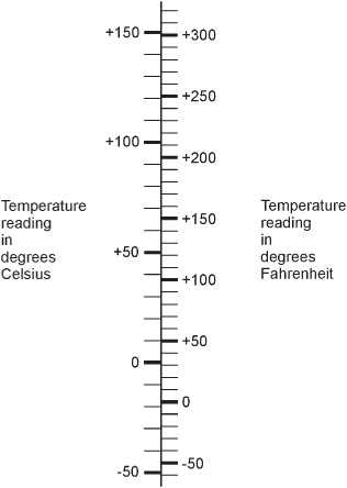
Fig. 2-7. An example of a nomograph for converting temperature readings.
In a point-to-point graph, the scales are similar to those used in continuous-curve graphs such as Figs. 2-2 and 2-3. But the values of the function in a point-to-point graph are shown only for a few selected points, which are connected by straight lines.
In the point-to-point graph of Fig. 2-8, the price of Stock Y (from Fig. 2-2) is plotted on the half-hour from 10:00 A.M. to 3:00 P.M. The resulting “curve” does not exactly show the stock prices at the in-between times. But overall, the graph is a fair representation of the fluctuation of the stock over time.
When plotting a point-to-point graph, a certain minimum number of points must be plotted, and they must all be sufficiently close together. If a point-to-point graph showed the price of Stock Y at hourly intervals, it would not come as close as Fig. 2-8 to representing the actual moment-to-moment stock-price function. If a point-to-point graph showed the price at 15-minute intervals, it would come closer than Fig. 2-8 to the moment-to-moment stock-price function.
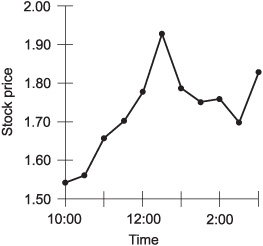
Fig. 2-8. A point-to-point graph of hypothetical stock price versus time.
When composing a graph, it’s important to choose sensible scales for the dependent and independent variables. If either scale spans a range of values much greater than necessary, the resolution (detail) of the graph will be poor. If either scale does not have a large enough span, there won’t be enough room to show the entire function; some of the values will be “cut off.”
Figure 2-9 is a hypothetical bar graph showing the percentage of the work force in a certain city that calls in sick on each day during a particular work week. What, if anything, is wrong with this graph?
The dependent-variable scale is too large. It would be better if the horizontal scale showed values only in the range of 0 to 10%. The graph could also be improved by listing percentage numbers at the right-hand side of each bar. Another way to improve the graph would be to put the independent variable on the horizontal axis and the dependent variable on the vertical axis, making the graph a vertical bar graph instead of a horizontal bar graph.
Fig. 2-9. Illustration for Problems 2-3 and 2-4.
What’s going on with the percentage values depicted in Fig. 2-9? It is apparent that the values don’t add up to 100%. Shouldn’t they?
No. If they did, it would be a coincidence (and a bad reflection on the attitude of the work force in that city during that week). This is a situation in which the sum of the percentages in a bar graph does not have to be 100%. If everybody showed up for work every day for the whole week, the sum of the percentages would be 0, and Fig. 2-9 would be perfectly legitimate showing no bars at all.
Graphs can be approximated or modified by “tweaking.” Certain characteristics can also be noted, such as trends and correlation. Here are a few examples.
The term interpolate means “to put between.” When a graph is incomplete, estimated data can be put in the gap(s) in order to make the graph look complete. An example is shown in Fig. 2-10. This is a graph of the price of the hypothetical Stock Y from Fig. 2-2, but there’s a gap during the noon hour. We don’t know exactly what happened to the stock price during that hour, but we can fill in the graph using linear interpolation. A straight line is placed between the end points of the gap, and then the graph looks complete.
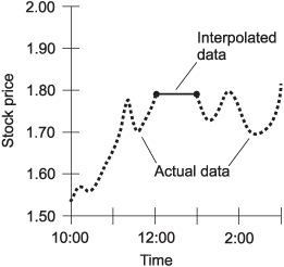
Fig. 2-10. An example of linear interpolation. The thin solid line represents the interpolation of the values for the gap in the actual available data (heavy dashed curve).
Linear interpolation almost always produces a somewhat inaccurate result. But sometimes it is better to have an approximation than to have no data at all. Compare Fig. 2-10 with Fig. 2-2, and you can see that the linear interpolation error is considerable in this case.
Curve fitting is an intuitive scheme for approximating a point-to-point graph, or filling in a graph containing one or more gaps, to make it look like a continuous curve. Figure 2-11 is an approximate graph of the price of hypothetical Stock Y, based on points determined at intervals of half an hour, as generated by curve fitting. This does not precisely represent the actual curve of Fig. 2-2, but it comes close most of the time.
Curve fitting becomes increasingly accurate as the values are determined at more and more frequent intervals. When the values are determined infrequently, this scheme can be subject to large errors, as is shown by the example of Fig. 2-12.
The term extrapolate means “to put outside of.” When a function has a continuous-curve graph where time is the independent variable, extrapolation is the same thing as short-term forecasting. Two examples are shown in Fig. 2-13.
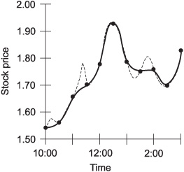
Fig. 2-11. Approximation of hypothetical stock price as a continuous function of time, making use of curve fitting. The solid curve represents the approximation; the dashed curve represents the actual price as a function of time.
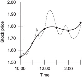
Fig. 2-12. An example of curve fitting in which not enough data samples are taken, causing significant errors. The solid line represents the approximation; the dashed curve represents the actual price as a function of time.
In Fig. 2-13A, the price of the hypothetical Stock X from Fig. 2-2 is plotted until 2:00 P.M., and then an attempt is made to forecast its price for an hour into the future, based on its past performance. In this case, linear extrapolation, the simplest form, is used. The curve is simply projected ahead as a straight line. Compare this graph with Fig. 2-2. In this case, linear extrapolation works fairly well.
Figure 2-13B shows the price of the hypothetical Stock Y (from Fig. 2-2) plotted until 2:00 P.M., and then linear extrapolation is used in an attempt to predict its behavior for the next hour. As you can see by comparing this graph with Fig. 2-2, linear extrapolation does not work well in this scenario.
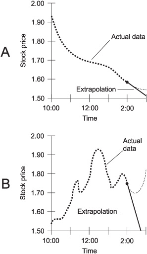
Fig. 2-13. Examples of linear extrapolation. The solid lines represent the forecasts; the dashed curves represent the actual data. In the case shown at A, the prediction is fairly good. In the case shown at B, the linear extrapolation is way off.
Extrapolation is best done by computers. Machines can notice subtle characteristics of functions that humans miss. Some graphs are easy to extrapolate, and others are not. In general, as a curve becomes more complicated, extrapolation becomes subject to more error. Also, as the extent (or distance) of the extrapolation increases for a given curve, the accuracy decreases.
A function is said to be nonincreasing if the value of the dependent variable never grows any larger (or more positive) as the value of the independent variable increases. If the dependent variable in a function never gets any smaller (or more negative) as the value of the independent variable increases, the function is said to be nondecreasing.
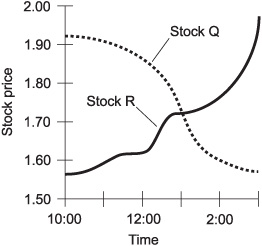
Fig. 2-14. The price of Stock Q is nonincreasing versus time, and the price of Stock R is nondecreasing versus time.
The dashed curve in Fig. 2-14 shows the behavior of a hypothetical Stock Q, whose price never rises throughout the period under consideration. This function is nonincreasing. The solid curve shows a hypothetical Stock R, whose price never falls throughout the period. This function is nondecreasing.
Sometimes the terms trending downward and trending upward are used to describe graphs. These terms are subjective; different people might interpret them differently. Everyone would agree that Stock Q in Fig. 2-14 trends downward while Stock R trends upward. But a stock that rises and falls several times during a period might be harder to define in this respect.
Graphs can show the extent of correlation between the values of two variables when the values are obtained from a finite number of experimental samples.
If, as the value of one variable generally increases, the value of the other generally increases too, the correlation is considered positive. If the opposite is true – the value of one variable increases as the other generally decreases – the correlation is considered negative. If the points are randomly scattered all over the graph, then the correlation is considered to be zero.
Fig. 2-15. Point plots showing zero correlation (A), weak positive correlation (B), strong positive correlation (C), weak negative correlation (D), and strong negative correlation (E).
Figure 2-15 shows five examples of point sets. At A the correlation is zero. At B and C, the correlation is positive. At D and E, the correlation is negative.
Suppose, as the value of the independent variable in a function changes, the value of the dependent variable does not change. This is called a constant function. Is its graph nonincreasing or nondecreasing?
According to our definitions, the graph of a constant function is both non-increasing and nondecreasing. Its value never increases, and it never decreases.
Is there any type of function for which linear interpolation is perfectly accurate, that is, “fills in the gap” with zero error?
Fig. 2-16. Illustration for Problem 2-6.
Yes. If the graph of a function is known to be a straight line, then linear interpolation can be used to “fill in a gap” and the result will be free of error. An example is the speed of a car that accelerates at a known, constant rate. If its speed-versus-time graph appears as a perfectly straight line with a small gap, then linear interpolation can be used to determine the car’s speed at points inside the gap, as shown in Fig. 2-16. In this graph, the heavy dashed line represents actual measured data, and the thinner solid line represents interpolated data.
Refer to the text in this chapter if necessary. A good score is eight correct. Answers are in the back of the book.
1. Suppose a graph is drawn showing temperature in degrees Celsius (°C) as a function of time for a 24-hour day. The temperature measurements are accurate to within 0.1 °C, and the readings are taken every 15 minutes. The day’s highest temperature is +23.8 °C at 3:45 P.M. The day’s lowest temperature is +13.5 °C at 5:30 A.M. A reasonable range for the temperature scale in this graph is
(a) 0.0 °C to +100.0 °C
(b) –100.0°C to +100.0 °C
(c) +15.0 °C to +20.0 °C
(d) +10.0 °C to +30.0 °C
Fig. 2-17. Illustration for Quiz Questions 3 through 6.
2. In a constant function:
(a) the value of the dependent variable constantly increases as the value of the independent variable increases
(b) the value of the dependent variable constantly decreases as the value of the independent variable increases
(c) the value of the independent variable does not change
(d) the value of the dependent variable does not change
3. In Fig. 2-17, which of the curves represents y as a function of x?
(a) Curve A only.
(b) Curve B only.
(c) Both curves A and B.
(d) Neither curve A nor curve B.
4. In Fig. 2-17, which of the curves represents x as a function of y?
(a) Curve A only.
(b) Curve B only.
(c) Both curves A and B.
(d) Neither curve A nor curve B.
5. In Fig. 2-17, which of the curves represents a relation between x and y?
(a) Curve A only.
(b) Curve B only.
(c) Both curves A and B.
(d) Neither curve A nor curve B.
6. In Fig. 2-17, which of the curves can represent a constant function of one variable versus the other?
(a) Curve A only.
(b) Curve B only.
(c) Both curves A and B.
(d) Neither curve A nor curve B.
7. It is reasonable to suppose that the number of traffic accidents per year on a given section of highway is positively correlated with
(a) the number of cars that use the highway
(b) the number of sunny days in the year
(c) the number of alternative routes available
(d) the number of police officers that use the highway
8. Suppose a large data file is downloaded from the Internet. The speed of the data, in bits per second (bps), is plotted as a function of time in seconds. In this situation, time is
(a) a dependent variable
(b) an independent variable
(c) a constant function
(d) nondecreasing
9. Suppose the path of a hurricane is plotted as a curve on a map, with the latitude and longitude lines as graphic coordinates. A prediction of the future path of the storm can be attempted using
(a) interpolation
(b) extrapolation
(c) curve fitting
(d) correlation
10. Suppose the path of a hurricane is plotted as a series of points on a map, representing the position of the storm at 6-hour intervals. A continuous graph of the storm’s path can be best approximated using
(a) a bar graph
(b) extrapolation
(c) curve fitting
(d) correlation