The following analysis is based upon EEMUA 201:2002. This guide from the Engineering Equipment & Materials Users Association (EEMUA) provides a checklist for designing and evaluating Supervisory Control and Data Acquisition (SCADA) systems. The guide is primarily aimed at more constrained civilian process control systems such as gas and electricity distribution; however, the activities of Battle Group (BG) and Brigade (Bde) also fit into this definition. The role of the Headquarters (HQ) is to supervise and control subordinate units. This task is assisted through data acquisition and dissemination.
The data was collected in a team of three; two Human Factors professionals (authors of this book) and a Subject Matter Expert (SME). The SME was an experienced trainer of the digital Mission Planning and Battlespace Management (MP/BM) system with an expert understanding of the tool along with its functionality and capabilities. The data collection exercise lasted approximately 90 minutes. The requirements were approached in the order presented, the SME controlled the terminal and the screen of the terminal was duplicated on a projected screen. Where possible evidence was produced relevant to the EEMUA requirements, the evidence was recorded by the Human Factors professionals textually and accompanied by screenshots of the process. The SME agreed to each of the statements made on compatibility with the EEMUA guidelines.
The number of screens must allow for complete access to all necessary information under all operational circumstances
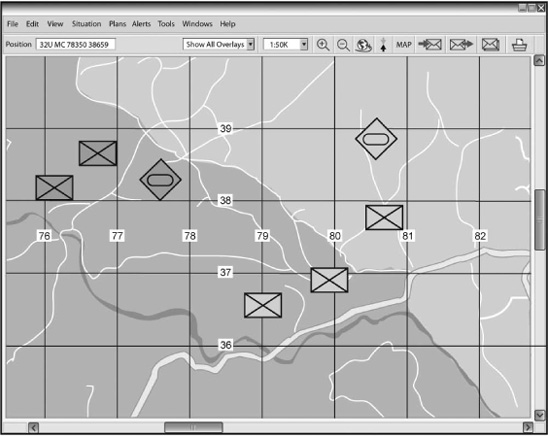
Figure 8.1 shows the main window of the system which displays the Local Operatinal Picture (LOP). The screenshot presented in Figure 8.2 illustrates that when an Operational Plan window is opened, the LOP is obscured. The current system, with its single display does not support the requirement of monitoring the LOP whilst conducting staff work. Specific staff work activities are actor dependent; they include activities such as: product creation; message sending and receipt; and data handling.
To compensate for the single display some users (for example, the Ops Officer at the BG main HQ) have two screens available to them; however, this is through the use of two terminals. Although the terminals are networked and thus allow some level of data transfer they are essentially separate systems. The user must use two separate terminals and thus two separate input devices; the mice and keyboards of two terminals.
Figure 8.1 shows the overview display format, but as highlighted in the previous requirement this screen is frequently obstructed when the user needs to carry out any staff work. Wherever possible, two terminals should be used in order to allow for a permanently viewable overview display format. Figure 8.3 illustrates the two screen system, with one screen displaying the LOP and the other displaying a planning system.

Figure 8.1 Diagram showing the main system screen (Local Operational Picture; LOP)

Figure 8.2 Diagram showing the obscuration of LOP window by the Operational Plan window
Figure 8.3 Diagram showing the LOP window and a planning window
There is no dedicated alarm screen; pertinent messages can be transmitted as ‘flash’ messages. These always appear in the centre of the screen flashing.
The capability to expand the number of screens is available in the form of adding more terminals. Figure 8.3 shows the two windows needed by users. There are a number of usability concerns with this system as a result of the duplication of input devises. Users are likely to confuse the input devices frequently. Users may also suffer from physical discomfort through the positioning of these devices. The user will have to make frequent posture alterations to successfully use both terminals.
It is also postulated that a system made up of two terminals is financially less cost effective than a terminal with two screens.
It is possible to have separate screens for these four states; however it would involve the use of several separate terminals networked together. The system itself does not allow for multiple screens.
With respect to the resizing of windows, this system has functionality similar to ‘Microsoft Windows’. It is possible to resize windows using the minimise and maximise buttons; however, this functionality may invoke a problem for terminals where the user has only a stylus as these resize buttons are located directly next to the close window button. Thus it would be very easy for the user to accidentally close the window instead of resizing it.
Windows can also be resized by moving the cursor to any corner of the window, left clicking and then dragging the window to a new size, either smaller or larger. An example of window resizing is shown in Figure 8.4.

Figure 8.4 Diagram showing the ability to resize windows
The system refresh rate is too slow to allow for easy navigation up and down the hierarchy of screens. The system refresh rate should be fast enough to enable ease of navigation.
This system does not allow users to explicitly access an overview picture; there is no ‘see all’ button. The screen size also means that the user cannot see the entire area within their boundary effectively.
The refresh rate of the system is too slow to allow for ease of navigation across displays. The time taken in both panning and zooming significantly affects task flow and potentially leads to users becoming disorientated. The system refresh rate should be fast enough to allow the user to navigate easily between displays allowing them to frequently zoom in and out in order to gain environmental perspective.
The system does allow users to switch between single and multiple window views. The system has a ‘Microsoft Windows’-like environment which allows windows to be overlaid on top of one another. The system does initially minimise the old screen but this screen can easily be maximised and resized to allow the view of more than one screen. Figure 8.5 shows the system displaying multiple window views.
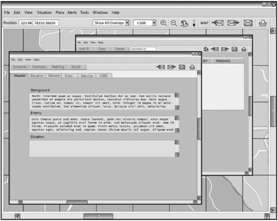
Figure 8.5 Diagram showing overlapping resizable windows and multiple windows displayed on a single screen
The system does not have a default maximum number of windows per screen; there is no limit to the number of windows which can be open simultaneously. It is down to individual users to manage their displays. Users should be encouraged to limit the number of windows open at any one time as this has a significant effect on the terminal processing performance.
There is no automatic default configuration for the terminal. The user does have the ability to develop ‘favourite pallets’, however these have to be reloaded upon each login. The system should allow the user to configure the windows under their personal log on, so that every time that they log on to the system, their preferred windows layout automatically appears.
As Figure 8.2 demonstrates the system does not ensure that the important windows are always on display. The window displaying the user’s LOP is the most important window and it is not viewable in Figure 8.2. The user can easily minimise important windows, or place different windows on top of them thus obscuring the important window from view.
The system does allow the user to create a favourites palette. Within this palette the user can place any icon or symbol that they draw, for example, a boundary, a mine field or an enemy tank. Figure 8.6 shows the process of opening this folder, the user selects situation from the toolbar and then selects create/modify and favourites. Figure 8.6 shows the favourites folder when opened as it appears down the left-hand side of the screen.
In order to add an icon to the favourite’s palette the user creates the icon on an overlay, the icon is then selected using a left click on the symbol, the user then right clicks and selects the edit option. There is a large button labelled ‘add to favourites’, the user then clicks this button and the favourites palette down the left-hand side of the screen is populated with the icon. Figure 8.6 shows these items when they are present in the favourites palette.
Although the system does allow for a favourites folder to be configured the user does have to manually create the favourites folder every time they log on to digital MP/BM.
Although not observed in practice the system does provide a Watch Keeper log in the form of an electronic list called the operational record. Within this facility the user can set reminders, such as ‘shift handover in 5 minutes’, the user can add staff comments to symbols and add Free Text notations to the operational record. Figure 8.7 shows the route to the operational record. The user is then presented with the operational record as seen in Figure 8.7, which can be populated with details of the current situation.
This is not possible with the current system. There is little perceived benefit from the addition of this functionality.
Figure 8.6 Diagram showing how to navigate to the favourites palette
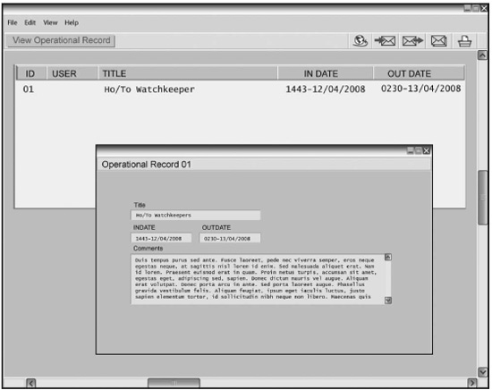
Figure 8.7 Operational record within the Watch Keeper log
This system does allow users to capture a snap shot of the state of a variable for discussion later as all of the terminals have a print screen button. The image captured from the print screen can then be saved on to the user’s terminal hard drive or printed out.
This is not possible in the system at present. The system does provide a help manual if the user presses the F1 button. This is only a help manual with respect to buttonology and does not include operating procedures. At present in order to view the operating procedures the user must acquire a CD ROM containing these operating procedures and use the CD drive of the terminal to read this disk. It would be advantageous to have a hyperlinked help section in both functionality and doctrine.
The system does not currently allow for the viewing of data in different formats. There is no perceived benefit from the addition of this functionality.
The software does support functionality to select the correct mapping symbol. Figure 8.8 shows an example of a number of icons on an overlay in close proximity. In this situation the user can left click on any of these icons and a list of the icons in the vicinity will be displayed (as demonstrated in the figure). The user can then select the desired icon from the list. The user also has the capacity to bring the pertinent symbol to the top of the stack (see Figure 8.8).
This aspect of the system can still be improved as there have been issues with users selecting the wrong item due to the difficulty in accuracy when using a stylus or a tracker-ball. An example of this was seen during our observation when a user intended to push the ‘publish and subscribe’ button but instead pushed the ‘CONTACT’ button as it was next to the ‘publish and subscribe’ button.
The system provides the ability to use a mouse, a tracker-ball, a stylus and a keyboard to interact with the interface. Different terminals are limited to which of these methods they can use. For example, a Vehicle User Data Terminal (VUDT) would have a tracker-ball and a stylus along with the keyboard. Whereas a Staff User Data Terminal (SUDT), would have a tracker-ball, a keyboard and a mouse. A few platforms have bespoke interfaces such as thumb joysticks on fixed handles. Due to usability issues the terminal has been retrofitted with an additional keyboard and mouse.
Figure 8.8 Diagram displaying a number of icons on top of one another
The refresh rate and processing rate of the system is too slow to enable quick, consistent and effective feedback to the user. Very occasionally and inconsistently the system may display an hour glass figure when an action is taking an extended period of time. If a user attempts to open a large product (1MB or greater; for example, an Op Order), a progress bar will appear on the screen. A progress report may also appear if the user sends a large message. The system’s feedback is inconsistent and thus unreliable.
The system does not allow for dedicated displays for emergency shut down operations as it is a single screen system.
The terminals’ batteries are kept charged by running the vehicle engines for between 15 and 30 minutes every hour. Although this ensures no loss of power, it creates a lot of noise. Static running of the engines at low load is also detrimental to the vehicles.
This was not perceived to be a problem with the digital MP/BM system.
The system does not allow quick access to schematics or detailed information as the terminal’s processing speed is too slow.
The system allows for the e-map to be turned off from the LOP as shown in Figure 8.9, which decreases the display density.
The system also allows the user to hide overlays from view as shown in Figure 8.10. This allows the user to choose which and how much information is on display at any point in time and allows the user to reduce the information content on the screen. For example, switching from a high-density screen showing all icons, to a low-density screen showing only friendly forces, or as Figure 8.10 shows, by hiding all overlays except a User Defined Overlay in which only a small number of icons are displayed. In this case a minefield, a Named Area of Interest (NAI), a boundary and the user’s own call sign.
Figures 8.9 and 8.10 illustrate the process involved in creating a User Defined Overlay. The user selects the situation button from the toolbar, and then selects the User Defined Overlay option. At this point a palette similar to the ‘favourite’s palette’ is created down the left-hand side of the screen. The palette is populated in the same manner as the ‘favourite’s palette’ shown previously.
A careful balance needs to be struck between reducing the need for navigation between and within pages. The selection and level of applicability of the information on the screen is far more important that the quantity.
The system allows for icons to be hidden from view in order to ensure that the display is not cluttered. Icons can be hidden from view in a number of ways in order to ensure that only the relevant information remains on the screen.
This requirement is not applicable to this system.
The system requires the user to flick between windows, as well as copy and paste between windows in order to perform most tasks.
Figure 8.9 Diagram showing the LOP with the e-map turned off

Figure 8.10 Diagram displaying the ability to hide all icons except the user’s own
The icons used within this system are taken from a set of icons called 2525B (DoD (2005) Department of Defense, Interface Standard for Common Warfighting Symbology, MIL-STD-2525B, available at http://www.mapsymbs.com/ms2525b_ch1_full.pdf). These are standard military icons with which all users should be familiar.
The colour used for the background of this system can be described using the hexadecimal code #D4D0C8; it has a Hue of 40°, Saturation of 6 per cent and Brightness of 83 per cent.
Standard military symbols and colours are used within this system. There is no gratuitous use of colour.
Within this system there is very little colour coding. Aspects of the colour coding that is present are inconsistent in places and this can be confusing for the user. As seen in Figure 8.11 a number of buttons within the system are colour coded purple. Purple colour coding appears to carry the message that if the user clicks this then something will happen straight away. The colour coding acts as a form of warning message; it prompts the user to consider their actions before clicking the button. The colour coding of buttons is used correctly for publish and subscribe, and send. However, the purple colour coding is also used inconsistently for the print button; the user is presented with a new window asking them to select a printer, this window can be cancelled. The print button should be grey and not purple as it does not lead directly to an action.
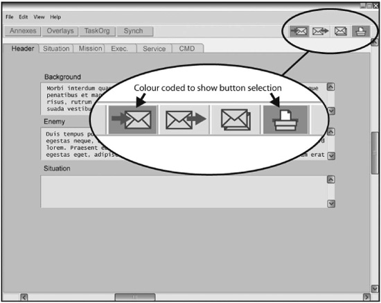
Figure 8.11 Diagram showing the purple colour coding of certain buttons
Within the system a further colour coding system is used to show when a button has been switched on. When a button has been switched on it will turn green to alert its state to the user (see the menu bar in Figure 8.11)
There are no animated graphics within the digital MP/BM system.
Of the 28 applicable requirements outlined by EEMUA 201:2002 the digital MP/BM system examined was: fully compatible with 8; partially compatible with 12; and incompatible with 8 (see Table 8.1 on the following pages). As these requirements do not carry equal weighting it is not appropriate to draw wider conclusions from this summary. Rather, the information should be used to inform future software and hardware upgrades.
Table 8.1 Summary of EEMUA survey

