
This chapter will examine the relationship among pie charts, tables, graphs, and Venn diagrams. It will review and help explain the similarities and differences. Each visual format is useful for showcasing data depending upon what kind of information is being evaluated. The various visual representation techniques will also help you select the most appropriate data display when giving a presentation. Review questions test your ability to interpret the information correctly. The answers to the questions are given at the end of the chapter.
A pie chart is in the shape of a circle. It is a visual design that represents a whole with each segment portrayed as a sector or slice. It is a graphical way to divide items into segments and to compare parts to a whole. Additionally, in a pie chart, the arc length of each sector is proportional to the quantity it represents. A full circle, for example, has 360 degrees. Each sector, therefore, would represent a certain proportion of the circle. The following pie chart questions will provide insight into pie chart design concepts.
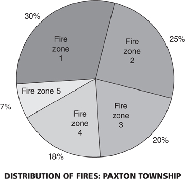
1. According to the pie chart above, what three fire zones combined had half the total number of fires in Paxton Township?
(A) Zone 1, Zone 4, and Zone 5
(B) Zone 2, Zone 4, and Zone 5
(C) Zone 3, Zone 4, and Zone 5
(D) None of the above
2. If the total number of fires in Paxton Township was 620, how many fires were in Zone 3?
(A) 108
(B) 116
(C) 124
(D) 130
3. What two fire zones combined represent a quarter of all fires inside Paxton Township?
(A) Zone 1 and Zone 3
(B) Zone 3 and Zone 4
(C) Zone 2 and Zone 5
(D) Zone 4 and Zone 5
4. Using the information in question 2, how many fires were in Zone 1?
(A) 186
(B) 180
(C) 177
(D) 168
5. If there were 330 fires in Zone 2, how many total fires would there be in Paxton Township?
(A) 1,280
(B) 1,300
(C) 1,320
(D) 1,375
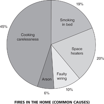
1. Based on the pie chart above, what percentages of fire in the home are deemed incendiary?
(A) 25
(B) 20
(C) 10
(D) 6
2. The majority of the fires listed are started due to
(A) fire code violations
(B) cooking carelessness
(C) malicious actions
(D) cold weather
3. Based upon the percentages for fire, a fire extinguisher is needed most in what room of the house?
(A) Kitchen
(B) Bedroom
(C) Den
(D) Living room
4. Which of the following pairs of common causes of fire in the home accounts for the greatest percentage of fires?
(A) Arson and faulty wiring
(B) Faulty wiring and space heaters
(C) Arson and smoking in bed
(D) Faulty wiring and smoking in bed
5. If the total number of fires in the home is 3,200, what would be the number of fires caused by faulty wiring?
(A) 100
(B) 250
(C) 300
(D) 320
6. Using the information in question 5, what would be the number of fires caused by space heaters?
(A) 730
(B) 715
(C) 640
(D) 610
Firefighters at a firehouse use many means of travel to get to work. View the pie chart above and Legend below to answer questions 1 through 6.
Legend
Car = 8
Bus = 12
Walk = 7
Taxi = 3
Cycle = 6
1. What is the total number of firefighters at the firehouse?
(A) 35
(B) 36
(C) 38
(D) 40
2. What is the least common mode of travel?
(A) Cycle
(B) Walk
(C) Taxi
(D) Bus
3. What fraction of firefighters cycle to work?
(A) 1/3
(B) 1/4
(C) 1/5
(D) 1/6
4. Approximately what percentage of firefighters take the bus to work?
(A) 33%
(B) 37%
(C) 40%
(D) 44%
5. How many firefighters don’t drive a car to work?
(A) 29
(B) 28
(C) 26
(D) 23
6. What percentage of firefighters either cycle or take a taxi to work?
(A) 30%
(B) 28%
(C) 25%
(D) 22%
A table is a means of arranging numbers or data in rows and columns. Tables are pervasive throughout the fire service to help firefighters better understand statistical information within reports. They are ordered visual displays of data that enhance analysis. The following questions using tables provide examples on how this is accomplished.
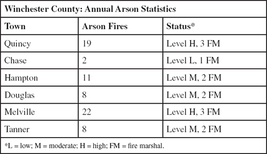
1. According to the table above, how many total arson fires were there in Winchester County?
(A) 60
(B) 70
(C) 80
(D) 85
2. What three towns combined had half the arson fires in Winchester County?
(A) Douglas, Melville, and Tanner
(B) Quincy, Chase, and Hampton
(C) Chase, Hampton, and Melville
(D) Hampton, Melville, and Tanner
3. How many fire marshals (FM) were assigned to Level M towns?
(A) 27
(B) 13
(C) 7
(D) 6
4. What is the total number of fire marshals assigned?
(A) 13
(B) 11
(C) 9
(D) 70
5. How many arson fires were there in Level H towns?
(A) 41
(B) 45
(C) 48
(D) 51
6. What percentage of fires in Winchester County occurred in Level H towns?
(A) 48%
(B) 58%
(C) 64%
(D) 66%
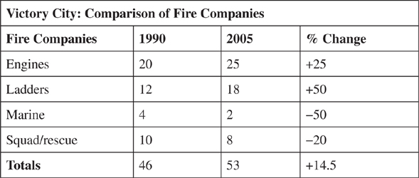
1. On the basis of the figures given in the table above, it can be accurately stated that between 1990 and 2005:
(A) The number of squad/rescue companies increased.
(B) Engine companies increased by a greater percentage than ladder companies.
(C) Marine companies suffered the highest percentage of cuts.
(D) More marine companies were eliminated than squad/rescue companies.
2. The total increase in fire companies from 1990 to 2005 is a result of
(A) the increase of engine companies
(B) the increase in ladder companies
(C) the decrease in marine companies
(D) increases and decreases in fire companies
3. In 2005, what type of fire company represented approximately 33 percent of the total number of companies?
(A) Engines
(B) Ladders
(C) Marine
(D) Squad/rescue
4. In 1990, engines were five times as numerous as
(A) marine companies
(B) ladder companies
(C) squad/rescue companies
(D) none of the above
5. What was the total number of engines and ladders added to the Victory City department from 1990 to 2005?
(A) 25
(B) 18
(C) 11
(D) 8
A line graph visually summarizes how two items of information are related. The numbers along the side of the line graph are called the scale.
A bar graph consists of an axis and vertical or horizontal bars that represent items of information. The bars denote various values for each item. The numbers along the side of the line graph are also called the scale.
Review the following line and bar graph questions to become more familiar with these two visual design concepts.
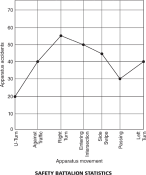
1. According to the line graph above, what kind of apparatus maneuver is most prone to being involved in an accident?
(A) U-turn
(B) Right turn
(C) Entering an intersection
(D) Left turn
2. The number of accidents occurring while entering an intersection is equal to the number of accidents occurring during
(A) both right turn and U-turn
(B) both left turn and side swipes
(C) both U-turn and passing
(D) both left turn and against traffic
3. What two apparatus movements have the same number of accidents?
(A) Against traffic and left turn
(B) U-turn and passing
(C) Right turn and side swipe
(D) Entering an intersection and against traffic
4. The total number of apparatus accidents is
(A) 300
(B) 290
(C) 280
(D) 270
5. How many more right turn accidents were there than U-turn accidents?
(A) 25
(B) 35
(C) 45
(D) 50
6. What percentage of total accidents was against traffic?
(A) 20%
(B) 18%
(C) 14%
(D) 12%
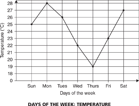
1. According to the line graph above, what day of the week had the highest temperature reading?
(A) Sunday
(B) Monday
(C) Tuesday
(D) Wednesday
2. What temperature reading was the lowest recorded for the week?
(A) 28
(B) 26
(C) 22
(D) 19
3. What part of the week had the highest recorded temperatures?
(A) Beginning of the week
(B) End of the week
(C) Middle of the week
(D) All of the above
4. What was the average temperature for the last three days of the week?
(A) 19
(B) 21
(C) 23
(D) 27
5. What is the approximate average temperature for the week?
(A) 26
(B) 24
(C) 21
(D) 20
6. What two days of the week listed below had the greatest disparity in temperature?
(A) Tuesday and Thursday
(B) Wednesday and Friday
(C) Monday and Wednesday
(D) Wednesday and Saturday
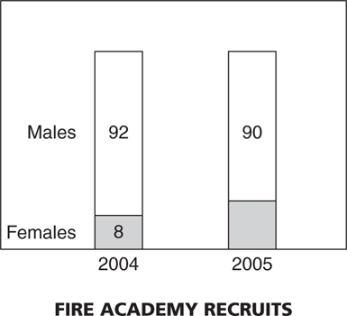
1. According to the bar graph above, the total number of new recruits entering the fire academy was the same in 2004 and 2005. What was the percent increase for female enrollment from 2004 to 2005?
(A) 2%
(B) 8%
(C) 25%
(D) 20%
2. What percent decrease in male recruits did the fire academy have from 2004 to 2005?
(A) 2.1%
(B) 3.3%
(C) 3.7%
(D) 4.2%
3. What was the total number of female recruits during 2004 and 2005?
(A) 8
(B) 10
(C) 18
(D) 20
4. In 2006, the same number of recruits is brought into the fire academy. The number of female recruits, however, increases to 14. How many male recruits would there be?
(A) 88
(B) 86
(C) 84
(D) 82
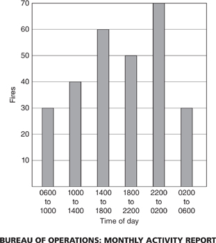
1. According to the bar graph above, the most fires occur during what time of day?
(A) Morning (0600–1000)
(B) Noon time (1000–1400)
(C) Late afternoon (1400–1800)
(D) Late night (2200–0200)
2. The total number of fires for a 24-hour period is most nearly
(A) 300
(B) 280
(C) 270
(D) 250
3. During which time period have the fewest fires occurred?
(A) 6 p.m. to 6 a.m. (1800–0600)
(B) 2 p.m. to 2 a.m. (1400–0200)
(C) 6 a.m. to 6 p.m. (0600–1800)
(D) 10 a.m. to 10 p.m. (1000–2200)
4. How many fires occurred from 6 p.m. to 10 a.m.?
(A) 180
(B) 190
(C) 200
(D) 240
5. What percentage of fires occurred between the hours of 2200 and 0200 hours?
(A) 22%
(B) 25%
(C) 28%
(D) 29%
6. What two brackets of time if added together give you the total number of fires during 1400 to 1800 hours?
(A) 1000 to 1400 and 0200 to 0600
(B) 0600 to 1000 and 2200 to 0200
(C) 1400 to 1800 and 1800 to 2200
(D) 0600 to 1000 and 0200 to 0600
1. According to the bar graph above, what month had the most snow days?
(A) February
(B) March
(C) December
(D) January
2. How many total snow days were there during the four-month period?
(A) 22
(B) 25
(C) 28
(D) 30
3. Which two months had the greatest discrepancy in snow days?
(A) December and March
(B) January and February
(C) February and March
(D) December and February
4. What percentage of snow days for the four-month period were in January?
(A) 18%
(B) 20%
(C) 24%
(D) 30%
5. If the total number of snow days for the year was 30, what percentage of snow days is represented by the four months on the bar graph?
(A) 84.6%
(B) 83.3%
(C) 81.2%
(D) 79.7%
Venn diagram circles are drawings that visually represent the logical relationship of groups sharing common properties. (A ∪ B) is the union of items found in either group A or group B. (A ∩ B) is the intersection of items found in both group A and group B. This method was devised by John Venn, a British logician.
Use the Venn diagram circles shown below to answer questions 1 through 4 based on the following scenario:
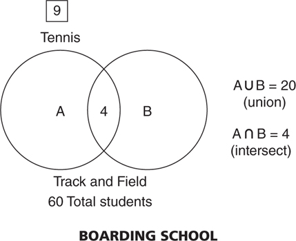
At a small boarding school with an enrollment of 60 students, 9 students are currently on the tennis team and 4 students are taking both tennis and track and field (A ∩ B). The union of sets A and B (A ∪ B) is 20 students.
1. How many students are only playing tennis?
(A) 10
(B) 9
(C) 5
(D) 4
2. How many students are only participating in track and field?
(A) 10
(B) 11
(C) 12
(D) 20
3. What is the total number of students participating in track and field?
(A) 15
(B) 16
(C) 20
(D) 21
4. How many students are not participating in either tennis or track and field?
(A) 15
(B) 25
(C) 30
(D) 40
Use the Venn diagram circles shown below to answer questions 1 through 4 based on the following scenario.
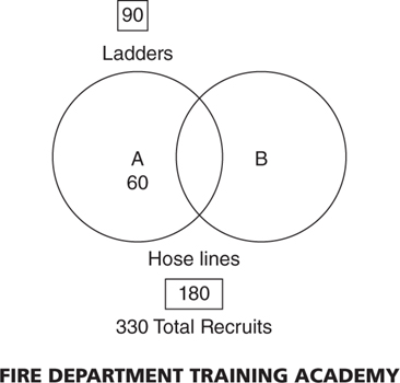
There are 330 recruits at the fire department training academy. Training includes ladder placement and hose line stretching. Ninety recruits are using ladders while 180 are carrying hose lines. Sixty recruits are only using ladders.
1. How many recruits are working with both ladders and hose lines (A ∩ B)?
(A) 30
(B) 60
(C) 90
(D) 100
2. How many recruits are only working with hose lines?
(A) 180
(B) 150
(C) 130
(D) 100
3. How many recruits are working in at least one of the ladder or hose line training components (A ∪ B)?
(A) 90
(B) 180
(C) 210
(D) 240
4. How many recruits are not involved in working with ladders or hose lines?
(A) 60
(B) 90
(C) 100
(D) 105
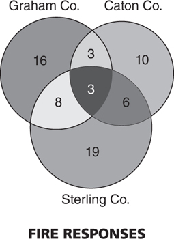
The Venn diagram circles above depict three rural fire departments and their fire responses for a week in August. The smallest circle on the upper right is the Caton County fire department. The larger circle on the upper left is the Graham County fire department. The largest circle at the bottom represents the Sterling County fire department. Overlapping sections denote fire responses where two or all three county fire departments responded in a joint mutual aid effort. Answer questions 1 through 8 based upon the Venn diagram.
1. What county fire department had the most fire responses for the week?
(A) Graham
(B) Sterling
(C) Caton
(D) Tie between Caton and Sterling
2. How many fire responses did the Graham Co. fire department have for the week?
(A) 34
(B) 32
(C) 30
(D) 28
3. What was the total number of fire responses where just the Graham and Caton County fire departments responded together?
(A) 3
(B) 6
(C) 9
(D) 12
4. How many fire responses involved all three counties?
(A) 3
(B) 6
(C) 8
(D) 9
5. What was the total number of single responses for all three county fire departments combined?
(A) 35
(B) 45
(C) 55
(D) 58
6. How many fire responses involved two or more county fire departments?
(A) 6
(B) 8
(C) 10
(D) 20
7. How many total fire response incidents were there involving any of the three county fire departments for the week?
(A) 55
(B) 60
(C) 65
(D) 88
8. What county fire department had the least mutual aid fire responses for the week?
(A) Sterling
(B) Caton
(C) Graham
(D) All of the above
For answer explanations to the review questions in this section, refer to this book’s companion website.
Distribution of Fires in Paxton Township
1. B
2. C
3. D
4. A
5. C
Fires in the Home (Common Causes)
1. D
2. B
3. A
4. B
5. D
6. C
Means of Travel to the Firehouse
1. B
2. C
3. D
4. A
5. B
6. C
Winchester County: Annual Arson Statistics
1. B
2. C
3. D
4. A
5. A
6. B
Victory City: Comparison of Fire Companies
1. C
2. D
3. B
4. A
5. C
Safety Battalion Statistics
1. B
2. C
3. A
4. C
5. B
6. C
Days of the Week: Temperature
1. B
2. D
3. A
4. C
5. B
6. A
Fire Academy Recruits
1. C
2. A
3. C
4. B
Bureau of Operations: Monthly Activity Report
1. D
2. B
3. C
4. A
5. B
6. D
Days of Snow
1. A
2. B
3. D
4. C
5. B
Boarding School
1. C
2. B
3. A
4. D
Fire Department Training Academy
1. A
2. B
3. D
4. B
Fire Responses
1. B
2. C
3. A
4. A
5. B
6. D
7. C
8. B