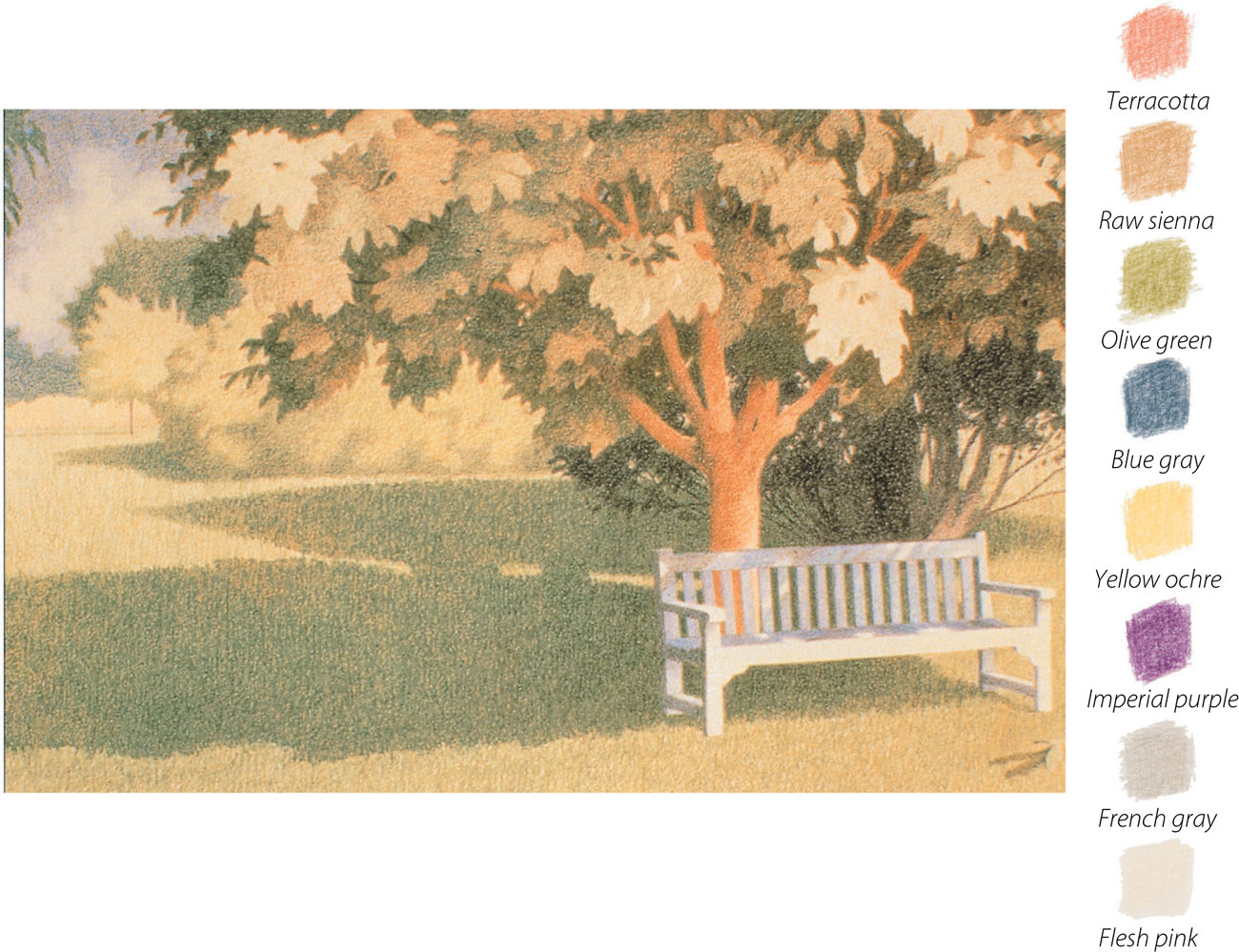

All about color
All colors have three distinctive properties that account for their appearance: hue, tonal value, and saturation. Manufacturers tend to use descriptive and somewhat subjective names for their colors, for example, one will describe a green as “grass green,” while another will describe a similar hue as “spring green.” In a large box of pencils, you will find many different hues, and many different tones of each one, usually more than you will need, and certainly more than you would wish to carry around. It is therefore important to understand both how these characteristics interact and the relative effect of color so that you can select a few to work with at a time.
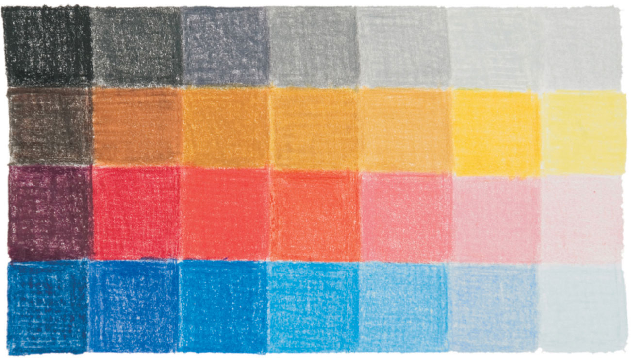
Relative tonal value
A gray scale made from “cool” unmixed grays sits alongside unmixed reds, yellows, and blues, demonstrating their relative tonal value. The nature of yellow changes as it becomes darker, whereas the reds and blues retain their identity.
Hue, tonal value, and saturation
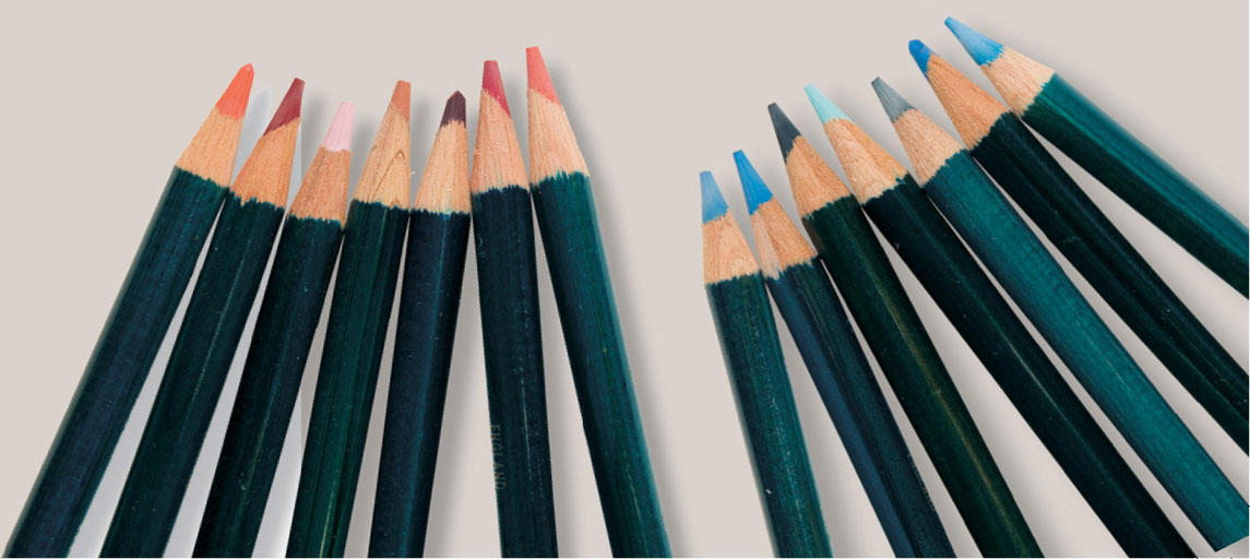
Yellows, blues, and reds of differing hue, tonal value, and saturation are grouped together below to show the range within just one color name. The yellows show the least tonal change as yellow quickly loses its identity as it becomes darker, but they all demonstrate wide ranges in hue (where the color is placed on the color circle) and saturation (how bright or how dull they are).
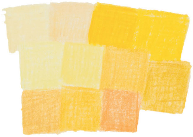
Yellows If you place the lightest yellow and the darkest against the gray scale on the previous page, you can gauge the fairly narrow breadth of tone compared to that of the lightest and darkest reds and blues.
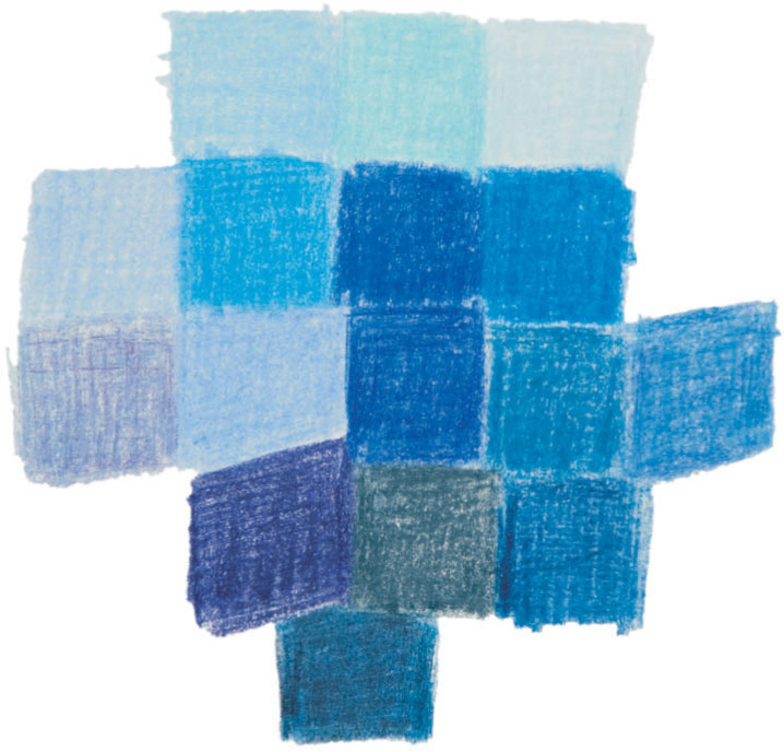
Blues These are easily classified whether they vary in hue from those on the green side of the spectrum, to those juxtaposed with the violet. Tonal variation and purity have little effect on their blueness.

Reds These cover the spectrum from red violet through orange and are often not seen as “red” at all, but described as pink, brown, or terracotta.
ARTIST’S TIP
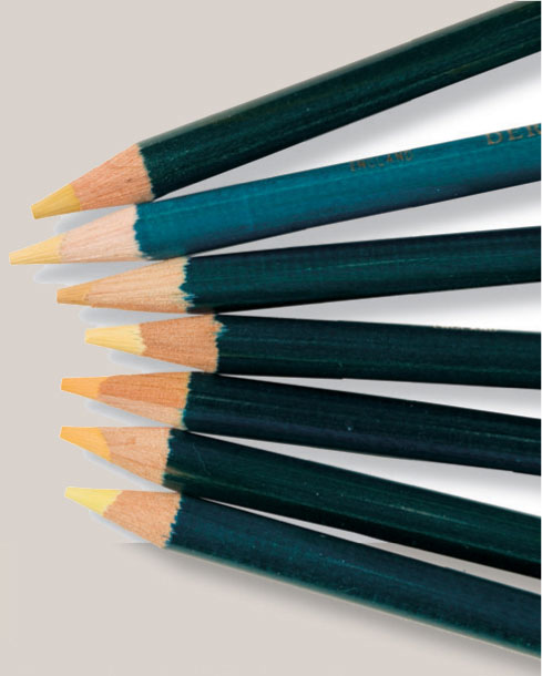
Try grouping your pencils as “reds,” “blues,” etc. and in doing so you’ll become familiar with the range of hues within a group and the variations in tone and intensity.
Prismatic colors
Prismatic is the term used for the pure colors in the spectrum, the primary and secondary colors as seen in a rainbow: red, orange, yellow, green, blue, indigo, and violet. Three of these are primary colors, which cannot be made by mixing other colors together. The primaries are red, blue, and yellow when dealing with pigment, and red, blue, and green when dealing with light.
This difference is becoming more familiar through the increased use of home computers for color printing. The screen image is in RGB (red, green, and blue), but the images are printed out using inks in CMYK (cyan, magenta, yellow, and black).
Secondary colors are two primaries mixed together; for example, red and yellow make orange. However, no pigment represents a true primary color, as pigments don’t behave like colors of light. Instead they tend to have a bias toward one or other of the colors that is next to them on the spectrum. The purest orange will be made from a red and a yellow with a bias towards one or the other, but a whole range of oranges can be made from any number of combinations of reds and yellows.
Mixing primary colors
By combining the primary colors, a number of secondary hues can be obtained. Below are just some examples of the variations that can be achieved through mixing.
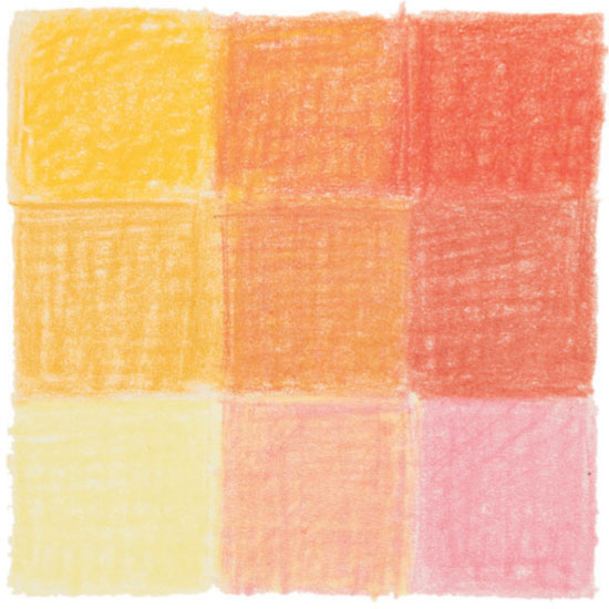
Yellow and red are mixed together to form orange (top row). In the second row, yellow ochre and terracotta form a brownish orange, while in the third a light, greenish yellow and a cool pink combine to form a peachy orange.
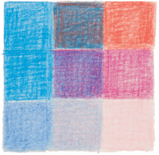
Blue and red In the top row, these are mixed to form a dark brownish violet; in the second row they produce a warm red violet, and in the bottom row the light, cool violet and dull pink mix to form a silvery gray.
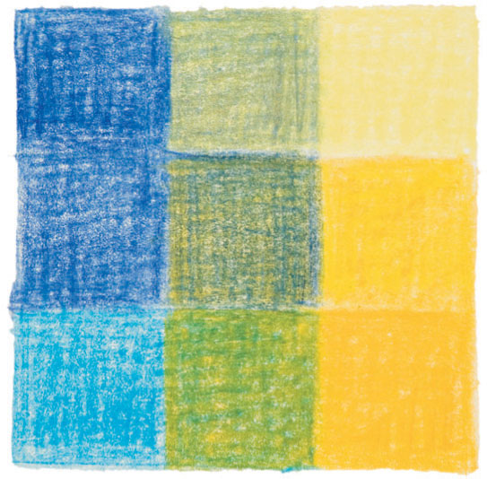
Blues and yellows
Many shades of green can be obtained by mixing blues and yellows. Here they vary from an olive green (top of the second column) through to a rich grass-green (bottom of the second column).
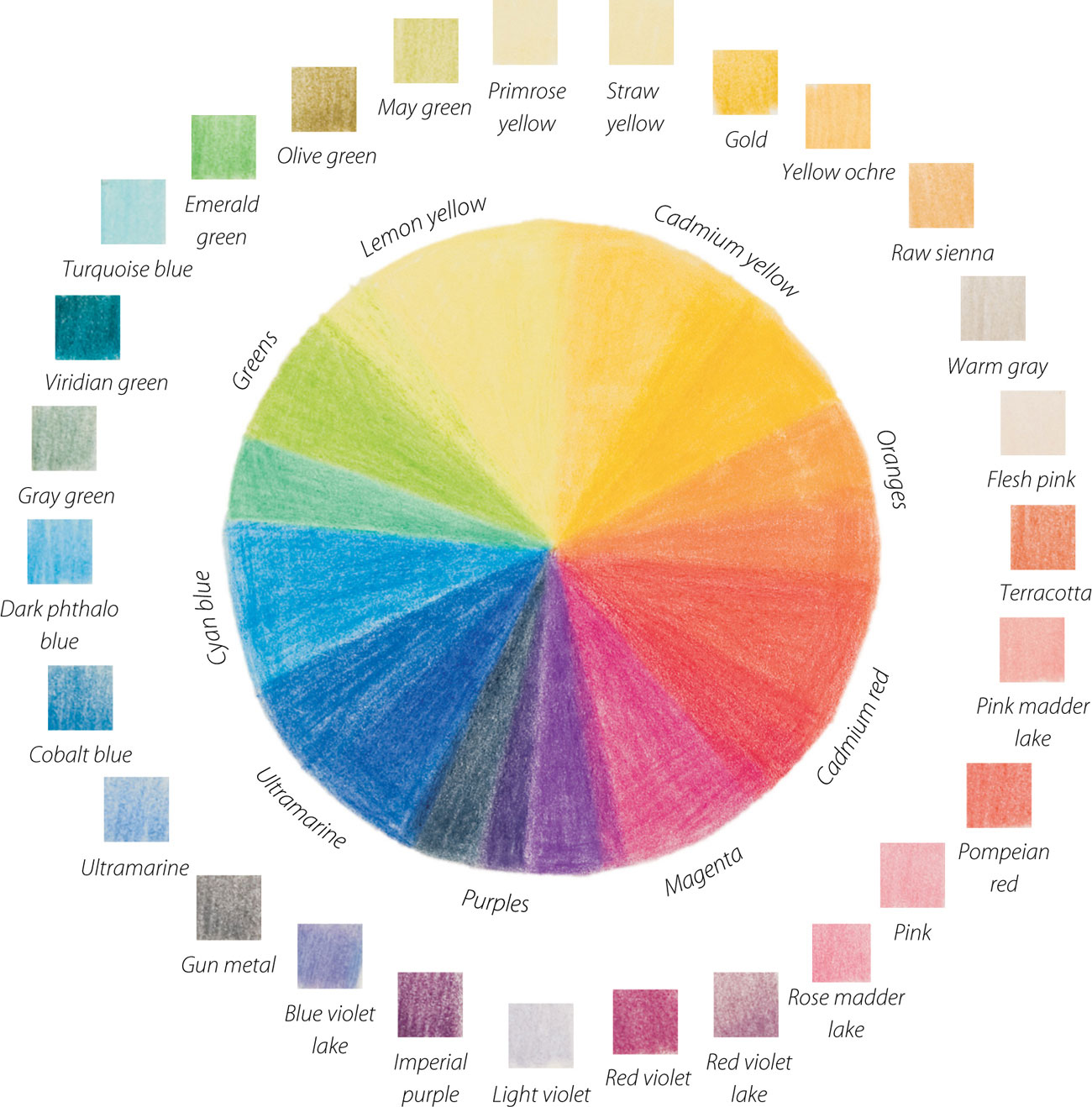
Color bias Pigments have a bias towards one or other of the adjoining colors of the spectrum. In this color circle (the spectrum joined up) colored pencils from several different brands are grouped to show their color bias.
Warm and cool colors
Colors are often described as warm or cool, but this is a relative term. It’s generally understood that, on the color circle, the green, blue, and violet range are the cool colors, while the red, orange, and yellow range are the warm ones. But within these categories, every color has varying degrees of warmth and coolness. For example, magenta, although a red, has a definite blue bias, so is described as a cool red, while vermilion has an orange bias and so is considered to be a warm red.
Warm and cool primaries
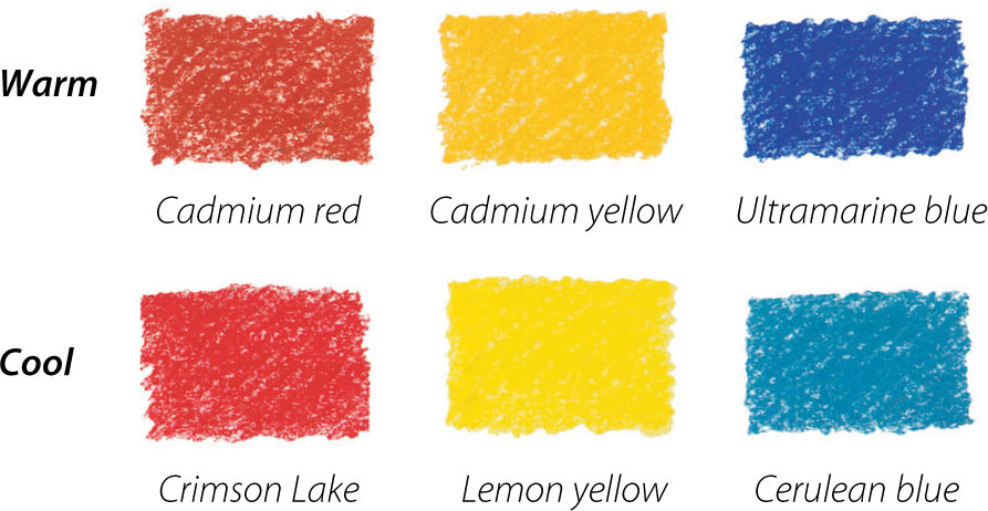
Red and yellow are often described as warm colors, and blue as cool, although there are variations in temperature within each hue. The crimson reds have a blue bias, and are cooler than the more orangey reds, such as cadmium red, while an orangey yellow, such as cadmium yellow, is warmer than the acid lemon yellow. Some blues are purplish, veer toward red, and are therefore warmer than those with a greenish tinge, such as turquoise. Below, three primary colors are shown with the warm version on top and the cooler below.
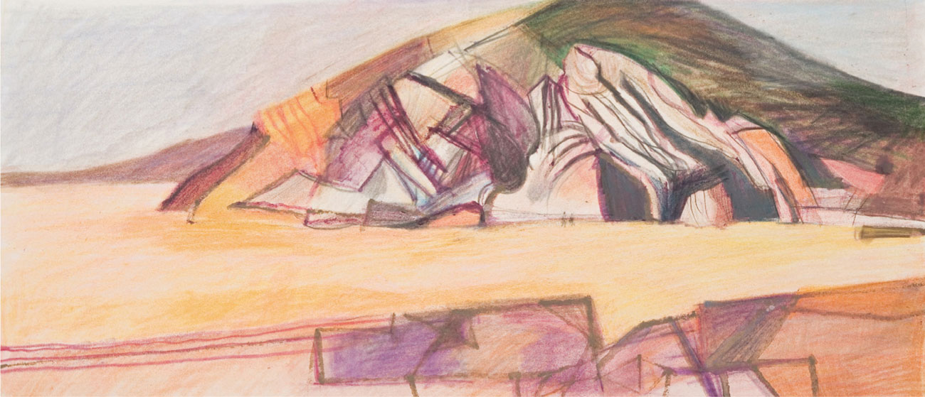
Warm palette
Cliff at Newgale is worked up from fiber-tipped pen on-the-spot sketches, as a preliminary to a much larger painting. The palette is mostly warm and colors are muted, with contrast found in the relative tonal values.

Cool palette
Predominantly cool colors from the crimson to yellow-green part of the spectrum are used in Green Moon and the Goat, apart from a very small dash of yellow ochre on the extreme left.
ARTIST’S TIP
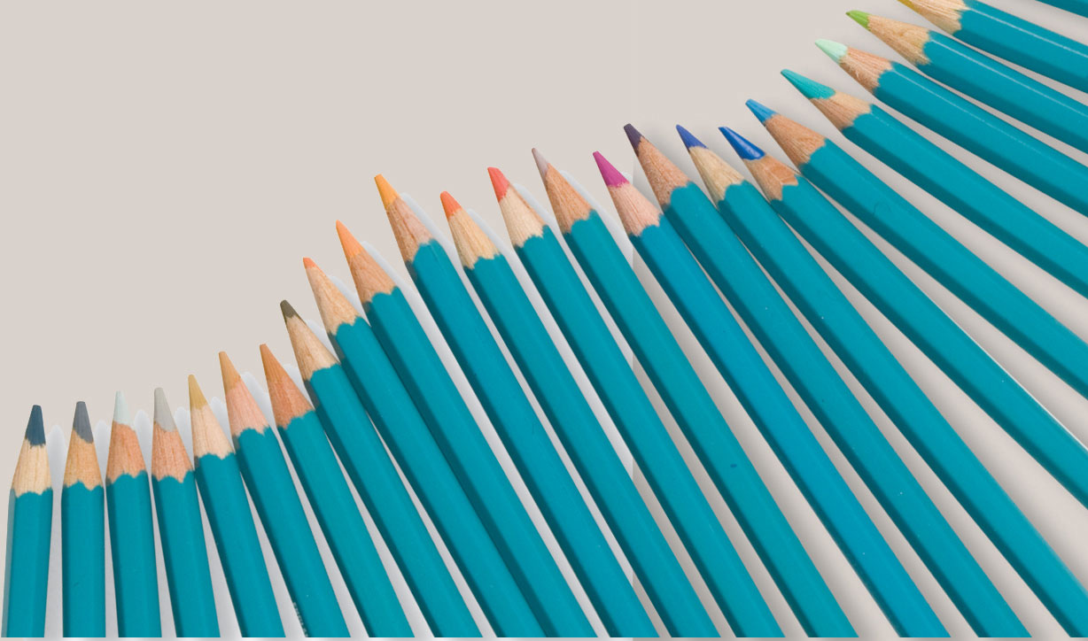
If you have a large set of pencils you will find it helpful to line them up in a warm to cool continuum. This will help you sort out the bias of any one color (see page 67). You may find the difference in tonal value confusing at first, but you will soon begin to see whether a so-called neutral color in fact leans toward yellow, blue, or red.
Complementary colors
Complementary colors are those that are opposite one another on the color circle. There are three pairs of these colors: red and green, yellow and mauve, and blue and orange. In their purest state they don’t contain any of each other, so provide the greatest contrast when placed side by side. They play an important role in working with color, as they have the effect of enhancing each other.
If you look at paintings in any media you will often see how artists have used these contrasts, bringing mauves into shadows on a yellow object, for example, or using touches of red among greens of foliage.
Complementary colors are also very useful for “knocking back” a color that is too bright, as they become less saturated and less contrasted if overlaid or blended together. A red, for example, could be muted with a light overlay of green. If mixed or overlaid in equal proportions, the identity of each color will be almost lost, producing what is known as a chromatic gray.
Harmonious colors
Any two or three colors that lie next to each other on the color circle will appear harmonious—because they share a common base color, they work well together without jarring. A picture painted predominantly in harmonious colors would be described as having a narrow hue range, and would convey a sense of quietness or calm. Even if prismatic hues, fully saturated red and orange are chosen, the colors are less gaudy than they might be if used in conjunction with similarly saturated complementary turquoise or emerald green.
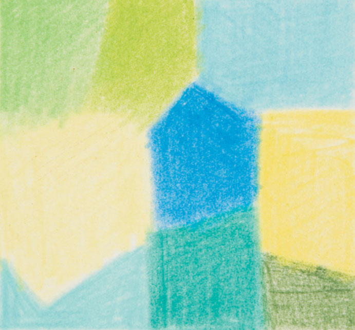
Harmonious and complementary
An harmonious range, in this case a slightly greenish lemon yellow to turquoise, would sit quietly together; but the study is dominated by the addition of the cool blue, which changes the dynamics and sets up a complementary relationship with the lemon yellow.
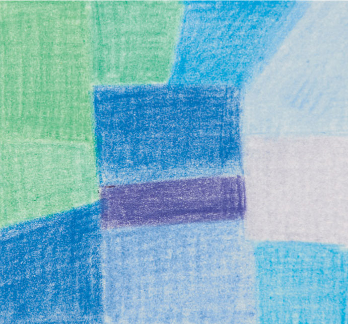
Strong harmony
In this study the harmonious element of the color scheme is stronger than the one shown on the left, as both extremes contain blue. This time the complementary contrast, between either the emerald green and dark red-violet or the light gray-violet, is more subtle.
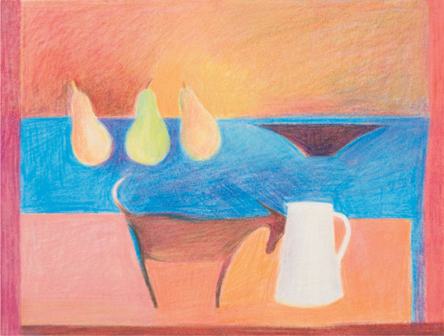
Complementary colors in use
In Goat Nudging Jug, the strong complementary blue heightens the vivid reds and oranges. Further contrast is generated by mixing these two complementaries together, as seen in the integrated shading of the background strip behind the pears. The lime green of the pear and the red-violet immediately around it set up an echoing diversity.
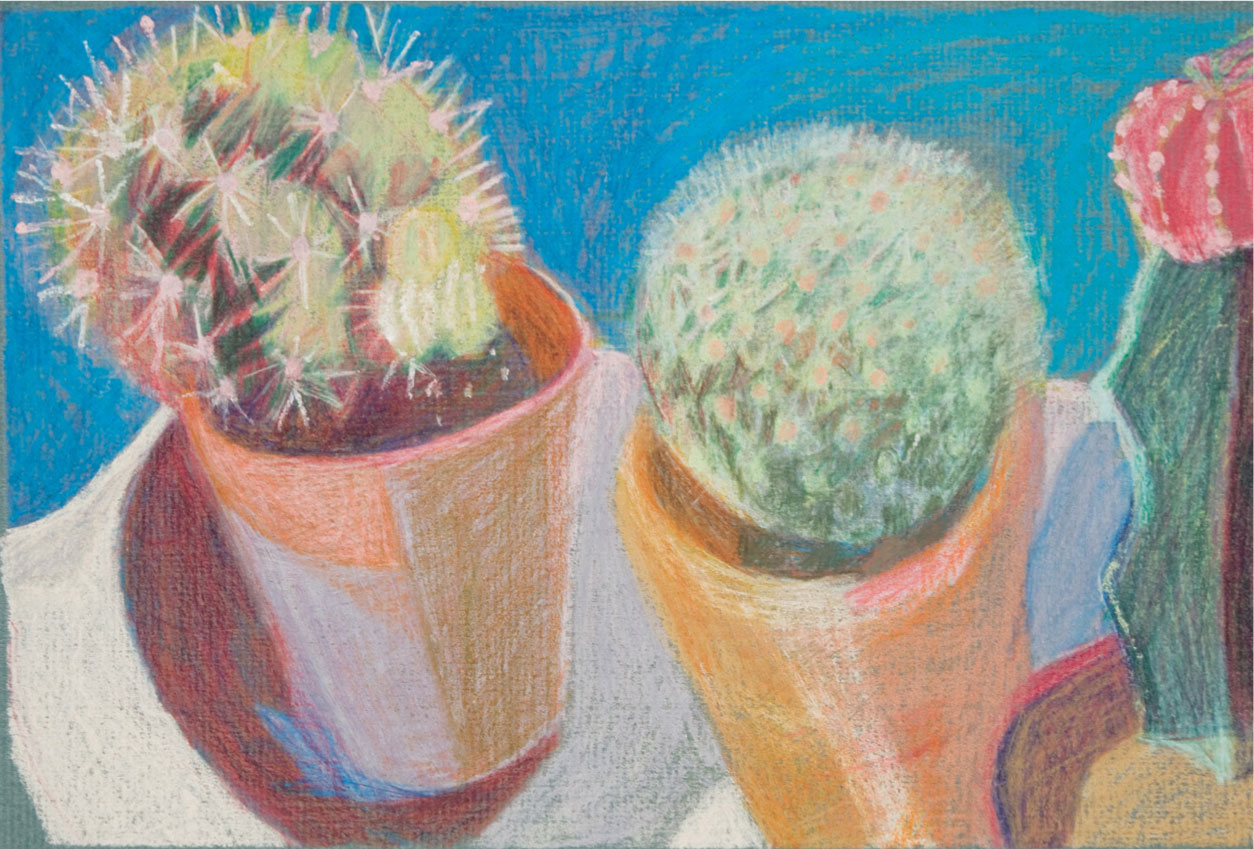
Subtle complementary effects
The complementary contrasts in Cacti, although evident, are less vivid than in Goat Nudging Jug above (the salmon pink with the olive green, and the yellow ochre and raw umber with the gray-violet). The colors appear less intense, partly because of the influence of the green-gray paper, and partly because the palette includes a number of less saturated or intense colors, in places dulled down by mixing complementaries. These can be seen in the greens and reds of the cactus on the right and in the dark patches in and around the flowerpots.
Color and mood
Color is not only a means of describing what we see—it can also be used expressively to convey a mood or atmosphere. Bright or light colors—known as “high key”—tend to evoke a happy response, whereas dark-toned colors such as browns, deep blues, and purples—“low key”—give a sense of stability and thoughtfulness.
Using harmonious colors, which are those next to one another on the color wheel, create a gentler, more restful atmosphere than strongly contrasting colors such as complementaries (see page 70) or vivid primary colors. In landscape, colors tend to be harmonious—greens, yellows, and blues—indeed you may sometimes need to exaggerate or even invent a contrasting color to avoid dullness. Flower and still-life painters often deliberately set up groups consisting mainly of harmonious colors such as pinks and mauves, with perhaps a touch of a muted complementary or a lighter tone for contrast.
High-key palette
A Corner of Green by Laura Duis, uses a high-key but muted palette, with strong tonal contrasts. The composition is carefully organized, with the light areas established from the beginning.

Low-key palette
Formal Gardens at Hidcote is relatively low in key and conveys an atmosphere of an impending summer storm. The palette is limited, consisting largely of scarlet, dark violet, ultramarine, cyan blue, turquoise green, lemon yellow, white, and cool gray. Scarlet and lemon yellow were blended with water and used for the initial underpainting, followed by several layers of the mainly prismatic colors to suggest dark shadows. Highlights were emphasized by erasing and then redrawing in lemon yellow.
Lightening and darkening colors
The pressure you use obviously affects the lightness or darkness of the colors, but you can also mix colors on the paper surface to change the tones, even laying light colors over dark (if using water-soluble pencils, you can lighten colors simply by adding water). Although colored pencils are most often worked from light to dark, as they are semi-transparent, white is relatively opaque, as are many of the lighter colors, because they have a higher proportion of white in their make-up than the dark colors. Interesting effects can be achieved by working pale pinks over browns, or pale yellows over greens. When darkening colors, try to avoid too much use of black; this can have a deadening effect. The examples shown on the opposite page will give you some ideas.
ARTIST’S TIP
Vibrant “darks” are evoked by often surprising mixtures of bright reds, oranges, dark blues, greens, violets; or these can be added to brown or black. The depth of tone will be far greater than that achieved with just a black even with heavy pressure.
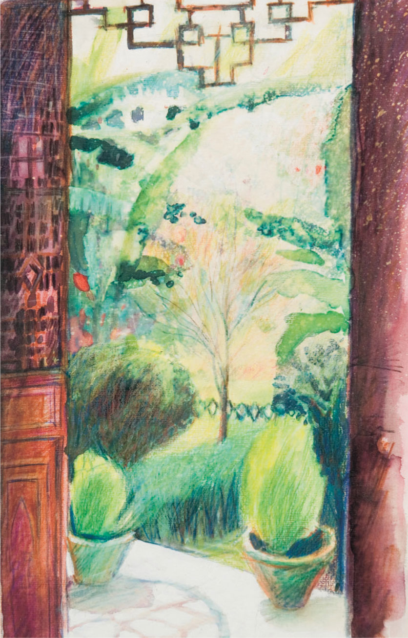
Lightening and darkening in context
Garden at Chengdu Museum is confined to mainly prismatic greens, yellows, blues, and reds in colored pencil and inks, blended with water and overlaid with loose hatching. Some of the light patches have been further lightened with gouache and spattered with bleach, which removed some of the ink. The screen on the left was begun with a pink ink wash and knocked back with pencil work in warm browns, purples, and ultramarine, blended in some places with water. The shadows of the foliage are darkened using ultramarine and some whites and yellows are included. The paper is firm with a fine grain enabling an effective build-up of layers.
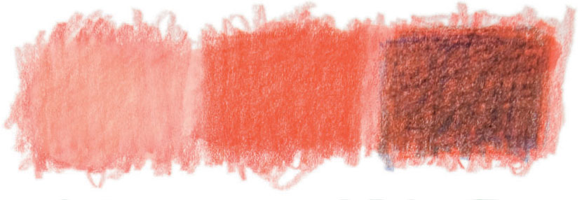
Scarlet lightened with white (left) and darkened with ultramarine (right).

Grass green lightened with lemon yellow (left) and darkened with ultramarine (right).

Lemon yellow lightened with white (left) and with added grass green (right).

Ultramarine lightened with grass green (left) and darkened with burnt umber (right).

Burnt sienna lightened with flesh pink (left) and darkened with ultramarine (right).

Violet lightened with water (left) and darkened with umber (right).
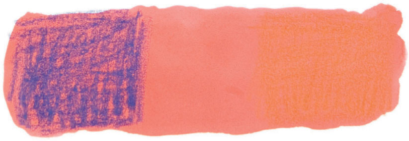
Persimmon pink ink darkened with violet (left) and knocked back with burnt sienna (right).
Overlaying colors
The majority of colored pencil renderings depend upon the effects of overlaying colors. In this way you can achieve richness of hue, tonal density, and contrast, and effective three-dimensional modeling of forms and surface textures. Because colored-pencil marks have a degree of translucency, with applications being influenced by the paper color or other colors beneath, the process of building up a drawing in many layers creates potential for many subtle variations of hue, shade, and texture.
There are many different ways of overlaying colors: you can put one layer of shading over another to modify colors and produce interesting mixtures and gradations; you can build up a network of lines, dashes, and dots to develop complex effects of optical mixing; or you can enliven areas of flat color by overlaying a linear pattern or broken texture that subtly meshes with the original hue.
Color layering provides greater depth and detail in a drawing: you can achieve active color qualities in highlight areas or dark shadows, which intensify effects of light and atmosphere. In a practical sense, overlaying colors is equivalent to mixing paints in a palette: if you don’t have the precise hue that you need, you can create it from a blend of two or more colors.
Overlaying water-soluble pencils
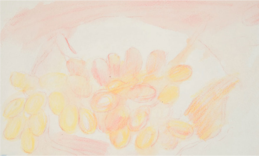
1 A pink water-soluble pencil was used for the initial line drawing, to merge quietly with subsequent drawing. Shading in lemon yellow was added and blended with the pink using a wet brush. Highlights were dabbed out with a rag while the color was still wet.
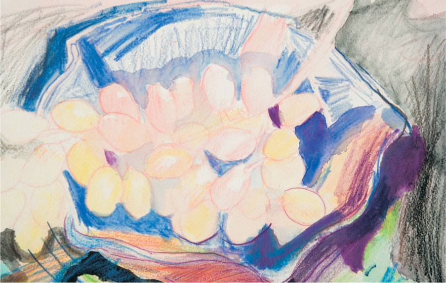
2 Loosely hatched blue pencil describes the form of the dish, and was worked into the shadows. Further loose hatching in black and Prussian blue was used to fill in the “negative” shapes around the dish, the scribbled marks echoing those used for the grapes. Some of the pencil work was merged with water to denote the darker shadows, and more delicately, to produce the pale gray around the grapes in the center.
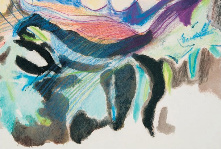
3 The fluid patterning in the foreground was made by painting water shapes, filling in with a pencil to make a soft pigmented pool, and then pushing the color about with the brush. This was lightened in some areas by lifting out with a rag and added to with pencil and water. Once dry, more pencil work was layered over the top to give a veiled appearance.
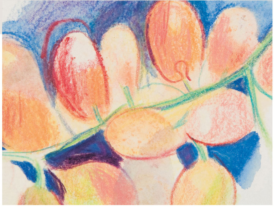
4 The grapes were developed with several layers of wet and dry pencil. Loose shading and line drawing reveal the color beneath. Water was used to soften blends, taking care not to lose the linear work altogether, however, the shapes of the grapes are described as much by the drawing of the surrounding shadows, as by these linear marks.

5 The Blue Dish
Layering need not result in dense compacted color. Here, open shading and loose watercolor washes are combined with free line drawing.
ARTIST’S TIP
As you begin to learn how colors work together, experiment with overlaying using a very small palette of six colors; two yellows, two reds, and two blues, choosing a warm and cool version of each.

