Lesson 9
Introduction to UIKit and Adaptive Layout
With the launch of iOS8, Apple has made it possible to build an application that can run on any device with a single storyboard. In Apple's terminology, the application adapts to the device it is running on. Prior to iOS8, it was common to have different storyboards for each device family.
Instead of specifying explicit sizes and positions for UI elements, with adaptive layout you specify constraints between the user interface elements of your view and have iOS apply these constraints at run time to work out the size and position the elements. A constraint is a mathematical description of the relationship between elements.
Most of the time, you apply these constraints using Interface Builder, but it is possible to specify these constraints programmatically in your code by creating instances of NSLayoutConstraint. Creating NSLayoutConstraint instances programmatically is outside the scope of this book. If you are interested in learning more about creating layout constraints programmatically, refer to the NSLayoutConstraint Class Reference at:
https://developer.apple.com/library/ios/documentation/AppKit/Reference/NSLayoutConstraint_Class/
Introducing the UIKit Framework
A framework is a collection of classes that you can use to write your apps. Apple provides a large number of frameworks that enforce consistent implementation of features across applications from different developers. All the familiar user interface features such as navigation bars, toolbars, back buttons, and so on that you commonly use in iOS apps are, in fact, classes in one of the frameworks provided by Apple.
Although the idea of sticking to user interface elements that only appear in an Apple framework may seem limiting, it is in fact not the case. Apple's frameworks have a large number of classes; in fact, some frameworks do not have any user interface–specific classes at all. You must always try to use classes from one of the standard frameworks when possible; this will ensure that you do not spend time reinventing the wheel.
The frameworks are grouped together into layers, with frameworks in higher layers building upon frameworks found in lower layers. Figure 9.1 shows the different layers with examples of some of the frameworks they contain. In general, using a class from a framework in a lower layer requires you to write more code than using one from a higher layer.
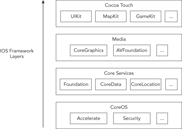
The top-most layer is known as Cocoa Touch and contains a large number of classes distributed within multiple frameworks that handle the most common aspects of iOS applications, including but not limited to processing events, touches, gestures, multithreading, map support, and accelerometer.
Every Xcode project that is created from one of the standard iOS application templates includes three key frameworks: CoreGraphics, Foundation, and UIKit. Most simple apps do not need to use classes from any other framework.
Of all the Cocoa Touch frameworks, perhaps the most important and commonly used is UIKit. The name UIKit may lead you to conclude that it contains only user interface–specific classes. This is, however, not true. Besides user interface–specific classes, UIKit contains classes for handling events, touches, gestures, and general application support.
Classes that are part of UIKit always begin with the UI prefix. Thus, the UIApplication, UIWindow, UIView, and UIViewController classes that you have encountered earlier in this lesson are all part of UIKit.
The UIButton Class
The UIButton class is part of the UIKit framework and encapsulates the functionality of a button on a touch screen. A UIButton object sends a message to a target object when it intercepts one or more touch events.
UIButton objects can intercept different types of touch events; some of the most common ones are briefly summarized in Table 9.1.
Table 9.1 UIButton Touch Events
| Event | Description |
| Touch Up Inside | The user has lifted his finger from the touch screen inside the area of the button. |
| Touch Up Outside | The user had pressed this button but has lifted his finger outside the area of the button (that is, dragged his finger outside the button before lifting it). |
| Touch Down | The user has just pressed this button and hasn't yet lifted his finger, or moved it. |
| Touch Drag Enter | The user has pressed this button, then dragged his finger outside the button, and has just entered the area of the button again (without lifting the finger). |
| Touch Drag Exit | The user has pressed this button, then dragged his finger and, as a consequence of dragging, has just left the area of the button. |
| Touch Drag Inside | The user has pressed this button and is dragging his finger within the area of the button. |
| Touch Drag Outside | The user has pressed this button and is now dragging his finger outside the area of the button. The user would have had to move his finger out of the button and continued to drag without lifting his finger to receive this event. |
By and large, the most common event that you will use in your code is the Touch Up Inside event.
Adding a UIButton to the view is a simple matter of dragging a Button object from the Object library onto the client area of the scene. You can use the Attributes inspector to set up some common properties of the new button. However, keep in mind that each of these properties can also be set up using Objective-C code. If you just want to add a title to a button quickly, simply double-click the button and type in a suitable title.
The default button created by Xcode is, in fact, quite boring. To make it more interesting you can change its appearance using use the Attribute inspector (View  Utilities Show Attributes Inspector). You can select from common button types using the Type drop-down (see Figure 9.2).
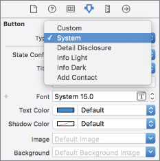
The standard button types are:
- Custom: A button without any specific appearance, invisible unless you set up an image. Typically used to create hotspots or graphical buttons.
- System: This is the default.
- Detail Disclosure: A button with an arrow; usually indicates that tapping it will reveal additional information.
- Info Light: The standard “i” icon, intended to be used over dark backgrounds.
- Info Dark: The standard “i” icon, intended to be used over light backgrounds.
- Add Contact: The standard + icon.
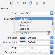
A UIButton object can be in one of four states:
- Default: The button is visible on the screen; the user is not interacting with it.
- Highlighted: The user is currently pressing down the button.
- Selected: A
UIButtonobject does not ordinarily move into this state as a result of user interaction, but this state can be set up programmatically. - Disabled: The button is visible on the screen, but the user cannot interact with it.
For each state you can provide a different background color, title, and background image. You can use the Attribute inspector's State Config drop-down to select a state and set up attributes for that state. This is shown in Figure 9.3.
To assign an image for your button, you will need to create a PNG image for each state and import the images into your Xcode project. When applying an image to a button, you can assign the image to either the Image attribute or the Background attribute. There is a slight difference between the two. The background image is scaled to fill the entire area of the button and is displayed behind the title. The foreground image is displayed beside the title.
The UILabel Class
The UILabel class allows you to draw one or multiple lines of static text onto your view. The UILabel class does not normally generate touch events but provides several properties that allow you to customize its appearance. The most common ones are described in Table 9.2.
Table 9.2 UILabel Properties
| Property | Description |
text |
Sets the text displayed by the label using the current font. |
numberOfLines |
The maximum number of lines of text to be drawn. |
textAlignment |
Defines the horizontal alignment of text in the label. Permissible values are UITextAlignmentLeft, UITextAlignmentRight, and UITextAlignmentCenter. |
textColor |
Sets the color used to display the text. You can set the color by providing a UIColor object. The UIColor class is discussed later in this lesson. |
font |
Sets the font that is used to display the text. |
Basic Constraints
If you have developed iOS applications in the past, the first change you will notice when you open a nib or a storyboard is that each view is now represented using a square canvas instead of a rectangular one (see Figure 9.4).
This may seem a little odd at first because the iPhones and iPads all have rectangular form factors. Apple has introduced a square canvas because they do not want you to think in terms of a specific device when designing your UI. Instead, you build your user interface for a generic square canvas and iOS will adapt it to fit the specific device based on the constraints you have specified.
The fundamental building block of this new layout system is the constraint. A constraint is a mathematical rule that helps lay out UI elements. Constraints can specify an element's height, width, horizontal position, or vertical position from another element. Constraints can be added, removed, and edited to affect the layout of your application's UI.
For instance, to position a label centered (horizontally and vertically) in the screen, you will need to add a few constraints. Start by dragging a Label object from the Object Library and placing it at an arbitrary location on the storyboard canvas (see Figure 9.5).

With the Label selected, you bring up the alignment constraint editor by clicking the Align button located at the bottom-right corner of the storyboard editor (see Figure 9.6).

In the alignment constraint editor, ensure the Horizontally in Container and Vertically in Container options are enabled and their corresponding values are both zero. Click on the Add 2 Constraints button to add these constraints. When you do this, you will notice two new constraints has been added between the label and the view (see Figure 9.7).

If you select one of the constraint in the view hierarchy, you can update its properties using the size inspector (see Figure 9.8).
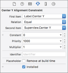
Mathematically, any constraint can be expressed using the following equation:

X and Y are attributes of views and can be either left, right, top, bottom, leading, trailing, width, height, centerX, centerY, or baseline.
The attributes leading and trailing are the same as left and right for left-to-right languages such as English. However, in a right-to-left language such as Arabic, leading and trailing are interpreted as right and left. When you create constraints, you should usually use leading and trailing (instead of left and right) to make sure your interface is laid out appropriately in all languages.
Some of the other properties relevant to constraints are:
- Relation: The relationship between the attributes represented in a constraint can be one of equality (=), greater than or equal to (>=), or less than or equal to (<=)
- Priority: When multiple constraints are defined for a given attribute, those with higher priority levels are satisfied before those with lower priority.
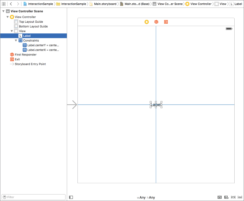
At this point, even though you have added constraints to center the label horizontally and vertically, the label is still where you left it on the storyboard. If you were to run the application now, you would find that the label is indeed centered as you would expect.
If you select the label on the storyboard, you will notice that it has an orange outline. An orange outline implies that there is an adaptive layout problem. There are three typical problems that you will encounter:
- The constraints are correct, but the size/position of the UI elements will be different from what you see on the storyboard in Interface Builder
- You don't have enough constraints to specify both the size and position of a UI element
- You have ambiguous constraints, i.e. either none or too many constraints are specified for the same attribute, with the same priority level.
You can find out what the problem is by switching to the Issue Navigator (see Figure 9.9).
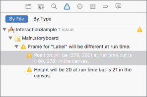
In this particular case there is just one issue with the constraints on this storyboard scene, and is listed as
- Frame for “Label” will be different at run time.
To fix this particular issue, select the label and then select Editor Resolve Auto Layout Issues Update Frames.
The storyboard should now resemble Figure 9.10.
If you pay attention to the bottom-right corner of the storyboard, you will notice four auto layout–specific buttons (see Figure 9.11):

- Stack: This button is only enabled if one or more items are selected in a storyboard scene. When this option is available, using it will embed the selected items into a UIStackView.
- Align: This button enables you to add an alignment constraint to the selected UI element relative to another element in the scene. Clicking this button will bring up a popup that contains various alignment options.
- Pin: This button enables you to set the position of a UI element relative to other elements and to apply size constraints.
- Resolve Auto Layout Issues: This button enables you to correct layout problems. Clicking this button will bring up a popup menu that is identical to the Editor Resolve Auto Layout Issues menu item.
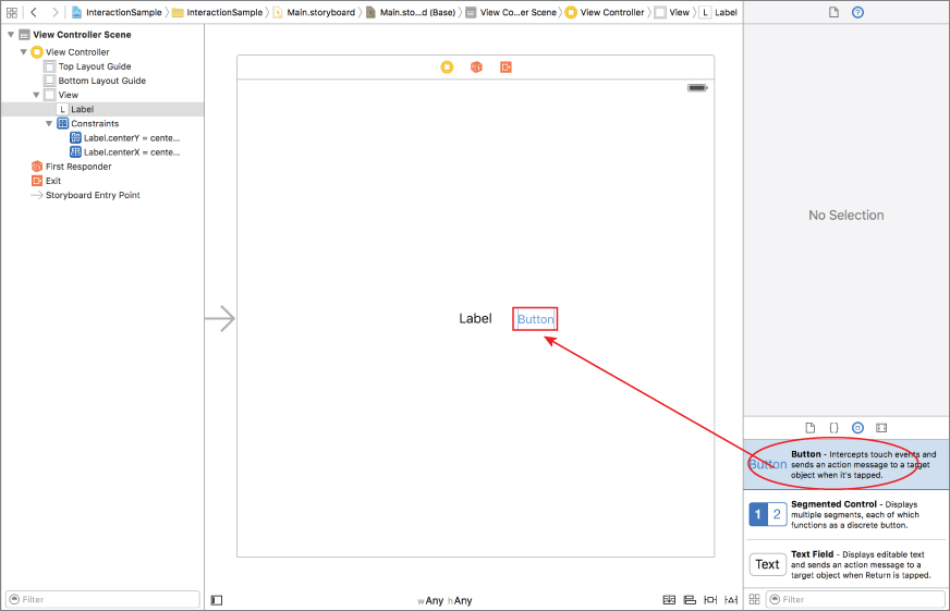
If you now wanted to add a button to the right of the label, you could do this by first dragging a Button object from the object library and placing it in the approximate location on the scene (see Figure 9.12).
You can then use the Pin button to create constraints that fix the size of the button and its horizontal distance from the label, as shown in Figure 9.13.
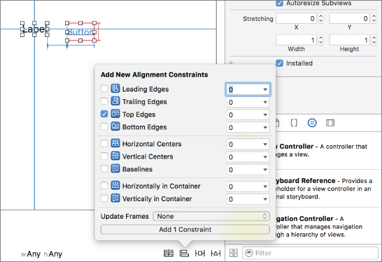
To align the top of the button with the top of the label, select both the button and label (in that order), and then use the alignment constraint editor to add a new alignment constrained for Top Edges (see Figure 9.14).
To reflect these changes on the storyboard, select Editor Resolve Auto Layout Issues Update Frames.
Previewing Your Layout
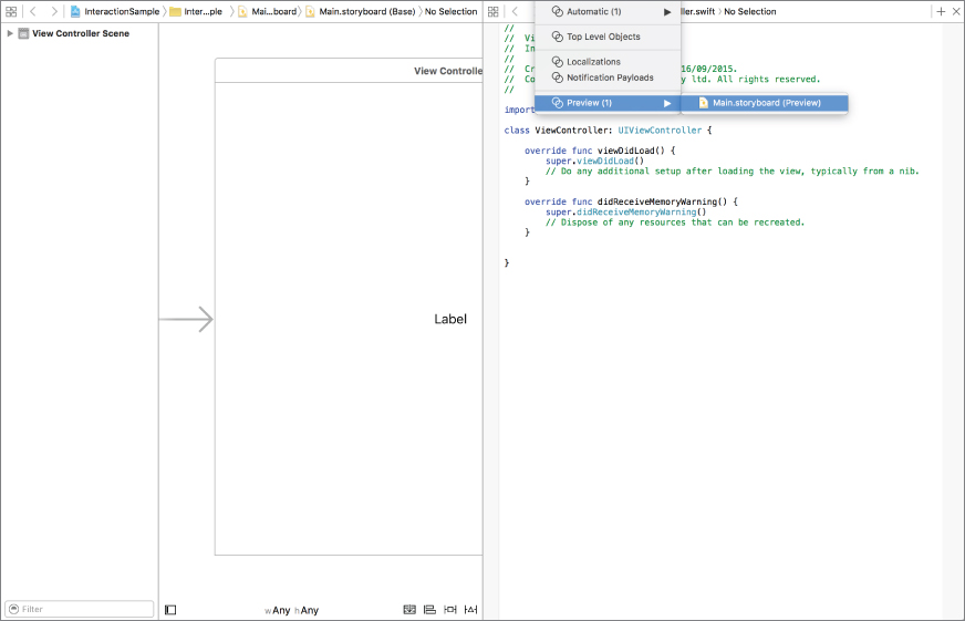
If you would like to know how your storyboard will appear on a specific device without running the application, you can use the assistant editor. First, ensure a scene is selected in your storyboard and show the assistant editor by selecting View Assistant Editor Show Assistant Editor.
Next, use the assistant editor's jump bar to switch to the layout preview (see Figure 9.15). The assistant editor will now display a preview of the storyboard in one of the standard iOS screen sizes.
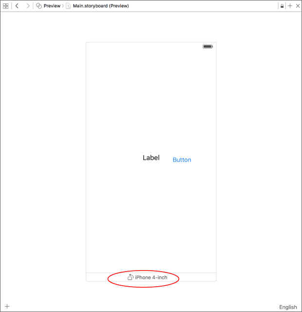
You can add additional screen sizes to the preview area by clicking the plus sign (+) button at the bottom-left corner of the preview window (see Figure 9.16). You can also toggle the orientation of the preview between portrait and landscape by clicking the device name (see Figure 9.17).

Creating Outlets
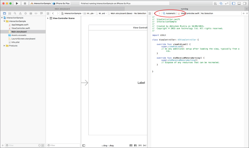
User interface elements are usually defined in storyboards, and even though you can set their properties graphically using Interface Builder, there will be times when you will need to read or change a property from your code while your application is running. To do so, you need to create an appropriate instance variable in the view controller class and connect it to the user interface element in the scene. These connections are known as outlets, and can be created quickly using the assistant editor. To display the assistant editor, select View Assistant Editor Show Assistant Editor. If the assistant editor is in Automatic mode, selecting a user interface element in one of the scenes of the storyboard file automatically opens the Swift code (.swift) file of the corresponding view controller class. You can switch the assistant editor into Automatic mode using the jump bar. This is shown in Figure 9.18.
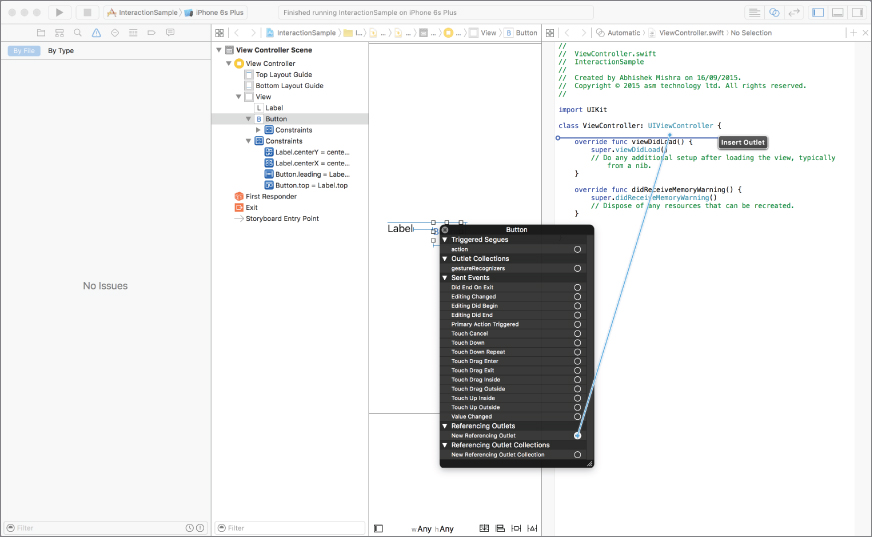
To create an outlet for the button object, right-click the button to bring up a context menu and drag from the circle beside the New Referencing Outlet line to an empty line in the Swift class (see Figure 9.19).
Release the mouse button on an empty line in the header file to open a dialog box that allows you to type in a name for the outlet (see Figure 9.20). Type a name for the outlet variable—for our purposes here, let's name it someButton.
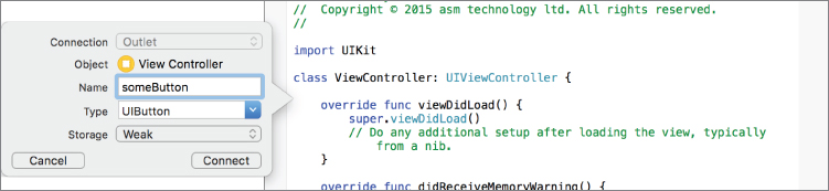
Click the Connect button in the popup dialog box to finish creating the outlet. Notice how Xcode has created an optional var of type UIButton in your class.
@IBOutlet weak var someButton: UIButton!To signify that the variable refers to an object defined in the storyboard file, Xcode adds the @IBOutlet keyword to the variable declaration.
Creating Actions
Most user interface elements generate a variety of events as a result of user interaction. As a programmer, you will be interested in some of these user-generated events and will want your code to be executed when these events occur. To achieve this, you need to create one or more methods in the view controller class and wire them up to appropriate events generated by the user interface element. These methods in the view controller class that are called when an event has been triggered as a result of user interaction are referred to as actions.
As you might expect, both of these steps can be performed graphically with the Interface Builder. To show a list of events that can be intercepted by a user interface object, simply right-click the user interface element in Interface Builder and browse through the entries under the Sent Events category of the context menu.
You will see all the familiar touch events listed there along with a few others. To wire up the Touch Up Inside event to a method in your class, simply drag from the circle beside the name of the event to an empty line in your view controller class.
When you release the mouse on the view controller, Xcode presents a popup window in which you can provide a name for the new method. Call the new method onButtonPressed.
Note that the onButtonPressed method takes in a single argument of type AnyObject called sender. This parameter always contains a reference to the object that sent this message to your view controller. In this particular case, the sender would be the user interface object that generated the corresponding event.
Once you have an action method wired up to the button's Touch Up Inside event, you can write Swift code that will be executed when the user interacts with this button. This is examined in this lesson's Try It.
Try It
In this Try It, you launch Xcode and create a new Xcode project using the Single View Application template called InteractionSample. You use the Interface Builder to create an instance of a UIButton and a UILabel class and then write code to update the text displayed in the label when the button is pressed.
Lesson Requirements
- Launch Xcode.
- Create a new project based on the Single View Application template.
- Edit the storyboard with Interface Builder.
- Add a
UILabeland aUIButtonobject to the default scene in the storyboard. - Create and connect the
UILabelto an outlet in the view controller class. - Create and connect the Touch Up Inside event of the
UIButtoninstance to an action method in the view controller class. - Change the text of the label when the button is clicked.
Hints
- To show the Object library, select View Utilities Show Object Library.
- To show the assistant editor, select View Assistant Editor Show Assistant Editor.
- To show the source editor, select View Source Editor Show Standard Editor.
Step-by-Step
- Create a Single View Application in Xcode called
InteractionSample:- Launch Xcode and create a new application by selecting File New Project.
- Select the Single View Application template from the list of iOS project templates.
- In the project options screen, use the following values:
- Product name: InteractionSample
- Organization name: your company
- Organization identifier: com.yourcompany
- Language: Swift
- Devices: iPhone
- Use Core Data: Unchecked
- Include Unit Tests: Unchecked
- Include UI Tests: Unchecked
- Save the project to your hard disk.
- Launch Xcode and create a new application by selecting File
- Open the
Main.storyboardfile in the Xcode editor:- Ensure the project navigator is visible and the InteractionSample project is open.
- Click the
Main.storyboardfile.
- Add a label to the storyboard:
- Ensure the Object Library is visible by selecting View Utilities Show Object Library.
- Select a label from the Object Library and drag it onto the single scene of the storyboard. The position of the label does not matter at this point.
- Use the Attribute inspector to change the alignment of the label to Centered.
- Select Editor Size to Fit Content to resize the label so that its contents are not truncated. This option is only visible if the text in the label is currently truncated.
- Ensure the Object Library is visible by selecting View
- Set up a few basic layout constraints to center the label on the screen:
- Ensure the label is selected; if it is not, simply click it once.
- Center the label horizontally and vertically by using the alignment constraint editor popup window.
- Update the storyboard to display the new position of the label accurately by selecting Editor Resolve Auto Layout Issues Update Frames.
- Add a button to the storyboard:
- From the Object library, select a Button and drop it onto the scene.
- Double-click the button and change the text displayed in it to
Greet Me! - Drag the button to sit a short distance below the label. The precise position does not matter.
- Ensure the button is selected; if it is not, simply click it once.
- Center the button horizontally by using the alignment constraint editor popup window.
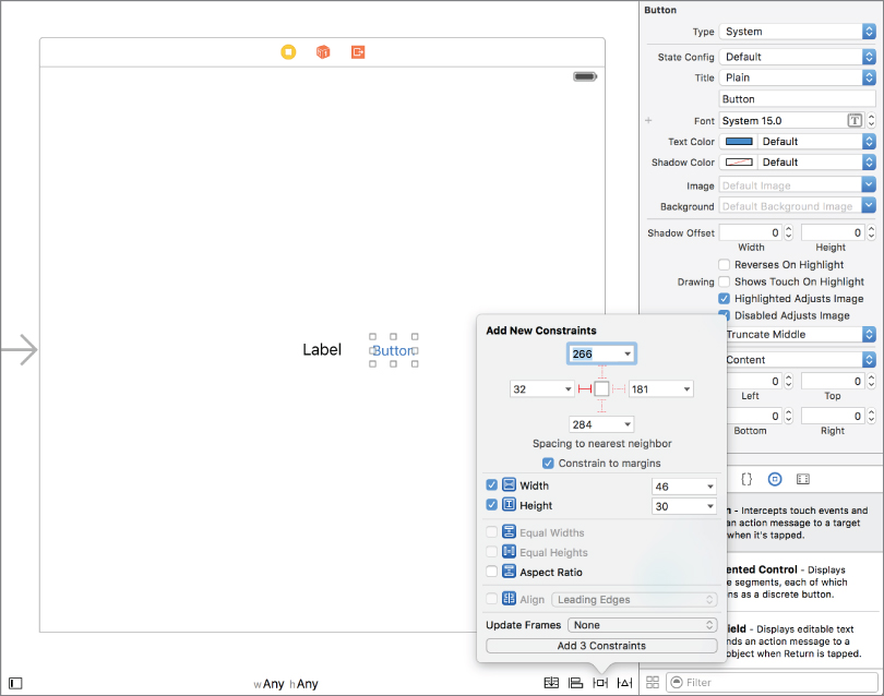
- Use the pin button to add the following constraints (see Figure 9.21)
- Pin the distance between the top of the button and its nearest neighbor in the storyboard (the label).
- Pin the height of the button.
- Pin the width of the button.

- Create an outlet in the view controller class and connect it to the label.
- Ensure the assistant editor is visible. To show it, select View Assistant Editor Show Assistant Editor. Ensure the
ViewController.swiftfile is open in the assistant editor. If it's not, use the jump bars to select it. - Right-click the label to show the context menu. Ensure you have right-clicked the label and not the layout constraint.
- Drag from the circle beside
New Referencing Outletto an empty line in theViewController.swiftfile in the assistant editor. - Name the new connection
textLabelin the popup dialog that appears and click the Connect button. The code in the assistant editor should now resemble the following:import UIKit class ViewController: UIViewController { @IBOutlet weak var textLabel: UILabel! override func viewDidLoad() { super.viewDidLoad() // Do any additional setup after loading the view, // typically from a nib. } override func didReceiveMemoryWarning() { super.didReceiveMemoryWarning() // Dispose of any resources that can be recreated. } }
- Ensure the assistant editor is visible. To show it, select View
- Create an action method in the view controller class and connect it to the Touch Up Inside event of the button:
- Right-click the button to show the context menu.
- Drag from the circle beside the Touch Up Inside event to an empty line in the
ViewController.swiftfile in the assistant editor. - Name the new method
onButtonPressedin the popup dialog that appears and click the Connect button. The code in the assistant editor should now resemble the following:import UIKit class ViewController: UIViewController { @IBOutlet weak var textLabel: UILabel! @IBAction func onButtonPressed(sender: AnyObject) { } override func viewDidLoad() { super.viewDidLoad() // Do any additional setup after loading the view, // typically from a nib. } override func didReceiveMemoryWarning() { super.didReceiveMemoryWarning() // Dispose of any resources that can be recreated. } }
- Write code to update the text of the label when the button is pressed:
- Scroll down and locate the implementation of the
onButtonPressedmethod in the Assistant Editor. - Replace it with the following code to change the text of the label:
@IBAction func onButtonPressed(sender: AnyObject) {
        textLabel.text = “Greetings mighty coder!”
}
- Scroll down and locate the implementation of the
- Run the app on the iOS Simulator:
- Use the scheme/target selector buttons on the Xcode toolbar to select an iOS simulator.
- Run the application by selecting Product Run. Tap the button and observe the text in the label change.
- Go back to Xcode and stop the app in the simulator by selecting Product Stop.