Lesson 20
Popovers and Modal Views
Popovers and modal views provide ways to temporarily display some information to users. The information that is displayed is usually contextual and related to an action performed by the user.
Both popovers and modal views interrupt the user's journey through your application; the user must interact with the popover/modal view before using the rest of the application. Popovers are dismissed by tapping outside the bounds of the popover; modal views are dismissed by using a user-defined cancel button located in the modal view. Popovers are only available on iPads, whereas modal views are available on both the iPad and iPhone.
Popovers
A popover view is one that is revealed when a control is tapped. A popover appears attached to the control that was tapped to reveal it (see Figure 20.1).

Popovers are only supported on the iPad, and should be used to display additional information related to the control that displays it. When presenting a popover, you do not provide a Done or Cancel button; popovers are dismissed when the user taps outside the popover.
To present a scene in your storyboard in a popover, simply create a popover presentation segue from a button in one of the other scenes of your view controller to the scene you wish to use within the popover (see Figure 20.2).

You can use the Attribute inspector to configure the popover presentation segue (see Figure 20.3). The Anchor attribute references a button (or bar button item) in the presenting view controller. The popover will be anchored to this control. By default, popovers are dismissed as soon as the user taps outside them. If you do not want the popover to be dismissed when some controls are tapped, you can set up the Passthrough attribute to reference them.

Modal Views
A modal view can be created in a couple of different ways; the most common is to use a Present Modally segue from a button in a scene to another scene (see Figure 20.4).

The Present Modally segue has a few presentation styles that can be set up using the Attribute inspector:
- Full Screen
- Current Context
- Form Sheet
- Page Sheet
The default setting is to present the modal view so that it takes up the entire screen. A commonly used presentation style is form sheet. On an iPhone, the form sheet presentation style and the full screen presentation style achieve identical effects. However, on the iPad, the form sheet presentation style causes the modal view to appear as a self-contained form centered in the presenting view (see Figure 20.5).

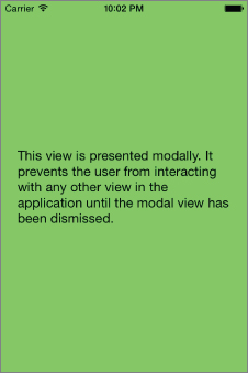
When a view is presented modally, there is no system-provided means to dismiss it and return back to the presenting view. If you do not provide a way to dismiss the modal view, then your user will be unable to use the rest of your application (see Figure 20.6).
Modal views are used when your app needs to collect some vital information before proceeding. Typically you add a close button in the modal view that, when tapped, will dismiss it. You cannot use a segue to dismiss a modal view; instead you must call the dismissViewControllerAnimated method on the modal view controller. This method allows you to provide an optional completion handler that is executed when the modal view is dismissed.
@IBAction func onDismissModalView(sender: AnyObject) {
        self.dismissViewControllerAnimated(true, completion: nil);
    }
If you do not wish to use a segue, you can alternately present a scene in your storyboard modally by using the following code snippet attached to a UIButton instance in the presenting view controller:
@IBAction func onPresentModalView(sender: AnyObject) {
        let modalViewController:ModalViewController =
(self.storyboard!.instantiateViewControllerWithIdentifier
("ModalViewController") as? ModalViewController)!
        modalViewController.modalPresentationStyle =
 UIModalPresentationStyle.FormSheet
        self.presentViewController(modalViewController,
animated: true, completion: nil)
    }
Try It
In this Try It, you create a simple iPad-only application based on the Single View Application template called PopoverTest, which displays an image and some information on the image in a popover.
Lesson Requirements
- Launch Xcode.
- Create a new iPad-only project based on the Single View Application template.
- Create a storyboard with multiple scenes.
- Use Interface Builder to create segues between scenes.
- Present a scene in a popover.
Hints
- When creating a new project, you can use your website's domain name as the Company Identifier in the Project Options dialog box.
- To show the Object library, select View
 Utilities Show Object Library.
 - To show the assistant editor, select View Assistant Editor Show Assistant Editor.
Step-by-Step
- Create a Single View Application in Xcode called
PopoverTest.- Launch Xcode and create a new application by selecting File New Project.
- Select the Single View Application template from the list of iOS project templates.
- In the project options screen, use the following values:
- Product Name: PopoverTest
- Organization Name: your company
- Organization Identifier: com.yourcompany
- Language: Swift
- Devices: iPad
- Use Core Data: Unchecked
- Include Unit Tests: Unchecked
- Include UI Tests: Unchecked
- Save the project onto your hard disk.
- Launch Xcode and create a new application by selecting File
- Add image resources to your project.
- Ensure the project navigator is visible. To show it, select View Navigators Show Project Navigator.
- Open the
Assets.xcassetsfile by clicking on it in the project navigator. - Navigate to the
Imagesfolder in this chapter's download from the book website. - Create a new image set using Editor New Image Set and name this new image set
Sunflower. - Drag the
Sunflower_1x.jpg,sunflower_2x.jpg, andSunflower_3x.jpgimages from this chapter's resources into the appropriate placeholders in the image set.
- Ensure the project navigator is visible. To show it, select View
- Add user interface elements to your storyboard's scene.
- Add a toolbar to the bottom of the scene.
- Using the Object library, add a Toolbar to the bottom of the storyboard scene.
- Ensure the toolbar is selected and use the Pin button to display the constraints editor popup.
- Ensure the Constrain to margins option is unchecked.
- Pin the distance between the left edge of the view and the toolbar to 0.
- Pin the distance between the right edge of the view and the toolbar to 0.
- Pin the distance between the bottom of the view and the toolbar to 0.
- Pin the height of the toolbar to 44.
- Click the Add 4 Constraints button to dismiss the constraints editor popup.
- Update the frames to match the constraints you have set.
- Click on the View controller item in the dock above the storyboard scene. This is the first of the three icons located directly above the selected storyboard scene.
- Select Editor Resolve Auto Layout Issues Update Frames.
- Edit the toolbar.
- Select the default bar button item in the toolbar and rename it to Image Information.
- Add a
UIImageViewinstance to the default scene.- Use the Object library to add an
Image Viewto the default scene of the storyboard. Place it above the tab bar.
- Use the Object library to add an
- Ensure the image view is selected and use the Pin button to display the constraints editor popup.
- Ensure the Constrain to margins option is unchecked.
- Pin the distance between the left edge of the view and the image view to 0.
- Pin the distance between the right edge of the view and the image view to 0.
- Pin the distance between the bottom of the image view and the tab bar to 0.
- Pin the distance between the top of the view and the image view to 20.
- Click the Add 4 Constraints button to dismiss the constraints editor popup.
- Update the frames to match the constraints you have set.
- Click on the View controller item in the dock above the storyboard scene. This is the first of the three icons located directly above the selected storyboard scene.
- Select Editor Resolve Auto Layout Issues Update Frames.
- Using the assistant editor, create an outlet for the image view in the view controller class called
imageView.
- Add a toolbar to the bottom of the scene.
- Add code to the view controller class.
- Add a variable declaration to the view controller class.
var image:UIImage! - Add the following snippet to the end of the view controller's
viewDidLoadmethod to load an image and set up the image view:image = UIImage(named: "Sunflower") imageView.image = image imageView.contentMode = UIViewContentMode.ScaleAspectFit - Add the following implementation of the
prepareForSegue(segue: sender:)to the view controller class.override func prepareForSegue(segue: UIStoryboardSegue, sender: AnyObject?) { if segue.identifier == "imageInformationSegue" { let viewController:ImageInformationViewController = segue.destinationViewController as! ImageInformationViewController viewController.imageBeingDisplayed = self.image } }
- Add a variable declaration to the view controller class.
- Create an additional view controller scene.
- Use the Object library to drag and drop a new View Controller scene onto the storyboard.
- Create a new Cocoa Touch class called
ImageInformationViewControllerby selecting File New. Ensure the class is a subclass of UIViewController(see Figure 20.7).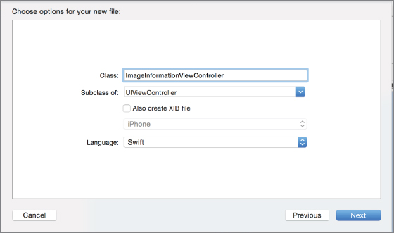
- Select the new scene in the storyboard and switch to the Identity Inspector (View Utilities Show Identity Inspector).
- Change the Class attribute of the scene to
ImageInformationViewController.
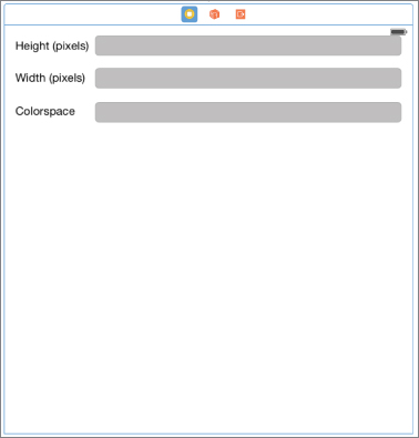
- Add user interface elements to your new scene.
- Add three labels to the scene.
- Using the Object Library, drag and drop three labels onto the scene, position them one below the other, and name them Height (pixels), Width (pixels), and Colorspace.
- Add three text fields to the scene.
- Using the Object Library, drag and drop three text fields onto the scene; position them one below the other and beside the three labels you have created in the previous step.
- Use the Attribute inspector to change the background color of the three text fields to a shade of dark gray.
- Create layout constraints for each of elements on the storyboard scene using the information in Table 20.1. When creating layout constraints using the pin constraints dialog box, ensure the Constrain to margins option is unchecked.
Table 20.1 Layout Constraints
Element Left Top Right Width Height Height (label) 16 20 115 21 Height (text field) 24 0 16 30 Width (label) 16 26 115 21 Width (text field) 24 18 16 30 Colorspace (label) 16 26 115 21 Colorspace (text field) 24 18 16 30 - Update the frames to match the constraints you have set.
- Click on the View controller item in the dock above the storyboard scene. This is the first of the three icons located directly above the selected storyboard scene.
- Select Editor Resolve Auto Layout Issues Update Frames.
- Your scene should resemble Figure 20.8.
- Use the assistant editor to create outlets for each of the text fields in the
ImageInformationViewController.swiftclass. Name the outletsimageHeight,imageWidth, andimageColorSpace.
- Add three labels to the scene.
- Update the
ImageInformationViewController.swiftfile to display information on the image file.- Add the following variable declarations to the file:
var imageBeingDisplayed:UIImage! - Update the
viewDidLoadmethod in theImageInformationViewController.swiftfile to resemble the following:override func viewDidLoad() { super.viewDidLoad() let imageSize = imageBeingDisplayed.size let height = imageSize.height let width = imageSize.width imageHeight.text = "\(height)" imageWidth.text = "\(width)" imageColorSpace.text = "RGB" }
- Add the following variable declarations to the file:
- The code in the
ImageInformationViewController.swiftfile should now resemble the following:import UIKit class ImageInformationViewController: UIViewController { @IBOutlet weak var imageHeight: UITextField! @IBOutlet weak var imageWidth: UITextField! @IBOutlet weak var imageColorSpace: UITextField! var imageBeingDisplayed:UIImage! override func viewDidLoad() { super.viewDidLoad() let imageSize = imageBeingDisplayed.size let height = imageSize.height let width = imageSize.width imageHeight.text = "\(height)" imageWidth.text = "\(width)" imageColorSpace.text = "RGB" } override func didReceiveMemoryWarning() { super.didReceiveMemoryWarning() } } - Create a segue from the Image Information bar button item in the first scene to the Image Information View Controller scene.
- Select the Image Information bar button item in the first scene.
- Ctrl+drag from the bar button item to the second scene. On releasing the mouse button, you will be presented with a context menu that lets you select the segue type. Select
Popover Presentationfrom the list. - Select the segue in the scene and use the Attribute inspector to set its identifier attribute to
imageInformationSegue.
-
Test your app in the iOS Simulator.
Click the Run button in the Xcode toolbar. Alternatively, you can select Project
Run.