A view from design space
Greg McInerny
The promise
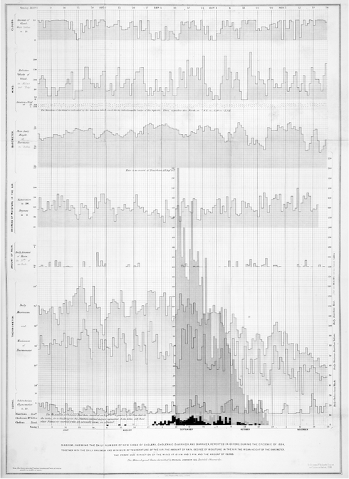
Anything can be visualized – whether it is financial trends, phylogenetic relationships, partisanship in senate voting patterns or even the concept of evolution (Figure 2.12.1). Visualizing data brings quantities, forms and relationships into view when the subject matter is minuscule or distant, abstract or intangible, transient or multiscale.
Visualizing data can be essential to making sense of data by enabling discoveries and increased understanding. Visualizations can also facilitate education and enjoyment, and have even become cultural icons. As a new ‘photojournalism’ (Stefaner 2014), visualizing data can reveal unseen issues; such as when a humble chart catalysed the creation of the Bill and Melinda Gates’ foundation – ‘that rotavirus slice in the pie chart set us on fire’ (Gates 2013).
Visualization tools make businesses intelligent, allowing us to ‘Answer questions as quickly as you can think of them’ (TableauTM 2010). This might be unsurprising. When we visualize, we wire data into our cognition via advanced graphics technologies and the highly evolved human visual system. More information is consumed ‘through vision than through all of the other senses combined’ (Ware 2012), so why consume information any other way? As Peter Hall (2008) suggests, as data and information inundate our lives, ‘diagrams, maps, and visualisation tools offer a means to filter and make sense of it’.
Do visualizations visualize?
But that is only the promise. Peter Hall (2008) closed the statement above with a caveat – ‘to visualise it is to understand it, or so we hope’.
When data are visualized ineffectively, the invisible is not necessarily made visible. No matter what level of promise the information industries bestow on visualization, ‘to visualize’ is not always a guarantee that discoveries or sense will be made. Rendering data in visual objects is not always sufficient. Not all pictures are worth a thousand words. Not all visualizations ‘visualize’.
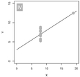
Consider Anscombe’s Quartet (Anscombe 1973), a quintessential example of visualization where inspecting the data or a simple statistical investigation reveals little information (Figure 2.12.2). Yet when the Quartet is ‘visualized’ patterns immediately pop out and ideas spark (Figure 2.12.3).
Anscombe’s demonstration has, however, been staged. It depends on a particular graphical representation, where the categories are separated across multiple graphs that have common scales. This staging can easily be undermined (Figure 2.12.4) by encoding data in ways our perception does not instinctively decode, or that our cognition cannot translate. If our perception and cognition fail, does a visualization actually visualize?

Figure 2.12.2 Anscombe’s Quartet, as seen as raw data (left) and simple exploratory statistics (right) (after Anscombe 1973).

Figure 2.12.3 Visualizing Anscombe’s Quartet, an example that features in very many books and teaching materials (after Anscombe 1973).

Figure 2.12.4 Reducing the effectiveness of Anscombe’ s Quartet. (A) The original rendition; (B) with data increased by 1,000; (C) individual panels scaled to focal variables; (D) one plot with overlaid symbols; (E) and then perceptually informed symbols (see Ware 2012); and finally (F) a 3D surface.
Design Space
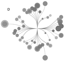
Visualizations are often described by the constraints from which they were designed, such as the resources to be used (e.g. data, tools, media), the tasks to be enabled (e.g. to locate, compare, reflect) and the context of use (e.g. users, situation, device). For example, various renditions of Anscombe’s Quartet (e.g. Anscombe 1973; Figure 2.12.5) share the analytical goal of visualizing patterns and trends, with the specified data. Most of these renditions aim to demonstrate the power of ‘visualization’ and a few aim to examine frailties in the generality of that claim (Figures 2.12.4 and 2.12.5).
Any single design is just one realization of the design constraints, with alternative designs arising when the data (Figure 2.12.4B) or media change (Figure 2.12.4F), or when non-standard plots are required (Figure 2.12.5). Divergent designs might arise from the same design constraints (Figure 2.12.6), and differing design constraints might produce convergent designs. A discussion of ‘visualization’ – whether as objects, a set of methods or a subject – could be hindered by our predisposition to viewing visualization through the design constraints that can also define function and how function is evaluated.
To shed some of these inbuilt values and perspectives, we could consider visualizations as collections of visual objects and nothing more, and consider all design possibilities, even those that have not been made material. We can use this ‘Design Space’ as a shorthand term for the infinite variation of visualizations. Some areas in this space will have a use, or multiple uses, and some will have no conceivable purpose. Design Space is envisaged as a hyper-volume of all possible visualization designs with as many dimensions as there are ways to visualize data using coordinate and mapping systems, visual encodings and formatting, scales and sizing, sampling and aggregation methods, etc.


Figure 2.12.5 Further variations on Anscombe’ s Quartet: (A) A tribute to George Nees’ 1964 computer drawing ‘23-ecken’ (note the discovery of spectacles in the X variable of category 4); (B) chord diagrams; (C) radar plots comparing the row values; and (D) with inspiration from Jan Willem Tulp’s ‘Ghost Counties’ but designed to reveal nothing in particular.
There are issues with this definition of Design Space, but its vagueness forces us to reflect on how we define, evaluate and interpret visualizations. Different disciplines can impose highly specific views onto qualities such as ‘effectiveness’ or ‘beauty’, and how visualizations might be used and created. In what follows, we will explore topics such as function, technology, aesthetics and our approaches to studying visualization. To start, let us consider if Design Space might be charted, and what parts of this n-dimensional space ‘work’?
Lost in Design Space
Many books and blogs assist the craft of visualizing data, by suggesting how to visualize data effectively using different coordinate systems, visual encodings, patterns of emphasis and data manipulations. Each perspective, however, will at some point fail. Visualization ‘rules’ are often drawn from experimental evaluations that compare simplified, tractable compartments of Design Space. As visualization science lacks a wholly predictive theory (Kindlmann and Scheidegger 2014), the science accumulates contingent rules to understand and compare the relative suitability of designs given specific data types or tasks. Rather than providing a reliable rule-based mapping between designs and their properties, these studies instead point to the unavoidable difficulties of a predictive theory as there are instabilities in Design Space where the properties of a design depend on the data. In Design Space, contingency reigns.
For example, even simple datasets can experience conflicts between the ‘rules of thumb’ that should assist us when visualizing data, such as when different categories conflict in their demands for a truncated axis (an axis not starting at zero) or demand differing aspect ratios (the relative dimensions of the plot) (Figure 2.12.7). When visualizing data, it might be inevitable that we hide some patterns as we reveal others. Patterns can be a composite of features that might be optimally revealed in different kinds of charts and not viewable in any single graph.
Even in a simple chart, the accuracy of comparing different data combinations may vary widely (Figure 2.12.8) suggesting that information cannot always be reliably retrieved. We could then say, with some confidence, that visualizations are intrinsically biased, each design having its own hallucinatory or jumbling effects (e.g. Kindlmann and Scheidegger 2014) that are specific to the visualization technique or the data, or both. Despite the wealth of visualization research, it is easy to get lost in Design Space.

Figure 2.12.7 Visualizing two data series with contrasting demands in one graph. In the top row (A), the details of the grey oscillation are revealed by stretching the graph. More detail is seen by squashing the y-axis (B), which increases the aspect ratio further, showing the different rates of increase and decline. However, the pattern in the black data becomes increasingly hidden. Each stretch, and each squash, flattens the black pattern. More could be seen of the black data in the thinnest and, relatively, tallest plot (left hand side of A) where the grey data was least visible. By zooming in the detail of trend, and fine scale oscillations around that trend, are shown for the black data (C–E), but at the expense of the grey data. In (E) we have contravened what some might call a golden rule by truncating the y-axis. The format of a graph might not always suit all the patterns it contains. Arbitrary data selections were downloaded and modified from www.sidc.be/silso/datafiles and for the Waddington data station http://data.giss.nasa.gov/gistemp/stdata/.

Figure 2.12.8 As shown by visualization studies (e.g. Talbot, Setlur and Anand 2014), making comparisons within a single chart is subject to a variety of position dependent errors. Comparisons of size are not equally accurate for the data highlighted in each chart. Where the data are categorical a designer would select the ordering, or enforce an arbitrary ordering such as alphabetical order, but each design will affect what is seen in different ways.
Degrees of freedom
Design Space might initially appear to be small for simple data sets. For instance, a scatterplot might seem the only choice when visualizing two vectors of continuous data, such as for a category in Anscombe’s Quartet (e.g. XP YI in Figure 2.12.2). Yet the axes of a scatterplot can be aligned to produce a parallel-coordinates plot, then bent to simulate a chord diagram or hive plot, or the values can be summed for a stacked bar chart, which can be bowed into a pie chart and then punctured to produce a donut plot. Each jump in Design Space can modify the meaning and information content (Figures 2.12.3, 2.12.4 and 2.12.5), even when the symbols, shapes and scales are unchanged.
More and more degrees of freedom are presented to the designer as data increase in their dimensionality or become dispersed in complex ways, or if the data contain multiscale attributes or lack intrinsic ordering. As data become complicated there are more and more ways to sample and aggregate, and then to lay out, arrange and format the visual encodings. A designer can simultaneously reduce and increase the dimensionality of data by aggregating and framing the data, and introducing emphasis and interpretations that do not appear in the ‘raw’ data. Any particular design can, then, be considered as both arbitrary and specific.
Designed by defaults
Without armies of avid draughtspersons, software are essential for mapping data within visual objects. Nonetheless, software coerces as it enables by suggesting, or insisting on, idioms that represent small portions of Design Space. These idioms need not neatly map onto designers’ goals, or the data’s structure, or even the best practices proposed by visualization research. For example, defaults do not always enable the ‘small multiples’ (Tufte 1990) rendition of Anscombe’s Quartet without some tinkering. For more bespoke or artistic visualizations – that often inspire us to visualize (e.g. Figure 2.12.1(f)) – software might lack the templates and analytical functions necessary to emulate these works.
Different software reveal and optimize different design possibilities, determining what can be defined and manipulated programmatically, or otherwise. For instance, data manipulation and analysis might be easier in some software (R; www.r-project.org/), whereas control over the form of shapes and interactivity is easier in others (Processing; https://processing.org) and interactive web applications might be more naturally created elsewhere (P5; https://p5js.org/ and D3; https://d3js.org/). Each software offers a different view of Design Space. Spreadsheet applications can launch users towards apparently polished forms, but designing beyond the defaults requires flexibility within software, and the facilities to create new templates and functions in code, or by other means. Design Space is too vast, and its contingencies too many, to be entirely contained within defaults.
Points of view
In his book review entitled ‘Pretty vacant’, Kevin Walker (2014) critiques the apparent hollowness of some visualizations which substitute function and precision with frivolity and fun. Despite being more likely to reside in coffee table books than to inform system-critical decisions, these ‘vacant visualizations’ can face incredibly strong criticisms that have included censorship campaigns. Neither art nor science, these visual stories do not necessarily claim any grand discoveries or offer experiential epiphanies. The vigorous critique is often aimed at explorations in Design Space that go beyond the software defaults.
However, the differences in this ‘infographic’ genre are not always recognized when it is critiqued. Vacant visualizations may use ‘fun’ illustrations and pictograms that aid memorability and recall (Borkin et al. 2015) and so improve understanding in ways that pared-back graphs cannot. This does not stop purists being concerned with the use of chart junk, in what they might already consider to be junk charts. Other approaches that use ‘arbitrary encodings’ (those that must be learnt through the visualization itself (Ware 2012)) are more readily accepted due to their apparent aesthetic qualities. Some propose that arbitrariness might stimulate deliberative reasoning which could benefit comprehension (Hullman, Adar and Shah 2011). This strategy might only work when aesthetics seduce the reader sufficiently for them to invest in decoding the images, though the seduction need not lead to anything more.
For the designer Georgia Lupi (2012), her approach is to use ‘non-linear story telling’ where multiple layers of information are overlaid in what others might deem to be ornamentation or complication of a design. Lupi says this method is ‘just ours’ (Lupi 2012), with no claims to advance visualization techniques in general. Rather than aiming for dimension reduction to optimize information retrieval, this artistic approach adds dimensionality to optimize interest. By intertwining what other disciplines would remove or separate into multiple panels, a more sublime, aesthetic appeal can be produced in designs that are cryptic despite using familiar forms of visual encoding. Not all areas of Design Space can be understood by studies that seek to minimize response times. Design Space can be understood in many opposing ways. Without stepping back from our own point of view there is a lot we can miss.
20/20 visualization
How we see the subject of visualization and see Design Space can be determined by a critical condition; a ‘visualization myopia’ that develops when research predominantly focuses on the design and interpretation of visualizations up to and including cognition. Perhaps this visualization myopia originates from an academic community rooted in computer graphics, and that reaches into perceptual and cognitive sciences. Then, Design Space is understood in most detail through functional errors revealed by experiments and through user-study reports on designing with-science, for-science.
Other perspectives obviously exist, each with its own characteristic focus and reciprocal myopias – such as an artist focused on unmapped techniques, or digital methods researchers focused on new translations. When visualizing data we are confronted with complementary, but distinctive approaches that have alternative views of how Design Space might be mapped (if it has to be), and how dimensions such as functionality, aesthetics and technology might be positioned in relation to Design Space. Design Space is, then, a key pivot point for all areas of study: a shared space within and onto which multiple values and perspectives can be imposed. Without looking out from Design Space on to visualization we could miss a 20/20 view of what happens when we visualize data.
These myopias share a lack of understanding of what happens post-cognition, after the visual is seen. What impact do visualizations actually have? And those that do not really visualize? Do visualizations reconfigure and feed back into cultural and socio-technical systems? And how do they do that? After all, the legend where the discovery of cholera transmission hinged on a visualization ignores that map’s purpose and other forms of information and knowledge upon which decisions were made (Brody, Rip, Vinten-Johansen, Paneth and Rachman 2000; and see Figure 2.12.9). Similarly, a graph might not have averted the space shuttle disaster on its own (Robison, Boisjoly, Hoeker and Young 2012). In the wilds beyond the interfaces of engineers or economists or experimentalists, we engage with and respond to visualizations among a host of other data, information and knowledge.
The visible spectrum
Right now we are exposed to the broadest spectrum of visualization expertise, literacy, use, tools and interest that has ever existed. At one set of extremes we have the purer reflections of the promise, where inspirational bespoke interactive visuals have inspired large changes in the practices, structure and audiences of influential organizations. At the other extremes are people who do not know what visualizations are and do not use digital technologies.
This spectrum offers diverse opportunities to develop lenses to see beyond our myopias and beyond the myopic brouhahas of data-ink ratios. Probing this spectrum could help define and reconcile how Design Space might be mapped to concepts beyond functionality and
aesthetics, such as visual cultures, power and the construction of knowledge. At present, we often navigate these issues with speculation and opinions that do not challenge how our myopias determine what we see.
We know that data are, by definition cooked, maps are not the territory, and that visualizations are biased propositions. These issues of representation are not always revealed when inferences about data and systems are made using a visualization, nor in our analyses of how we visualize data. The question is, then, how visualizations elicit change as a joint function of data, design, technology, perception, cognition, cultures and socio-technical systems. Novel interdisciplinary approaches are undoubtedly needed to look out from Design Space, into this spectrum, with the aim of developing a 2020 view of visualizing data.
References
Anscombe, F. J. (1973). Graphs in statistical analysis. American Statistician, 27(1): 17–21.
Borkin, M., Bylinskii, Z., Kim, N., Bainbridge, C., Yeh, C., Borkin, D., Pfister, H. and Oliva, A. (2015). Beyond memorability: visualization recognition and recall. IEEE Transactions on Visualization and Computer Graphics, 22(1): 519–528.
Brody, H., Rip, M. R., Vinten-Johansen, P., Paneth, N. and Rachman, S. (2010). Map-making and myth-making in Broad Street: The London cholera epidemic, 1854. The Lancet, 356: 64–68.
Gates, B. (2013). Bill Gates: Dimbleby lecture. [online] Retrieved 6 July 2016 from: www.gatesfoundation.org/media-center/speeches/2013/01/bill-gates-dimbleby-lecture
Hall, P. (2008). Critical visualization. In P. Antonelli (Ed.) Design and the Elastic Mind (pp. 122–131). New York, NY: Museum of Modern Art, Harrison.
Hullman, J., Adar, E. and Shah, P. (2011). Benefitting InfoVis with visual difficulties. IEEE Transactions on Visualization and Computer Graphics, 17(12): 2213–2222.
Kindlmann, G. and Scheidegger, C. (2014). An algebraic process for visualization design. IEEE Transactions on Visualization and Computer Graphics, 20(12): 2181–2190.
Lupi, G. (2012). Non-linear storytelling: journalism through ‘Info-spatial’ compositions. Parsons Journal for Information Mapping, IV(4): 1–11.
Robison, W., Boisjoly, R., Hoeker, D. and Young, S. (2002). Representation and misrepresentation: Tufte and the Morton Thiokol engineers on the Challenger. Science and Engineering Ethics, 8(1): 59–81.
Stefaner, M. (2014). Worlds, not stories. [online] Retrieved 6 July 2016 from: http://well-formed-data.net/archives/1027/worlds-not-stories
Tableau (2016). Answer questions as fast as you can think of them. [Online] Retrieved 29 April 2016 from: http://get.tableau.com/trial/p3group.html?width=300&height=300&inline=true
Talbot, J., Setlur, V. and Anand, A. (2014). Four experiments on the perception of bar charts. IEEE Transactions on Visualization and Computer Graphics, 20(12): 2152–2160.
Tufte, E. R. (1990). Visual Explanations: Images and Quantities, Evidence and Narrative. Cheshire, CT: Graphics Press.
Walker, K. (2014). Pretty vacant: what we’re not seeing in graphics today. New Scientist. [Online] Retrieved 6 July 2016 from: www.newscientist.com/article/mg22429991-700-pretty-vacant-what-were-not-seeing-in-graphics-today/
Ware, C. (2012). Information Visualisation: Perception for Design (3rd ed.). Burlington, MA: Morgan Kauffman.


