PHOTO BY BLAKE PATTERSON. LICENSED UNDER THE CREATIVE COMMONS 2.0 ATTRIBUTION LICENSE.
FIGURE 32.1 Simple, effective slides augment a presentation; they are not the presentation.
[W]e shouldn’t abbreviate the truth, but rather get a new method of presentation.
—EDWARD TUFTE
Poor presentation is killing creativity in corporate America as millions are forced to sit through boring, poorly thought-out, waste-of-time presentations. Earlier in my career, I was pitching a new game to a board of decision makers at Electronic Arts when one executive producer who was on his BlackBerry the whole meeting interrupted me: “Why aren’t there any words on your slides? Where’s the content?” I was taken a bit aback. I was talking about a visual feature, explaining it in sequence with a number of diagrams. I muttered something like “That’s... that’s... exactly what I’m explaining right now.” He looked back down at his BlackBerry. “I don’t listen to presentations. I just read the slides.” If he just wanted text to read, I could have emailed it to him. That would have saved everyone time, since everyone in the group could have read it at their leisure. But a meeting was called to discuss the new idea in a group.
The problem is that most presentations are just people reading slides aloud in a group environment—an activity that wastes everyone’s time and is less effective for idea retention. A kind of Stockholm Syndrome sets in and people assume that this is what presentations must be, so they build up defenses like that executive producer; he’d spend the first few seconds of each slide reading the text and the rest of the presentation on his BlackBerry waiting for the presenter to catch up. It doesn’t have to be that way.
PowerPoint and other slideware (a term coined by Edward Tufte to describe programs such as PowerPoint and Keynote) usage is only symptomatic of a larger problem: People do not know how to organize and present ideas. In this chapter, I’ll use slideware as the primary vector for delivering ideas to an audience. However, oral presentations do not always need slides. In fact, slides often hurt the audience’s retention of the presented ideas. Luckily, many of the techniques I talk about here are applicable to other forms of persuasive communication as well.
There has to be a reason for each presentation. No one just wanders into a presentation for fun or just randomly types out words to make a slide deck. The presenter is there to get some idea across and the audience is there to understand it. The “it” is the thesis.
One helpful heuristic for developing a thesis is to think about Twitter. On Twitter, users are confined to completing a message in 140 characters or less. If you only have 140 characters, how will you explain your idea? This constraint forces you to boil your idea down to the essence of your tweet. Some places like to use the concept of the “elevator pitch.” In it, you imagine you have a decision-maker’s time only from the moment she gets on an elevator on the first floor to the time the elevator reaches the top floor and she gets off. You have a minute or less to give her the salient points. Presentations should operate similarly. You should be able to sum up the presentation itself quickly, but you should also be able to sum up each individual point quickly.
Imagine that you need to present a complex board game to a potential investor. You have done all your homework in advance—designing and refining, doing market research, estimating costs, and so forth. You have a ton of information to present. But if you have only 140 characters, what do you say? A recent study of venture capital pitches showed that slide presentations for successful pitches lasted only 3 minutes and 44 seconds on average.1 Luckily, if you follow the procedures in this book (specifically, those in Chapter 2), you will have a problem statement from which to draw. The problem statement makes a good thesis for covering the whole “what” of a game.
1 Cutler, K. (2015, June 8). “Lessons From a Study of Perfect Pitch Decks: VCs Spend an Average of 3 Minutes, 44 Seconds on Them.” Retrieved June 10, 2015 from techcrunch.com/2015/06/08/lessons-from-a-study-of-perfect-pitch-decks-vcs-spend-an-average-of-3-minutes-44-seconds-on-them/.
Slideware suggests that users break down content into individual slides and it defaults to bulleted lists. Not surprisingly, few presenters diverge from using walls of text and bullets. When one graph of text fills up the screen, they move on to the next slide. For the typical presenter, bulleted lists serve to chop up narratives into pieces that fit visually on a slide based on arbitrary font and layout decisions instead of being based on the organization of information.
Instead, a better organizational pattern is to break up a thesis into subtopics, each with its own thesis. This ensures that each slide has a purpose and is focused on achieving that purpose instead of merely serving as a repository for text.
Despite the vast repository of free and evocative images and the ease with which presenters can create graphs and charts to support their arguments, the dominant use of the slide presentation is to create bulleted lists of text items that the presenter reads. Research has shown that it is more difficult to process information when it is simultaneously spoken to an audience and presented as text.2 So while a presenter reads a slide aloud to the audience, the audience struggles to reconcile the words it hears with the text it is currently reading. The average audience can read much faster than you can easily talk: The comparison is 100 to 160 words per minute for aural presentation to 300 to 1,000 words for visual. Avoid reading the text on your slide aloud at all costs.
2 Tufte, E. R. (2003). The Cognitive Style of PowerPoint (Vol. 2006). Cheshire, CT: Graphics Press.
The average PowerPoint slide has 40 words.3 This is far too many. Marketer and author Seth Godin limits his slides to six words at the most.4 Steve Jobs, who crafted some of the most effective presentations in the world, was known for slides with just a few words or a statement and a subtle gradient background (FIGURE 32.1).
3 Medina, J. (2008). Brain Rules: 12 Principles for Surviving and Thriving at Work, Home, and School. Seattle, WA: Pear Press.
4 Godin, S. (2007, January 27). “Really Bad PowerPoint.” Retrieved May 11, 2015, from http://sethgodin.typepad.com/seths_blog/2007/01/really_bad_powe.html.
PHOTO BY BLAKE PATTERSON. LICENSED UNDER THE CREATIVE COMMONS 2.0 ATTRIBUTION LICENSE.
FIGURE 32.1 Simple, effective slides augment a presentation; they are not the presentation.
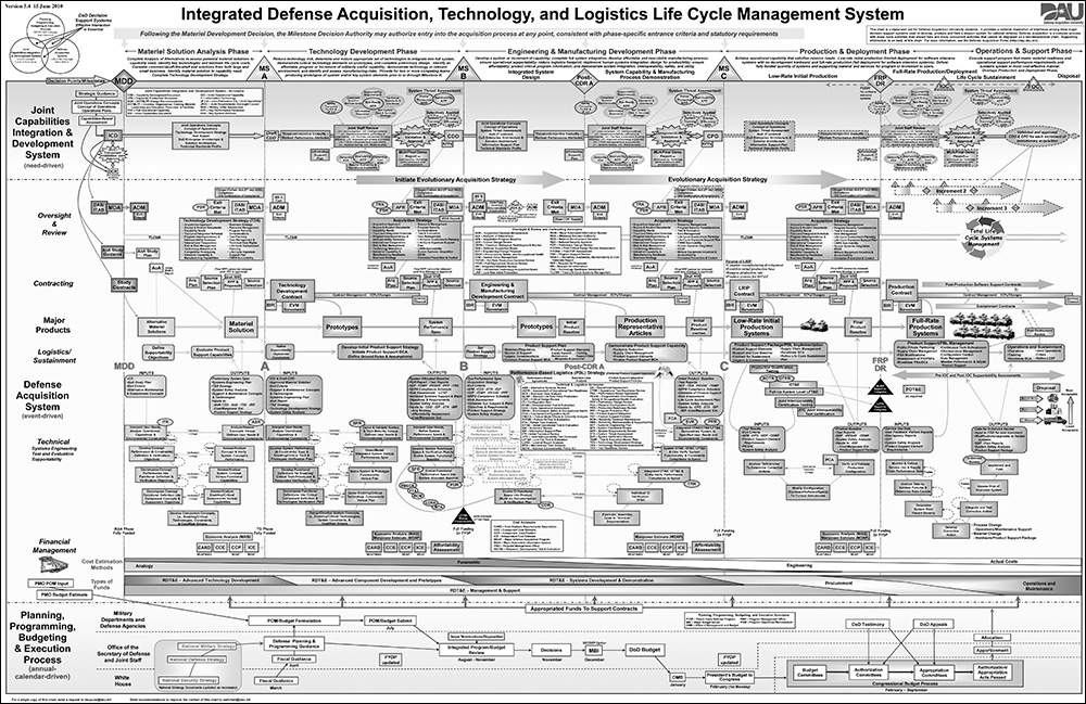
In a typical presentation, the slide would perfectly augment the thesis Jobs wanted to talk about. The audience briefly scanned the information and then returned their attention to Jobs to hear continued information. Compare the slide in Figure 32.1 to one from 2010 that purported to help explain the acquisition process in the US Department of Defense (FIGURE 32.2).
IMAGE IN THE PUBLIC DOMAIN VIA DEFENSE ACQUISITION UNIVERSITY.
FIGURE 32.2 This is a slide that is easy to take in at a glance, isn’t it?
Some use slides as cue cards to remind them of what they need to talk about. There is a place for being reminded about key points to present; however, the place is not on the slide itself. It is perfectly acceptable to use cue cards to remind yourself of the order and specificity of facts. If you feel you must have a bulleted list, a private cue card is the place to print it. A visible cue card that you show to the audience, however, reveals all your information at once.
And what if you do not have anything to show at this point? Perhaps a particular point does not need any imagery or text. In that case, show nothing. Pressing B on PowerPoint or Keynote presentations brings up a black screen. Use this technique when the audience seems so into slides that they cannot focus on you. Remember that the presenter should be the focus of the presentation. The slides are there to augment the presenter. Not the other way around! You are not presenting to explain your slides; your slides just help you explain your thesis.
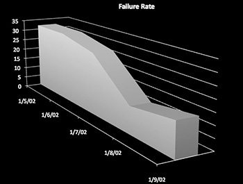
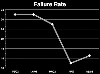
In his book, The Visual Display of Quantitative Information, Edward Tufte relates the concept of data-ink.5 In a presentation, data-ink is ink that you cannot remove from a slide without also losing information. A line that connects data points on a chart is data-ink because it shows the relationship between two points. However, a 3-D representation (FIGURE 32.3) of a linear relationship is non-data-ink because you can compress it to a 2-D version (FIGURE 32.4) without removing any information. Something with low data-ink has more of the visual representation taken up by decorative elements rather than data elements. In many cases, this makes the data harder to read. If the point of the slide is to convey data, then you want to convey that data as directly as possible.
5 Tufte, E. R., & Graves-Morris, P. R. (1983). The Visual Display of Quantitative Information (Vol. 2). Cheshire, CT: Graphics Press.
Tufte recommends that you remove non data-ink whenever possible. However, research has shown that a minimal amount of non-data-ink can be helpful.6
6 Inbar, O., Tractinsky, N., & Meyer, J. (2007, August). “Minimalism in Information Visualization: Attitudes Towards Maximizing the Data-Ink Ratio.” In Proceedings of the 14th European Conference on Cognitive Ergonomics: Invent! Explore! (pp. 185–188). New York, NY: ACM Press.
FIGURE 32.3 A low data-ink slide. You do not need the slide to have perspective and a depth dimension. It makes it harder to read where the graph intercepts the date and rate elements. For instance, what is the failure rate on January 7th?
FIGURE 32.4 A high data-ink version of the graph. This is much easier to evaluate. The failure rate on January 7th was around 28 percent.
Anyone who has sat through many presentations, especially those from novices, has been subject to the presenter who is in love with splashy transitions, sound effects, and other flash. Even if the content of the presentation is good, audiences have to wait for noisy transitions to build, wasting audience time and adding often undue pauses to the flow of information. A good rule of thumb here is to remember that no one ever closed a deal by having clever transitions; they closed deals by being persuasive. Leave the animations at home unless they help illustrate a point.
Data-ink is a more precise way of measuring the signal-to-noise ratio of a presentation. What elements of the presentation are “signal,” that is, communicating persuasive information? What elements are “noise,” that is, existing as excess elements that distract from the persuasive elements? A presentation designer’s job should be to eliminate noise whenever possible.
A list of common “noise” elements in presentations include:
• Irrelevant images
• Bullet points when items do not work as a list, or a bulleted hierarchy when items are not hierarchical
• Text that is too small or too low-contrast for an audience member in the back row to easily read
• A company logo or template cruft on every slide (nobody cares about your company’s logo except your company)
• Long animations that do not deliver information
Prezi, while a wonderful presentation tool in many ways, makes it easy to add nausea-inducing camera movements that are completely unnecessary. Prezi is great if you need to show part of a larger figure and need to reiterate the relationship of parts to a whole, but it is noisy when you use it just to fly around a largely text-based presentation.
• Unnecessary font or color changes
• Sound effects or video that do not deliver information
• Gradients that make text or images ugly or difficult to read
I listen to many student presentations every year. Nearly every single one contains extraneous time wasters. One of the biggest time wasters I come across is students explaining the obvious. If I have scheduled time to watch your project presentation, you do not need to say, “Hi, my name is Adam Fakename, and this is my presentation for GDN-1234 for Mr. Hiwiller’s class.” I know all that. That is why I’m here. And it’s already on your title slide.
Team presentations are even worse at controlling overhead. I have lost count of the number of team-based presentations I have seen in my life where the team of four splits 20 slides into four equal parts. At the end of every fifth slide, the presenter goes, “And now I will hand it off to Steve, who will talk about the demographics.” She hands the clicker to Steve and he begins: “Hi, I’m Steve, and I’m the market research analyst for the team and I will be talking about the demographics.” He then clicks to a slide that says “Demographics.”
What a waste of time!
If the audience sees you handing off the slide advancer, they will not go, “Whoa, what’s happening? Did she quit?” All audience members understand that different people can present. You don’t have to have an introduction and conclusion for every few slides. In this example, how many times did “Demographics” need to be said aloud? The answer is zero. Once on the slide was enough. The first speaker should conclude her section, hand off, and Steve should start into his spiel. It should be like a NASCAR pit crew: change the tires and speed off. Do not give the audience time to let their attention wander.
If you think this is just me as a listener being impatient, you are only partially right. It turns out that redundancy in information presented simultaneously verbally and visually makes the material harder to remember, especially if there are other distractions.7
7 Moreno, R., & Mayer, R. E. (2002). “Verbal Redundancy in Multimedia Learning: When Reading Helps Listening.” Journal of Educational Psychology, 94(1), 156.
So far, I’ve focused on what not to do. Here I relate a process for creating effective presentations.
First, you must understand the point of your presentation and the thesis you are trying to deliver. Only after that should you determine how you want to relate that information. For instance, do you have supporting data or anecdotes that could help you prove your point?
Start by either writing all of these elements down on paper or in a word processor. Use a free-form style. Don’t open a slideware program yet. You need to know what you want to say before you can determine how to say it.
Garr Reynolds’ excellent book Presentation Zen suggests you should make three artifacts.8 Most presenters only have one: the slide deck. Having only the slide deck makes the slide deck attempt to perform triple duty, and as such, it does none of its duties well. Here are the three jobs for which you may need artifacts:
8 Reynolds, G. (2008). Presentation Zen: Simple Ideas on Presentation Design and Delivery. Berkeley, CA: New Riders.
• To remind yourself of the essential points and order of the presentation
• To support your presentation by showing the audience data or images
• To give the audience something to take home remember your presentation
All presentations don’t need all three artifacts. Yet most slide decks attempt to be all three. The presenter should not use the slide deck to remind them of what to say because having such elements on the slides renders the presenter useless. The audience will read ahead. Because of this, the slides should be fairly incomprehensible without the presenter’s narration to go along with them, so the third job also cannot be served by the slide deck alone. Instead, spend your time making three things:
• Private notes
• Slide deck
• Take home documents
The private notes are just for you. Depending on the complexity of the presentation equipment, you may be able to keep your notes within the slide deck on a hidden notes field that only you can see during the presentation. This is slick, but some notecards with just a few words written on them are just as useful.
The slide deck is for supporting data and images that go with your narration. You won’t know what to put in your deck until you have your notes arranged.
The take-home documents are for you to distribute after the talk—they should be your presentation in a written form. Do not distribute this before the presentation or your audience will read ahead and there will be dissonance between where they are and what you are trying to present. An additional benefit of take-home documents is that they can contain more data and information than is easily readable on slides.
A disturbing trend in academic and professional conferences is that presenters are often required to send slides early for review and distribution. Your slides should be fairly incomprehensible on their own, so if you are planning to present at a conference that requires this, I recommend that you email the organizers to see if you can send your take-home documents instead.
Many presenters who decide to use images in their presentation simply go to Google Image Search, punch in a keyword, and grab the first image they find. This has numerous problems. First and most importantly, the image you find may not add anything but decoration to the presentation. Images should not just be thematic; they should support the presentation’s thesis or subtheses in some way, and if they don’t, they can just be distracting. For example, if you are pitching a new fighting game, a picture of Street Fighter V may be relevant, but unless you are showing how a particular competing feature is presented, the audience will be thinking about Street Fighter V instead of what you are trying to present.
Secondly, presenters often try to stretch low-resolution images to fit the size of the screen, which makes them pixelated and blurry. Or the presenter tries to cram many small, low-resolution images onto one slide. Both techniques make for poor legibility. The rule of thumb is that text and images should be easily legible by the audience member in the farthest back row of the presentation room.
Finally, in most cases, a copyright holder owns the images you find online, so you do not necessarily have the license to use them in your presentations.
 Note
Note
You can scale up vector art without loss of fidelity.
You can acquire high-resolution, freely usable images through stock image sites, such as freeimages.com (formerly sxc.hu), and free vector-based art at thenounproject.com, but be careful that the images you choose do not distract from your points.
Using a company or conference logo on each slide can also be distracting. Having this on the first slide is fine, but having it on every slide simply wastes space that you could use for helpful images, text, or even just pleasing negative space. Avoid using templates that waste space on unnecessary boilerplate.
A final point to consider when placing images is what photographers call the rule of thirds. This is a heuristic that recommends that you place the focal point of a slide along the grid that divides the slide into threes rather than center an image. This provides a more visually pleasing aesthetic and it also gives you room for a caption word or phrase if necessary. Let’s compare some images.
When I place a 3×3 grid over FIGURE 32.5, you can see that the action is largely contained in the center and top of the figure.
FIGURE 32.6, however, has been cropped so that the action follows the left-most vertical divider while the right side of the image serves largely as negative space.
Although the image centered in Figure 32.5 is acceptable, it does not provide enough room for notation (FIGURE 32.7), whereas the image with the negative space in Figure 32.6 has a more natural place for labels (FIGURE 32.8).
FIGURE 32.8 ...but the negative space in the offset image provides a more balanced and attractive presentation.
Here is a walkthrough of a simple presentation I gave to an audience of simulation experts who wanted to know about the mobile games industry in 2014. First, I had to come up with a thesis. That was easy. I opened a word processor and wrote the following:
Thesis: While mobile games as a whole sector are making money, most individual app developers do not make money.
Next, I needed to decide the beats or subtheses that my argument would take. Eventually I settled on the following. Note that each is tweet-length and so already summarized:
• There are a huge number of submissions to app stores.
• Most apps do not make money, according to surveys.
• Some apps make a ton of money.
• If apps follow the Pareto distribution, then this is predictable.
• Using Swrve’s published monetization data, we can create simulated app releases to gauge likelihood of profitability.
• These simulations show that 85.3 percent of apps will not break even given past results.
Each of these is short and not easily compressible to make an even shorter list. As I developed the presentation, I had to expand on some to help support the overall thesis.
After I settled on the list, I had to figure out how to best relate these points. In the interest of space, I’ll only walk you through how I did this for the first point.9
9 I will also not cite the facts from this presentation here as the relevant citations are all in Hiwiller, Z. (2014, April 24). “ECGC 2014: Design Lessons from Pareto.” Retrieved December 8, 2014, from www.hiwiller.com/2014/04/24/ecgc-2014-design-lessons-from-pareto.
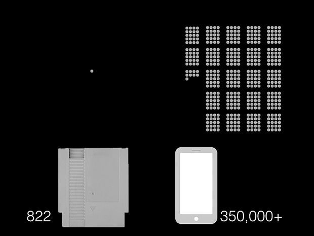
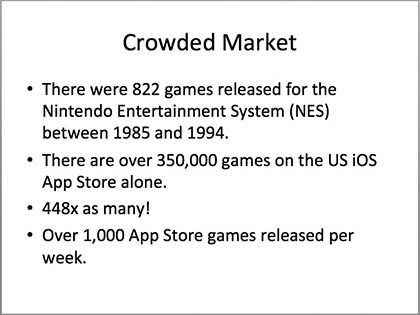
App stores have a large number of games. How should I best represent this? My target audience grew up playing games on the Nintendo Entertainment System (NES). Thus, if I can relate the situation to that, it could help strengthen my point. Some quick Internet searches revealed that there were 822 published games for the NES. Additional research showed me that there are over 400,000 games on the Google Play store alone. An NES library’s worth of games are submitted to the Google Play store every week. The discrepancy in these numbers was enough to make my point.
I decided that this point could be enhanced with a visual, so I started my slide software (Keynote) and made the graphic in FIGURE 32.9.
I had the slide reveal itself in build steps. First, the audience only sees the left side. After a click, they see the right side. The slide serves as a visual hook to the points that I made verbally about the differences in the number of games. Although there is some redundancy in data-ink, it serves to emphasize the point being made.
This image does not contain all the information I wished to talk about. Some information was relegated to my notes:
• 822 NES games were released between 1985 and 1994.
• The tiny blue dot represents every game you cherished from that time: Mario 3, StarTropics, Contra, DuckTales, Duck Hunt, and so on.
• The same number of games are released on Google Play in less than a week. There are over 350,000 games on the App Store. That means there are 448 times as many as the 822 NES games. The blue dot is lost in the sea of red dots representing mobile apps.
Had I put those bullets on the slide shown in FIGURE 32.10, the audience would have read ahead by the time I talked about them. If I had used the slide of text, I would have had little to say beyond what was on the slide.
For each of my subtheses, I completed this process. Some required multiple slides because I had too much data to succinctly show it all at once. For each slide, I created notes, then the slide itself. When the presentation was complete, I wrote my notes as a handout, which I put on the web, and I shared the link at the end of the presentation.
—WARREN BUFFETT
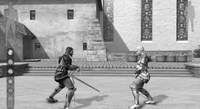
In 2012, award-winning author Neal Stephenson set up a Kickstarter project to fund his idea called CLANG, which was to be a multiplayer one-on-one sword-fighting game that focused on realism. CLANG would come with its own unique motion-based controller custom-built for the game. Stephenson’s fans ate up the presentation, pledging over $500,000 for the title. In the Kickstarter pitch, Stephenson noted that the game had “a simple and attainable goal; we don’t want to mess this up by overreaching.”10
10 Stephenson, N. (2012, June 9). CLANG by Subutai Corporation. Retrieved May 21, 2015, from www.kickstarter.com/projects/260688528/clang/description.
In 2014, CLANG was unceremoniously canceled by an update to the Kickstarter page. Stephenson noted that after spending the half-million, they had a prototype that “was technically innovative, but [not] very fun to play.” The money was gone and backers were reasonably upset (FIGURE 32.11). What happened?
CLANG IS © 2013 SUBUTAI CORPORATION.
FIGURE 32.11 CLANG is a great case study in understanding risk at an early stage.
Development structures differ in how they handle the riskiness of projects. For instance, a waterfall type project (Chapter 3) is not very risky if the team is making a known quantity with known resources. You do not need much iteration because the problem is well-understood up front. However, a project with less than well-understood requirements has risk in many different areas and is thus more suited for an iterative model.
Risks are elements that may diverge the final product from the planned product. Risks in games manifest mainly in three ways:
• DEVELOPMENT RISKS are ones that are associated with the project not finishing on time because of elements of building the project itself. These include technical limitations, personnel limitations, funding limitations, and business limitations.
• MARKET RISKS are ones that are associated with the project underperforming because of elements external to the team. Examples are not being able to launch a branded game with its tie-in movie, or that the market does not care about your type of game anymore. Another market risk is that you are unable to sell or explain the game to the market. This is often the case in riskier, more experimental projects.
• DESIGN RISKS are ones that are associated with the project underperforming because of what the project is. For instance, you may think that making an ultra-realistic sword-fighting game is an excellent idea, but you may not realize all the dependencies in animation and communication that such a design implies. These risks show themselves late in a project when you have a functional game that is not fun or a game that cannot be completed to design specifications.
To understand the risks involved in a project, it helps to play devil’s advocate and enumerate all the weak points in the project or areas where things could go wrong. This is difficult to do because of ego-related blinders when this is a project you are working on, so it makes sense to practice first with other projects to which you have no personal ties. For instance, a quick look at the risks of CLANG reveals the following:
DEVELOPMENT RISKS
• The development team is unknown. Have they worked on games before? What kind? Does the team have an experienced producer to manage the project or will Stephenson manage the project?
• Has Stephenson or members of his team ever developed hardware peripherals before?
• Who is manufacturing the peripheral? What is their history?
• Where is the development team based? Will a $500,000 budget be enough? What are other sources of income in case the development goes longer?
• How will the team implement online play? What technical dependencies exist due to choices of technology? Is the technology chosen tested for this type of gameplay? How much online work will be required to create versus out-of-the-box solutions?
MARKET RISKS
• If the project is banking on selling a prototype to future investors, what if the prototype is no good? What other funding options exist?
DESIGN RISKS
• The pitch identifies this as being wildly innovative design work. What if the design does not work? When will prototypes be tested and completed?
• Neal Stephenson is a successful author and knows vast amounts about medieval-style sword fighting, but has he ever been the creative director in a video-game project, which is a wildly different medium?
• What if realistic sword fighting is not fun?
• What animation system dependencies are needed to provide realistic fighting?
• How will the game teach players to use the peripheral and fight effectively?
• How will the game give feedback to the player without the tactile feedback of actual sword fighting?
• How will the game limit player motion to realistic maneuvers?
For what it is worth, the CLANG Kickstarter pitch tackled proposed answers to many of these questions. Unfortunately, the project crumpled around the weight of these and other risks.
Yooka-Laylee is a 2015 Kickstarter project that raised over $3 million.11 It’s a game by former developers of the influential studio Rare Entertainment to make a spiritual successor to their 1998 hit Banjo Kazooie. The team is loaded with professionals who have made this kind of game before successfully, which somewhat mitigates development risk. They choose to use the popular Unity engine, which has been used to make other 3D platform games successfully. Market risks are largely mitigated by the Kickstarter model and the large amount of money raised given the scope. The team provides a budgetary breakdown in their original pitch that makes a backer relatively confident that they understand where the money goes. The design risks are mitigated by a tightly controlled design that essentially promises that if you liked Banjo-Kazooie, that they will make more of that, with periodic design check-ins with the community during development to help steer particular features. Since the team has already made a similar game before, some of the remaining outstanding risks are the team’s ability to develop in a multiplatform environment, the logistic problems in fulfillment, and the design risk of over-scoping given their Kickstarter largesse.
11 “Yooka-Laylee—A 3D Platformer Rare-vival!” (2015). Retrieved June 1, 2015, from www.kickstarter.com/projects/playtonic/yooka-laylee-a-3d-platformer-rare-vival.
By explaining these risks and how they attempt to address them within the pitch in Kickstarter itself, the Yooka-Laylee team showed that they are much more prepared to deliver a project than the largely speculative pitch of the CLANG team, and because of that, they are much more likely to deliver a product.
There is one question above all others that has to be answered clearly and quickly in any game pitch presentation:
What does the player do?
Note
Or at least, earlier titles in the series were about this.
Think about how you would explain some of your favorite games. Super Mario Bros. is about jumping on platforms and dodging enemies, not about defeating an evil turtle. Katamari Damacy is about rolling up objects in size order to make your ball larger and larger. Splinter Cell is about using the environment (breaking lights, using alternate routes) to sneak through an area where you are outgunned.
All of these explanations tell you what the player does. They do not focus on the story or the aesthetics. The explanation of Splinter Cell could easily be “You play a secret agent who is trying to stop a terrorist threat.” That is an accurate explanation of the game, but it does not explain to an audience what the player does. That explanation could just as easily have been appropriate for a movie or a book. But you are not pitching a movie or book; you are pitching a game. Focus your explanation on what the player does.
When I ask students to pitch me their game, I usually go through the following questions to judge a game pitch:
• MOST IMPORTANT QUESTION: What does/do the player(s) do? Is what the player does effectively communicated? Can this action be interesting to do?
• RULES: Are the rules needed to understand how this game would work effectively communicated? This does not mean that every rule needs to be enumerated and cross-referenced as if in a game design document, but the audience needs to understand what the boundaries of the interactions are and how they are determined.
• GOALS AND OPPONENTS: Is/are the player’s goal(s) effectively communicated? Are the forces that stop the player from that goal effectively communicated? Do these seem reasonable?
• THEME AND PERSPECTIVE: How does the game look and feel? Do the theme and perspective make sense? This does not need to be exhaustive and final. However, in many games the theme is essential to understanding the game itself, so a broad understanding of the theme may be necessary. This and all aspects may change by the time the game is actually made.
• INTERACTION: Is it clear how this game is played/controlled? This does not mean that buttons are called out, just that the audience knows what they manipulate.
• NOVELTY: Are the elements that make this unique or similar to other games effectively communicated? Is the game sufficiently different from existing games in a way that would be meaningful to players? There are many platforming games. One that stars a snail would be different, but is that meaningfully different? Would players care?
• FUN: Does the presentation show how what is presented suggests fun or interesting interactions? Not all games need to be fun first. This War of Mine is a great game that is incredibly bleak. Nonetheless, it has extremely interesting interactions.
• RISKS: Does the pitch address obvious risks? If you plan on making an MMO in six months with a three-person team, do you understand what you are getting into?
• HOOK: Is there an interesting hook for the game that is effectively communicated? This should be given early! The hook does not have to be what makes the game novel, but it should be something that draws the player in.
• RELEVANT INFORMATION: Is all pitch information relevant? Did the presenter waste time with story elements or other elements that are not relevant to any of the other questions? Does the presenter make unsubstantiated claims (“deep strategic gameplay,” “epic boss fights,” “possibilities are limitless,” and so on)?
If you and your team cannot answer any of the questions or cannot answer them sufficiently, this serves as a prompt that you need to go back and more effectively address them. Some questions may not be relevant. If I were using this as a guide to pitch a new feature to an existing franchise, then theme and perspective may not be relevant. However, each point is worth considering as a whole to examine areas of vagueness. Answering each ensures that the audience knows exactly what is being pitched and why.
• Do not waste the audience’s time.
• Create separate artifacts for your presentation notes, for the data and graphics shown to the audience, and for the audience to take home. Do not use the slides themselves to fulfill all three jobs.
• Although it is exciting to pitch the possibilities in a game idea, it is irresponsible to ignore the various risks that can hold the project back from developing those ideas to their full potential.
• When pitching games, it is important to communicate what the player does.