
There’s been a lot of talk the past few years about net neutrality, a concept that argues either for or against assigning different values to the various types of data that flow through our networks. Net neutrality advocates claim that all data on the network be treated as equal, whether it be a piece of spam or a Nobel laureate’s speech. Their advocacy reminds me of the post office, which charges by the pound, not by what’s inside the package: you can’t charge more to send a couture dress than you can for a book of poetry just because it’s more valuable.
Uncreative writing mirrors the ethos of net neutral advocates, claiming that one way of treating language is materially, focusing on formal qualities as well as communicative ones, viewing it as a substance that moves and morphs through its various states and digital and textual ecosystems. Yet, like data, language works on several levels, endlessly flipping back and forth between the meaningful and the material: we can choose to weigh it and we can choose to read it. There’s nothing stable about it: even in their most abstracted form, letters are embedded with semantic, semiotic, historical, cultural, and associative meanings. Think of the letter a, and it’s anything but neutral. Associations for me include The Scarlet Letter, a top grade, the title of Louis Zukofsky’s life poem, Andy Warhol’s novel, and so forth. When nonobjectivist painters tried to rid painting of illusion and metaphor, you can see why they chose geometric forms, not letters, to do so.
Right now I am writing transparently: how I’m using words is supposed to be invisible to you so that you can follow what I’m saying. If, instead, I WAS TO WRITE IN ALL CAPS, I move into the material or oblique. You’d first notice the way it looked, then—noting that CAPS generally connote SHOUTING—its tone, and last, its message. In day-to-day life we rarely notice the material properties of language except for when, say, we encounter a stutterer or a person with a heavy accent, we first notice how they say, second we decode what they are saying.1 When we listen to an opera sung in a language we don’t understand, we push language’s formal properties to the front—its cadences and rhythms—choosing sound over sense. If we further choose to invert the transparency of words, we can hear them as sound or see them as shapes. One of modernism’s great aspirations was to skew language in this way, but the backlash it produced was equally strong: emphasizing its materiality disrupts normative flows of communication. Human beings have enough trouble understanding each other, critics complained. Why would we purposely want to make it more difficult?
In most literature, writers strive to strike a balance between these two states. A way to think of this is similar to the way the transparency slider bar in Photoshop functions: slide the bar far to the right and your image is 100 percent opaque; all the way to the left renders it barely visible, a ghost of its former self. In literature, if the slider is skewed toward complete transparency, language becomes functional discourse, the sort of language used to write a newspaper editorial or caption a photograph. Slide it back a little bit and it becomes prose: Lo-lee-ta: the tip of the tongue taking a trip of three steps down the palate to tap, at three, on the teeth. Lo. Lee. Ta. Nabokov’s opening hits a perfect note between sound and sense, signal and noise, poetry and narrative. After this dynamic opener, Nabokov moves the slider back toward sense, swapping it for a more transparent style in order to tell a story.
Two movements in the middle of the twentieth century, concrete poetry and situationism, experimented with sliding the slider all the way up at 100 percent opacity. In uncreative writing, new meaning is created by repurposing preexisting texts. In order to work with text this way, words must first be rendered opaque and material. Both movements viewed materiality as primary goals, the situationists through détournement and the concretists by literally treating letters as building blocks. The situationists worked in a variety of mediums, realizing their vision of the city as canvas whereas the concretists took a more traditional tact, mostly publishing books. By envisioning the page as a screen, the concretists anticipated the way we would work with language in the digital world half a century later.
The Situationists: Out in the Streets
In the mid 1950s, a group of artists and philosophers who called themselves the Situationist International proposed three concepts designed to infuse magic and excitement into the dull routine of everyday life: the dérive, détournement, and psychogeography. Their idea, not unlike that of uncreative writing, was not to reinvent life but to reframe it, reclaiming dead zones as alive. A slight shift of perspective could lead to fresh takes on tired subject matter: renaming a symphony without altering the music, drifting through a city with no goal in mind, or putting new subtitles on an old movie. By creating new situations, such interventions were intended to be a catalyst for social change filtered through a reorientation of normal life.
If we were to map out our daily movements, we’d find that we tend to stick to what we know with little deviation. We move from our house to our job to the gym to the supermarket, back to the house, and get up the next day and do it all again. Guy Debord, one of the key figures in situationism, proposed taking a holiday from those routines in the form of the dérive or drift, which was meant to renew the urban experience by intentionally moving through our urban spaces without intention, opening ourselves up to the spectacle and theater that is the city. Debord claimed that our urban spaces are rich places—full of untold encounters, wondrous architecture, complex human interaction—that we’ve grown too numb to experience. His remedy was to take a day or two out and disorient ourselves (often with the aid of drugs or alcohol) by stumbling about our city, tempering the grid of urbanity with the organic quality of not knowing, being pulled by intuition and desire, not by obligation and necessity. We might want to spend a night in a house that’s in the process of being torn down or hitchhike without a destination through Paris during a transportation strike—just to add more confusion—or break into graveyards and catacombs, wandering aimlessly through the bones.
By taking our city’s physical geography and overlaying it with psychogeography—a technique of mapping the psychic and emotional flows of a city instead of its rational street grids—we become more sensitive to our surroundings: “The sudden change of ambiance in a street within the space of a few meters; the evident division of a city into zones of distinct psychic atmospheres; the path of least resistance that is automatically followed in aimless strolls (and which has no relation to the physical contour of the terrain); the appealing or repelling character of certain places.”2 Geography, then—that most concrete of propositions to which we are bound—is reconfigurable and customizable through the imagination. Psychogeography can take many forms: One could create an alternate map of a city according to specific emotions, for example, mapping Paris not by arrondissement but by every place you’ve shed a tear. Or you could create a psychogeographic map of a city’s language by a making a dérive from point A to point B, writing down every word your eyes encounter on buildings, signage, parking meters, flyers and so forth. You’d end up with a trove of rich language, myriad in its tones and directives, comprised of peripheral words you’d most likely never paid attention to, such as the fine print on a parking meter.
Guy Debord tells of a friend who wandered “through the Harz region of Germany while blindly following the directions of a map of London,”3 détourning that map by assigning it a purpose for which it was not intended; it still functioned as a map, but yielded unpredictable results. Taking his inspiration from Debord, Vito Acconci created a work in 1969 he called Following Piece, whereby he simply followed the first person he saw, walking a few paces behind him, until he disappeared into a private space. As soon as one person did, he would begin to follow the first person he saw until she went into a private space and so on.4 By mapping the city according to voyeurism, Acconci was enacting a Debordian dérive, a psychogeographical cartography, a human chain of hypertext.
Détournement is a way of taking existing objects, words, ideas, artworks, media, etc., and using them differently so that they become entirely new experiences. For example, Debord proposed that we take Beethoven’s Eroica Symphony and simply rename it Lenin Symphony. After having dedicated his symphony to Napoleon when he was first consul, Beethoven reneged on his dedication when Bonaparte proclaimed himself emperor. From that time on, the symphony had no dedication, and Beethoven changed the title to the generic “Heroic Symphony, Composed to Celebrate the Memory of a Great Man.” Debord, sensing that this was a free space, ripe for détournement, decided to fill the vacancy with his great man: Lenin.
There’s a series of wonderful films by René Viénet that takes B-grade foreign exploitation flicks and resubtitles them with political rhetoric: a sexist Japanese porn film is détourned into a protest statement about the oppression of women and the exploitation of workers. Similarly, a cheap kung fu flick, in which the master teaches disciples the secrets of martial arts, is subtitled so that the master schools the students in the finer points of Marxism and retitled Can Dialectics Break Bricks? “Anyway, most films only merit being cut up to compose other works,” Debord says.5
Neither are the plastic arts immune to détournement. The Danish situationist painter Asger Jorn took old thrift shop paintings and painted new images over them. In an essay entitled “Détourned Painting,” he wrote:
Be modern,
collectors, museums.
If you have old paintings,
do not despair.
Retain your memories
but détourn them
so that they correspond with your era.
Why reject the old
if one can modernize it
with a few strokes of the brush?
This casts a bit of contemporaneity
on your old culture.
Be up to date,
and distinguished
at the same time.
Painting is over.
You might as well finish it off.
Detourn.
Long live painting.6
Titles of books too could be détourned. Guy Debord and Gil Wolman stated that “we believe it would be possible to produce an instructive psychogeographical détournement of George Sand’s Consuelo, which thus decked out could be relaunched on the literary market disguised under some innocuous title like Life in the Suburbs, or even under a title itself détourned, such as The Lost Patrol.”7
Low culture was also subject to détournement. In 1951 the situationists envisioned “a pinball machine arranged in such a way that the play of the lights and the more or less predictable trajectories of the balls would form a metagraphic-spatial composition entitled Thermal Sensations and Desires of People Passing by the Gates of the Cluny Museum Around an Hour after Sunset in November.”8 Comic strip speech bubbles were replaced with new texts to create the most politically charged funnies ever written.
Debord saw these cultural efforts as first steps toward an ultimate goal of the complete transformation of daily life: “Finally, when we have got to the stage of constructing situations—the ultimate goal of all our activity—everyone will be free to détourn entire situations by deliberately changing this or that determinant condition of them.”9 Such situations were regularly enacted in the happenings of the early sixties and found their fullest flowering on the streets of Paris in May ’68, when the walls of the city were sprayed with situationist slogans. Punk rock, too, claims situationism as its roots: On numerous occasions, Malcolm MacLaren has said that the Sex Pistols grew directly out of situationist theories.
For Debord, the city is an ecology, a series of networks, each replete with its own potential for meaningful exchanges and encounters: “The ecological analysis of the absolute or relative character of fissures in the urban network, of the role of microclimates, of distinct neighborhoods with no relation to administrative boundaries, and above all of the dominating action of centers of attraction, must be utilized and completed by psychogeographical methods. The objective passional terrain of the dérive must be defined in accordance both with its own logic and with its relations with social morphology.”10
Figure 2.1A. Sarah Charlesworth, detail 1 of forty-five images from April 21, 1978 (1978).
Figure 2.1B. Sarah Charlesworth, detail 2 of forty-five images from April 21, 1978 (1978).
Figure 2.1C. Sarah Charlesworth, detail 3 of forty-five images from April 21, 1978 (1978).
Our digital ecology is a virtual corollary to Debord’s urbanism, and many of the same gestures he proposed in meatspace can be enacted on the screen. As familiar as our urban movements are, our cyber-ramblings tend to be equally prescribed: we visit the same Web pages, blogs, and social networking sites again and again. We could break out by randomly clicking from one link to another, viewing a Web surfing session as dérive. Or we could take the source code and graphics from a major news site and populate it with text of our choosing, like the poet Brian Kim Stefans did by repopulating the contents of the New York Times Web site with the situationist writings of Raoul Vaneigem.11
When peer-to-peer file sharing began, widespread détournement of MP3s took a form referred to as a “dinosaur egg,” wrongly titling a song for the purposes of promotion. A young unknown band would take a song of theirs, retitle it “Like a Virgin,” and throw it out onto the networks with the hopes that the zillions of Madonna fans would download it and hear their music. The “dinosaur egg” is a cultural artifact that flows without direction, its author not knowing who would be receiving it or what the response would be.
Variants of situationist détournement can be found in the visual arts involving the eradication of texts. In 1978 the conceptual artist Sara Charlesworth took the front pages from forty-five newspapers from around the world and, with the exception of the newspaper’s title header, erased all the text, leaving only the photographs in place. The day’s paper she worked with featured a photograph of the Italian prime minister, Aldo Moro, who was held in captivity by the Red Brigade. The terrorist group released the photo to prove that, contrary to reports of his death a day earlier, he was still alive.
Why is Moro’s image the only photograph on the front page of Il Messaggero and yet only one of three in the New York Times? What does this tell us about local versus international news? About the editorial decisions that were made? About the politics of the newspaper? A simple gesture of removal reveals a lot about the visual thinking, politics, and editorial decisions behind what is presented as stable and objective information, elegantly revealing the structures of power and subjectivity behind the news. In these pieces, language is displaced in the cloak of erasure, leaving behind only structure and image.
The anticorporate film Food, Inc. begins: “When you go through the supermarket, there is an illusion of diversity. So much of our industrial food turns out to be rearrangements of corn.”12 A similar sentiment could be made about the types of public language surrounding us. When we look closely at what types of words splatter across our environment, we’ll find they are mostly prescriptive and directive: either the language of authority (parking signs, license plates) or the language of consumerism (advertising, product, display). While we have the illusion of abundance and variety, in our language-steeped cities the varieties are shockingly small. The photographer Matt Siber demonstrates this by shooting mundane scenes of streetscapes and interiors—parking lots, drug stores, subway stations, freeways—then systematically eradicating every trace of language in them. He lifts all the removed text intact from the photograph and drops it in situ—fonts and all—onto a blank white panel next to the photograph. The two are presented as one piece: a world devoid of language and a map of the removal.
By removing the language, we become aware of its layout as well as its prevalence and ubiquity, a fact we are blind to in our daily lives. We see how language in the city is ruled as much by the grid of architecture as the streets are: when the words are displaced on to a blank sheet of paper, the ghosts of architecture remain visible, enforcing its structure onto the words. Architecture, generally front and center, is demoted to a secondary role as a page for words; the buildings feel empty and forlorn without them. If we examine the types of language on the white panels, we become aware of its varieties, tonalities, and clusterings. We also see how bland and banal most of the public language is surrounding us. One could easily imagine laying Siber’s maps of words over any number of gridded buildings in any number of cities with the same effect. Surely every city has a building that is inscribed with the words “SELL BUY / LOANS CASH / SELL LOANS.”
In Untitled #21 we’re presented with language as branding. From the text adorning the car, to the dealership, to the logos on the sneakers of the figure, it’s all commercial, a veritable landscape of consumerism. The ghost panel is a visual poem, a linguistic schema of logos describing forms: a ghost car, with the forms of its wheels described by logos. Looking at the text panel, the imperatives in advertising are absurd when decontextualized: who in America hasn’t seen a Ford lately? Why would anyone want to look again? In fact, this photograph is nothing but Ford.
In the denser urban environment of Untitled #13, the ad language and branding is just as present, yet less homogeneous. The text panel looks like it could be a minimalist spread from a fashion magazine, with its elegant fonts strewn across the page in a dashing manner. But on closer examination, there’s an intersection of tonalities and brands that would never be found on the pages of Vogue. Through the uncanny placement of the delivery van, the cosmetic brand Bliss dialogues with Lay’s potato chips. Siber’s accomplishment is remarkable since, had we been walking down the street and seen the van parked in front of the billboard, it is unlikely that we would have seen the intersection of chips and makeup the same way. Similarly, the Dior billboard text is neatly bisected by a line of words taken from the bar of the cherry picker. And the Bliss text, beginning with “wise” (a serendipitous coincidence with the Lay’s below it) is itself truncated by the fold in the billboard being installed. Two hours later, with the delivery truck gone and the billboard installation finished, Siber would have mapped a very different landscape. Words are temporary, movable, and changeable in the city’s commercial microclimates.
Moved indoors, branding has its own psychogeograpic topography. Untitled #3 shows a drug store display, scrubbed of its texts. Here packaging, with a slant toward natural beauty, sets the structure and tone of the work. It’s no coincidence that the textual placement mirrors the forms of stems and flowers upon which they’re placed. And when removed to the blank page, in fact, the words form a garden of language that could easily be titled, “The Healing Garden”—not unlike Mary Ellen Solt’s word-flower concrete poems of the 1960s (figure 2.6).
Figure 2.2. Matt Siber, Untitled #26, 2004.

Figure 2.3. Matt Siber, Untitled #21, 2003.
Siber’s words are derived from consumer notions of “organics”: even the roots of the flowers are price tags. In 1985 Andy Warhol said, “When you think about it, department stores are kind of like museums.”13 While we may question the sincerity of this statement, Warhol’s point is borne out by the generational difference in approaches from the unironic sweetness of Solt’s word gardens to the nefarious consumer-driven language hothouse presented by Siber. Siber’s drugstore brings to mind photographer Andreas Gursky’s monumental consumerist landscapes, particularly his well-known 99 Cent, an endlessly mirrored discount store showing us an infinite landscape of consumption, a modern-day bumper crop, a bounty of abundance that, upon closer inspection, reveals the same few brands and items Photoshopped over and over again.

The audio equivalent to Siber’s and Charlesworth’s practices is a shadowy group of anonymous artists who call themselves Language Removal Services. Their name literally describes what they do: they remove all language from celebrities’ recorded speech. Legend has it that they began as Hollywood sound editors, whose job it was to clean up the stars’ speech, removing all their ums, ahs, and stutters from the day’s rushes. After work, they’d surreptitiously scoop up all the bits of tape left on the cutting room floor and reassemble them into nonverbal portraits of famous actors as artworks. What began as a joke became serious as their practice extended to all forms of prerecorded speech. Before long they were making portrait of politicians, sports stars, and poets, leaving only the extralinguistic traces: stumbles, ums, ughs, sighs, sneezes, coughs, breaths, swallows. Whether it’s Marilyn Monroe, Malcolm X, or Noam Chomsky, the intonation and rhythms distinctly belong to the speaker. William S. Burroughs’s breathing and stutters contain his unmistakable nasal quality; even his grunts sound famously Burroughsian.14

Figure 2.4. Matt Siber, Untitled #13, 2003.

By drawing our attention not to what they are saying but how they are saying it, Language Removal Services inverts our normative relationship to language, prioritizing materiality and opacity over transparency and communication. In the same way, by scrubbing out words where we usually find them, Matt Siber both concretizes and defamiliarizes marginally visible language. Both artists’ practices—one using sound and the other using imagery—provide inspiration for how writers might be able to reframe, rethink, and invert standard uses of language for their own work. I attempted to do something similar when I wrote Soliloquy, a six-hundred-page unedited record of every word I spoke for a week, from the moment I woke up on Monday morning until the moment I went to bed the following Sunday. It was an investigation into how much one average person spoke over the course of a normal week. And this was the book’s postscript: “If every word spoken in New York City daily were somehow to materialize as a snowflake, each day there would be a blizzard.” There was a great snowstorm that year, and, as the trucks and backhoes moved up and down Broadway, I imagined this mass as language. Daily, such collections would happen, backhoes shoveling language into the back of trucks, which, in turn, like the snow, would be dumped in the Hudson River and floated out to sea. I was reminded of Rabelais, who tells of a winter battle when it was so cold that the sounds created during the battle instantly froze upon hitting the air, falling to the ground, never reaching the ears of the combatants. When springtime arrived, these long inaudible sounds began to melt randomly, creating a racket by skewing their original temporal sequences of action. It was suggested that some of the frozen sounds be preserved for later use by packing them in oil and straw.15

Figure 2.5. Matt Siber, Untitled #3, 2002.

The mathematician Charles Babbage was correct when he speculated that the air had great capacities for carrying information. In 1837 he predicted our impossibly packed but invisible airwaves: “The air itself is one vast library, on whose pages are for ever written all that man has ever said or woman whispered. There, in their mutable but unerring characters, mixed with the earliest, as well as with the latest sighs of mortality, stand for ever recorded, vows unredeemed, promises unfulfilled, perpetuating in the united movements of each particle, the testimony of man’s changeful will.”16
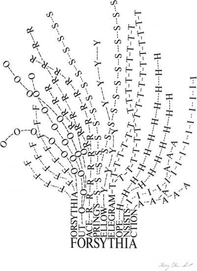
Figure 2.6. Mary Ellen Solt, “Forsythia” (1965).
The thought of all that invisible language racing through the very air we breath is overwhelming: television, terrestrial radio, shortwave, satellite radio, citizen band, text messages, wireless data, satellite television, and cell phone signals, to name but a few. Our air is now chokingly thick with language posing as silence. Nowhere is it as thick as in New York City, with its density of population and architecture: language is both silent and screamingly loud. The New York City street is a place of public language. From signage to chatter, traces of language are inscribed on nearly every surface: T-shirts, sides of trucks, manhole covers, watch faces, baseball caps, license plates, food packages, parking meters, newspapers, candy wrappers, mailboxes, buses, posters, billboards, and bicycles. It’s the density of population in New York that gives the illusion of anonymity, the sense that there are so many people around me that no one can possibly be listening to what I’m saying. In much of the world, talk goes on behind closed doors or sealed in climate-controlled cars, but on the streets of New York words are out there for all to hear. One of my favorite things to do is to walk a few steps behind two people engaged in conversation for several blocks, listening to their conversation progress, punctuated by red lights, giving the speech a certain pace and rhythm. John Cage said that music is all around us if only we had ears to hear it. I would extend that to say that, particularly in New York, poetry is all around us, if only we had the eyes to see it and the ears to hear it.
The modern city has added the complication of the mobile phone, yet another layer of language. A dérive—the desire to get lost—is hard when everyone either has a GPS embedded in their device or is broadcasting their coordinates to the public at large: “I’m walking north on Sixth Avenue, just past 23rd Street.” The mobile phone has collapsed the space between private and public language. All language is public now. It’s as if the illusion of public anonymity of the private conversation has been amped up. Everyone is intensely aware of the phenomenon of public cell phone use, most viewing it as inconsiderate, a nuisance. But I like to think of it as a release, a new level of textual richness, a reimagining of public discourse, half conversations resulting in a breakdown of narrative, a city full of mad people spewing remarkable soliloquies. It used to be this type of talk was limited to the insane and the drunken; today everyone shadowboxes language.
Public language on the streets used to include graffti tagging, but, due to the cat-and-mouse game played by taggers and the authorities, it was a physical model of textual instability. Subway cars tagged in the morning would be scrubbed clean later that night. Documentation was a must: the constant movement of the cars demanded specific times and locations for viewing the surviving works. Language traveled at high speeds, coming and going very quickly. When the city rid the subways of graffti, there were changes in textual tactics. Exterior spray paint application was replaced by interior glass etching and plastic scratching, leaving ghostlike traces of the full-blown markings that once covered the cars. Today train exteriors are covered once again in another sort of temporary language, this time offcial language: paid advertising. The MTA learned from graffti culture and détourned its tactics and methodology into a revenue-producing stream by covering the subway cars with paid advertising. The language itself is computer generated, output as giant removable car-sized stickers; next week another series of advertisements will be stuck on the exterior of trains.
Impermanent language, moveable type, fluid language, language that refuses to be stuck in one form, sentiments expressed in language that can be swapped on a whim, a change of mind, a change of heart surround both our physical and digital environments. While deconstructionist theory questioned the stability of language’s meaning, current conditions both online and in meatspace amp it up a notch, forcing us to view words as physically destabilized entities, which can’t help but inform—and transform—the way that we, as writers, organize and construct words on the page.
Concrete Poetry and the Future of the Screen
Concrete poetry, a little, somewhat forgotten movement in the middle of the last century, produced poems that didn’t look like poems: nothing was versified or lineated, there was no meter and very little metric rhythm. They often looked more like corporate logos than they did poems: clusters of letters atop one another, sitting in the middle of a page. These were poems that bore more relation to the visual arts or to graphic design, which, in fact, they were often mistaken for. Yet, sometimes a form is so ahead of its time—so predictive—that it takes many years to catch up to it. That’s what happened in the case of concrete poetry.
Concrete poetry was an international movement that began in the early 1950s and faded from view by the end of the sixties. It had a utopian agenda of creating a transnational, panlinguistic way of writing that anyone—regardless of where they lived or what their mother tongue was—could understand. Think of it as a graphic Esperanto, taking language and rendering it as symbols and icons. Like most utopias, it never really got off the ground, yet scattered about in the ashes of its manifestos are several kernels anticipating how we would think about language in the future. Like many other efforts in the twentieth century, the thrust of the movement was to force poetry into the modern age, away from the long-winded prosaic sentences of, say, Henry James, toward the headline-inspired compactness of Ernest Hemingway. Concrete poetry’s twist was to align the history of literature with the history of design and technology. By applying a Bauhaus sensibility to language, concrete poets invented new forms of poetry. Readability was the key: like a logo, a poem should be instantly recognizable. Interestingly, the ambitions of concrete poetry mirrored changes happening in computing, which was moving from the command line to the graphic icon. Indeed, the ideas that animated concrete poetry resonate with the use of language in our present-day digital environment.
Figure 2.7. bpNichol, eyes (1966–67).
The poems themselves sometimes looked like gaggles of letters coming together to form a constellation. Sometimes they would deconstruct and look like leaves blown across a page willy-nilly. Other times, letters would form images—a trophy or a face—taking their cue from George Herbert’s 1633 poem “Easter Wings,” in which a prayer is constructed visually, with lines getting successively longer and shorter, finally forming the images of a pair of wings.

Figure 2.8. George Herbert, “Easter Wings” (1633).
The content of Herbert’s poem—humankind’s expanding and contracting fortunes—is embodied in the image of the words. One glance at the poem and you get its message. “Easter Wings” is an icon, boiling down complex ideas into a single, easily digested image. One of the aims of concrete poetry is to render all language into poetic icons, similar to the way that everyone can understand the meaning of the folder icon on the computer screen.
Concrete poetry’s visual simplicity belies the informed sense of history and intellectual weight behind it. Anchored in the tradition of medieval illuminated manuscripts and religious tracts, concrete poetry’s modernist roots date back to Stéphane Mallarmé’s Un coup de dés where words were splayed across the page in defiance of traditional notions of versification, opening up the page as a material space, proposing it as a canvas for letters. Equally important was Guillaume Apollinaire’s Calligrammes (1912–18) in which letters were used visually to reinforce a poem’s content: The letters of the poem “Il Pleut” pour down the page in lines, looking like streams of rain. Later, extending the practice of both Mallarmé and Apollinaire, E. E. Cummings’s stacks of atomized words proposed the page as a space where reading and seeing were mutually entangled. Ezra Pound’s use of Chinese ideograms and Joyce’s compound neologisms, wrought from many languages, gave concrete poetry ideas on how to carry out a transnational agenda.
Music played a part as well. The concrete poets borrowed Webern’s notion of Klangfarbenmelodie—a musical technique that involves distributing a musical line or melody to several instruments rather than assigning it to just one instrument, thereby adding color (timbre) and texture to the melodic line.17 A poem could enact a multidimensional space, being visual, musical, and verbal at once: they called it verbivocovisual.
But, for all its smarts, concrete poetry was often dismissed as being little more than commercial one-liners—akin to Robert Indiana’s concrete poetry-inspired LOVE logo—easily usurped by commercial culture into blacklight posters, T-shirts, or baubles. Even as conceptual artists began to use language as their primary material, the art world distanced itself. In 1969 Joseph Kosuth wrote, “concrete poetry was a formalization of the poet’s material. And when the poets become materialistic, the state is in trouble.”18 These sorts of dismissals resonate today. In a recent book about language and visual art from a top-notch academic press, an art historian writes:
Understood in its most general sense, as “language art,” poetry is a form that explores the aesthetics, structures, and operations of language as much as any specific content. In the postwar era, various types of concrete and visual poetry, in particular, promised to probe the space of the typographic page and link contemporary literature with the visual arts. Yet a reliance on rather quaint illustrational or pictorial modes—as in poems that take on the shape of their subjects—left much concrete poetry out of touch with changing paradigms in the visual arts and the wider conditions of language in modernity.19
However, by focusing on concrete poetry’s relationship to the art world, she misses the point: it turns out that the link was not so much with the visual arts but with the multimedia space of the screen. Had she gone back and read a 1963 tract written by the Swiss concretist Eugen Gomringer, she would have found much more than merely “quaint illustrational or pictorial modes”: “Our languages are on the road to formal simplification, abbreviated, restricted forms of language are emerging. The content of a sentence is often conveyed in a single word. Moreover, there is a tendency among languages for the many to be replaced by a few which are generally valid. So the new poem is simple and can be perceived visually as a whole as well as in its parts … its concern is with brevity and conciseness.”20
A few years later, the concrete poet and theorist Mary Ellen Solt critiqued poetry’s inability to keep up with the rest of culture, which she saw racing by: “Uses of language in poetry of the traditional type are not keeping pace with live processes of language and rapid methods of communication at work in our contemporary world. Contemporary languages exhibit the following tendencies: … abbreviated statement on all levels of communication from the headline, the advertising slogan, to the scientific formula—the quick, concentrated visual message.”21
The rise of global computer networks in the 1960s and their intensive use of language, both natural and computative, fueled these statements, which remain as relevant today as when they were written even as the phenomena of globalized computing has infinitely mulitplied. As computing progressed from command line to icon, concrete poetry’s parallel claim was that poetry, in order to remain relevant, needed to move from the verse and stanza to the condensed forms of the constellation, cluster, ideogram, and icon.
In 1958 a group of Brazilian concrete poets calling themselves the Noigandres group (after a word from Pound’s Cantos) made a laundry list of physical attributes they wanted their poetry to embody. When we read it, we see the graphical Web described nearly four decades ahead of its time: “space (“blancs”) and typographical devices as substantive elements of composition … organic interpenetration of time and space … atomization of words, physiognomical typography; expressionistic emphasis on space … the vision, rather than the praxis … direct speech, economy and functional architecture.”22
All graphical user interfaces gives us “typographical devices as substantive elements of composition” in a dynamic setting of “time and space.” Click on a word and watch it “atomize” in a “physiognomical” way. Without “functional architecture”—the coding beneath the graphics and sounds—the Web would cease to work.
As modernists, the concrete poets adored clean lines, sans serif fonts, and good design. Pulling theory from the plastic arts, they adhered closely to Greenbergian modernist tenets such as nonillusionistic space and autonomy of the artwork. Looking at early concrete poems, you can almost hear Clement Greenberg saying “look how these ‘shapes flatten and spread in the dense, two-dimensional atmosphere.’”23 In spite of ongoing attempts to prove otherwise, the screen and interface are, in essence, flat mediums. They generally employ sans serif fonts such as Helvetica for their classic design tropes. It’s the same reason that Arial and Verdana have become the standard screen fonts: cleanness, readability, and clarity.24
The emotional temperature of their concrete poems is intentionally kept process-oriented, controlled, and rational: “Concrete poetry: total responsibility before language. Through realism. Against a poetry of expression, subjective and hedonistic. To create precise problems and to solve them in terms of sensible language. A general art of the word. The poem-product: useful object.”25
Against expression: such statements, with their need to create “precise problems” and to solve them with “sensible language,” emerging with “a poem-product,” and a “useful object” read more like a scientific journal than a literary manifesto. And it’s that sort of mathematical level-headedness which makes their poetry so relevant to today’s computing. Cool words for a cool environment.

Figure 2.9. Decio Pignitari, “Beba Coca Cola” (1962).
Informed by Pop Art, the concretists engaged in the dialectics of language and advertising. As early as 1962, Decio Pignitari’s poem “Beba Coca Cola” fused the red and white colors of Coke with clean design to make an alliterative visual pun on the hazards of junk food and globalism. Over the course of a mere seven lines, using only six words, the slogan “Drink Coca Cola” is transformed into “drool,” “glue, “coca(ine),” “shard,” and finally into “cloaca / cesspool,” a sewer or the intestinal digestive cavity where bodily waste is produced. Pignitari’s poem is a testament to the powers of the icon, yet also works as a social, economic, and political critique.
The international orientation of concrete poetry could be as celebratory as it could be critical. In 1965, poet Max Bense declared, “concrete poetry does not separate languages; it unites them; it combines them. It is this part of its linguistic intention that makes concrete poetry the first international poetical movement.”26 Bense’s insistence on a combinatory universally readable language predicts the types of distributive systems enabled by the Web. It’s a poetics of paninternationality, finding its ultimate expression in the decentered, constellation-oriented global networks where no one geographic entity has sole possession of content.
By 1968 the idea of reader as passive receiver was called into question. The reader must distance herself from poetry’s long yoke and simply perceive the poem’s reality as structure and material:
The old grammatical-syntactical structures are no longer adequate to advanced processes of thought and communication in our time. In other words the concrete poet seeks to relieve the poem of its centuries-old burden of ideas, symbolic reference, allusion, and repetitious emotional content; of its servitude to disciplines outside itself as an object in its own right for its own sake. This, of course, asks a great deal of what used to be called the reader. He must now perceive the poem as object and participate in the poet’s act of creating it, for the concrete poem communicates first and foremost its structure.27
But it works both ways. Concrete poetry has framed the discourse of the Web, but the Web has, in effect, given a second life to concrete poetry. Backlit by the screen, dusty, half-century-old concrete poems look amazingly bright, fresh, and contemporary. We’re reminded of concrete poems when we see words skitter across screens as splash pages for Web sites, in car ads on television where the movement of words connotes automotive speed, or in the opening credits of films where restless words explode and dissolve. Like de Kooning’s famous statement, “History doesn’t influence me. I influence it,”28 it’s taken the Web to make us see just how prescient concrete poetics was in predicting its own lively reception half a century later. What had been missing from concrete poetry was an appropriate environment in which it could flourish. For many years, concrete poetry has been in limbo, a displaced genre in search of a new medium. And now it’s found one.