Chapter 2
Quickly Sprucing Up Shots
IN THIS CHAPTER
 Choosing an image quality
Flagging photos you want to work with
Correcting brightness, contrast, and color
Making more improvements
Not every photo that comes out of the camera looks as good as it can. Some aren’t worth saving. Those that are can be made better with just a little effort. It’s really not that hard to do, but it will improve your photography by a tremendous amount.
If you want to learn how to quickly spruce up your photos, this practical chapter is for you. I talk about how to decide what image quality settings to choose and how that decision will affect working with them in software, and then dive right in. I cover how to review and flag photos, how to get started developing them, then how to make brightness and contrast, clarity, color, and many other adjustments. The chapter concludes with a look at processing photos in the camera.
Software for Sprucing Up Photos
Whether you shoot and save Raw, JPEG, or both types of images, I recommend using an application like Adobe Photoshop Lightroom to manage and quickly spruce up your photos. Because Lightroom excels at making this part of the process painless and quick, I’ve chosen to feature it in this chapter. I use it as my main media manager and image processor, but I also shoot using many different makes and models of digital SLRs from several manufacturers. Having a standard application makes sense for me.
What Ligthroom doesn’t do, which I lament at times, is give me access to certain camera functions that I can turn on or off in software. Canon’s Digital Photo Professional, for example, allows you to change the strength of the Auto Lighting Optimizer setting, or disable it entirely. You can also change the Picture Style of Raw photos. You cannot perform these actions in Lightroom.
If you don’t use Lightroom, don’t panic. The processing principles that I outline in this chapter, as well as most of the details, are not wholly unique to Lightroom.
Feel free to experiment and try any software you like. Camera manufacturers support their cameras with software that helps you manage and edit your photos. Most are solid. There are also a number of other applications. You can find them by searching online.
Deciding on an Image Quality
The decisions you make when you set up your camera to shoot have an impact on the processing process. The main issue is whether to save your photos in JPEG, Raw, or both image formats.
If you plan to do more than tweak basic brightness and contrast, I encourage you to shoot in Raw. Raw image files have the best raw photo data that your camera can produce. Therefore, Raw images are considered the best source material with which to work.
When processing, JPEGs can’t be pushed as hard as Raw photos before noise becomes troublesome. They simply have less information, which means you get to the noise sooner when turning things up. In addition, camera options like white balance, noise reduction, dynamic range limitations, color, and style are fixed in the JPEG and can’t be edited or changed later.
 That fact doesn't mean that JPEGs are terrible. Absolutely not. You’d be very hard pressed to tell a JPEG produced from a Raw file versus one created by the camera, assuming the photo was well exposed and didn't need dramatic adjustments.
Benefits of Raw images
The advantages of shooting Raw images are numerous. Two of the most critical advantages follow:
- Control: When processing Raw images in software, you are in control of the process. Within certain bounds, you, not the camera, decide what goes into the JPEG or TIFF when you process a Raw file using software. When you change the white balance, exposure, color profile, and many other parameters during processing, you are simply interpreting the data differently. In the end, the JPEG file is a good end product, especially for web media. When taken right out of the camera, however, all the creative decisions that go into shaping the JPEG have already been made. By the time you look at it, the original data has been thrown out.
- Flexibility: When you process your camera's raw exposures into JPEG files, you still have the raw data to fall back on. You can reprocess them, if the mood strikes you, whether tomorrow, next week, or five years from now.
Challenges of working with Raw photos
Raw doesn’t work for everything. There are costs associated with using the raw data files from your camera. If those costs outweigh the benefits for you, don't be afraid to move toward (or not change from) a JPEG workflow.
You may choose not to shoot Raw photos for these practical reasons:
- Limited compatibility: You can’t throw up a Raw photo on Facebook or Instagram. Even if you can get them uploaded, people won't be able to look at them. You have to convert Raw photos to something like a JPEG to share them most places online. If you want to go from camera to the world in as few steps as possible, shoot JPEGs.
- They take up space: If your memory card is tight on space, you might not have the room to store Raw and JPEG files. Also consider how much hard drive space you're willing (and able) to use to store and work with photos. Raw files are much larger than even the highest quality JPEG your camera creates.
- Slower shooting speed: When you’re shooting Raw, the camera simply has to move more data from the sensor through the processor to the memory card. You'll benefit from a faster frame rate (how many photos you can take per second) if you shoot and store JPEGs only.
-
Impact on processing time: If you don’t have the time to process Raw photos, JPEGs are your best solution. And remember, you can still edit JPEGs if you need to. Turn to the next chapter for more information.
 If this is you, devote as much time as necessary in choosing between different JPEG processing options that your camera has. This is where you get to exercise limited creative control. You’ll likely be able to adjust the photo's look by altering the Picture Control (Nikon), Picture Style (Canon), or Creative Style (Sony).
- No need: You may find that the JPEGs coming from your camera are just as good or better than what you can do yourself with Raw. If that's the case, use the JPEGs and don't worry about it.
Non-destructive editing
Raw workflow is more flexible than JPEG, because with Raw you don't make an adjustment, apply it, and move to another adjustment. Raw editors — and this includes import-to-final product photo managers and Raw processors like Lightroom — don't actually apply changes until you export the file.
For example, changes you make on the Develop panel are stored in the Lightroom database. The original files aren't affected, even if you crop the photo. You can press the Reset button at the bottom of the Develop panel to undo everything. You can also create virtual copies in Lightroom and compare alternative settings. Only when you export are the settings permanently applied to create the new file, and even then the original is left intact.
Getting Started
Your goal should be to take the photos you shoot and quickly make them look better using your photo software. I’m convinced that everyone can do this much. To get started, transfer the photo files to your computer (if you need help with this, turn back to Book 5, Chapter 1) and import them into your chosen application. As a reminder, I am using Lightroom to illustrate the general process.
Reviewing and flagging good photos
Whether you take 10, 100, or 1,000 photos a day, your first step toward sprucing them up is to realize something critically important: You don’t need to worry about them all. That’s right. Let the bad ones be bad and don’t fuss over them. Spend your time making the good shots better. You’ll be able to upload your prized shots to Facebook or tweet them far sooner if you work this way.
That means reviewing all the photos from a shoot, with the intended purpose of identifying the best shots. That may seem backward to you. I don’t propose that you start at 350 and winnow out the bad ones so that you process what’s left. That takes too much time and is, frankly, an unnecessary burden. Start your count at 0 and work your way up by flagging the best shots.
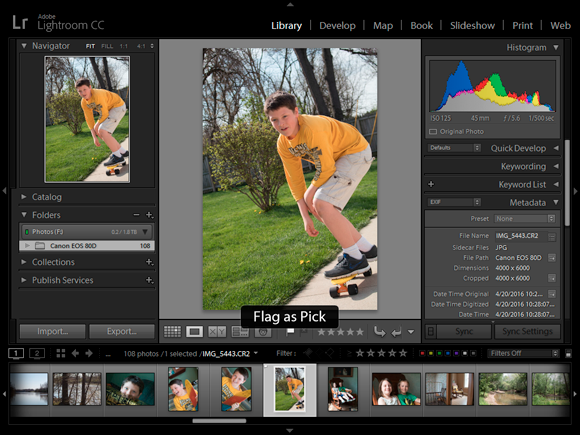
I’m reviewing photos in the Library tab of Lightroom in Figure 2-1. Except for the menu, which is off, I’ve got all the doodads and gizmos showing. You can show or hide each side panel, the Filmstrip on the bottom of the screen, and the Identity Plate/Module Picker at the top. If you use another application, it most likely has the same general elements that you see here.
The first step I suggest you take is to rate photos with stars. That sounds great in theory, right? You have five levels to use. Rate your best shots with five stars, the next best with four, and so on. The problem with this is that haggling with yourself takes a tremendous amount of time and leaves you an emotional wreck. At this point, it’s meaningless whether a particular photo is worth four or five stars. Heaven help the 1-star shots. All you really need to know is whether you want to post, print, or otherwise show it off. If the answer to that is yes, then it goes in the “good pile.”
With Lightroom, use its Flag as Pick feature. Take a few seconds to look at each photo, and if the shot has “it,” then flag it (see Figure 2-2). With this method, you’re not rejecting photos; you’re simply flagging the ones you want to work with. You may end up with four, seven, or more.
If you end up flagging the whole batch, reassess how you’re choosing them. The only exception to this I can think of at the moment is if you want a ton of photos for a job or project and need volume. Otherwise, don’t worry about limiting yourself.
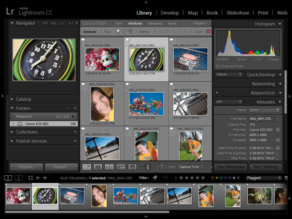
After you flag the keepers, run through them again (see Figure 2-3) to make sure they qualify. If you’ve flagged photos that are close to identical, chances are you don’t need both. If you don’t have enough, go back to the collection and add more, if possible.
I've got a secret. After you start, you'll realize that it doesn’t take a whole lot of time to whip good shots into shape. Pass the bad ones over and don’t worry about them.
Switching to the Develop panel
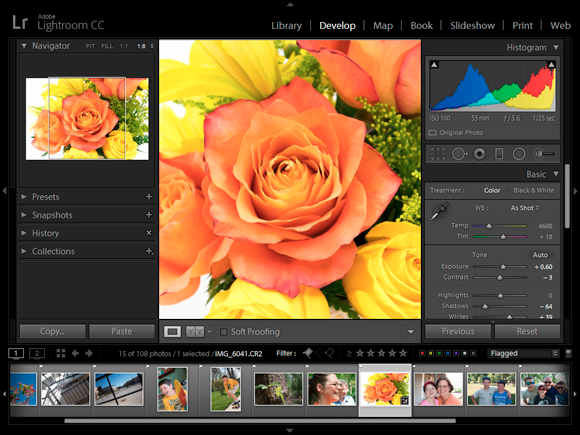
After you choose the photos you want to work on, switch to your application’s Edit window. In Lightroom, this is the Develop panel, shown in Figure 2-4. The obvious visual difference between this and the Library panel is the appearance of controls on the right side of the screen. The navigation elements that were on the left have been replaced by panels suitable for image processing. I have turned off most of the additional panels and helpers that appear in the Develop panel for the rest of the chapter to focus on the photo at hand and the panel I want to describe.
While Lightroom suggests that you follow its panel order (Basic panel with white balance, tone, and “presence” first, followed by the other panels), you can work in any order you wish.
Setting the lens profile
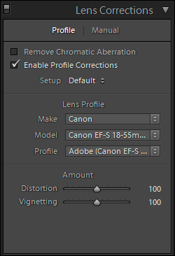
The first thing I do is set the lens profile. This feature (see Figure 2-5) automatically corrects lens distortion and vignetting caused by the specific lens that took the photo. I’ve found that fixing this first always gives me a better photo to start with, and keeps me from having to make adjustments to fix distortion or exposure around the edges later. There are a couple catches: Lens correction data has to be available (which it is for most popular lenses) and you must be working with Raw photos (there is very little support for other formats). This feature is located on the Lens Corrections panel in Lightroom. Check Enable Profile Corrections, and identify the make of the lens, the model, and the profile.
Testing the waters
Next, I have a look in the Tone area of the Basic panel and click the Auto button. Lightroom evaluates the photo and makes the changes that it thinks will produce a photo with the best tonal range (from dark through bright) with as little highlight and shadow clipping as possible.
As shown in Figure 2-6, the results are sometimes great. I took this photo of a giraffe at our local zoo with a nice 300mm super telephoto lens and Nikon APS-C dSLR. It was a nice day, and the combination of the camera and lens created a great photo. In the end, it needed a bit more brightness and contrast, which Lightroom provided.
Of course, not every photo works as well as this one. Either way, I learn something. I may keep the settings and be done with it, or make a mental note of them to experiment with.
Setting Brightness and Contrast
If you do nothing more to spruce up your photos, quickly tweak the brightness and contrast. It’s simple and you don’t have to have a degree in photography or photo manipulation to make your photos dramatically better. If you need a quick reminder about exposure and histograms, refer to Book 3, Chapter 1.
Adjusting the exposure
Lightroom’s exposure control allows you to darken or brighten the photo. The numbers below it are f-stop equivalents, or EV. Negative numbers darken and positive numbers brighten.
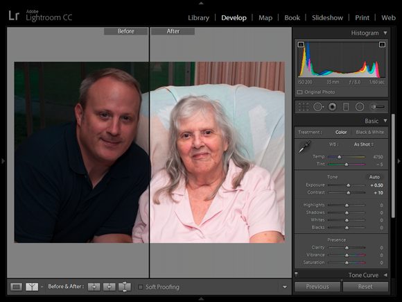
Adjusting the exposure is sometimes a delicate dance. Raise or lower it until the photo looks right. Don’t push exposure so hard either way that you blow out highlights or lose shadows. If you do, pull the control back. If you need to, rescue bright and dark areas of the photo with the highlights and shadow controls. Figure 2-7 shows a photo of my grandaunt Elouise and me taken a few years ago. I raised the exposure by 0.5 EV to brighten the photo.
Carefully read the documentation that comes with your software. Some brightness controls compress highlights and shadows when they reach the edges of the histogram. This squeezes them together, limiting their range but preserving some detail. Others clip highlights to white and shadows to black when they reach the edge of the histogram, which essentially tosses data away.
See Book 3, Chapter 1 for more information on exposure and histograms.
Improving contrast
Overall, contrast is how far apart the middle-to-bright tones are from the middle-to-dark tones on the photo’s histogram. Imagine two people standing near each other. That situation is comparable to a low contrast photo. There isn’t that much difference between the tones. Imagine them standing farther apart. That situation is comparable to a photo having more contrast. There is a greater difference between the tones.
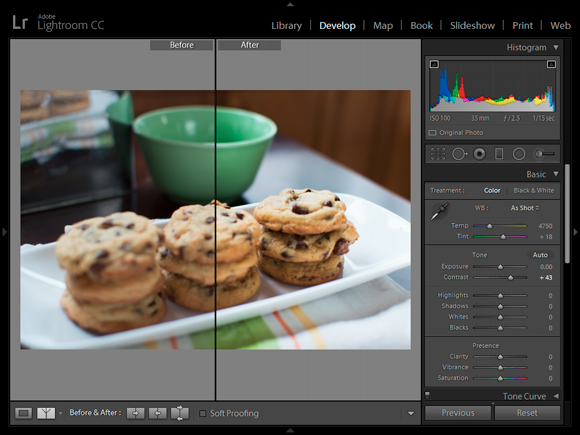
Experiment with the contrast control until the photo looks clear and well defined. Normally, photos with too little contrast appear to have a gray sheen on them. It dulls them, as shown in Figure 2-8. In this case, you can see the Before side is not as clear as when I increase the contrast. The cookies, plate, table, and bowl all look better.
However, photos with too much contrast have shadows that are too dark and highlights that are too bright, with few mid-tones to connect them.
Protecting highlights and shadows
Normally, you want bright areas in photos, but you want to keep them from becoming so bright that they are a featureless sea of white. Likewise, you want dark areas in your photos, but you don’t want them to be featureless black. I say featureless to emphasize the point. Uniform areas of white or black literally have no features, or details.
One way to protect them is to target them with highlights and shadows adjustments. This approach works best with Raw photos, because they have a greater dynamic range than JPEGs. This fact enables you to pull highlights back and bring shadows into a tonal range that fits into the histogram.
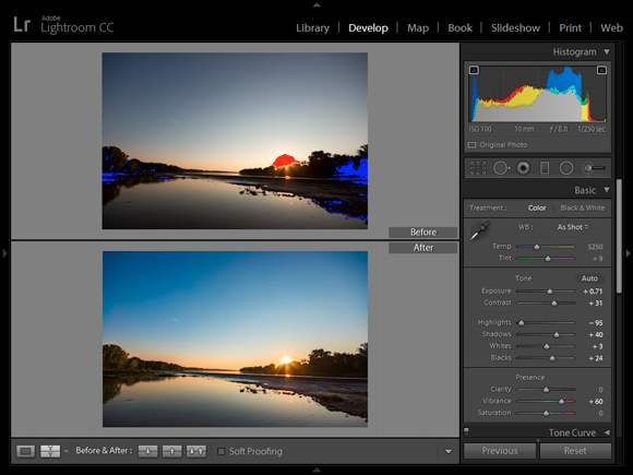
I’ve done just that with the photo in Figure 2-9. I chose this shot because it’s a challenging scene and shows blown highlights caused by the setting sun and overly dark shadows in the trees in the original photo. Lightroom identifies these areas in red (highlights) and blue (shadows) to make it easier to tell when things are going wrong.
I made several adjustments to this photo to improve the exposure and color. In the end, I lowered the Highlights setting by a whopping 95 and increased the Shadows control by 40 to keep these areas from clipping. You’ll find that many elements of exposure are connected, and that you may need to come back to these controls after making further adjustments.
You don’t have to eliminate all bright or dark pixels. Bring them into balance so that the photo looks good.
Setting the black and white points
Lightroom has two more important tone controls that enable you to adjust brightness and contrast: Whites and Blacks. These are clipping controls. They adjust the white and black points in the image, which is to say, where clipping occurs. Highlights and Shadows adjust the brightness of the photo. The Whites and Blacks controls set the boundaries. In effect, you’re saying “This is where white actually is” or “This is as dark as it gets” when you use the controls.
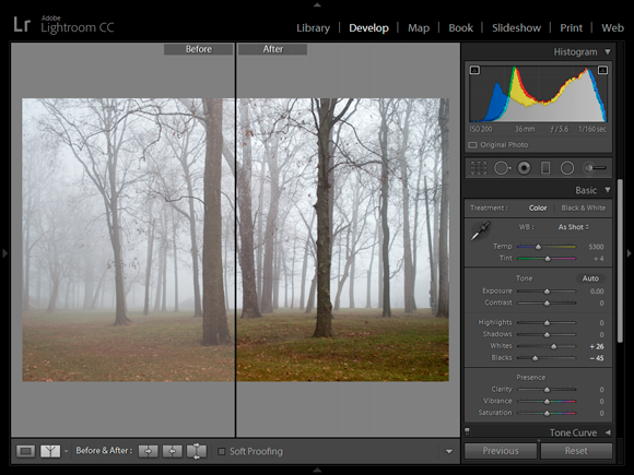
The effect of sliding them left and right is to darken or lighten the photo, but don’t use them for that. Instead, drag them to expand or reduce the overall tonal range of the photo so that it fits nicely within the histogram. I did that on the foggy landscape scene in Figure 2-10. Note that I didn’t change the brightness or the contrast of this photo, and yet it’s brighter and has more contrast. Curious, isn’t it? The result was caused by the fact that white tones are now whiter and the black tones are blacker.
Improving clarity and removing haze
Lightroom has two more controls that affect clarity and contrast of your photos: Clarity and Dehaze.
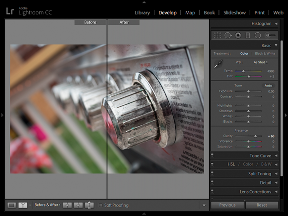
Clarity increases the local contrast of the photo by making edges stand out. I find that this makes photos look sharper and have greater detail (see Figure 2-11). Reducing it makes the photo look dreamy, softly focused, and misty. Be careful when increasing clarity on photos of people, as too much local contrast makes shadows on faces look very unattractive. Lightroom puts the Clarity control in the Presence section of the Basic panel, right above Vibrance and Saturation.
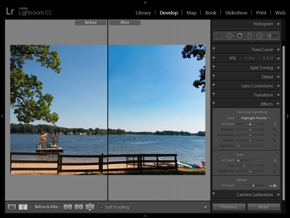
Lightroom has another interesting control called Dehaze. This feature enables you to add or subtract haze and fog from your photos. When it’s used judiciously, I find it a great feature to use on outside shots that have plenty of blue skies and water, as shown in Figure 2-12. One minor point: The control works in reverse. Increasing Dehaze decreases ’de haze. Decreasing Dehaze increases ’de haze. Got that?
Correcting and Improving Color
After making lens, brightness, contrast, highlights, shadows, clarity, and haze adjustments, I move on to color. I do things in this order because color is more subjective. Not every white balance or saturation adjustment is necessary, while getting the brightness correct seems fundamental. Therefore, I like nailing down exposure first.
Checking the white balance
Quite often, white balance is just fine. You only have to worry about it if you see something out of place. After you adjust the photo’s brightness and contrast, you can better troubleshoot color.
Once again, Raw photos have the advantage over JPEGs. When you set the white balance in your camera, it appends your choice to the Raw data as a suggestion. The actual data is left alone. Software uses the setting to interpret the scene and display the photo. That means you can change the white balance setting to another preset in Lightroom, or decide on a specific color temperature yourself, using the original data.
If you shot only JPEGs, however, the camera used your white balance setting and processed the color accordingly when it saved the photo as a JPEG. While you can reinterpret it in software, you’ve lost the original data. I don’t mean to sound overly dramatic. It’s just that you have less wiggle room when adjusting the white balance of a JPEG.
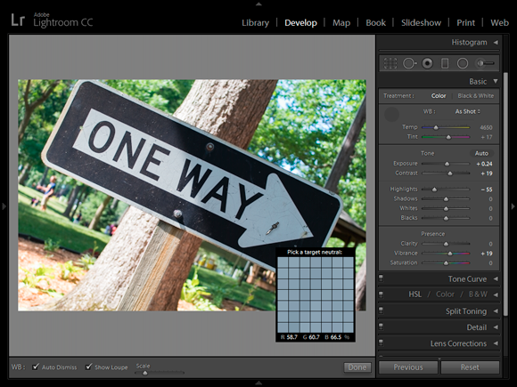
Figure 2-13 shows the White Balance Selector over an area of a One Way sign that should be white. It’s not. As you can see from the detail loupe, the RGB value is imbalanced. There is not enough red and too much blue. If this were white, they would be the same (or very close). Clicking this spot corrects the entire photo.
Adjusting color vibrancy and saturation
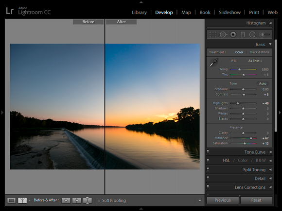
These simple controls boost or cut color intensity. Vibrancy raises or lowers the saturation of weak colors, while saturation strengthens or weakens all colors. I’ve used a combination of both to enhance the color of a sunset in Figure 2-14.
I like saturated photos. As I raise it, however, I’m careful to not make noise more visible or blow out highlights. Turning up most things while you edit or process runs these risks. When possible, I increase vibrancy first to see whether it does the trick. Vibrancy is more forgiving because you're not turning up all colors, just the muted ones.
Making Additional Improvements
After you get the basics under control, you should begin to look at more advanced photo editing. You may not need or want to apply every technique mentioned here.
-
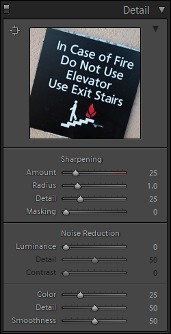
Sharpen: Everybody likes sharp-looking photos. Factors such as the quality of your lens, focus, camera stability, shutter speed, and distance clearly have a large effect on how sharp a photo can be. Within those bounds, you can sharpen photos quite a bit. Figure 2-15 shows the Sharpening controls in the Detail panel of Lightroom.
If the photo has serious sharpness problems, try reshooting it with a better technique or leave it for editing, where you can use more sharpening techniques. Don't oversharpen photos. It makes the edges look artificial and makes noise more obvious. Oversharpening can also increase the appearance of noise in a photo.
-
Noise reduction: Similarly, most raw converters have some form of noise reduction. Many let you reduce noise in the Luminance channel and/or the photo’s color channels. Figure 2-15 also shows the Noise Reduction controls in Lightroom.
 Too much noise reduction removes a great deal of a photo's detail. If it’s too much, try backing off. Third-party noise reduction plug-ins (small add-ons that provide new or better features to the software you're using) can give you more control over noise reduction and the ability to protect or sharpen details. You can also selectively reduce noise by using layers or masks in a photo editor.
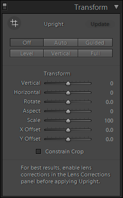
- Correcting perspective distortion: Pointing the camera up makes vertical lines converge toward the top of the photo. This is called vertical perspective distortion, or vertical distortion. It happens most often when you photograph a building or something tall and you have to look up to get the whole structure in the shot. Horizontal perspective distortion, or horizontal distortion, happens when you angle the camera sideways as you take a shot. Horizontal lines run at an angle instead of being parallel to the frame or ground. Figure 2-16 shows the Transform panel in Lightroom where you can correct any distortion.
My point in this chapter is to give you the basics. Remember that many other features in most photo-editing applications enable you to perfect your photos. Aside from the basic controls I’ve mentioned, Lightroom has quite a few more features, controls, and options. While having them is great, don’t think that you have to use them all.
Finishing Up
When everything else is finished, I straighten and crop the photo, if necessary, and then export it as a JPEG or TIFF.
Straightening and cropping
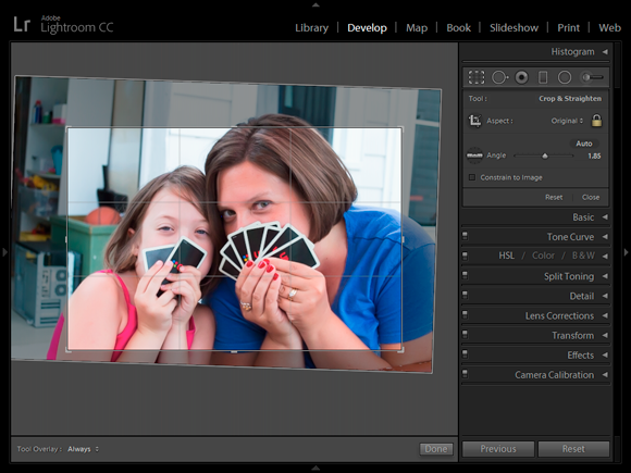
I prefer to straighten and crop photos last. That way I know I have all my other adjustments in the bank and can take my time deciding whether the photo needs anything else.
When I straighten and crop, I always keep in mind that my goal is to improve the final photo. Some photos don’t need to be straightened or cropped. They look fine as they are. Don’t think that you have to straighten every photo that is a half-degree out of perfect. You don’t. However, if the alignment causes a distraction, you should try fixing it.
Figure 2-17 is a shot of my wife and daughter. We were playing Uno on the picnic table and I had my camera with me. I took this shot without thinking about the background too much. You can see an old computer case and shelf in the garage. While I can’t get rid of everything, I can improve the photo by cropping those details out, and rotate them a bit so that they appear level.
Be aware that as you straighten photos, you lose the original corners. How much depends on how badly the shot is aligned in the first place.
Exporting images
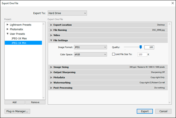
This isn’t an editing task, but I do want to mention it: In Lightroom, you don't have to do anything to save or close files. After you're done developing a photo, you can select another one from the Library or another module. You can export a photo anytime.
Figure 2-18 shows the Export dialog box. I’ve created a preset called JPEG-1K Min with the settings I like to use to export a reduced-size JPEG. I save it to my desktop, resize it, strip all the metadata, apply a copyright, and use a watermark.
Processing Photos In-Camera
More and more dSLRs come with snazzy built-in raw processing tools that you can use at the spur of the moment and with a touch of a button. This development isn't limited to a particular price point, either. For example, the professional-level Pentax K-1 and the consumer-level Canon T6i both have impressive in-camera raw image processing (sometimes called retouching) options.
Canon cameras enable you to change brightness, white balance, picture style, and Auto Lighting Optimizer settings; turn on high ISO speed noise reduction; set the desired JPEG image quality and color space; and correct peripheral illumination, lens distortion, and chromatic aberrations! Not bad at all.
Nikon cameras have similar options: Change the image quality, size, white balance; adjust exposure compensation; change the Picture Control settings; turn on high ISO noise reduction; change the color space; and change the D-Lighting settings.
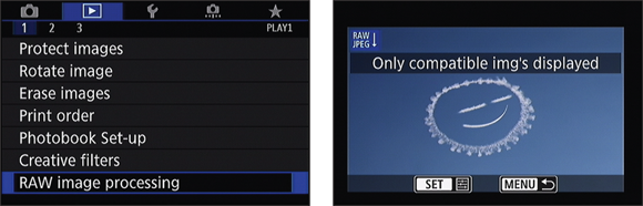
I’m going to use the Canon EOS 80D as an example. Here’s how easy it is to process Raw photos and turn them into new JPEG images:
- Select RAW Image Processing from Playback menu 1, as shown on the left in Figure 2-19.
-
Choose a photo you want to process, as shown on the right in Figure 2-19.
Believe it or not, we heard a plane overhead just the other day. It seemed close, and wasn’t going away. We decided to run out to see it, and discovered that it was skywriting. That’s not something you see every day, and when you’re writing a book on digital SLR photography, well, you run back into the house and grab your camera.
After finishing (practicing, we think) some letters that seemed to make no sense to us, the pilot made a few smiley faces. So that’s the story behind these figures.
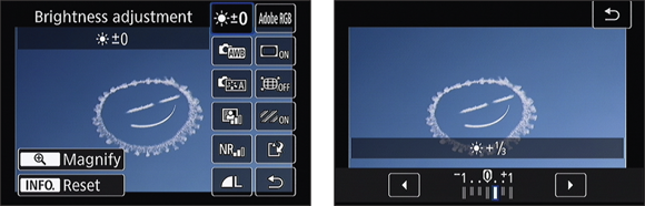
- Select an adjustment you would like to make, as shown on the left in Figure 2-20.
-
Make the adjustment, as shown on the right in Figure 2-20.
In this case, I’m increasing the brightness by 1/3 of a stop.
-
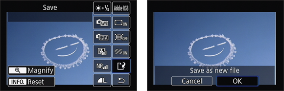
Save the photo, as shown in Figure 2-21.
The camera creates a new JPEG image from the raw data, gives it a new name, and stores it on the memory card.