4 Why good design matters
Accidents, disasters, crises. When systems fail we become temporarily conscious of the extraordinary force and power of design, and the effects that it generates. Every accident provides a brief moment of awareness of real life, what is actually happening, and our dependence on the underlying systems of design.
— Bruce Mau and the Institute Without Boundaries1
The official alarm was sounded on 28 February 2003 when the French Hospital of Hanoi notified the local office of the World Health Organization about a patient who had been admitted with an unusually aggressive influenza-like virus. He was Johnny Chen, an American businessman who lived in Shanghai and had flown to Hanoi from Hong Kong two days before. On arrival he was taken to the hospital, a tiny private clinic, whose staff were concerned that his strange illness was a form of avian influenza virus, or ‘bird flu’. The WHO dispatched Dr Carlo Urbani, a specialist in infectious diseases, to investigate. He was so alarmed that he stayed at the hospital for the next few days, assisting the staff, enforcing infection controls and documenting Chen’s condition.
Based on his recommendations, the Vietnamese government quarantined the French Hospital on 9 March and imposed other emergency measures in a desperate effort to contain the disease. The WHO then issued a global alert about an outbreak of severe acute respiratory syndrome – SARS for short – an aggressive, highly infectious, often deadly disease, which had emerged in China the previous autumn and was spreading with terrifying speed throughout Asia. Within weeks of Chen’s death, SARS had been detected in thirty-seven countries and was known to have killed nearly a thousand people, including Dr Urbani and other members of the medical team who had treated him in Hanoi.2
At the height of the SARS alert, a senior designer for an American company was scheduled to fly to China to oversee the final stage of prototyping for a new product in a subcontractor’s factory. He made such visits several times a year, generally staying in China for a week or two. This visit was particularly important because the product, the result of years of research and development, was expected to be a best-seller and the company’s financial forecasts had been set accordingly. But there was a problem. Americans, like other nationalities, had been advised not to travel to Asia for fear of contracting SARS. The company’s insurers refused to provide cover for the designer or his colleagues to go there, and it proved impossible to find an alternative source of insurance. Unless he travelled to China to complete the design process, the new product would not be completed on time. Nor was there any indication of when the SARS alert would end. No one knew how long it would take to prevent a pandemic by controlling the spread of the disease, or whether it would be possible to do so.
The company was so desperate to finish the project on schedule that it chartered a long-haul aircraft and kitted it out as a home-cum-design studio where the designer could live and work. He then flew to China in the plane, which was ‘parked’ on a runway of the airport closest to the factory. A controlled system was set up to deliver prototypes, components, tools, testing equipment and anything else he might need. To prevent anyone inside the aircraft from risking exposure to infection, they arrived there in surgically sealed containers. The designer assessed the new product, discussed his findings and suggested modifications with the prototyping team at the factory using a video-conferencing program. He stayed on the aeroplane for ten days without ever setting foot outside it, then flew back to the United States.
Why did he do it? Professional pride? Corporate loyalty? Determination to complete a project on time, having devoted several years of his working life to its development? Sheer bloody-mindedness? Any or all of those factors may have prompted his decision to cut himself off from the world in the safe but far from pleasant environment of that aircraft for so long. It is easier to understand why his employer should have invested so much effort and expense in ensuring that the design of its new product would be up to scratch and finished on deadline. Money. The company stood to make much more of it if the design project was completed on time, and considerably less if it was not.
Money. Money. Money. It may not be a fashionable or romantic explanation for why good design matters, but it is undeniably persuasive, and has been throughout history. Yet design matters in many other respects too. How could it not, given its ubiquity? Design exerts so much power over so many aspects of our lives that the quality of a design project can be a decisive factor in deciding whether we will enjoy happiness and success, or be subjected to misery, failure or worse.
The design historian John Heskett once likened design to language, arguing that each is ‘a defining characteristic of what it is to be human’.3 Like language, design is unavoidable, and our relationship to it – the degree to which we understand what is being communicated to us and to which we can express what we think, feel and desire – has an immense influence in determining how we deal with the world, and it with us. There are similar parallels between design and health. Regardless of how much or how little we choose to dwell on it, whether our health is good or bad has a huge impact on our quality of life. A sense of well-being can be empowering and nurturing, while poor health can be enfeebling, painful and possibly fatal. Even people blessed with strong constitutions and good genes may have to deal with some sort of medical difficulty at some point in their lives. Few of us can escape this fate, but there is much we can do to mitigate the damage, by spotting potential problems swiftly, taking preventative action by eating sensibly or exercising, and choosing the correct medical treatment. Exactly the same can be said of design.
Consider the impact of good design on an individual: on Aimee Mullins, the American actor, model and athlete who set three world records for the hundred metres, two hundred metres and long jump at the 1996 Paralympic Games in Atlanta, Georgia.4 She is a bilateral amputee who was born without fibulas in both legs, which were amputated below the knees on her first birthday. Her parents were told that if she kept her lower legs she would have to use a wheelchair for the rest of her life, but if they were amputated she could learn how to walk with prostheses. The problem was that for anyone growing up in the United States in the late 1970s and 1980s as Mullins did, the only available artificial limbs were woefully badly designed, as they had been for decades.
‘My earliest prosthetics were little more than rudimentary stilts,’ she recalled. ‘They were made from a wood-plastic compound material with rivets on the sides of the knees and rubberized feet held on to the shins by metal bolts. There was no give when you walked, and your entire body weight landed in just a few places on your residual limb, which was often times why it blistered.’ Equally painful were the leather straps with which she attached the prostheses to her thighs. ‘I had to tie them so tightly that they killed the circulation in a death-grip strangling effect. The residual limb ended up being desensitized in some places and highly sensitized in others, which is why some amputees opt to use wheelchairs, because they can’t adapt to the initial levels of pain.’5
Those prostheses were also hopelessly unsuitable for a sporty, sociable child like Mullins, who grew up in Allentown, a small industrial city in Pennsylvania. The ‘toes’ were prone to breaking if she kicked a ball or scuffed them on a diving board, and swimming in her prosthetics was strictly forbidden in case the wood rotted and the bolts rusted.6 ‘But I was a child, and on a hot July day there was no way I was staying out of the water.’ Eventually she was given a pair of waterproof polypropylene legs, which were so buoyant that she would dive into the water only for them to drag her straight back up to the surface, until her father drilled holes in the ankles. ‘Every pair of legs I had we ended up hacking somehow in my dad’s tool shed.’ Worst of all was when the wood broke. ‘I’d taken a ball in the shin during a game. Of course, it didn’t hurt at the time, and we didn’t realize that it had formed a hairline crack in the wood. Six months later, I was jumping around in a music class – we were doing the twist. There was this horrible splintering sound, then kids screaming and the teacher fainting at the piano. All I remember thinking was that my parents were going to kill me, because getting a leg on the insurance was such a nightmare.’
When Mullins was sixteen, her wooden legs were replaced by woven carbon-fibre ones, which were, at least, less painful and onerous to move in. ‘The first time I put them on, I felt as though I was walking on a cloud. I hadn’t realized what an ordeal it had been to wear the wooden legs, because they were all I’d ever known.’7 Not that her new prostheses were entirely painless, or effortless; and they looked dreadful. ‘The quote-unquote cosmetic covering was made from a horrible dense foam. And they were unisex, with two colour options: “Caucasian” and “Not”. “Caucasian” was the ugliest shade of peach you have ever seen. Growing up, I didn’t meet another amputee until I was a teenager, and I didn’t think of them as being my tribe, any more than blondes. I understood that I was different, but other people had differences too. Putting on my legs seemed no different from a friend putting in contact lenses. But I do remember looking at a waxwork of Jerry Hall at Madame Tussauds on a trip to London, and thinking: ‘If you can build this mannequin, with the layering of texture to propose tendons and muscles, and the specificity of colour and shape, why can’t you build a decent prosthetic for human beings?’8
Aimee Mullins wearing silicone legs

Aimee Mullins wearing fantastical bespoke prosthetic legs in Matthew Barney’s 2002 work Cremaster 3
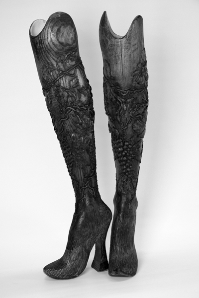
Bespoke wooden legs worn by Aimee Mullins in an Alexander McQueen fashion show in 1999
Having excelled at sports in high school, Mullins participated in track and field events as a student at Georgetown University in Washington, becoming the first ever amputee to compete in US collegiate sports. It was then that she began experimenting with the design of her prostheses. She started in 1995 by being the first person to be fitted with the woven carbon-fibre sprinting limbs, which are modelled on the hind legs of a cheetah and are now standard issue for athletes wearing prosthetic legs. Mullins competed in them in the 1996 Paralympics. ‘They were incredible, but off-track I still had to put on these horrible foam-covered legs,’ she said. ‘They were made for dead-flat orthopaedic shoes, but I’d shove the foot into a shoe with an inch of a heel. I was a teenager and I’d put up with the pain of being pitched slightly forward, straining my hips and knees, to look cool. I remember someone saying: “It’s really a shame that you care what you look like, Aimee. You’re an amputee, you just need to accept that.” To me, that statement about “acceptance” was really shocking. I wasn’t going to be embarrassed or ashamed for demanding more than function from prosthetics.’
Since then, Mullins has sought to overcome the design deficiencies of her prostheses by working with prosthetists, biomechatronic engineers, athletes, artists and designers to develop the type of legs that meet her needs and expectations. She now has fourteen pairs, nine of which she uses regularly. For everyday use at home in New York, she wears woven carbon-fibre ‘shock absorber’ prosthetics, which are comfortable and practical. ‘If I wear them for running around the park or going to the food market, children come up and ask: “Can you fly?” Or they’ll say: “You should put rocket boosters right there.”’9
Other legs were designed specifically to look like human flesh-and-bone legs. Since 1997, Mullins has had silicone legs made for her by the prosthetist Bob Watts at Dorset Orthopaedic in southern England.10 Remarkably realistic to look at, each leg can be made in whichever shape and length she chooses, and the feet are angled to fit the different heel heights of her shoes, going as high as four inches. To make them as lifelike as possible, Watts has added tiny flaws, such as veins and birthmarks, to the silicone ‘flesh’, though Mullins drew the line when he suggested ageing a new set of legs by adding more veins. ‘I was like: “Oh no, no, no!”’11
She has also developed fantastical legs. When the fashion designer Alexander McQueen invited her to model in one of his shows, they collaborated on the design of a pair of wooden legs, which were carved from solid ash by a master craftsman into ornate and clearly artificial prostheses.12 She worked with the artist Matthew Barney to devise a surreal collection of limbs for her role in his film Cremaster 3, including transparent glass legs and replicas of the sleek, furry hind legs of a cheetah that transformed Mullins into a mystical creature.13 ‘I don’t want to promote the idea that human-looking legs are more desirable than non-human-looking legs. It’s a throwback to amputees feeling that they need to “pass”. I quite like my carbon legs and feel that they are desirable as an aesthetic choice as well. I want people to find empowerment from personal choice among many different aesthetic options. If you have so many choices when it comes to a couch or an iPad, why not have the same choices with something as intimate as a prosthetic?’
Rather than risk being constrained by the badly designed prostheses she was originally given, Mullins has chosen to make herself faster, stronger, taller and weirder by commissioning specific types of legs with which she can enhance her natural beauty, athleticism and theatricality. One night, when she arrived at a party in New York wearing her longest, most elegant prosthetics with her highest heeled shoes, a friend came up and said mock-seriously: ‘Oh Aimee! That’s not fair.’14
In future, Mullins expects her prostheses to become increasingly efficient, versatile and appealing as technology advances. An important area for innovation is joints, and a team of researchers at the Massachusetts Institute of Technology, led by the American engineer Hugh Herr, head of the Biomechatronics Group, has pioneered the development of a powered ankle-foot, which replicates the movement of a biological ankle.15 Mullins’s first set of powered ankles were made by him. ‘They save my knees and hips from having to withstand so much impact, and enable my muscular system to work more efficiently.’16
Like her, Herr is a double amputee. An avid mountaineer, he lost both his legs below the knee in a teenage climbing accident, when he and a friend were trapped in a blizzard in an icy ravine in New Hampshire. He, too, struggled with inadequate prostheses, and has devoted his work in biomechatronics to the design of more efficient artificial limbs. Before developing the powered ankle, he made a similar breakthrough with the knee, but has also developed bespoke legs for himself. After his accident, Herr was determined not only to climb again, but to continue to participate in free-climbing competitions, and he constructed a pair of prosthetic legs designed specifically to enable him to do so.
Free climbers forgo ropes, harnesses and other protective equipment, making the sport so dangerous that a climber’s safety relies entirely on his or her physical strength and agility, climbing ability and psychological fortitude, which, in principle, could put a bilateral amputee at a disadvantage. Before his accident, Herr was an accomplished free climber, and he designed his new prostheses to amplify his natural prowess. His bespoke legs can be lengthened or shortened to the precise length needed for him to hoist himself up – or down – to the next level of a climb. If necessary, he can vary the length of one limb from the other. Another advantage is that the tips of his prostheses are so much smaller than human feet that Herr can find secure footholds in the narrowest nooks and cracks, which would otherwise be too tiny to cling on to. So effective are his artificial climbing limbs that some of the fellow free climbers who had pitied him after his accident were soon calling for him to be banned from entering competitions because of his ‘unfair advantage’.17
Those ingeniously designed prostheses are compelling examples of how much good design can matter to individuals, in this instance to people who were determined, resourceful and imaginative enough to take matters into their own hands. Having identified the design flaws of critically important components of their lives – the artificial limbs they needed to walk, run, swim, jump, dance and climb – Aimee Mullins and Hugh Herr took the action required to develop superior alternatives. Millions more people have benefited from their efforts, which have contributed to general improvements in the design of artificial limbs all over the world. Their achievements demanded courage and resilience, but they did at least have the advantage of being able to identify the cause of the problem – the shortcomings of the design of their original prostheses. It is much more common for design to affect our lives without us noticing that it has done so, which can make it even harder for us to address the problems caused by dysfunctional design.
Think of the World Cup soccer tournament. It is the world’s most popular sports event, watched by more people than any other, and its emotional impact is incalculable. Psychologists have written book after book on why people feel able to express the joy, exhilaration, despondency, fury and other emotional extremes during soccer matches that they repress in more portentous situations, such as falling in love or faltering in their careers. During the World Cup, those emotional extremes are heightened because national reputations can be won or lost, old loyalties put to the test and new allegiances formed.
The underlying principle of the World Cup, and all other sporting events, is the importance of fair play. With so much at stake, it is essential that every team has an equal chance of success and each player is treated in the same way. The primary means of enforcing these principles are the rules of the tournament and the conduct of the referees, but the design of various elements of the sport are relevant too, including the new ball which is developed for each World Cup. The Fédération Internationale de Football Association, or FIFA, the Zurich-based body that organizes the tournament, commissions a new ball every four years from the German company Adidas, which pays a hefty fee for the rights to be the official supplier. Adidas does so in the knowledge that its newly developed ball will be seen on television by hundreds of millions of people, many of whom will buy it.
In the interest of fair play, the World Cup ball must behave in exactly the same way wherever and whenever it is kicked, regardless of the conditions, thereby ensuring that no team has an unfair advantage over another. What could possibly go wrong? How hard can it be to design a round object of a specific size and shape? Designers know that the smoother and rounder a soccer ball is made, the likelier it will be to respond in the same way to the impact of a player’s foot. They also know that it should absorb as little moisture as possible during the course of each game to avoid fluctuations in weight. But identifying what sort of ball to design is the easy part. Producing it is more difficult thanks to the complex physics of the sphere, which scientists still know less about than the aerodynamics of aircraft and Formula 1 racing cars.18
For decades, most professional soccer balls, World Cup balls included, adhered to the late nineteenth-century design template of eighteen stitched leather panels. During the 1966 World Cup in England, the growing number of television viewers complained that they could not see the ball clearly enough to follow the games on their black and white TV sets. It was then that FIFA charged Adidas with designing a telegenic alternative. The result was the Telstar, which was made from twelve black pentagonal panels and twenty white hexagonal ones. It was introduced at the 1970 World Cup in Mexico, when it proved hugely popular, not least because it was clearly visible on television, and has been the default design for soccer balls ever since. The Telstar is a glowing example of design’s ability to enhance our lives, both by solving a practical problem and improving our sense of well-being. By enabling many millions of soccer fans all over the world to follow the progress of World Cup games clearly, it has given them great pleasure (at least when their teams have won) and defused the risk of their friends and families being subjected to furious complaints about the lousy picture quality on their television screens.
Adidas has continued to produce a new World Cup ball every four years, but with mixed results. The Tango España ball was a disaster at the 1982 tournament in Spain. The rubber inlay over the seams rubbed off when it was kicked, and the ball had to be replaced during some games, disrupting the flow of play and irritating everyone: players, managers, officials, spectators in the stadiums and television viewers alike. Whereas the Questra ball shone at the 1994 World Cup in the United States. A newly developed polyurethane foam coating made it faster in flight, arguably helping the players to score more goals.19 The +Teamgeist ball at the 2006 World Cup in Germany had a similar effect. It was made from fourteen panels bonded together by thermal technology rather than by traditional stitching, to create a smoother, water-resistant surface. Strikers loved it, as they could kick the ball more powerfully from long distances. When Germany played Costa Rica in the opening game of the tournament, the German midfielder Torsten Frings scored a spectacular goal by kicking the ball thirty-five yards into the goalmouth. It started off straight then bent sharply to the right for the last ten yards.20 But goalkeepers were less enthusiastic about the dynamic new ball. One of their complaints was that it moved erratically because of its smoothness. Another was that the ball was so light it often slipped out of their hands. Though, like the Questra, the +Teamgeist did make World Cup games faster and more exciting.21
The design of the Tango España, Questra and +Teamgeist undoubtedly made a difference to their respective World Cups, but did not necessarily detract from the principle of fair play, because each player was equally likely to be advantaged or disadvantaged by their idiosyncrasies. The Jabulani, the official ball for the 2010 World Cup in South Africa, proved more controversial. No sooner had the tournament begun, than goalies started to complain of it swerving, slipping and spinning erratically. The problem lay not with the ball itself, but with its response to the stark differences in altitude and air density between the South African cities where the games were played, particularly between Johannesburg and Cape Town. The ball was likely to swerve less and to fly to greater heights in the former, which is at a higher altitude than the latter.
Another anomaly was that the ball’s position could change by anything up to two diameters in a typical goal shot between the two cities, making it difficult for goalies to anticipate its path, especially as teams often flew straight from one place to another for successive games. When that happened, the goalkeepers’ chances of guessing where the ball would land lessened considerably.22 In theory, this meant that a team which had switched altitude between games was at a significant disadvantage to one that had not, and the failure to produce a ball which was immune to such changes had compromised fair play.
Not only do the fortunes and misfortunes of the various World Cup balls illustrate how much design can matter to us without us even realizing (in this instance by possibly distorting the outcome of an event that many millions of people care passionately about), they also show how much likelier we are to notice design’s failures than its triumphs. How many of the strikers whose chances of scoring were enhanced by the speed of the Questra or power of the +Teamgeist credited their goals to those balls? None. Yet goalkeepers wasted no time in grumbling that the +Teamgeist was slippery and the Jabulani erratic. Perish the thought that those goalies might have dropped the ball after bungling a catch; or that a triumphant scorer would admit that, if not for its quirks, the ball might not have ended up inside the goal.
When design affects us directly, rather than being something we see from across a sports stadium or on television, the same principle applies. Many of the greatest design feats go unnoticed: they do their job so well that we are barely aware of them, happy to congratulate ourselves for having solved a problem or made some sort of progress. One of the most important functions of design is to regulate our behaviour, whether it is by pointing us in the right direction, enabling us to operate an otherwise impenetrable digital device, or saving us from danger. If the end result is well designed, the experience of using it will be so uncomplicated and instinctive that we will not need to think about it.
Take Zurich Airport. For years, whenever I went there, I was struck by how easy it was to find my way around and how calm it felt, just as airports are supposed to feel but rarely do. It was not because of the architecture. The glass and steel sheds look exactly like those of hundreds of other airports. Nor was it the location, which is indistinguishable too. It was thanks to the airport signs.
There was nothing especially stylish or noticeable about those signs, but they always seemed easy to spot and to decipher. The letters and numbers were presented in a crisp, clear typeface. The illustrated symbols were instantly recognizable black silhouettes on white squares: a knife, fork and spoon for the café, and so on. Unlike the blizzard of signage that greets you at other international airports, such as Heathrow in London or JFK in New York, there were not very many signs in the terminal buildings at Zurich, but whenever I needed to check where I should be going, one always seemed to appear.
Those signs were the work of one man – the Swiss graphic designer Ruedi Rüegg – for nearly forty years.23 He designed other signage schemes, for the Zurich Opera House and nearby Basel Airport, but Zurich Airport was his masterpiece.24 Rüegg updated the signs there regularly, adapting them to changes in technology or the airport’s layout, but the colours, symbols and typefaces stayed the same. The original system was so thoughtfully designed by him in 1972 that there was no need to alter it, at least not dramatically.
Rüegg’s design scheme guided me through Zurich Airport so deftly that being there always felt soothing to me and, I suspect, to other people too. But how many of them would have noticed those intelligently conceived and positioned signs? Very few. Yet design projects like this one are shining testimonies to the value of good design and its ability to make a positive difference to our lives. Rüegg’s signs spared people the anger and frustration of missing a turning, walking too far in the wrong direction or, worse still, arriving too late for a flight. Even so, it is not surprising that we often fail to recognize the value of something that saves us from making mistakes; it is only when design projects like this one go wrong that we realize quite how much they matter.
How many times have you worried about losing your way in an airport because of poorly designed signs? Missed a train thanks to an indecipherable timetable? Taken a wrong turning in your car after struggling to decipher a confusing road sign? Thrown away one form and filled in another because the layout was so befuddling that you were not sure which boxes to fill in and what to write there? Or given up trying to do something with your computer because, however many keys you press, you do not seem to be able to work out how to do it? By demonstrating how damaging bad design can be, such glitches remind us of how dependent we are on good design. If the signs, timetable and form had been clearer, and your computer easier to operate, would you have noticed? Probably not. They would simply have fulfilled their functions efficiently, rather than standing out as stellar examples of design. But bad design is unavoidable, because its effects can be so grave, even if the cause of the problem seems inconsequential.
This was the case with the apparently minor flaws in the design of the ballot cards for the 2000 US presidential election in Palm Beach County, Florida.25 When the local voters arrived at their polling stations on 7 November 2000, they were given punch cards listing all ten presidential candidates, including the front-runners, Vice President Al Gore representing the Democrats and George W. Bush for the Republicans. The cards were inserted into a marking machine so that each voter could punch a hole in the perforated square next to the name of their chosen contender. If all went well, a small square of paper, known as a ‘chad’, would be removed beside the correct candidate’s name. But all did not go well that election day.
One obstacle was that some of the Palm Beach County marking machines turned out to be faulty, and failed to dislodge all the chads. The holes in some cards were partially perforated and others not at all, raising the risk of them being rejected as ‘spoilt’ ballot papers by the electronic equipment that counted the votes. This problem was down to mechanical failure, but another glitch concerned the design of the punch cards. In the preparations for the election, Theresa LePore, the official responsible for organizing the voting in Palm Beach County, had been concerned that if all ten candidates were listed on the same page, as they were everywhere else in Florida and in many other counties across the United States, the typeface would be too small for elderly voters to read: a common cause of complaints about ballot card design. Her solution was to spread the names across two facing pages, in what is called a ‘butterfly ballot’, thereby allowing the printers to use bigger, clearer type.
LePore had acted with the best of intentions.26 At the time, the changes she implemented may very well have sounded sensible to her colleagues and the Palm Beach County electorate. But on polling day, a worryingly large number of Democrats complained of having been so confused by the new layout that they had mistakenly punched a hole beside the name of the ultra-conservative Reform Party candidate Patrick J. Buchanan, thinking that they were voting for Al Gore. It is not surprising that they did so. Gore’s name, the second to be listed on the left side of the ballot paper, was almost directly across from Buchanan’s on the right, and the holes for voters to punch were side by side in the centre. Other voters claimed that they had panicked and punched more than one hole, thereby invalidating their ballot papers.27 In other words, the final tally was bound to have been distorted because one batch of votes would have been recorded for the wrong candidate, and another batch rejected.
It goes without saying that, in the interests of fairness and democracy, every election result must be as precise as possible, but accuracy becomes even more important when the outcome is as tight as it was in the 2000 US presidential poll, both nationally and in Florida. The voting there turned out to be so close that a recount was announced the following day. Under Florida law, a recount is compulsory whenever an election is decided by a majority of less than half of one per cent of the total vote, as it was in the first count, in which George W. Bush beat Al Gore by just one thousand, seven hundred and eighty-four of the six million votes cast. Recounts are always dramatic in such important elections as presidential polls, but this one was especially so: the national vote was so tight that whichever of the front-runners won Florida would win the presidency.28
As the recount was manual, it should have rectified at least some of the mistakes made by Palm Beach County’s faulty marking machines. But how could it have determined which of Pat Buchanan’s ‘supporters’ had really intended to vote for Al Gore? Or which of the multiple holes in a ‘spoilt’ ballot paper was the correct one? It is impossible to judge exactly how many votes were credited to the wrong candidates in Palm Beach County because of those badly designed punch cards, and how many were simply ‘lost’.29
What we do know is that Palm Beach County is a Democrat stronghold, yet Pat Buchanan (whose politics are so right-wing that Wikipedia describes him as a ‘paleoconservative’) won three thousand, seven hundred and four votes there,30 three times more than he received in any other Florida county, even the conservative strongholds. And he had not made a single campaign stop in Palm Beach County, presumably because he and his advisors had not considered it to be worthwhile. Local Democratic officials claimed that Al Gore lost as many as three thousand votes to Buchanan because of the confusingly designed layout, which would have been more than enough for him to have defeated George W. Bush and clinched the presidency.
Would Al Gore have become the forty-third president of the United States of America rather than George W. Bush if Palm Beach County’s voters had been given a single-page ballot card designed like those in all of the other Florida counties when they went to the polls on 7 November 2000? Possibly. And would history have been different if Al Gore had won? Undoubtedly. That is how much good design can matter.