5 So why is so much design so bad?
I have never been able to understand why cheap books should not also be well designed, for good design is no more expensive than bad.
— Allen Lane1
If there is a designer who begins his or her working day determined to design something that is bad, or maybe just mediocre, I have yet to meet them.
At its best, design is a noble endeavour, committed to making the world a better place. Not that every designer is talented or lucky enough to work on such heroic projects as developing an energy-efficient car or educational software that could help the world’s poorest children to learn how to read. The dull truth is that they are likelier to end up dedicating years of study and cherished dreams to humdrum tasks like redesigning toothpaste packets, or cutting the cost of producing a particular model of washing machine because its manufacturer has been acquired by a private equity group with usuriously high profit targets. Even so, I do not believe that any of them wants the outcome to be disappointing.
So why is it? If you doubt that most design is bad, just look at the evidence on a retail website or in a shopping mall. Many, though thankfully not all, of the things you see there will have few if any of the qualities we associate with good design. They are unlikely to be particularly useful, desirable or responsible, and if any of those virtues are evident, they may well be countered by the absence of others. Whereas they will very probably be ugly, inefficient, derivative or wasteful. Neurotically over-styled cars. Illogical signage systems. Illegible typography. Inscrutable instruction manuals. Pretentious corporate symbolism. Anything that guzzles energy unnecessarily or is impossible to recycle safely. Examples of bad design are frighteningly common, much more so than good ones, and there are many more instances when design is not necessarily bad, but so uninspired that it is not good enough.
You could argue that design is no different from anything else and that every other area of life suffers the same problem. How many artists can match Gerhard Richter’s virtuosity, David Hammons’s eloquence, Ai Weiwei’s courage, Isa Genzken’s acuity or Rosemarie Trockel’s eclecticism? Very few. But that is no excuse. Art history tends to forget the disappointments and celebrate the triumphs, and the same tendency is apparent in design. But if we accept that no designer sets out to produce something substandard, and that the same can be said of the people they work with, why do they end up doing so?
Consider a car. It always strikes me as odd that an object which is the single most expensive thing that many people buy, except for their homes, should so often be badly designed. Ungainly exteriors, garish interiors, uncomfortable seats, irritatingly over-complicated dashboards and feeble ecological claims are just a few of its routine failings. What a dismal decline for the industry that pioneered a radical new system of mass production with the 1908 Ford Model T, and produced a car so gorgeous in the 1955 Citroën DS 192 that Roland Barthes nicknamed it la déesse, the French word for goddess.3 If we drivers were to receive a fair return for our emotional and financial capital, a car should be one of the most desirable things we own. And it is not that there is a dearth of investment in new models. Quite the opposite. The automotive industry ploughs hundreds of millions of dollars into research and development every year in the hope of tempting us to buy new cars. So why are so many of us forced to compromise in our choice of vehicle? And why, despite those generous development budgets, has the industry failed to produce an energy-efficient equivalent of a vintage beauty like the DS 19?
One obvious explanation is that designing anything well is tough, particularly if it is as structurally challenging as a car. Take one element of its design – the bodywork. The designers need to ensure that it is strong enough to support the engine and suspension system, as well as to hold up the roof. Having satisfied those functional requirements, they then need to refine the form. There are sensitive intersections of surfaces to deal with, often in different materials. An additional complication is that the vehicle’s shape is generally conceived as a series of optical illusions. If a line looks straight on a car, it will actually be a curve or one of the irregularly curved lines that mathematicians call ‘splines’, which were designed to seem straight. All of the ‘curves’ are probably splines too, and any parts of the bodywork which appear symmetrical will be subtly different to create the illusion of similarity. Pulling that off is tough.
The end result also has to conform, quite rightly, to a maelstrom of health and safety regulations, as must every other component of the vehicle. Automotive designers often note ruefully that many of their own favourite examples of car design pre-dated the safety crackdown, including the DS 19 and the Lamborghini Miura, which was developed by the Italian designer Marcello Gandini with his colleagues in Lamborghini’s engineering team during the mid 1960s, initially as a labour of love that they worked on in their spare time.4
Designers in every field face their own tensions and complications. Remember how refined the design of the typeface Helvetica is compared to Arial’s? And how precise the functional requirements of Aimee Mullins’s sprinting legs and Hugh Herr’s free-climbing limbs need to be? However daunting those design challenges are, it is the designer’s job to tackle them, which is why technical complexity is more of an excuse than an explanation for the substandard design of cars or anything else.
One cause of sloppy design lies in design culture, and with the type of people who become professional designers. Thankfully, there has been progress since Le Corbusier ejected Charlotte Perriand from his studio and Charles Harrison was told that the Sears design team did not hire African Americans.5 But design is still a Western-centric discipline, and the most prominent designers are mainly male and mostly white. We need the best possible designers, and we will not get them unless the design community reflects society as a whole. Until it does, the quality of design will continue to suffer.
Design’s lack of diversity contributes to another problem: the self-referential tendency of many professional designers. Too many of them suffer from ‘designing for other designers’ syndrome, whereby they seem to be striving to impress each other with their work, rather than the people who will use it. This is endemic throughout design, but particularly severe in fields like automotive design and fashion, where students enrol on specialist courses, often isolated from their peers, and work with fellow specialists after graduation.
Car designers tend to speak in jargon, which is incomprehensible to everyone else. They even draw in a similar style, depicting vehicles in sweeping lines with exaggerated proportions and heavily stylized details, such as unrealistically large wheels. Spending their university education and working lives surrounded by fellow specialists makes them less likely to absorb the broader developments that influence other areas of design and their customers’ taste. Similar problems apply to fashion designers, who frequently end up living and working in a closed circle of stylists, photographers and editors. How many times have you looked at a fashion collection and wondered why nothing seems to be wearable? Or watched a woman hobbling in pain at the end of a party because the heels of her shoes are agonizingly high? Or hobbled yourself? I have, usually because I was silly enough to buy a pair of shoes which were designed to appeal to a fellow designer or stylist rather than to be walked in. Though thankfully I have never been quite as foolish as one French fashion editor who is said to have resorted to painkillers in order to subject her feet to freakishly high heels.
Another problem is that some areas of design tend to be prized above others, often to the detriment of the end result. The design of both cars and computers, for instance, has long been dominated by engineering. Understandably so. The single most important element of a car is its performance, and the emphasis on it has produced admirable advances in speed, safety and reliability. But problems arise when the focus on engineering detracts from other aspects of the design, such as aesthetics and usability. Similarly, computers must be reliable, but is it really necessary to encase so many of them in indistinguishable plastic boxes? And why are they so tricky to operate? Possibly because their designers and manufacturers were so tantalized by the dazzling new features dreamt up by the engineers that they expected their customers to be seduced by them too, even though their own research will have explained that very few of us ever use our computers to their full capacity.
The consequences can be even more damaging for products for people with disabilities, whose designers have traditionally come from engineering or clinical backgrounds.6 Speak to anyone who uses a wheelchair, a hearing aid, or prostheses, and you are likely to hear a litany of complaints about their shortcomings, often because the human aspects of their design have been neglected. Even minor design gaffes can be infuriating.7 The British sociologist Tom Shakespeare has achondroplasia, a genetic condition which restricts leg and arm growth. He has a long list of ineffectual ‘adapted products’ that he has had to deal with over the years, and was particularly irritated to discover that a genuinely useful device – a pair of metal jaws mounted on a rod with a trigger action, which enables him to pick things up off the floor or from high shelves – had been patronizingly named ‘The Helping Hand’. (Shakespeare has rechristened his ‘The Grabber’.8)
The way that designers work can be problematic too, particularly in a commercial context. Typically, they are organized in teams, which should, in theory, amount to more than the sum of their parts by enabling each member to play to their strengths, while colleagues compensate for their weaknesses. The risk is that the design process can become so fragmented, with different designers working on different parts of the same project, that the outcome may seem incoherent. Website design is particularly problematic, because navigation is often entrusted to ‘user experience’ specialists, aesthetics to graphic designers, the structure of the site to developers, and so on.
Most commercial design exercises are also subject to negotiation with members of other teams, such as marketing, finance, sales and engineering, who have a vested interest in the outcome but may have little enthusiasm for, or understanding of, design. Typically each decision is critiqued by committee, which inevitably stacks the odds against originality or innovation. The outcome may then be submitted to consumer focus groups, thereby raising the odds again. The investment required to develop a new product, or to modify elements of an old one, can be so high that making the wrong choice can be costly, financially and reputationally. No wonder corporate design culture is often conservative, and so many products end up looking pretty much the same.
Gifted designers can overcome these obstacles, but only if they combine raw talent with the necessary diplomatic skills and strength of will to steer their ideas through corporate bureaucracy, resisting the pressure to compromise. Many designers do not have the chance even to try, particularly if they work for external consultancies, which can have little or no control over what happens to their proposals once they have sold them to the client. Even the most powerful in-house designers can find the process tough. Dieter Rams, the celebrated head of design at Braun in its late twentieth-century heyday, once said that ‘To be a designer, you have to be half-psychologist.’ Though he also claimed that his job became a little easier once he realized he could win over the engineering team by buying ‘a bottle of good cognac to share with them’.9
All designers, no matter how talented, diplomatic or determined, will struggle to prevail unless they are blessed with loyal champions in their clients or employers. Sadly, few of them are. Would Rams’s products for Braun have been as exceptional without the support of its empathetic owners, Artur and Erwin Braun? Probably not. Will Apple’s be without Steve Jobs? We will see. Most successful examples of commercial design are due not just to talented designers, but to enlightened managers. ‘I cannot count the number of clients who have marched in and said: “Give me the next iPod,”’ noted Tim Brown, who runs IDEO. ‘But it is probably pretty close to the number of designers I’ve heard respond (under their breath): “Give me the next Steve Jobs.”’10
One of the best models of corporate design championship was London Transport during the early twentieth century, when the design programme was run by Frank Pick. A lawyer by training, he joined the London Underground in 1906 as assistant to the deputy chairman, and became managing director of the London Passenger Transport Board, when it was founded in 1933. Pick insisted that every aspect of the network should be of the highest quality, including its design. Artists such as Man Ray, Graham Sutherland, Edward McKnight-Kauffer and Paul Nash were commissioned to design posters, as was László Moholy-Nagy during his brief stay in London en route to Chicago.11 Moholy also produced a booklet explaining how wary Londoners should use the newfangled escalators then being installed in Underground stations. It was under Pick’s watch that a young draughtsman, Harry Beck, devised a diagrammatic map to guide passengers around the labyrinthine network as it expanded into newly built suburbs. And it was Pick who charged the typography designer Edward Johnston with the development of the red, white and blue roundel symbol that the London Underground has used ever since.12
Critically, Pick realized that if his inspired design commissions were to be effective, their execution and maintenance had to be meticulous. To this end, he devoted his evenings and weekends to travelling the length and breadth of the network, checking that everything was up to scratch. He made a note of every glitch, however minor, and fired off memos the following day, instructing the station and depot managers to remove peeling posters or to mend fraying seat upholstery. Sadly, Frank Pick was exceptional, as in their eras were Josiah Wedgwood, the Braun brothers and Steve Jobs. Few senior executives come close to matching their understanding of design, and often end up adding to the pressures on the designers in their employ by creating yet more obstacles to be overcome.

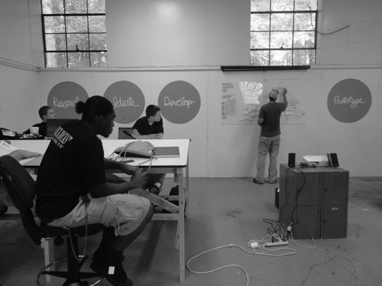
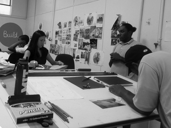
The Studio H experimental design course at Bertie Early College High School in Windsor, North Carolina


A cautionary tale of how a well-intentioned design project was torpedoed by organizational inefficiency is that of another public transport system, the New York subway, during the 1960s and 1970s. Up until then, the subway had sported a motley assortment of signs in different styles and sizes, reflecting the fractured nature of the network, which was cobbled together in a series of mergers between different lines. The end result was confusing, as the title of a 1957 design proposal suggested: ‘Out of the Labyrinth: A plea and a plan for improved passenger information in the New York subways’. Even so, it took until 1966 for the transit authority to act, by appointing the Unimark design group to review the signage system. Paul Shaw’s book Helvetica and the New York City Subway System recounts how the Unimark designers watched in horror as the Bergen Street Sign Shop, where the subway signs were made, disregarded some of their proposals and misinterpreted others. The transit authority, which was strapped for cash after a recent strike, refused to allow them to oversee the process, arguing that it could not afford to do so. Eventually it relented, but insisted that the signs be made at Bergen Street and that the typeface had to be one which the workshop already owned. This ruled out Unimark’s chosen font, Helvetica, and the similar but clumsier Standard Medium was used instead. Nor could the transit authority afford to buy enough new signs to replace all of the existing ones. The result was another muddle, albeit a milder one. The same problems recurred when Unimark introduced a new design scheme in the late 1970s, and it was not until 1989 that Helvetica, the gutsy, modern typeface that suits New York so well, was finally introduced to the subway.13
Even worse is when design quality is imperilled by mismanagement across an industry, rather than within one organization. Take fashion, where chief designers and creative directors can be hired and fired with alarming speed by companies that tend to be run by executives whose management skills were honed in other sectors, such as banking or food. Some of them become genuinely knowledgeable about the fashion system, and sensitive to the idiosyncrasies of individual designers, but all too often they try to impose managerial methods and financial disciplines which may work perfectly well in other businesses, but are ill-suited to the fashion world.
Inexperience, shortsightedness and obduracy are problematic in any business, but can be particularly damaging in fashion, where the chief designer of each label is obliged to produce anything up to a couple of dozen collections each year. They are also locked into a punishing cycle of reinventing their vision of the brand in each collection, and subjecting the results to public scrutiny. Such pressures may have contributed to Alexander McQueen’s suicide in 2010, and to John Galliano’s breakdown, which culminated in his dismissal from Christian Dior the following year, after being arrested for an anti-Semitic rant in a Paris bar.14
Not that Galliano’s behaviour would be acceptable under any circumstances, but his fragility and McQueen’s tragic death are stark reminders of how vulnerable designers can be, not least as the appeal of many fashion brands is steeped in the romantic mythology of volatile designers and their extreme behaviour. Some designers are robust enough to cope and even flourish. Karl Lagerfeld is known as ‘Kaiser Karl’ in the industry, partly for the vigour with which he has marketed his skills to different companies over the years and rebuffed would-be rivals; while Helmut Lang was responsible for both business and design at his company before selling it to Prada in 2004 and retiring the next year. But most designers need the support of efficient, empathetic managers, who are hard to find. Tellingly, many of the most successful creative and commercial duos in fashion have been both personal and professional partnerships. Yves Saint Laurent founded his fashion house in 1962 with his then-lover, the former art dealer Pierre Bergé, and Miuccia Prada’s business partner is her husband, Patrizio Bertelli. But other fashion brands have suffered from being run in cookie-cutter fashion by corporate executives, who may well be capable managers, but are neither imaginative, nor adroit enough to understand the vagaries of the fashion cycle, or the design temperament. The serial sackings are not only expensive and embarrassing for the companies concerned, but can be bruising for the individuals, all of which detracts from the design quality of the clothes.
Even the best-managed design projects in fashion and elsewhere can be scuppered by external factors, especially unexpected events such as corporate takeovers, economic turbulence, fluctuating commodity prices and exchange rates, or political changes.15 Good design can also be bedevilled by imbalances of power within particular industries. One reason why using a mobile phone can seem confusing is because of the influence of the cellular networks, which exert tremendous pressure on phone makers to ensure that their operating systems are compatible with the networks’ technology. Unless the manufacturers oblige, the networks may refuse to sell their products. As a result, operating software is often designed to appease the networks, rather than to make life easier for the phones’ owners. Steve Jobs is said to have delayed Apple’s entry into the market with the iPhone for several years because of his concerns about the networks’ power, and the risk of callers blaming Apple for glitches in their service, which the company would be powerless to correct. Apple refused to comply with the networks’ demands and produced an exemplar of intuitive user interface design for the iPhone. Sadly, few other companies are courageous enough to do the same, and can unwittingly create impediments of their own.
A common pitfall is ‘change for change’s sake’ syndrome. Ambitious but insecure executives are particularly prone to this. Anxious to make their mark in new roles, they conclude that the simplest way of doing so is to effect dramatic change, regardless of whether it is necessary or desirable. This can explain why companies take otherwise incomprehensible decisions to ditch great design projects and to replace them with unworthy successors. Why else would the courier company UPS have dumped the wonderful ‘present’ logo designed for it by Paul Rand in 1961 – a parcel tied with a bow above the company’s historic shield symbol – for a bland, digitally airbrushed shield, memorably described by one design blogger as ‘the golden combover’?16 And why else would Citroën have replaced the upturned Vs, modelled on the herringbone gears invented by its founder, the great engineer André Citroën, with a couple of characterless digital smudges?17 Presumably the management of those companies believed that their new symbols were either better designed or more eloquent representations of their corporate values than the old ones, but, if so, they were mistaken. As was the fashion designer Hedi Slimane when one of the first changes he made as creative director of Yves Saint Laurent was to rebrand its ready-to-wear collections as ‘Saint Laurent Paris’ and to replace the beautiful initialled symbol drawn for the house by the illustrator Cassandre in the early 1960s. If Slimane wished to demonstrate that he was imposing his vision on the fashion collections, he succeeded, but at the risk of appearing impetuous.18
Another version of the same condition could be called ‘designeritis’, which often afflicts products in markets that experience sudden sales growth. An example is the espresso machine. Once they were purist, utilitarian, no-nonsense exercises in engineering. But no sooner had Starbucks’ success convinced kitchen equipment manufacturers that we might like to make our own iced skinny flavoured lattes at home than they unleashed a monstrous new breed of espresso machines. They are the SUVs of the kitchen. Too big. Too bombastic. Too wasteful. Too much.
Equally vulnerable are elderly products which fulfil their functions reasonably well but have exhausted the possibility of improvement. An example is the toaster. For centuries, people toasted bread on open fires by spearing it on sticks, forks, knives or swords. By the late 1800s, erstwhile inventors were constructing electrical contraptions to toast it on heated strips of iron wire. The hitch was that the wire was prone to melting and bursting into flames. The golden age of toaster design was in the early 1900s, when the machines were made safer and more reliable. The automatic pop-up toaster was patented in 1919 by Charles Strite, a master mechanic working in Minneapolis, and went on sale seven years later as the Model 1-A-1, the first toaster with a timer that could be set to toast the bread on both sides at once, before ejecting it.19
Toasters very much like the Model 1-A-1 have been used ever since. There have been some functional improvements, mostly to make them safer and more energy-efficient, if only slightly less likely to spray crumbs. As a result any design innovations have tended to focus on styling, which is why, judging from the toasters on sale in one of the department stores on Oxford Street in London, their designers and manufacturers have succumbed to designeritis.
Why does the DeLonghi Icona toaster appear to require more buttons, dials and levers than the most complex components of the International Space Station? What possessed Bosch to attach what looks like a miniature helipad to the top of its Private Collection Toaster? Or Magimix to think that we have enough time on our hands to watch bread toasting and, presumably, crumbs accumulating through the glass casing of the Vision Toaster? Equally outlandish is the Dualit NewGen, which, despite its name, is so antiquated in style that it looks as if it has been salvaged from the debris of a 1930s Lyons Corner House. While anyone fancying a whiff of futurism could plump for the Bodum Bistro, whose inscrutable case looks likelier to belong inside the Large Hadron Collider than in a kitchen. But if you were hoping to find something reasonably attractive and unobtrusive to toast a couple of slices of bread – tough.
Another product that is prone to over-styling is the chair. We have always needed things to sit on, from conveniently shaped boulders in prehistoric caves and medieval milking stools, to the thrones of monarchs, popes and tyrants. And chairs have acted as excellent canvases for designers over the years, being big enough to use sophisticated materials and production processes, without being too large for designers and manufacturers to baulk at experimentation. They can also be manufactured in huge quantities, thereby justifying the use of complex technologies, or made by hand from precious materials using intricate craft techniques as limited editions or one-offs. ‘Every truly original idea – every innovation in design, every new application of materials, every technical invention for furniture – seems to find its most important expression in a chair,’ wrote the American furniture designer George Nelson in 1953.20 Sadly, as more and more chairs have been produced, the possibility of them being either original or important has become progressively slimmer. Every year hundreds of new chairs are unveiled at the Milan Furniture Fair, only a handful of which are distinctive or innovative. Most of the others are forced to resort to stylistic excesses in desperate attempts to attract attention.
Design can also suffer if the context in which it is used changes. Sometimes designers are at fault for failing to anticipate the impact of a change of circumstances on their work or to take effective action to correct it. Website designers are guilty of both offences when they take great pride in showing their clients how stunning digital typefaces like Georgia will look by unveiling them on state-of-the-art Apple computers. What they fail to point out is that the same font will look very different and considerably less elegant on PCs, which are, after all, used by many more people than Apple’s machines.
Sometimes the designers are blameless. The Adidas design team must have known that its efforts to produce the best possible official ball for the 2010 World Cup in South Africa would be hampered by FIFA’s decision to stage the tournament in cities of dramatically different altitude and air density.21 After all, similar discrepancies had affected the performance of a different World Cup ball at the 1978 tournament in Argentina, the last one in which the changes in altitude were as stark. The designers of the Jabulani were powerless to prevent it from happening again, because science has not yet succeeded in regulating the performance of a ball moving at speed through such dramatically different altitudes and air densities. The fault lay with FIFA’s officials, who must also have been aware of the altitude problem and could surely have revised the fixture schedule accordingly, to minimize the changes in altitude.
Yet all too often design projects flounder because designers have messed up. Sometimes they make misjudgements, like the well-intentioned but misguided designers of a device intended to help people carry water across long distances in Africa. It was a portable water purification unit in the form of a drum that used reverse osmosis, whereby dirty water is cleaned by being strained at high pressure through a membrane. So far so good, except that many of the people who used it had to expend time and energy on rolling gallons of dirty water for miles to extract a few gallons of clean water.
Other designers simply seem not to care. Clearly they would not have been willing to camp out in a 747 for several weeks to complete work on a prototype during the SARS scare. Take my electric toothbrush, a Braun Oral-B Sonic Complete. I bought it because a friend recommended it. After using it for a few months, she was told by her dentist that her teeth were so clean that they did not need to be scaled or polished: a ringing endorsement. My own Sonic Complete turned out to be equally reliable when it came to teeth cleaning, but there its design merits end. Aesthetically, it looks lazy. The shape is clumsy, the mix of colours discordant, the typography ungainly and the silver detailing tacky. It also feels odd to touch, thanks to its incongruous mix of materials.
Even so, I would be willing to overlook those flaws, on the Post-it/Google logo principle of good design, because of the toothbrush’s functional strengths, but it is impossible to ignore its environmental failings. The first problem is the box that it arrived in, which was considerably bigger than its contents. The bigger the box, the fewer of them will fit into each freight container, and the more planes, ships and trucks will be needed to transport them, thereby consuming more petrol. Problem two was that the empty space in the box was padded with a type of polystyrene which is neither biodegradable nor easily recyclable. As for what will happen to the Sonic Complete at the end of its working life? Cue problem three. Had Braun made proper provision to dispose of it responsibly? No. The instruction booklet contains a vague suggestion that it should be taken to ‘the appropriate collection points provided in your country’. Finally, problem four. Cleaning my teeth with the Sonic Complete for two minutes twice a day for a fortnight requires sixteen hours of recharging, which adds up to seventeen minutes of recharging for every minute it is used. Hardly energy-efficient.
However pearly white it promises to make my teeth, those niggling shortcomings stop the Sonic Complete from qualifying as good design. Did its designers wake up one morning and decide to design an electric toothbrush which would look ugly, feel awkward, take a preternaturally long time to charge and end up hogging sorely needed landfill space with potentially toxic packaging that has already squandered fossil fuel? Probably not, but that is what they have done.