9 When a picture says more than words
Information is only useful when it can be understood.
— Muriel Cooper1
Charles Booth was a fortunate man. Born into a prosperous family in Liverpool, he inherited a substantial sum in his early twenties and invested it in setting up a new shipping line between England and Brazil. As Anglo-Brazilian trade flourished, so did his venture, making Booth even richer. Able though he was at business, his passion was politics, and during the 1865 general election he volunteered to canvass for the Liberal Party candidate in Toxteth, one of the poorest parts of Liverpool. Knocking on door after door to speak to the residents, Booth was horrified by the desperate conditions he found there, and flung himself into a campaign against poverty.
Having begun his relief work in Liverpool, Booth continued it in London, after moving there in 1875 following his marriage to Mary Macaulay. The squalor of London’s frenziedly expanding slums, where crime, disease and hardship were rife, was a national scandal at the time. By the 1880s, Booth’s fellow anti-poverty campaigners were claiming that one in four Londoners was living in intolerable conditions, but based on his own knowledge of the slums, he suspected this figure was exaggerated. Concerned that even an accidental inaccuracy could inflame public opinion at a sensitive time, Booth decided to ascertain the true extent of hardship in the city.2
Helped by Mary, he assembled a team of volunteers, mostly recent graduates, including the political economist Clara Collet and the sociologist Beatrice Webb, to assess the income and social class of the residents of every street in London, starting in the poorest neighbourhood, the East End.3 Having spoken to the local people, Booth and his researchers consulted policemen, councillors, clerics and school boards to verify their impressions and the information they were given. For weeks on end, he left his home in plush Kensington to live in meagre lodgings in East London. Clara Collet did the same, renting a room in Whitechapel where she befriended the local women, many of whom made ends meet by working in factories during the day and as prostitutes at night, despite their fear of Jack the Ripper, who was terrorizing the area at the time.4
After analysing the data, Booth’s team determined the socio-economic status of each street and recorded their findings in a series of maps published between 1886 and 1903.5 The streets were depicted in different colours to signify the circumstances of their residents. A black street was occupied by the ‘lowest class, vicious and semi-criminal’, who lived ‘the life of savages with vicissitudes of extreme hardship’. The people living on dark-blue streets were ‘very poor’ and in ‘chronic want’, while light-blue streets were for those who were ‘poor’ but not destitute. Purple signified slightly less poor, pink ‘fairly comfortable’ and red ‘well-to-do’. Best of all was to live on a yellow street among the richest, grandest Londoners, as Booth did in Kensington.6
The first map was published as the ‘Descriptive Map of East End Poverty’ in 1889. A second set of maps covering all of central London came out in 1891, followed by a third series charting a wider area. Far from proving that the estimate of one in four Londoners living in poverty was an exaggeration, Booth’s investigation revealed that it had underestimated the problem, and the correct figure was one in three.7
The most important component of Booth’s poverty project was the rigour of its research, which may well have influenced public policy in whatever form it was presented. But the design decision to colour-code each street ensured that the information relayed by the maps could be readily understood by a far wider audience than the relatively small number of people who would have ploughed through an academic tome. Anyone could identify the pockets of deepest poverty at a glance, simply by looking for strips of black and dark blue; while the other colours acted as accurate and objective guides to the nuances of Britain’s arcane class system. As a result, Booth’s findings had greater impact on public opinion than they otherwise would have done, and stepped up the pressure on the government to clear the slums and replace them with decent housing. It is for this reason that his poverty maps are now hailed as exemplars of information design.
Translating huge quantities of complex, often contradictory information into a form in which it can be understood easily and accurately has been an important role of design from ancient Egyptian hieroglyphics onwards. Yet like other instinctive design exercises, including Ishtar’s raised fist and the pirates’ skull-and-crossbones, such feats were seldom recognized for their design merits.
The American statistician Edward Tufte has published a series of books hailing unsung examples of information design, starting with eleventh-century Chinese maps8 and early seventeenth-century depictions of the solar system, including Johann Bayer’s sky maps and the beautiful copper engravings in Galileo’s book The Starry Messenger.9 By the late eighteenth century, such visualizations were used increasingly as analytical tools. Among the pioneers were the Swiss-German scientist and mathematician J. H. Lambert, and William Playfair, a Scottish political economist who devised ingenious visual interpretations of statistics, including the first known bar chart, in his 1786 book The Commercial and Political Atlas.10 Their work paved the way for nineteenth-century social reformers, including Charles Booth, to deploy visualization for political ends. The anti-slavery lobby used John Hawksworth’s 1823 engraving of the layout of The Vigilante, a French slave ship captured by the British navy off the coast of Africa the previous year, to expose the heinous conditions in which African slaves were transported to North America. Nearly three hundred and fifty slaves were crammed into the hold of the ship in shackles, while the spacious captain’s cabin occupied roughly the same amount of room as several dozen seated women. By depicting the ship in the dispassionate style of an architectural drawing, Hawksworth demonstrated the merciless brutality of the slave trade.11
Equally effective was a dot map devised by a London doctor, John Snow, to identify the source of a sudden cholera outbreak in the Soho area in September 1854. He produced a map of the affected area, marking the water pumps with crosses and the home of each cholera victim with a dot. As nearly all the dots were clustered around the Broad Street water pump, Dr Snow concluded that it was the likeliest source of the disease. His suspicions were confirmed when the handle was sent away to be tested and found to be contaminated. After its removal, the spread of cholera ceased.12 As with Booth’s poverty maps, Dr Snow’s medical knowledge and the efficiency with which he analysed the data were the decisive factors in defusing the crisis, but it would have been much more difficult for him to have secured the institutional support he needed to tackle the problem had the information been presented less persuasively.
Tufte’s own favourite example of historical information design is a series of cartes figuratives, or flow maps, of famous military campaigns produced by a retired French engineer, Charles Joseph Minard, in the mid 1800s. One map traces the arduous journey of the army of soldiers and elephants led by the Carthaginian commander Hannibal over the Pyrenees and the Alps from Spain to northern Italy in 218 BC. By drawing Hannibal’s army as a pale-brown band against a black and white geographical map of the mountains, Minard showed how many men he had lost, together with almost all of the elephants. Hannibal’s army shrank from ninety-six thousand to twenty-six thousand men during the course of the campaign, and the band grows progressively thinner as the death toll rose.13
Minard’s masterpiece was his map of Napoleon’s ill-fated invasion of Russia in 1812. Using the same formula, it illustrates how France’s Grand Army crossed the border between Poland and Russia in June that year with four hundred and twenty-two thousand troops. The pale brown band then dwindles to depict the tragic consequences of their four-month march to Moscow, and the one hundred thousand soldiers who survived it. A black band illustrates the retreat, including a disastrous crossing of the Berezina River in November in which hundreds more men died. Minard also traced the impact of the plunging temperature as the icy Russian winter set in. By the time the remaining troops crossed the border back into Poland in December, only ten thousand were left in a skinny black line, which is barely visible. Having personally witnessed the brutality of war, Minard hoped that his maps might deter future warmongers.14
As the logistics of daily life became more complicated in the early twentieth century, information designers stepped up their efforts to demystify them. One of the most ambitious initiatives was the International System of Typographic Education, or Isotype for short, an extensive range of pictorial symbols introduced in the late 1920s by the Austrian political scientist Otto Neurath in the hope of explaining important social, economic, political and scientific issues to people who had difficulty reading and writing.
Born into a wealthy Viennese family, Neurath had been radicalized in his early twenties when conducting academic research in poor rural areas of the Austro-Hungarian empire. He had no design training, but as a boy he was fascinated by the maps, charts and drawings in the books in his father’s library, and by the Egyptian hieroglyphics he saw in museums.15 Convinced that pictures could explain even the most complex ideas more effectively than words, he assembled a team of researchers and analysts, including his future wife, the mathematician Marie Reidemeister, to identify which symbols would be required to produce a comprehensive visual language and how they could be combined to express different issues. He then commissioned artists to draw them.
The most prolific of the artists was the German draughtsman Gerd Arntz. Like Neurath, he came from a privileged background but had become politically active, in his case after working in his father’s factory. During the mid 1920s, he depicted the social and political problems of the era in a series of woodcuts. When Neurath saw them, he summoned Arntz to a meeting in Vienna in 1926, greeting him with a brusque: ‘How much do you cost?’ Arntz was to draw hundreds of symbols for Isotype. Each one was intended to depict an aspect of daily life in as simple a style as possible, with few lines and no perspective, in a limited range of colours. A lawyer was represented by scales of justice; a student by a man or woman writing at a desk; a farmer by a scythe; and a striking worker by a clenched fist.16 Different symbols could be combined to convey more complex messages, and Neurath insisted from the start that they be used in multiples to indicate increases in size, rather than being made individually bigger. Isotype flourished in the progressive climate of ‘Red Vienna’ during the 1920s when the city was controlled by social democrats, who championed a stream of social and economic experiments. By the end of the decade, some twenty-five people were working on the project, and the Isotype team had close links with the Bauhaus, as well as with foreign artists and designers, such as El Lissitzky in Russia and Jan Tschichold in Germany.17
Neurath’s researchers used the system to produce concise and accurate analyses of such complex phenomena as urbanization, economic development, the demographic differences between various countries and their relative readiness for war in the 1930s. The results were seen by millions of people in books, lectures and touring exhibitions during periods of intense political volatility before and during the Second World War. A series of wartime books on America and Britain used Isotype charts to analyse the distinctions between the two countries. In one book, entitled Our Private Lives, the charts reveal at a glance how highly educated the population of each country was, what type of meat they ate, whether they drank coffee or tea, how they spent their leisure time and which jobs they were likely to do.18 As Neurath liked to say: ‘Words divide, pictures unite.’19
Other feats of early twentieth-century information design tended to be instructive rather than analytical. Among the finest examples was the London Underground Map, designed in 1931, initially on a speculative basis by a freelance draughtsman, Harry Beck.20 Like many public transport systems, the London Underground had developed piecemeal, with new lines being built by different companies, and existing ones extended as new suburbs emerged. By the early 1930s, the companies had merged and the Underground sprawled across such a large area that it was increasingly difficult to squeeze all the lines and stations on to a geographical map, especially one which was legible enough for people to read and act upon when dashing through tunnels or across crowded platforms. Navigating the network was tricky enough for Londoners, including those with a reasonable knowledge of the city, but even more so for tourists.
Finding ways of improving the map was a constant concern for the Underground’s management, and Beck took it upon himself to modify the existing version in his spare time. Having concluded that a geographical map was no longer feasible, he decided to adopt a diagrammatic approach, which would seem clearer and more logical to passengers, even if it risked distorting geographical reality. ‘Looking at the old map of the Underground railways, it occurred to me that it might be possible to tidy it up by straightening the lines, experimenting with diagonals and evening out the distance between stations,’ he said. To that end, he enlarged the crowded central area of the network and compressed the lengthy stretches of suburban tracks. He then connected all the stations on each line with straight lines, and positioned them as though they were similar distances apart, depending on whether they were in the city centre or the suburbs. Each line was allocated a different colour, and every station depicted as a circle: hollow rings for interchanges, and solid dots for the rest. Beck’s ‘tidying up’ exercise even included straightening the course of the River Thames.
Having completed his first diagrammatic map, Beck showed it to his colleagues, who encouraged him to present it to the heads of the Publicity Department, only for them to reject it. Undaunted, Beck asked them to reconsider. A year later, he was summoned to see one of the managers, who said: ‘You’d better sit down. I’m going to give you a shock. We’re going to print it.’21 Up until then, Beck had done all of the work on the map outside office hours and at his own expense. Only when the map was finally printed was he paid, and even then it was a nominal fee for producing the artwork.
The Underground placed an order for seven hundred and fifty thousand copies of the ‘Diagram’, as it was called internally, to be printed as a small, folded leaflet in January 1933.22 The public response was positive, surprisingly so, given the radical nature of Beck’s design. The distances between stations bore no relation to reality, nor did their positions. Angel station was shown on the same level as Old Street, rather than to the north. Victoria and St James Park were level too, although the former is south of the latter. Beck even modified the style of his chosen typeface in the interest of clarity, when it came to printing lengthy station names like Tottenham Court Road. Ever the stickler, he would have considered shortening them to be cheating. (Although he eventually admitted defeat with Ravenscourt Park, which had to be printed on three lines as Ravens- court Park on later editions of the map.23)
Despite its calculated geographical gaffes, the ‘Diagram’ was instantly popular. The first batch of leaflets ran out, and a repeat order for one hundred thousand copies was placed after a few weeks.24 The principal reason for its success was that it worked. The old Underground map really was confusing, and this one was not. Even first-time travellers could make sense of it. Beck’s ‘Diagram’ was a rousing example of an ingenious design solution with instantly identifiable benefits for those who used it. No more late arrivals, missed meetings or stranding friends beside ticket booths because you had mistakenly taken the wrong line, missed a turning or ended up having to wait for a later train.
No wonder passengers liked it, especially as geographical inaccuracy must have seemed like a small price to pay for the map’s efficiency. London is such a big city that few of its citizens were knowledgeable about its geography in the 1930s, nor are they today. Most of the people who used Beck’s map would have been unable to guess the location of far-flung suburban stations like Rickmansworth, Hounslow, Wimbledon, Edgware, Richmond or Morden. If those stations were ‘moved’ to make the map clearer, passengers would not necessarily notice, so why should they object? (This was just as well, as Richmond in particular would be shuffled around repeatedly in subsequent revisions of the ‘Diagram’.25) All the public knew was that the new Underground map seemed to make more sense than any supposedly accurate attempt to chart the geographical reality of London’s labyrinth of medieval lanes, Georgian squares, Victorian terraces, modern suburbs and the twists and turns of the Thames.
The ‘Diagram’ was such a success that Beck was made a full-time employee of the London Underground, albeit not until 1937, five years after his design had been accepted. Ten years later, he resigned to take up a teaching post at what is now the London College of Communications, but continued to work for the Underground on a freelance basis until 1959. Throughout that time, he remained immersed in his map, constantly identifying improvements, such as changing the colour-coding in 1934 to make the Central Line more distinctive (it switched from orange to red),26 and accommodating structural or operational changes to different parts of the network. Fiercely protective of the ‘Diagram’, he often found himself at odds with colleagues in his efforts to stave off what he saw as damaging interventions. Ken Garland’s book Mr Beck’s Underground Map recounts Beck’s tireless campaign to safeguard his work through verbal complaints, letters of protest and legal threats.
The crunch came in 1960 when, unbeknownst to Beck, the Underground commissioned a new map to include the soon-to-be-completed Victoria Line, the only entirely new line to have been built since the ‘Diagram’ had been introduced. The first Beck knew of it was when the new map was published, complete with abbreviated station names – Trafalgar Sq., Liverpool St., Bow Rd. – and other graphic howlers such as splitting the name ‘Aldgate’ by placing ‘Ald’ on one side of the Circle and Metropolitan Lines and ‘gate’ on the other. (Unsurprisingly, it failed to solve the Ravens- court Park problem.) Up until then, Beck had been expecting to revise his own ‘Diagram’ to accommodate the Victoria Line, and had been looking forward to doing so. He was furious.27
Beck began a long, ultimately fruitless battle to try to persuade his old bosses to allow him to redesign the map. He lost the campaign and never worked for the Underground again, yet the spirit, at least, of his original ‘Diagram’ has survived, as one of the most popular emblems of London and a stunningly efficient way of navigating an otherwise baffling city. Other cities have adopted diagrammatic subway maps, including Tokyo, Milan and Amsterdam. But Beck’s approach has proved most effective in places that are structurally similar to London: agglomerations of villages that have merged over the centuries to stretch across vast geographical areas, with densely clustered towers surrounded by low-lying suburbs. Tokyo is like that, but Paris is not. The Paris Métro invited Beck to design a diagrammatic map, only to realize that it would not be suitable for a smaller city with a more orderly, radial layout. The idea was dropped quietly.28
The outcome of the New York subway’s flirtation with a Beck-inspired map turned out to be much noisier. In 1972, it introduced a diagrammatic map devised by the Italian-born designer Massimo Vignelli, who had advised the New York Transit Authority on design since the late 1960s.29 He relished the challenge of ‘tidying up’ the tangled subway system into a seemingly rational network depicted in twenty-two colours, one for each line, with every station shown as a dot. Design purists still reminisce fondly about Vignelli’s design, but a vociferous group of New Yorkers loathed it from the start, and voiced their complaints loudly.30
The problem was that New Yorkers were more familiar with the geography of their city than Londoners were with theirs; at least, they thought they were. Very few subway passengers were familiar with the length and breadth of the network, including all the suburbs. But the central area of New York is small enough to be walkable, unlike London’s, and the ‘grid’ system of numbered avenues and cross-streets introduced to Manhattan by the Commissioners Plan of 1811 is so orderly that New Yorkers are likelier to think that they know their way around, even if they do not.31 They also have the comfort of knowing that, thanks to the grid, if the worst came to the worst, they could work out where to go. Their confidence significantly reduced the perceived benefits of a diagrammatic subway map, and made New Yorkers less inclined to forgive its geographical anomalies. Even those that managed to do so found it hard to ignore the most obvious ones, especially the glitch that Vignelli’s critics claimed was the most egregious of all, depicting Central Park as a square, as opposed to its actual shape of an elongated oblong, at least three times bigger than the diagrammatic version.
Eventually, the transit authority buckled and Vignelli’s map was abandoned in 1979. He continued to defend it, arguing that, rather than going too far in terms of ignoring geographical reality, his mistake was not to have gone far enough. Vignelli had made a few geographical references on the map: to the locations of Manhattan, Brooklyn and the Bronx, for instance. In retrospect, he felt that his chances of success would have been higher had he ignored them. When interviewed by Gary Hustwit for his 2007 documentary film Helvetica, Vignelli explained ruefully that the world was divided between ‘visual’ people, who had no difficulty reading maps, and ‘verbal’ ones, who often did. ‘Verbal people have one great advantage over the visual people,’ he groaned, ‘they can be heard.’32
Quite so, though if there is a moral subtext to the saga of those subway maps, it is that the rest of us are happy to allow designers to simplify life’s complexities, even if it involves straying from the truth, providing that we enjoy the result. New Yorkers rejected Vignelli’s map because they found his attempt to edit out their city’s idiosyncrasies to be dull and soulless, whereas Londoners still like the look of the neat, navigable city depicted by Harry Beck. Indeed, most of them are so familiar with the latter-day version of his ‘Diagram’, and so confident that they can trust it, that they do not think of it as being inaccurate. When the London Eye opened beside the Thames in 2000, many Londoners saw a ‘bird’s eye view’ of their city for the first time, and expressed astonishment that it looked so different from the Underground map. The river turned out to be wigglier than they had thought, and many people had no idea that some of the landmarks on the South Bank, including Tate Modern and Waterloo Station, were actually north of the Houses of Parliament and Westminster Abbey, both of which are on the northern bank of the Thames.
It takes considerable skill to pull off such a convincing act of (entirely well-intentioned) design deception, but not even a designer with Harry Beck’s flair for condensing a blizzard of information into brevity and clarity could have risen to the challenges facing information designers in the digital age, at least not if he had stuck to print. Millions of people still use printed maps, charts, pictograms and diagrams like those devised by Beck, Neurath, Minard, Snow, Hawksworth and Booth to help us to make sense of the world, but the unprecedented speed, scale and complexity of modern life means that we need new forms of information design too.
The central issue is the colossal increase in the volume of data that computers produce and store, the ‘data deluge’, as the Economist has called it.33 ‘Moore’s law’ is to blame. In 1965, Gordon E. Moore, a founder of Intel, the US chip manufacturer, calculated that the number of tiny transistors which could be packed on to a silicon monocrystal microchip had doubled every year. He also predicted that this would continue for at least a decade. Dubbed ‘Moore’s law’, his forecast has remained accurate ever since, and as microchips have become more powerful, so have the machines they operate.34 As a result, the volume of traffic on the Internet increased eightfold in the five years to 2011, and is expected to rise threefold between then and 2016, when it will reach over a zettabyte, such a huge quantity of information that the word was only invented in 1991.35 In practical terms, this means that the amount of data generated by the Internet is growing considerably faster than the network’s ability to carry it.
Not only has computer processing power escalated, but software has become more efficient. The most sophisticated systems now take days to complete projects which would have taken years until relatively recently, or proved impossible to execute. When the Sloan Digital Sky Survey’s giant telescope in New Mexico started operation in 2000, it amassed more data in its first few weeks than in the entire history of astronomy up until that point. And it produced as much information in the whole of its first decade as the new Large Synoptic Survey Telescope now being built in northern Chile will be able to amass in just five days. Similarly, it is now possible to decode the human genome within a week, compared to the ten years of computer analysis required when it was first completed in 2003.36
These advances are aggravating data deluge, but may also offer a solution, if the same increases in processing power and software efficiency are applied to developing new ways of managing the maelstrom of information. A group of software designers has responded by developing computer programs which fulfil the old-fashioned function of information design by crunching through the data and reinterpreting it in a way that is legible and useful to the rest of us, without over-simplifying it by introducing errors or losing nuances. The result is a new genre of dynamic digital images known as data visualizations: computer-generated images and animations that can be programmed to change in real time to track the information they are relaying.
Their origins lie partly in the research into computational aesthetics begun by László Moholy-Nagy in late 1920s Berlin when he experimented with moving images on home-made contraptions like the Light Space Modulator, which stupefied customs officials when he and his family were moving around Europe in the 1930s.37 His assistant at the time, György Kepes, continued this work in the United States, first when teaching in Chicago with Moholy, and then in his own research at the Massachusetts Institute of Technology, where he spent most of the rest of his career.38 Kepes’s work there and his books, such as 1944’s Language of Vision, had a profound influence on colleagues such as Nicholas Negroponte and Muriel Cooper, and through them on future MIT students, including the software designers John Maeda and Lisa Strausfeld.39
Not all the aesthetic pioneers of data visualization came from such a nurturing academic environment as MIT. Many of them were self-taught amateurs working in isolation. Computers had been restricted to military use until the end of the Second World War, when they were introduced to universities and research laboratories, where scientists and mathematicians started to experiment with them to create visual effects. Mostly they did so by attaching mechanical arms to guide pens or pencils across sheets of paper. Their goal was aesthetic, to find out what sort of images a machine would produce of its own volition. Throughout the 1950s and 1960s, artists gradually became aware of the unusually precise nature of the imagery generated by computers, as did people from other fields.40
Among them was a lecturer at the University of Manchester, Desmond Paul Henry.41 The university was responsible for important early advances in computer science, not least in building the world’s first stored-program computer, the Manchester Small-Scale Experimental Machine, which was nicknamed ‘Baby’ when it was completed in 1948. Henry took a keen interest in such developments, but as an observer, not a participant. He taught philosophy at the university, and had discovered computers as a technical clerk for the Royal Electrical and Mechanical Engineers during the Second World War. In 1951, while browsing around the second-hand bookstalls on Shudehill in Manchester, Henry went into an army surplus warehouse and spotted an old Sperry bombsight computer used by British bomber aircraft to calculate when to release their bombs. He bought it for £50, a substantial sum at the time, and rigged it up to guide ballpoint pens and, later, technical tube pens across paper. After his first machine died, Henry recycled some of the components into a new one and subsequently repeated the process to build a third. He exhibited his mechanical drawings at local art galleries in Manchester and also in ‘Cybernetic Serendipity’, the 1968 survey of computer art at the Institute of Contemporary Arts in London, which later toured to the United States. When his computer returned from the tour, it was broken, and although Henry built two more machines, his interest in computer art faded and he concentrated on philosophy, becoming an authority on medieval logic.42
Touchingly naïve though they look now, the computerized images produced by Henry and fellow pioneers, such as Charles Csuri, Harold Cohen, Roman Verostko and Vera Molna, must have seemed extraordinary at the time. The lines, forms and repetitions are too improbably precise to have been made by hand or even by conventional machines. Kepes’s and Cooper’s experiments at MIT had a similarly gauche quality, yet all of these early works have helped to produce the intensely sophisticated digital imagery we see today.
Data visualization is also rooted in scientific research from the 1980s onwards. Science was one of the first fields to be affected by data deluge, because computers had pumped out ever-increasing quantities of scientific data since the 1960s. This gave scientists the information required to grapple with new and more difficult problems, but there was a growing realization that they needed to find more efficient ways of testing their assumptions and of explaining the results of their research to non-scientists, in particular politicians, whose support would be needed to tackle environmental issues. By the mid 1980s, a growing group of scientists was interested in exploring the possibility of using computer graphics to translate their theories into images.
The National Science Foundation in the United States convened a Panel on Graphics, Image Processing and Workstations to discuss the issue in 1986.43 The following year, the panel published a report on ‘Visualization in Scientific Computing’ in which it outlined the potential of computer graphics to aid scientific research and to disseminate it more widely.44 The NSF allocated funds for suitable facilities to be installed at the supercomputing centres which had recently opened throughout the United States. One of the first successes was the Vapors project, which demonstrated how damaging smog was threatening to become in southern California. The computer-generated image of how badly the region would be affected was so realistic that the authorities agreed to introduce more stringent pollution controls.
The technology developed to produce scientific visualizations was then applied to other fields including engineering, architecture and product design, where it was used to produce accurate digital models of finished projects. More recently, it has been deployed as an information design tool in the form of data visualizations. Some of the earliest examples dealt with developments in the digital domain, such as mapping the flow of traffic across the Internet, which would be impossible to represent accurately using traditional printed media.45
An important breakthrough was the development of Processing, a computer programming language initiated by the American software designers Ben Fry and Casey Reas in 2001, when they were colleagues at MIT Media Lab, where Muriel Cooper’s protégé John Maeda was among their teachers. Processing was designed specifically to enable technologists to express themselves visually, while being simple enough for designers, artists and architects with no experience of programming to use it to produce images, models and animations.46
Fry harnessed Processing to produce a remarkably clear and succinct explanation of the genetic difference between human beings and chimpanzees in 2005, shortly after the publication of the first analytical comparison between human and chimp genomes. The differences are very slight, and a key distinction is believed to be the FOXP2 gene, which is linked to language. Fry’s visualization created a photographic-style image of a chimpanzee’s head from seventy-five thousand digitally generated dots, each representing one of the letters in the gene, with just nine dots highlighted in red to identify the only significant differences between the coding of the chimp and human versions of that gene.47 You could read several weighty academic tomes on the subject and still not grasp it as clearly as you can in that image.
Data visualizations have since been used to illustrate everything from the progress of natural disasters such as earthquakes, floods and tsunamis; the often circuitous process of garbage disposal; the location of emergency calls in particular cities; recurring themes in the campaign speeches of US presidential candidates; to the flow of asylum seekers across the globe. The new interactive maps produced by the New York subway no longer simply show passengers what the network looks like, as the traditional printed one does, but, in the case of ‘The Weekender’, a digital map posted on its website, also alert them to delays, closures and seasonal hitches, such as leaves on the line, as well as suggesting the most efficient way of getting from one station to another between Friday night and early on Monday morning.48 ‘The Weekender’ was also a personal triumph for Vignelli, because MTA officials invited him to reinterpret his diagrammatic map for the project, more than thirty years after their predecessors had axed it.
Hundreds of websites have emerged, symposia convened and books published on data visualization. Ferocious debates have raged over whether too many visualizations are strong on style but weak on substance, because their designers are obsessed by aesthetics or technology to the detriment of other qualities. But enough visualizations have proven themselves to be useful, and some indispensable. Often they are the work of young designers and programmers working independently in grungy studios, but visualization swiftly became a standard tool for government departments and bastions of ‘old media’ such as The New York Times, the Guardian and the BBC.
Nor has design’s co-option of data visualization detracted from scientific progress. On the contrary, it has fostered greater collaboration between scientists and designers to the benefit of both fields, while scientific developments in visualization have continued to advance in long-running programmes such as the Blue Brain Project, for which a team at the École Polytechnique Fédérale de Lausanne is building a virtual brain in a supercomputer, thereby enabling scientists to learn more about and possibly develop new ways of treating neurological disorders and to study the impact of new drugs.49
Visually luscious and logistically dazzling though data visualization can be, there is still a place for old-fashioned forms of information design. Some of the most interesting recent examples are the work of the Dutch designer Joost Grootens. Having originally trained as an architect, he then worked as a multimedia designer before deciding to apply his knowledge of digital media to developing books which would be useful and appealing in the online era. He began by producing a series of atlases for the Rotterdam-based publisher 010 in which he reinvented the traditional atlas by devising new types of maps and other visual means of explaining the implications of its content.
His greatest feat is a book on his own work, published in 2010 as I swear I use no art at all: 10 years, 100 books, 18,788 pages of book design. In it, Grootens describes the process of designing each of those hundred books and the evolution of his work, partly in words, but mostly visually, in maps, charts, grids, infographics and indices. There are floor plans of every office and design studio he has worked in with coded numbers to indicate who sat where. A map of northern Europe shows the cities where he has held meetings, printed books and staged book launches. He has included examples of every typeface he has used, photographs of the binding of each book and coded diagrams of the layouts. There are also lists of all the authors, publishers, printers and colleagues with whom he has collaborated, and a flow chart which shows how one project led to another through meetings and word of mouth in a stunningly concise account of the random cocktail of tactics and coincidence that determine most design careers.50
Convinced that people stop looking at books as soon as they start reading the words, Grootens presents the visual information first. He proves the point in I swear … by printing the text in reverse on the few reproductions of pages taken from the books he has designed over the years. And he forces his readers to search for the things they probably most expect to find in a book about book design – images of the covers – by ‘hiding’ them inside the folded pages of an essay, knowing that the hunt for those pictures will make them seem more precious than any number of words could have done.51
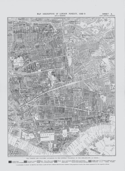
East London in Booth Map 5 from Charles Booth’s ‘Map Descriptive of London Poverty, 1898–9’

An Isotype exhibition at the Gesellschafts und Wirtschaftsmuseum in Vienna, c.1929

Marie Reidemeister working on an Isotype chart in Vienna, c.1930
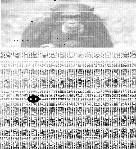
‘Humans vs Chimps’ data visualization designed by Ben Fry in 2005 using Processing software
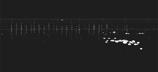

From Stamen’s data visualization of trading on the NASDAQ stock market in New York on 24 July 2012