Chapter 2
Performing Basic Tasks
In This Chapter
 Using selectors to access objects
Relying on boxes to organize content
Developing backgrounds
Chapter 1 rushed you through a few examples that demonstrated how Cascading Style Sheets (CSS) work at a basic level. Of course, there’s a lot more to CSS and this chapter helps you take the next step on the journey. There are a few essential tasks that you’ll perform whenever you work with CSS simply because there isn’t any way to avoid them.
One of these tasks is selecting objects to work with, as discussed in Chapter 1. Creating a p or h1 style involves selecting <p> and <h1> tags (objects) within the document. After these objects are selected, you can perform tasks with them. Note, however, that simple tags aren't the only objects, as you discover in this chapter.
You also need to know how layout works at a basic level. In this chapter you discover how CSS interacts with the drawing area onscreen. For example, you need to know the starting point for drawing new information onscreen and how the underlying platform deals with packaging objects for display. This is the same sort of information that developers need in order to create desktop applications, but it’s CSS3-specific.
Finally, on websites, white backgrounds are boring. Adding a simple picture makes the background a lot more interesting and it doesn’t require a lot of effort. Of course, you can add the background directly to the pages of your site, but using a style to add the background is better. If you decide to update the background, you can update all pages at once without difficulty. The whole idea behind using styles is to create an environment where you can perform tasks easily and reliably.
Working with Selectors
When you want to change something in your environment, you select the object associated with that factor and modify it in some way. For example, you select the remote control, point it at the television, and change the channel as needed to view your favorite show. If you’re hungry, you open the refrigerator, select the food that’s appealing at the moment, and then eat it. The objects in a web page work the same way. To change an object to look the way you want, first you select the object and then you make changes to it.
 When creating a style sheet, HTML documents can be a problem. They can be long and so complex you can't tell what they contain. As a consequence, you need methods for selecting objects without knowing what those objects are in advance. For example, you know that you want all
 <p> tags to appear in a certain way, even though you don't know where they're placed on a page or whether the page even has any <p> tags at all. Consequently, CSS provides a number of techniques that allow you to find the objects you want to select without a problem.
Because the topic is relatively complex, it’s important to find an easy way to determine which selector to use and when to use it. This chapter breaks selectors down into types so you can ease into them a little at a time, without the shock of seeing a huge, somewhat disorganized list of them displayed on a site. The following sections discuss the various ways in which you can use selectors to interact with objects on pages.
An overview of selectors
There’s no reason that selectors should be complicated. All you’re really trying to do is select an object on the current page so you can interact with it in some way. The idea is quite simple. It’s the implementation that makes things complicated. However, you can reduce the complexity by viewing selectors in specific ways.
 Most selectors fall into particular categories. Note, however, that a special selector, * (asterisk), selects every object in the document without regard for type or location. You use this selector when you want to format every object in the document in a certain way.
This chapter tells you about every selector you’ll ever use (and probably a few you won’t). To reduce the complexity of selectors, the chapter breaks them into functional categories like this (the standard doesn’t categorize the selectors in this way — this breakdown is merely for your convenience):
 Tag: HTML tags form the basis of most documents. You can interact directly with any tag, such as
 <p> and <h1> on the page. CSS also makes it possible to be discriminating in your choices. For example, you could choose to interact only with <p> tags found within a <div>. A number of selector types work with tags in various ways.
Attribute: HTML tags contain attributes. The most commonly used attributes with CSS are class and id. However, there are methods of working with tags containing any attribute. For example, you might want to interact in a specific way with tags that contain a target attribute and CSS provides the means to do that.
Pattern: There are cases when you want to format content based on a pattern. For example, you might want to format every other list item <li> in a specific way to make the list items stand out — so the user can easily see each list item as a specific entity. If the page were to suddenly have another item in the list, the CSS would automatically reformat the items to match the pattern you created — all without any special changes on your part.
Event: Some pages you visit look like someone has performed fancy programming to obtain the special effects that you see. In reality, many of these sites trap an event, such as a mouseover, and create CSS to interact with it. The object is formatted one way normally and then another way when the mouse passes over it. Depending on the complexity of the CSS you create, the effects can be truly amazing (and all without programming).
State: Objects on a page have a specific state. For example, links are active, visited, or unvisited. You can choose to format these objects in special ways that depend solely on their state at any given time. A link that someone has visited might appear with a check mark next to it, while the link that’s currently active might appear highlighted in some way. Just how you interact with the state information depends on the sort of effect you want to achieve.
 The topic of selectors really is quite complicated. Don't even think about viewing the standards without a bottle of aspirin by your side. Fortunately, there are a few sites that you can reference that provide a list in a somewhat organized manner. For example, the W3C Schools site (
www.w3schools.com/cssref/css_selectors.asp) provides a simple chart that tells you about the majority of the selectors in a straightforward manner. Short lists of selectors, such as the one at http://net.tutsplus.com/tutorials/html-css-techniques/the-30-css-selectors-you-must-memorize/, are also helpful. This particular site provides straightforward information about browser compatibility when working with selectors as well. If you really want to find out about browser compatibility, though, have your browser take the CSS Selectors Test at www.css3.info/selectors-test/.
Working with tag selectors
Tag (or element) selectors are character sequences you use to choose tags such as <h1> and <p>. In fact, you can select any HTML tag this way; Chapter 1 shows simple examples of a tag selector at work. A tag selector always relies on the tag name, such as p or h1. However, there are some interesting tag selector combinations you should know about. The following list tells you about tag selectors that you can use in addition to the simple tag selector shown in Chapter 1.
Tag,Tag: Separating two tags with a comma means selecting both tags, regardless of where they appear in the document. For example, using p,div would select all <p> and <div> tags within the document.
Tag>Tag: Separating two tags with a greater-than sign (>) tells the browser to select a tag that has another tag as a parent. For example, if you have <div><p /></div> and use div>p, the browser will select the <p> tag.
Tag Tag: Separating two tags by a space tells the browser to select a tag that appears within another tag. This selector differs from using a greater than sign in that the first tag need not directly appear immediately before the second tag. For example, if you have <div><span><p /></span></div> and use div>p, the browser won't select anything. However, if you use div p instead, the browser will select the <p> tag.
Tag+Tag: Separating two tags with a plus sign (+) tells the browser to select a tag that appears immediately after another tag. For example, if you have <div /><p /> and use div+p, the browser will select the <p> tag. Notice that the <p> tag doesn't appear within the <div> tag, it appears after the <div> tag.
Tag~Tag: Separating two tags with a tilde (~) tells the browser to select every tag that appears after another tag. For example, if you have <div /><p /><p /> and use div~p, the browser will select both <p> tags. This differs from div+p, which tells the browser to select only the first <p> tag that follows the <div> tag.
:root: Selects the root element of the document. The root element depends on the document type. This selector is normally used with XML documents, but you could potentially use it with any document type.
Even with this short list of tag selectors, you can see that CSS is quite flexible when working with tags. Seeing the selectors in action will help you understand them a bit better. The following procedure shows how to use the various tags:
1. Copy the ExternalCSS.HTML and ExternalCSS.CSS files (created in Chapter 1) to a new folder.
A number of examples in the book build on previous examples to save time and effort on your part. Make sure you create a copy of the existing example and use the copy for your work in this chapter.
2. Open ExternalCSS.HTML.
3. Type the following code after the existing <p> tag in the file and save the changes to disk.
<div>
<p>Text within a DIV.</p>
<span>
<p>Text with a DIV parent.</p>
</span>
</div>
<p>Text after a DIV.</p>
<p>More text after a DIV.</p>
This code simply adds tags in specific arrangements so that you can test the various selectors. If you open the resulting file now, you see that each of the <p> tags has been automatically formatted like the original <p> tag, as shown in Figure 2-1.
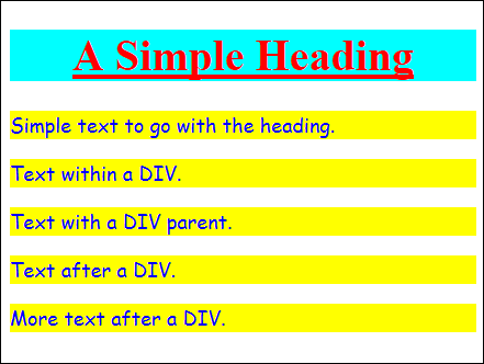
Figure 2-1: CSS automatically formats any <p> tags you add.
3. Open ExternalCSS.CSS.
4. Type the following code after the existing styles and save the changes to disk.
div>p
{
text-align: right;
}
5. Reload the test page.
The effect of making the style change is shown in Figure 2-2. Notice that the only <p> tag that's been affected is the one that has the <div> tag as a direct parent. In addition, notice that the previous formatting cascades into the current formatting. You haven't overridden any of the existing formatting, so the text appears as before — it simply uses right-justification instead of the default left-justification.
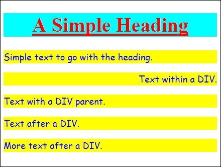
Figure 2-2: Only the <p> tag with a <div> as a direct parent is affected.
6. Type the following code after the existing styles and save the changes to disk.
div p
{
text-decoration: line-through;
background-color: #ff7f7f;
}
7. Reload the test page.
The effect of these style changes appears in Figure 2-3. Notice that two lines are affected this time. In addition, the background-color style has been changed, so these two lines use the new color — it takes precedence over the original color. When you think about the cascading part of CSS, think about a stream where changes downstream take precedence over the original state of the water.
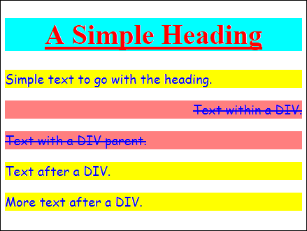
Figure 2-3: All <p> tags within <div> tags are affected.
8. Type the following code after the existing styles and save the changes to disk.
div+p
{
font-family: monospace;
font-style: italic;
}
9. Reload the test page.
The effect of these style changes appears in Figure 2-4. Only the line that appears directly after the <div> is affected: The font has changed to a monospace font (normally reserved for code) and is italicized.
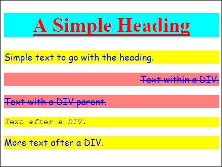
Figure 2-4: Only the <p> tag directly after the <div> tag is affected.
10. Type the following code after the existing styles and save the changes to disk.
div~p
{
font-weight: bolder;
font-size: 30px;
margin: 0px;
color: #7f007f;
}
11. Reload the test page.
You see the effects of this style change in Figure 2-5. Notice that both <p> tags that appear after the <div> tag are affected. The font now appears bold and is larger. The font color has also changed. Especially important in this part of the example is that setting the margin to 0px gets rid of the white space between lines.
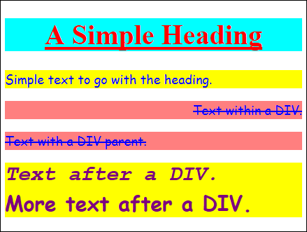
Figure 2-5: All <p> tags after <div> tags are affected.
Working with attribute selectors
Within many tags are attributes that describe tag properties. Two common attributes are the tag identifier (id) and CSS classification (class). However, CSS makes it possible to select objects by any attribute desired. The following list tells you about attribute selectors that you commonly use when creating styles.
.ClassName: Selects any objects that have a class attribute value with the given name. For example, .StdPara would select every object that has a class="StdPara" attribute without regard for object type.
#Id: Selects any objects that have an id attribute value with the given name. For example, #ThirdHeader would select every object that has an id="ThirdHeader" attribute without regard for object type.
:lang(Language Identifier): Selects any object with the specified language value. For example, :lang(en) would select any object that uses English as its language. You can find a list of common language identifiers at www.w3schools.com/tags/ref_language_codes.asp.
[Attribute]: Selects all objects that use a particular attribute regardless of the attribute's value. For example, [lang] would select all objects that use the lang attribute.
[Attribute=Value]: Selects all objects that have an attribute with a particular value. The value must match precisely. For example, [lang="en-us"] would select every object that has a language attribute with a value of English.
[Attribute~=Value]: Selects all objects that have an attribute that contains a particular value. The search value need only appear somewhere within the value as a whole. For example, [title~="Secondary"] selects all objects with title attributes that contain the word Secondary as a discrete word. This selector works with whole words.
It's possible to further restrict many of these attribute selectors by combining them with tag selectors. For example, p[title~="Secondary"] selects only the <p> tag objects with title attributes that contain the word Secondary as a discrete word. It's often possible to combine selectors in unique ways to create precisely the effect you want.
[Attribute|=Value]: Selects all objects that have an attribute that begins with a particular value. The search value needs to appear at the beginning of the value as a whole, but need not be the entire value. For example, [title|="Sub"] selects all objects with title attributes that start with the word Sub. This selector works with hyphenated terms.
[Attribute^=Value]: Selects all objects that have an attribute that begins with a particular value. For example, [title|="Sub"] selects all objects with title attributes that start with the word Sub. This form of the selector differs from the [Attribute|=Value] attribute in that it's less restrictive. Using this form will select title="SubHeader", title="Sub Header", or title="Sub-Header" with equal reliability.
[Attribute$=Value]: Selects all objects that have an attribute that ends with a particular value. For example, [title$="Secondary"] selects all objects with title attributes that end with the word Secondary. This form of the attribute is nonrestrictive — it requires no special formatting.
[Attribute*=Value]: Selects all objects that have an attribute that contains a particular value. For example, [title$="Secondary"] selects all objects with title attributes that contain the word Secondary. This form of the selector is less restrictive than the [Attribute~=Value] attribute. Using this form will select title="SecondaryParagraph", title="Secondary Paragraph", or title="Secondary-Paragraph" with equal reliability.
Now that you have some idea of how attribute selectors work, it’s time to see them in action. The following procedure helps you understand what attribute selectors do and how you can use them to choose specific objects within a document for formatting.
1. Copy the ExternalCSS.HTML and ExternalCSS.CSS files you created in Chapter 1 to a new folder.
2. Open ExternalCSS.HTML.
3. Type the following code after the existing <p> tag in the file and save the changes to disk.
<h1 id="SecondHeader" class="SubHead"
title="Sub-Header">
Another Heading
</h1>
<p id="SecondaryPara" class="StdPara"
title="Secondary-Paragraph">
More Text
</p>
<h1 id="ThirdHeader" class="SubHead"
title="Sub-Header Secondary">
Another Heading Still
</h1>
<p id="SecondaryPara" class="StdPara"
title="Secondary Sub-Paragraph">
Still More Text
</p>
<p id="SecondaryPara" class="SubPara"
title="Sub-Paragraph" lang="en-us">
Even More Text
</p>
This code simply adds tags in specific arrangements so that you can test the various selectors. If you open the resulting file now, you see that each of the <h1> and <p> tags has been automatically formatted like the original <h1> and <p> tags; the result is similar to Figure 2-1.
3. Open ExternalCSS.CSS.
4. Type the following code after the existing styles and save the changes to disk.
.SubHead
{
border: double;
border-width: thick;
border-color: Green;
}
5. Reload the test page.
You see the effect of making the style change (as shown in Figure 2-6). Each object that has a class value of SubHead now has a thick double border colored green.
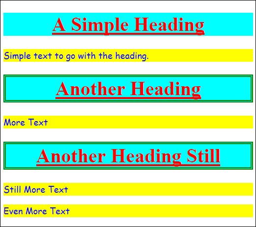
Figure 2-6: Every object that has a class value of SubHead now has a border.
There are many ways to define the colors you want to use. Many developers use the hexadecimal format shown so far because it's precise and flexible. However, #008000 is a little hard to read. Using the color name, Green, is a lot easier. Of course, this means you need to know the name of the color. Fortunately, you can find a list of names that browsers understand at www.w3schools.com/cssref/css_colornames.asp.
6. Type the following code after the existing styles and save the changes to disk.
#ThirdHeader
{
text-decoration: line-through;
}
7. Reload the test page.
You see the effect of making the style change as shown in Figure 2-7. Each object that has an id value of ThirdHeader now has a text-decoration value of line-through, rather than underline. Notice that the new value overwrites the old value. If you want to preserve the original value, you must specify it again.
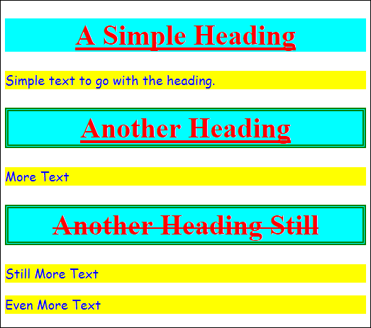
Figure 2-7: Every object that has an id value of ThirdHeader now has a line through its text.
The oddities of attribute selectors
Using the attribute selectors can be tricky at times. If you don't test your assumptions about them, using a simple test case with all of the browsers you want to work, your results could be surprising. For instance, the [Attribute~=Value] attribute works only with whole words. A selector of [title~="Secondary"], then, matches title="Secondary Paragraph" and title="Sub-Header Secondary". However, it won't match title="Secondary-Paragraph" because of the hyphen between Secondary and Paragraph.
Likewise, when working with the [Attribute|=Value] selector, you must supply hyphenated terms. For example, [title|="Sub"] matches title="Sub-Header", but it won't match title="Sub Header" because there's a space rather than a hyphen.
The odd thing is that these two examples work consistently across all of the test browsers and across all platforms. This behavior doesn’t make sense, but you need to be aware that it exists — and then compensate for it when creating your site. A lot of people complain about these selector issues without realizing that they are consistently embedded in the browsers they use.
If you want to select terms without worry about precise formatting, then you need to rely on alternatives. For example, [Attribute*=Value] is the less specific version of [Attribute~=Value] and [Attribute^=Value] is the less specific version of [Attribute|=Value]. Using the correct selector is absolutely essential if you want to get the desired results.
8. Type the following code after the existing styles and save the changes to disk.
[title|="Sub"]
{
text-align: right;
background-color: rgb(128, 255, 128);
}
9. Reload the test page.
You see the effect of making the style change (as shown in Figure 2-8). Each object that has the word Sub somewhere in its title attribute is changed. Notice that this particular change affects both <p> and <h1> tags. This example also shows another way to define color selections. Each color: red, green, blue (rgb) is represented by a value between 0 and 255. You can read more about the rgb() approach to creating colors at www.w3schools.com/cssref/css_colors.asp.
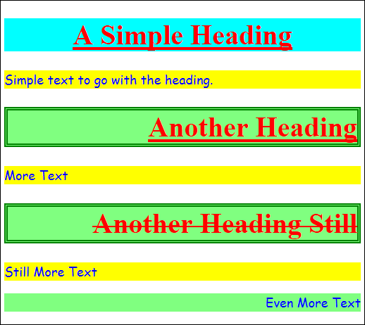
Figure 2-8: Here every object that has Sub in its title property is changed.
Working with pattern selectors
In some cases, a selection you need to make has nothing to do with either tags or attributes, but the pattern in which the objects appear on the page. For example, you might want to select just the first object, regardless of what that object might be. In some cases, you want to format with alternate members of a list or other repetitive data element in some manner to make it easier for the user to see each element individually. The following list tells you about pattern selectors that documents commonly use.
:first-letter: Select the first letter of the specified object. This selector is useful in creating special textual effects, such as drop caps.
 It's extremely rare to see most pattern selectors used alone because you normally don't want to specially format just the first letter of every object on the page in a certain way. Generally, you see pattern selectors used in combination with an attribute selector, such as the
 class selector, or with a particular tag selector. Using pattern selectors globally can have unexpected results or even cause an application to fail (depending on how the application's code and the CSS interact).
:first-line: Selects the first line of the specified object.
:before: Selects the area immediately before the specified object content. This selector is normally coupled with the content property to insert something special before the content in the existing object.
:after: Selects the area immediately after the specified object content. This selector is normally coupled with the content property to insert something special before the content in the existing object.
:first-of-type: Selects the first object of a specific type.
Even though the specification doesn't actually tell you that you must provide a type or a parent, some pattern selectors won't work without one. Typically you see the :first-of-type selector used with a tag selector, (for example, p:first-of-type), but it can also be used with an attribute selector. All of the other type and child pattern selectors work the same way.
:last-of-type: Selects the last object of a specific type.
:only-of-type: Selects the only object of a specific type. If there’s more than one object of a particular type, then no selection is made.
:nth-of-type(Number): Selects the specified object of a specific type.
:nth-last-of-type(Number): Selects the specified object of a specific type, beginning from the end of the object list.
:first-child: Selects the first child of a specified object. This selector is commonly used to apply special formatting to the first item in a list or table.
:last-child: Selects the last child of a particular parent.
:only-child: Selects the only child of a particular parent. When a parent object has more than one child, no selection is made.
:nth-child(Number): Selects the specified child of a particular parent.
:nth-last-child(Number): Selects the specified child of a particular parent beginning from the end of the list of children.
Pattern selectors can create some interesting effects on your site. The following procedure takes a quick look at what these selectors can do. It’s important to remember that you’ll see selectors, including pattern selectors, used in examples throughout the book, so consider this a starting point.
1. Copy the ExternalCSS.HTML and ExternalCSS.CSS files you created in Chapter 1 to a new folder.
2. Open ExternalCSS.HTML.
3. Type the following code after the existing <p> tag in the file and save the changes to disk.
<ul id="MyList">
<li id="One" class="ListItem">One</li>
<li id="Two" class="ListItem">Two</li>
<li id="Three" class="ListItem">Three</li>
<li id="Four" class="ListItem">Four</li>
<li id="Five" class="ListItem">Five</li>
</ul>
In this case, you add a list to the page to allow easier detection of patterns. Of course, patterns aren’t limited to lists or tables. You can use them with any arrangement of objects that could lend themselves to selection by a pattern.
3. Open ExternalCSS.CSS.
4. Type the following code after the existing styles and save the changes to disk.
.ListItem:first-letter
{
font-size: xx-large;
}
.ListItem:after
{
content: " \27A8";
font-size: x-large;
color: Red;
}
.ListItem:nth-child(odd)
{
background-color: LightBlue;
}
.ListItem:nth-child(2n+2)
{
background-color: LightGreen;
}
5. Reload the test page.
You see the effect of making the style change as shown in Figure 2-9. To begin, each bullet starts with an extra-large letter.
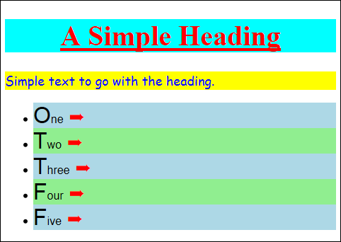
Figure 2-9: The formatting changes have created patterns in the output.
At the end of each bullet you see a special arrow character. Notice how the CSS uses \27A8 to create this character. When viewing charts such as the one at http://ikwebdesigner.com/special-characters/ and the one at www.petterhesselberg.com/charcodes.html, you see these character codes presented with a &# combination at the beginning. CSS uses the same numeric codes, but relies on a backslash (/).
The :nth-child() selector can be used in a number of ways. Even though the example doesn't show it, you can provide a number to select one specific child element. However, this selector also accepts a number of other interesting inputs. For example, you can use the even and odd keywords to select the even or odd objects in a list. You can also provide an equation that uses n to indicate the current object. When the browser inputs 0 for n, for example, the equation becomes 2 * 0 + 2 or element 2. If you wanted to start with element 3 instead, you'd use 2n+3. The equation you provide can be of any complexity required to produce the desired result.
Working with event selectors
Most CSS changes are static — you ask the browser to look for specific tags, attributes, or patterns. However, event selectors choose objects based on a particular event, such as a mouse over. When the user hovers the mouse pointer over an object, the object’s formatting changes to signify that the event has occurred. When the user moves the mouse pointer off of the object, the formatting returns to normal. The following list tells you about event selectors that documents commonly use.
:hover: Selects an object when the mouse pointer is hovered over it. Developers commonly use this feature to show that an item is selected or to display details about an object. You see this feature used quite often with menu systems to display the submenu items.
:focus: Selects an object when the object has the input (keyboard) focus. It’s commonly used with forms to show which field is selected for input. One interesting use of this selector is to show the selected field in a larger-sized font to make input easier.
Event selectors are handy because you can use them to make it appear the page is interacting with the user without writing even one line of code. Everything happens as part of a style. The following procedure shows one way to use event selectors to produce a visual effect, but this particular trick appears relatively often in the book, so you’ll see it used more than once.
1. Copy the ExternalCSS.HTML and ExternalCSS.CSS files (created in Chapter 1) to a new folder.
2. Open ExternalCSS.CSS.
3. Type the following code after the existing styles and save the changes to disk.
p:hover, h1:hover
{
text-decoration: none;
font-family: "Arial", sans-serif;
font-size: xx-large;
color: BlueViolet;
background-color: Plum;
}
4. Reload the test page.
5. Hover the mouse pointer over the paragraph text.
You see the effect of making the style change as shown in Figure 2-10. The style of the text changes to match the selection criteria.
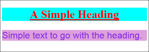
Figure 2-10: Events make it appear that your application is coded, when it really isn’t.
6. Hover the mouse over the header text.
The paragraph text returns to normal and the header text now matches the selection criteria. You can use this approach with any object on screen and make any kind of change desired.
Working with state selectors
There are some situations in which the dynamic state of an object is important in formatting it. For example, an object may have a link associated with it. When the user clicks that link, the state of the link changes to “visited.” Using state selectors can help a user determine when goals have been achieved or a particular feature is unavailable (the object is disabled). The following list tells you about state selectors that documents commonly use.
:link: Selects all of the unvisited links in a document.
It's common practice to combine state selectors with tag selectors. For example, you may not want to format all unvisited links in a document. The link for an <img> tag would most likely be formatted differently from the link for an <a> tag. Consequently, you commonly see state selectors as a:link where the formatting would affect all of the unvisited anchor links.
:visited: Selects all of the visited links in a document.
:active: Selects the link that the user currently has selected.
:empty: Selects an object that has no content.
:target: Selects the target of an object. For example, when the user clicks a link, the target of that link is selected.
:enabled: Selects any object that’s enabled.
:disabled: Selects any object that’s disabled.
:checked: Selects any object that’s checked.
::selection: Selects the content that the user has highlighted in some way.
State selectors make it possible to change the appearance of the document to match activities that the user has performed. What this means is that the document becomes more interactive, without requiring any coding on your part. This effect is used in a number of the examples that follow, so you’ll get plenty of practice working with state selectors. The following procedure shows one method for working with state selectors.
1. Copy the ExternalCSS.HTML and ExternalCSS.CSS files (created in Chapter 1) to a new folder.
2. Open ExternalCSS.HTML.
3. Type the following code after the existing <p> tag in the file and save the changes to disk.
<a href="#One">Select One</a><br />
<a href="#Two">Select Two</a>
<p id="One">One</p>
<p id="Two">Two</p>
This added code provides some state indicators for the example. When you click a link, the target of that link changes state.
3. Open ExternalCSS.CSS.
4. Type the following code after the existing styles and save the changes to disk.
::selection
{
color: BlueViolet;
background-color: Plum;
}
::-moz-selection
{
color: BlueViolet;
background-color: Plum;
}
:target
{
border: solid;
border-width: medium;
border-color: Red;
background-color: BlanchedAlmond;
}
Notice the use of the special -moz- preface for the second ::selection selector. This is one of your first exposures to browser compatibility issues. In order to make this selector work with Firefox, you must add this second ::-moz-selection selector with the preface.
5. Reload the test page.
6. Select some of the first paragraph text.
The color of the text and its background change.
7. Click Select One.
The paragraph containing One changes its appearance as shown in Figure 2-11.
8. Click Select Two.
The paragraph containing Two changes its appearance. The paragraph containing One returns to its original appearance.
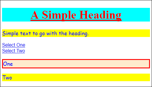
Figure 2-11: Using a :target selector can make it clear which link was clicked.
Understanding Layout Using the Basic Box Model
Everything you view on a page is in a box. That box separates objects from each other and makes it possible to create various special effects. Using boxes makes it possible to position content onscreen, fill various areas with color, and create the sorts of separations that users expect. The following sections discuss the basic box model in more detail.
Viewing the box
The basic box model actually relies on a series of four boxes — each of which is placed inside the next. Figure 2-12 shows how these boxes appear and the names associated with each box.
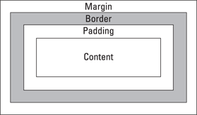
Figure 2-12: Boxes make it possible to format data in precisely the way users expect.
Each region or box has a specific purpose. For example, the margin serves to separate the entire boxed region from other boxed regions on the page. Of course, you can set the margin to zero so that there’s no separation, but you can provide as much separation as needed to obtain the desired appearance.
Borders serve to provide visual separators between items of content. They are used all the time on web pages. What you may not realize is that each side of a border can be controlled separately. You may choose to display only the right border and not the top, bottom, or left when working on the left pane of a page. The border would end up looking like a line instead of a box.
Padding separates the border from the content, when the border is displayed. Otherwise, the border and content would appear directly next to each other and the content would appear cramped in some cases. This would be a serious problem when you’re working with text. On the other hand, you may actually want the border directly next to an image to highlight the image and set it off on a page.
The result of all these regions is that you end up with a content area that’s somewhat smaller than the box as a whole unless you eliminate the margin, border, and padding. The content is nestled securely in its box and presents information to the user in a form that’s both usable and aesthetically pleasing.
Working with the box model
You’ve already seen a few examples of the box model in Chapter 1 and in this chapter. The use of a border is one such situation. In addition, setting the margin to zero removes the space between screen elements. All the examples so far have made use of content, but there’s no requirement to do so. An object on the page can provide a visual function as well. The following procedure shows a few other ways in which to work with the margin, border, padding, and content used to create the basic box model.
1. Copy the ExternalCSS.HTML and ExternalCSS.CSS files (created in Chapter 1) to a new folder.
2. Open ExternalCSS.CSS.
3. Change the existing styles by adding the code shown in bold:
p
{
font-family: cursive;
font-size: large;
color: #0000ff;
background-color: #ffff00;
border: outset;
border-width: thick;
border-radius: 6px;
margin: 2px;
padding: 5px;
}
h1
{
font-family: "Times New Roman",Georgia,serif;
font-size: 40px;
text-align: center;
text-decoration: underline;
color: #ff0000;
background-color: #00ffff;
border-bottom-style: groove;
border-left-style: ridge;
border-right-style: ridge;
border-top-style: groove;
border-width: 15px;
border-color: Gray;
margin: 2px;
padding: 6px;
}
These changes add various special effects to the text. You wouldn’t actually use this many different kinds of styles all on one page. It’s a bit overwhelming.
Notice that you can make the corners square or rounded. The amount of rounding is specified by the border-radius property. The border-width and border properties both affect the rounding as well. Certain border styles support round corners better than others do.
It’s possible to control each border, margin, and padding side individually. This example also shows the effect of combining border styles to create a particular look. In order to combine styles, you must specify each side separately.
4. Type the following code after the existing styles and save the changes to disk.
body
{
border: double;
border-width: 20px;
border-color: Blue Red Green Purple;
margin: 0;
padding: 20px;
}
Many developers forget that the document <body> tag is also an object onscreen — and that its appearance is controllable. This example adds a border around the entire content area. Notice that the border-color property is used to add a different color to each side: top, right, bottom, and left (in that order).
5. Reload the test page.
You see the effect of making the style change as shown in Figure 2-13. As previously mentioned, you’d never use this many styles together, except in an example for comparison purposes.
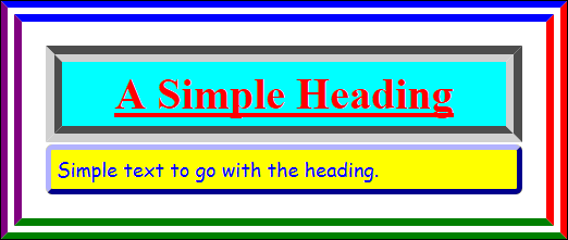
Figure 2-13: Using borders, margins, and padding to create an interesting effect.
Designing Backgrounds
Most pages you look at have some sort of background. For example, vendor sites normally display pictures of the kinds of products they create or industries in which they participate. Other sites use other kinds of graphics to portray the overall feeling of the site at a glance. The following procedure shows how to add a background using CSS.
1. Copy the ExternalCSS.HTML and ExternalCSS.CSS files (created in Chapter 1) to a new folder.
2. Create or obtain a background image in Joint Photographic Experts Group (JPEG) format and name it Background.JPG.
The downloadable source for this chapter includes a Background.JPG file for your use.
3. Open ExternalCSS.CSS.
4. Type the following code after the existing styles and save the changes to disk.
body
{
background-image: url("Background.JPG");
background-size: 100%;
background-repeat: no-repeat;
}
The most common place to book background images is in the <body>. However, nothing prevents you from using backgrounds in other objects and in various other ways. The starting point for most backgrounds is the background-image property where you can specify the image you want to use with the url() method. It's possible to add multiple images to the background. If you do so, the browser combines the images into a single presentation.
The use of the background-size property determines how large the image appears onscreen. The example is a large picture, so you want it to take up the entire display area. Using 100% as the value means that the image automatically resizes to take up the entire client area.
You use the background-repeat property to determine whether the image repeats in the background. It's common for small images to repeat so they take up the entire display area. Repeating a large image tends to make the background look confusing and detract from the overall appearance of the display.
5. Reload the test page.
You see the effect of making the style change (as shown in Figure 2-14).
6. Resize the browser window.
You see that the background image automatically resizes to take up the entire display area.
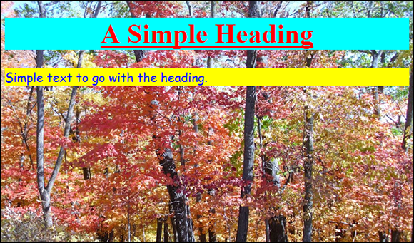
Figure 2-14: The formatting changes create patterns in the output.