Chapter 1
Understanding CSS3
In This Chapter
 Understanding why using Cascading Style Sheets version 3 (CSS3) is essential
Determining how your browser affects your use of CSS3
Considering the structure of CSS3 through its modules
Defining the concept of a style
Working with basic styles
Determining how units of measure affect appearance
There was a time when even websites painstakingly formatted with arcane tags still ended up boring or unattractive because the tags simply didn’t provide much flexibility in presenting content. In addition, the tags were supported in different ways by each of the browsers that were popular at the time, so that your beautifully rendered page ended up looking terrible on another user’s system. The improper use of tags (such as those used to define tables) also caused problems for people with special needs when their software failed to work with the tags. In short, developers needed something better than tags to create nicely formatted presentations — that something better is Cascading Style Sheets (CSS).
The stated purpose of CSS is to provide a human-readable method of separating the content on a page from the presentation of that content. Separating content from presentation allows users to substitute style sheets that present information in a manner that works better for them (such as the substitution of larger fonts or specific color combinations for sight-impaired users). Separating presentation from content also means that you can define a presentation once and use it on a variety of pages and formats. When you decide you need to change a presentation, all you need to do is change the CSS, rather than edit the specific tags on every page of your site.
However, CSS has gone well beyond simple presentation on HTML pages. CSS also works with a wide variety of other content types such as XML. In addition, CSS makes it possible to create special effects on your page, so that you get the appearance of programming without actually writing any code to do it. The term special effect covers a lot of ground. It includes everything from mouseover effects (a change that occurs when you hover the mouse over a page element) to the use of transparency to fool the eye into seeing both foreground and background elements in specific ways. You can also use special effects to perform tasks such as giving a page a three-dimensional (3D) look.
 Even through CSS is standardized through various organizations such as the Internet Engineering Task Force (IETF) as Request for Comment (RFC) 2318 (see
 www.faqs.org/rfcs/rfc2318.html) and the World Wide Web Consortium (W3C) as specific version-level specifications (see www.w3.org/TR/CSS21/ for the version 2.1 specification), there are differences in the way browsers work with CSS. For the most part, you'll find that every browser supports the basic CSS formatting functionality without any problem. It's when you get into the special effects that you may notice some differences, so this chapter has a special section that discusses some of the differences you need to consider. The differences between browsers is one reason that this book focuses on third-party tools that address these differences for you so that you can focus on creating great-looking pages.
The chapter ends with some simple examples of working with CSS to create some simple effects. You’ll also discover how various units of measure affect the manner of presentation on a page.
Defining the CSS3 standard
The CSS3 standard is a combination of a number of existing and new W3C standards. The base standard is the CSS2.1 standard found at www.w3.org/TR/CSS21/. Added to this standard are the following standards:
 CSS Style Attributes (
www.w3.org/TR/css-style-attr/)
Media Queries Level 3 (www.w3.org/TR/css3-mediaqueries/)
CSS Namespaces (www.w3.org/TR/css3-namespace/)
Selectors Level 3 (www.w3.org/TR/css3-selectors/)
CSS Color Level 3 (www.w3.org/TR/css3-color/)
At some point, the W3C will combine all of these independent pieces into a single standard. For now, you can find the pieces documented at www.w3.org/TR/CSS/#css3. Although looking at the standards can be interesting, you don't actually need to know anything about them when using this book. You'll find that this book does all of the heavy lifting for you so that you can focus on creating great content, rather than on trying to figure out the arcane wording used by standards organizations to create a precise definition of a technology.
Defining Why You Need CSS3
The introduction to this chapter discusses some of the reasons you need CSS. The most important reason is that you need some means of separating content from presentation so that it’s easier to maintain a site, and so that people with special needs can still access your site by using a different style sheet from the one used by everyone else. There have actually been a lot of style sheet standards in the past, but CSS has special functionality that makes it unique. The defining functionality is the ability to combine several style sheets together to create an overall appearance for a page. These style sheets cascade — that is, one flows into another — so that every style sheet is represented in the output. The standard provides rules for resolving conflicts between style sheets so that you always know how the output will appear.
The early versions of CSS provided a wealth of functionality. Even if you were still limited to the features provided by these early versions, you’d still have good reasons to use CSS in your next project. You’ll find that just about every browser on the planet supports these basic features, which include
Font characteristics such as typeface and emphasis
Text element characteristics such as letter spacing, word spacing, and spacing between lines
Color characteristics of all elements including fonts and backgrounds
Alignment of various elements including text, images, controls, and tables
Positioning and size of spacing elements such as borders, padding, and margins
Identification and classification of groups of attributes
Two groups commonly use CSS because of the functionality it provides:
Developers use CSS to create robust applications that are less likely to encounter browser-specific tag issues.
Designers use CSS to provide specific presentation characteristics or to make it easy to present the same content in a number of ways.
This book favors developers who need to create great looking pages quickly, even when it might mean creating a page that lacks that certain pizzazz that designers favor. With this in mind, you also need to consider that later versions of CSS provide these additional features:
Absolute, relative, and fixed positioning of elements so that you can create a precise alignment of application elements on screen
The use of a z-index to control the stacking of elements on screen so that one element can hide another as part of an application’s functionality
Support for various media types so that a developer need not be an artist to create dramatic looking pages
Support for aural style sheets where content is read instead of merely being presented in print form for these uses:
• To help those with special visual needs
• To help teach people to read
• Creating an environment in which users who can speak another language but can’t read it can still interact with the page
• Developing home entertainment systems
• Interacting with web content in a car
• Presenting content that has no written counterpart
Rendering bi-directional text (text that can flow either left to right or right to left)
Adding new font effects, such as shadows
CSS3 makes things even better! When working with CSS3, you use a new concept called modules. A module is an individual CSS feature that has its own specification (a written description of how the feature should work that is provided by a standards group). As a result of using modules, you no longer need to wade through a single huge CSS document looking for the CSS feature you want to interact with. Instead, you can locate precisely what you need in a much smaller document that's easier to search. (For more on modules, see the section, "Obtaining an Overview of the CSS Modules," later in this chapter.) There are actually fifty different specifications that are either completed or under consideration now. You can see them at www.w3.org/Style/CSS/specs. This book addresses the main specifications — the ones you use most often.
The point to this section is that CSS3 can help you perform a huge number of tasks in a manner that will likely work with a large number of browsers on many different platforms. By following the standard, you create an environment in which any vendor who also follows the standards can run your application unimpeded, and your users will gain access to an application that works anywhere at any time on any platform and using any browser. Given the Bring Your Own Device (BYOD) craze that's sweeping industry right now (read about BYOD at www.zdnet.com/topic-byod-and-the-consumerization-of-it/), using CSS is your best bet for writing applications that users will actually enjoy using.
Understanding How Browser Support Affects You
CSS3 is a complex specification and it will require time to implement fully in every browser out there. The support your browser provides might vary from other browsers. In fact, it’s almost guaranteed that the support levels will vary unless you have an incredibly strict policy about browser usage in your organization.
 There are many different techniques you can use to ensure that your application will work as intended when working with CSS3. However, some techniques work significantly better than others. Smart developers usually focus on the three specific strategies that work best:
Use a third-party library that uses special coding techniques to work around the browser compatibility issues.
Avoid using CSS3 features that don’t work with the browsers you plan to target with your application.
Verify in advance that the user’s browser provides the required support, and if not, suggest that the user perform an update (including a link to the update on your site if at all possible).
Most of this book focuses on the first technique. It’s fast, easy, reliable, and most importantly, requires the least amount of work. Using well-designed third-party solutions makes your work considerably easier. Starting with Part II of this book, you use third-party libraries and tools to perform all sorts of tasks in a manner that makes your workload light, while producing reliable code that works as it should.
Sometimes a third-party solution can't work around a particular issue because no workaround exists. For example, even though CSS3 currently supports bookmarks, no browsers currently implement this support. No third-party solution can get around this problem. Consequently, you can add bookmark functionality to your application, but no existing browser will put that feature into effect (at least, until a browser implements the required functionality). Use the chart at www.w3schools.com/cssref/css3_browsersupport.asp to determine whether the browsers you're targeting provide the required support. Using this chart, you can determine that a user requires Internet Explorer 10, Firefox 16, or Opera 12.1 to have support for animations. Safari and Chrome both require special coding to provide animation support (which is where a third-party library comes in handy).
The reason I'm not including this compatibility chart in the book is that the level of support provided by browsers changes constantly. When creating browser-based applications, you want to be sure that the online resources you use are updated frequently to ensure you have the best information possible. The www.w3schools.com/cssref/css3_browsersupport.asp site provides such support, but there are many other sites that also provide great support.
In some cases, the user is trying to work with your application using an ancient browser — say, the version of Internet Explorer the dinosaurs used. No third-party heavy lifting can help you here. Your best bet is to detect really old browsers and do anything you can to get their users to upgrade. Chapter 6 shows you how to perform this technique using jQuery — a third-party library that makes the task simple and painless.
Obtaining an Overview of the CSS Modules
Previous versions of CSS relied on a single specification document to detail all of the features it provided. CSS3 takes a different approach — it relies on the concept of modules to provide the specification. Each module appears in a separate document and details a particular CSS3 feature. This approach provides several benefits:
You don’t have to sift through a huge document to locate the one little piece of information you need.
Each module can be released independently, which means that the standard will be available (in part) sooner.
Specialized groups can work on each module to ensure that it contains the best possible features.
Because modules are smaller, it’s easier to obtain agreement on a standard than to obtain the same agreement for CSS3 as a whole.
At this time of writing, there are fifty modules that could appear as part of a CSS3 standard, but only some of these modules are currently approved — and you really require only a subset of them to create most applications. The following table displays the essential modules you need to know about in order to work with CSS3 successfully (along with their documentation sites and the locations they’re discussed in the book):
|
Module |
Documentation online at |
Discussed in this book in |
|
CSS Values and Units Module Level 3 |
||
|
Selectors Level 3 |
||
|
CSS Basic Box Model |
||
|
CSS Fonts Module Level 3 |
||
|
Module |
Documentation online at |
Discussed in this book in |
|
CSS Text Module Level 3 |
||
|
CSS Color Module Level 3 |
||
|
CSS Speech |
Chapter 3 (replaces the older CSS Aural Style Sheets specification) |
|
|
CSS Backgrounds and Borders Level 3 |
||
|
CSS Transforms |
||
|
CSS Multi-column Layout Module |
||
|
CSS Basic User Interface Module Level 3 |
||
|
CSS Animations |
Explored as part of third party library support in various chapters |
Using this set of twelve modules will provide most of the functionality you need for every application. Some of the other fifty modules aren’t even implemented yet (and may never be). For example, the CSS Extended Box Model hasn’t been started yet, but it should provide some exciting new functionality when someone puts it together.
A few of the fifty modules that don’t appear in this table are used for something other than standard applications. The CSS Marquee module is implemented and available, but you normally use it with smartphones. The groups working on these standards have also combined a few of the modules to make them easier to work with. The CSS 2D Transformations Module and the CSS 3D Transformations Module have been combined into a single CSS Transforms module. So, even though there are three entries in the list, there’s only one implemented module to think about.
Understanding Styles
You could look at styles created by other people and quickly become lost in all the arcane ways they’re used. The best way to start with styles is to view them simply as a means of formatting information onscreen. Because most of the information you’ll work with is text, it’s easiest to start with text as the basis for understanding styles. Let’s start with this basic HTML5 formatted page:
<!DOCTYPE html>
<html>
<head>
<title>A Simple Page</title>
</head>
<body>
<h1>A Simple Heading</h1>
<p>Simple text to go with the heading.</p>
</body>
</html>
There’s nothing complex about this page. It simply displays a heading and a paragraph of text. Figure 1-1 shows how this page looks. (Your page may look a little different from the information shown here due to differences in platform and browser configuration.)
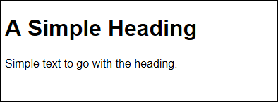
Figure 1-1: A simple HTML5 document used for testing purposes.
At the moment, the heading and the paragraph are rather plain. The text will appear in whatever default font you’ve chosen for your browser. Typically, the text is black on a white background unless you or your browser vendor have chosen a different color combination.
At this point, you can begin playing with the page a little to see how to format it differently. The following procedure helps you modify the basic page so it looks a little more interesting. You can use any text editor you like, so long as it doesn't add any formatting. However, using a product such as Komodo Edit (www.activestate.com/komodo-edit) will make the task considerably easier by providing you with help in writing your code. (Dedicated editors will display tooltips on what to write or what options are available; and they also provide advanced features such as debuggers.).
1. Create a new HTML5 file with your text editor.
Your editor may not support HTML5 files. Any text file will do. Using a specific file type usually means that the editor inserts some of the code for you automatically, which will save you typing time.
2. Type the code for the HTML page.
Make sure you type the code precisely as it appears earlier in this section.
3. Insert the following code immediately after the <title> tag.
<style type="text/css">
</style>
The <style> tag defines the beginning of a style. When you place the <style> tag directly in the page like this, it's called an internal style. You can also create external style sheets. External style sheets reside in .CSS files.
The type attribute tells the browser the <style> tag contains CSS information in text format.
4. Within the <style> tag, (between the <style> and </style> entries, type the following code.
p
{
font-family: cursive;
font-size: large;
color: #0000ff;
background-color: #ffff00;
}
This looks complicated, but it really isn't. The p stands for the <p> (paragraph) tag. Everything in this entry will affect the <p> tags in your document.
The curly braces ({}) tell the browser that all of the formatting instructions between them apply to the <p> tags in the document. You always include the curly braces as part of the style definition.
Within the curly braces, you see attribute name and value pairs. For example, font-family is the name of a CSS attribute that defines which font to use. In this case, the attribute specifies the default cursive font for the platform and browser. Using the CSS generic names ensures that your application will produce generically compatible results on all platforms, using any browser.
The font-size attribute defines a relative size. In this case, large specifies you want to make the font large compared to its default size. You aren't specifying a specific font size, which means that each platform and browser can render the font larger than normal for that individual environment.
The color attribute specifies a red, green, blue value to use for the font's color. The value is preceded by a hash (#) followed by hexadecimal color values from 0 to ff. In this case, the font will be the brightest blue supported by the platform. Likewise, the background-color attribute specifies the background for the text, which will be yellow in this case.
5. Save the page and load it in your browser.
You see the effects of the style change as shown in Figure 1-2. Your page may look different from the one in the book because your platform or browser may use different values for the font family or font size. If the book were able to present color, you’d see that the colors on your display would be close to those shown in the example.
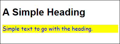
Figure 1-2: The paragraph text has changed to match the style specifications.
6. Type the following code after the p style within the <style> tag.
h1
{
font-family: "Times New Roman",Georgia,serif;
font-size: 40px;
text-align: center;
text-decoration: underline;
color: #ff0000;
background-color: #00ffff;
}
This style affects the <h1> tag entries and it has many of the entries used for the <p> tag style. However, notice that this time the font-family attribute contains three entries: The Times New Roman value is the most specific, followed by Georgia, followed by the least specific — serif (you don't need to know the specifics of how this works now — Chapter 3 discusses the topic in detail). When working with a value that contains spaces, you must enclose the value in quotes as shown.
Using the three-entry approach gives you more control over the appearance of the output, but still makes it possible for browsers that don’t support a specific font to render the content correctly. When supplying a specific font, make sure you also supply less specific fonts for browsers that don’t have access to your specified font.
The font-size attribute is also different. This time the style uses a specific size of 40 pixels. Even though a specific value can make it possible to create special effects onscreen, using a specific value also creates problems. A 40px entry will work just fine on the desktop or laptop, but might cause problems with a tablet, and will definitely make the content impossible to display on a smartphone.
This style also includes some entries that change the appearance of the text. The text-align attribute determines where the text is placed on screen, while the text-decoration attribute determines any special font features. In this case, the font is displayed centered onscreen with an underline.
6. Save the page and load it in your browser.
You see the effects of the style change as shown in Figure 1-3. The heading appears in red text on a pale blue background, and the paragraph is shown as blue text on a yellow background.
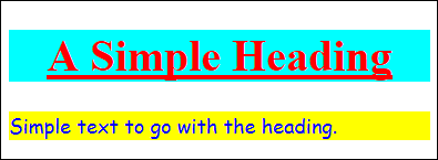
Figure 1-3: The heading text has changed to match the style specifications.
Creating External Styles
The preceding "Understanding Styles" section of this chapter describes styles in general and then shows you an example of a simple internal style. Internal styles can be useful on pages — especially when the page has some type of specialized requirement not found on other pages on the site — but they are less common than the external kind. Most developers use external styles to reduce the amount of work required to maintain a site. A single .CSS file contains all of the styles for the site, which means that changing a style site-wide is as simple as changing that one file (rather than each individual page). Because the change occurs in just one place, there isn't any chance of missing one or more changes on individual pages.
Creating and using an external style sheet isn’t much different from using an internal style sheet. The following example uses the techniques found in the preceding section to create an external style sheet:
1. Create a new HTML5 file with your text editor.
2. Type the code for the HTML page found in the “Understanding Styles” section of this chapter.
Make sure you type the code precisely as you would to start the previous example. What you should end up with is the same plain page — one without any styles.
3. Type the following code immediately after the <title> tag.
<link rel="stylesheet" href="ExternalCSS.CSS" />
The <link> tag tells the browser to look for an external resource. In this case, the rel attribute says that it should look for a style sheet and the href attribute provides the name of that style sheet.
4. Save the HTML5 file to disk.
5. Create a new .CSS file with your text editor.
Your editor may not support .CSS files. Any text file will do.
6. Type the following code in the .CSS file.
p
{
font-family: cursive;
font-size: large;
color: #0000ff;
background-color: #ffff00;
}
h1
{
font-family: "Times New Roman",Georgia,serif;
font-size: 40px;
text-align: center;
text-decoration: underline;
color: #ff0000;
background-color: #00ffff;
}
Yes, this is the same code that you used before. The only difference is that it now resides in an external file.
7. Save the CSS file to disk as ExternalCSS.CSS.
It's absolutely essential that the name of the file precisely match the name found in the href attribute. Some platforms are case sensitive, so you must use the same case for the filename. For example, externalcss.css might be viewed as a different file from ExternalCSS.CSS.
8. Load the page in your browser.
You see the effects of the style change as shown in Figure 1-3.
Defining the CSS Units of Measure
There are many ways to specify a value when working with CSS. For example, you can simply say that the browser should use a large font (where medium is the default size). You can also tell the browser to compute a size based on the browser’s configuration. Relative measurements make it possible for the browser to adjust the content presentation to match the size of the device displaying it, but using relative measurements also means that the user may not see the content as you originally wanted to present it. In rare cases, using relative measurements can actually make the content unusable because the browser doesn’t know how to use the relative measurements to present the content correctly.
Absolute measurements have the advantage of allowing precise placement of content onscreen and making that content a specific size or giving the content a precise appearance. However, use absolute measurements only when you’re certain about the user’s configuration. For example, you could use absolute measurements when creating an application that’s for internal use within your organization and the organization has mandated device configurations.
When creating absolute measurements, and some relative measurements, you need to use a unit of measure that the browser will understand. Table 1-1 shows the standardized units of measure that every browser will understand, along with a description of that measurement. You see many of these units of measure used in the examples in this book.

Understanding ems
Most web developers rely on the em as their basic unit of measure because ems automatically adapt to whatever the user relies upon. If a user has a special visual need, an em might be much larger than the default size of 16 px. On the other hand, someone using a smartphone might see an em as being only 10 px due to the small size of the screen. The point is that you can use a consistent measure for your pages that’s then automatically translated to whatever the user needs. Here are the default sizes for an em when compared to pixels for various kinds of text:
Headline 1 (<h1>) = 20px
Headline 2 (<h2>) = 18px
Headline 3 (<h3>) = 16px
Main text (<p>) = 14px
Sub text = 12px
Footnotes (usually <footer>) = 10px
The feature that makes ems different from pixels or other relative measures is the concept of an inherited default font size. If you create an element that has a default font size different from the default size displayed by the browser, and then place another element within it, the child element will use the default size of the parent, and not that of the browser. For example, if you place a footnote inside a paragraph tag, the footnote will appear at 8.75 px instead of 10 px (the default font size). The way to calculate this value is (14 px <p> tag size / 16 px default text size) * 10 px footnote size. Likewise, placing a footnote inside an <h1> tag will display the footnote at 12.5 px.