Chapter 5
Using CSS Shortcuts
In This Chapter
 Defining style inheritance
Using cascading styles to your benefit
Employing basic user interface functionality
Providing pizzazz through special effects
Creating pages with multiple columns
Everyone likes shortcuts — methods of doing something quickly without any loss of quality. In fact, there are entire industries that are focused solely on the shortcut. Just think about the number of ads you see every day that tell you about a product, service, or technique that reduces the time you spend doing something — they’re all shortcuts. So it shouldn’t surprise you too much to discover that CSS has shortcuts as well. In this case, shortcuts are techniques you can use to reduce your workload and make life easier. Many of these techniques help you when you write the code, and then a second time when you need to perform updates. That’s the best kind of shortcut — the kind that keeps providing a dividend for little time spent up front.
 Many of these techniques focus on the fact that the true purpose of CSS is to separate content from formatting. Chapters 2, 3, and 4 show you all sorts of interesting new techniques — and you’ve probably gotten away from this core idea a little. This chapter brings that idea back to the forefront — it’s all about the concept of keeping things separate so you can interact with the part you need and leave the other part undisturbed.
As part of the separation of content and formatting, this chapter discusses some special effects, and then shows you how to present your content in columns. Special effects make it possible to communicate information in non-verbal ways, but they only work when the person using your site has the ability to interact with them. When you use CSS to build your site, users with special needs can remove your site’s special effects and still enjoy the content you provide. Likewise, columnar presentations work for people with normal vision who want to review content more quickly or see it grouped in certain ways. By using CSS, you allow someone who requires larger text to see the content in a single column, but with a larger font size. Again, the person can still enjoy the content, even if the presentation isn’t quite the same as you envisioned.
Understanding Style Inheritance
All of the chapters so far have worked around the idea of style inheritance. The cascading part of Cascading Style Sheet (CSS) tells it all. A style at the uppermost part of the page hierarchy will cascade down into the lower parts of the page. By defining a style at the right level of the hierarchy, you reduce the work required to implement that style in all the places that the style is needed. For example, a style that is defined with the <body> tag will flow down into the <div> tag that is a child of the <body> tag. If you defined the style at the <div> level, you would need to define it for each <div> that requires the style. By defining it at the <body> level, you employ a shortcut in the form of a cascading style.
The use of a cascading architecture means that you define styles that affect the page as a whole at a higher level than the specific styles used to define particular elements. For example, if your page relies mainly on a single font, then you should define that font at the <body> tag. Even though the Document Object Model (DOM) hierarchy starts with the document, moves toward the root (the <html> tag), and only then splits into the <head> and <body> tags, the <body> tag is the first displayable element.
Inheritance also comes in another form. You can define styles in three different places. The location of that definition modifies the priority of that style. Here are the three style locations and their priorities:
 Inline (top priority): An inline style appears specifically with a particular object. It modifies only that object and no other object in the document or in any other document. You haven’t seen an inline style used so far in the book because they tend to cause problems. Locating and changing an inline style is time-consuming and error-prone, so you should avoid them whenever possible.
Internal: An internal style appears as part of the <style> tag in the <head> of the document. It affects all of the objects in the document, but no other document on the site. Using internal styles can help you provide special pizzazz to a particular page, but you should use an internal style only when the style is unique to that page, and you never intend to use that style anywhere else. Given that you normally can't make such a guarantee, it's best to avoid internal styles whenever possible, but even so, they're preferable to inline styles.
External (lowest priority): An external style appears in an external .CSS file. You must create a reference to this file by using a <link> tag in the <head> of a document. The styles affect every document linked to the .CSS file. Using this approach makes updates easier and gives your site a uniform appearance overall. In addition, using external styles makes it easy for people with special needs to supply an alternative style sheet that better meets their needs.
 You can associate as many external style sheets as needed with a page by using multiple
 <link> tags. This approach lets you use styles from diverse sources so that you can format your page with the least amount of effort. External style sheets are processed in the order in which they appear. If two .CSS files contain the same style name that modify the same properties, the style processed last is the style that has precedence.
The final level of inheritance to consider is the selector itself. You can create selectors that act only on objects contained within other objects or that meet special criteria (as discussed in Chapter 2). A specific selector will always override the settings provided by a generic selector, so you should only use this technique when necessary (imagine trying to find all of those specific changes in all the files on your site). The more specific the selector, the greater its priority becomes. However, you need to consider the effects of the selector’s level within the document — and the manner in which the style is defined — as part of the overall picture.
Cascading Styles — Using Multiple Styles Together
Understanding the rules of inheritance helps you create interesting sites that require a minimum of maintenance. By following these rules, when maintenance is required, you normally have to make just one change, rather than changing hundreds of items individually. It pays to experiment, though, so you can understand the full effects of inheritance and the effects of using multiple styles together. The following procedure helps demonstrate these techniques.
1. Create a new HTML5 file with your text editor.
Your editor may not support HTML5 files. Any text file will do.
2. Type the following code for the HTML page.
<!DOCTYPE html>
<html>
<head>
<title>Inheritance Example</title>
<style>
p
{
font-family: Arial, Helvetica, sans-serif;
color: Blue;
background-color: Yellow;
margin: 0;
font-style: italic;
font-size: medium;
}
div p
{
font-style: italic;
font-size: larger;
}
</style>
</head>
<body>
<h1>An Example of CSS Inheritance</h1>
<p>A paragraph outside a
<span style="font-family: monospace">
<div></span>.</p>
<div id="Container"
style="text-align: left;">
<p>A paragraph inside a container.</p>
</div>
</body>
</html>
This page contains a number of inline styles, which always have the highest inheritance precedence. For example, the <span> provides a font-family of monospace for the <div> tag part of the sentence. You could accomplish the same thing by assigning the <span> a class attribute for code, but this example uses the inline style instead.
The <div> uses an inline style to set the text-align style to left. Because the default style sets the alignment to left, you won't see any difference. However, if another style change modifies the text alignment, this style will take effect and prevent movement of this paragraph.
The internal style modifications all appear within the <style> tag in the <head> element. The first style sets the general characteristics for a <p> tag. Notice that the style specifically sets the font-style to italic and the font-size to medium.
The second style is more specific. It sets the characteristics for <p> tags that appear as a child of a <div>. Consequently, inheritance rules say that this style will take precedence when the rules of inheritance are met, which means the font-style and font-size styles will be different in this case. Figure 5-1 shows how these styles play out.
4. Save the file as Inheritance.HTML.
The sample will appear in other chapters, so naming is important.
5. Load the Inheritance example into your browser.
You see the role that inheritance and cascading styles play, as shown in Figure 5-1.
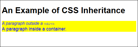
Figure 5-1: Inheritance and cascading styles interact to format this page.
6. Create a new CSS file with your text editor.
Your editor may not support CSS files. Any text file will do.
7. Type the following CSS style information.
body
{
text-align: center;
color: DarkRed;
background-color: Khaki;
border: inset;
border-color: Green;
}
h1
{
border: outset;
border-color: Brown;
}
p
{
text-decoration: underline;
font-family: "Times New Roman", Times, serif;
font-style: oblique;
font-size: xx-large;
}
The <body> tag appears as the topmost object in a page, so the changes noted in the body style should affect everything not specifically overridden later. In this case, the example changes the text alignment to center and places a dark red border around any content. The background color is also changed. Finally, the style adds a green border around every object.
The h1 style overrides any body styles. In this case, that means modifying the border styles.
The p style also overrides any body styles. However, there aren't any properties that are the same in this case, so the p styles enhance the styles inherited from the body style.
8. Save the file as Inheritance.CSS.
The sample will appear in other chapters, so naming is important.
9. Add the following code to the <head> area of the HTML file.
<link rel="stylesheet" href="Inheritance.CSS" />
This code creates the link between the HTML file and the CSS file.
10. Save the HTML file and reload the page.
You see the changes shown in Figure 5-2.
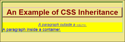
Figure 5-2: Modifying the external style produces both inheritance and cascading changes.
Notice that all the expected changes are in place. For example, the text is centered, except for the one paragraph that has an inline style overriding the centered text. The heading text is now in dark red — the paragraph text overrides that color selection, so it remains blue. Even though there is an external p style for the size of the text, the internal style overrides it.
You should notice something else about the example. The body contains an inset border of the correct color (where the left and top lines are green and the border appears to sink the content below the surface of the rest of the page) and the heading contains an outset border of the correct color, because it has overridden the default. The right and bottom lines in the heading border are brown, but that the left and top lines are a lighter color due to the effect of the outset border (giving the appearance that the heading is raised above the surface of the background). However, the paragraphs have no border. At one time, <body> tag changes affected the entire document and some of them still do. However, other changes affect only the body and not other block elements. Block elements don't inherit some settings from the body style.
11. Delete the h1 style from the Inheritance.CSS style sheet.
You can also comment out the h1 style by adding the starting (/*) and ending (*/) comment symbols to it like this:
/* Commented out to show block settings.
h1
{
border: outset;
border-color: Brown;
}
*/
12. Save the CSS file and reload the page.
You see the changes shown in Figure 5-3.
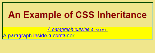
Figure 5-3: Take care not to assume that your body-style changes affect other block-level objects.
 Notice that the heading now lacks a border. It turns out that the heading wasn't overriding the body-level border — it was adding a new border. Never assume that a
 body style will carry through to other block-level styles — some settings simply don't. When you find that your page doesn't look as you expected it to look, try configuring the setting at a lower block level.
You may also see some style sheets that access the html style, which affects the <html> tag that contains the <body> tag. It's true: You can work with the html style to achieve some effects. For example, you may want to create a raised border around the page, which would require accessing the html style.
13. Add the html style shown here to the Inheritance.CSS style sheet.
html
{
border: outset;
border-color: Green;
background-color: White;
}
14. Save the CSS file and reload the page.
You see the changes shown in Figure 5-4.
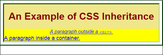
Figure 5-4: The html style can help you achieve specific special effects.
You rarely have to rely on the html style because it simply isn't necessary. The html block is a level above the body block, as shown by this example. The html block doesn't give you access to anything that the body block can't change in most cases, except for special effects like the one shown here.
Using Additional Basic User Interface Features
The book discusses a number of user interface features so far and you’ll find even more details in later chapters. The user interface is the hardest part of your application to get right. It’s not a matter of coding or of presentation — it’s a matter of perception. The way you perceive the user interface is completely different from that of your users because you approach it from the viewpoint of a developer — it’s unavoidable.
Users commonly have problems figuring out what to put in fields. Most of this book’s user interface suggestions help you create an environment where the user has few questions. For example, using drop-down list boxes helps eliminate user confusion over what to include in fields. However, the second most common problem is finding an application feature, a page of content, or a resource. The following sections address this problem by presenting methods of defining a document outline (that is, a method for navigating a single page) and site navigation. You’ll see other techniques for addressing these issues as the book progresses.
Performing quick navigation
Most sites provide some sort of site navigation aid. If you don’t provide this sort of support, the user may get lost and you’ll lose business or at least activity. Site navigation makes information easier to find and use. In addition, you really need it in order for the user to make good use of your site. The following procedure describes how to add site navigation without programming to a page. It doesn’t do anything fancy, but it does work well with most browsers.
1. Create a new HTML5 file with your text editor.
2. Type the following code for the HTML page.
<!DOCTYPE html>
<html>
<head>
<title>Navigating User Interfaces</title>
<link rel="stylesheet" href="Navigation.CSS" />
</head>
<body>
<ul id="MainMenu">
<li>
<a href="Navigation.HTML">Home</a>
</li>
<li>
<a href="Navigation.HTML">Products</a>
<ul>
<li>
<a href="Navigation.HTML">One</a>
</li>
<li>
<a href="Navigation.HTML">Two</a>
</li>
<li>
<a href="Navigation.HTML">Three</a>
</li>
<li>
<a href="Navigation.HTML">Four</a>
</li>
</ul>
</li>
<li>
<a href="Navigation.HTML">Events</a>
<ul>
<li>
<a href="Navigation.HTML">Red</a>
</li>
<li>
<a href="Navigation.HTML">Green</a>
</li>
<li>
<a href="Navigation.HTML">Blue</a>
</li>
<li>
<a href="Navigation.HTML">Orange</a>
</li>
</ul>
</li>
<li>
<a href="Navigation.HTML">About</a>
<ul>
<li>
<a href="Navigation.HTML">Contact</a>
</li>
<li>
<a href="Navigation.HTML">Founding</a>
</li>
<li>
<a href="Navigation.HTML">Privacy</a>
</li>
</ul>
</li>
</ul>
</body>
</html>
The menu system consists of a number of lists. Each unordered list represents another layer of menus. This example has just two layers, but you can easily apply the concepts to any number of layers desired. The overall menu is enclosed with an unordered list element (<ul>) named MainMenu. The name is important because you'll use it extensively when creating the required styles.
3. Save the file as Navigation.HTML.
The sample will appear in other chapters, so naming is important.
4. Create a new CSS file with your text editor.
5. Type the following CSS style information.
#MainMenu
{
margin: 0;
padding: 0;
}
#MainMenu li
{
margin: 0;
padding: 0;
list-style: none;
float: left;
}
#MainMenu li a
{
display: block;
margin: 0 1px 0 0;
padding: 4px 10px;
width: 80px;
background: Black;
color: White;
text-align: center;
}
#MainMenu li a:hover
{
background: Green;
}
#MainMenu li:hover ul
{
visibility: visible;
}
#MainMenu ul
{
position: absolute;
visibility: hidden;
margin: 0;
padding: 0;
background: Grey;
border: 1px solid White;
width: 80px;
}
#MainMenu ul a
{
position: relative;
display: block;
margin: 0;
padding: 5px 10px;
width: 80px;
text-align: left;
background: LightGrey;
color: Black;
}
#MainMenu ul a:hover
{
background: Violet;
}
Wow, that's a lot of code! Styles can become complex as you try to do more with them. That's why many developers rely heavily on third party libraries and tools, which is the focus on most of this book. Trying to come up with all that style information on your own is time consuming. In fact, the kind of menu we're creating here is easily made using a tool such as CSS Menu Maker (http://cssmenumaker.com/), Menucool.com (www.menucool.com/), or CSS3Menu (http://css3menu.com/index.html). However, it's important to go through this exercise at least once so you know how things work.
The styles begin with the MainMenu, an unordered list (<ul>) element. Everything is referenced to this element. The MainMenu consists of a number of list items (<li>), which are set using the #MainMenu li style. You don't want the list items to actually look like a list — you want them to look like menus — so it's essential to set the list-style to none. Setting float to left will also help give the menu a professional appearance. Within each list item is an anchor (<a>) that points to the location to which the user goes after selecting the menu item. The #MainMenu li a style creates the required appearance, which includes displaying the item as a block. When the user hovers the mouse over one of the MainMenu items, the #MainMenu li a:hover style turns the entry green.
The #MainMenu li:hover ul requires a little explanation. Normally, the secondary menu has its visibility set to hidden, so that you don't see it. When a user hovers the mouse over a MainMenu list item, you want the submenu displayed. This style performs that task. It creates the appearance of using code without actually using any code.
The submenus will appear vertically, below the horizontal main menu. In order to do this, the #MainMenu ul style sets the width to 80px, the size required to hold a single menu entry. This setting must match the width setting for the #MainMenu ul a style. Notice that this second level of menus has its visibility property set to hidden because you don't want to see it until the user clicks the associated main menu item. As with the main menu, you want users to know when they have selected a particular item, so the #MainMenu ul a:hover style changes the menu's background value to Violet.
6. Save the file as Navigation.CSS.
The sample will appear in other chapters, so naming is important.
7. Load the Navigation example.
You see the menu similar to the one shown in Figure 5-5 (your menu won’t have anything selected initially and will appear as a black bar across the top of the page).
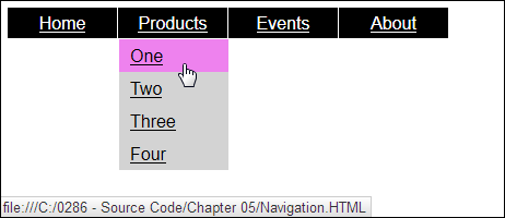
Figure 5-5: You don’t need any code at all to produce a useful menu for your site.
Try selecting various items. The example uses the existing site for each of the links, but if you want, you can try using other links. Clicking a link will take you to the desired location. The point of this menu is that you can create quite a few user interface items that look like they’re coded, but really aren’t, using CSS. This CSS-only approach will work with most browsers without having to ask the user to enable JavaScript. Most browsers support the level of CSS required to make this menu system work.
Providing a document outline
A document outline is useful when a page contains a lot of material and you want the user to navigate it easily. The outline relies on the various tags you provide. The current method of creating a document outline is to use the <h1> through <h6> tags. This approach works great when the material comes from the same page or you have control over the formatting of the content. It doesn't work quite so well when the content comes from another location, which is why the standards groups had to come up with an entirely new way to do things (see the "Discovering HTML5 Document Outlining" sidebar for details). The following procedure demonstrates a technique for adding an outline to a page that already contains a menu. You use the Navigation example created in the previous section as a starting point.
1. Open the Navigation.HTML file and add the following code to the end of the <body> section (after the existing menu).
<div id="DocOutline">
<ul>
<li>
<a href="Navigation.HTML#MainHeading1">
Main Heading 1
</a>
<ul>
<li>
<a href="Navigation.HTML#SubHead1a">
Sub Heading 1
</a>
</li>
<li>
<a href="Navigation.HTML#SubHead1b">
Sub Heading 2
</a>
</li>
</ul>
</li>
<li>
<a href="Navigation.HTML#MainHeading2">
Main Heading 2
</a>
<ul>
<li>
<a href="Navigation.HTML#SubHead2a">
Sub Heading 3
</a>
</li>
<li>
<a href="Navigation.HTML#SubHead2b">
Sub Heading 4
</a>
</li>
</ul>
</li>
</ul>
</div>
<div id="DocContent">
<br />
<h1 id="MainHeading1">Main Heading 1</h1>
<p>Introductory Material</p>
<h2 id="SubHead1a">Sub Heading 1</h2>
<p>Article</p>
<h2 id="SubHead1b">Sub Heading 2</h2>
<p>Article</p>
<h1 id="MainHeading2">Main Heading 2</h1>
<p>Introductory Material</p>
<h2 id="SubHead2a">Sub Heading 3</h2>
<p>Article</p>
<h2 id="SubHead2b">Sub Heading 4</h2>
<p>Article</p>
</div>
The entries consist of a document outline and the associated content. The outline specifically follows the <h1> and <h2> objects in this example. There are methods for generating this sort of content automatically, but all of them require coding. This is one case where using CSS does involve some manual coding that you wouldn't have to perform when using other techniques, such as including JavaScript. However, the advantage is that the example will work fine with any browser that supports CSS.
2. Save the HTML file.
3. Open Navigation.CSS and type the following styles at the end of the file.
#DocOutline
{
font-family: Arial, Helvetica, sans-serif;
font-size: 14px;
width: 145px;
height: 800px;
}
#DocOutline ul
{
margin-bottom: 20px;
list-style: none;
margin-left: -40px;
}
#DocOutline ul ul
{
margin-left: -20px;
}
#DocContent
{
margin-top: -800px;
margin-left: 150px;
}
The main focus is on the document outline where you need to provide formatted links to the content found on the remainder of the page. Notice that the outline is set to a specific height. The reason for this setting is to make it easier to position the document content once the links are displayed.
The example sets the #DocOutline ul style list-style property to none. You could just as easily use numbers, letters, or any other outlining index you prefer. This list will automatically indent half of the distance of the individual menu elements you created earlier. In order to place the links at the left side of the page, you must reverse the list's indentation by setting margin-left to -40px, which is half the 80px width of the individual menu elements.
Each level will require some additional amount of indentation so the user can see the relative levels of each entry. The #DocOutline ul ul changes the indentation for the second-level headings. If you had a third level of headings, you'd create a #DocOutline ul ul ul style to format it.
The document content will start after the document outline unless one of two things happens. First, you can use actual columns as described in the "Working with Multiple Columns" section, later in this chapter. However, this functionality requires CSS3. Second, you can use pseudo-columns. You set the margin-top property value equal to the height of the document outline. The technique shown in this example will work with any browser that fully supports CSS. Notice that you must also set margin-left to a value that equals the width of the document outline (plus a few pixels for spacing.
4. Save the CSS file.
5. Reload the Navigation example.
You see the document outline and associated content as shown in Figure 5-6. This outline actually works — you can click links to go to the various headers presented in the outline.
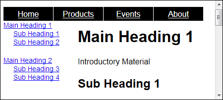
Figure 5-6: Using a document outline on complex pages makes it easier to find specific content.
Creating Special Effects
You can create so many special effects by using CSS that it would require a book or two to list them all. The following paragraphs discuss two of the more interesting special effects. You’ll find a considerable array of special effects in other examples in this book.
Transforming objects, including graphics
A transform changes the appearance of objects onscreen in a specific way. For example, you might rotate the object or skew its dimensions. Transforms make it easy to create unique presentations from common objects — effects that ordinarily you’d need a designer or graphic artist to create for you. The following list describes the kinds of transformations you can perform.
matrix(a, b, c, d, tx, ty): Skews the object using a matrix defined by points a, b, c, and d. It then translates the object's position on screen by a value denoted by tx and ty. (You can try the matrix() transform out at www.w3schools.com/cssref/playit.asp?filename=playcss_transform_matrix.)
There are versions of many of these functions that work on three-dimensional objects. For example, there is a matrix3d() function. These functions add a z-axis to the equation, so that you can manipulate three-dimensional objects in three-dimensional space. A full discussion of precisely how the 3D versions work is outside the scope of this book, but you can read more at https://developer.mozilla.org/docs/Web/CSS/transform-function and http://css-tricks.com/missing-documentation-for-matrix3d-transforms/.
translate(tx, ty), translateX(tx), translateY(ty): Modifies the position of the object on screen by a horizontal amount defined by tx, a vertical amount defined by ty, or both. (You can try the translate() transform at www.w3schools.com/cssref/playit.asp?filename=playcss_transform_translate.)
scale(x, y), scaleX(x), scaleY(y): Stretches the object horizontally by the amount specified by x, vertically by the amount specified by y, or both. (You can try the scale() transform at www.w3schools.com/cssref/playit.asp?filename=playcss_transform_scale.)
rotate(angle), rotateX(angle), rotateY(angle): Rotates the object by the number of degrees specified in the desired axis. (You can try the rotate() transform at www.w3schools.com/cssref/playit.asp?filename=playcss_transform_rotate.)
Internet Explorer doesn't support all of the transforms. For example, you'll find that Internet Explorer 9 doesn't support the rotateX() and rotateY() functions.
skew(angleX, angleY), skewX(angleX), skewY(angleY): Skews the object by the number of degrees horizontally specified by angleX, the number of degrees vertically specified by angleY, or both. (You can try the skew() transform at www.w3schools.com/cssref/playit.asp?filename=playcss_transform_skew.)
The best way to understand these transformations is to see them in action. The following procedure helps you create a sample application that demonstrates the transformations you can perform.
1. Create a new HTML5 file with your text editor.
2. Type the following code for the HTML page.
<!DOCTYPE html>
<html>
<head>
<title>Examples of Transforms</title>
<link rel="stylesheet" href="Transforms.CSS" />
</head>
<body>
<p id="Matrix">Matrix</p>
<p id="Translate">Translate</p>
<p id="Scale">Scale</p>
<p id="Rotate">Rotate</p>
<p id="RotateY">Rotate Y</p>
<p id="Skew">Skew</p>
</body>
</html>
The example demonstrates the transformations listed as paragraphs. You can try other transformations by modifying the example (a great idea).
3. Save the file as Transforms.HTML.
4. Create a new CSS file with your text editor.
5. Type the following CSS style information.
#Matrix
{
border: solid;
border-color: Black;
border-width: thin;
font-size: 30px;
margin: 50px;
width: 140px;
height: 40px;
transform: matrix(0.866,0.5,0.4,0.866,5,15);
-ms-transform: matrix(0.866,0.5,0.4,0.866,5,15);
-webkit-transform: matrix(0.866,0.5,0.4,0.866,5,15);
}
#Translate
{
border: solid;
border-color: Black;
border-width: thin;
font-size: 30px;
margin: 50px;
width: 140px;
height: 40px;
transform: translate(20px, 30px);
-ms-transform: translate(20px, 30px);
-webkit-transform: translate(20px, 30px);
}
#Scale
{
border: solid;
border-color: Black;
border-width: thin;
font-size: 30px;
margin: 50px;
width: 140px;
height: 40px;
transform: scale(1.6, 0.75);
-ms-transform: scale(1.6, 0.75);
-webkit-transform: scale(1.6, 0.75);
}
#Rotate
{
border: solid;
border-color: Black;
border-width: thin;
font-size: 30px;
margin: 50px;
width: 140px;
height: 40px;
transform: rotate(140deg);
-ms-transform: rotate(140deg);
-webkit-transform: rotate(140deg);
}
#RotateY
{
border: solid;
border-color: Black;
border-width: thin;
font-size: 30px;
margin: 50px;
width: 140px;
height: 40px;
transform: rotateY(140deg);
-ms-transform: rotateY(140deg);
-webkit-transform: rotateY(140deg);
}
#Skew
{
border: solid;
border-color: Black;
border-width: thin;
font-size: 30px;
margin: 50px;
width: 140px;
height: 40px;
transform: skew(15deg, 30deg);
-ms-transform: skew(15deg, 30deg);
-webkit-transform: skew(15deg, 30deg);
}
Each of these transforms uses precisely the same paragraph format so that you can better understand how they work. The use of a border makes it easier to understand the transform because the combination of words and an onscreen object convey more information (something to remember when you create your own test applications).
Transforms are considered experimental, even though they appear as part of the specification. In order to use them with Internet Explorer 9+, you must include the -ms- prefix. Both Safari and Chrome require the -webkit- prefix. This is why you see each transform listed three times. The transforms should also work with both Opera and Firefox without any problem.
6. Save the file as Transforms.CSS.
The sample will appear in other chapters, so naming is important.
7. Load the Transforms example.
You see the transformation effects shown in Figure 5-7. All these transforms are using the same font, font size, and box size, so the differences you see are due solely to the transformation taking place. Notice that the rotateY() transformation actually shows the text backward.
Try modifying the transform values to see how the changes affect the output. You’ll be surprised at just how flexible these functions are.
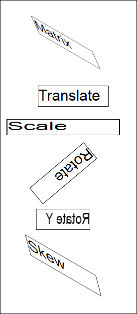
Figure 5-7: Transformations produce special effects that create interesting pages.
It's possible to combine transforms to create even more unusual effects. Simply separate them with a space. For example, to combine a rotate() with a skew(), you'd type transform: rotate(25deg) skew(15deg, 30deg);.
Using the attr() function
The attr() function is interesting because it lets you interact with any attribute of an object as part of a style. You see this function used in a number of unique ways on the Internet, even though it seems to be a well-kept secret for the most part. One site that demonstrates a quick application that relies on attr() is The New Hotness: Using CSS3 Visual Effects (http://coding.smashingmagazine.com/2010/01/25/the-new-hotness-using-css3-visual-effects/). The following procedure demonstrates the attr() function in a simpler way so that you can better understand the few examples online that demonstrate it in a detailed way.
1. Create a new HTML5 file with your text editor.
2. Type the following code for the HTML page.
<!DOCTYPE html>
<html>
<head>
<title>Using the attr() Function</title>
<link rel="stylesheet" href="Attr.CSS" />
</head>
<body>
<h1>Using the attr() Function</h1>
<p id="TestMe"
TestText="Hello">
World
</p>
</body>
</html>
All you have here is a heading and paragraph. Notice that the paragraph defines a standard attribute, id, and a non-standard attribute, TestText. The attribute you use for the attr() function need not be standard — you can define any attribute desired.
3. Save the file as Attr.HTML.
4. Create a new CSS file with your text editor.
5. Type the following CSS style information.
#TestMe:before
{
content: attr(TestText);
}
The style begins by saying that the output from the style should appear before the tag referenced by TestMe as an id. It then sets the content of that area to the current value of the TestText attribute by using the attr() function.
6. Save the file as Attr.CSS.
The sample will appear in other chapters, so naming is important.
7. Load the Attr example.
The output is pretty much what you'd expect, Hello World, as shown in Figure 5-8. The attr() function can make it possible for you to hide and use all sorts of information in your pages, reuse information in different ways, or even perform debugging tasks.
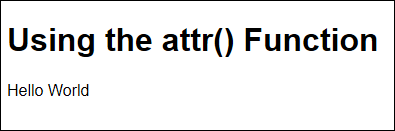
Figure 5-8: Use the attr() function to output the value of attributes.
Working with Multiple Columns
CSS3 provides a new method for working with columns that doesn’t require you to have a math degree and perform test setups with arcane styles. The column styles provide the means to create multiple columns on a page without a lot of effort on your part. Depending on the specific style you use, you can obtain various layouts or simply create a newspaper-type setup where content flows from column-to-column based on the user’s browser setup.
As with anything CSS3-specific, you need to test your application with the browsers that your users intend to use. In addition, this feature is considered experimental — and you have to jump through a few hoops to make it work with some browsers. While Internet Explorer and Opera support the column properties directly, you must prepend -moz- to make them work with Firefox and -webkit- to make them work with Safari and Chrome. The following list provides a brief overview of the column properties.
column-count: Specifies the number of columns to create. The width of the columns automatically fluctuates as the user resizes the browser window (or the browser displays a horizontal scrollbar to make it possible to scroll across columns when a specific width is set as well).
column-fill: Determines how the browser fills the columns (either filling one column at a time or filling all columns simultaneously with an even amount of content).
column-gap: Creates a gap between columns to make it easier to determine where one column ends and another begins.
column-rule: Creates a rule between columns so the user can see a physical separator. This property consists of color, style, and width.
column-rule-color: Determines with color of the rule used between columns.
column-rule-style: Determines the style of the rule used between columns.
column-rule-width: Determines the width of the rule used between columns.
column-span: Specifies the number of columns that an object can span.
column-width: Specifies a column width.
columns: Provides a shorthand method for defining both the column-count and column-width properties.
One of the easiest ways to begin experimenting with columns is to create some content and then use a newspaper-style layout to present it. The following procedure helps you create a multiple column newspaper layout for some dummy text.
1. Create a new HTML5 file with your text editor.
2. Type the following code for the HTML page.
<!DOCTYPE html>
<html>
<head>
<title>Creating a Newspaper Layout</title>
<link rel="stylesheet" href="NewspaperLayout.CSS" />
</head>
<body>
<h1>Creating a Newspaper Layout</h1>
<p id="Text">
Lorem ipsum dolor sit amet, consectetuer
adipiscing elit, sed diam nonummy nibh euismod
tincidunt ut laoreet dolore magna aliquam erat
volutpat. Ut wisi enim ad minim veniam, quis
nostrud exerci tation ullamcorper suscipit
lobortis nisl ut aliquip ex ea commodo consequat.
Duis autem vel eum iriure dolor in hendrerit
in vulputate velit esse molestie consequat, vel
illum dolore eu feugiat nulla facilisis at vero
eros et accumsan et iusto odio dignissim qui
blandit praesent luptatum zzril delenit augue
duis dolore te feugait nulla facilisi. Nam liber
tempor cum soluta nobis eleifend option congue
nihil imperdiet doming id quod mazim placerat
facer possim assum. Typi non habent claritatem
insitam; est usus legentis in iis qui facit eorum
claritatem. Investigationes demonstraverunt
lectores legere me lius quod ii legunt saepius.</p>
</body>
</html>
All you have here is a heading and paragraph. The paragraph contains the dummy text used for content in the newspaper layout.
If you're wondering what Lorem ipsum is all about, you can read more at www.lipsum.com/. In fact, the site provides a dummy-text generator that won't distract a viewer's attention from an underlying layout or other technical consideration.
3. Save the file as NewspaperLayout.HTML.
4. Create a new CSS file with your text editor.
5. Type the following CSS style information.
#Text
{
column-count: 3;
column-rule: 4px ridge Blue;
column-gap: 20px;
-moz-column-count: 3;
-moz-column-rule: 4px ridge Blue;
-moz-column-gap: 20px;
-webkit-column-count: 3;
-webkit-column-rule: 4px ridge Blue;
-webkit-column-gap: 20px;
}
The example creates a style that includes three columns, with a blue rule between columns. Of course, you need to repeat the styles three times — once for each of the browser requirements.
6. Save the file as NewspaperLayout.CSS.
The sample will appear in other chapters, so naming is important.
7. Load the NewspaperLayout example.
You see a newspaper-style format as shown in Figure 5-9. This format will be easier to read when you work with a lot of text on a site. In the past, you’d have had to work pretty hard to get a layout as nice as this one, but now all you need is a few simple styles.
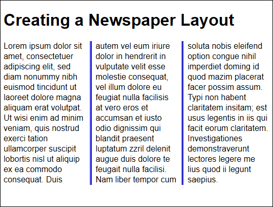
Figure 5-9: It’s easy to create a newspaper style layout with columns.