Chapter 6
Creating a Test Site with jQuery and jQuery UI
In This Chapter
 Working with the basic jQuery features
Understanding why jQuery UI is a good addition to your toolbox
Developing applications using the jQuery UI controls
Developing applications using the jQuery UI interactions
Developing applications using the jQuery UI special effects
Defining the basic page layout
Third-party libraries are a cornerstone of creating web-based applications today because most developers (and even many designers) simply don’t have the time to perform every task required to create a new site by hand. In fact, it doesn’t make sense to create everything by hand when someone else already has done most of the work for you. The day of the Application Programming Interface (API), as libraries are often called, is at hand. This chapter is about two of the most popular libraries: jQuery and jQuery UI. Of course, there are many other libraries out there and you’ll work with a number of them as the book progresses.
Third-party libraries differ in what they can do for you. Both jQuery and jQuery UI are JavaScript libraries. Up to this point in the book, you haven’t used any JavaScript at all. In most cases, you’ll use at least some JavaScript or another language on your site, but, as the examples in previous chapters prove, there are situations when all you need is CSS to accomplish a task. The jQuery and jQuery UI examples in this chapter focus on the sorts of tasks that you can’t perform using CSS, such as discovering what kind of browser a user has.
In order to use some of the features of jQuery UI, you need to know a little more about the special selectors it uses and the way it interacts with the page. This chapter provides a short section that presents the essentials of working with jQuery UI to produce some really interesting special effects on a page. More importantly, once you know the way that jQuery UI works, you’ll find that you can create some pretty amazing pages with very little JavaScript code.
 This book is not a tutorial on using JavaScript. In fact, it would take another book to perform that task. My book, HTML5 Programming with JavaScript for Dummies (which you can find at
 www.dummies.com), provides a detailed guide for working with JavaScript. The book starts simply and moves through a number of topics, including using third-party libraries for a wealth of tasks. You can also find a number of helpful JavaScript tutorials online. The best of these tutorials is on the W3Schools.com site at www.w3schools.com/js/. If you really don't do well with online tutorials, you can watch the JavaScript video, "Learn JavaScript in 30 Minutes," at www.youtube.com/watch?v=_cLvpJY2deo.
Using the jQuery Core Features
The jQuery library (http://jquery.com/) helps you perform non-graphical tasks, such as detecting a user's browser, with relative ease. This library is designed to work with a broad array of browsers and doesn't rely on any particular platform to do its work. The library automatically handles browser and platform differences for you, so you don't have to worry about whether a particular bit of CSS requires a -moz- or a -webkit- prefix to work. All you need to think about is getting your work done.
The examples in this book show you how to access jQuery directly from the Internet, so you don't have to do anything special to use it except provide the required link on the page (much as you already do for CSS). However, if you want to use a local copy of jQuery to make your page work faster and to handle some security issues for your users, you can download a copy of the jQuery library from http://jquery.com/download/. The API is also fully documented online at http://api.jquery.com/. You can also get help with questions about issues not discussed in this book at http://forum.jquery.com/. Mobile device support is something that many API vendors haven't really tackled yet, so your Android (or other mobile device) may not work well with the examples in this chapter. The list of browsers that jQuery supports appears at http://jquery.com/browser-support/.
Detecting the user’s browser type
In most cases, developers don’t get to choose a user’s browser. To determine whether a particular user can work with your application, then, you need first to detect the user’s browser — and then determine whether that browser is acceptable.
 Creating the code required to perform this task by hand isn't impossible, but it can be hard. Articles like the one at
 www.javascripter.net/faq/browsern.htm tell you how to perform this task, but one look at the code should tell you that it's a complex task. (You can see the output from this example code at www.javascripter.net/faq/browserv.htm.)
jQuery makes it possible to perform the detection with relative ease. The following example shows one method to detect the name and version of the user's browser. It relies on the latest 1.x version of jQuery, which is version 1.10.1 at the time of this writing. (You can find complete code for this example in the \Chapter 06\jQuery folder of the downloadable code as BrowserDetect.html.)
<!DOCTYPE html>
<html>
<head>
<title>Detect a Browser</title>
<script
src="http://code.jquery.com/jquery-latest.js">
</script>
<script
src="http://code.jquery.com/jquery-migrate-1.2.1.js">
</script>
</head>
<body>
<h1>Browser Information</h1>
<p id="name"></p>
<script language="JavaScript">
var browser =
$.uaMatch(navigator.userAgent).browser;
$('p[id="name"]').html(
"Browser Name: <span>" + browser + "</span>");
</script>
<p id="version"></p>
<script language="JavaScript">
$('p[id="version"]').html(
"Version Number: <span>" + $.browser.version +
"</span>");
</script>
</body>
</html>
This is an HTML5 page, so it starts with the HTML declaration, <!DOCTYPE html>. As with the examples in Chapter 1, this example begins with a basic structure that includes the <html>, <head>, <title>, and <body> tags.
The code begins with the first <script> tag that uses the src attribute to tell the browser where to find the jQuery library. You can copy this information as shown to any page where you want to use jQuery. Anyone who uses the application will automatically have access to jQuery as long as the browser can access the Internet. (You can also download a copy of jQuery for local access from the jQuery site.)
The latest 1.x version of jQuery doesn't support the browser detection feature directly. You can read about this omission at http://api.jquery.com/jQuery.browser/. In order to make the feature work with anything newer than jQuery 1.8.3, you must also include the link for the jQuery Migrate library (http://code.jquery.com/jquery-migrate-1.2.1.js) as shown in the example.
The <body> of the page starts out with a <h1> tag that contains the page's heading. The next step is to provide a place for jQuery to put the browser's name. In this case, the example uses a <p> (paragraph) tag that has an id of name. The first <script> creates a var (variable) named browser and places the browser's name in it. The browser name is always provided to your application as part of the JavaScript navigator.userAgent object, but working with this object is time-consuming, so this code shows a one-line method for obtaining the information.
It's time to display the name onscreen. The $ (dollar sign) is a special symbol that refers to the jQuery library, which is also called an Application Programming Interface (API). The bit of code that says, $('p[id="name"]').html, tells jQuery to use the <p> tag with an id value of name to hold some HTML. This is a kind of selector. You can read about jQuery selectors in general in the "Selecting elements" section, later in this chapter, or in specific online at http://api.jquery.com/category/selectors/.
You now have a specific tag selected. The code then tells jQuery to create some text, a <span>, and then place the name of the browser within that span. All this information appears in the <p> tag after the script executes.
Next comes a second <p> tag. This one has an id attribute of version. The accompanying script starts out the same as before. The $('p[id="version"]').html entry tells jQuery to place some HTML in the <p> tag with an id attribute of version. In this case, jQuery provides what you need as a property. All the code has to do is tell jQuery to place the value in browser.version within the <p> tag to display the browser's version number. When you run this example, you see output similar to what's shown in Figure 6-1.
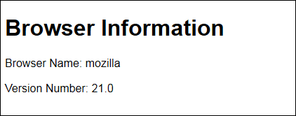
Figure 6-1: Detecting the browser name and version is made easier when using jQuery.
A library can detect only the browsers it's designed to detect. Consequently, jQuery detects some browsers, but not others. For example, you can't currently use it to detect an Android browser because Android isn't in the list of browsers supported by jQuery (which focuses on desktop browsers). Most browser detection methods rely on user agent strings that contain information about the browser (see http://msdn.microsoft.com/library/ms537503.aspx for details). To see the user agent string for your browser, check out What's My User Agent? (www.whatsmyuseragent.com/). You can generally find lists of user agent strings for devices online. For example, the Android user agent strings appear at www.gtrifonov.com/2011/04/15/google-android-user-agent-strings-2/. With enough knowledge, you can usually modify third party libraries to detect other browser types, but that topic is well outside the scope of this book.
Selecting elements
You can use jQuery to perform a vast array of object selections in your application, but for the most part, you use the basic selectors. You can read more about them at http://api.jquery.com/category/selectors/basic-css-selectors. Here's a list of basic selectors that you commonly use:
 All selector (
"*"): Selects all the elements in the document.
Object selector (object): Selects the specific object types. The most commonly used object is document.
Class selector (".class"): Selects a specific class as specified by the class attribute for an element. This selector always appears within quotes and is preceded by a period.
Element selector ("element"): Accesses all the elements with a particular tag name, such as p for the <p> tag. This selector always appears within quotes.
ID selector ("#id"): Chooses a specific element with the id attribute value specified. This selector always appears within quotes and is preceded by a pound sign (#).
Multiple selector ("selector1, selector2, selectorN"): Selects each of the elements specified in the comma delimited list.
One of the more commonly used selectors is the element selector. After you select an element, you can change it in a number of ways. For example, you might choose to change the text associated with that element in some way (later examples will show all sorts of other ways to manipulate output). The following example shows how to select elements and modify their associated text. (You can find complete code for this example in the \Chapter 06\jQuery folder of the downloadable code as SelectingElements.html.)
<!DOCTYPE html>
<html>
<head>
<title>Selecting Elements</title>
<script
src="http://code.jquery.com/jquery-latest.js">
</script>
</head>
<body>
<h1></h1>
<p></p>
<script type="text/javascript">
$("h1").text("A Sample Header")
$("p").text("This is a sample paragraph.")
</script>
</body>
</html>
The example begins with simple <h1> and <p> tags that don't contain any text. If you displayed this page without the script, you'd see a blank page. However, with the script in place, the page now contains information as shown in Figure 6-2. It's also possible to use the text() method to obtain the current value of an object of any sort (assuming the object actually contains text).

Figure 6-2: jQuery provides a number of methods for selecting objects, including element selection.
Changing an element’s CSS
The previous two sections about jQuery have described various mechanical ways in which you can use the library to obtain specific results. The jQuery library is mostly used to perform these sorts of necessary, but low-level tasks. You can, however, use jQuery to perform some fancier tasks by incorporating CSS. There's an actual .css() method you can use to access the CSS associated with an object or to modify the CSS used by that object. You always see the change made to the CSS because the jQuery changes are inline, rather than internal or external CSS.
Imagine that you want to create a formatted multiplication table that automatically changes the color of a selected cell to make it easier to see. The example uses JavaScript to generate the table. Of course, you could also manually generate the table using standard code, but this approach is simpler. (You can find complete code for this example in the \Chapter 06\jQuery folder of the downloadable code as NestedLoop.html.)
// Start the table.
document.write("<table>");
// Start a heading row.
document.write("<tr>");
// Create a heading.
for (var i = 0; i <= 10; i++)
{
if (i == 0)
{
document.write("<th />");
}
else
{
document.write("<th>" + i + "</th>");
}
}
// End the heading row.
document.write("</tr>");
for (var i = 1; i <= 10; i++)
{
// Start a data row.
document.write("<tr>")
// Create the row header.
document.write("<th>" + i + "</th>");
for (var j = 1; j <= 10; j++)
{
// Add each data element.
document.write("<td>" + i * j + "</td>");
}
// End a data row.
document.write("</tr>")
}
// End the table.
document.write("</table>");
This code starts by creating a <table> and creating a heading row, <tr>, for it. The loop simply adds the numbers 1 through 10 to the header using heading, <th>, tags. After the header row is complete, the code then begins to create the data rows. Each data row begins with a heading, followed by the multiplied values. The double loop creates a square table that shows the multiplied values all the way up to 10 * 10.
In order to make this example pleasant to look at, you'd want to use CSS to differentiate the rows and columns. The highlighted cell would use a larger font size and a different font color. In order to make this change, the example uses the .Selected internal CSS style shown here.
<style type="text/css">
.Selected
{
color: blue;
font-size: 30px;
font-weight: bold;
}
</style>
The example now contains a table with multiplied values and a special style for the selected cell. However, it still lacks any formatting for the rows and there isn’t any way to select a specific cell so that it will have the required special formatting. The following code presents one way to accomplish these goals.
// Perform some basic formatting.
$("th:even").css("background-color", "lightblue");
$("th:odd").css("background-color", "lightgreen");
$("td:even").css("background-color", "lightgreen");
$("td:odd").css("background-color", "lightblue");
$("th, td").css("width", "50px");
// Add a special effect.
$("td").mouseover(
function()
{
$(this).toggleClass("Selected");
});
$("td").mouseout(
function()
{
$(this).toggleClass("Selected");
});
The formatting consists of selecting the <th> and <td> elements and then using a basic filter to choose between odd and even elements. The odd elements receive one background color, and the even elements receive another. The code then uses a multiple selector to apply the same width formatting to each of the cells. By combining selectors and selector filters, you can create some interesting effects with little programming. It's important to remember that this table is programmatically generated, so applying formatting to it could be difficult.
The special effect starts with the <td> elements. When a user hovers the mouse pointer over a particular element, the code applies the .Selected CSS formatting to it. Likewise, when the user places the mouse pointer somewhere else, the effect is toggled back to the original formatting used by the <td> element. Toggling the formatting is a quick way to create a mouseover effect. Figure 6-3 shows typical output from this example.
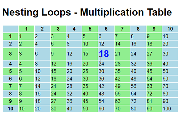
Figure 6-3: The table is a little nicer and includes a special effect now.
Understanding jQuery UI
Although jQuery is interesting, it lacks pizzazz. For the most part, you can't use it to create any sort of special visual effect (at least, aside from the sorts of visual effects you could use CSS to perform). The jQuery UI library (http://jqueryui.com), on the other hand, works with the user interface. You use it to add new kinds of interactions, expand the number of controls at your disposal, create special effects, and perform utilitarian tasks, such as positioning user interface elements precisely.
All the examples in this section require that you provide a link to the jQuery UI as well as jQuery. They also use the jQuery Cascading Style Sheet (CSS) that helps create a pleasant presentation. These external elements make the coding task easier. Make sure you include the following entries in the heading of the file for each of the examples:
<script
src="http://code.jquery.com/jquery-latest.js">
</script>
<script
src="http://code.jquery.com/ui/1.9.2/jquery-ui.js">
</script>
<link
rel="stylesheet"
href="http://code.jquery.com/ui/1.9.2/themes/base/jquery-ui.css" />
You can always download the required files if desired. However, this approach makes it easier for your application to receive required updates. The following sections introduce you to jQuery UI and help you understand how you can use these features to create more interesting applications.
 Using a third-party library doesn't limit your ability to personalize the output. A number of sites show how to modify the CSS, for example, to create some interesting results (see
 http://benknowscode.wordpress.com/2012/10/18/exploring-the-new-jquery-ui-spinner-beyond-the-basics/ as an example). Chapter 13 demonstrates techniques you can use to modify the CSS for jQuery and jQuery UI to produce your own customizations. For now, all you really need to know is that many of the effects that you see in this chapter owe their special nature to the use of CSS.
Using the jQuery UI Controls
Widgets are specialty controls you can use to create special effects on a page. The advantage of these controls is that they can make your application easier to use and more appealing as well. The disadvantage of widgets is that they can be overused or used incorrectly.
A widget is a good idea only when it materially adds to the usefulness and accessibility of your application. When you find yourself admiring the pizzazz that a widget adds to the application — rather than how it makes the user work faster or with greater ease — reconsider using the widget. Your application may work a lot better without it.
HTML5 already comes with a number of useful generic controls of all sorts. For example, if you need a standard check box for your application, rely on HTML5 to provide it. The controls described in the following sections are special in some way. For example, the Accordion widget makes it easy to focus user attention by hiding unused elements from sight. The jQuery UI library does provide access to additional widgets that aren't discussed in the sections that follow. Most widgets, such as Button, have HTML5 counterparts and therefore aren't that useful.
Working with Accordion
You use the accordion to hide any page element from view. When a user selects a category, the elements in that category become visible, and the elements from all other categories are hidden. The effect is to focus user attention and make the user more efficient in performing specific tasks. The following code is all you need to make this feature usable. (You can find complete code for this example in the \Chapter 06\Widgets folder of the downloadable code as Accordion.HTML.)
$(function()
{
$("#Configuration").accordion();
});
The code is concise, but the secret in this case is the way you create the tags for your page. Figure 6-4 shows how the form appears to the user. Notice that the Accordion widget hides from view the settings that the user isn't focusing on. When the user clicks Background Color, the Foreground Color options are hidden from view. Likewise, clicking Options reveals the Options controls.

Figure 6-4: The Accordion widget focuses user attention.
The controls in each area don't matter to the Accordion widget, but the HTML5 formatting does. This form also includes a submit button. If you don't configure the controls properly, the submit button becomes part of the accordion effect, and clicking it no longer submits the form. Here's a condensed view of the HTML5 for this example:
<form id="ConfigForm"
method="get"
action="Accordion.html">
<div id="Configuration">
<h2>Foreground Color</h2>
<div>
<input id="FGRed"
type="radio"
name="Foreground"
value="Red"
checked="checked" />
<label for="FGRed">Red</label><br />
... More inputs and labels ...
</div>
<h2>Background Color</h2>
<div>
<input id="BGRed"
type="radio"
name="Background"
value="Red"
checked="checked" />
<label for="BGRed">Red</label><br />
... More inputs and labels ...
</div>
<h2>Options</h2>
<div>
<input id="Sounds"
type="checkbox"
name="Sounds"
value="SpecialSounds" />
<label for="Sounds">Use Special Sounds</label>
<br />
<input id="Effects"
type="checkbox"
name="Effects"
value="SpecialEffects" />
<label for="Effects">Use Special Effects</label>
</div>
</div>
<input id="ChangeConfig"
type="submit"
value="Change Configuration" />
</form>
Notice that you must place the headings control groups within a separate <div> and then label that <div> as the one you want to use for the accordion effect. A separate <div> houses the individual controls for a specific group. The submit button is part of the form, but it's outside the Configuration <div>. When you click the Change Configuration button, you see that the form works as it should — by examining the address field content. Using the defaults, the resulting URL contains Accordion.html?Foreground=Red&Background=Red when you click Change Configuration.
Working with Datepicker
There are situations where HTML5 currently provides a solution for a particular need, but few vendors have implemented it yet. This is the case with the date and time support for HTML. Only Opera and Chrome provide support for the date and time features. For example, if you want to add a date to a form, you can use the date input type as shown here:
<label for="Date">Enter a Date: </label>
<input id="Date"
type="date" />
The default date is today. When the user clicks the field, the application displays a date picker control, but only when you use Opera or Chrome. Until the other vendors provide date and time support, it's still necessary to use the jQuery UI Datepicker widget to ensure that all of your users can enter a date with ease. The following code shows how to use the Datepicker widget. (You can find complete code for this example in the \Chapter 06\Widgets folder of the downloadable code as Datepicker.HTML.)
$(function()
{
$("#DateEntry").datepicker();
})
DateEntry is a standard <input type="text"> control. When the user clicks the control, jQuery UI automatically displays a calendar like the one shown in Figure 6-5.

Figure 6-5: The Datepicker widget makes entering dates much easier.
Working with Dialog
Both HTML5 and JavaScript make it possible to display dialog boxes. For example, you can see a combination of an HTML5/CSS3 dialog box that doesn't require the use of JavaScript at www.codeproject.com/Tips/170049/Pure-HTML-5-CSS-3-Modal-Dialog-Box-no-JavaScript. Adding JavaScript means you have instant access to the alert(), confirm(), and prompt() functions for limited direct dialog box display. You also have all of the functionality that JavaScript can provide to create truly amazing custom dialog boxes. The problem with all of these approaches is that you may need to write a considerable amount of code to obtain the desired result. On the other hand, using jQuery UI makes it possible to create these dialog box types without much coding at all:
Basic
Animated
Modal
Modal with confirmation
Modal form
Modal message
Additionally, even a basic jQuery UI dialog box provides better functionality than the JavaScript alert() function. You can move the dialog box around, resize it, and close it by using the X in the upper-right corner. The text can also be decorated in various ways because it uses standard HTML input. The following example begins by creating an internal style to use to decorate the text. (You can find complete code for this example in the \Chapter 06\Widgets folder of the downloadable code as DialogBox.HTML.)
<style type="text/css">
.Normal
{
font-family: Arial, Helvetica, sans-serif;
color: SaddleBrown;
background-color: Bisque;
}
.Emphasize
{
color: Maroon;
font-style: italic;
font-size: larger;
}
</style>
This code provides a few simple changes to the text — just enough so you can see the custom CSS at work. The following code creates the dialog box on screen automatically when you load the page.
<h1>Creating a Simple Dialog Box</h1>
<div id="DialogContent"
title="Simple Dialog Example"
hidden>
<p class="Normal">
This is some
<span class="Emphasize">interesting</span>
text for the dialog box!
</p>
</div>
<script type="text/javascript">
$("#DialogContent").dialog();
</script>
The dialog box requires two elements — a container, such as a <div>, to hold the caption in the title attribute and a textual element, such as a <p>, to hold the content. Notice that the paragraph text includes a <span> in this case to provide emphasis to the word interesting. You can format the content in any way desired without modifying the call to jQuery UI at all.
The script uses an id selector to access the <div>. It then makes a simple call to dialog() to display the dialog box on screen. Figure 6-6 shows the output from this example. Notice that it provides a pleasing appearance and it contains formatted content, unlike the alert() function, which provides an austere, square dialog box that lacks any formatting.
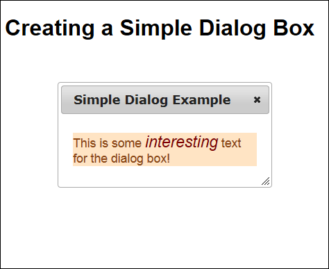
Figure 6-6: Creating custom dialog boxes is easier when using jQuery UI.
Working with Progressbar
Users are impatient, and sometimes a process takes a while to complete. A file downloads only so fast, and some transactions become bogged down on the server. A progress bar makes it possible for the developer to keep the user informed about the progress of a task. Modern programming strategies try to keep the user from waiting at all by performing longer tasks in the background, but sometimes a user can’t proceed until the task is done. This is the time you need to rely on a progress bar to keep the user from attempting to stop the process before it completes.
The following example shows how to use a progress bar. In this case, the progress bar is updated through a timing loop. Each time the timer expires, the progress bar is updated, and the timer is reinstituted. The result is that the progress part indicator moves from left to right and that the timer eventually stops when the indicator moves all the way to right. (You can find complete code for this example in the \Chapter 06\Widgets folder of the downloadable code as Progressbar.HTML.)
// Configure the progress bar.
$(function()
{
$("#Progress").progressbar({value: 0});
})
// Create a variable to hold the timer object.
var Timer;
// Create a variable to hold the total timeout.
var Timeout;
function StartTimer()
{
// Initialize the timeout.
Timeout = 0;
// Set the progress bar maximum value.
$("#Progress").progressbar(
"option", "max", parseInt($("#StartValue").val()));
// Create the timer variable.
Timer = window.setTimeout(UpdateTimer, 100);
}
function UpdateTimer()
{
// Get the maximum value.
var MaxTime =
$("#Progress").progressbar("option", "max");
// Check for the end of the timing cycle.
if (Timeout >= MaxTime)
return;
// Update the Timeout value.
Timeout += 100;
// Update the percentage completed.
$("#PercentDone").text(
Math.round((Timeout/MaxTime)*100));
// Set the progress bar value.
$("#Progress").progressbar("value", Timeout);
// Create the timer variable.
Timer = window.setTimeout(UpdateTimer, 100);
}
The first task is to create the progress bar itself by calling progressbar(). Notice that you must provide an initial value as input. However, the progress bar configuration isn't complete — the call to StartTimer() later will perform some additional configuration tasks.
The StartTimer() function is called when the user clicks the Start Timer button on the form. This function initializes two global variables. Timer is a timer object used to animate the progress bar. Timeout is the current elapsed time in milliseconds. This function also configures the max option for the progress bar. The indicator is a percentage of the current value and the max value properties. The maximum value is provided by the user through an <input type="text"> control, StartValue.
Whenever Timer expires, it calls UpdateTimer(). UpdateTimer() obtains the maximum time value from the progress bar and places it in MaxTime. It then verifies that Timeout is less than MaxTime. When Timeout finally reaches MaxTime, the progress bar has reached 100 percent and it's time to stop the timer.
The next step is to update Timeout to the next value. Every iteration advances Timeout by 100 milliseconds.
After updating Timeout, the example updates the onscreen percentage, which is stored in a <span> with an id of PercentDone. It also updates the progress bar's value attribute so that the bar moves to the next position.
A timer fires only once. To create the next loop of the iteration, the example must reset Timer. When the next 100 millisecond wait is over, UpdateTimer() is called again and the process begins anew. Figure 6-7 shows typical output from this example.
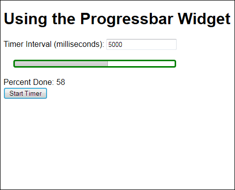
Figure 6-7: Use progress bars to show the user how far a process has completed.
Working with Slider
Sliders give the user the capability to input a value visually — as part of a whole. A slider ensures that the user inputs a correct value within a range of values, so you don't need to worry about security issues or incorrect values. As a result, sliders provide a valuable means of allowing variable input. The following example shows how to use a slider in your application. It begins with the HTML used to define the location and basic appearance of the slider. (You can find complete code for this example in the \Chapter 06\Widgets folder of the downloadable code as Slider.HTML.)
<h1>Using the Slider Widget</h1>
<div id="Slider">
<span id="Left">0</span>
<span id="Right">50</span>
</div>
<div>Value: <span id="Value"></span></div>
The slider has a minimum value of 0 and a maximum value of 50. The slider also uses the following CSS to give the output a more pleasing appearance and to make it possible to mark the beginning and ending of the scale.
<style type="text/css">
#Slider
{
width: 50%;
margin: 30px;
}
#Left
{
position: absolute;
top: 15px;
left: -5px;
}
#Right
{
position: absolute;
top: 15px;
left: 99%;
}
</style>
As you can see, the CSS places the beginning and end of the scale in a particular position so that it matches the size of the slider. As far as the user knows, the scale and the slider are one piece, but they’re actually two pieces in the code. The remaining piece of the code is the script shown here.
$(function()
{
$("#Slider").slider(
{
// Set the maximum slider value.
max: 50,
// Perform tasks when the value changes.
change: function(event, ui)
{
// Display the current slider value.
$("#Value").text(
$("#Slider").slider("value"));
}
});
})
In this case, the code sets the maximum slider value to 50. The minimum value defaults to 0. However, you can set both the maximum and minimum values to any starting or stopping position. Even though the example doesn't show it, the Slider can have more than one handle, so it can represent a range. This flexibility means that you can ask the user to input both a starting and a stopping point.
One of the most commonly used events is change. The example displays the new value each time the user finishes moving the handle. However, the way in which you use the output depends on your application. Generally, you use the output to provide data input or application control. However, it's a good idea to display the actual slider value so the user knows the actual input value. (See Figure 6-8.)

Figure 6-8: Sliders make it possible to obtain precise input in a given range from the user.
Working with Tabs
Many developers use tabbed interfaces to reduce application complexity. If you can focus the user's attention on one item at a time, you reduce the potential for errant input. This example provides an alternative to the example shown in the "Using the Accordion widget" section, earlier in this chapter. As with that example, you begin with a simple function call. (You can find complete code for this example in the \Chapter 06\Widgets folder of the downloadable code as Tabs.HTML.)
$(function()
{
$("#Configuration").tabs();
});
The trick for this example is in the HTML tags, just as it was for the Accordion widget example. There are some important differences in how you create the two pages to obtain the desired appearance, as shown in the following code:
<form id="ConfigForm" method="get" action="Tabs.html">
<div id="Configuration">
<ul>
<li><a href="#Tab1">Foreground Color</a></li>
<li><a href="#Tab2">Background Color</a></li>
<li><a href="#Tab3">Options</a></li>
</ul>
<div id="Tab1">
<input id="FGRed"
type="radio"
name="Foreground"
value="Red"
checked="checked" />
<label for="FGRed">Red</label><br />
... More inputs and labels ...
</div>
<div id="Tab2">
<input id="BGRed"
type="radio"
name="Background"
value="Red"
checked="checked" />
<label for="BGRed">Red</label><br />
... More inputs and labels ...
</div>
<div id="Tab3">
<input id="Sounds"
type="checkbox"
name="Sounds"
value="SpecialSounds" />
<label for="Sounds">Use Special Sounds</label>
<br />
<input id="Effects"
type="checkbox"
name="Effects"
value="SpecialEffects" />
<label for="Effects">Use Special Effects</label>
</div>
</div>
<input id="ChangeConfig"
type="submit"
value="Change Configuration" />
</form>
Notice that the <h2> elements are gone in this case. Instead of using headings to define the separation between elements, you provide an unordered list (<ul>) instead. The list must contain a href to each of the <div> elements in the page. There isn't any difference in the page content. You also need to provide some CSS to format the control as shown here.
<style>
#Configuration
{
width: 90%;
text-align: center;
}
#Configuration div
{
text-align: left;
}
</style>
In this case, the #Configuration style defines the overall size of the tabbed interface and the fact that the tabs have centered text. The #Configuration div changes the content alignment to left. Figure 6-9 shows typical output from this example.
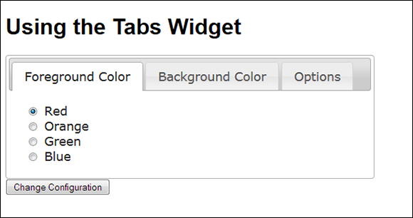
Figure 6-9: Tabs focus the user’s attention, just as the accordion interface does.
To make a change, you click the tab that contains the information you want to see. You make changes as normal. Clicking the Change Configuration button sends the changes to the server. If you test this example by using the same process you did for the accordion example, you get precisely the same results — only the interface appearance has changed.
Performing jQuery UI Interactions
The way in which a user interacts with an application is important. When a set of interactions seems contrived or proves inconvenient, users have to concentrate too hard on what the application should be able to do and how to obtain that result, which makes them lose focus on their work goal. Many business users are currently in the process of moving from desktop applications to browser-based applications for at least part of their work. Consequently, these users often anticipate having desktop-like features in their browser-based application solutions. The following sections describe some jQuery UI features that help you provide that desktop experience to your users.
Creating a Draggable Interface
Sometimes a user needs to reposition screen elements to make them easier to see or work with. Creating an environment in which the user can move items around need not involve writing reams of code. In fact, all you really need is a single method called draggable(). The following code shows the method used to create a draggable paragraph in this example. (You can find complete code for this example in the \Chapter 06\Interactions folder of the downloadable code as DragContent.HTML.)
$(function()
{
$("#MoveMe").draggable();
});
This code is interesting because it actually creates a jQuery anonymous function that extends the jQuery environment rather than working with any particular page feature. The focus of this call is a paragraph (<p> tag) with an id of MoveMe. All you need to do is access that member and call draggable() to make it move around. Try the downloadable example and you find that you can move the paragraph anywhere you want on the page.
To create a movable box, this example relies on a custom style. The style creates a border, allows plenty of room for the text, and then centers the text both horizontally and vertically. Here’s the style used for this example:
#MoveMe
{
border: solid;
width: 200px;
height: 5em;
text-align: center;
line-height: 5em;
}
Many developers experience problems vertically centering text within a <p> tag. You can find a number of ways to perform this task. However, one of the easiest ways to get the job done in a platform- and browser-consistent manner is to use the line-height style as shown in the example. The trick though is to set the height and line-height styles to the same value — the text will always appear in the middle.
Creating a Droppable Interface
Sometimes a user needs to drag an item to a container and drop it in the container. There are many instances of this process in current applications. For example, the concept of dragging an item to a trash can and dropping it to delete it is consistent across all platforms. If you want to send an item to the printer, you drag its icon to the printer icon and drop it there.
Of course, to create this effect, you must have one item that's draggable and another item that's droppable. The preceding section describes how dragging works. As with that previous example, this example relies on some custom CSS to create a particular effect onscreen.
#FillMe
{
border: solid;
width: 400px;
height: 10em;
text-align: center;
line-height: 10em;
position: absolute;
top: 250px;
left: 250px;
}
.Filled
{
background-color: lightblue;
}
There are two states for the droppable container: empty and filled. It starts out empty and uses the #FillMe style. When the draggable paragraph is dropped into the droppable paragraph, the style changes to .Filled. The following code shows how dragging and dropping can work together to create this desirable user interaction. (You can find complete code for this example in the \Chapter 06\Interactions folder of the downloadable code as DropContent.HTML.)
$(function()
{
$("#MoveMe").draggable();
$("#FillMe").droppable(
{
drop: function(event, ui)
{
$(this)
.addClass("Filled")
.html("Filled!");
}
});
});
This example uses the same code for the MoveMe <p> tag. A second <p> tag, with the id of FillMe, acts as a container. When a user drags MoveMe to FillMe, the code calls the anonymous function associated with the drop event. Notice how the example begins with the event name, followed by a colon (:), followed by the anonymous function to handle that event. Notice how the code uses addClass() to modify the class of FillMe. The droppable() method supports these events:
create: Indicates that the droppable item has been created.
activate: Indicates that a draggable item is active. You can use this event to change the droppable item style so that the user can see where to drop an item.
deactivate: Indicates that the user has stopped dragging an item. You can use this event to change the droppable style back to its original state.
over: Fires when the draggable item is over the top of the droppable item. You can use this event to indicate when the user should release the mouse to drop the item into the container.
out: Fires when the draggable item has moved out of the droppable item container. You can use this event to tell the user that it's no longer possible to drop an item into the container.
drop: Tells the droppable item (the container) that it has received a draggable item.
You can create an event handler for any of the events you want to handle in your code. In fact, there are several opportunities for special effects that would focus the user’s attention.
Creating a Resizable Interface
The wide variety and types of screens used to display information make it necessary to allow the user to resize elements as needed. In most cases, you can simply allow the user to make the element any size. However, there may be situations where you need to monitor the amount of resizing so that you can tailor content to meet the needs of the container. The following example shows how to resize an object and monitor its size. (You can find complete code for this example in the \Chapter 06\Interactions folder of the downloadable code as ResizeContent.HTML.)
$(function()
{
$("#ResizeMe").resizable(
{
minWidth: 200,
minHeight: 60,
resize: function(event, ui)
{
$("#Content")
.html("Width: " +ui.size.width +
"<br/>Height: " + ui.size.height);
}
});
});
This example is interesting because it shows how to set properties as well as respond to events. In this case, the minWidth and minHeight properties keep the element a specific minimum size — the user can't make the element smaller.
The code also responds to the resize event. There's a special requirement for resizing you need to know about. The resizing container is separate from the content element. Here's the HTML for this example:
<div id="ResizeMe">
<p id="Content">
Resizable Paragraph
</p>
</div>
The associated style, #ResizeMe, provides a border around the <div>, sets the starting height and width, and centers the content in the container. When you want to write content to the screen, you must use the content element, not the container element. Otherwise the sizing handles will disappear, and the user won't be able to resize the element after the first time. In this case, the current size of the container appears as part of the ui object passed to the resize event handler. You access the information though the size.width and size.height properties, as shown in the code.
Creating a Selectable Interface
Making it possible to select from a list of items reduces the chance that the user will enter incorrect information. Fortunately, HTML5 already comes with a number of selection controls, but you may find that these controls don't quite fulfill your needs at times. In this case, a custom selection technique implemented with jQuery UI might answer the need. A selection sequence can consist of a <div> and a series of <p> tags, as shown here. (You can find complete code for this example in the \Chapter 06\Interactions folder of the downloadable code as SelectContent.HTML.)
<div id="Selections">
<p id="Red">Red</p>
<p id="Green">Green</p>
<p id="Blue">Blue</p>
<p id="Purple">Purple</p>
</div>
Notice that the <div> acts as a container and the <p> tags act as items within the container. (The example includes CSS styles to format each of the selectors, such as using a red background for the Red element — a #Selections style defines the width of the selectors, along with the margin and padding used to display them.) No matter how you implement your custom list (and it need not be the arrangement shown), it must have a container/item arrangement like the one shown here. When you have the arrangement in place, you can create a selection and tracking mechanism like the one shown in the following code:
// Create an array to track the selections.
var Selections = new Array();
// Handle the selects and unselects.
$(function()
{
$("#Selections").selectable(
{
selected: function(event, ui)
{
// Verify the item hasn't already
// been added.
if (Selections.indexOf(ui.selected.id ) ==
-1)
// Add the id of the selected item
// to the array.
Selections.push(ui.selected.id);
},
unselected: function(event, ui)
{
// Find the location of the unselected
// item in the array.
var Index =
Selections.indexOf(ui.unselected.id);
// Remove that item.
Selections.splice(Index, 1);
}
});
})
// Display the results.
function ShowResults()
{
alert("You have selected: " + Selections);
}
The Array, Selections, keeps track of the current selection list. To make the <div>, Selections, selectable, you use the selectable() method. This example uses two events, selected and unselected, to keep track of the current selections. When the user selects a new item, the selected event handler verifies that the item doesn't already appear in Selections, and then it pushes the new item onto Selections.
The unselected event handler must perform two tasks. First, it must locate the unselected item using the indexOf() method. Second, it must use splice() to remove that item from Selections.
This example doesn't provide any fancy output, but you can see for yourself how well the selection methodology works. Click Show Selections to display the list of selected items. The ShowResults() event handler displays a list of the selections for you. In a production application, you could just as easily process each of the selected items.
A final piece to this particular application is the need to define one special style. You must provide a means for the display to register the selected state of a particular item, which means providing values for the #Selections .ui-selected style, as shown here:
#Selections .ui-selected
{
background: black;
color: white;
}
When a user selects an item, the background turns black with white text so the user can see a visual change. You could also modify the text as a second means of helping the user see the selection.
Creating a Sortable Interface
Certain kinds of sorting are easy for computers to do. For example, a computer can put items in alphabetical order much faster than a human can, especially when the list is long. However, sorts aren't always logical. You may want the user to sort a list of items by personal preference or other criteria that the computer can't even understand. In these cases, you need a means of allowing manual sorts — and this example gives you just what you need. The following example lets a user sort items by unspecified criteria. (You can find complete code for this example in the \Chapter 06\Interactions folder of the downloadable code as SortContent.HTML.)
$(function()
{
$("#SortMe").sortable();
})
function ShowResults()
{
// Create the ouput string.
var Output = "The sort order is:\n ";
// Locate each of the required items and
// add them to the string.
$("#SortMe p").each(
function(index, element)
{
Output += element.innerHTML.substr(74);
});
// Display the result.
alert(Output);
}
The sortable() call is all that you need to do to make the list visibly sortable. The user can place the elements, whatever those elements might be, in any order desired. To make this call work, however, you do need to create a container — a <div> in this case — and a list of items, specifically <p> tags. The SortMe id goes with the <div>.
Accessing the items in order is also a requirement. Otherwise there's no point in letting the user sort the items. In this case, it's actually easier to use other jQuery functionality to obtain the list of elements in the order in which they appear and process them that way. ShowResults() demonstrates one technique for performing this task. You begin by creating the appropriate selector, which begins with the <div>, SortMe, and ends with each <p> tag it contains. The anonymous function receives both an index and an element argument. By checking the innerHTML property of the element, you can obtain the moniker for that <p> tag. The result is displayed in a dialog box.
This example also makes use of a special jQuery UI CSS style. This style creates a double-ended arrow that helps the user understand that each item can move up or down in the list. You create it using a <span> like this:
<span class="ui-icon ui-icon-arrowthick-2-n-s"></span>
You can find a list of these icons at http://jquery-ui.googlecode.com/svn/tags/1.6rc5/tests/static/icons.html. It's important to create icons that match the way your list appears onscreen.
Creating jQuery UI Special Effects
Special effects can add pizzazz to your site. They can turn mundane information into something with that special sparkle that people will remember long after they’ve read the material you provide. Using special effects correctly can draw the user’s attention to a particular area of the page or help the user understand a process when using an animated sequence. The point is that effects are normally an addition to the page, not the main focus of it. Effects normally don’t present any sort of information, but they can enhance the impact of information you do present. The following sections describe some of the more interesting effects that you can create using jQuery UI.
Adding color animations
If you want to perform an actual color animation in your application, you need to use the animate() method. This method seems to be a work in progress because the documentation for it isn't nearly as well-written as the other documentation for jQuery UI. The method does seem to work for all the target platforms and browsers for this book, but you'll want to experiment to ensure that it will work for every browser you need to target. The color will actually transition in this case. It's also possible to control the text colors to a large degree. The following example shows the most commonly used transitions. (You can find complete code for this example in the \Chapter 06\Animations folder of the downloadable code as Animate.HTML.)
$(function()
{
// Track the normal state.
var State = true;
$("#ChangeColors").click(
function()
{
if (State)
{
// Set to the changed state.
$("#SampleText").animate(
{
backgroundColor: "#0000ff",
color: "white",
borderColor: "#ff0000",
height: 100,
width: 600
}, 1500);
}
else
{
// Set to the normal state.
$("#SampleText").animate(
{
backgroundColor: "#7fffff",
color: "black",
borderColor: "#00ff00",
height: 50,
width: 400
}, 1500);
}
// Change the state.
State = !State;
}
)
})
If you're thinking that this code looks like it works similar to CSS, it does, but the animate() method provides a significantly reduced list of features it can change. You can change many features of the text and the container that holds it, including both the width and height. However, you can't change things like the kind of border used to hold everything — even though you can change the color of the border. The jQuery UI documentation states that animate() supports these properties:
backgroundColor
borderBottomColor
borderLeftColor
borderRightColor
borderTopColor
color
columnRuleColor
outlineColor
textDecorationColor
textEmphasisColor
The library-supplied examples (those provided by the vendor on the vendor's site) show that a few other properties are supported, including width, height, and borderColor. Use these non-published properties with care. Even though they work now, they may not be supported in future releases of the library.
Employing class transitions
Using CSS classes can have an interesting effect on the presentation of information onscreen. jQuery UI makes it possible to use CSS classes to perform animations in four different ways:
Adding a class
Removing a class
Switching between classes
Toggling a class
In all four cases, the effect doesn't occur immediately — you provide a time delay to make the transition between presentations slow enough for the user to see. (You can find complete code for this example in the \Chapter 06\Animations folder of the downloadable code as ManageClasses.HTML.)
$(function()
{
$("#ChangeClass").click(function()
{
$("#SampleText").addClass(
"Effect", 1500, RemoveClass);
return false;
});
function RemoveClass()
{
$("#SampleText").removeClass(
"Effect", 1500, "easeOutBounce");
};
$("#SwitchClass").click(function()
{
$(".Normal").switchClass(
"Normal", "Effect", 1500, "easeInElastic");
$(".Effect").switchClass(
"Effect", "Effect2", 1500,
"easeOutElastic");
$(".Effect2").switchClass(
"Effect2", "Normal", 1500,
"easeInOutElastic");
return false;
});
$("#ToggleClass").click(function()
{
$(".Normal").toggleClass("Effect", 1500);
return false;
})
})
There are three buttons on the front of the page: Add/Remove Class, Switch Between Classes, and Toggle Between Classes. Each of these buttons is assigned an event handler as shown. The RemoveClass() function is a callback for the Add/Remove Class button. After the transition for the event handler has ended, the code automatically calls this function.
All of these animations work in precisely the same way — they add or remove classes to or from the specified element. In this case, a <div> named SampleText is the target of the animations. The difference between the method calls is how they perform their task. The addClass() method performs a straightforward addition of a class. You supply the name of the class to add as the first argument. If the class already exists for the element, nothing happens. Likewise, the removeClass() method removes the specified class from the element. Again, you supply the name of the class to remove as the first argument.
The switchClass() method switches between one class and another. You can use it to create multiple transitions. For example, this example shows how to switch between three transitions. The Normal class is replaced with Effect, Effect is replaced with Effect2, and Effect2 is replaced with Normal. Consequently, you see the animations rotate between three classes. You supply the name of the class to remove as the first argument and the name of the class to add as the second argument.
The toggleClass() method adds or removes a class depending on whether the class is assigned to the element. In this case, the code adds Effect when SampleText lacks it and removes Effect when SampleText has it applied. You supply the name of the class to toggle as the first argument.
jQuery UI can’t animate all styles. For example, there’s a transition between having the text left justified and having it centered in this example. This transition can’t be animated. What you see is that the effect occurs at the end of the animation. In addition, some effects are animated, but they aren’t animated in the way you might expect. For example, if an element changes color, the new color is used throughout the animation, but you see it gradually fade in.
Each of these method calls includes a time delay of 1500 milliseconds. This value indicates the amount of time in which the animation occurs. The default setting is 400 milliseconds, which is a little hard for most people to see. However, this argument is optional, and you don’t have to supply it to make the method work.
The addClass() method includes another optional argument, a callback function. The callback function is called when the animation is over. The example uses the callback function to toggle the effect. However, a callback could be used for any of a number of purposes. For example, you could use it to create a validation sequence to ensure that users enter the correct data for form fields that have incorrect information.
An animation can also use an easing function. This function determines how the animation appears onscreen. The default setting is to use the swing easing function, which provides a gentle transition from the starting point to the end point that most users will appreciate (the animation starts a tiny bit slow, becomes a bit faster and more linear in the middle, and then ends a bit slow). However, you might want a little more pizzazz or at least a different effect. You can see a list of easing functions at http://api.jqueryui.com/easings. This example uses a number of different easing functions so that you get an idea of how they work.
Working with advanced easing
Many applications require that you show or hide elements at different points of application execution. It may be something as simple as not needing the element at that particular time (such as a progress bar). In most cases, you simply want the element to go away. Whether the user notices the disappearance is immaterial to the application’s functionality. However, you may want the user to notice the change in some situations. For example, a user might select an option that makes other options inaccessible. Using a special effect to make this more noticeable could be helpful.
The jQuery UI library provides several means of controlling element visibility in an animated manner. The fact that the element is shown or hidden doesn’t change, but the way in which the application shows or hides it does. For example, you could use a slide effect to show that a new element has been added due to a choice the user has made. There are four main methods of animating elements by using this technique:
Use an effect where the element visually changes.
Show a hidden element by using an effect.
Hide an element by using an effect.
Toggle an element’s visibility by using an effect.
The effect that you choose for working with an element controls how jQuery UI visually manages it. For example, an explode effect causes the element to break into pieces, with each piece moving in a different direction off screen. The following keywords define the sorts of effects that you can use (you can find additional details at http://api.jqueryui.com/category/effects):
|
blind |
bounce |
clip |
|
drop |
explode |
fade |
|
fold |
highlight |
puff |
|
pulsate |
scale |
shake |
|
size |
slide |
transfer |
In addition to the actual effect, you can use an easing function to make the effect more pronounced or special in other ways. You can see a list of easing functions at http://api.jqueryui.com/easings. The following example shows how to use all four approaches for working with element visibility. There are actually four buttons used for the example, but element visibility limits you to seeing just three at a time because you can't show an element that's already visible or hide an element that's already hidden. (You can find complete code for this example in the \Chapter 06\Animations folder of the downloadable code as Visibility.HTML.)
$(function()
{
// Keep track of the element hidden state.
var Hidden = false;
$("#Effect").click(
function()
{
$("#SampleText").effect(
"bounce", "easeOutBounce", 1500);
});
$("#Show").click(
function()
{
Hidden = false;
$("#SampleText").show(
"slide", 1500, ChangeButtonState);
});
$("#Hide").click(
function()
{
Hidden = true;
$("#SampleText").hide(
"explode", 1500, ChangeButtonState);
});
$("#Toggle").click(
function()
{
Hidden = !Hidden;
$("#SampleText").toggle(
"scale", {percent: 0}, 1500,
ChangeButtonState);
});
// Set the button state as needed.
function ChangeButtonState()
{
if (Hidden)
{
$("#Show").attr("hidden", false);
$("#Hide").attr("hidden", true);
}
else
{
$("#Show").attr("hidden", true);
$("#Hide").attr("hidden", false);
}
}
})
The example begins by creating a variable, Hidden, to track the state of the element. When the element is hidden, the Show button is displayed. Likewise, when the element is displayed, the Hide button is displayed as well. This functionality is controlled by a callback function, ChangeButtonState().
The code for the Effect button simply performs an effect on the element, SampleText. In this case, you see the bounce effect. The performance of this effect is modified by the easeOutBounce easing function, and the entire animation lasts 1500 milliseconds. The actual visibility is unchanged, but the user sees an animation of the element onscreen. You could use this technique to point out fields that have incorrect information or require additional information. Of course, you can also use it to perform any other sort of simple animation desired — including a looped animation, where the animation is constantly replayed.
The Show and Hide button code work hand-in-hand to hide or display SampleText. The Show button uses the slide effect, and the Hide button uses the explode effect. Both perform the task over 1500 milliseconds. Notice that both event handlers set the state of Hidden directly because the state is an absolute based on the task that the button performs. The event handlers also provide ChangeButtonState() as a callback function. The animation calls this function after the animation has completed to set the button state correctly.
The Toggle button works like a combination of the Show and Hide buttons — the event handler simply toggles the SampleText visual state. Because the state isn't known, the value of Hidden is also toggled. In this case, the event handler calls the scale effect, which requires an additional argument in the form of percent. Make sure you check the effects to determine whether they require additional arguments — most don't. When the animation completes, the application calls ChangeButtonState() to reconfigure the user interface as needed.
Performing transforms
It's possible to use jQuery to perform transformations and these transformations are often more powerful, yet easier to use, than the native CSS transformations I discuss in Chapter 5. However, in order to gain this functionality, you must download a jQuery plug-in — a special kind of library that extends the native jQuery functionality. The best plug-in to perform the task is jquery.transform.js (http://louisremi.github.io/jquery.transform.js/index.html). You can go to this page and see the transformations demonstrated.
The host page doesn't contain a link for downloading the plug-in, unfortunately. In order to obtain a copy of this plug-in, you go to www.downscripts.com/jquery.transform.js_javascript-script.html and click the Click Here to Download link. You receive a .ZIP file containing a number of files, including the jquery.transform.js file that you must copy into your application directory. (You must perform the download and obtain access to jquery.transform.js to work with the example in this section.) To gain access to this plug-in, you add the following <script> tag after all of the other jQuery entries (position is important).
<script
src="jquery.transform.js">
</script>
Using this plug-in works much like any other jQuery function call. This example relies on a <div> that contains a <p> with the required content. In this case, the example simply rotates the content, but you have access to all of the usual CSS transformations. The interesting part is the simplicity of the script used to perform the task. (You can find complete code for this example in the \Chapter 06\Animations folder of the downloadable code as Transform.HTML.)
<script type="text/javascript">
$("#TransformMe").css("transform", "rotate(45deg)");
</script>
This script simply says to perform a standard CSS transformation of rotating the TransformMe <div> 45 degrees. In addition to static transformations, this plug-in also provides animated transformations using the animate() function with a timing function that defines how long to perform the animation. It's also quite easy to combine transformations to create various special effects. Make sure you try the examples in the test folder of the downloaded plug-in to see the full range of effects that this plug-in provides.
Defining the Basic Page Layout
You'll find quite a few more examples throughout this book of working with jQuery plug-ins, but one requires a special mention. The jQuery UI Layout Plug-in (http://layout.jquery-dev.net/) makes it incredibly easy to create various kinds of layouts for your site without spending a lot of time. The layouts can incorporate all sorts of interesting features, such as the ability to resize partitions dynamically. That's right; the user can choose how to make each section of a page in order to focus on the content of interest.
The examples on the site can be complex, but it pays to review them at http://layout.jquery-dev.net/demos.cfm. This plug-in can help you create amazingly functional sites with very little programming. Of course, a simpler example is always welcome. This example demonstrates the simplest layout you can create using this plug-in. The starting point is to add a reference to the plug-in library. This is one case where you don't have to download anything. (You can find complete code for this example in the \Chapter 06\Layout folder of the downloadable code as Layout.HTML.)
<script
src="http://layout.jquery-dev.net/lib/js/jquery.layout-latest.js">
</script>
In order to create the panes used for this example, you define <div> tags for North, South, East, West, and Center panes. Of all the panes, the Center pane is the only one that's required.
<div class="ui-layout-center">
Center
</div>
<div class="ui-layout-north">
North
</div>
<div class="ui-layout-south">
South
</div>
<div class="ui-layout-east">
East
</div>
<div class="ui-layout-west">
West
</div>
Notice that each pane has a specific class value associated with it. In order to create a pane in a particular location, you must use the associated pre-defined class. Otherwise the layout plug-in won't recognize the <div> as a pane. The object within each <div> defines the content for that pane.
The example also requires use of a script to associate the panes with the plug-in. The following script is all you need to make this example functional.
<script type="text/javascript">
$(document).ready(
function ()
{
$('body').layout({ applyDemoStyles: true });
});
</script>
The arguments you supply to the layout() function determine the appearance of the panes. The applyDemoStyles argument provides the simplest layout method. Figure 6-10 shows the output from this example.
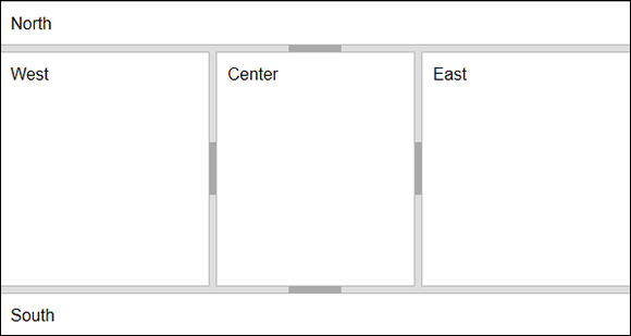
Figure 6-10: The user can resize or toggle individual panes in this layout.
You can perform two tasks with the example. Notice the dark area in the middle of each line separating the panes. Clicking this dark area will close that pane. Clicking it again will reopen the pane. When you hover the mouse cursor over one of the lines, it turns into a double-pointed arrow. This arrow lets you resize the pane as needed.