Chapter 13
Modifying the jQuery and jQuery UI CSS
In This Chapter
 Viewing the jQuery and jQuery UI CSS
Developing new controls
Executing special control effects
Defining additional graphics
Extending jQuery and jQuery UI with plug-ins
Using code to create a few added effects
jQuery and jQuery UI are two of the most popular libraries used to enhance browser-based applications for good reason — they both provide significant functionality in small, well-documented packages. Using these two libraries alone can give you most of the functionality any developer could want. However, the wealth of available third-party tweaks, modifications, add-ons, and plugins suggests that many other developers think jQuery and jQuery UI could use something more. That’s what this chapter is all about — obtaining a bit more from jQuery and jQuery UI. The simple act of modifying the CSS associated with jQuery and jQuery UI can create some amazing effects.
Of course, you don’t want to simply plunge in and start making changes to any library. It’s important to make measured changes that obtain the result you want with the fewest modifications to the way the library works. Otherwise you risk altering the library in a way that causes problems with future versions of the library. Breaking changes (those that cause the library to work incorrectly in the future) are one of the biggest problems with any change you make.
This chapter reviews a number of common modifications that people make to the jQuery and jQuery UI libraries. Of course, the most common is a specialized form of an existing control — one that uses the basic control, but augments it in some way. For example, you may decide that the control should be coupled with another control to make it easier to use (as with the spinner-and-slider combination discussed in Chapter 12). You may also want to create special application effects based on control state or output. Adding graphics is another common change. The point is that you have a number of ways to modify how jQuery and jQuery UI work so that they better fit your application’s requirements.
 Most of the examples in this chapter use some amount of JavaScript that's based on the jQuery (
http://api.jquery.com/) and jQuery UI (http://api.jqueryui.com/) examples. Many developers simply copy and paste code they find online in order to reproduce an effect without really understanding JavaScript at a low level. This approach does work, but it's more helpful if you know how to write applications using JavaScript — at least at the novice level (to gain that knowledge, you can read my book on JavaScript entitled, HTML5 Programming with JavaScript For Dummies). The explanations in this chapter are complete enough that most people with at least a little coding experience should be able to follow them. However, you can use the code in your application by simply copying and pasting it as needed.
Looking at the jQuery and jQuery UI CSS
Most of the changes you make to jQuery and jQuery UI involve modifications of the CSS. You can perform this task in a number of ways. For example, you can create an internal style that modifies the behavior of the default style. When your application uses external styles, the style overrides must appear later than the jQuery and jQuery UI styles in the list of styles. The following sections discuss some essentials you must know before overriding a style.
Understanding the basic layout
The makers of jQuery and jQuery UI do a good job of documenting the internals of their library. From a CSS perspective, the material found at http://api.jqueryui.com/theming/css-framework/ tells you about the styles used to create the output you've seen in various places in the book. Figure 13-1 gives you a good idea of how the initial page of documentation is laid out.
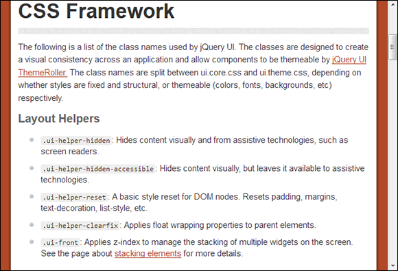
Figure 13-1: Start with the CSS documentation to discover how to make modifications.
One of the first things you notice on this page is that the developers recommend you use ThemeRoller (see Chapter 10 for details) to make your changes whenever possible. However, there are many cases where ThemeRoller simply won’t do the job, so you need to make the modifications in a more traditional manner. The list that follows describes each of the classes and their range of effects. I’ve divided the classes into two files with a number of styles within each file:
 jquery.ui.core.css: Contains all of the styles that affect structural elements in some way. These include
• Layout helpers: Determines the overall layout of objects onscreen; makes it possible to interact with assistive technologies; and provides a method for resetting the layout as needed.
• Interaction cues: Defines when an object is disabled.
• Icons: Specifies the icon state.
• Overlays: Determines the size and position of overlays.
jquery.ui.theme.css: Defines any styles that affect thematic elements, such as color, fonts, and backgrounds. These include
• Component containers: Specify the appearance of content within various object containers. The containers normally include the overall object, object headers, and object data (specified as content within the styles).
• Interaction states: Determine the appearance of an object when specific interaction states occur. The four interaction states are: default (when nothing is happening with the object), hover (when the mouse cursor is over the object), active (when the user is actually performing a task with the object), and focus (when the user has selected the object, but isn't doing anything with it).
• Interaction cues: Determine the appearance of an object that's in a particular state to help the user understand the object's status. The interaction cues are: highlight (the object or content is selected for interaction); error (an error has occurred with an object); error text (an error has occurred with content, usually text, within an object); disabled (the object or content are disabled); primary (an object is the primary or first-level object in a hierarchy of objects); and secondary (an object is the secondary or second-level object in a hierarchy of objects).
• Icons: Define the state and positioning of the icons used with an object. The state and positioning are controlled separately. The state information determines whether the icon is part of a header or the content. In addition, it determines formatting based on the status of the icon: default, hover, active, highlight, error, and error text. Icons are positioned individually based on icon name, such as .ui-icon-carat-1-n.
The icons are actually defined in block format as part of the states and images section of the icons portion of the file.
You can see the widget-specific icon images at http://code.jquery.com/ui/1.9.2/themes/base/images/ui-icons_222222_256x240.png.
The default icon images appear at http://code.jquery.com/ui/1.9.2/themes/base/images/ui-icons_888888_256x240.png.
You can find the active icon images at http://code.jquery.com/ui/1.9.2/themes/base/images/ui-icons_454545_256x240.png and those used for highlighting at http://code.jquery.com/ui/1.9.2/themes/base/images/ui-icons_2e83ff_256x240.png.
When an application experiences an error, you see the list of icons at http://code.jquery.com/ui/1.9.2/themes/base/images/ui-icons_cd0a0a_256x240.png.
• Corner radius: Creates rounded corners on the various objects.
• Overlays: Determines the formatting of content within overlays and the formatting of the overlay shadow (so that you can see there’s an object behind the object in the front).
 In order to better understand how things work, it's a good idea to look at the actual files. You can find the first file at a location such as
 http://code.jquery.com/ui/1.9.2/themes/base/jquery.ui.core.css where http://code.jquery.com/ui/ is the base URL, 1.9.2 is the version of jQuery or jQuery UI in question, and themes/base/jquery.ui.theme.css is the specific file location. To obtain a copy of the CSS for a different version of jQuery or jQuery UI, simply change the version number part of the URL. The second file is found at a location such as http://code.jquery.com/ui/1.9.2/themes/base/jquery.ui.theme.css. Figure 13-2 shows what you'll see when looking at jquery.ui.core.css.

Figure 13-2: Checking the individual CSS files helps you understand how things work.
Viewing the files provides details on how the various styles are constructed, so you can make modifications safely. In addition, the files often contain notes. For example, when you look at jquery.ui.theme.css, you find that one of the styles is actually deprecated (no longer supported), as this note tells you:
/* ui-icon-seek-first is deprecated, use ui-icon-seek-start instead */
The style is commented out so that you can’t use it. However, the note is still important because it tells you which style to use instead.
Picturing the use of jquery-ui.css
In the examples in Chapter 6, notice that none of the examples uses either jquery.ui.core.css or jquery.ui.theme.css. That's because these files are actually incorporated into http://code.jquery.com/ui/1.9.2/themes/base/jquery-ui.css. This single file actually contains a number of CSS files:
jquery.ui.core.css
jquery.ui.accordion.css
jquery.ui.autocomplete.css
jquery.ui.button.css
jquery.ui.datepicker.css
jquery.ui.dialog.css
jquery.ui.menu.css
jquery.ui.progressbar.css
jquery.ui.resizable.css
jquery.ui.selectable.css
jquery.ui.slider.css
jquery.ui.spinner.css
jquery.ui.tabs.css
jquery.ui.tooltip.css
jquery.ui.theme.css
The use of a single file makes it easier for developers to interact with jQuery and jQuery UI. However, when working through changes you want to make to the library, it’s usually easier to view the individual CSS file. Otherwise you’d have to wade through a lot of styles and wouldn’t get the full picture of how these various styles interact because the structure that jQuery and jQuery UI provide is collapsed into this single file.
Defining reasonable changes
Because the jQuery and jQuery UI API is so well documented, there’s a tendency to think it’s possible to modify anything about these libraries. However, changing the way anyone’s code works can result in unforeseen consequences. For example, a change may make sense in your mind, but actually cause the library to break and behave in an unacceptable way. In general, you need to consider the smallest amount of change that will accomplish a given purpose. For example, rather than making a coding change, try to use the programming-like functionality provided by CSS to obtain the change you want.
In some cases, you want to substitute your own art to obtain an effect. For example, you may choose to use custom icons for your application. In this case, you must create an icon file that precisely matches the one used for jQuery and jQuery UI. The number of icons, the icon size, and the icon arrangement must match precisely in order to make the change work. With this in mind, look at the icons at http://code.jquery.com/ui/1.9.2/themes/base/images/ui-icons_222222_256x240.png. As shown in Figure 13-3, the icons are arranged in a specific manner — they don't follow one after the other and you can see they are grouped according to type. Yes, you can use your own art, but only as long as the art matches the mechanical specifications of the original art. (The icons are a little hard to see on the actual page, so viewing them at the bottom of the ThemeRoller page at http://jqueryui.com/themeroller/ is helpful.)
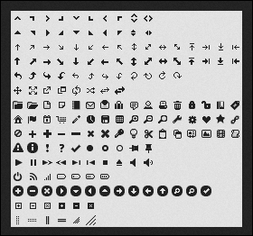
Figure 13-3: When substituting your own icons, make sure the icon size and arrangement matches.
At some point, you’ll want a change that you can’t provide through new art or an updated CSS. In this case, you need to create a plugin. For example, you may want to modify a behavior that you simply can’t modify without adding code. Reasonable changes include adding new behaviors or allowing a widget to accept a new type of input from the user. What you want to avoid is completely rewriting the widgets, behaviors, or other jQuery and jQuery UI features so that the result becomes something completely different from what the authors originally intended. This approach will almost certainly result in failure (if not now, then with a future update to either jQuery or jQuery UI).
Avoiding potential error conditions
Ensure that you’re familiar with the area of jQuery or jQuery UI that you want to modify before you make any sort of changes to it. This means acquainting yourself with the way in which the library performs tasks and uses resources. When you design an alternative resource, such as a list of icons, the resource must precisely match the mechanical attributes (size, order, and content) of the original resource. In addition, you need to test carefully to ensure the new resource behaves as you expect it to. Some changes can cause undesirable side effects. For example, making an icon one pixel too wide or too high will cause problems in using that icon with the library.
 Sometimes you do need to resort to coding in order to meet your objective. However, it would be an error to modify the .JS or .CSS files directly. Always modify an external file to obtain the results you want. Fortunately, the authors of jQuery and jQuery UI provide a well-documented method for extending the functionality these libraries provide through the use of plugins. The “Working with Plug-ins” section, later in this chapter, discusses various techniques you can use to work with existing plugins. If you really do need to write new code, the “Finishing with the Coded Bits” section, at the end of this chapter, provides advice on how to create your own plugin.
Of course, the sage advice for working with someone else’s code is to test heavily after you make a change. Test as many different situations as you can and look for odd quirks that tend to pop up as the result of changes you make. The library should work precisely as it did before, but with the added functionality you’ve provided in place.
Defining a Specialized Control
All the jQuery UI widgets lend themselves to customization. Most of the changes you make deal with using built-in features correctly. You can also work with the CSS that jQuery UI employs to format the widgets to produce special effects. Of course, if nothing else, you can always use JavaScript to modify the actual widget behavior as needed. The point is that you can change widgets (such as Spinner) to meet specific needs without having to reinvent the wheel. The modifications are usually short and easy to do, which means you don't have to start from scratch with an idea you have to code by hand.
Spinners are popular because you can use them to control user input in a number of ways. The idea is to provide control for data that's normally variable, so you can't use something like a drop-down list box. One of the most interesting uses of spinners is shown on the Ben Knows Code site at http://benknowscode.wordpress.com/2012/10/18/exploring-the-new-jquery-ui-spinner-beyond-the-basics. In this case, the author shows how to perform tasks such as moving the location of the arrows and creating an alphabetical spinner. The example in this section plays off the example on this site, but it's a bit more straightforward and easier to understand. Once you understand the example in this section, you can go to the Ben Knows Code site and understand that example right away.
Spinners normally deal with numeric input. However, you might have a need for alphabetic input instead. To create an alphabetic input, you need to give the appearance of letters without actually using letters, because the Spinner widget works only with numbers. The following example takes a standard jQuery UI Spinner widget and transforms it to use letters instead of numbers. (You can find complete code for this example in the \Chapter 13\Spinner folder of the downloadable code as Spinner.HTML.)
$(function()
{
var CurrentValue = 65;
var ThisSpinner = $("#Spinner").spinner(
{
// Set the minimum to the code for A
// and the maximum to the code for Z.
min: 65,
max: 90,
// When the user starts to spin the spinner,
// convert the value to a number and hide the
// text from view.
start: function(ui, event)
{
ThisSpinner.spinner("value", CurrentValue);
$("#Spinner").css("color", "transparent");
},
// When the user stops spinning the spinner,
// save the numeric value, convert it to a
// letter and display the text onscreen.
stop: function(ui, event)
{
CurrentValue =
ThisSpinner.spinner("value");
ThisSpinner.spinner("value",
String.fromCharCode(CurrentValue));
$("#Spinner").css("color", "green");
}
});
});
When you see a section of code in a jQuery or jQuery UI application that begins $(function(){}), it means that the application should wait until the page is fully loaded and ready for use before doing any processing. All of the code in this chapter (and the vast majority of examples you see online for that matter) begins by telling jQuery or jQuery UI to wait until the page is ready for use. The code between the curly brackets ({}) defines what you want jQuery or jQuery UI to do after the page is ready.
The code begins by creating a variable, CurrentValue, that tracks the numeric value of the spinner. The value, 65, is the numeric equivalent of the letter A. So the spinner starts with a value of A, but it stores this value as the number 65.
Creating the spinner, ThisSpinner, comes next. You must set minimum and maximum values that reflect the numeric values of A and Z. This same technique can work for any series of letters. You could just as easily use lowercase letters, if desired. For that matter, any series will work, including special characters. It's even possible to use this approach for enumerated values.
The simplest approach provides handlers for the start and stop events. When the user clicks one of the two arrows, it starts a spin event. The change occurs, and then the spin stops. For the spinner to work correctly, the value attribute must contain a numeric value. The code sets value to CurrentValue, which is the code that equates to the currently selected letter. However, at this point, you can see the numeric value as text in the spinner, which is distracting. To keep this from happening, the event handler also sets the text color to transparent, so the user can't actually see the text onscreen.
 Make sure you think about how you set the colors for hidden items. There’s a tendency with some developers to set the hidden item’s color to the background color, but the background color can change. Even though many references don’t actually state it, one of the recognized colors is transparent, which means no color at all. Always use transparent objects when you want to hide something.
The stop event handler stores the new spinner value in CurrentValue. It then converts the numeric value from a number, such as 65, to a letter, such as A (as shown in Figure 13-4). The code then changes the text color to green so the user can see the letter onscreen.
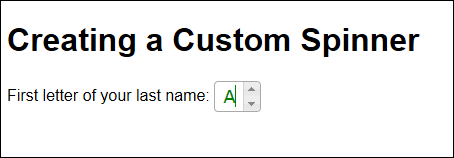
Figure 13-4: The example application asks the user to enter the first letter of his or her last name.
This example also changes a few of the widget styles. These styles are listed as part of the jQuery UI CSS file at http://code.jquery.com/ui/1.9.2/themes/base/jquery-ui.css. In this case, you don't want the user to be able to type more than one character, so the width of the widget is changed to accept just one letter. In addition, the text color is changed to green, as shown here:
.ui-spinner
{
width: 45px;
}
.ui-spinner-input
{
color: green;
}
Using a combination of events and CSS lets you create all sorts of custom effects with any of the jQuery UI widgets. All you need to do is experiment a little to create some really interesting output.
Creating Specialized Control Effects
A specialized effect is any sort of activity that a control (widget) isn’t designed to handle at the outset. For example, it’s possible to use XML files (or databases) to hold just about anything related to a browser-based application. By adding XML functionality to an existing control, such as a tabbed interface, you can modify how that control works. The effect is that you can make changes to the user interface by modifying the XML, rather than working directly with the page code. There are many ways in which to generate XML, so this technique adds a significant amount of flexibility to the user interface.
In this example, you see how to create a jQuery UI tabbed interface by using data stored in an XML file. In addition, this example relies on jQuery to get the XML file rather than relying on handwritten code to perform the task. What you’re doing is combining features found in jQuery UI with those found in jQuery to create a composite control. The code you create using jQuery is shorter than handwritten code; somewhat easier to understand; and, most important of all, more likely to work with browsers that you didn’t originally test as part of the initial application design.
Developing the page code
The following code shows the jQuery method of creating a tabbed interface. (You can find complete code for this example in the \Chapter 13\XMLTab folder of the downloadable code as XMLTab.HTML.)
$(function()
{
// Create variables to hold temporary data.
var TabHeads = "";
var TabContent = "";
// Obtain the XML data file and process it.
$.get("XMLTabData.xml", function(data)
{
// Locate each Heading entry and use it to
// create a tab heading.
$(data).find("Heading").each(function()
{
TabHeads +=
"<li><a href='" +
$(this).attr("href") +
"'>" + $(this).attr("caption") +
"</a></li>";
});
// Append the data to the heading area.
$("#Headings").append(TabHeads);
// Locate each Content entry and use it to
// create the tab content.
$(data).find("Content").each(function()
{
TabContent +=
"<div id='" + $(this).attr("id") +
"'>" + $(this).text() + "</div>";
});
// Append the data to the tab content area.
$("#Tabs").append(TabContent);
// Complete the process by displaying the
// tabs.
$("#Tabs").tabs();
});
});
The code begins by creating two variables: TabHeads and TabContent, to contain the data used to fill in the tabbed interface. This information is eventually added to two HTML tags, as shown here:
<div id="Tabs">
<ul id="Headings" />
</div>
The get() method obtains the XML file, XMLTabData.XML, and places the content in data. What data contains is a fully formed XML file that's passed to an anonymous function (one that has no name) that you define as: function(data){}. The function is executed when the data retrieval is complete, so it acts as a callback for an asynchronous data read.
The XML file is described in the "Creating the XML file" section later in this chapter. All you need to know for the moment is that the XML file contains <Heading> elements that contain the data used to create the tab entries, as well as <Content> elements that contain the data placed within each tab (as shown in Figure 13-5). In this case, Tab 1 would be a heading and "This is some content for Tab 1." would be content for that tab.
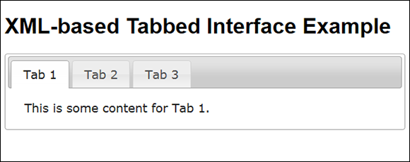
Figure 13-5: Dynamic tab configuration is just as easy as creating dynamic menus.
All of the heading information appears within the <Heading> elements. So, the code asks jQuery to find() each of the <Heading> elements and process them one at a time using the each() method. The each() method creates a loop that automatically provides access to individual <Heading> elements through the this variable. Tab headings are stored in an unordered list (<ul>), Headings, that's already part of the HTML for the example page.
The content for each tab appears in <div> elements that are appended after the <ul> element, Headings. The content could be anything — including controls as used for the previous tabbed-interface example (demonstrated in the section on using the Tabs widget in Chapter 6). The most important issue to consider is how to store information in the XML file. Be sure you escape any tags so that they're not misinterpreted as XML elements.
As with the headings, the code uses find() to locate each of the <Content> elements in the XML file and convert them to the HTML required to create the tab content. The each() method creates the loop used to process each element one at a time.
Creating the XML file
In order to make this example work, you need an XML file named XMLTabData.XML. This file has a specific format that you must follow to make the example work properly. Here's the XML file used for this example:
<?xml version="1.0" encoding="UTF-8"?>
<Tabs>
<TabData>
<Heading id="Tab1"
href="#Tabs1"
caption="Tab 1" />
<Heading id="Tab2"
href="#Tabs2"
caption="Tab 2" />
<Heading id="Tab3"
href="#Tabs3"
caption="Tab 3" />
</TabData>
<TabContent>
<Content id="Tabs1">
This is some content for Tab 1.
</Content>
<Content id="Tabs2">
This is some content for Tab 2.
</Content>
<Content id="Tabs3">
This is some content for Tab 3.
</Content>
</TabContent>
</Tabs>
Notice that the file has a root element named <Tabs> that contains child elements: <TabData> and <TabContent>. These child elements contain the <Heading> and <Content> data used to fill in the tabbed interface. There's one <Heading> element for each <Content> element. The actual content can be anything you want it to be, as long as it follows the structure shown in the example.
Working with Added Graphics
On a website, graphics can take many forms. For example, you can have a free-standing piece of static art used for a logo or some other purpose. The chapter has already discussed using alternative art with jQuery and jQuery UI, such as replacement icons for the various controls. This section discusses graphics used in an interactive way, which many sites do. In this case, the example relies on a master/detail view where a tab provides the mechanism to group like graphics and entries in the content section provide access to individual graphics within the category.
There are many situations where you need to provide a master/detail view. Of course, the most common use for such a view is in database applications where you present data such as the orders associated with a particular client. The view is also used in many other places; the Windows Explorer and Mac Finder applications, for example, use a master/detail view in presenting the folder hierarchy in one pane and the content of the selected folder in the other. The example application shows categorized data and the details of that data. Like every other master/detail view you’ve ever seen, the categories and their associated content appear in the left pane and the selected item appears in the right, as shown in Figure 13-6.
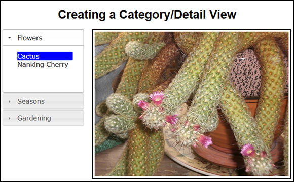
Figure 13-6: A category/detail view provides a useful method of presenting information to the user.
What you're actually seeing here is a combination of the jQuery UI Accordion widget and the Selectable interaction — both of which are discussed in Chapter 6. The following sections break the application into pieces to make it easier to understand.
Creating the HTML
As with any other jQuery UI example, this one relies on a framework of HTML tags to support the widgets. The following code shows how to create the HTML for the application shown in Figure 13-6. (You can find complete code for this example in the \Chapter 13\CategoryDetail folder of the downloadable code as CategoryDetail.HTML.)
<div id="Categories">
<h2>Flowers</h2>
<div>
<ol id="FlowerSelect" class="Selections">
<li id="Cactus">Cactus</li>
<li id="Nanking">Nanking Cherry</li>
</ol>
</div>
<h2>Seasons</h2>
<div>
<ol id="SeasonSelect" class="Selections">
<li id="Nanking">Nanking Cherry</li>
<li id="Mountain">Mountain View</li>
<li id="Harvest">Squash Harvest</li>
<li id="Snow">First Snow</li>
</ol>
</div>
<h2>Gardening</h2>
<div>
<ol id="SeasonSelect" class="Selections">
<li id="Nanking">Nanking Cherry</li>
<li id="Harvest">Squash Harvest</li>
</ol>
</div>
<div id="DrawingContainer">
<img id="Drawing" />
</div>
</div>
The left pane consists of a series of three <h2> and <div> pairs, with the <h2> tag defining the tab headings and the <div> defining the tab content. Each tab content area contains a list of potential choices as an unordered list.
The right pane consists of a <div> and <img> combination. The <div> has an id of DrawingContainer, whereas the <img> has an id of Drawing. These two tags act together to display the image that the user has selected.
Designing the CSS styles
There are a number of considerations for this application from a style perspective. However, the most pressing need is to provide a means of displaying the graphics in a way that the user would expect, despite the manner in which the tags are defined. Normally, these components would appear one over the other. You need to create some CSS in order to obtain the required appearance. Here’s the CSS for this example:
<style>
h1
{
text-align: center;
}
#Categories
{
width: 220px;
}
.Selections .ui-selected
{
background: blue;
color: white;
}
.Selections
{
margin: 0;
padding: 0;
width: 150px;
list-style-type: none;
}
#DrawingContainer
{
width: 533px;
height: 400px;
border: solid;
position: absolute;
left: 250px;
top: 80px;
}
#Drawing
{
width: 523px;
height: 390px;
margin: 5px;
}
</style>
Notice that the width of Categories is such that the DrawingContainer can appear to the right of it. The Selections are set up to fit fully in Categories. When setting the width of Selections, you must account for the indent that jQuery UI automatically provides as part of the Accordion widget. The most important part of the DrawingContainer setup is the left setting, which must be configured to accommodate the Accordion widget to the left of it. The size of Drawing is such that the application can maintain the aspect ratio of the images it will display. With some additional work, you could allow for images of multiple sizes to fit easily within the space — the example images are all the same size.
Developing the required code
The example requires surprisingly little code to perform its work. That's because jQuery UI does most of the heavy lifting for you. The act of displaying the image is surprisingly easy because of the way the <img> tag works. Here's all the code you need to make this example work:
$(function()
{
// Create an Accordion as a means to
// organize the data.
$("#Categories").accordion();
// Choose a particular image based on the
// user's selection. Display it using the
// src attribute of the <img> tag.
$(".Selections").selectable(
{
selected: function(event, ui)
{
switch(ui.selected.id)
{
case "Cactus":
$("#Drawing").attr(
"src", "CactusBlossom.jpg");
break;
case "Nanking":
$("#Drawing").attr(
"src", "NankingCherry.jpg");
break;
case "Mountain":
$("#Drawing").attr(
"src", "MountainView.jpg");
break;
case "Harvest":
$("#Drawing").attr(
"src", "SquashHarvest.jpg");
break;
case "Snow":
$("#Drawing").attr(
"src", "FirstSnow.jpg");
break;
}
}
});
});
A production application might perform some additional work with the input handling, but testing will show you that the application is fully functional now, and there's little the user can do to cause the application to crash. The trick is in the ui.selected.id. Each of the selections has a unique id value that the switch statement can capture. All that you need to do then is modify the src attribute of the <img> tag to match the desired drawing.
Working with Plug-ins
Plug-ins extend libraries to perform tasks that the original author didn’t consider or that require some special level of expertise to implement. You can find a vast array of plug-ins for jQuery and jQuery UI. It really does pay to search for a plug-in should you need to do something that jQuery or jQuery UI don’t do natively.
In this case, the example extends one of the widgets. Users need to enter time values as well as date values. The jQuery UI library comes with a Datepicker widget (see http://jqueryui.com/datepicker), which is fine but not quite enough for modern applications where users have to modify the time independently of the date. Fortunately, there's a solution in the form of a third-party plugin on the Trent Richardson site at http://trentrichardson.com/examples/timepicker. To use this plugin, you add the following reference to your code. (You can find complete code for this example in the \Chapter 13\Timepicker folder of the downloadable code as Timepicker.HTML.)
<script
src="http://trentrichardson.com/examples/timepicker/jquery-ui-timepicker-addon.js">
</script>
All you need to do is add a simple <input> tag to your code and provide an id value for it. This widget has a number of forms. For example, you can request both a date and time if desired. The simplest form is to request the time by using the following code:
$(function()
{
$("#TimeSet").timepicker();
})
As with most widgets, you can configure the Timepicker by using various options — and they’re considerable. There aren’t any events to handle except those provided natively by jQuery UI. The default settings present a 24-hour clock, but you can override the presentation and use a 12-hour clock, if desired. Figure 13-7 shows typical output from this example.
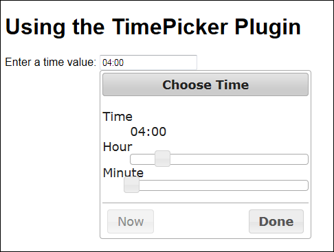
Figure 13-7: Users now have an easy method for adding time values to forms.
Viewing the plug-ins on Unheap
There are many locations online with one, two, or even twenty jQuery or jQuery UI plug-ins. However, few sites have the number of plug-ins supported by Unheap (www.unheap.com/). At the time of this writing, you can find 699 different plug-ins listed on this site, which are listed over 47 pages. You can find all sorts of interesting plug-ins, such as TextFit (http://strml.github.io/examples/jquery.textFit.html), a plug-in that helps you fit text into a container without doing a lot of measurement work yourself. The ScrollTo plug-in (http://individual11.github.io/Scroll-To/) creates a smooth scrolling setup so users don't see the usual jittery interface every time the page scrolls for some reason. There are whole categories of plug-ins devoted to just one widget, such as the Accordion (www.unheap.com/section/navigation/accordion/). If you want to include social media on your site, you can find a number of plug-ins to do that, too (www.unheap.com/section/other/social-rss/). The point is that if you want a single site to explore for plug-ins, this would be a good choice.
Hovering the mouse cursor over an entry tells you more about it and displays two buttons:
Demo: Click this button to access the demo that each of the plug-ins provide so you can try it before downloading it. Many of the plug-in demo pages include coding examples so you can see how the author implemented a particular behavior. Most demos rely on JavaScript, so you must enable JavaScript support to see the demo work.
Launch: After you decide to use a particular plug-in, click Launch to gain access to it. The browser will go to a page where you can download the plug-in and the latest documentation for it.
Trying to find what you need could be daunting on such a large site. Fortunately, the content is organized into categories, such as Interface, and subcategories, such as Layout. All you need to do is click the grouping level that makes the most sense for the kind of plug-in you need.
Finishing with the Coded Bits
There’s a small chance that you’ll encounter a situation where you can’t modify an existing jQuery or jQuery UI feature by using either CSS or JavaScript — and can’t locate a useful plug-in either. In these cases, you have to create a plug-in of your own. Creating a plug-in means writing JavaScript code that extends or overrides existing jQuery or jQuery UI functionality. You can’t create one in any other way. For example, there’s no automated tool you can use to define what you’d like the plug-in to do and have the tool write some or all of the code for you. Creating plug-ins is strictly a manual process.
Fortunately, you can get quite a bit of help directly from the jQuery site. There's an actual page devoted to creating plug-ins at http://learn.jquery.com/plugins/. However, even in this case, the first topic of discussion is techniques for finding and using existing plug-ins. The wealth of existing plug-ins really is that bountiful.
If you want to get right into creating a plug-in, you can read the "How to Create a Basic Plugin" topic at http://learn.jquery.com/plugins/basic-plugin-creation/ as a starting point. Essentially, a plugin is nothing more than a special kind of function. Once the function is attached to a page, you can access the features it provides just as you would any normal jQuery or jQuery UI feature. The tutorial discusses all sorts of techniques you can use to create a basic plug-in. Once you complete this tutorial and have had some practice creating a basic plug-in of your own, you can move on to the advanced tutorial at http://learn.jquery.com/plugins/advanced-plugin-concepts/. A final tutorial at http://learn.jquery.com/plugins/stateful-plugins-with-widget-factory/ discusses techniques for writing plug-ins that track state information.
Experienced developers will emphasize the importance of not reinventing the wheel. When it comes to writing plug-ins, make sure you check out the code of other developers, especially for plug-ins that perform the same sorts of tasks that your plug-in will perform. Because all plug-ins are written in JavaScript, you can generally see the entire listing by accessing the .JS file used to hold the plug-in. Tracing through the plug-ins you use with a debugger will also help you understand them better and make creating your own plug-in significantly easier.