Chapter 9
Managing Colors Using ColorZilla
In This Chapter
 Getting ColorZilla support
 Using the Color Picker feature
 Using the Eyedropper feature
 Analyzing the colors used in graphics
 Defining color gradients to spruce up a page
 Changing an image into CSS form
Color is an essential element in creating all sorts of sites. By using color wisely, you can add pizzazz without expending too much effort on graphics. Color is also valuable for its ability to communicate ideas to your site's visitors. For example, displaying a success message in green better conveys the idea of success than would displaying the message in another color; and a red error message easily draws attention to the fact that something has gone wrong. However, the successful management of color can sometimes be difficult — which is where ColorZilla (www.colorzilla.com/) comes into play. This tool makes it easier for developers to create useful color patterns on a page without making the page look absurd or reducing the user's ability to see details clearly.
You do get a number of helpful tools with ColorZilla, including an Eyedropper to grab colors from sites you like, a Color Picker to choose useful color combinations, and a Color Analyzer to check your color combinations. There’s also a special tool for creating gradients, which transition from one color to another and give your site a nice appeal. There’s even a tool for turning your images into a CSS form so you can create special effects with them.
Obtaining the Plugin
In order to use most ColorZilla features, you must install the plugin. (The Ultimate Gradient Generator, discussed later in this chapter, doesn’t require the plugin.) The plugins used for this chapter are version 2.8 for Firefox and version 0.5 for Chrome. If you use a newer or different version of the plugin (say, for another browser), you may see some differences in the appearance of the screenshots. A little variation is normal and you shouldn’t worry about it. Use the following procedure to install the plugin.
1. Go to the ColorZilla site at www.colorzilla.com/.
You see the ColorZilla main page shown in Figure 9-1.

Figure 9-1: The ColorZilla main page provides access to the plugin and the Ultimate Gradient Generator.
2. Click ColorZilla for Firefox and Chrome.
You see options for selecting the browser type (as shown in Figure 9-2). Even though Figure 9-2 shows the Firefox page, the options for working with Chrome are the same.
3. Click Firefox if you use the Firefox browser or Chrome if you use the Chrome browser.
The installation button that appears below the browser buttons changes to match the browser you selected.
4. Click Install ColorZilla 2.8 if you use the Firefox browser or Install ColorZilla 0.5 if you use the Chrome browser.
You see a dialog box similar to the one shown in Figure 9-3 for Firefox that asks your permission to install the plugin. It may also tell you what the plugin will do. If you don’t see the dialog box, your browser may be asking for permission to display it.

Figure 9-2: ColorZilla currently supports Firefox and Chrome.
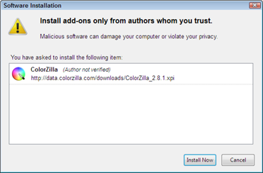
Figure 9-3: The installer will tell you what the plugin will do after installation.
5. Click Install Now (or Add if you’re using Chrome).
The installation will proceed. Firefox users may have to restart the browser (a dialog box will tell you whether this step is necessary) After a few seconds, you see a ColorZilla Installed page that describes all the features of the plugin in a little more detail, as shown in Figure 9-4.
After you get the plugin installed, you see a new eyedropper icon in the toolbar of your browser. Next to this eyedropper is a drop-down list (menu) of ColorZilla features you can use (as shown in Figure 9-5). This menu provides access to all of the ColorZilla features discussed in this chapter.

Figure 9-4: The ColorZilla Installed page is confirmation that everything went as expected.
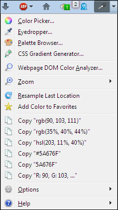
Figure 9-5: Use the drop-down list associated with the ColorZilla icon to access features.
Choosing Colors with the Color Picker
The Color Picker is actually a two-function tool. The way in which you interact with it depends on how involved you want to get with color selections. You can create a completely customized view or you can let ColorZilla help you make a selection based on predefined palettes. The first option, creating a custom color, is described in the next section. The second option, using a predefined palette, is discussed in the second section that follows.
Using the Color Picker
The first item on the ColorZilla menu is the Color Picker. When you select this option, you see a dialog box (like the one shown in Figure 9-6) where you can work through color selections in a number of different ways. In many respects, the initial view of the Color Picker looks just like any other color picker you’ve used in the past.
Using the Color Picker saves you time. With it, you can enter colors directly by using the characteristics described at these links:
 Hue, saturation, and value (see
 www.greatreality.com/color/ColorHVC.htm for details)
 Red, green, blue (see
 http://dba.med.sc.edu/price/irf/Adobe_tg/models/rgbcmy.html for details)
 Hexadecimal color value (see
 www.w3schools.com/html/html_colors.asp for details)
 Lab color space (see
 www.hidefcolor.com/color-management/lab-color-space/ for details)
 Cyan, magenta, yellow, key (see
 http://searchcio-midmarket.techtarget.com/definition/CMYK for details)
From this dialog box, you receive two different versions of CSS-specific output (both the rgb() function and the hsl() function). In addition, you also get a color name. When there's no precise color name for the color you've created, the Name field is left blank.

Figure 9-6: The Color Picker makes it easy to choose colors based on a number of criteria.
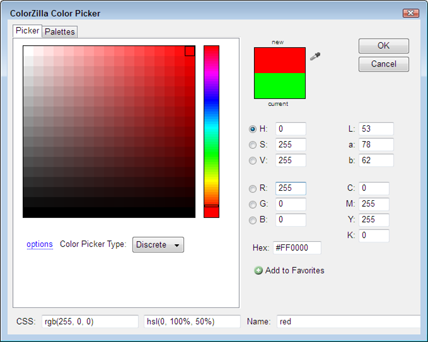
Figure 9-7: Use the Discrete option to make choosing colors easier.
You may also see a color that you like on a page somewhere. In this case, click Sample Color from Document (the icon that looks like an eye dropper) and then click on the color you want to use from the page. The Color Picker will automatically display the values used to create that color.
Using the Palette Browser
Using the Picker tab will be too much work for many people. It’s a lot easier if the tool helps you choose a specific color. That’s where the Palettes tab (shown in Figure 9-8) comes into play. The Palettes tab provides several methods for organizing and categorizing colors to make them a lot easier to work with. (You can also access this tab immediately by selecting the Palette Browser option on the menu.)

Figure 9-8: The Palettes tab helps you organize and categorize colors.
The two drop-down lists help you make good color choices. The first drop-down list contains methods for organizing the color selections. By default, you can choose colors based on
 Favorites
 History
 Hues and Brightness
 Hues and Saturations
 System CSS Colors
 W3C Named Colors
 Colors by Hue
 Web Named Colors
 Web Safe Colors
 X Named Colors
The default display shows the colors as thumbnails. Selecting the List option shows the colors as a list that includes a larger color sample, hexadecimal value, and named value (when available). Figure 9-9 shows a typical view of this display option.

Figure 9-9: Some developers prefer the list view because it provides additional information.
There are three links at the bottom of the selection area that you should know about as well. Clicking any of these links will open a page in your browser. However, the browser window doesn’t gain focus automatically, so it may appear that nothing has happened. Check your browser for the new page. Here’s a list of what these links do:
 permalink: Shows the permanent link for the palette option you’ve selected.
 save in web services: Provides a method for sending the selected palette to your account or to someone else’s account online. You can choose from one of the following services:
• del.icio.us
• digg
• netscape
• technorati
• blinklist
• blogmarks
• live
• google bookmarks
• stumbleupon
• furl
• yahoo! myweb
• newsvine
• ma.gnolia
• tailrank
 more palettes: Displays a wealth of other palettes you can download to your system and use.
Grabbing Colors Using the Eyedropper
The Eyedropper menu option displays a plus-sign mouse cursor. As you move the mouse cursor around a page, a bar at the top of the page displays the current color value and other information, as shown in Figure 9-10. (The additional information includes the mouse cursor’s position and the CSS style name.)

Figure 9-10: Use the Eyedropper to select colors from the page.
When you click a particular color, the Eyedropper copies the information you see to the Clipboard. The bar will display the message “Copied to Clipboard” for a few seconds, and then the bar will disappear. The output sent to the Clipboard is the hexadecimal color value. (Choose a different copy option on the Options⇒Auto Copy menu if you want to receive something other than a hexadecimal color value.) You don’t see all of the other information that appears on the bar when you paste the value into an editor.
The Eyedropper doesn’t work with linked images or icons in many cases. When you see the Eyedropper mouse icon change to some other icon, such as a pointing hand, then you know that color isn’t accessible by Eyedropper. This problem occurs most often with images used to depict items you would click for additional information. The best option is to hover the mouse cursor over the item you want to interact with and see whether the cursor changes. If the cursor remains the same (as shown in Figure 9-10), then you can probably access that color value.
Working with the Color Analyzer
You might see a page that has great color combinations and not want to spend hours figuring those colors out one at a time. The Color Analyzer makes it possible to full list all the colors used on a site.
Performing the analysis
To perform an analysis, choose the Webpage DOM Color Analyzer option from the menu. The bottom half of the browser window will open with a new pane that contains the color analysis from the current page (as shown in Figure 9-11).
However, you don’t just get the color analysis. Hover the mouse cursor over a particular color and you see where that color is used on the page (as shown in Figure 9-12). In this case, black is used to outline just about every object on-screen. Even though the screenshot doesn’t show it, you also see a tooltip containing the color information for the color you selected.
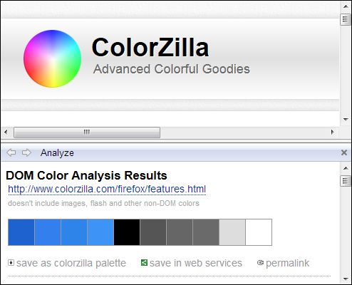
Figure 9-11: The color analysis tells you precisely which CSS colors are used on a page.
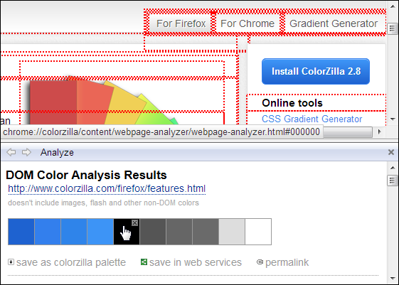
Figure 9-12: Selecting a color automatically shows you where the color is used.
Seeing the details
Scroll the analysis page down and you find details of the color usage (as shown in Figure 9-13). Each color has its own entry in the list, so you can see specifically where each color is used.

Figure 9-13: The analysis includes specific details about each color’s use.
The color entries provide quite a bit of information. The entry begins with the CSS style name, followed by the property that the color affects. The output tells you how the color is selected and you even see where the color appears in the .CSS file.
Each of the file entries is actually a link. When you click on this link, ColorZilla displays the precise location of the color usage in the .CSS file, in the upper pane of the browser, by opening a new tab (as shown in Figure 9-14).
Note: Any link marked inline attribute won't open a corresponding location in the original HTML file — this feature only works on .CSS files.
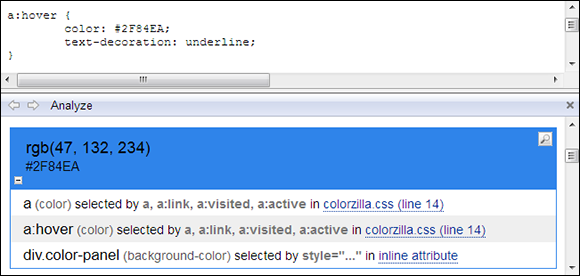
Figure 9-14: You can check the CSS by clicking the appropriate color link to it.
Saving the output
After you’re satisfied with the results of your analysis and selections, you can save the choices you’ve made. There are three methods for accomplishing this task:
 save as colorzilla palette: Displays a Palette Name dialog box where you type the name of the palette as you want to save it on your hard drive. Click OK and you see a Palette Saved dialog box that you can clear by clicking OK. The palette will now appear as one of the selections on the Palettes tab of the ColorZilla Color Picker dialog box, as discussed in the “Using the Palette Browser” section, earlier in this chapter.
 permalink: Shows the permanent link for the palette option you’ve selected. The URL for this link contains the hexadecimal values for each of the colors; here’s an example:
The formatting of the URL in this manner means you can send it to anyone and your recipient can reconstitute the color selections based on the URL alone.
 save in web services: Provides a method for sending the selected palette to your account or to someone else’s account online. This option provides the same functionality as the feature described in the “Using the Palette Browser” section, earlier in this chapter.
Creating a Gradient
Gradients are commonly used for presenting special effects on pages because they have a lot of pizzazz and don’t require code to accomplish their task. Any browser that supports CSS3 can display dazzling gradients without much effort — and the user isn’t exposed to any sort of potential virus or other hacking trick (so far). You can find a discussion of gradients in Chapter 4, which shows you how to create your first gradient by hand. In that chapter I show you what other people have done to create interesting displays. This section takes a middle road between creating the gradient by hand and relying on others to do all the work.
The Ultimate Gradient Generator (www.colorzilla.com/gradient-editor/) can create some truly interesting effects for you and it's more flexible than many of the other generators you find online. However, it still won't produce the amazing results found on sites such as http://lea.verou.me/css3patterns/. These sorts of patterns are the work of dedicated artists who are willing to hand-code the gradients. Even so, you might be surprised at the sorts of gradients you can create, given a little time to play around with the settings on this site. The following sections will get you started.
Developing a basic gradient
Many online tools provide little help with getting a gradient together — but that’s not the case with Ultimate Gradient Generator. As shown in Figure 9-15, this tool begins with a series of presets. Just select one of the blocks in the Preset list and you already have a gradient that works. It may not work perfectly for your needs, but it will give you a good start.

Figure 9-15: The Ultimate Gradient Generator comes with all sorts of useful presets.
Two basic ways of tweaking the resulting gradient are (1) to modify its size and (2) to change its orientation. For example, you can start with the Blue Gloss Default present, modify the size, and change to a radial format to create the gradient shown in Figure 9-16. The result is quite a bit different — despite not having changed the colors at all.
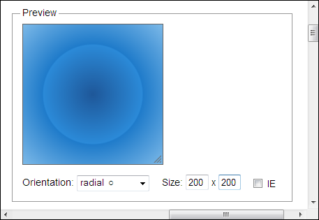
Figure 9-16: Little changes can make a big difference.
When you’re finally satisfied with the changes you make, you can copy the resulting CSS directly to a project. Adding comments so that you know what the CSS is doing is always a good idea, so make sure you check the Comments option (as shown in Figure 9-17). If you plan to support Internet Explorer 9 users, make sure you check the IE9 Support option. Choose a color format option as well. (When your gradient includes transparent areas, you must choose one of the options that allow transparency.) When you’ve finished selecting options, hover the mouse cursor over the code and a Copy button appears. Click this button to copy the CSS to the Clipboard. At this point, you can copy it to your project for testing.
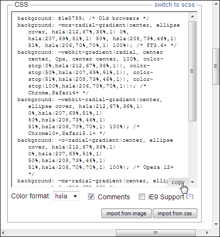
Figure 9-17: Use the Copy feature to copy the CSS to your project.
Adding special effects
You have access to a number of special effects when creating gradients using Ultimate Gradient Generator. The first is to change colors and add color stops. A color stop signifies a change in color. Notice the color bar in Figure 9-15 has four tabs on the bottom. These tabs control the colors used and where each color starts and ends.
When you click one of the tabs, you see the little triangle above the square tab turn from white to black. In addition, the settings in the Stops area change, as shown in Figure 9-18.
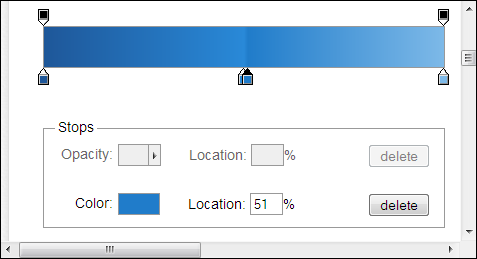
Figure 9-18: Change individual stop settings using the Stops area’s features.
To change a color, click inside the Color field. You see a color picker (similar to the one shown in Figure 9-6) that you can use to select a new color. Set the color you want and click OK to change the color of the selected stop.
To change the stop position, either type a new value in the Location field or slide the stop along the bar. As you change the setting, you see modifications to the output of the gradient.
You can also click Delete to remove a color stop you don’t want. To add a new color stop, hover the mouse near the bottom of the color bar. You see the cursor change to a pointing hand with a plus sign. Click wherever you want to add the new stop along the color bar and then configure the stop as needed.
The second special effect is the use of transparency. Look again at Figure 9-15 and you see two tabs at the top of the bar. These tabs control transparency. When you click one of these tabs, its triangle turns black, just as the color tabs do. However, in this case, the upper settings of the Stops area become active, as shown in Figure 9-19.
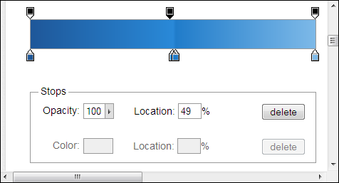
Figure 9-19: Opacity modifies the appearance of your gradient by making the background visible.
The default setting makes the gradient opaque, which means that the user can’t see through it. However, you can adjust the opacity to allow some of the background to show through — or make the gradient transparent so the user can only see the background in a particular area onscreen. As with color stops, you can add or delete transparency stops as needed to produce a particular effect.
Saving the result
It’s important to save the gradients you want to use again. To save a gradient locally, you can type a name in the Name field (located under the Presets) and click Save. The new gradient appears in the Presets list.
You can also click the unique link entry in the Permalink area of the page. This creates a new tab that shows your gradient. The URL will provide details about the custom gradient you created so someone else can reproduce it.
Converting an image to CSS
A special feature of the Ultimate Gradient Generator is the capability to turn your existing image into a CSS gradient that you can use on your site. This is an interesting way to define some complex gradients with little effort; note, however, that this feature works best with images like the one in Figure 9-20. Even if you provide a complex graphic, the resulting gradient will use only the colors on the left side of the image. Anything after the first color is ignored. (You can find the image for this example in the \Chapter 09 folder of the downloadable code as MyGradient.JPG.)
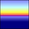
Figure 9-20: Use an image that will translate well into a gradient.
Refer to the bottom of Figure 9-17 to find the Import from Image button. Click this button and you see the bottom of the CSS area expand to include the form shown in Figure 9-21. You can obtain images from a location online or from your local hard drive. When you want to use your hard drive as a resource, click Browse to display a File Upload dialog box, locate the file, and then click Open.
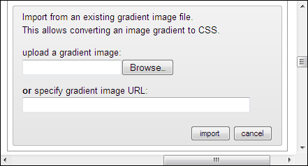
Figure 9-21: Fill in this form to use an image to generate CSS.
After you provide a source for the image, click Import. The Ultimate Gradient Generator imports the file and creates the CSS required to mimic the image and its applied gradient. You can then make tweaks and changes as needed to produce the desired result. After you’re done, you can save the CSS as usual and include the gradient in your application.
After you provide a source for the image, click Import. The Ultimate Gradient Generator imports the file and creates the CSS required to mimic the image and its applied gradient as shown in Figure 9-22. You can then make tweaks and changes as needed to produce the desired result. After you’re done, you can save the CSS as usual and include the gradient in your application.
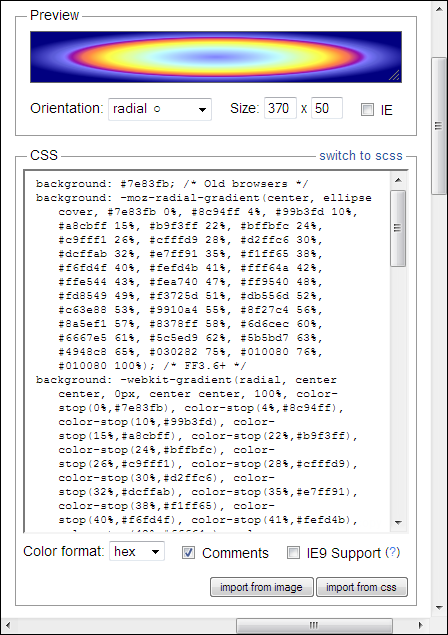
Figure 9-22: After importing the image, you can see the gradient and associated CSS.
 Unfortunately, it’s nearly impossible to find a color management tool that works with every browser. These tools usually work as plugins, rather than as strict browser applications written in JavaScript. Most ColorZilla features currently work only with Firefox and Chrome. Both of those browsers work in a large number of platforms, so you won’t have any problem using this tool. The Ultimate Gradient Generator tool, discussed later in this chapter, will work with other browsers such as Internet Explorer, Safari, and Opera. You can use the Ultimate Gradient Generator to create gradients online and then simply copy the code to your application.
 The ColorZilla plugin provides more functionality than you see described in this chapter. The chapter does provide an overview of the most useful features, but you should also review the full list of features at
  When using specific kinds of effects, such as radial gradients, the Ultimate Gradient Generator will also supply you with a script or other requirements to make the gradient work in older browsers. This is especially true when working with Internet Explorer 9. If you don’t add this special support, users of older browsers will see a less spectacular, but equally nice, gradient. For example, the radial gradient will default to a kind of linear gradient as required.