This chapter introduces various aspects of CSS3, such as 2D/3D graphics and 2D/3D animation. In some cases, CSS3 concepts are presented without code samples due to space limitations; however, those concepts are included because it’s important for you to be aware of their existence. By necessity, this chapter assumes that you have a moderate understanding of CSS, which means that you can write a basic stylesheet with selectors and properties. If you are unfamiliar with CSS selectors, there are many introductory articles available through an Internet search. If you are convinced that CSS operates under confusing and seemingly arcane rules, then it’s probably worth your while to read an online article about the CSS box model, after which you will have a better understanding of the underlying logic of CSS.
The first part of this chapter contains code samples that illustrate how to create shadow effects, how to render rectangles with rounded corners, and also how to use linear and radial gradients. The second part of this chapter covers CSS3 transforms (scale, rotate, skew, and translate), along with code samples that illustrate how to apply transforms to HTML elements and to JPG files.
The third part of this chapter covers CSS3 2D graphics, such as linear gradients, radial gradients, and CSS3 transforms.
You can launch the code samples in this chapter in a Webkit-based browser on a desktop or a laptop. You can also view them on mobile devices, provided that you launch them in a browser that supports the CSS3 features that are used in the code samples. For your convenience, many of the code samples in this chapter are accompanied by screenshots of the code samples on a Sprint Nexus S 4G and an Asus Prime Android ICS 10” tablet (both on Android ICS), which enables you to compare those screenshots with the corresponding images that are rendered on Webkit-based browsers on desktops and laptops. In Chapter 10, you will learn the process of creating Android applications that can launch HTML5 Web pages.
CSS3 Support and Browser-Specific Prefixes for CSS3 Properties
Before we delve into the details of CSS3, there are two important details that you need to know about defining CSS3-based selectors for HTML pages. First, you need to know the CSS3 features that are available in different browsers. One of the best Websites for determining browser support for CSS3 features is here:
The preceding link contains tabular information regarding CSS3 support in IE, Firefox, Safari, Chrome, and Opera, as well as several mobile browsers.
Another highly useful tool that checks for CSS3 feature support is Enhance.js. It tests browsers to determine whether or not they can support a set of essential CSS and JavaScript properties, and then delivers features to those browsers that satisfy the test. You can download Enhance.js here:
https://github.com/filamentgroup/EnhanceJS
A third useful tool is Modernizr, which checks for HTML5-related feature detection in various browsers, and its homepage is here:
At some point you will start using JavaScript in your HTML5 Web pages (indeed, you probably do so already), and Modernizr provides a programmatic way to check for many HTML5 and CSS3 features in different browsers.
In order to use Modernizr, include the following code snippet in the <head> element of your Web pages:
<script src="modernizr.min.js" type="text/javascript"></script>
Navigate to the Modernizr homepage where you can read the documentation, tutorials, and details regarding the set of feature detection.
The second detail that you need to know is that many CSS3 properties currently require browser-specific prefixes in order for them to work correctly. The prefix applies to “work in progress” for individual browsers, and the final specification drops browser-specific prefixes. The prefixes –ie-, -moz-, and -o- are for Internet Explorer, Firefox, and Opera, respectively. Note that Opera also supports –webkit- prefixes, and it’s possible that other browsers will do the same (check the respective Websites for updates).
As an illustration, the following code block shows examples of these prefixes:
-ie-webkit-border-radius: 8px;
-moz-webkit-border-radius: 8px;
-o-webkit-border-radius: 8px;
border-radius: 8px;
In your CSS selectors, specify the attributes with browser-specific prefixes before the “generic” property, which serves as a default choice in the event that the browser-specific attributes are not selected. The CSS3 code samples in this book contain WebKit-specific prefixes, which helps us keep the CSS stylesheets manageable in terms of size. If you need CSS stylesheets that work on multiple browsers (for current versions as well as older versions), there are essentially two options available. One option involves manually adding the CSS3 code with all the required browser-specific prefixes, which can be tedious to maintain and also error-prone. Another option is to use CSS toolkits or frameworks (discussed in the next chapter), which can programmatically generate the CSS3 code that contains all browser-specific prefixes.
Finally, an extensive list of browser-prefixed CSS properties is here:
http://peter.sh/experiments/vendor-prefixed-css-property-overview/
An extensive list of prefix-free CSS properties is here:
http://www.blooberry.com/indexdot/css/propindex/all.htm
Quick Overview of CSS3 Features
CSS3 adopts a modularized approach involving multiple sub-specifications for extending existing CSS2 functionality as well as supporting new functionality. As such, CSS3 can be logically divided into the following categories:
With CSS3, you can create boxes with rounded corners and shadow effects; create rich graphics effects using linear and radial gradients; detect portrait and landscape mode; detect the type of mobile device using media query selectors; and produce multi-column text rendering and formatting.
In addition, CSS3 enables you to define sophisticated node selection rules in selectors using pseudo-classes (described in the next section), first or last child (:first-child, :last-child, :first-of-type, and :last-of-type), and also pattern-matching tests for attributes of elements. Several sections in this chapter contain examples of how to create such selection rules.
CSS3 Pseudo Classes and Attribute Selection
This brief section contains examples of some pseudo-classes, followed by snippets that show you how to select elements based on the relative position of text strings in various attributes of those elements.
Recall that the class attribute in CSS provides a way to mark a group of elements as having a certain property, such as the following code snippet:
<p class="details">
On the other hand, pseudo-classes enable you to reference an arbitrary group of elements by some identifying feature that they possess. For example, the following code snippet collects the first paragraph in each HTML <section> element in an HTML Web page:
section:p:first-of-type
CSS3 supports an extensive and rich set of pseudo-classes, including nth-child(), along with some of its semantically related “variants,” such as nth-of-type(), nth-first-of-type(), nth-last-of-type(), and nth-last-child().
CSS3 also supports Boolean selectors (which are also pseudo-classes) such as empty, enabled, disabled, and checked, which are very useful for Form-related HTML elements. One other pseudo class is not(), which returns a set of elements that do not match the selection criteria.
Although this section focuses on the :nth-child() pseudo-class, you will become familiar with various other CSS3 pseudo-classes. In the event that you need to use those pseudo-classes, a link is provided at the end of this section, which contains more information and examples that illustrate how to use them.
The CSS3 :nth-child() pseudo-class is both powerful and useful, and it has the following form:
:nth-child(insert-a-keyword-or-linear-expression-here)
The following list provides various examples of using the nth-child() pseudo-class in order to match various subsets of child elements of an HTML <div> element (which can be substituted by other HTML elements as well):
div:nth-child(1): matches the first child element
div:nth-child(2): matches the second child element
div:nth-child(:even): matches the even child elements
div:nth-child(:odd): matches the odd child elements
The interesting and powerful aspect of the nth-child() pseudo-class is its support for linear expressions of the form an+b, where a is a positive integer and b is a non-negative integer, as shown here (using an HTML5 <div> element):
div:nth-child(3n): matches every third child, starting from position 0
div:nth-child(3n+1): matches every third child, starting from position 1
div:nth-child(3n+2): matches every third child, starting from position 2
Another very useful pseudo-class involves :hover, which can easily create nice visual effects. The following example of the CSS3 :hover pseudo-class changes the font size of an element whose id attribute has value text1, whenever users hover over the associated element with their mouse:
#text1:hover {
font-size: 12pt;
}
You can specify CSS3 selectors that select HTML elements, as well as HTML elements based on the value of an attribute of an HTML element using various regular expressions. For example, the following selector selects img elements whose src attribute starts with the text string Laurie, and then sets the width attribute and the height attribute of the selected img elements to 100px:
img[src^="Laurie"] {
width: 100px; height: 100px;
}
The preceding CSS3 selector is useful when you want to set different dimensions to images based on the name of the images (Laurie, Shelly, Steve, and so forth).
The following HTML <img> elements do not match the preceding selector:
<img src="3Laurie" width="200" height="200" />
<img src="3Laurrie" width="200" height="200" />
CSS3 uses the meta-characters ^, $, and * (followed by the = symbol) in order to match an initial, terminal, or arbitrary position for a text string. If you are familiar with the Unix utilities grep and sed, as well as the vi text editor, then these meta-characters are very familiar to you. However, CSS3 imposes a restriction for using meta-characters: they can only be used in the context of an attribute match (which uses square brackets).
The following selector selects HTML img elements whose src attribute ends with the text string jpeg, and then sets the width attribute and the height attribute of the selected img elements to 150px:
img[src$="jpeg"] {
width: 150px; height: 150px;
}
The preceding CSS3 selector is useful when you want to set different dimensions to images based on the type of the images (jpg, png, jpeg, and so forth).
The following selector selects HTML img elements whose src attribute contains any occurrence of the text string baby, and then sets the width attribute and the height attribute of the selected HTML img elements to 200px:
img[src*="baby"] {
width: 200px; height: 200px;
}
The preceding CSS3 selector is useful when you want to set different dimensions to images based on the “classification” of the images (mybaby, yourbaby, babygirl, babyboy, and so forth).
If you want to learn more about patterns (and their descriptions) that you can use in CSS3 selectors, an extensive list is available here:
http://www.w3.org/TR/css3-selectors
This concludes part one of this chapter, and the next section delves into CSS3 graphics-oriented effects, such as rounded corners and shadow effects.
CSS3 Shadow Effects and Rounded Corners
CSS3 shadow effects are useful for creating vivid visual effects. You can use shadow effects for text as well as rectangular regions. CSS3 also enables you to easily render rectangles with rounded corners, so you do not need JPG files in order to create this effect.
Specifying Colors with RGB and HSL
Before we delve into the interesting features of CSS3, you need to know how to represent colors. One method is to use (R, G, B) triples, which represent the Red, Green, and Blue components of a color. For instance, the triples (255, 0, 0), (255, 255, 0), and (0, 0, 255) respectively represent the colors Red, Yellow, and Blue. Other ways of specifying the color include: the hexadecimal triples (F, 0, 0) and (FF, 0, 0); the decimal triple (100%, 0, 0); or the string #F00. You can also use (R, G, B, A), where the fourth component specifies the opacity, which is a decimal number between 0 (invisible) to 1 (opaque) inclusive.
However, there is also the HSL (Hue, Saturation, and Luminosity) representation of colors, where the first component is an angle between 0 and 360 (0 degrees is north), and the other two components are percentages between 0 and 100. For instance, (0, 100%, 50%), (120, 100%, 50%), and (240, 100%, 50%) represent the colors Red, Green, and Blue, respectively.
The code samples in this book use (R, G, B) and (R, G, B, A) for representing colors, but you can perform an Internet search to obtain more information regarding HSL.
A shadow effect for text can make a Web page look more vivid and appealing. Many Websites look better with shadow effects that are not overpowering for users (unless you specifically need to do so).
Listing 2.1 displays the contents of the HTML5 page TextShadow1.html that illustrate how to render text with a shadow effect, and Listing 2.2 displays the contents of the CSS stylesheet TextShadow1.css that is referenced in Listing 2.1.
LISTING 2.1 TextShadow1.html
<!DOCTYPE html>
<head>
<meta charset="utf-8" />
<title>CSS Text Shadow Example</title>
<link href="TextShadow1.css"
rel="stylesheet" type="text/css">
</head>
<body>
<div id="text1">Line One Shadow Effect</div>
<div id="text2">Line Two Shadow Effect</div>
<div id="text3">Line Three Vivid Effect</div>
<div id="text4">
<span id="dd">13</span>
<span id="mm">August</span>
<span id="yy">2012</span>
</div>
<div id="text5">
<span id="dd">13</span>
<span id="mm">August</span>
<span id="yy">2012</span>
</div>
<div id="text6">
<span id="dd">13</span>
<span id="mm">August</span>
<span id="yy">2012</span>
</div>
</body>
</html>
The code in Listing 2.1 is straightforward: there is a reference to the CSS stylesheet TextShadow1.css that contains two CSS selectors. One selector specifies how to render the HTML <div> element whose id attribute has value text1, and the other selector matches the HTML <div> element whose id attribute is text2. Although the CSS3 rotate() function is included in this example, we’ll defer a more detailed discussion of this function until later in this chapter.
LISTING 2.2 TextShadow1.css
#text1 {
font-size: 24pt;
text-shadow: 2px 4px 5px #00f;
}
#text2 {
font-size: 32pt;
text-shadow: 0px 1px 6px #000,
}
/* note the multiple parts in the text-shadow definition */
#text3 {
font-size: 40pt;
text-shadow: 0px 1px 6px #fff,
2px 4px 4px #0ff,
4px 5px 6px #00f,
0px 0px 10px #444,
0px 0px 20px #844,
0px 0px 30px #a44,
0px 0px 40px #f44;
}
#text4 {
position: absolute;
top: 200px;
right: 200px;
font-size: 48pt;
text-shadow: 0px 1px 6px #fff,
2px 4px 4px #0ff,
4px 5px 6px #00f,
0px 0px 10px #000,
0px 0px 20px #448,
0px 0px 30px #a4a,
0px 0px 40px #fff;
-webkit-transform: rotate(-90deg);
}
#text5 {
position: absolute;
left: 0px;
font-size: 48pt;
text-shadow: 2px 4px 5px #00f;
-webkit-transform: rotate(-10deg);
}
#text6 {
float: left;
font-size: 48pt;
text-shadow: 2px 4px 5px #f00;
-webkit-transform: rotate(-170deg);
}
/* 'transform' is explained later */
#text1:hover, #text2:hover, #text3:hover,
#text4:hover, #text5:hover, #text6:hover {
-webkit-transform : scale(2) rotate(-45deg);
transform : scale(2) rotate(-45deg);
}
The first selector in Listing 2.2 specifies a font-size of 24 and a text-shadow that renders text with a blue background (represented by the hexadecimal value #00f). The attribute text-shadow specifies (from left to right) the x-coordinate, the y-coordinate, the blur radius, and the color of the shadow. The second selector specifies a font-size of 32 and a red shadow background (#f00). The third selector creates a richer visual effect by specifying multiple components in the text-shadow property, which were chosen by experimenting with effects that are possible with different values in the various components.
The final CSS3 selector creates an animation effect whenever users hover over any of the six text strings, and the details of the animation will be deferred until later in this chapter.
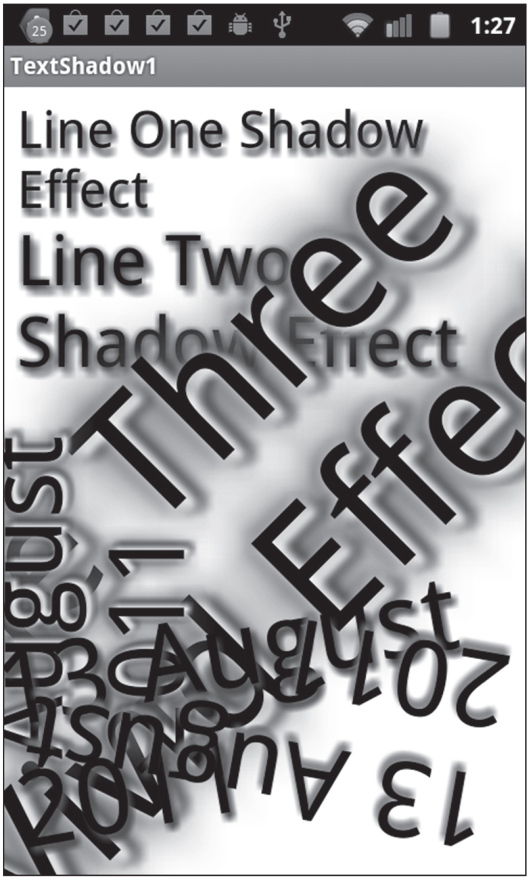
Figure 2.1 displays the result of matching the selectors in the CSS stylesheet TextShadow1.css with the HTML <div> elements in the HTML page TextShadow1.html. The landscape-mode screenshot is taken from an Android application (based on the code in Listing 2.1 and Listing 2.2) running on a Nexus S 4G (Android ICS) smart phone.
Figure 2.1 CSS3 text shadow effects.
You can also apply a shadow effect to a box that encloses a text string, which can be effective in terms of drawing attention to specific parts of a Web page. However, the same caveat regarding over-use applies to box shadows.
 The HTML page BoxShadow1.html and BoxShadow1.css are not shown here, but they are available on the CD. Together, they render a box shadow effect.
The key property is the box-shadow property, as shown here in bold for Mozilla, WebKit, and the non-prefixed property:
#box1 {
position:relative;top:10px;
width: 50%;
height: 30px;
font-size: 20px;
-moz-box-shadow: 10px 10px 5px #800;
-webkit-box-shadow: 10px 10px 5px #800;
box-shadow: 10px 10px 5px #800;
Figure 2.2 displays a landscape-mode screenshot is taken from a Nexus S 4G with Android ICS (based on the code in BoxShadow1.html and BoxShadow1.css).
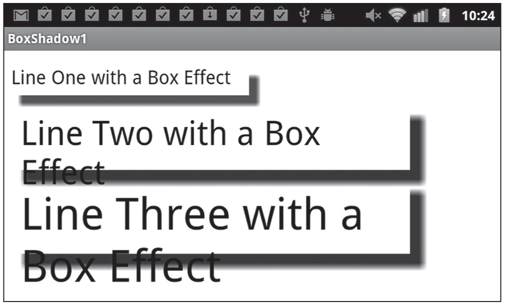
Figure 2.2 CSS3 box shadow effect on a Sprint Nexus with Android ICS.
Web developers have waited a long time for rounded corners in CSS, and CSS3 makes it very easy to render boxes with rounded corners. Listing 2.3 displays the contents of the HTML page RoundedCorners1.html that renders text strings in boxes with rounded corners, and Listing 2.4 displays the CSS file RoundedCorners1.css.
LISTING 2.3 RoundedCorners1.html
<!DOCTYPE html>
<html lang="en">
<head>
<link href="RoundedCorners1.css" rel="stylesheet"
type="text/css">
</head>
<body>
<div id="outer">
<a href="#" class="anchor">Text Inside a Rounded Rectangle</a>
</div>
<div id="text1">Line One of Text with a Shadow Effect</div>
<div id="text2">Line Two of Text with a Shadow Effect</div>
</body>
</html>
Listing 2.3 contains a reference to the CSS stylesheet RoundedCorners1.css that contains three CSS selectors that match the elements whose id attribute has value anchor, text1, and text2, respectively. The CSS selectors defined in RoundedCorners1.css create visual effects, and as you will see, the hover pseudo-selector enables you to create animation effects.
LISTING 2.4 RoundedCorners1.css
a.anchor:hover {
background: #00F;
}
a.anchor {
background: #FF0;
font-size: 24px;
font-weight: bold;
padding: 4px 4px;
color: rgba(255,0,0,0.8);
text-shadow: 0 1px 1px rgba(0,0,0,0.4);
-webkit-border-radius: 8px;
border-radius: 8px;
}
Listing 2.4 contains the selector a.anchor:hover that changes the text color from yellow (#FF0) to blue (#00F) during a two-second interval whenever users hover over any anchor element with their mouse.
The selector a.anchor contains various attributes that specify the dimensions of the box that encloses the text in the <a> element, along with two new pairs of attributes. The first pair specifies the border-radius attribute (and the WebKit-specific attribute) whose value is 8px, which determines the radius (in pixels) of the rounded corners of the box that encloses the text in the <a> element. The last two selectors are identical to the selectors in Listing 2.1.
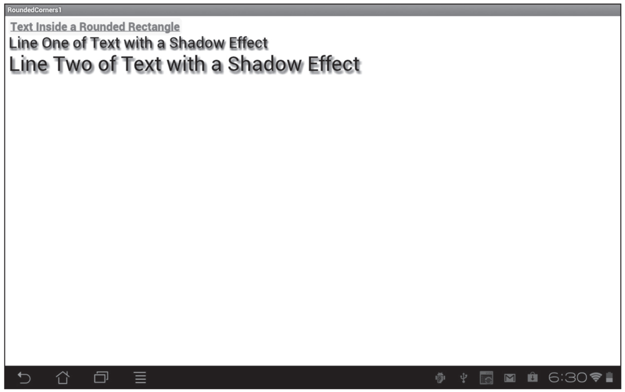
Figure 2.3 displays the result of matching the selectors that are defined in the CSS stylesheet RoundedCorners1.css with elements in the HTML page RoundedCorners1.html in a landscape-mode screenshot taken from an Asus Prime tablet with Android ICS.
Figure 2.3 CSS3 rounded corners effect on an Asus Prime tablet with Android ICS.
CSS3 supports linear gradients and radial gradients, which enable you to create gradient effects that are as visually rich as gradients in other technologies such as SVG. The code samples in this section illustrate how to define linear gradients and radial gradients in CSS3 and then match them to HTML elements.
CSS3 linear gradients require you to specify one or more “color stops,” each of which specifies a start color, and end color, and a rendering pattern. Webkit-based browsers support the following syntax to define a linear gradient:
A start point can be specified as an (x, y) pair of numbers or percentages. For example, the pair (100, 25%) specifies the point that is 100 pixels to the right of the origin and 25% of the way down from the top of the pattern. Recall that the origin is located in the upper-left corner of the screen.
Listing 2.5 displays the contents of LinearGradient1.html and Listing 2.6 displays the contents of LinearGradient1.css, which illustrate how to use linear gradients with text strings that are enclosed in <p> elements and an <h3> element.
LISTING 2.5 LinearGradient1.html
<!doctype html>
<html lang="en">
<head>
<meta charset="utf-8" />
<title>CSS Linear Gradient Example</title>
<link href="LinearGradient1.css"
rel="stylesheet" type="text/css">
</head>
<body>
<div id="outer">
<p id="line1">line 1 with a linear gradient</p>
<p id="line2">line 2 with a linear gradient</p>
<p id="line3">line 3 with a linear gradient</p>
<p id="line4">line 4 with a linear gradient</p>
<p id="outline">line 5 with Shadow Outline</p>
<h3><a href="#">A Line of Gradient Text</a></h3>
</div>
</body>
</html>
Listing 2.5 is a simple Web page containing five <p> elements and one <h3> element. Listing 2.5 also references the CSS stylesheet LinearGradient1.css, which contains CSS selectors that match the four <p> elements and the <h3> element in Listing 2.5.
LISTING 2.6 LinearGradient1.css
#line1 {
width: 50%;
font-size: 32px;
background-image: -webkit-gradient(linear, 0% 0%, 0% 100%,
from(#fff), to(#f00));
background-image: -gradient(linear, 0% 0%, 0% 100%,
from(#fff), to(#f00));
-webkit-border-radius: 4px;
border-radius: 4px;
}
#line2 {
width: 50%;
background-image: -webkit-gradient(linear, 100% 0%, 0% 100%,
from(#fff), to(#ff0));
background-image: -gradient(linear, 100% 0%, 0% 100%,
from(#fff), to(#ff0));
-webkit-border-radius: 4px;
border-radius: 4px;
}
#line3 {
width: 50%;
font-size: 32px;
background-image: -webkit-gradient(linear, 0% 0%, 0% 100%,
from(#f00), to(#00f));
background-image: -gradient(linear, 0% 0%, 0% 100%,
from(#f00), to(#00f));
-webkit-border-radius: 4px;
border-radius: 4px;
}
#line4 {
width: 50%;
font-size: 32px;
background-image: -webkit-gradient(linear, 100% 0%, 0% 100%,
from(#f00), to(#00f));
background-image: -gradient(linear, 100% 0%, 0% 100%,
from(#f00), to(#00f));
-webkit-border-radius: 4px;
border-radius: 4px;
}
#outline {
font-size: 2.0em;
font-weight: bold;
color: #fff;
text-shadow: 1px 1px 1px rgba(0,0,0,0.5);
}
h3 {
width: 50%;
position: relative;
margin-top: 0;
font-size: 32px;
font-family: helvetica, ariel;
}
h3 a {
position: relative;
color: red;
text-decoration: none;
-webkit-mask-image: -webkit-gradient(linear, left top,
left bottom,
from(rgba(0,0,0,1)),
color-stop(50%, rgba(0,0,0,0.5)),
to(rgba(0,0,0,0)));
}
h3:after {
content:"This is a Line of Gradient Text";
}
The first selector in Listing 2.6 specifies a font-size of 32 for text, a border-radius of 4 (which renders rounded corners), and a linear gradient that varies from white to blue, as shown here:
#line1 {
width: 50%;
font-size: 32px;
background-image: -webkit-gradient(linear, 0% 0%, 0% 100%,
from(#fff), to(#f00));
background-image: -gradient(linear, 0% 0%, 0% 100%,
from(#fff), to(#f00));
-webkit-border-radius: 4px;
border-radius: 4px;
}
As you can see, the first selector contains two attributes with a -webkit- prefix and two standard attributes without this prefix. Since the next three selectors in Listing 2.6 are similar to the first selector, we will not discuss their content.
The next CSS selector creates a text outline with a nice shadow effect by rendering the text in white with a thin black shadow, as shown here:
color: #fff;
text-shadow: 1px 1px 1px rgba(0,0,0,0.5);
The final portion of Listing 2.6 contains three selectors that affect the rendering of the <h3> element and its embedded <a> element. The h3 selector specifies the width and font size; the h3 selector specifies a linear gradient; and the h3:after selector specifies the text string “This is a Line of Gradient Text" to display after the HTML5 <h3> element. (Note: you can use h3:before to specify a text string to display before an HTML5 <h3> element.) Other attributes are specified, but these are the main attributes for these selectors.
Figure 2.4 displays the result of matching the selectors in the CSS stylesheet LinearGradient1.css to the HTML page LinearGradient1.html in a landscape-mode screenshot taken from an Android application running on an Asus Prime tablet with Android ICS.
CSS3 radial gradients are more complex than CSS3 linear gradients, but you can use them to create more complex gradient effects. Webkit-based browsers support the following syntax to define a radial gradient:
Figure 2.4 CSS3 Linear gradient effect on an Asus Prime 10" tablet with Android ICS.
Notice that the syntax for a radial gradient is similar to the syntax for a linear gradient, except that you also specify a start radius and an end radius.
The HTML5 Web page RadialGradient1.html and the CSS stylesheet RadialGradient1.css are not shown here, but the full listing is available on the CD. The essence of the code in the HTML5 code involves this code block:
<div id="outer">
<div id="radial3">Text3</div>
<div id="radial2">Text2</div>
<div id="radial4">Text4</div>
<div id="radial1">Text1</div>
</div>
The CSS stylesheet RadialGradient1.css contains five CSS selectors that match the five HTML <div> elements, and one of the selectors is shown here:
#radial1 {
background: -webkit-gradient(
radial, 500 40%, 0, 301 25%, 360, from(red),
color-stop(0.05, orange), color-stop(0.4, yellow),
color-stop(0.6, green), color-stop(0.8, blue),
to(#fff)
);
}
The #radial1 selector contains a background attribute that defines a radial gradient using the –webkit- prefix, and it specifies the following:
The other selectors have the same syntax as the first selector, but the rendered radial gradients are significantly different. You can create these (and other) effects by specifying different start points and end points, and by specifying a start radius that is larger than the end radius.
Figure 2.5 displays the result of matching the selectors in the CSS stylesheet RadialGradient1.css to the HTML page RadialGradient1.html in a landscape-mode screenshot taken from an Android application running on an Asus Prime tablet with Android ICS.
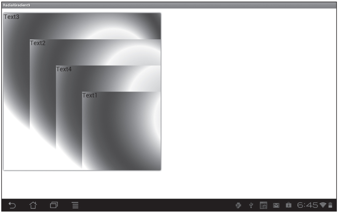
Figure 2.5 CSS3 Radial gradient effect on an Asus Prime tablet with Android ICS.
In addition to transitions, CSS3 supports four common transforms that you can apply to 2D shapes and also to JPG files. The four CSS3 transforms are scale, rotate, skew, and translate. The following sections contain code samples that illustrate how to apply each of these CSS3 transforms to a set of JPG files. The animation effects occur when users hover over any of the JPG files; moreover, you can create “partial” animation effects by moving your mouse quickly between adjacent JPG files.
Listing 2.7 displays the contents of Scale1.html and Listing 2.8 displays the contents of Scale1.css, which illustrate how to scale JPG files to create a “hover box” image gallery.
LISTING 2.7 Scale1.html
<!DOCTYPE html>
<html lang="en">
<head>
<title>CSS Scale Transform Example</title>
<link href="Scale1.css"
rel="stylesheet" type="text/css">
</head>
<body>
<header><h1>Hover Over any of the Images:</h1></header>
<div id="outer">
<img src="sample1.png" class="scaled" width="150"
height="150"/>
<img src="sample2.png" class="scaled" width="150"
height="150"/>
<img src="sample1.png" class="scaled" width="150"
height="150"/>
<img src="sample2.png" class="scaled" width="150"
height="150"/>
</div>
</body>
</html>
Listing 2.7 references the CSS stylesheet Scale1.css (which contains selectors for creating scaled effects) and four HTML <img> elements that references the JPG files sample1.png and sample2.png. The remainder of Listing 2.7 is straightforward, with simple boilerplate text and HTML elements.
LISTING 2.8 Scale1.css
#outer {
float: left;
position: relative; top: 50px; left: 50px;
}
img {
-webkit-transition: -webkit-transform 1.0s ease;
transition: transform 1.0s ease;
}
img.scaled {
-webkit-box-shadow: 10px 10px 5px #800;
box-shadow: 10px 10px 5px #800;
}
img.scaled:hover {
-webkit-transform : scale(2);
transform : scale(2);
}
The img selector in Listing 2.8 specifies a transition property that applies a transform effect occurring during a one-second interval using the ease function, as shown here:
transition: transform 1.0s ease;
Next, the selector img.scaled specifies a box-shadow property that creates a reddish shadow effect (which you saw earlier in this chapter), as shown here:
img.scaled {
-webkit-box-shadow: 10px 10px 5px #800;
box-shadow: 10px 10px 5px #800;
}
Finally, the selector img.scaled:hover specifies a transform attribute that uses the scale() function in order to double the size of the associated JPG file whenever users hover over any of the <img> elements with their mouse, as shown here:
transform : scale(2);
Since the img selector specifies a one-second interval using an ease function, the scaling effect will last for one second. Experiment with different values for the CSS3 scale() function and also different value for the time interval to create the animation effects that suit your needs.
Another point to remember is that you can scale both horizontally and vertically:
img {
-webkit-transition: -webkit-transform 1.0s ease;
transition: transform 1.0s ease;
}
img.mystyle:hover {
-webkit-transform : scaleX(1.5) scaleY(0.5);
transform : scaleX(1.5) scaleY(0.5);
}
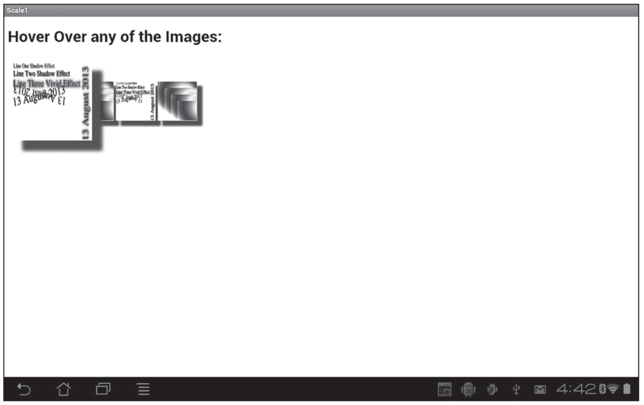
Figure 2.6 displays the result of matching the selectors in the CSS stylesheet Scale1.css to the HTML page Scale1.html. The landscape-mode screenshot is taken from an Android application (based on the code in Listing 2.7 and Listing 2.8) running on a Nexus S 4G smart phone with Android ICS.
The CSS3 transform attribute allows you to specify the rotate() function in order to create scaling effects, and its syntax looks like this:
rotate(someValue);
You can replace someValue with any number. When someValue is positive, the rotation is clockwise; when someValue is negative, the rotation is counter clockwise; and when someValue is zero, there is no rotation effect. In all cases, the initial position for the rotation effect is the positive horizontal axis.
Figure 2.6 CSS3-based scaling effect on JPG files.
The HTML5 Web page Rotate1.html and the CSS stylesheet Rotate1.css on the CD illustrate how to create rotation effects, a sample of which is shown here:
img.imageL:hover {
-webkit-transform : scale(2) rotate(-45deg);
transform : scale(2) rotate(-45deg);
}
The img selector that specifies a transition attribute that creates an animation effect during a one-second interval using the ease timing function, as shown here:
transition: transform 1.0s ease;
The CSS3 transform attribute allows you to specify the skew() function in order to create skewing effects, and its syntax looks like this:
skew(xAngle, yAngle);
You can replace xAngle and yAngle with any number. When xAngle and yAngle are positive, the skew effect is clockwise; when xAngle and yAngle are negative, the skew effect is counter clockwise; and when xAngle and yAngle are zero, there is no skew effect. In all cases, the initial position for the skew effect is the positive horizontal axis.
The HTML5 Web page Skew1.html and the CSS stylesheet Skew1.css are on the CD, and they illustrate how to create skew effects. The CSS stylesheet contains the img selector that specifies a transition attribute, which in turn creates an animation effect during a one-second interval using the ease timing function, as shown here:
transition: transform 1.0s ease;
There are also the four selectors img.skewed1, img.skewed2, img.skewed3, and img.skewed4 create background shadow effects with darker shades of red, yellow, green, and blue, respectively (all of which you have seen in earlier code samples).
The selector img.skewed1:hover specifies a transform attribute that performs a skew effect whenever users hover over the first <img> element with their mouse, as shown here:
transform : scale(2) skew(-10deg, -30deg);
The other three CSS3 selectors also use a combination of the CSS functions skew() and scale()to create distinct visual effects. Notice that the fourth hover selector also sets the opacity property to 0.5, which takes place in parallel with the other effects in this selector.
Figure 2.7 displays the result of matching the selectors in the CSS stylesheet Skew1.css to the elements in the HTML page Skew1.html. The landscape-mode screenshot is taken from an Android application running on a Nexus S 4G smart phone with Android ICS.
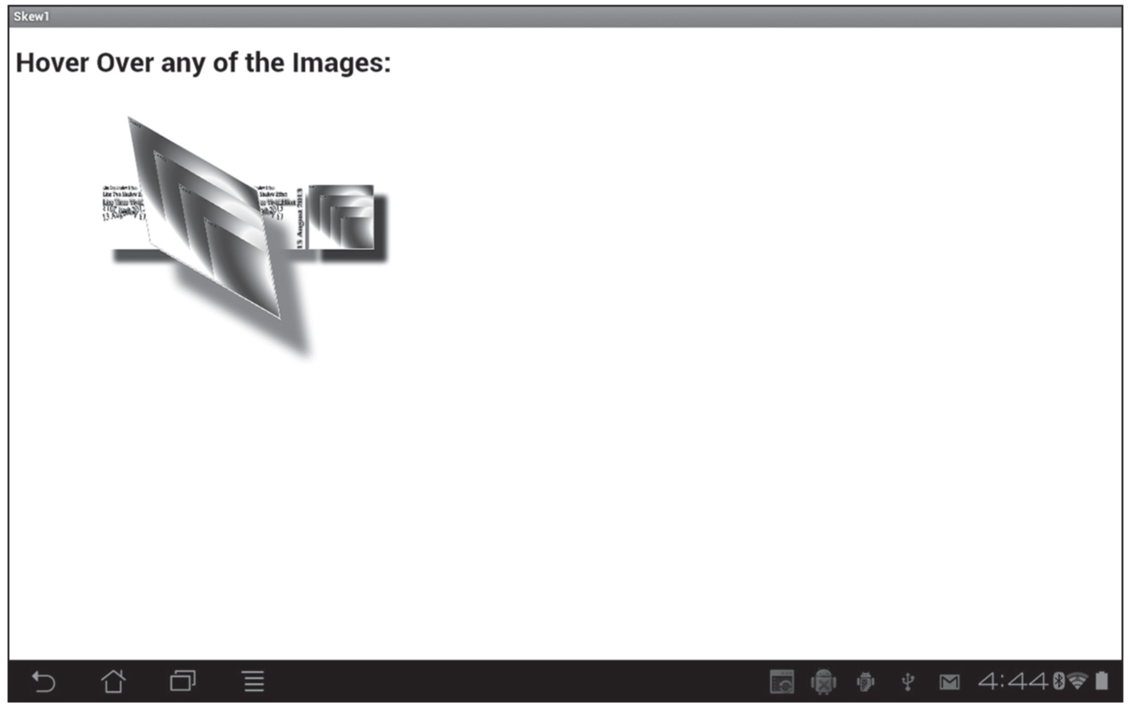
Figure 2.7 CSS3-based skew effects on JPG files.
The CSS3 transform attribute allows you to specify the translate() function in order to create an effect that involves a horizontal and/or vertical “shift” of an element, and its syntax looks like this:
translate(xDirection, yDirection);
The translation is in relation to the origin, which is the upper-left corner of the screen. Thus, positive values for xDirection and yDirection produce a shift to the right and downward, respectively, whereas negative values for xDirection and yDirection produce a shift to the left and upward. Zero values for xDirection and yDirection do not cause any translation effect.
The Web page Translate1.html and the CSS stylesheet Translate1.css on the CD illustrate how to apply a translation effect to a JPG file.
img.trans2:hover {
-webkit-transform : scale(0.5) translate(-50px, -50px);
transform : scale(0.5) translate(-50px, -50px);
}
The CSS stylesheet contains the img selector specifies a transform effect during a one-second interval using the ease timing function, as shown here:
transition: transform 1.0s ease;
The four selectors img.trans1, img.trans2, img.trans3, and img.trans4 create background shadow effects with darker shades of red, yellow, green, and blue, respectively, just as you saw in the previous section.
The selector img.trans1:hover specifies a transform attribute that performs a scale effect and a translation effect whenever users hover over the first <img> element with their mouse, as shown here:
-webkit-transform : scale(2) translate(100px, 50px);
transform : scale(2) translate(100px, 50px);
Figure 2.8 displays the result of matching the selectors defined in the CSS3 stylesheet Translate1.css to the elements in the HTML page Translate1.html. The landscape-mode screenshot is taken from an Android application running on a Nexus S 4G smart phone with Android ICS.
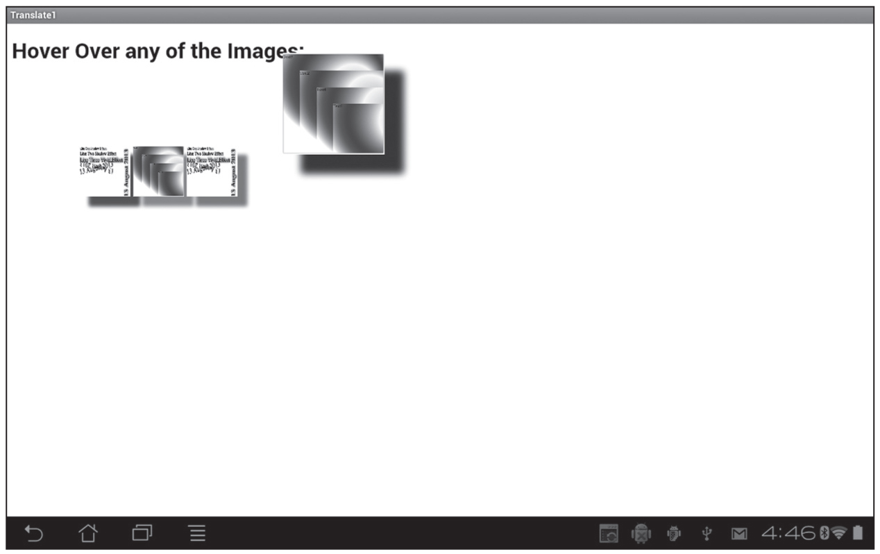
Figure 2.8 JPG files with CSS3 scale and translate effects.
CSS3 media queries are very useful logical expressions that enable you to detect mobile applications on devices with differing physical attributes and orientation. For example, with CSS3 media queries you can change the dimensions and layout of your applications so that they render appropriately on smart phones as well as tablets.
Specifically, you can use CSS3 media queries in order to determine the following characteristics of a device:
CSS3 media queries are Boolean expressions that contain one or more “simple terms” (connected with and or or) that evaluate to true or false. Thus, CSS3 media queries represent conditional logic that evaluates to either true or false.
As an example, the following link element loads the CSS stylesheet mystuff.css only if the device is a screen and the maximum width of the device is 480px:
<link rel="stylesheet" type="text/css"
media="screen and (max-device-width: 480px)"
href="mystuff.css"/>
The preceding link contains a media attribute that specifies two components: a media type of screen and a query that specifies a max-device-width whose value is 480px. The supported values for media in CSS3 media queries are braille, embossed, handheld, print, projection, screen, speech, tty, and tv.
The next CSS3 media query checks the media type, the maximum device width, and the resolution of a device:
@media screen and (max-device-width: 480px) and (resolution: 160dpi) {
#innerDiv {
float: none;
}
}
If the CSS3 media query in the preceding code snippet evaluates to true, then the nested CSS selector will match the HTML element whose id attribute has the value innerDiv, and its float property will be set to none on any device whose maximum screen width is 480px. As you can see, it’s possible to create compact CSS3 media queries that contain non-trivial logic, which is obviously very useful because CSS3 does not have any if/then/else construct that is available in other programming languages.
Additional Code Samples on the CD
The CSS stylesheet CSS3MediaQuery1.css and the HTML5 Web page CSS3MediaQuery1.html illustrate how to use media queries in order to change the size of two images when users rotate their mobile device.
You can detect a change of orientation of a mobile device using simple JavaScript code, so you are not “forced” to use CSS3 media queries. The HTML5 Web page CSS3OrientationJS1.html on the CD illustrates how to use standard JavaScript in order to change the size of two images when users rotate their mobile device.
In essence, the code uses the value of the variable window.orientation in order to detect four different orientations of your mobile device. In each of those four cases, the dimensions of the JPG files are updated with the following type of code:
document.getElementById("img1").style.width = "120px";
document.getElementById("img1").style.height = "300px";
Although this is a very simple example, hopefully this code gives you an appreciation for the capabilities of CSS3 Media Queries.
This chapter showed you how to create graphics effects, shadow effects, and how to use transforms in CSS3. You learned how to create animation effects that you can apply to HTML elements, and you saw how to define CSS3 selectors to do the following: