This chapter introduces you to various jQuery UI controls, along with code samples that show how to render some jQuery UI controls in HTML5 Web pages. The rationale for using these UI controls is simple: they do not require nearly as much effort as writing your own custom UI controls, nor do you need to maintain the code for these controls. Moreover, these UI controls work well on a range of browsers.
You will see examples of using jQuery to render accordions, buttons, combo boxes, date pickers, progress bars, sliders, and tabs. In addition, you will learn how to programmatically handle user-initiated events involving jQuery UI controls. There are more UI controls available that you can learn about by consulting the jQuery homepage.
The jQuery UI controls in this chapter are presented alphabetically, so feel free to skip around to read about the UI controls that are of interest to you. Although information about these UI controls is available in the jQuery documentation, this is a primer book, so it’s more appropriate to include a list of UI controls in one convenient location instead of telling you to “go read the documentation.” After you have read this chapter, you will also be in a better position to understand the lengthy code sample at the end of the chapter. The sample illustrates an HTML5 Web page with various jQuery UI controls in a manner that reflects a somewhat realistic scenario.
This chapter also contains code samples for handling user click events that trigger updates in other (sometimes graphical) elements that are defined elsewhere in the same HTML5 Web page. This approach makes it easy to understand how to implement event-related functionality, and hopefully you will be able to adapt the code samples in this chapter to your specific needs.
One point to keep in mind is that the HTML5 Web pages in this chapter contain both HTML markup and jQuery code. For longer Web pages, it makes more sense to put jQuery code in a separate file (just as we have done with CSS stylesheets). However, almost every Web page in this chapter is short (between one page and 1.5 pages), so it’s a choice based on convenience to keep the code in a single file.
A second point involves how to write your own jQuery plugins, which is beyond the scope of this book. You can find online tutorials that show you how to write jQuery plugins if you cannot find any existing jQuery plugins that meet your needs.
Using jQuery 2.0 in this Chapter
The following code samples work correctly on jQuery 1.5, but they do not work correctly with jQuery 2.0.0:
Keep in mind that future versions of jQuery will undoubtedly resolve these issues and other inconsistencies that you might encounter in your own HTML Web pages that use jQuery.
jQuery UI supports an accordion widget, which contains one or more “folders” whose contents are shown only when users click on a particular folder.
Listing 4.1 displays the contents of the HTML5 Web page JQUIAccordion1.html, which illustrates how to render an accordion widget.
LISTING 4.1 JQUIAccordion1.html
<!DOCTYPE html>
<html lang="en">
<head>
<meta charset="utf-8" />
<title>jQuery Accordion</title>
<link href="JQUIAccordion1.css" rel="stylesheet"
type="text/css">
<link type="text/css"
href="css/themename/jquery-ui-1.8.14.custom.css" />
<script src="http://code.jquery.com/jquery-2.0.0b1.js">
</script>
<script src="http://code.jquery.com/jquery-migrate-1.1.0.js">
</script>
<script src="http://code.jquery.com/ui/1.10.1/jquery-ui.js">
</script>
<link href="JQUIAccordion1.css"
rel="stylesheet" type="text/css">
</head>
<body>
<div id="accordion">
<h3><a href="#">Section 1</a></h3>
<div>
<p> This is the first section of the accordion. </p>
</div>
<h3><a href="#">Section 2</a></h3>
<div>
<p> This is the second section of the accordion. </p>
<ul>
<li>List item one</li>
<li>List item two</li>
<li>List item three</li>
</ul>
</div>
<h3><a href="#">Section 3</a></h3>
<div>
<p> This is the section of the third accordion. </p>
</div>
<h3><a href="#">Section 4</a></h3>
<div>
<p> This is the section of the fourth accordion. </p>
<div id="outer">
<div id="inner1"></div>
<div id="inner2"></div>
<div id="inner3"></div>
</div>
</div>
</div>
<script>
$(document).ready(function() {
$("#accordion").accordion();
});
</script>
</body>
</html>
Listing 4.1 is straightforward: after the usual file references, there is an HTML <script> element that references a HTML <div> element (whose id attribute has value accordion). This HTML <div> element also contains 4 HTML <div> elements that refer to four different “sections” in the HTML Web page.
The <script> element contains jQuery code that renders the contents of this HTML <div> element as an accordion in literally one line of code, shown here:
<script>
$(document).ready(function() {
$("#accordion").accordion();
});
</script>
In fact, the code in the preceding <script> element is the typical manner in which jQuery renders the contents of an HTML <div> element as a jQuery widget:
$("#theDivID").widgetType();
In this example, the widgetType function is the jQuery accordion() function. You can create different accordion effects by overriding some of the default CSS definitions for a jQuery accordion. For example, insert the following section of code before the first section of the accordion in Listing 4.1, and see how this changes the effect of selecting each section in the accordion:
<h3 class="ui-accordion-header ui-helper-reset ui-state-active ui-corner-top">
<span class="ui-icon ui-icon-triangle-1-s"/>
<a href="#">Section 1</a>
</h3>
LISTING 4.2 JQUIAccordion1.css
#inner1 {
float: left;
background-col33r:#F00;
width: 200px;
height:200px;
}
#inner2 {
float: left;
background-color:#FF0;
width: 200px;
height:200px;
}
#inner3 {
background-color:#00F;
width: 200px;
height:200px;
}
The three selectors in Listing 4.2 match their corresponding HTML <div> elements in Listing 4.1, which renders three rectangular shapes with red, yellow, and blue, respectively. This effect is visible when users click on the lowest folder (labeled “Section 4”) in the accordion. In a sense, an accordion can be viewed as a set of vertical tabs, where each tab contains whatever HTML content you want to render, including graphics-like effects.
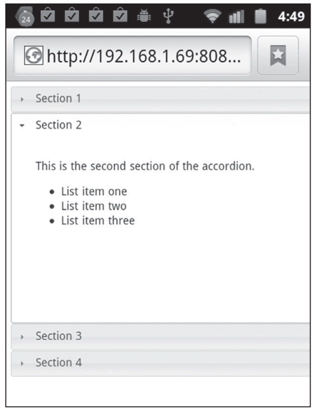
Figure 4.1 A jQuery accordion on a Nexus S 4G with Android ICS.
Launch the HTML5 Web page in Listing 4.1 and click on each “folder” in the rendered accordion, which will reveal the contents of the currently selected folder and also hide the contents of the other folders of this accordion.
Figure 4.1 displays the result of rendering JQUIAccordion1.html in Listing 4.1 in a landscape-mode screenshot taken from an Android application running on a Nexus S 4G with Android ICS.
Buttons are obviously important in Web pages, especially for submitting form-based data, and jQuery provides significant support for button-related functionality. You can define CSS3 selectors to apply whatever styling effects you need to HTML buttons, including gradients and shadow effects.
Listing 4.3 displays the contents of the HTML5 Web page JQUIButtons1.html, which illustrates how to render buttons in an HTML Web page. The CSS stylesheet JQUIButtons1.css is omitted because its contents are the same as Listing 4.2.
LISTING 4.3 JQUIButtons1.html
<!DOCTYPE html>
<html lang="en">
<head>
<meta charset="utf-8" />
<title>jQuery Buttons</title>
rel="stylesheet" type="text/css">
<link type="text/css" rel="Stylesheet"
href="css/themename/jquery-ui-1.8.14.custom.css" />
<script src="http://code.jquery.com/jquery-2.0.0b1.js">
</script>
<script
src="http://code.jquery.com/jquery-migrate-1.1.0.js">
</script>
<script src="http://code.jquery.com/ui/1.10.1/jquery-ui.js">
</script>
</head>
<body>
<div id="outer">
<div class="buttons">
<button>A regular button</button>
<input type="submit" value="A submit button">
<a href="#">An anchor button</a>
</div>
<div id="inner1"></div>
<div id="inner2"></div>
<div id="inner3"></div>
</div>
<script>
$(function() {
$( "input:submit, a, button", ".buttons" ).button();
});
</script>
<script>
$(document).ready(function() {
var divColors = new Array('#000', '#F0F', '#F00',
'#0F0', '#00F', '#0FF');
var clickCount = 0;
var color1 = "";
$("button").click(function() {
++clickCount;
color1 = divColors[(clickCount) % divColors.length];
$("#inner1").css({background: color1});
});
++clickCount;
color1 = divColors[(clickCount) % divColors.length];
$("#inner2").css({background: color1});
});
$("a").click(function() {
++clickCount;
color1 = divColors[(clickCount) % divColors.length];
$("#inner3").css({background: color1});
});
});
</script>
</body>
</html>
Listing 4.3 contains an HTML <script> element that applies the jQuery button() method to three HTML elements and converts them into jQuery buttons with one line of code, as shown in this code snippet:
$("input:submit, a, button", ".buttons").button();
Notice that the class .buttons (which is used to style an HTML <div> element that contains the HTML buttons and anchors) is also specified in the preceding code snippet. This extra class is redundant in this code snippet, but it shows you the flexibility of specifying a set of HTML elements that you want to convert into jQuery buttons.
The next block of code renders three HTML <div> elements with colors that are specified in their corresponding selectors that are defined in the associated CSS stylesheet.
Launch the HTML Web page in Listing 4.3, and when you click on the top row of buttons (which includes the anchor link), the rectangles change colors. For example, the buttons change color whenever users click on them because of the following code:
$("button").click(function() {
++clickCount;
color1 = divColors[(clickCount) % divColors.length];
$("#inner1").css({background: color1});
});
In the preceding event handler, the colors are selected from a JavaScript array called divColors that contains a set of colors.
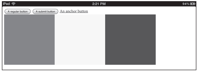
Figure 4.2 displays the result of rendering JQUIButtons1.html in Listing 4.3, in a landscape-mode screenshot taken from an iPad3.
Figure 4.2 Buttons on an iPad3.
jQuery enables you to add event handlers to HTML checkboxes and radio buttons so that you can determine which ones that users have selected.
Listing 4.4 displays the contents of JQUICheckBoxRadio1.html that illustrates how to render a checkbox and a set of radio buttons in an HTML Web page. The CSS stylesheet JQUICheckBoxRadio11.css is omitted because its contents are the same as Listing 4.2.
LISTING 4.4 JQUICheckBoxRadio1.html
<!DOCTYPE html>
<html lang="en">
<head>
<meta charset="utf-8" />
<title>jQuery Checkbox and Radio ButtonsEffect</title>
<link href="JQUICheckBoxRadio1.css"
rel="stylesheet" type="text/css">
<link type="text/css"
href="css/themename/jquery-ui-1.8.14.custom.css" />
<script src="http://code.jquery.com/jquery-2.0.0b1.js">
</script>
<script
src="http://code.jquery.com/jquery-migrate-1.1.0.js">
</script>
<script src="http://code.jquery.com/ui/1.10.1/jquery-ui.js">
</script>
ox
<style>
#CheckBoxRadioInfo, #CheckBoxRadioInfo2 {
font-size: 20px;
top: 10px;
width: 50%;
height: 50px;
}
</style>
<body>
<div id="outer">
<div>
<fieldset id="CheckBoxRadioInfo">
<label for="checkbox1"><strong>Check Something:</strong>
</label>
<input type="checkbox" name="checkbox1" id="checkbox1">
</input>
<input type="radio" name="radio"
value="radio1" checked="checked"></input>
<input type="radio" name="radio" value="radio2"></input>
<input type="radio" name="radio" value="radio3"></input>
</fieldset>
</div>
<div>
<fieldset id="CheckBoxRadioInfo2">
<label for="input1"><strong>You Clicked On:</strong>
</label>
<input type="input" name="input1" id="input1"></input>
</fieldset>
</div>
</div>
</div>
<script>
$(document).ready(function() {
$("input[name='checkbox1']").click(function() {
$("#input1").val("checkbox1");
});
$("input[name='radio']").click(function() {
$("#input1").val($(this).val());
});
});
</script>
</body>
</html>
Listing 4.4 contains two HTML <div> elements that contain an HTML <fieldset> element, which specifies an HTML checkbox followed by HTML radio buttons.
You can find the state of the checkbox whose name attribute has the value checkbox1 with this event handler:
$("input[name='checkbox1']").click(function() {
$("#input1").val("checkbox1");
});
Similarly, you can determine which radio button is checked with this code:
$("input[name='radio']").click(function() {
$("#input1").val($(this).val());
});
In addition, you can also check which radio button is selected with the following code snippet:
var value = $("input[@name= fieldname] :checked" ).val();
In the preceding snippet, you need to replace fieldname with the corresponding name in the form field.
$('input:radio[ name="postage" ]').change( function(){
if ($(this).is( ':checked' ) && $(this).val( ) == 'Yes') {
// append goes here
}
});
Figure 4.3 displays the result of rendering JQUICheckBoxRadio1.html in Listing 4.4 in a Chrome browser on a MacBook.
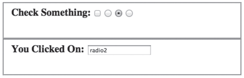
Figure 4.3 Checkboxes/button in the Chrome browser on a MacBook.
jQuery provides support for HTML combo boxes, and you can attach event handlers to detect events that are associated with those HTML elements.
Listing 4.5 displays the contents of JQUIComboBox1.html that illustrates how to render a combo box in an HTML Web page, and to execute a block of code whenever users select a different value in the combo box.
LISTING 4.5 JQUIComboBox1.html
<!DOCTYPE html>
<html lang="en">
<head>
<meta charset="utf-8" />
<title>jQuery ComboBox</title>
<link type="text/css"
href="css/themename/jquery-ui-1.8.14.custom.css" />
<script src="http://code.jquery.com/jquery-2.0.0b1.js">
</script>
<script src="http://code.jquery.com/jquery-migrate-1.1.0.js">
</script>
<script src="http://code.jquery.com/ui/1.10.1/jquery-ui.js">
</script>
<style>
#ComboBoxInfo {
position: relative;
font-size: 20px;
top: 10px;
width: 50%;
height: 50px;
}
</style>
</head>
<body>
<div id="outer">
<div>
<fieldset id="ComboBoxInfo">
<label for="ComboBox"><strong>My ComboBox:</strong></label>
<select id="ComboBox" >
<option value="1">Value 1</option>
<option value="2">Value 2</option>
<option value="3">Value 3</option>
<optgroup label="Group1">
<option value="4">Value 4</option>
<option value="5">Value 5</option>
<option value="6">Value 6</option>
</optgroup>
</select>
<label for="selected1"><strong>You selected:</strong>
</label>
<input id="selected1" type="text" value="">
</fieldset>
</div>
</div>
<script>
$(document).ready(function() {
$("#ComboBox").change(function() {
$("#selected1").val(
$("#ComboBox option:selected").text());
});
});
</script>
</body>
</html>
Listing 4.5 is straightforward: the first section references the required jQuery files, followed by an HTML <style> element, and then the definition of the items in a combo box.
Whenever users change the selected item in the combo box, this block of code is executed:
$("#ComboBox").change(function() {
// display the selected value
$("#selected1").val(
$("#ComboBox option:selected").text());
});
Figure 4.4 displays the result of rendering JQUIComboBox1.html in Listing 4.5 in the Chrome browser on a MacBook.
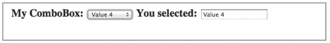
Figure 4.4 Combo box in the Chrome browser on a MacBook.
jQuery supports “date picker” functionality that enables you to set the past, current, and future dates, as well as the ability to modify those dates in a contextually relevant manner.
Listing 4.6 displays the contents of the HTML5 Web page JQUIDatePicker1.html that illustrates how to render a jQuery datepicker widget in an HTML Web page. The CSS stylesheet JQUIDatePicker1.css is omitted because its contents are the same as Listing 4.2.
LISTING 4.6 JQUIDatePicker1.html
<!DOCTYPE html>
<html lang="en">
<head>
<meta charset="utf-8" />
<title>jQuery Date Picker</title>
<script
src="http://code.jquery.com/jquery-ui-1.8.14.custom.min.js">
<script src="http://code.jquery.com/jquery-2.0.0b1.js">
</script>
<script
src="http://code.jquery.com/jquery-migrate-1.1.0.js">
</script>
<script src="http://code.jquery.com/ui/1.10.1/jquery-ui.js">
</script>
<style>
#input1, #input2, #input3 {
width: 150px;
height: 50px;
float: left;
}
</style>
</head>
<body>
<div id="outer">
<div id="input1">
Last Week:
<input type="text" name="date" id="date1" />
</div>
<div id="input2">
Today's Date:
<input type="text" name="date" id="date2" />
</div>
<div id="input3">
A Future Date:
<input type="text" name="date" id="date3" />
</div>
</div>
<script>
$(document).ready(function() {
// set date to last week
var defaultDate1 = $("#date1").datepicker("option",
"defaultDate" );
$("#date1").datepicker( "option", "defaultDate", -7 );
// set date to today
var defaultDate2 = $("#date1").datepicker("option",
"defaultDate");
$("#date2").datepicker("option", "defaultDate", +0 );
// set date to the future
var futureDate = "07/07/2017";
$("#date3").datepicker("setDate",futureDate);
});
</script>
</body>
</html>
Listing 4.6 references the usual jQuery files, followed by a <style> element that applies styling to the three HTML <div> elements. Next, the HTML <body> element specifies the container of the three HTML <div> elements, followed by a block of code that converts three HTML <input> fields into jQuery datepicker widgets, shown here:
$("#date1").datepicker();
$("#date2").datepicker();
$("#date3").datepicker();
You can specify a future date and when you want to change that future date, jQuery will display the previous and next months that are relative to that date, as shown here:
// set date to the future
var futureDate = "07/07/2017";
$("#date3").datepicker("setDate",futureDate);
Figure 4.5 displays the result of rendering JQUIDatePicker1.html in Listing 4.6 in the Chrome browser on a MacBook.
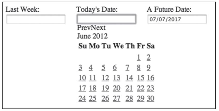
Figure 4.5 A date picker in the Chrome browser on a MacBook.
You can create and update progress bars very easily using jQuery. Listing 4.7 displays the contents of JQUIProgressBar1.html and illustrates how to render a progress bar in an HTML Web page.
LISTING 4.7 JQUIProgressBar1.html
<!DOCTYPE html>
<html lang="en">
<head>
<meta charset="utf-8" />
<title>jQuery Progress Bar</title>
<link rel="stylesheet" type="text/css" href="http://ajax.googleapis.com/ajax/libs/jqueryui/1.8/themes/base/jquery-ui.css"/>
<script src="http://code.jquery.com/jquery-2.0.0b1.js">
</script>
<script
src="http://code.jquery.com/jquery-migrate-1.1.0.js">
</script>
<script src="http://code.jquery.com/ui/1.10.1/jquery-ui.js">
</script>
<style>
#progressBarDiv1 {
width: 30%;
}
</style>
</head>
<body>
<div id="outer">
<div id="progressBar1">
Progress Bar:
<div id="progressBarDiv1"> </div>
</div>
<div id="value1">
Progress Bar Value:
<input id="text1" type="text" value="0" />
</div>
<div id="newValue">
Set New Value:
<input id="newVal" type="text" value="0" />
</div>
<script>
$(document).ready(function() {
$("#progressBarDiv1").progressbar({ value: 40 });
$("#text1").val($("#progressBarDiv1").progressbar("value"));
$("#newValue").bind("change", function() {
var newVal = $("#newVal").val();
$("#progressBarDiv1").progressbar("option", "value",
parseInt(newVal));
});
});
</script>
</body>
</html>
Listing 4.7 references the usual jQuery files, followed by an HTML <div> element (whose id value is outer) that contains the HTML code for a progress bar, the current value of the progress bar (which is initialized to 40), and an input field that allows users to change the value of the status bar.
The creation, display, and update of the value of the progress bar is handled in the following code block:
$(document).ready(function() {
$("#progressBarDiv1").progressbar({ value: 40 });
$("#text1").val($("#progressBarDiv1").progressbar("value"));
$("#newValue").bind("change", function() {
var newVal = $("#newVal").val();
$("#progressBarDiv1").progressbar("option", "value",
parseInt(newVal));
});
});
As you can see, the preceding code block binds a change event to the second HTML <input> field. When users enter a new value, the progress bar is updated with that value.
Figure 4.6 displays the result of rendering JQUIProgressBar1.html in Listing 4.7 in the Chrome browser on a MacBook.
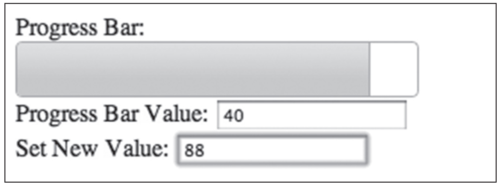
Figure 4.6 Progress bar in the Chrome browser on a MacBook.
 Additional Code Samples on the CD
The HTML5 Web page JQUISlider1.html illustrates how to render horizontal and vertical sliders in an HTML Web page, and a key block of code is shown here:
$(document).ready(function() {
$("#sliderDiv1").slider({
orientation: 'horizontal',
min: 0,
max: 200,
step: 10,
value: 100
});
}
One simple use of jQuery sliders is to use them to control the speed of animation effects (which can also be done with a spinner).
The HTML5 Web page JQUIAnimSlider1.html illustrates how to use a slider widget to control an animation effect.
Currently, jQuery does not provide scroll pane widgets, but you still have some options available. One option is to use HTML5 progress bars, which are simple to use and they provide some “reasonable” functionality. If HTML5 progress bars are insufficient for your needs, you may use a jQuery plugin that supports scroll pane widgets, such as the jScrollPane plugin whose homepage is here:
http://jscrollpane.kelvinluck.com/
The jScrollPane plugin provides the jScrollPane-<version>.min.js JavaScript file, as well as a CSS stylesheet (jScrollPane.css) that you can override with your own customizations.
This plugin provides over 20 demos that show you how to create scroll bars (horizontal, vertical, or both), the use of arrow buttons, its scrollTo and scrollBy methods, how to style scrollbars in an IFRAME, and various other effects.
The jQuery tab widget supports various options, methods, and events, and the HTML5 Web page JQUITabs.html illustrates how to render tabs in an HTML Web page.
jQuery UI provides very nice support for switching between different themes, which consist of different look-and-feel effects that are applied to widgets and text. You can find very good information about jQuery themes on these Websites:
http://jqueryui.com/docs/Theming
http://jqueryui.com/docs/Theming/API
http://jqueryui.com/docs/Theming#Using_ThemeRoller_and_Themes
The HTML5 Web page JQUIThemes1.html illustrates how to dynamically apply different themes to an HTML Web page with a set of widgets:
http://midnightprogrammer.net/post/Change-Page-Themes-Dynamically-Using-JQuery-Theme-Roller.aspx
 The theme switcher is no longer supported as of jQuery UI 1.9, but you can use the “Super-Theme-Switcher” that is available on github:
https://github.com/harborhoffer/Super-Theme-Switcher
The following example is purely for fun, and you might even find a good use for the jQuery effect() function, which enables you to create some nice visual effects.
The HTML5 Web page JQUIEffects1.html illustrates how to horizontally shake and then “explode” an HTML <div> element and its HTML <p> child elements.
The <script> element defines a click handler for the container HTML <div> element by means of method chaining that uses the jQuery effect() method, as shown here:
$("#outer").effect('shake', {times:3}, 300)
.effect('highlight', {}, 3000)
.hide('explode', {}, 1000);
When users click on this element, it will first shake horizontally three times (each time for 300 milliseconds), then change the color to a highlight effect. After 3 seconds, it will create an “exploding” effect that lasts for one second.
The HTML5 Web page JQUITravel1.html illustrates how to use some of the UI components that you saw earlier in this chapter. The validation details have been omitted in order to illustrate how to manipulate the UI components in a code sample of reasonable length, using techniques that you can use in your own Web pages.
The jQuery UI Website provides extensive documentation and details regarding jQuery UI components. Its homepage is here:
Another useful jQuery UI link is a Website that provides useful demos of jQuery UI components:
You can use the jFormer jQuery plugin with HTML5 forms, and its homepage is here:
A collection of jQuery plugins for playing audio and video files is here:
http://superdit.com/2011/04/27/12-jquery-plugins-for-playing-audio-video-files/
The jQuery plugin jTweetsAnywhere for displaying tweets is here:
http://thomasbillenstein.com/jTweetsAnywhere/
This chapter introduced you to jQuery UI controls, along with code samples that illustrated how to create HTML5 Web pages with jQuery UI controls. You learned how to use the following jQuery UI controls: