THIS CHAPTER DESCRIBES HOW INEQUALITY OF INCOME AND WEALTH have changed in the major Western and Eastern economies. It updates the data in the Piketty book (most of which ends in 2011 or 2012) to 2015 or the most recent years for which data is available. It draws an important distinction between the rise in inequality within countries and the decrease in inequality between countries.
The chapter also considers the critique of the concept of income inequality: that it fails to measure incomes accurately because of the informal economy and that consumption inequality is not only a better measurement but also a better representation of reality.
Measurement issues
I apologise, especially to non-technical readers, for having to start with this. But without understanding the relevant measurement issues, it is hard to interpret the data.
The seminal article on the measurement of inequality is by the late Sir Anthony Atkinson in the Journal of Economic Theory in 1970. He deals with conceptual issues. He argues that two conventional measures (the coefficient of variation and the Gini coefficient) are inappropriate since one needs to have an understanding of the social welfare function before attempting to measure inequality.1 One senses that this is the work of a young man looking for perfection rather than trying to deal with the real world of measurement problems. He completely fails to deal with data issues!
In their important work on measuring income inequality in the US, Auten and Splinter show that using US tax data carefully gives a very much smaller rise in income inequality than Piketty and Saez’s earlier work.2 The key conceptual problems with income inequality data are these:
(1) Many at the lower end of the income spectrum and a proportion at the upper end operate in parts of the economy where their income is not measured – data shows consumption (which itself is also probably underestimated) consistently exceeding income even after adjusting for transfers for low-income groups.3
(2) Many at the upper end of the income spectrum have international aspects to their income that are not fully reflected in the national tax data.
(3) A large number of people at both the top end and the bottom end of the income spectrums are there as a result of temporary changes in their income levels (loss of job; large lump sum payments, etc.) so that their income is not representative of their normal position. It appears that the temporary component has got larger in recent years.4
(4) Should post-tax or pre-tax data be used?
(5) How to account for transfers?
Looking at wealth inequality, the difficulties are even greater.
In theory, wealth is assets minus liabilities. But measuring assets without constant revaluation is hard, and revaluation is costly. Liabilities are often easier to measure, but contingent liabilities are less easy to evaluate. Entitlement programmes such as pensions are again difficult to evaluate and are often excluded. Small amounts of wealth are often excluded. The Credit Suisse Global Wealth Report data quoted by Oxfam tends to be weaker for those unlikely to be using the services of an investment bank (obviously predomininantly the poorest groups) than for the richer groups who do use such services, and weaker for assets that tend not to be marketable, such as the property of people in poor countries. By contrast they measure marketable assets relatively well. In addition, as wealth tends to accumulate with age on most saving hypotheses, even if everyone had the same average wealth over their lifetime, the statistics would show very large variations in wealth as it accumulates with age before being run down when people stop working and then start to spend and redistribute their wealth. And societies that are ageing will tend to have more apparent maldistribution of wealth than those that are getting younger, even if the average wealth of everyone is the same over their lifetimes.
It is beyond the scope of this book to construct data series corrected for all the weaknesses outlined above. They are pointed out to encourage a degree of scepticism that might help a shrewd observer not to be blindsided by the data. In general the weaknesses will tend to mean that data sets exaggerate inequality. But issues such as tax avoidance (let alone evasion) probably work in the opposite direction.
Although some of the weaknesses affect the changes in the data over time, my view is that the problems with this are fewer. It is for this reason that most of the analysis in this chapter looks at changes in inequality over time.
Inequality within countries
It is wrong to think of inequality as a single variable. Different measures in different countries show different things. I have looked at six different measures (shares of income for top 1% and top 10%, shares of wealth for the same groups, and Gini coefficients for both income and wealth) for seven countries (India, China, Japan, France, Germany, UK and US when the data is available).
It is also important to be aware of the deficiencies of the data. Income and (even more) wealth data are hard to calculate.
What do the data indicate?
First, the income shares of the top 1%.5 These typically trended down from the first quarter of the 20th century till around 1980. Since then they have trended up in all seven countries (see Table 1 in Chapter 1), in some cases quite sharply. In India the share rose from 7.3% in 1980 to 20.4% in 2008; in China the share rose from 6.4% to 15.2% over the same period. For the European countries the increases between 1980 and 2008 were relatively modest: in France from 8.2% to 11.6% and in Germany from 10.6% to 14.5%. In the Anglo-Saxon world with strong financial services sectors the increases were stronger over the same period: from 6.7%6 to 15.4% in the UK7 and from 10.7% to 19.5% in the US.
These data are from the World Inequality Database (WID) originally set up by Piketty and Saez. They do not take into account the analysis from Auten and Splinter which suggests a very much smaller increase in inequality in the US – about a quarter of the increase suggested by the Piketty and Saez data. Although the Auten and Splinter analysis looks amazingly thorough and detailed, it does not entirely chime with one’s gut reactions after nearly 50 years of observing economic data. One’s suspicion is that there is some international tax leakage that would allow wealthy people to earn rather more than is indicated from their tax returns. I admit that I might be completely wrong on this – no doubt time will tell. A less strong reason for not using the adjusted data is that it is not internationally comparable.
On the WID data, since the financial crisis in 2007/08 this measure of inequality has fallen back in all countries except India. This is consistent with Cebr’s analysis of financial sector bonuses in London, which fell from £12 billion in 2007 to £4 billion in 2015.
Looking at the top 10% share of income, the information presents a broadly similar picture. But there is no upward trend from 1980 for France. The scale of the rises from 1980 is smaller than for the top 1% in general. And (presumably reflecting the lesser representation of bankers in the top 10% than in the top 1%) there is a less marked falling back after 2007/08. Indeed (though as there is a series change it is difficult to compare), it looks as though the share of the US top 10% reached a new peak in 2015. Meanwhile, on this measure the rise in inequality in the UK is one of the least in the advanced countries and by 2015 income inequality in the UK even pre-tax was less than in Germany.
Shares of wealth
The WID has less data on wealth than on income and quite a lot of wealth data that was once available on the Piketty-Saez database is no longer posted, possibly reflecting the Giles critique mentioned below. There is now data only for China, France, the UK and the US (and Russia where I assume that the wealth data is not totally reliable). One would normally assume that the richer groups had higher shares of wealth than of income since they combine higher income with typically higher savings ratios and in addition wealth accumulates with age. The earlier data (which is no longer posted on the web) indicated that while the shares of income of the top 1% vary from around 10% to 25%, the shares of wealth vary from around 30% to around 50%.
There is now only long-term data for the wealth share of the top 1% from the 19th century for France and the UK. For France the peak share was 56.9% in 1906, although the rapid decline only started just after the First World War, bottoming out at 15.9% in 1984. Since then it has recovered to 28.1% in 2000 before settling at between 22% and 23% since 2004. For the UK the peak was earlier and higher, with the share of wealth of the top 1% ranging from 70-75% from 1895 to 1906 but falling thereafter and bottoming out at 15.2% in 1984. There has been a small recovery since to 19.8% in 2012. It is worth noting that the share of wealth of the top 1% in the UK is less than in any other country for which the WID has data!
The data for the US share of the top 1% starts in 1960 and falls more or less in parallel with the data for the UK until 1975 where it plateaus at around 22-24% for ten years. The share then recovered to 40.1% in 2012 although it edged back a little in the two subsequent years.
The data for China is interesting. The share remained (suspiciously) flat (even when measured to three decimal places) at 15.797% from 1978-95 but has since nearly doubled to 29.6% in 2015.
The WID data for the wealth of the top 10% mirrors that for the top 1%, though the movements are moderated and with a slight lag. Again there is data for only five countries, one of which (Russia) is probably fairly inexact.
In France the share fell from 86.0% in 1905 to 50.0% in 1984 and in the UK from 92-93% in 1895-1914 to 45.6% in 1991, and in the US from 72.4% in 1964 to 61.8% in 1985. Since then the shares have edged up in each of these countries, to 55.3% in 2014 for France and 51.9% in 2012 for the UK, and to 73.0% in 2014 in the US. The only place where the rise has been really dramatic has been in China where the share of wealth of the top 10% has risen from 40.8% in 1995 to 67.4% in 2015, but this is not surprising given the transition from a regime where private property was largely not allowed to a more capitalist system.
The Giles critique8
The Financial Times Economics Editor Chris Giles has analysed the Piketty data carefully. He has not identified any particular difficulties with the income data, but he argues that much of the wealth data has been constructed with little or no admission about the sources of the data. To quote The Economist magazine:
Several oddities surfaced, such as discrepancies between numbers in the source material Mr Piketty cites and those that appear in his spreadsheets; a large number of unexplained adjustments to the raw data (often in the form of a constant written into the Excel spreadsheet cell); inconsistency in how underlying source data were combined; and the frequent interpolation of data, without explanation, when underlying sources were missing. For instance, none of the sources Mr Piketty used had data for the top 10% wealth share in America between 1910 and 1950. So he assumed their wealth share was consistently that of the top 1% plus 36 percentage points. All told, Mr Giles found ‘problems’ in 114 of 142 data points in Mr Piketty’s wealth inequality tables.9
It is clear from the discussion in the preceding paragraph in this chapter, which refers to the updated data (from Piketty’s colleagues) for the wealth of the wealthiest 10%, that they have now adjusted their data from that criticised by Giles, presumably to meet the criticism.
What emerges after the data has been adjusted is that the new data for the upward trend in the shares of wealth of the richer groups in the years after 1980 is much less prominent than had been asserted in Piketty’s book and has done very little to reverse the huge fall in the share in wealth of the top 10% from the early to the late part of the 20th century.
We should all be grateful to Giles for his persistence and attention to detail. It is to his credit that Giles, whom many might consider left-wing and therefore from a political position not too diametrically opposed to Piketty’s, has done the job that Piketty’s opponents on the right have failed to do.
It is important to note, though, that Giles, who clearly checked the numbers closely, gave a clean bill of health to the data compiled by Piketty and his colleagues for shares of income.
Other criticisms
The other main criticisms of the data, which apply more to the income data than the wealth data, are as follows:
(1) The income data ignores the informal economy which is (allegedly) particularly important at the bottom end of the income scale.
(2) The income data does not take account of the extent to which the tax system redistributes income.
These criticisms suggest that it might be better to look at consumption data or disposable income data. The recent UK data confirms that inequality has fallen since 2007/08 measured by the comparison of the disposable incomes of the top quartile versus the bottom quartile. Increased employment and protected job benefits have relatively helped the poorest groups, while declining real salaries and rising taxes have hit the highest groups.
Although it seems clear that in many countries the incomes of the very rich have risen relatively sharply, at least until 2007/08, some of this progress has since been checked and it remains an open question how much inequality in individual countries is rising at the moment.
For this reason economists have looked at another measure, the Gini coefficient. This is the official definition of the Gini coefficient from the Office for National Statistics website:10
The Gini coefficient is a measure of the overall extent to which these groupings of households, from the bottom of the income distribution upwards, receive less than an equal share of income.
The concept is expressed more formally by the Lorenz curve of household income distribution, from which the Gini coefficient can be calculated.
Based on a ranking of households in order of ascending income, the Lorenz curve is a plot of the cumulative share of household income against the cumulative share of households.
Complete equality, where income is shared equally among all households, results in a Lorenz curve represented by a straight line.
The opposite extreme, complete inequality, where only 1 household has all the income and the rest have none, is represented by a Lorenz curve which comprises the horizontal axis and the right-hand vertical axis.
The Lorenz curve in most cases will lie somewhere between these two extremes.
The Gini coefficient is the area between the Lorenz curve of the income distribution and the diagonal line of complete equality, expressed as a proportion of the triangular area between the curves of complete equality and inequality.
Complete equality would result in a Gini coefficient of zero, and complete inequality, a Gini coefficient of 100.
All the Gini coefficients shown in the effects of taxes and benefits on household income are based on distributions of equivalised household income.
Equivalisation is a standard methodology that takes into account the size and composition of households and adjusts their incomes to recognise differing demands on resources.
The Gini coefficient is used to show the degree of income inequality between different groups of households in the population.
It can also be used to show how inequality of incomes has been changing over a period of time.
Table 3. Gini coefficients of income inequality, mid-1980s and late 2000s
| Mid 80s | 2008 | |
| Rising inequality | ||
| Mexico | 0.45 | 0.48 |
| US | 0.34 | 0.38 |
| Israel | 0.33 | 0.37 |
| UK | 0.32 | 0.35 |
| Italy | 0.3 | 0.34 |
| Australia | 0.3 | 0.34 |
| NZ | 0.27 | 0.33 |
| Japan | 0.31 | 0.33 |
| Canada | 0.29 | 0.32 |
| Germany | 0.25 | 0.3 |
| Netherlands | 0.27 | 0.3 |
| Luxembourg | 0.25 | 0.29 |
| Finland | 0.21 | 0.26 |
| Sweden | 0.2 | 0.26 |
| Czech | 0.23 | 0.25 |
| Norway | 0.22 | 0.25 |
| Denmark | 0.22 | 0.25 |
| Little change in inequality | ||
| France | 0.3 | 0.3 |
| Hungary | 0.27 | 0.27 |
| Belgium | 0.25 | 0.25 |
| Decreasing inequality | ||
| Turkey | 0.43 | 0.41 |
| Greece | 0.33 | 0.31 |
Table 3 shows how Gini coefficients had increased in most but not all Organization for Economic Cooperation and Development (OECD) countries. The original source is the OECD inequality database, but the chart comes from my Gresham Professorial lecture ‘How does globalisation affect equality’11 from the OECD report ‘An overview of growing income inequalities in OECD countries: Main findings’.12
The chart shows that the recent rise in income inequality observed in the US is part of a more general though not completely ubiquitous trend.
Over the two decades prior to the onset of the global economic crisis, real disposable household incomes increased by an average 1.7% a year in OECD countries. In a large majority of them, however, the household incomes of the richest 10% grew faster than those of the poorest 10%, so widening income inequality. Differences in the pace of income growth across household groups were particularly pronounced in some of the English-speaking countries, some Nordic countries, and Israel. In Japan, the real incomes of those at the bottom of the income ladder actually fell compared with the mid-1980s.
In OECD countries today, the average income of the richest 10% of the population is about nine times that of the poorest 10% – a ratio of 9 to 1. However, the ratio varies widely from one country to another. It is much lower than the OECD average in the Nordic and many continental European countries, but reaches 10 to 1 in Italy, Japan, Korea, and the United Kingdom; around 4 to 1 in Israel, Turkey, and the United States; and 27 to 1 in Mexico and Chile. Although what is happening to the very rich is interesting, I believe that it is much more important to see what is happening to the poorer income groups.
The OECD conclusion (which is limited to a much shorter period than the US income distribution data and so has a very limited historical basis) is as follows:
Increases in household income inequality have been largely driven by changes in the distribution of wages and salaries, which account for 75% of household incomes among working-age adults. With very few exceptions (France, Japan, and Spain), the wages of the 10% best-paid workers have risen relative to those of the 10% lowest paid. This was due to both growing earnings’ shares at the top and declining shares at the bottom, although top earners saw their incomes rise particularly rapidly (Atkinson, 2009). Earners in the top 10% have been leaving the middle earners behind more rapidly than the lowest earners have been drifting away from the middle.
A separate study on a wide range of countries is by Toth, who discusses the evolution of inequality in a set of 30 countries according to six groupings:13
(1) Five Continental European welfare states
(2) Four Nordic countries and the Netherlands
(3) Five English-speaking liberal countries
(4) Four Mediterranean countries
(5) Two Asian countries
(6) Ten Central and Eastern European countries
To get more insight into the magnitude in the trend in inequality, he models the trend in Gini coefficients using fixed effects for country, allowing country-specific intercepts. The linear trend is definitely upward, with 0.25 points increase each year, or 0.43 points if controlled for GDP per capita. He concludes that for the window of the data the increase thus equals 7.35 points, more than half of the within-year range of Gini coefficients between countries.
Interestingly, the English-speaking countries do not stand out in terms of inequality trends; the average growth in inequality is 0.15 Gini points, not much higher than in Continental Europe (0.12 Gini points per year). The trend in the Nordic countries is much larger, with 0.26 Gini points per year on average, and also in Central and European countries (0.30 Gini points) and the Baltic States (0.54 Gini points per year).
In all groups of countries, except in the Mediterranean countries, inequality has been on the rise. However, as will become clear below, there are large discrepancies in inequality trends between countries within these groups. In certain countries (such as Austria, Belgium, France, Italy, Ireland, Slovenia) the level of inequality remained largely unchanged.
The most dramatic increase in inequality was experienced by some transition countries and, to a lesser but still significant extent, by the Nordic countries, most notably Sweden and Finland. In some of these countries the increase was sudden and large (as in the Baltic states, Bulgaria and Romania); in others it accumulated gradually over time (the Nordic group, Netherlands).
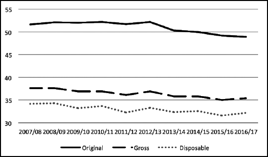
Figure 1 shows very recent data for the Gini coefficient for disposable income for the UK. Earlier data indicates a sharp rise in the Gini coefficient from the late 70s (and I believe that there was a rise immediately before that) to the early 1990s, but shows a slight falling back since then and the latest data shows a further decline in inequality on all three measures.14
Figure 1. ONS data for the UK. Movement of Gini coefficients over time
Source: Household disposable income and inequality in the UK: financial year ending 2017, Office for National Statistics, 10 January 2018.
It would appear that in the UK there have been a number of different trends that explain the fall since the early 1990s in contrast with the evidence for the top 1% and top 10%. Essentially the protection and indexation of benefits and the fall in unemployment helped the worst off over the period from the early 1990s to the late 2000s. Then the fall in bankers’ bonuses was the key explanation of the further fall in the past decade.
It is important to understand the basis of regional variations also. In the UK the regional data from the Office for National Statistics suggests that in fact inequality measured on any sensible basis is much lower than is generally assumed because the income data fails to take account of the lower costs of living in the parts of the country where incomes are lower.
The latest report that supports this is the relatively new data published by the ONS looking at country and regional public-sector finances. It considers how much money gets taken in tax from the wallets of the people in an area, and how much of the government’s spending they are then able to benefit from.
What it shows is that London and the South East of England pay much more into the common pot than they get, the East of England gets as much as it gives, and everyone else is a net beneficiary. This is not very different from what everyone thought was happening, partly because my colleagues and I have carried out this analysis on a similar basis on eight occasions since we first did so in 1993, nearly a quarter of a century ago, in a series of reports on London’s contribution to the UK economy.15
To understand why Gini coefficients overstate inequality for a country like the UK which has large regional differences it is a convenient simplification to see the British economy as two different parts. One part is London and the area around it – which are hugely productive and an important part of the global economy and the network of global cities. Then there’s everything else – which has been described as ‘really just a rather boring middle-ranking Northern European economy’.16
That huge difference in productivity, in tandem with a national taxation system, explains why the government gets nearly £16,000 a year in tax revenue from each Londoner and under £8,000 from each Welsh person on average. Even though a person earning £30,000 a year in London pays the same tax as someone earning the same amount in Bridgend, the hugely different costs of living in each place mean that one is much better off than the other. It is the differences in the cost of living in different parts of the country that mean that real income inequality is much less than measured income inequality.
In reality the high cost part of the economy has much lower living standards than is allowed for by the Gini coefficient, which does not take account of either the higher real rate of tax or the higher real cost of living in London and the South East of England. Equally the low cost and low income part of the economy has a much higher living standard than is allowed for by the Gini coefficient because it does not take account of the lower real rate of tax and the lower cost of living.
The same is true for the United States where again regional differences in the cost of living are not reflected in the national Gini coefficient which exaggerates income differentials.
Global Gini coefficients
Milanovic has made estimates of global income inequality. These are shown in Figure 2.17 What he shows is that at the time when income inequality in individual countries in the West was falling, income inequality for the world was rising. And when income inequality in the individual countries in the West was rising, worldwide income inequality was falling.The fact that there seems to be an inverse correlation over this particular period between income inequality in most Western countries and income inequality worldwide should not be taken to show causation but should at least hint that some economic factors connecting the two are at work.
Figure 2. Estimated global income inequality over the past two centuries, 1820-2013 (using 2011 PPPs)
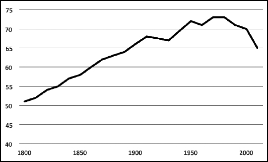
Source: ‘Inequality in the Age of globalisation’, presentation by Branko Milanovic to EU Annual Research Conference, Brussels, 20 November 2017, Lecture in Honour of Anthony A. Atkinson.
Gini coefficients for wealth
There is little data available for the trends in Gini coefficients for wealth, but I include data for the UK (Table 3), for Canada (Figure 4) and for the US (Figure 5).
Table 4. Great Britain, July 2006 to June 2014 Gini coefficient
| July 2006 to June 2008 |
July 2008 to June 2010 |
July 2010 to June 2012 |
July 2012 to June 2014 |
July 2014 to June 2016 |
|
| Property Wealth (net) | 0.62 | 0.63 | 0.64 | 0.66 | 0.67 |
| Financial Wealth (net) | 0.81 | 0.81 | 0.92 | 0.91 | 0.91 |
| Physical Wealth 2 | 0.46 | 0.45 | 0.44 | 0.45 | 0.46 |
| Private Pension Wealth | 0.77 | 0.76 | 0.73 | 0.73 | 0.72 |
| Total Wealth 1 | 0.61 | 0.61 | 0.61 | 0.63 | 0.62 |
Source: Wealth and Assets Survey, Office for National Statistics.
The UK data18 show little trend since 2007, but with a slight increase in the more recent years and a falling back in the latest period. The trends in pensions wealth seem to be in the opposite directions to the trends in property and financial wealth.
There is some Canadian data available which suggests a fall in wealth inequality in Canada: ‘there has been a 17% decline in the Gini Coefficient (the most popular indicator of inequality) on Canadian net worth between 1970 and 2012. As well, both top decile share and top quintile share have declined over the same period, although by a smaller percentage.’19
Figure 3 shows estimates for the US Gini coefficient for wealth since 1962. It shows a jump in the concentration in recent years and is consistent with the picture produced by the analysis of the shares of wealth of the top 1% and the top 10%.
Inequality between countries
So far we have looked only at inequality of income and wealth within countries.
Milanovic has examined measures of inequality of wealth that don’t simply look within countries but also cover the world as a whole. He demonstrated in his so-called ‘elephant graph’ that while inequality within countries has risen, with globalisation and the rise of the Asian and other economies, inequality between countries has fallen.
As a result, looking at the whole world, the groups of income earners whose incomes have been most squeezed in recent years have been those who are relatively well-off by international standards.
Figure 4 from Milanovic shows how the different parts of the global distribution of income have been affected by the globalisation of recent years. It shows clearly that those whose incomes have been most badly affected have been poor people in rich countries who in terms of the global distribution of income are in fact among the relatively rich. These are concentrated between the 75th and 90th percentiles in the global income distribution.
Figure 3. Gini wealth coefficients for the US
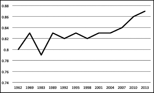
Source: Edward N. Wolff, ‘Household Wealth Trends in the United States, 1962 to 2013: What Happened Over the Great Recession?’, Russell Sage Foundation Journal of the Social Sciences 2(6), 2016. pp. 24-43.
Figure 4. The ‘elephant graph’ – the change in real income between 1988 and 2008 at various percentiles of global income distribution (calculated in 2005 international dollars)
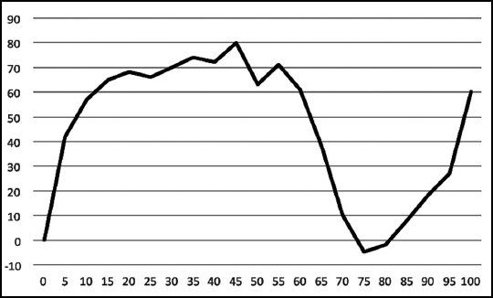
Source: Branko Milanovic, Global Inequality: A New Approach to the Age of Globalisation, Harvard University Press, 2016, fig. 1.3, p. 31. The vertical axis shows the percentage change in real income, measured in constant international dollars. The horizontal axis shows the percentile position in the global income distribution. This runs from 5-95 in increments of five (technically called vigintiles as they represent one-twentieth each) while the top 5% are divided into two groups, those between the 95th and 99th percent and the remaining top 1%.
The Resolution Foundation critique20
The Resolution Foundation, in its pamphlet ‘Examining an Elephant’, has made three criticisms of the elephant graph. The first is that the shape of the graph is distorted by the inclusion of some important economies in the end period that are not in the beginning period. This does not fundamentally affect the shape of the graph but does shift it up slightly for the higher income vigintiles (apologies for using this obscure word but the sample is divided into 20 parts – 5 percentage points each, so the first point is 0-5%, the second 5-10% and so on. The technical name for these one-twentieth parts is vigintiles). The second is that the shape of the graph is affected by population growth in some of the specific economies. This is true, but it does not necessarily mean that this growth should be excluded. The third is that if China is excluded then the results are completely different. Again this is true, but it does not seem sensible to exclude China.
Another way of testing the Resolution Foundation conclusions is to look at my conclusion, in my Gresham lecture, that inequality between countries has diminished.21
At an OECD Policy Forum on inequality, Richard Freeman, professor of economics at Harvard University, noted that ‘the triumph of globalization and market capitalism has improved living standards for billions while concentrating billions among the few. It has lowered inequality worldwide but raised inequality within most countries.’22
The reason for this paradox is that although inequality has risen within countries, it declined significantly between countries.
The first decade of the 21st century has seen both the middle income grouped countries and the poor countries catching up with the rich. The upper-middle-income countries have done best, mainly because of China, and the lower middle income countries have done nearly as well, mainly because of India. The poorer countries have done much better than the richer countries but not as well as the middle income countries. Figure 5 shows the definitions of these country groupings by income and shows how all the groups have grown faster than the rich countries.
Because this period includes the financial crash of 2007/08 it clearly may exaggerate the pace at which the economies are converging, but this was in fact happening before the crash and has actually accelerated, with the poorer economies doing even better since the crash. Cebr’s latest global forecasts, released on Boxing Day 2017,23 show continued convergence, with incomes in the poorest countries growing especially rapidly.
Figure 5. Annual GDP Growth by different country income groupings (per capita income annual percentage real PPP growth 2000-10)
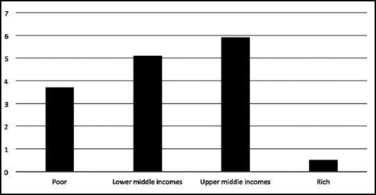
Source: World Bank.
The conclusions of the Canadian Conference Board report support those of Professor Freeman that there has been convergence in incomes between rich and poor countries since 2000 using data that is unweighted by population (because of the very large weights of India and China when weighting by population). The same trend appears to be have been in existence since 1960, though the evidence here uses data that is weighted by population and so is dominated by the experience of India and China.
Figure 5 shows that the rich countries have grown very much more slowly than the middle income countries especially but also more slowly than the poor countries. And this is one of the reasons for the basic shape of the elephant graph.
There seems to be an inbuilt resistance to accepting that globalisation can have an effect on the distribution of income. But this is surprising, since it would seem pretty obvious that the least skilled jobs are most likely to be competed against by the newly upskilling emerging economies. My M.Phil thesis in 1973 on the first two electronics plants in Malaysia showed how these were likely to suck jobs out of the developed economies and into the emerging economies with the corresponding effect on income distributions. As I predicted it before it happened and then it happened as I predicted, I guess I have some basis for saying that I am probably right in my explanation!
To be fair it is not only the least skilled jobs that are affected. Classical musicians are amongst the world’s most skilled workers. Yet their pay in the UK appears to have stagnated in nominal terms in recent years as the numbers wanting to work in the UK has risen dramatically.24 Interestingly this has not been the case in the US where the musicians are heavily financed by private patronage and pay is kept up by an aggressive trade union.
The last piece of evidence is from the 2016 issue of the Credit Suisse Global Wealth Report. This is an enormous resource on global wealth. It shows how wealth was distributed in 2016 and that the bulk of the most wealthy people are still in the West. But looking at past history shows a dramatic change in the share of the world’s wealth held in the traditionally poorer countries. As this continues, the degree of concentration of wealth in the richer countries is unlikely to remain the case as globalisation proceeds further.
Longer-term inequality analysis
An interesting longer-term analysis of inequality in England and Wales and subsequently the United Kingdom going back to the 13th century has been produced by the economists Max Roser and Esteban Ortiz-Ospina.25 They make the important but often ignored point that the scope for inequality grows as economies grow. A wholly subsistence economy has very little opportunity for inequality since there is a lower limit (the subsistence level) below which people cannot survive for any length of time. As economies get more prosperous, the opportunities for inequality increase.
They point out that ‘The United Kingdom is the country for which we have the best information on the distribution of income over the very long run.’
The message from the long-term analysis is that inequality on all measures drifted upwards slightly between 1200 and 1800, probably because of the rise in incomes and hence the increased scope for inequality. But from 1800, on the Gini coefficient measure, and from around 1870, on the ‘share of top 5%’ measure, there was a dramatic drop in income inequality. From 1980 till 2008 there was a rise in inequality which appears to have plateaued out since. Indeed on the Gini index inequality has fallen in recent years. There appears to have been a divergence between the behaviour of the Gini measure and the share of incomes of the top groups in the 21st century. The Gini measure fell; the share of incomes for the top groups rose until the financial crisis but then fell. It is highly likely that this phenomenon is largely a result of the overpayment of bankers discussed in Chapter 6.
If you ask most people in the UK whether the tax system reduces inequality they would conclude that it does.
The official data also suggests that it does, though mainly through financing benefits and not so much through the tax system.26 Although the official analysis says that income tax is redistributive, it suggests that this is offset by the negative redistribution of indirect taxes. Many academics accept this, some to the point of being quite outspoken.27
It is important to distinguish between two entirely different concepts. The first is whether tax is regressive. This is analysing what happens to the same person as they get richer – do they pay proportionately more in tax? This is of course affected by spending patterns and there is a theoretical problem, namely how much to allow for the changes in actual spending patterns that take place as one gets richer. There is also a problem with what to do with the fact that the rich save more – do you treat their savings as money eventually to be consumed and therefore to be taxed at some point, or do you just ignore the taxes paid on this money when it is eventually consumed? There is also the problem of the allocation of taxes on property. The ONS data ignore these taxes, which means that they considerably understate the taxes on expenditure paid by the better-off groups.
The second point is whether a tax system redistributes. The conventional measure of tax progressivity is the Kakwani Index, based on an article in the Economic Journal.28 But this is actually a measure of redistribution, not progressivity. In my investigations of this I was delighted to discover that my distinction between progressivity and redistribution had already been written about more than 40 years ago by no less than one of my predecessors as Chief Economist of the Confederation of British Industry, the distinguished economist Dr Barry Bracewell Milnes. In an article in the Economic Journal replying to the Kakwani article he wrote: ‘The distinction between progressivity and redistribution is the essence of the proposed measure of progressivity.’29 He pointed out that on the (then) new measure if all taxes were doubled the alleged progressivity of the tax system would increase, whereas, since progressivity relates to proportions, this should not be the case.
The ONS states that ‘In the financial year ending in 2016, the richest fifth of households paid 14.4% of their disposable income in indirect taxes, while the bottom fifth of households paid the equivalent of 27.0% of their disposable income.’30 This result appears to emerge from different savings patterns, different spending patterns and the failure to take property taxes into account. It also inflates the proportion of indirect tax paid by the poorest groups by including the tax paid on spending financed by benefits even though the benefits are not included in the income level – this is why the figures give a high ratio for indirect tax to incomes.
There is a further problem with the ONS data which purport to show that that the poor pay much more in indirect tax than the rich. This is that surveys of the kind that generate the ONS figures are heavily affected by income variability. People in the survey whose incomes are low are often only suffering from temporary low income. Their spending is likely to be based on their average income over a longer period and so will be high relative to their temporary income. Equally people with high incomes often are only benefiting from temporarily high incomes and again would be basing their spending on what they believed to be their longer-term average income. As a result their spending in relation to their temporarily high income is low and gives a misleading impression of what people with consistently high incomes might spend. This in turn means that the indirect contribution of well-off people is understated while that of less well-off people is overstated.
The top 1% of income earners in the UK pay just under 30% of all income-based taxation. This compares with the equivalent figure in the US where they pay roughly 50% of all federal income tax.
Conclusions
What all this shows is that the position is mixed.
The most important phenomenon is the huge fall in inequality on all measures between the late 19th or early 20th century and the late 20th century. On only one measure in one country (share of top 1% in the US) has the more recent rise in inequality fully reversed this fall. On all other measures in all other countries the recent rise is small in comparison with the scale of the fall in inequality.
The second phenomenon is that since around 1970 or 1980 the very rich (the top 1%) seem to have got relatively richer except over the recent period when bankers’ bonuses have been squeezed from their disequilibrium high levels achieved in 2007/08 (see Chapter 6 for more on the future of bankers’ pay).
Inequality has increased as a problem especially in the Anglo-Saxon world, though the increase has been very much less in Japan and in Continental European countries. This hints that the scale of financial markets, much larger in the Anglo-Saxon economies, has had a role to play in the increase in inequality. Since 2007/08 bankers’ salaries have fallen sharply and inequality in the Anglo-Saxon world has diminished. In the UK on all measures of inequality, the extent of inequality is now at its lowest for 20 years. In the US it is at its lowest for ten years.
The latest data seem to suggest that inequality is at least temporarily plateauing. This would not be surprising because the persistence of low interest rates seems to be driving out some of the excesses of financial capitalism and reducing some of the excessive salaries paid in financial services, so reducing inequality, even while other forces such as technology and globalisation are working in the opposite direction. Also some of the poorest in countries such as the UK have had the real value of their benefits protected while better-off groups in work have faced falls in dis-posable income (partly through tax rises to pay the benefits for the poorer groups). This has meant that on the Gini Index inequality has fallen by much more than on measures that simply look at the shares of the top 1 or 10%.
There are some issues of inequality that I have not attempted to address in this book. One is the growth in intergenerational inequality, especially in the UK. One reason that I do not do this is because the problem is much more serious in the UK than elsewhere and is essentially largely a result of excessive housing costs caused by planning rules that heavily restrict the building of new houses. I deal with this in some detail in Chapter 14 ‘Attacking the law of unintended consequences’ where I show how better balance between economic and environmental requirements are needed to prevent inequality from emerging or to reverse the inequality that has emerged. Another reason is that the problem has been well described by David Willetts in his book The Pinch: How the Baby Boomers Took Their Children’s Future – And Why They Should Give it Back, and there is very little that I can usefully add.31