The goal of this chapter is to present you with a general feeling for what Six Sigma is about: its focus, structure, and emphasis on data. Like ISO 9001:2000 and CMMI, Six Sigma is an in-depth process improvement program. The intention of this book is to give you a summary of each of these three leading standards so that you can begin to assess which one might be right for you, or—better yet—what parts of each might help you reach your quality goals. And that brings us to the A in DMAIC.
The A in DMAIC is for analysis, analysis of the data you have collected. This is a big subject, and it is not one that this chapter can explore to the depth that might be warranted. But the central idea here—and the central activity—is to analyze the data you've collected in order to determine the root causes of defects or poor performance, and then to establish an empirical basis for improving the process.
The key is to identify root causes of process variation, or instability, not just the symptoms. The symptoms are almost always pretty easy to spot, and they often appear to be easy to fix. A jammed printer is a good example. The paper is all crumpled up around the roller. So we take out the sheet, and we're ready to go again. We fixed the symptom, but chances are, the problem is still there: a dirty roller, a misaligned sheet feeder.
With Six Sigma, the story is always in the data. That's the story of how your systems are really performing. And with Six Sigma, the solution is always in the data, too.
Data analysis can be simple or it can be complex. In traditional Six Sigma projects, quite a few complex statistical and quantitative analyses can be used. We take a very brief look at some of these in the next section. But the techniques don't always have to be complex.
For example, you might run a process and then collect data on process performance values. Say you have a process to create a Configuration Management Plan for software projects. You gather the time it takes your configuration analysts to create plans for 12 projects over the period of four months. You look at the data. The value set might look like this: (3 hrs, 4 hrs, 2 hrs, 7 hrs, 3.5 hrs, 2.9 hrs, 3 hrs, 2.5 hrs, 4.5 hrs, 5 hrs, 4 hrs, 4.5 hrs). You total those values up and get 45.9. You then divide that by 12 and get 3.8 hrs.
That's the average amount of time it takes your configuration analysts to create a Configuration Management Plan for one of your software projects.
If that number seems high to you, you might look a little deeper. You might look at your plan template and see if maybe it's calling for too much information or if maybe the template is somehow confusing. You might check to see if the analysts have been properly trained in how to fill out the template. This data can point you to multiple improvement potentials.
The point is that you did a simple average analysis to get this insight.
The kinds of analyses used on project data will naturally vary from organization to organization. This is influenced by factors such as the type of problems being investigated, the kinds of data collected, the capabilities of your team, and the kinds of solutions you are looking for.
Six Sigma typically employs formulations for such indicators as:
Measures of central tendency
Histograms and data shapes
Process capability indexes
Percent noncompliant calculations
Upper and lower control chart limits
Data segmentation and stratification
Correlation and regression (linear, multiple)
Process performance (Cp, CpK, Pp, PpK, CpM)
Short-term versus long-term capability
Non-normal data distribution transformations
Central Limit Theorem
Goodness-of-fit testing
Hypothesis testing
Analysis of variance (ANOVA), two sample t-tests, chi-square tests
Design of Experiments (DOE): full, fractional factorials
These are great tools and techniques, but even though Six Sigma has a deep foundation in these capabilities, you don't have to feel that you are honor-bound to adopt these for your Six Sigma projects. Use the analytical techniques—sophisticated or simple—that best help you understand your data in meaningful ways.
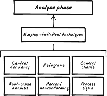
Figure 7-5 illustrates the analyze phase of DMAIC.
Figure 7-5. In the analyze phase of DMAIC, the objective is to draw the performance out of the data. This is where most of the well-known Six Sigma techniques come into play. The use of histograms, measures of central tendency, control chart derivation, process capability indexes, and process sigmas can all be used in this phase.
I'll repeat my basic premise about our look at Six Sigma here: this book is not intended to be a complete tome on the statistical and analytic techniques applicable to Six Sigma projects. The intention is to give you a pretty good feel for the structure and focus of Six Sigma. If it seems that this program may be helpful to your organization, then you can move forward to deeper investigation. However, in this section, we'll take a very topical look at a typical statistical path a team might follow when analyzing data on a Six Sigma project.
Note
The statistical descriptions provided in the following sections are presented to give you a feel for the kinds of analyses that can take place under a Six Sigma program. If this is of interest to you, good. If not, don't worry. The statistics described here, while valid and typical, are not essential to your appreciating what Six Sigma might be able to help you with. So you need not pay special attention to the statistics in this section if they hold no real interest for you.
Based on the details described in the project plan, the team collects the field data they acquired from examining process performance. There are a couple of considerations the team should keep in mind. First, collect enough data. The word "enough" is going to depend on the focus, size, and scope of the project. But for basic statistical legitimacy, the minimum number of data points should be no less than 100. Second, keep the data points in time sequence. This is important because the time sequence helps establish the performance patterns in the data.
All data sets have a shape. Valid data—data that can be used as a basis for statistical analyses—shows a valid shape. So an essential first step in performing statistical analyses is to determine the shape of your data. If you plot the data and the expected shape begins to take form, you know your data can be analyzed, and so you are free to move forward. But if your data's shape does not take expected form, there's no purpose in going further. You may need to begin again. Maybe you didn't collect enough data. Maybe you collected disparate kinds of data. Whatever the reason, if the data is not amenable to analysis, there's no point in analyzing it.
A histogram is a picture of your data. It's a bar chart, and from this you examine the shape for validity.
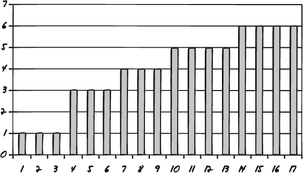
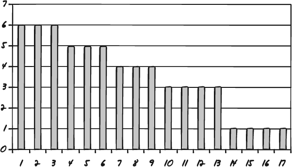
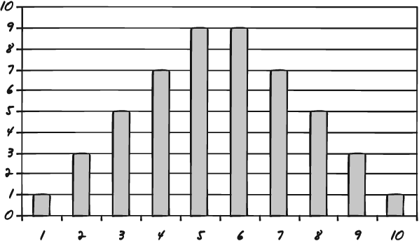
Once you have plotted your data points as a histogram you can examine the shape of the data. Figures 7-6, 7-7, and 7-8 are three sample histograms with valid shapes.
Figure 7-6. This data sample, while not a bell curve, shows a normal shape—a trend we would expect: abilities improve with each advanced grade level.
Figure 7-7. Here is another example of "normal" data. Lifting weights includes a "fatigue factor." People lift less after lifting for a while.
Figure 7-8. The traditional bell curve once again shows the tendency for data to cluster around the middle with extreme values falling off to either side.
The histogram in Figure 7-6 shows math, reading, and writing scores for school children at varying school grades. Notice that as a child advances in school, scores go up. This is to be expected, and so the shape of this data is said to be valid.
Figure 7-7 shows what appears to be an opposite example.
The histogram in Figure 7-7 has the opposite shape, and so we might think that it is invalid. But this is a histogram of fatigue factors. It shows three people's abilities to lift weights across five exercise sets. The graph shows that the people lift less weight as the number of attempts increase. This is also to be expected, and so the shape of this data is said to be valid.
The shape in Figure 7-8 is also a valid shape. It is the shape of random data. It is the traditional bell curve, with a central tendency and values falling away about equally on either side.
Valid data shapes are defined as statistical realities. They are not based on simple "expected shapes." But it is safe to say that all data has a valid shape and that it is important to ascertain the shape of your data before you move into further analyses.
Once you have determined that the shape of your data is valid, you can move forward with the next step. The next step is preparing to produce control charts. Control charts are plotted charts that help you determine whether your process is under control. This is an important concept. A process that is under control is statistically predictable. And because it is predictable, it should be stable. (Even if it is working poorly, it can still be stable.) And in terms of process improvement, you can improve only a stable process, a process that is under control, a process you can control.
Another point to remember is that even stable processes exhibit variation. The core idea behind all process improvement is to reduce the amount of this variation.
There are three common measures of central tendency: mean, mode, and median. In a sample of data, the mode is the most frequently occurring value, the median is the value right in the middle on the range, and the mean is the average of all the values.
You calculate the mean by adding up all the values in the sample and then dividing that total by the size of the sample.
In the sample (5, 2, 3, 5, 1, 4, 5), the mode is 5 (most frequently occurring), the median is 4 (the middle value), and the mean is 3.57 (the average).
The mean is represented as X̄ and will be used in further calculations.
When you collect multiple samples of the same size (a good practice for comparative statistics), you can generate a value known as the grand average or the grand mean.
In a data set of seven samples, each with a size n=10, the averages may appear as (4, 7, 5, 6, 4, 5, 7). The grand mean for this set would be 5.4.
The grand mean is represented as X̄ and can also be used in further calculations.
The range defines the degree of variability in a sample. The range is determined by subtracting the lowest value in the set from the highest value.
In the set (4, 9, 3, 3, 2, 5, 6), the range is 7 (9–2).
The range is represented as R and can be used when you are creating control charts.
The average range can be calculated when you have multiple sample sets. You determine the average range by summing the value of the ranges for the individual samples and then dividing by the number of samples.
If you have five samples, and the range values for each are (7, 4, 2, 4, 6, 5), the average range is 4.6.
The average range is represented as R̄, and is used when you are creating control charts.
The upper and lower control limits for the mean are used to develop an X-bar control chart, a form of a control chart. The formula to derive the upper control limit for the mean (UCLX̄) is:
You calculate this by first knowing your sample size. If you collected 2,000 measures across 5 sampling efforts, your size is 5. If you collected 10,000 measures using only 1 sampling effort, your size is 1.
Knowing the sample size (n), you can now consult a table of Shewhart constants. This is a table of numerical constants used to develop control charts. There is a column on the chart labeled A2. You align that column with the nth sample-size row. In a sample size of 5, A2 equals .58.
Next you gather the grand mean from the data as well as the average range (covered earlier). Then you can calculate the upper control limit for the mean. If the average mean is 7 and the average range is 12, the calculation is as follows:
UCLX̄ = 7 + .58 * 12
UCLX̄ = 91
Next you calculate the lower control limit for X̄. That formula is:
You now follow the same steps as you did earlier, only now the calculation is:
LCLX̄ = 7 − .58 * 12
LCLX̄ = 77
You can now plot the control chart using the upper and lower limits and the values from your data samples.
The upper and lower control limits for the range are used to develop an R chart, another form of a control chart. The formula to derive the upper control limit for the range (UCLR) is:
Just as with the control limits for the mean, you calculate this by first knowing your sample size. If you collected 2,000 measures across 5 sampling efforts, your size is 5. If you collected 10,000 measures using only 1 sampling effort, your size is 1.
Knowing the sample size (n), you can now consult a table of Shewhart Constants. This is a table of numerical constants used to develop control charts. There is a column on the chart labeled D4. You align that column with the nth sample-size row. In a sample size of 5, D4 equals 2.11.
Next, you gather the average range from the data (as shown previously). Then you can calculate the upper control limit for the range. If the average range is 12, the calculation is as follows:
UCLX̄= 2.11 * 12
UCLX̄= 25.32
Next you calculate the lower control limit for X̄. That formula is:
You now follow the same steps as you did earlier, only now you use the D3 column from the Shewhart table.
For this example, the D3 value is 0, so the calculation is:
LCLR= 0 * 12
LCLR= 0
You can now plot the control chart using the upper and lower limits and the values from your data samples.
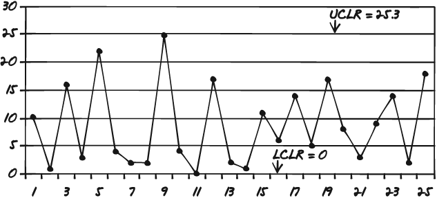
With the upper and lower control limits for the mean and the range in place, you can now plot the X-bar control chart and the range control chart. The two limits are used to frame where normal variation starts and stops with each chart. Now you pull out your data sets and plot each value on the charts.
Figure 7-9 is an example of how the range control chart might look.
Like histograms, control charts give you a good picture of your data. The charts tell you two things. The first trait they indicate is the stability of your process. As noted earlier, if the process is not stable, you cannot reliably improve it because you can't be sure that what you modify will really have an impact on performance in a consistent way. So if you find from the control charts that your process is not under control, you should probably go back and redesign a new experiment.
How does the control chart show control? Easy. Just look at the upper and lower control limits. If any of the data you have plotted falls outside of that range, you have special-cause variation at work. Special-cause variations are factors that affect process performance that are not derived from the process itself. In other words, something outside of the process is impacting process performance. If the data points all fall within the range, then you have a process under control—even if there is a great degree of variability. The way the in-limits points vary from one to another is called common-cause variation.
If you find that all the points fall within the limits and your process is under control, then you know you can now begin to move to tighten up the process, bring it more under control, shrink the common-cause variation.
The upper control limits and the lower control limits are statistical boundaries imposed on your data. There is another concept in Six Sigma: customer specs. There are two values here, the upper customer spec and the lower customer spec. These are the process performance limits imposed by the customers. Take pizza delivery, for example. A customer might accept a delivery that is up to 10 minutes early, but no earlier, or up to 10 minutes late, but no later. An automobile company might accept a ball bearing that is 5 mm in diameter, plus or minus .25 mm. These limits are important because they overlay with the upper and lower control limits to give your process measures a focal point in the reality of quality. Here is where you begin to see how closely what your process is doing matches to what your customer wants. The upper customer spec provided is typically called the Uspec. The lower customer spec provided is typically called the Lspec.
Once you have determined all the figures and calculations discussed previously, you may well end up with determining data that will allow you not only to understand how your processes have been performing to date, but predict how they will perform in the future. In fact—helpfully—you can predict how many defects the process will produce, to close approximation, each time you run it. This is called percent noncompliance, or %NC.
The formula for %NC is:
%NC = ZU + ZL * 100
To get to %NC, you will need to generate two Z values: ZU and ZL.
The formula for the first is:
To get this figure, you take the upper customer spec and subtract the grand mean from it; then you take the absolute value of that sum and divide it by sigma.
Here is the formula for sigma:
Here you go back to the Shewhart constants. You take the average range value and divide it by the D2 column on the table, lined up with the sample size (n).
You calculate the lower Z value the same way as the upper Z value:
Then to generate %NC, add ZU to ZL, and multiply by 100.
Now you might want to determine the process sigma. This is done by determining the process yield. Run your process and count the defects (or generate %NC as described earlier). The process yield is calculated by subtracting the total number of defects from the total number of opportunities, dividing by the total number of opportunities, and finally multiplying the result by 100.
Here's an example.
You run a process that produces 18 defects.
You know from the process analysis that there were 12,500 opportunities for defects—chances where defects could have crept in. So you subtract 18 from 12,500 and get 12,482.
You then divide 12,482 by 12,500 to get .99856. You multiply .99856 by 100 to get 99.856. That is your process yield.
The final step is to use the process yield and look up the value on a sigma conversion table, such as the following:
|
Yield % |
Sigma |
Defects Per Million Opportunities |
|---|---|---|
|
99.9997 |
6.00 |
3.4 |
|
99.9995 |
5.92 |
5 |
|
99.9992 |
5.81 |
8 |
|
99.9990 |
5.76 |
10 |
|
99.9980 |
5.61 |
20 |
|
99.9970 |
5.51 |
30 |
|
99.9960 |
5.44 |
40 |
|
99.9930 |
5.31 |
70 |
|
99.9900 |
5.22 |
100 |
|
99.9850 |
5.12 |
150 |
|
99.9770 |
5.00 |
230 |
|
99.9670 |
4.91 |
330 |
|
99.9520 |
4.80 |
480 |
|
99.9320 |
4.70 |
680 |
|
99.9040 |
4.60 |
960 |
|
99.8650 |
4.50 |
1350 |
|
99.8140 |
4.40 |
1860 |
|
99.7450 |
4.30 |
2550 |
|
99.6540 |
4.20 |
3460 |
|
99.5340 |
4.10 |
4660 |
|
99.3790 |
4.00 |
6210 |
|
99.1810 |
3.90 |
8190 |
|
98.9300 |
3.80 |
10700 |
|
98.6100 |
3.70 |
13900 |
|
98.2200 |
3.60 |
17800 |
|
97.7300 |
3.50 |
22700 |
|
97.1300 |
3.40 |
28700 |
|
96.4100 |
3.30 |
35900 |
|
95.5400 |
3.20 |
44600 |
|
94.5200 |
3.10 |
54800 |
|
93.3200 |
3.00 |
66800 |
|
91.9200 |
2.90 |
80800 |
|
90.3200 |
2.80 |
96800 |
|
88.5000 |
2.70 |
115000 |
|
86.5000 |
2.60 |
135000 |
|
84.2000 |
2.50 |
158000 |
|
81.6000 |
2.40 |
184000 |
|
78.8000 |
2.30 |
212000 |
|
75.8000 |
2.20 |
242000 |
|
72.6000 |
2.10 |
274000 |
|
69.2000 |
2.00 |
308000 |
|
65.6000 |
1.90 |
344000 |
|
61.8000 |
1.80 |
382000 |
|
58.0000 |
1.70 |
420000 |
|
54.0000 |
1.60 |
460000 |
|
50.0000 |
1.50 |
500000 |
|
46.0000 |
1.40 |
540000 |
|
43.0000 |
1.32 |
570000 |
|
39.0000 |
1.22 |
610000 |
|
35.0000 |
1.11 |
650000 |
|
31.0000 |
1.00 |
690000 |
|
28.0000 |
0.92 |
720000 |
|
25.0000 |
0.83 |
750000 |
|
22.0000 |
0.73 |
780000 |
|
19.0000 |
0.62 |
810000 |
|
16.0000 |
0.51 |
840000 |
|
14.0000 |
0.42 |
860000 |
|
12.0000 |
0.33 |
880000 |
|
10.0000 |
0.22 |
900000 |
|
8.0000 |
0.09 |
920000 |
Based on the table, your process is operating at 4.5 sigma. Congratulations.
The analysis phase can employ a good number of statistical tools and analytical techniques. Some of the common ones include:
Histograms
Pareto charts
Time series/run charts
Scatter plots
Regression analyses
Cause-and-effect/fishbone diagrams
Five whys
Process map review and analysis
Value stream mapping
Descriptive statistics
Inferential statistics
Probability analyses and trending
Cause-and-effect diagrams
Failure mode effect analyses
