4.1
Jill Desimini, Shaded-Relief Palettes, 2014.
A continuous tone that represents changes in elevation and landform by simulating a cast shadow thrown upon a raised relief map or model.
The most vivid and illustrative form of topographic depiction, the shaded relief paints a more complete picture of the landscape, using color and tonal gradients to blend varying elevations. The terrain is not abstracted into a series of lines with diminished white space indicating steepness, as with hachures, nor is it abstracted into concentric horizontal slices that indicate steps and terraces where they do not exist, as could be said of contours. Rather, shaded relief captures the most intricate forms in a fluid gradation of tonal variation.
In Leonardo da Vinci’s 1502 Bird’s-Eye Map of Western Tuscany, the hill forms are individually depicted, drawn in a pictorial tradition of molehill-like and conical shapes representing relief features. [FIG. 4.4] Yet in this case the landforms are also continuously related, blending into one another to show the aggregation of smaller hills into larger masses that frame the river valleys. The chiaroscuro technique, known for its strong contrasts, allows the voluminous qualities of the undulating ground to emerge through the interplay of light and dark. It is these last two qualities, the continuity of topography and the adept use of shadow, that are the key characteristics of shaded-relief drawings.
Emerging from both the pictorial tradition of depicting relief and the use of hachure as a lines-only approximation of tone, the shaded relief is a painterly technique of landform depiction. There are two types of relief shading: slope shading and oblique, or hill, shading. With slope shading, tones are graded on the now familiar principle of “the steeper it is, the darker it is.” In oblique shading, tones correspond to shadows illuminated from an oblique angle, mimicking an aerial photograph with the sun at a certain position; the light is diffuse, and the shadows are most effective with westerly or northwesterly illumination, depending on the hemisphere and the type of landform. Both slope shading and oblique shading are sometimes combined to heightened effect. In this instance, contradictory demands defy strict rules, and compromises are made especially when it comes to steep, sunny slopes—where the slope shading would normally be dark (to convey steepness), the shadow shading normally light (to convey sunniness).
Because shaded relief plays on our perception of light and shadow, mathematically accurate representations can appear false. For example, a sunny slope would exhibit less contrast with flat areas than a shadowed slope at the same angle would. The result is technically defensible but visually misrepresentative. Of the two systems, slope shades yield greater consistency, but even they fail to represent clearly the myriad terrain variations. Thus, despite (or perhaps because of) the seamless representation, a shaded-relief drawing can be deceptive. The lack of omission or hierarchy is, in fact, its limitation. In this regard, the fully rendered plan is the design drawing equivalent to the shaded relief map.
Pre-aviation, pre-Google cartographers exhibited great skill in the imagination and projection of three-dimensional features into a two-dimensional drawing. Large-scale, physical relief models were the tools for this endeavor and formed the basis of the shaded-relief simulation. Today these models are digital.
Design practice similarly places great emphasis on the model as the ultimate tool to envision space. Terrain models are fundamental, central to the work of numerous design practices, notably those led by landscape architects Kathryn Gustafson, Philippe Coignet, and George Hargreaves. The model aids in the generation, testing, and construction of the designed landscape. Here, the cartographic process is reversed. While historic mapmakers worked from landscape to model to drawing, designers often work from drawing to model (or model to drawing) to landscape.
A well-executed shaded-relief drawing has the potential to evoke mood, sensation, composition, and atmosphere. Much of this is affected by the selection of tones and tints. The coloration of shaded relief has received much attention within the cartographic discipline, with conflicting ideas about appropriate schemes. At the most basic level, there is a divide between using color to describe physical and cultural features or simply using it to define elevation. Further, the palettes that seek to emulate the natural colors of the earth can be differentiated from those that use a system based on convention rather than physical properties. One convention uses green for lower, presumably damper elevations and brown for the more arid, higher elevations. Another, by contrast, uses a heat map spectrum with green for lower elevations and red or white for higher elevations. A third approach deploys shades, from light to dark, of a single color.
The continuously rendered landscape is most instrumental when it strays from realism and the goal of accurate reproduction. To fully stimulate the imagination, the vividness of the drawing must supersede the reality and bewilder the mind. With the prevalence of aerial imagery, it is possible to virtually visit the far reaches of the earth. With drawing and modeling tools, computational capacity, and data availability, it is also possible to produce full and accurate landscape depictions. To be projective and provocative, editing is required. It becomes crucial to balance the real with the imagined, the fully described with the deliberately omitted, the distant with the immersive. Digital modelling facilitates landscape rendering, allowing for the layering of material and cultural features atop a shaded terrain image. The challenge is to produce a plan drawing that is not banal and generic but engaging and specific, as exemplified by the PROAP drawing of the Porto Waterfront. [FIG. 4.12] This chapter covers relief shading from pictorial to planar, terrain model to drawing, grayscale to color, phenomenological to material.
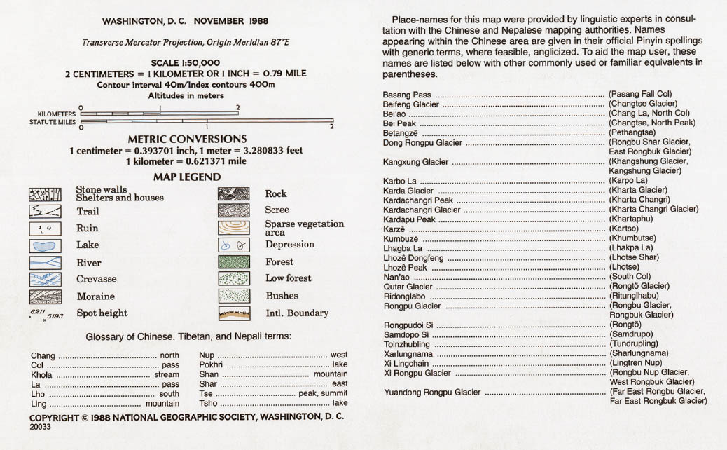
4.3
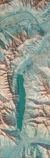
National Geographic Society, Mount Everest, 1988. Scale: 1:50,000 (shown at half size).
Under the direction of Bradford Washburn, National Geographic’s Mount Everest map combines advanced surveying, skilled rendering, and geopolitical collaboration. The execution is a joint effort between Chinese, Nepalese, and American cartographic teams, and the multicultural authorship is reflected in the trilingual place names. The terrain is shown through shading, contouring, spot elevations, and cliff drawing in the Swiss tradition, by National Geographic staff cartographer Paul Ehrlich. The contours distinguish between the terra firma of the mountainous forms and the liquidity of the glaciers.
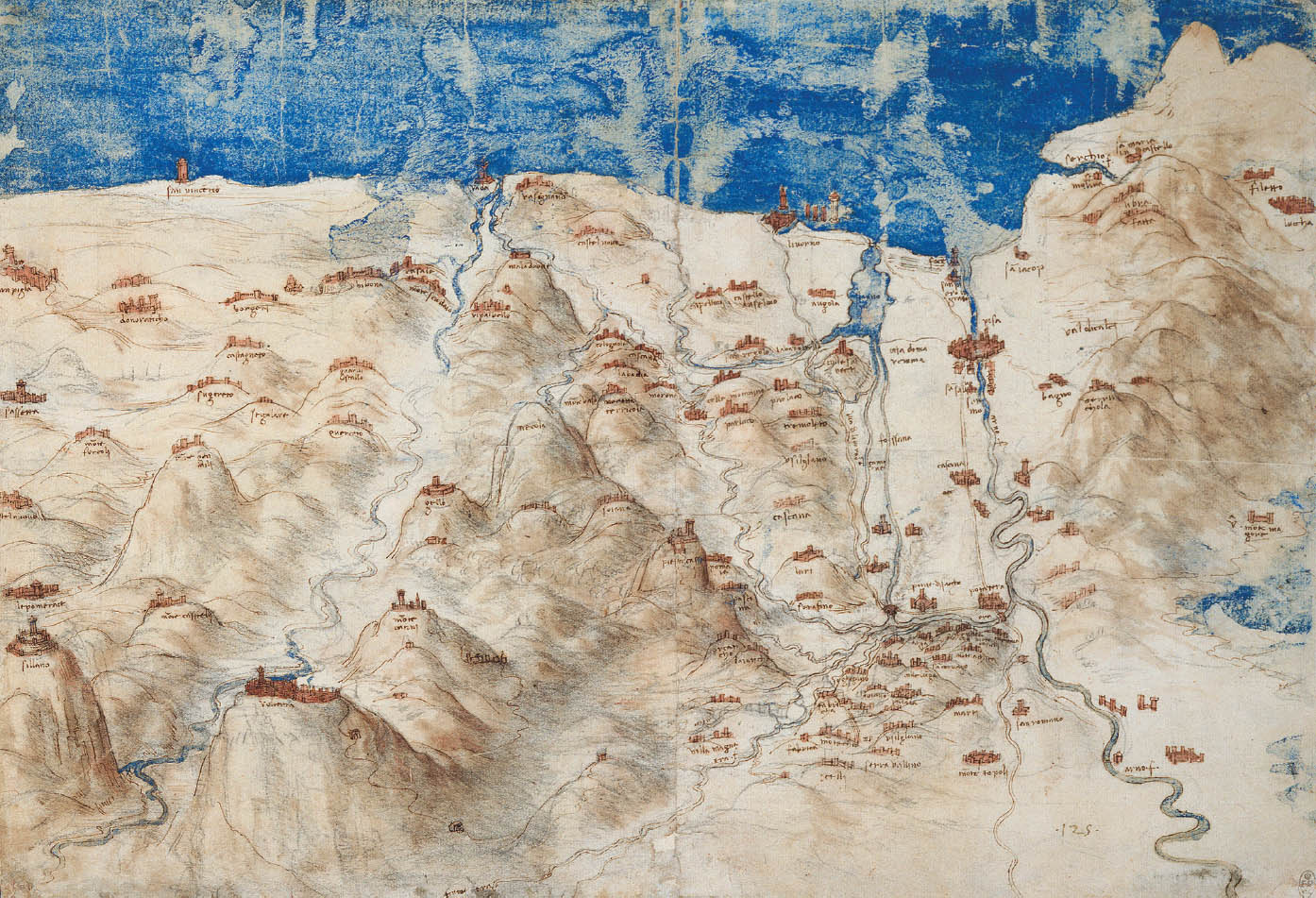
4.4
43.4100° N, 11.0000° E, Leonardo da Vinci, A Bird’s-Eye Map of Western Tuscany, 1503–4.
Da Vinci’s drawings are noteworthy for their topographic rendering and optics as well as for the engineering information embedded within them. He surveyed and depicted the Arno River region extensively and proposed ambitious canals to divert the river as part of a Machiavellian project during a war between Florence and Pisa. The Bird’s-Eye Map of Western Tuscany has incredible hill shading, one of the finest examples of chiaroscuro applied to topography, making it a precursor to later shaded-relief drawings.
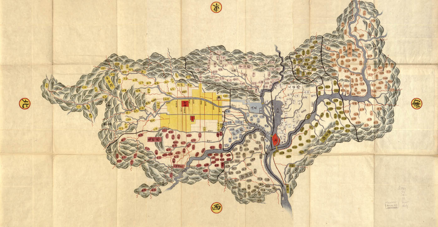
4.5
36.2833° N, 136.3670° E, Yamashiro no Kuni ezu, 1800.
This map is a product of a nationwide, multiyear, governmentally coordinated mapping effort that aimed to standardize and coordinate the description of each province in Japan. The goal was to describe the physical characteristics (topography, water bodies, roads, coastlines), economic interests (rice-crop yields), and political entities (boundaries and administrative units). The villages are represented with small ovals, agricultural fields in solid colors, rivers in blue, and roads in red with varying thicknesses to denote hierarchy. The mountainous terrain encompasses the drawing, with the profiles radiating out from the center. This form of terrestrial mapping descended from celestial mapping and the effects resonate in the polydirectional, constellation-like representation.
4.6
Bruno Taut, Alpine Architektur (Folkwang, Germany: Hogeni, 1919), plate 13.
In response to World War I, German-Jewish architect Bruno Taut envisioned a utopia largely articulated through his five-part manifesto Alpine Architektur. The vision unfolds in a series of annotated illustrations, arguing for the enhancement of alpine architecture with crystalline structures. Taut inserted elegant assemblies—glass arches, shrines, metal thorns, crystal spheres—into the topography to beautify the Alps, to render more evident the spectacular terrain. The result is an integration of morphologies, of built form and mountain form.
4.7
46.9791° N, 8.2562° E, Xaver Imfeld, Alpen-Panorama vom Pilatus, 1888.
Xaver Imfeld was an innovative engineer, a talented draftsman of alpine panoramas, and a master of relief modeling. After 1875, Imfeld completed over forty mountain panoramas, many of which supported the ongoing railway development in the Alps. His diverse training and personal experience with the Alpine landscape led to the creation of meticulously rendered cartographic works. Most of the drawings were based on on-site surveys yet present an impossible view. The result is an elevational representation of the mountainous terrain, where each peak is given equal detail and its own character.
4.8
47.1167° N, 9.2000° E, Eduard Imhof, Karte der Gegend um den Walensee, 1938.
The relative truthfulness of the map as an accurate depiction of empirical reality has been questioned over time, notably by Swiss cartographer Eduard Imhof. Imhof used his perceptual understanding of relief to develop a precise, effective, and accessible two-dimensional translation of the Alps. He argued that previous maps, with their reliance on mathematics, did not describe the terrain as perceived by the human eye. Using a combination of scale models and aerial photogrammetry, Imhof developed a shaded-relief system to convey the material expression and phenomenal feel of mountainous Swiss landscapes.
4.9
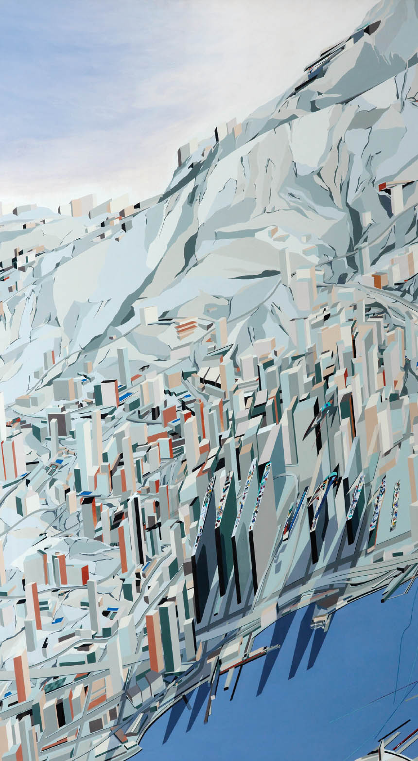
22.3000° N, 114.1667° E, Zaha Hadid, The Peak, 1982–83.
Zaha Hadid’s Blue Slabs painting from the Peak Leisure Club project in Hong Kong depicts the design and its context in rich blocks of color. The painting and the design are inspired by Russian suprematism and local geology. Hadid’s proposal for a man-made mountain of granite slabs set against the intensity of Hong Kong, between mountain and harbor, reads like a landscape. The proposal calls for leveling the ground to the lowest elevation and rebuilding it from excavated rock into a polished mountain. Tones of blue are set against reddish browns and pinks, exquisitely crafted with hard edges defined by color shifts. The tectonic vision is clearly articulated through surficial rendering and a carefully considered palette. Cast shadows highlight the architectural vision, showing the building beams as if flying from the cliffs beyond.
4.10
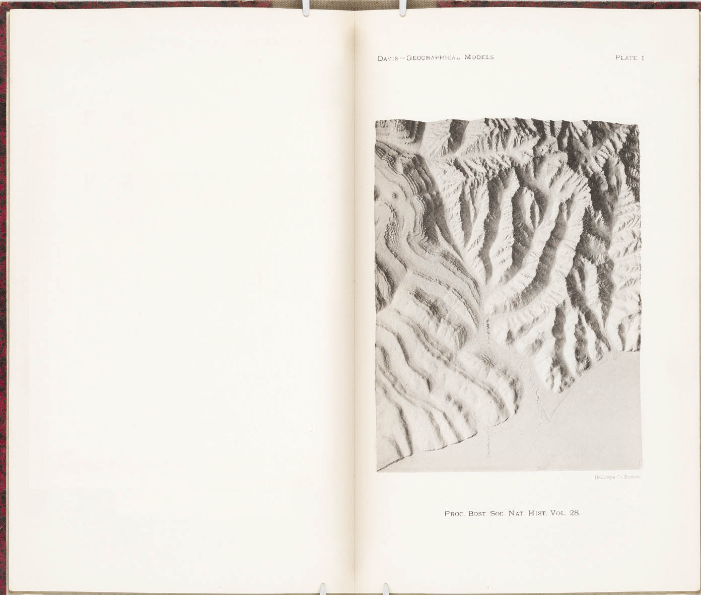
William Morris Davis, The Harvard Geographical Models (Boston: Boston Society of Natural History, 1897), plate 1.
In response to the poor quality of physical models used in geography education, William Morris Davis, using a timely monetary donation, oversaw the construction of three models at Harvard. The models were created from highly detailed shaded-relief drawings, reproduced in beeswax and cast in plaster. The models are relatively small—24 by 18 inches—but high-resolution lantern slides allowed the detail to be projected and used in the classroom. His desire was to produce exemplary prototypes that would demonstrate the potential and value of exact modeling for pedagogy. The models depict idealized landscapes, designed to explain precise but generalized geographical conditions.
4.11
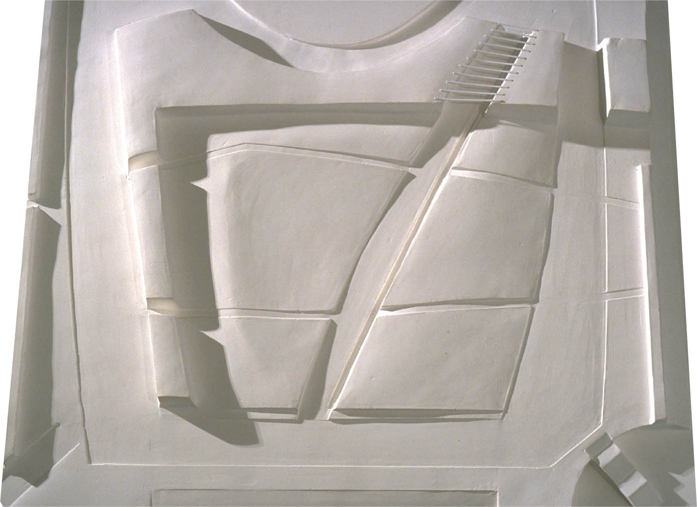
41.8819° N, 87.6278° W, Gustafson Guthrie Nichol, The Lurie Garden, 2006.
Landscape architect Kathryn Gustafson is recognized for her fluid landforms, generated through a process that relies heavily on modeling. Abstract forms are explored through three-dimensional clay models. From the clay maquettes, rubber molds are generated and plaster casts created. The genesis of the project rests with the plaster model, which is often translated into digital form and ultimately cut, carved, and formed into a landscape. Its tactility is expressed through stone, water, earth, and planting.
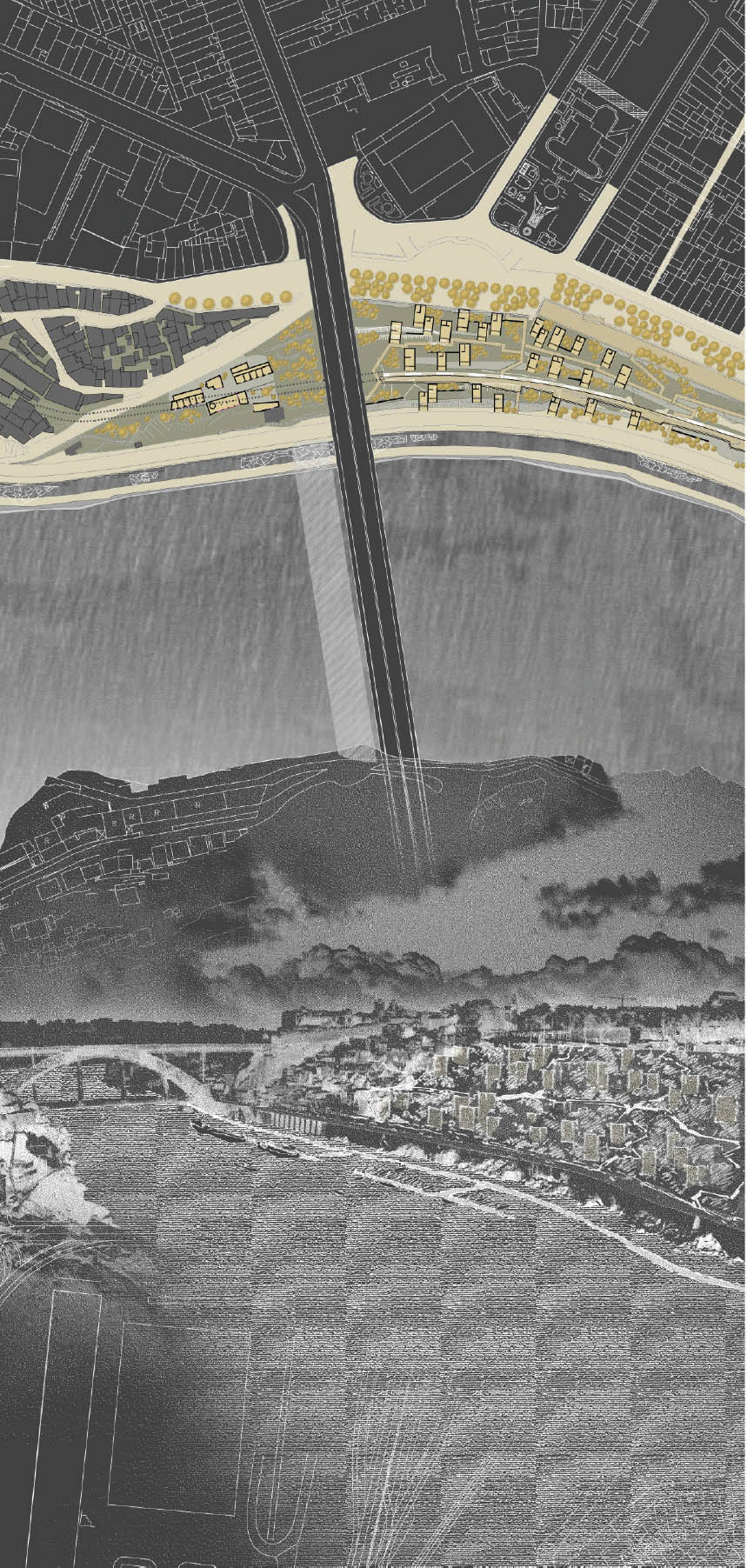
4.12
41.1621° N, 8.5830° W, PROAP, Frente Ribeirinha do Porto, 2007.
The edge between land and water is explored through the juxtaposition and inversion of the plan and the perspective. Here, the focus is returned to the edge—the Porto waterfront—recovering it from an industrialized past toward a recreational future. A series of architectural projects are linked through an urban strategy that extends along the entire 3.5-kilometer length. The notion of arrival and view, of a reinvented civic facade for the city, is articulated representationally through the dexterous merging of the organizational intent shown in the plan and the experiential quality seen in the perspective.
4.13
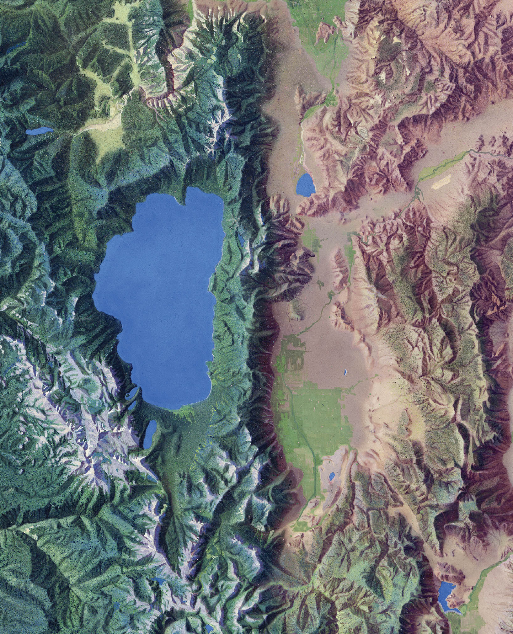
39.5274° N, 119.8134° W, Hal Shelton and Jeppesen Map Company, Reno Area, 1953. Scale: 1:50,000 (shown at half size).
4.14
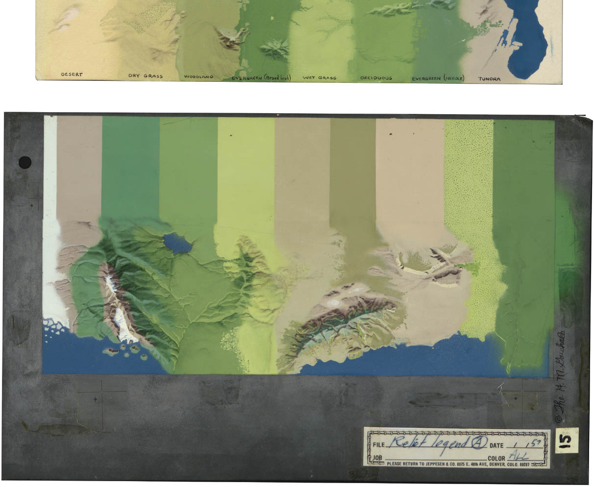
Hal Shelton, Color Legend, 1957.
Hal Shelton, one of the most accomplished American cartographers and terrain artists, was greatly influenced by the aerial and its incongruity with the topographic map. He promoted legibility—without a key—and verisimilitude, arguing that the relief rendering should resemble the landscape subject. Shelton developed a natural-color system to describe the surface of the earth. His maps were often small scale, encompassing countries and continents, with a few exceptions, including this map of the Reno area.
4.15
47.3314° N, 9.4076° E, Eduard Imhof, Relief Map of Appenzell Country, 1923. Scale: 1:75,000 (shown at half size).
The relief map of the Appenzell countryside is one of twelve detailed school maps of the Swiss cantons that cartographer Eduard Imhof worked on between 1922 and 1973. The maps employ different cartographic relief techniques. The Appenzell map is watercolor over a print showing topographical information. It balances clear line work with rich, translucent, painterly tones. The shading renders the form of the landscape, giving a much more dramatic reading than the underlying contours.