6.1
41.3833° N, 2.1833° E, Jill Desimini, Figure-Ground Techniques: Barcelona, 2014. After Joan Busquets [FIG. 6.6], Andreas Matschenz and Julius Straube [FIG. 6.16], and OMA [FIG. 6.10].
A representation of space, often urban, that uses a fill or poché to show the relationship between built structure and fabric.
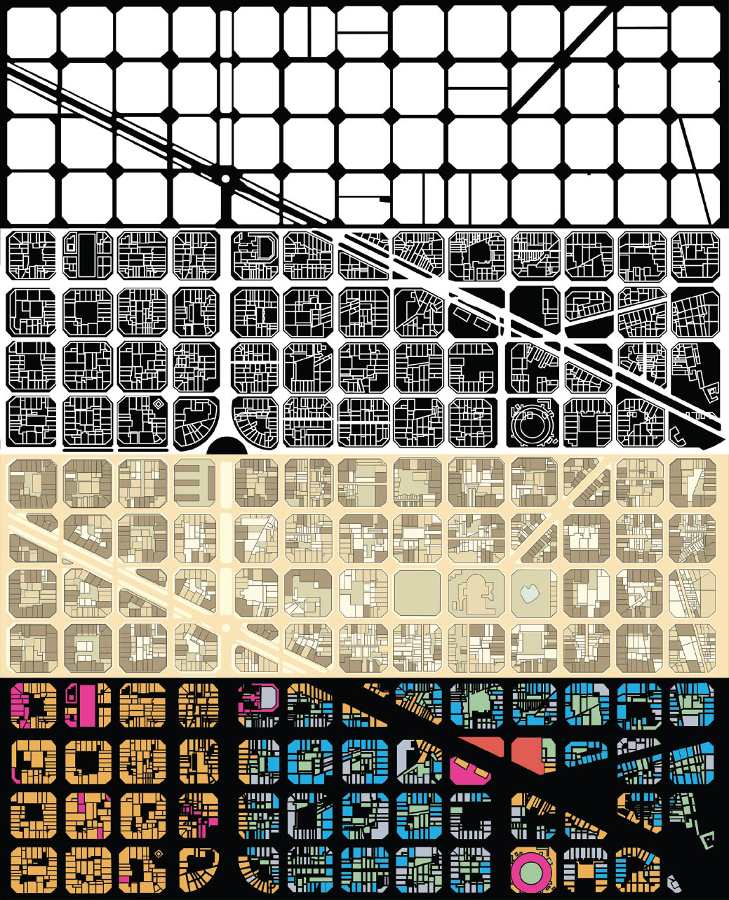
Figure-ground is a binary method that affords a clear and powerful spatial reading of the landscape. The separation of object from field underlies all cartographic and design drawings. While a figure can represent anything, the most fundamental figure-ground relationships in design and cartography include three oppositions: landmass versus water, landform versus flat ground, and built structure versus urban fabric. This chapter focuses on the latter, as a reductive yet revealing form of land-use division.
Devoid of lines, figure-ground depends on the perception of fills and voids as shapes. The default method for making a figure-ground drawing is to fill the figure, or built space, dark, often black, leaving the ground empty or white. The opposite—white figure and black ground—is also used. The ultimate legibility of this system depends on how recognizable the figure is to the eye. The Rubin face vase is a classic example of ambiguity in figure-ground. The choice of the two colors also affects the legibility, with black and white being easiest and blue and black significantly more difficult. With regard to urban fabric, the built form is usually legible through a simple poché, and the representational questions are ones of classification, hierarchy, and differentiation. Representation begins with the precise definition of the figure and the ground, followed by a determination as to whether the figure or ground should read more strongly or whether the opposition should be minimized, and ending with a choice whether to embed more information—time, material, structure, use—within the drawing.
A conventional figure-ground drawing has only two layers, described by solid fills and voids. However, designers and cartographers have challenged the articulation and number of layers while embracing the conceptual conceit of the figure-ground as a means of distinguishing between different types of built form. The more layers added, the less faithful the drawing is to the binary division of the figure-ground but the more capable it is of articulating gradations and nuance. The figure-ground has been used to support ideological claims, to inform the design of cities, to reframe territories, and to describe urban morphology over time.
Because of its representational simplicity and graphic boldness, the figure-ground is persuasive and adaptable. It can stand alone or be embedded with additional layers of information. The traditional black-and-white figure-ground presents a clear but limited reading of the distribution of buildings and nonbuildings within a city. It reveals density but occludes the character of the built fabric—age, height, style, and material. It can be augmented to allow for greater differentiation. The human eye can handle more information without losing the clear articulation of building and nonbuilding. City atlases, such as the 1906 Übersichtsplan (general plan) of Berlin, are easily understood through the fundamental distinction between figure and ground. [FIG. 6.16] These atlas plates are incredibly clear, with varying shades of gray for building typologies, pale yellow for roads, pale green for parks and squares, and blue for waterways. The remaining page space is a combination of small pathways and private open spaces that read as a fragmented, rather than connective, tissue. The information is rich, but the immediacy is lessened. The masses and voids, patterns and structures, opportunities and restraints for urban design are not as immediately legible as they would be in a classic figure-ground. However, the increased quantity of information encoded in the coloring allows for a more nuanced and less reductive reading of urban form. In the technique of figure-ground and its derivatives there is a trade-off between wealth of information and clarity of intention. This chapter tests the limits and legibility of the figure-ground drawing, extending from the classic monochromatic poché to the rendered fabric while exposing critical uses of the drawing typology.
6.1
41.3833° N, 2.1833° E, Jill Desimini, Figure-Ground Techniques: Barcelona, 2014. After Joan Busquets [FIG. 6.6], Andreas Matschenz and Julius Straube [FIG. 6.16], and OMA [FIG. 6.10].
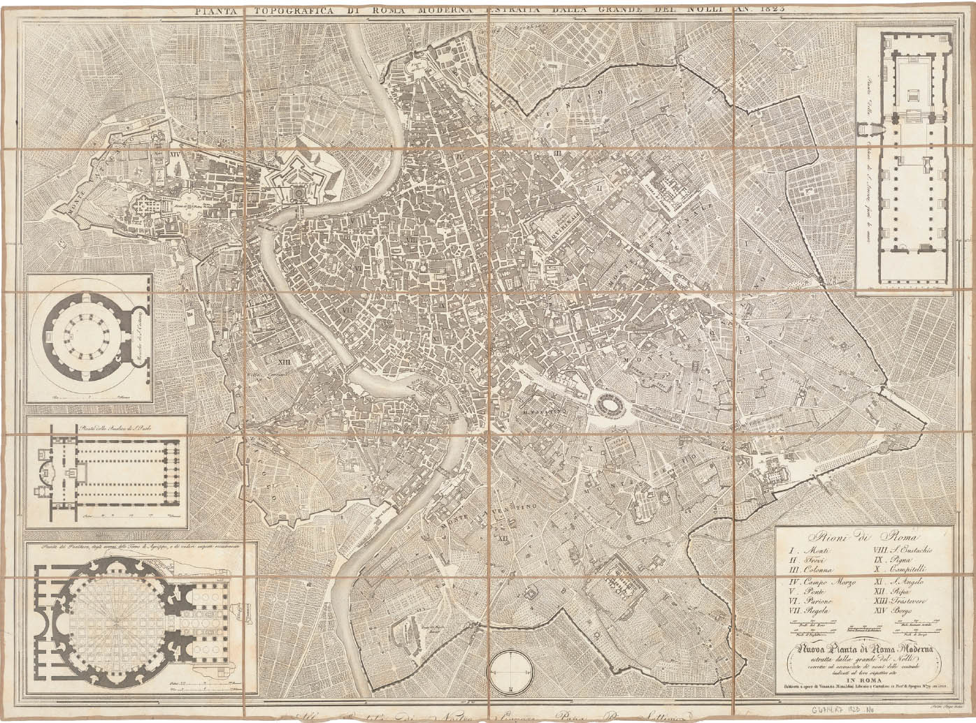
6.3
41.9000° N, 12.5000° E, Giambattista Nolli, Nuova pianta di Roma moderna, 1823.
Giambattista Nolli first published his Nuova pianta di Roma moderna in 1748, noteworthy for its revolutionary way of measuring and drawing the city. Truly a hybrid of map and plan, the Nolli drawing changed the perception of public space in Rome by drawing the figures of the buildings with the courtyards open, allowing the civic realm to penetrate the street enclosure. For over a century, until 1870, when Rome became the capital of Italy, most maps of Rome were variations of the original Nolli plan, a testament to its representational quality and an indication of its importance in cartographic history.
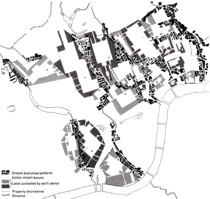
6.4
51.5063° N, 0.1271° W, David Grahame Shane, Field Study London, 1971.
The work of urban designer and theoretician David Grahame Shane is dedicated to the relationship between urban form and time, to the transient nature of urban morphologies. His Field Study London, a drawing from his thesis work with Colin Rowe at Cornell, reveals the patterns, forms, scales, and codes behind the Georgian estates along the Thames tributary beds. The drawing uses tone and line to describe the organization of the estates relative to the river, uncovering the relationships between hydrology and urban development.
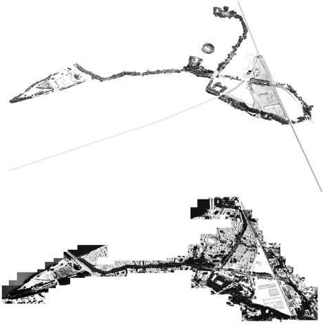
6.5
43.6667° N, 4.6167° N, Bureau Bas Smets, Parc des Ateliers, 2009
Cartographic practice is central to the design methodology of Belgian landscape architect Bas Smets. His projects begin with an act of reproduction, of drawing the existing condition from a particular lens to read the territory anew and to reveal what is visible but unseen. These maps create a customized and specific base for the project. The site is interpreted through drawing and the project continues as an ongoing exchange between drawing and imagining. The two maps of the Parc des Ateliers in Arles, France, isolate the specific landscape elements—the geomorphology of the ancient Roman city, the artificial platform of the Parc des Ateliers, and the vegetation, creating a loop of trees around the site—and articulate the design potential atop the redrawn base maps.
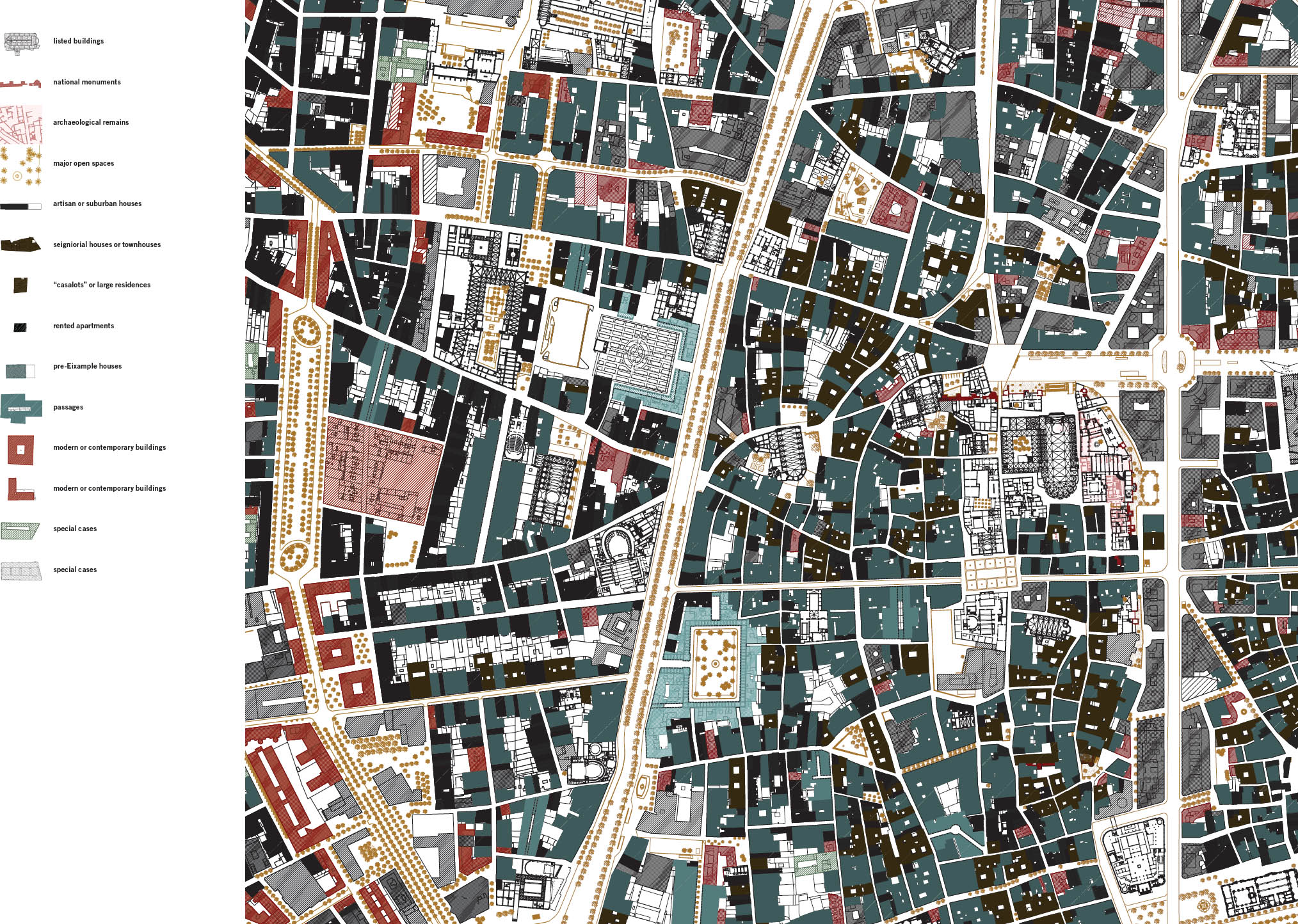
6.6
41.3857° N, 2.1699° E, Joan Busquets, Old Town Barcelona, 2000.
Urban designer Joan Busquets has devoted much of his career to the city of Barcelona, as a researcher, a planner, and a designer. His analytical drawings reveal the morphology of the city and describe its transformation through time. His plan of the Old Town, an adaptation of a Nolli-type plan, uses a rich coding system to depict monuments, open spaces, and building typologies of the historic city. Listed buildings and archaeological ruins are drawn as architectural plans, showing the scale and texture of the urban fabric, allowing the viewer to enter the buildings through the drawing. National monuments are hatched over in red, linking them to the similarly rendered contemporary and modern public buildings. The residential fabric is shown in tones of black and gray.
6.7
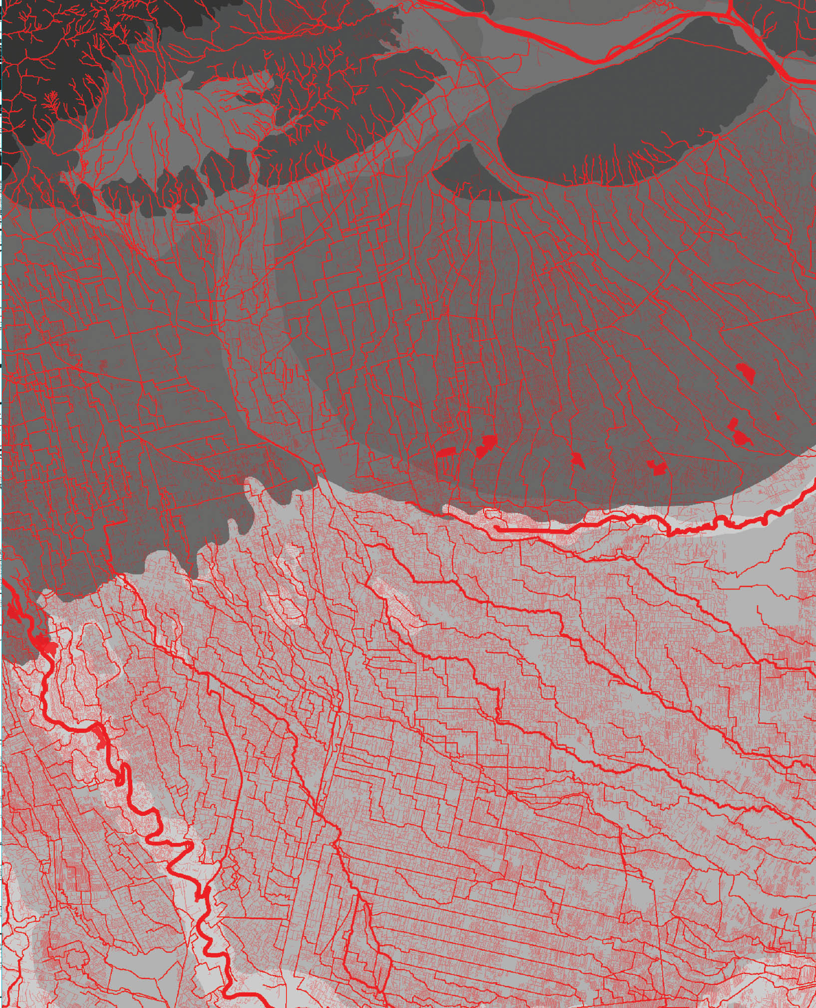
50.9462° N, 5.3633° E, Bureau Bas Smets, Euro Delta, 2010–12.
As part of his 2040 Territorial Vision for Brussels, landscape architect Bas Smets explored the extents of the hydrological systems affecting the city. The figure-ground of the large deltaic region to the north shows the relationship between water and urbanization, contrasting the conditions in Holland and Belgium. Smets demonstrates, through the drawing, that both the absence of a strong landscape character reinforces the extensive urbanity and that the flatland is laced with a robust system of rivers and small tributaries. This hydrological network has the potential to reframe the seemingly banal countryside and to produce a strong landscape identity capable of resisting the pervasive urban development.
6.8
45.4333° N, 12.3167° E, Bernardo Secchi, Paola Viganò, Lorenzo Fabian, and Paola Pellegrini, Water and Asphalt: The Project of Isotropy, 2008.
Italian urbanists Bernardo Secchi and Paola Viganò and their collaborators explore the dispersed qualities of the Venice region, articulating an isotropic condition formed through major infrastructural transformations over time. The cartographic endeavor relates the hydrological and transportation networks to the geological substrate, describing the relationships between water (red) and asphalt (gray) across the territory. The drawing reformulates the image of the region and its public realm, uncovering the logics embedded in the infrastructural systems through a reading of the material conditions of the ground.
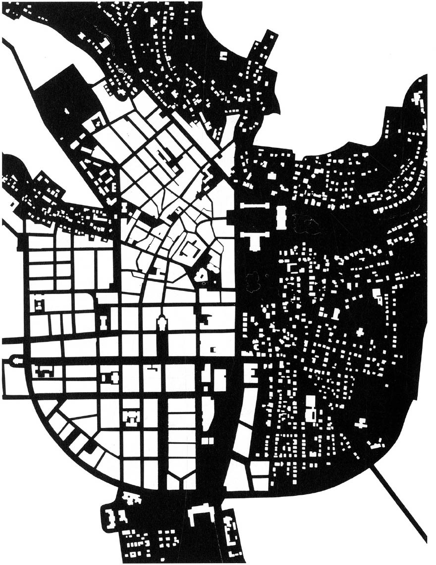
6.9
Colin Rowe and Fred Koetter, Drawing of Wiesbaden Street Plan, 1978. Originally published in Collage City (Cambridge, MA: MIT Press, 1978), 82, © 1979 Massachusetts Institute of Technology, by permission of The MIT Press.
Colin Rowe and Fred Koetter embrace the binary and celebrate the figure-ground and the juxtaposition of contrasting images to illustrate a set of design principles. The cover image of their seminal 1978 treatise on urban planning and design, Collage City, a figure-ground of Wiesbaden pictured above, exemplifies the use of the binary. One side of the image is a collection of solids with little void, the other a network of voids peppered with unstructured solids. Through this image and the accompanying text, the authors argue that the city must support both conditions: “the overtly planned and the genuinely unplanned.” For Rowe and Koetter, the figure and the ground should both read as positives within the city, as a continuous, interwoven texture rather than an unrelated positive and negative.
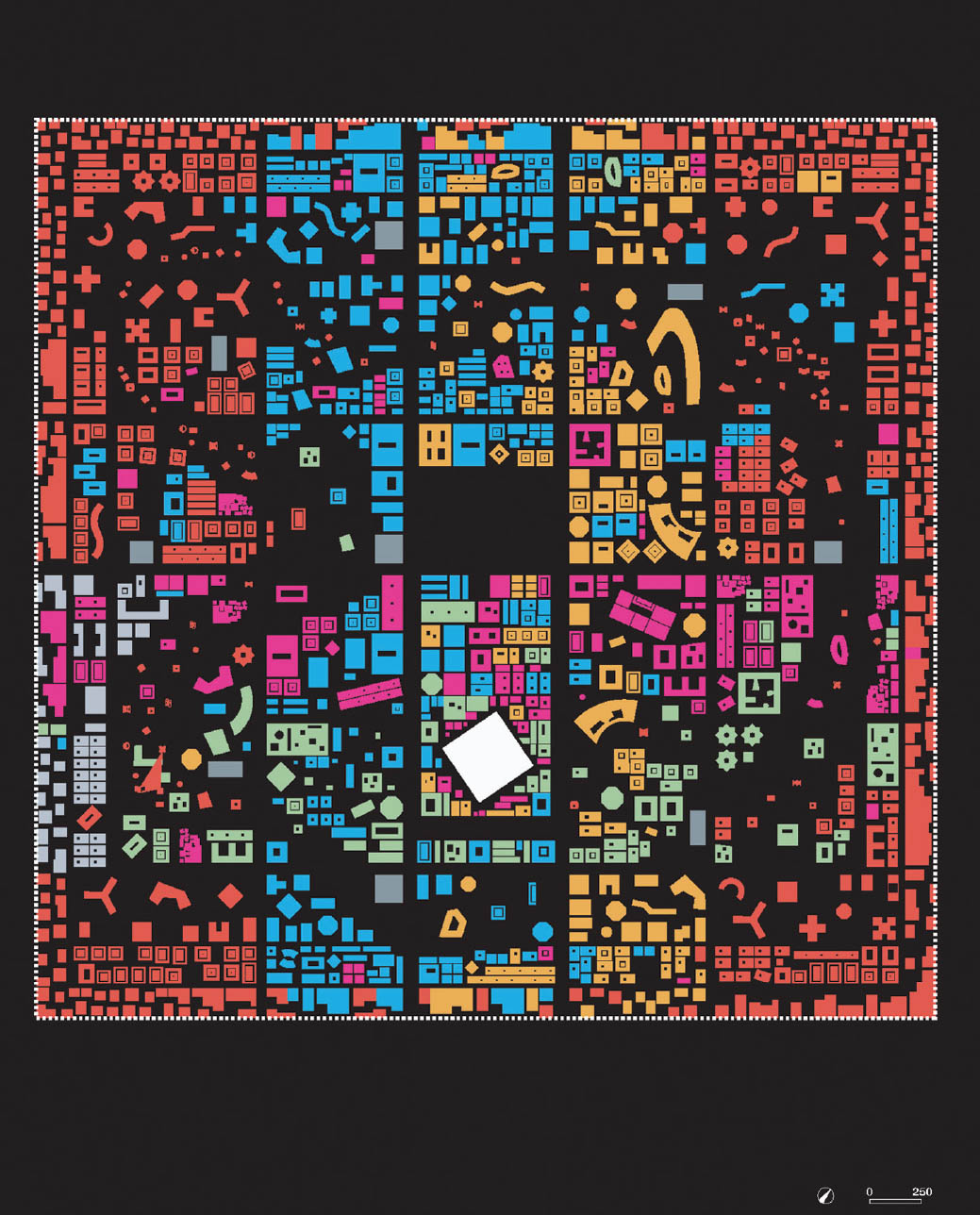
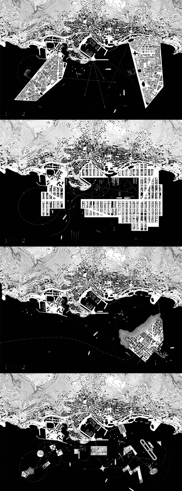
6.10
25.7833° N, 55.9500° E, OMA, Ras al Khaimah Structure Plans, 2007.
OMA and its research counterpart, AMO, were commissioned to create a conceptual plan for a new city in the United Arab Emirates. The plan promotes programmatic diversity while creating flexible areas to negotiate the anticipated population growth. After studying land uses and identifying them by color, OMA created a plan based around key urban functions: residential, community, and industrial. The black-and-white plan is a modified figure-ground of the proposed city. By removing the building fills and filling only the exterior walls, the interior spaces can be read as ground. This structure-based drawing approach provides a different reading of the city, one focused on the occupational similarities of the interior and exterior spaces.
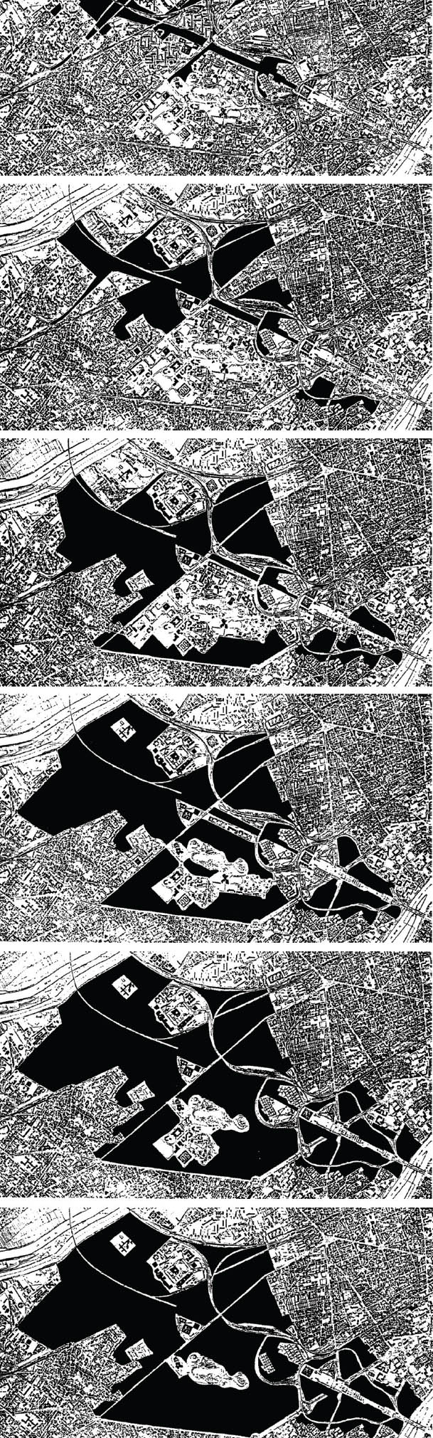
6.11
48.8917° N, 2.2408° E, OMA, La Défense Grand Axes, 1991.
The creation of a void—a liberated ground—underlies OMA’s project for the transformation of La Défense. The ground becomes a figure, a central form that evolves over time by selectively removing all the buildings over the age of twenty-five every five years. Key elements are retained—a beautiful courthouse, a park, a station, the Grande Arche, the CNIT, and the Tour Areva. Yet as the void expands, it outweighs the city and becomes a space to imagine a future project, to restructure in support of ongoing urbanization. Through the manipulation of the figure-ground of the city, the image of the city is fundamentally transformed, freeing both the physical ground for design invention and the design mind for unencumbered imagination.
6.12
43.7328° N, 7.4197° E, Xaveer de Geyter Architects, Extension in the Sea, Monaco, 2002.
The Belgian design firm Xaveer de Geyter Architects (XDGA) experiments with figure-ground drawings as a way to express architectural intention. For the Extension in the Sea project, XDGA addresses the condition of extreme urban density by extending the city beyond the coast and into the sea. The project is presented through four possible scenarios: the capes and bay, the grid and central pool, the Janus Island, and the archipelago. Each version alters the coastline, either through the filling of land along the edge or through the construction of islands. The plan drawings render built form and water in black, fill on a white ground with black contour lines. Centered on the further occupation of the sea, the representational technique aligns the water with inhabitation, rendering the sea as architectural space.
6.13
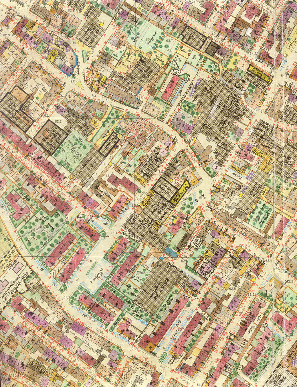
43.8820° N, 11.1003° E. Bernardo Secchi, Goffredo Serrini, Paola Viganò, Claudio Zagaglia with StudioPratoPrg, Prato general plan, survey: “the block-notes”, 1993–96.
Italian urbanists Bernardo Secchi and Paola Viganò’s “block-notes” drawing is a richly annotated urban map articulating use, access, and mobility. The buildings, streetscapes, and open spaces are dimensioned and characterized both quantifiably and qualitatively, with entrances, directions of movement, widths, materials, functions, and status noted. Existing conditions and future plans are included. The drawing is overlaid on a 1:2,000 scale city plan, and the distinctions between figure and ground are blurred. The coding is complex rather than binary, with the negative space—the color of the paper that remains—being the space of no information.
6.14
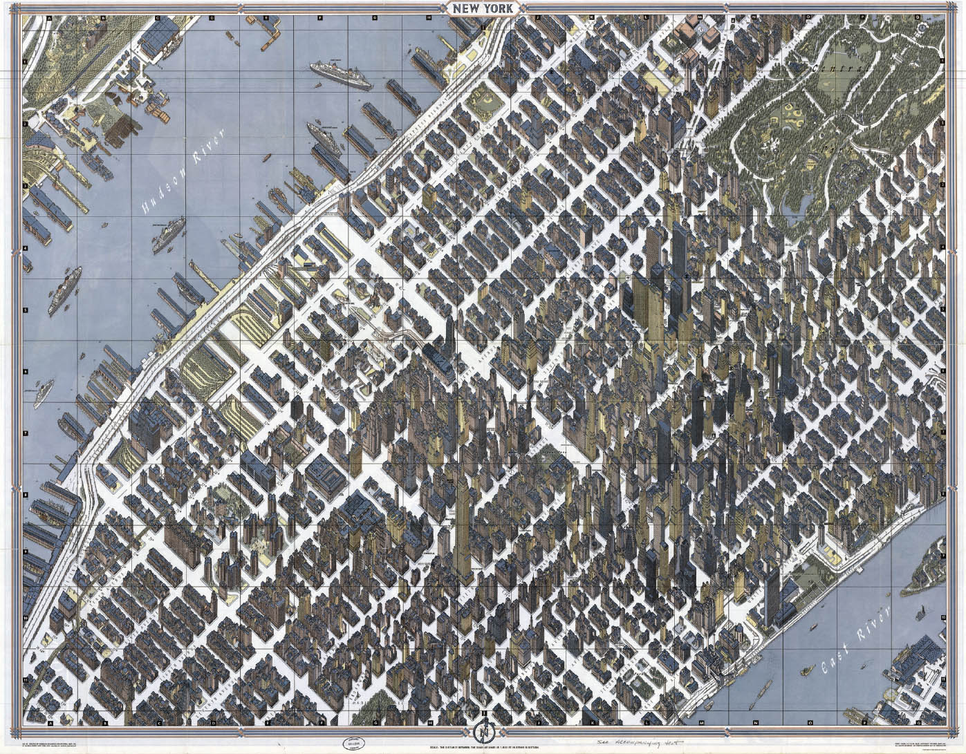
40.7145° N, 74.0071° W, Herman Bollmann, New York, 1962.
In his 1962 map for the New York World’s Fair, German cartographer and graphic artist Herman Bollmann merged the tradition of the bird’s-eye perspective with the precision afforded by aerial photography. He shot over sixty-five thousand photographs in order to create the map, nearly seventeen thousand from the air. The map successfully meets the challenge of portraying the high-rises of the city en masse without obscuring the ground plane. The incredible detail draws the eye in from above, stimulating the imagination required to occupy the streets and buildings below. The harmonious color scheme and fidelity to the ground experience allow for parallels with the work of Imhof and Hadid.
6.15
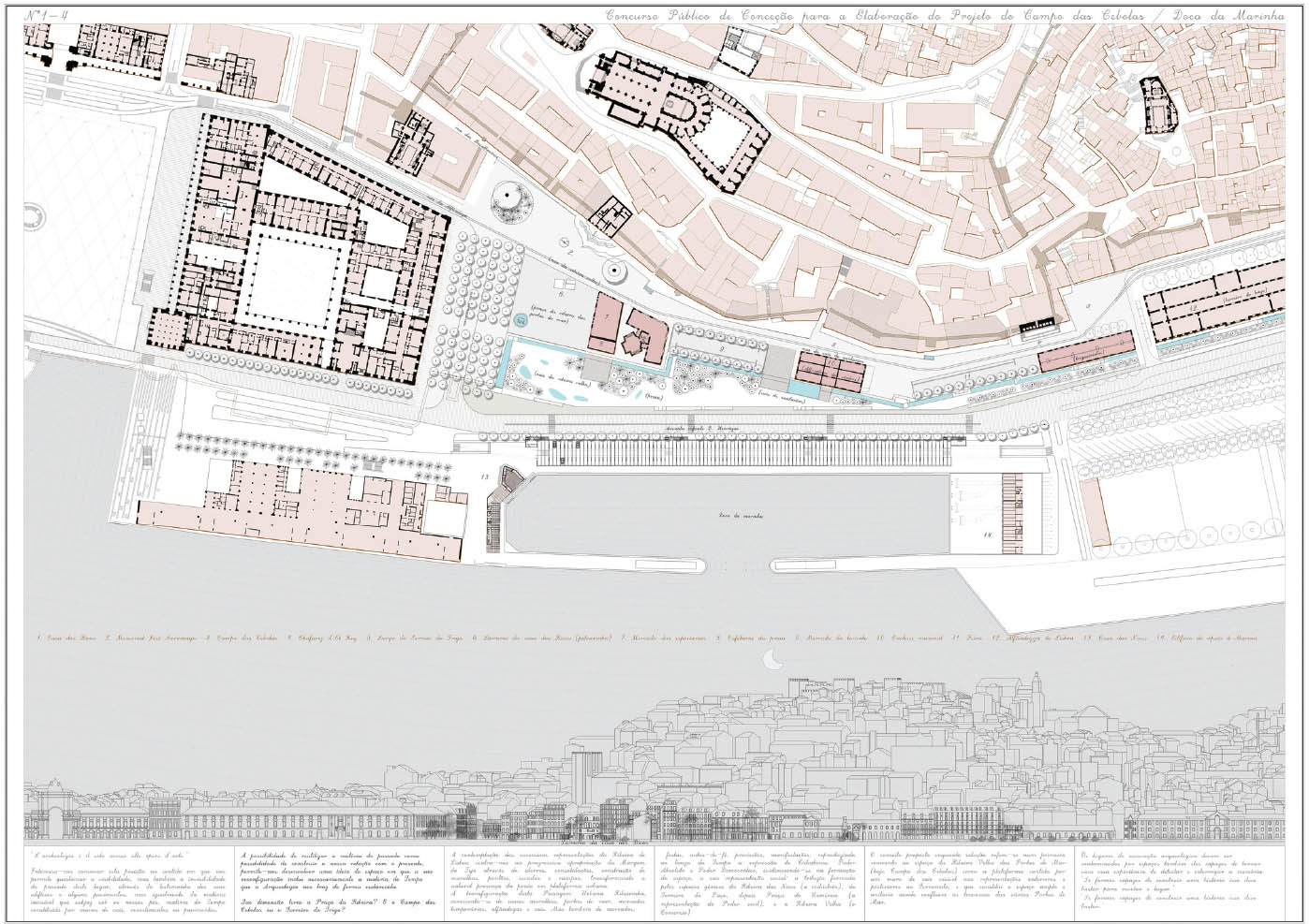
38.7138° N, 9.1394° W, Global Arquitectura Paisagista, Campo das Cebolas, 2012.
The Global Arquitectura Paisagista entry to a city-organized competition to enhance the historic Campo das Cebolas square along the shore of the Rio Tejo in Lisbon evokes the palimpsest. The proposal engages multiple layers of physical construction and social activism that have transformed the space from beach to constructed edge to urban margin. The design reveals the subterranean history of the site by exposing an eighteenth-century harbor wall and uses it to structure three distinct urban platforms. The drawing juxtaposes the urban plan with an orthographic view from the river, showing the sectional reading of the project and the locations where the historic walls are integrated into the design proposal. The drawing highlights the provocative merger of past and future, collapsing and conflating different time periods by using the very same graphic language Carlos Mardel and Eugénio dos Santos used in proposals for reconstruction of Lisbon after the earthquake of 1755.
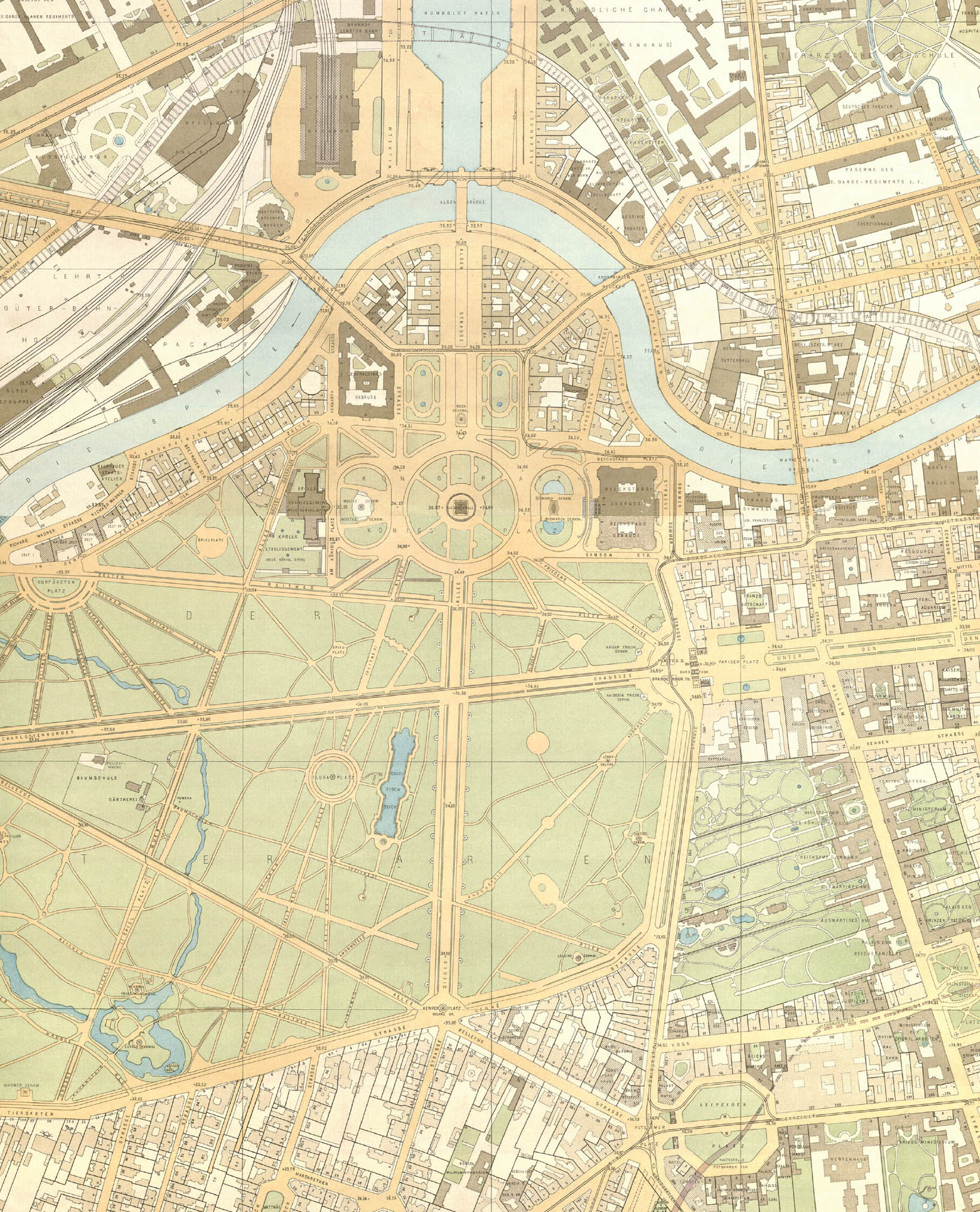
6.16
52.5231° N, 13.3721° E, Andreas Matschenz and Julius Straube, Ubersichtsplan von Berlin, 1903. Scale: 1:4,000 (shown at half size).
This beautiful atlas, a map series of forty-four sheets covering the entire city of Berlin, was a collaboration between the cartographer Andreas Matschenz and publisher Julius Straube. The map is based on detailed surveys from 1876 and shows building footprints with courtyards and outbuildings, transportation systems, and parks. The map is keyed in rich, muted colors, with public buildings marked in light brown, private buildings in dark brown, vegetated open space in green, hardscape in white, sidewalks and plazas in yellow, and water bodies in blue. In its most pure form, the figure-ground is a binary drawing with only black and white fills. Here, the binary distinctions are many: public/private, land/water, softscape/hardscape, vertical/horizontal, surficial/subterranean. As a composite of many layers of figure and ground, the drawing extends and possibly exceeds the categorization.