Being able to really see light, let alone control it, is something that comes with much practice and time. Subtly blending ambient light with artificial strobe light is not easy. In fact, it’s an art. And it’s something you never arrive at, but rather hone. By now you know to keep an eye on what the ambient light is already doing and even how to shape it. You also know your options when it comes to shaping light from a strobe. This chapter delves into how to make these two rogue forces play nicely together (currently imagining a scene from Tango & Cash ).
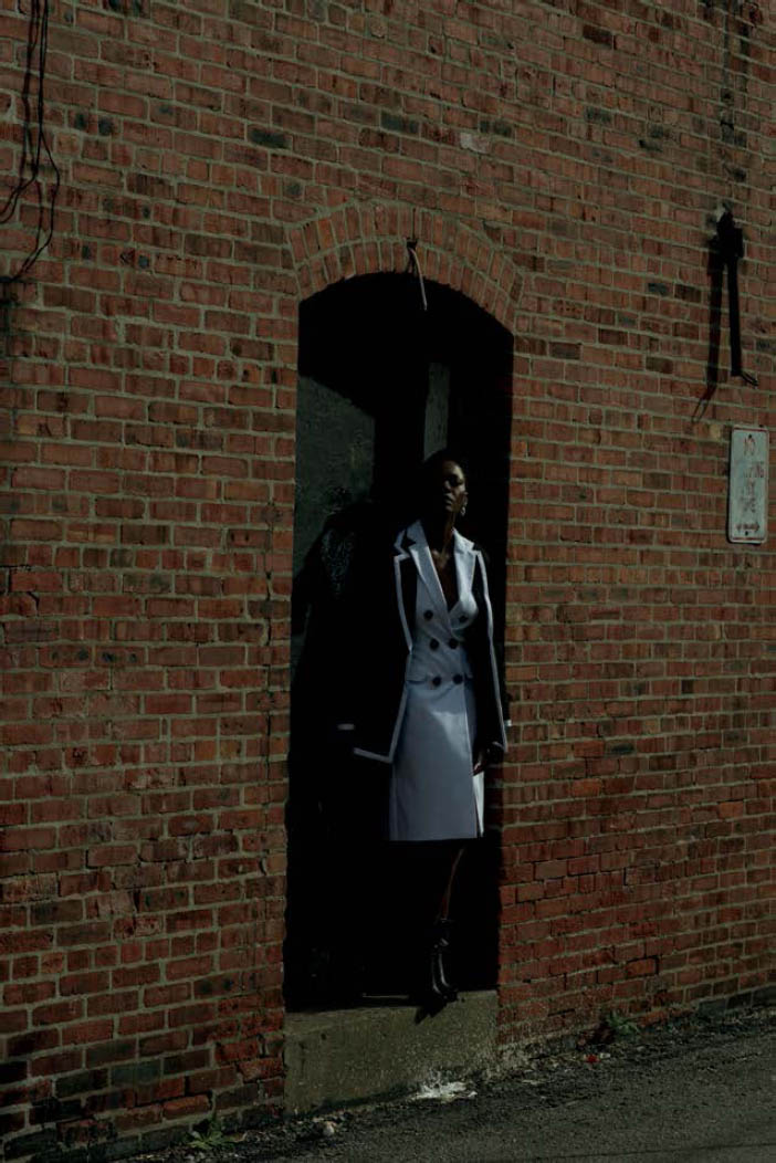
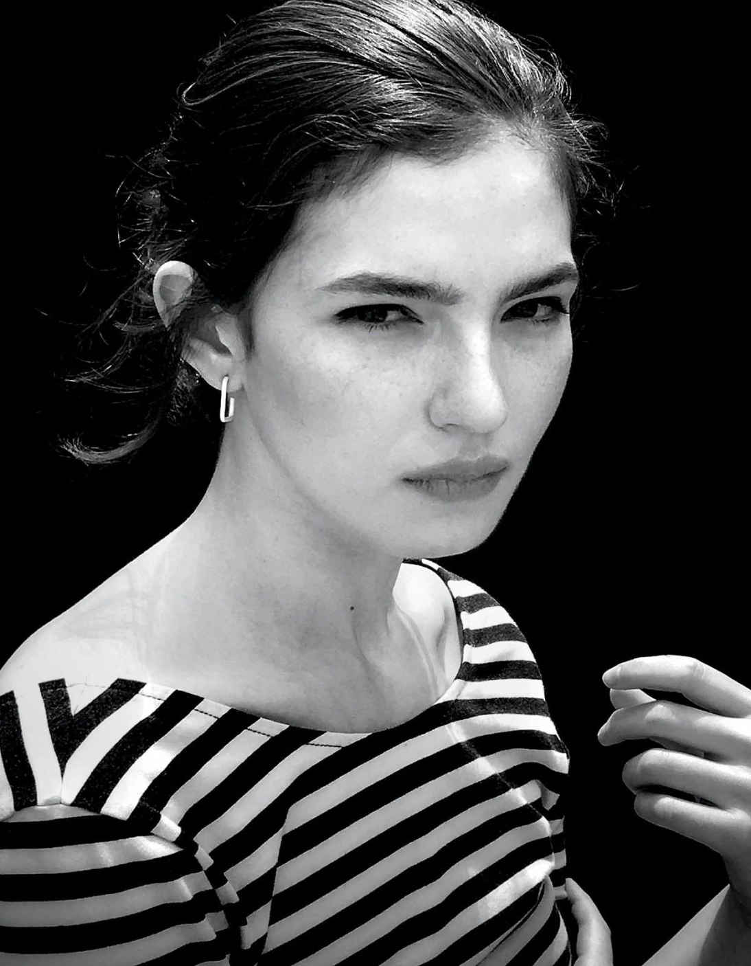
Once you know how to shape and control your light, you can start to better understand how to use the light in different situations. Check out the scene in Figure 3.1 . I was shooting a black-and-white-themed fashion editorial on the street and stumbled upon this cool doorway. Although I loved the spot, I didn’t love what the light was doing in it. The sun was in and out of the clouds, which made the exposure unpredictable, and the light that the sun was casting on the model wasn’t exactly the dramatic, flattering light I was going for. For Figure 3.2 , my first attempt, I exposed for the highlights on the model. As you can see, the model’s face is well exposed, but the rest of her gets lost in the shadows of the doorway. I tried opening up my exposure, metering for the whole scene. Though it’s not as muddy as the previous shot, it’s not what I’d call dramatic ( Figure 3.3 ). I was going to need to light her in order to dial down the ambient while making sure not to lose her in the shadows.
Figure 3.1 The setup. I loved this spot, but not so much what the light was doing. I wanted more drama, so I added a light. Note that I oriented the flash to a vertical position, rather than the normal horizontal one.
Figure 3.2 Here is the ambient shot that was exposed for the highlights on the model’s face. The deep shadows cause the model to get lost in the doorway.
Figure 3.3 In this shot, I exposed for an overall average reading. Although it’s brighter, it’s not what I’d call dramatic.
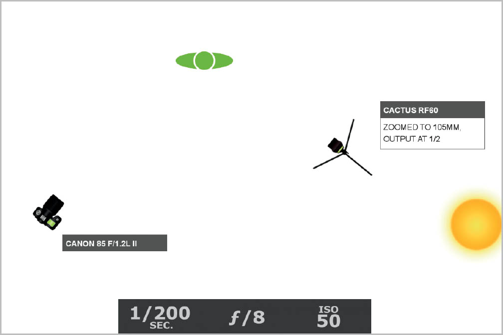
My first priority was dialing down the ambient light enough to where the flash would be apparent. Since I was not using High Speed Sync, my maximum shutter speed was 1/200 of a second. After setting that, I lowered my ISO as low as I could, which was 50. The only thing left to do was to start closing down my aperture until the ambient light was a stop underexposed, leaving me at f/8. Now it was time to turn on the flash and turn up the power until the output was bright enough to light my model, which ended up being 1/2 power.
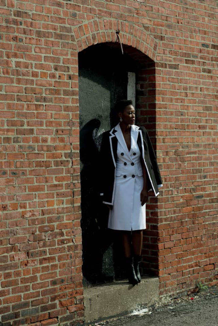
I put an unmodified flash on a stand, raising it up to roughly the same angle as the sun in relation to the model. I set it about 10 feet away from her, allowing for a greater spread of light as well as more defined shadows. My goal was to light the model and not the wall around her. Although a snoot would’ve worked in minimizing light falloff, I didn’t have one on me. Instead, I zoomed the flash in to 105mm, and I positioned the flash to a vertical orientation. This allowed for a narrow, vertical output of light, rather than a broader, horizontal burst ( Figure 3.4 ). Now my subject was popping out from the shadows and the brick wall was muted—just how I wanted it ( Figure 3.5 ).
Figure 3.4 The lighting diagram. To eliminate as much ambient light as possible, my ISO was at 50 and my shutter speed was maxed out at 1/200. Next, I lowered my aperture until the ambient was one stop underexposed at f/8. Finally, I turned on my flash, increasing the output until the light was bright enough to light the model, which ended up being 1/2 power.
Figure 3.5 The raw file. The model pops out from the shadows, and the brick wall is more muted.
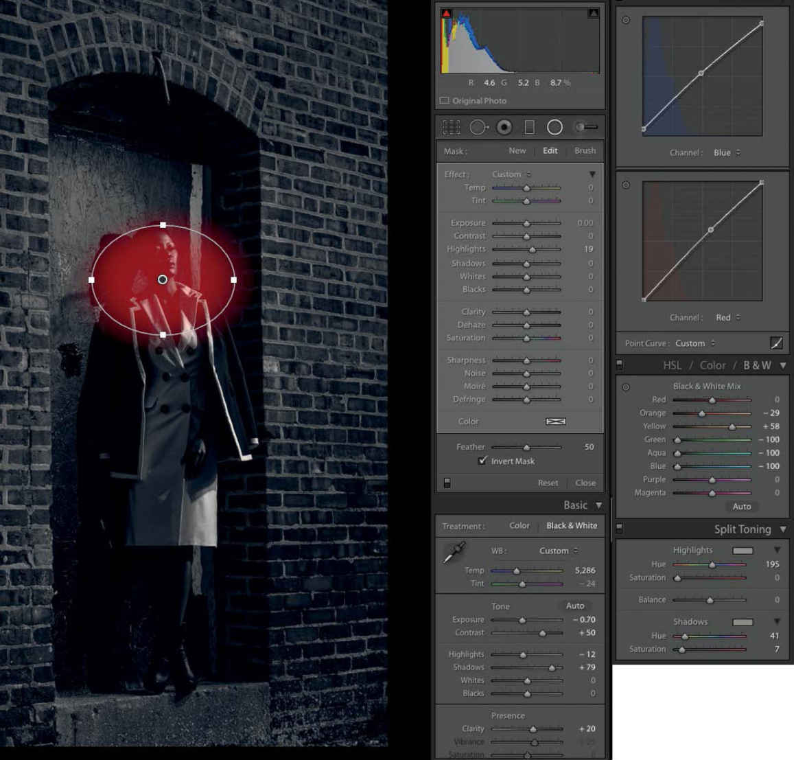
Figure 3.6 The Lightroom adjustments. By making a radial adjustment over the model, bringing up the Highlights slider, as well as tweaking the Orange and Yellow channels in the Black & White Mix, I was able to draw focus to the model’s face.
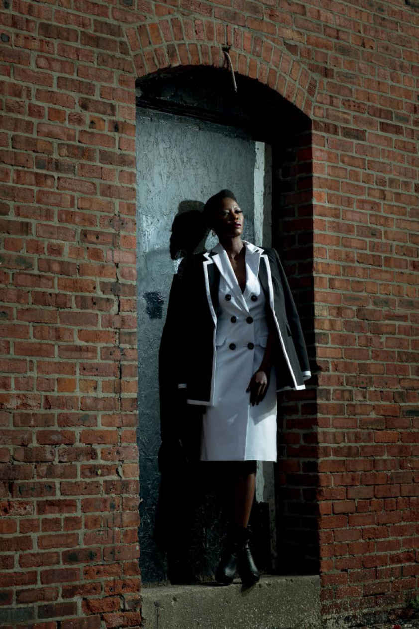
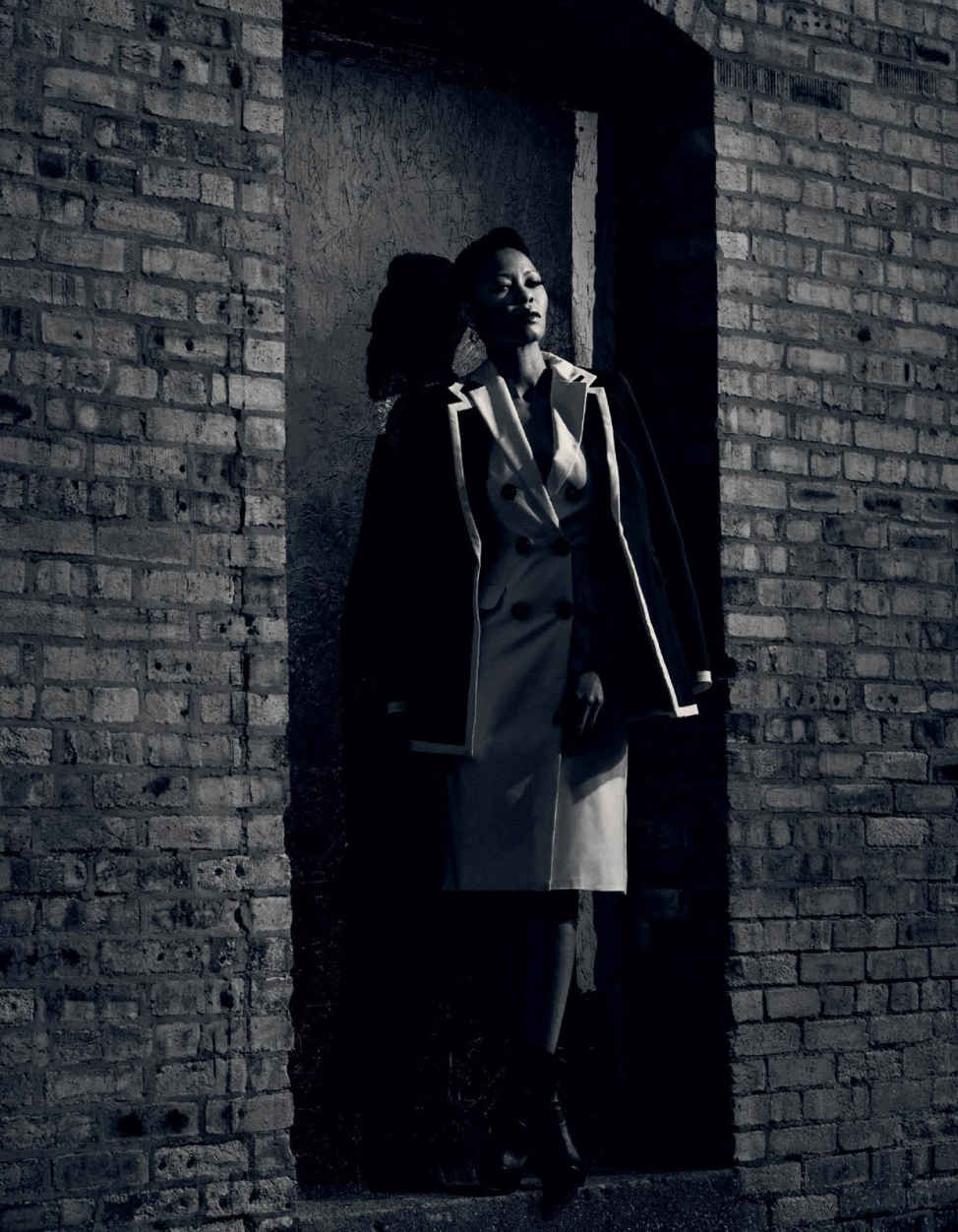
My goal in Lightroom was to push down the presence of the bricks a bit and bring more focus to the model’s face. To accomplish this, I made a radial adjustment on her face and increased the Highlights slider. Next, I decreased the Orange slider and increased the Yellow slider in the Black & White Mix panel to further dial back the intensity of the bricks ( Figure 3.6 ). To finish the color grading, I increased the contrast, upped the shadows, and added a bit of blue and red in the Tone Curves. Finally, I exported the file to Photoshop to use the more powerful Spot Healing tool to remove any remaining blemishes in the scene. The final shot now looks much more ambiguous, like it could be either moonlight or daylight ( Figure 3.7 ). Either way, it’s noir as hell, and I’m really happy with it.
Figure 3.7 The final shot. Looks almost like moonlight, no?
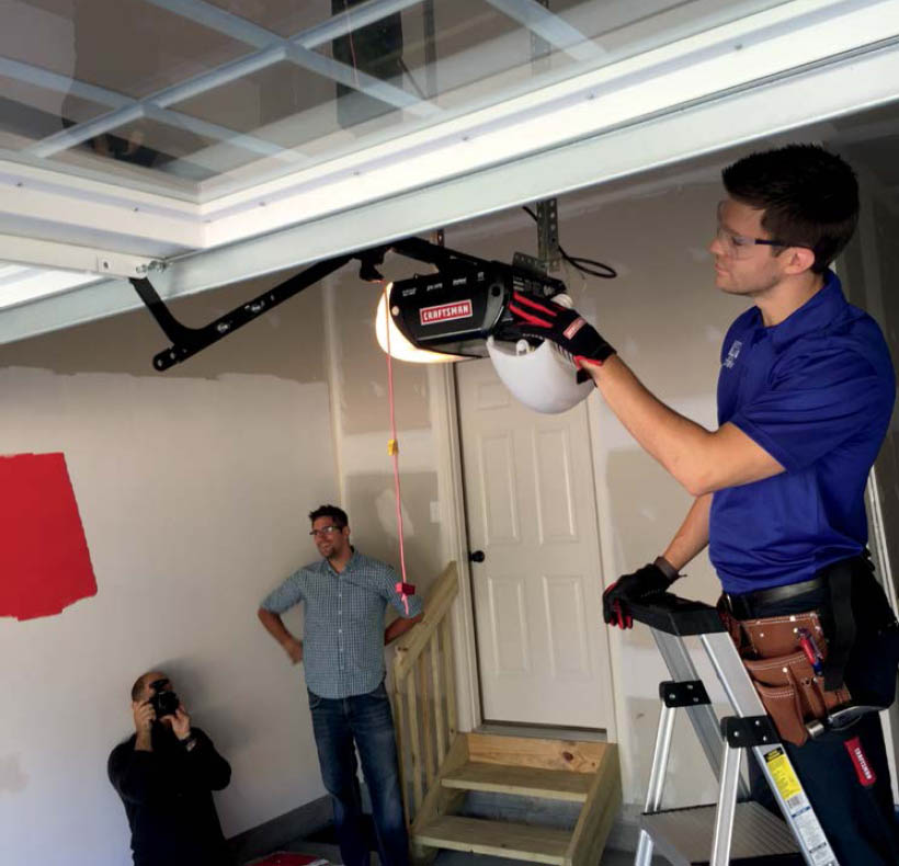
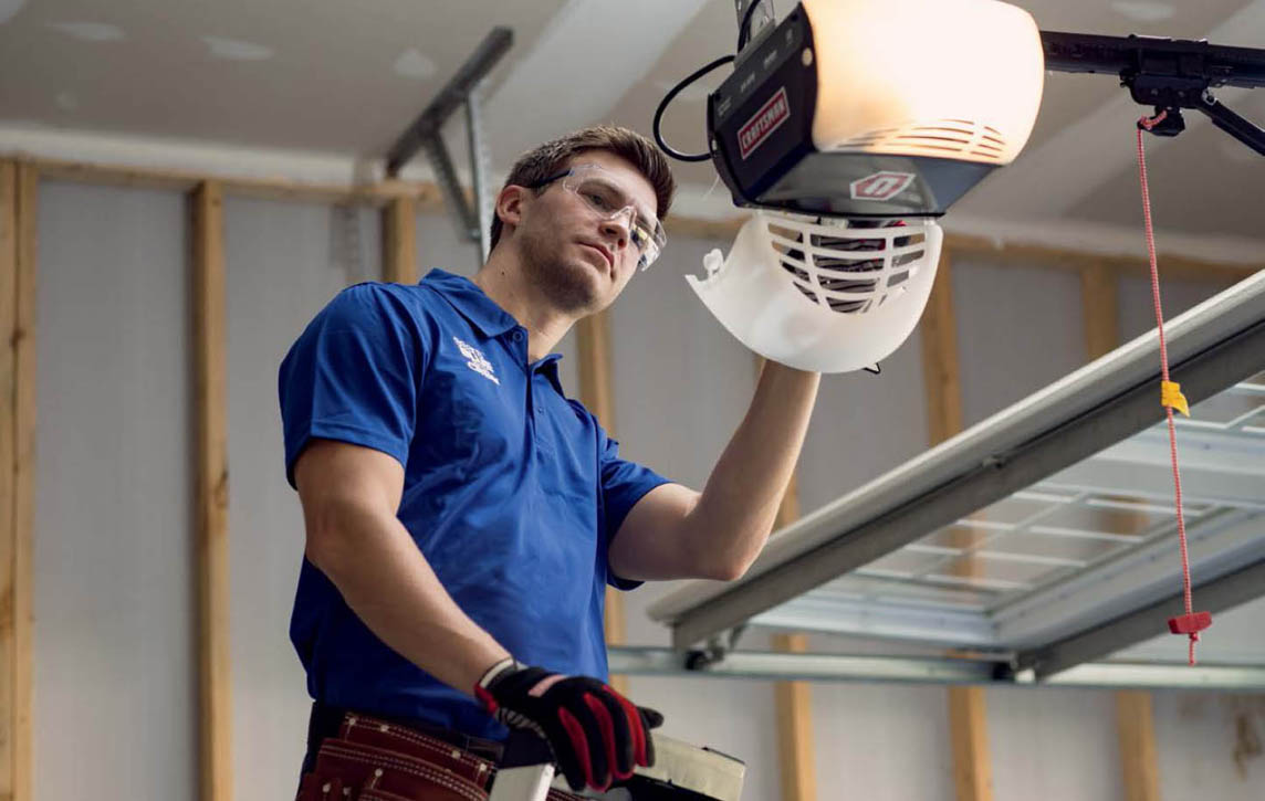
While doing a two-day shoot for Sears Hardware on location, I needed to capture a variety of scenarios, both indoors and out. In Figure 3.8 you can see one setup, which was inside a garage, in front of an open door, with the model on a ladder. Although the light from the open door was indirect and thus quite soft, it didn’t evenly light the model ( Figure 3.9 ) because his head was above the door opening. If the shoot hadn’t been for a print ad, I might have just brightened up the top of the image in post. Because the client was so important, however, I wanted to get the shot as close to perfect as I could in camera. That meant adding a flash.
Figure 3.8 The setup. Although the open garage door provided a large, soft light source, it didn’t fully light the model on his ladder, so a flash was needed. Photo by Dylan Stanley .
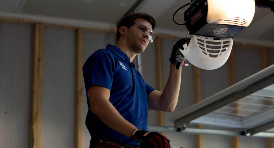
Figure 3.9 The available light shot. As you can see, the light falls off at the top of the frame, resulting in uneven lighting.
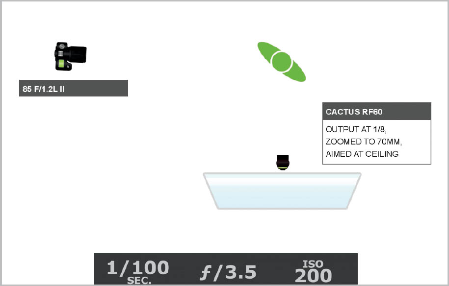
I wanted to fill in the light in the top part of the image, blending it with the light in the bottom, which meant adding soft, cool light. In Figure 3.8 you can see my flash through the window in the garage door. I aimed the light toward the ceiling, pulling the fill card up so that some of the light also kicked toward the subject’s face. To get a good ambient exposure in the dark garage, I had two options. The first was to open up my aperture really wide to f/2 or wider, which would lead to a super shallow depth of field. To have a bit of sharpness in my image, I opted instead to keep my aperture at f/3.5, meaning I need to bump up my ISO a bit to 200 to retain a good amount of ambient light ( Figure 3.10 ). The added flash filled in the side of the model’s face as well as added some separation between him and the ceiling ( Figure 3.11 ).
Figure 3.10 The lighting diagram. To have a bit more sharpness in my image, I kept my aperture at f/3.5. So I needed to bump my ISO up to 200 to get a decent ambient exposure. My flash output was moderate at 1/8 power.
Figure 3.11 The final shot. Now the model is evenly lit and nicely separated from the ceiling.
One of the blessings of using small flash is being able to set the output extremely low in order to match dim, indoor ambient light. If you’ve ever used a monolight, such as Alien Bees, or even more so a power pack like a Profoto system, you know how much more powerful those lights are than the existing ambient light in most indoor scenarios. They are often so strong that photographers sometimes have to “bleed” off extra light in order to get a lower output. This entails attaching an additional, unneeded strobe head to a pack in order to pull power from the main light to lower the output. The technique is helpful when you want to either use a wide aperture to achieve a shallow depth of field or use a higher ISO to bring up the ambient light in a scene. I’m willing to bet that many photographers wouldn’t have ever thought that having too much power would be an issue. But it is. In fact, it’s an issue whenever you’re shooting in a dimly lit room and you want to retain the ambient light, as I was for a recent wedding.
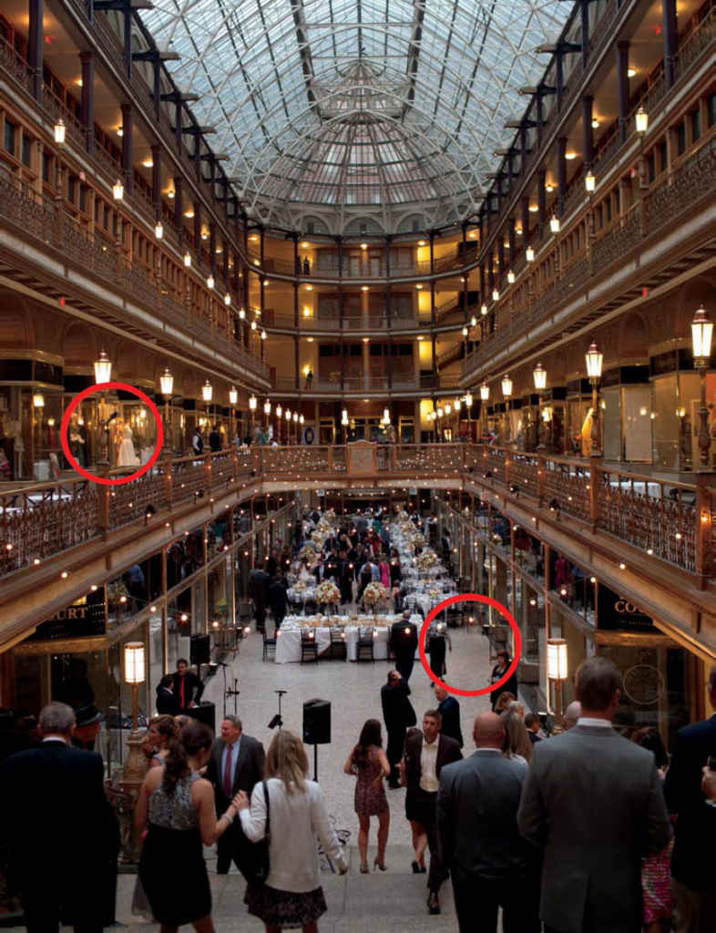
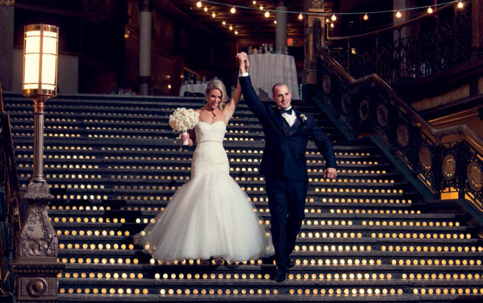
In Figure 3.12 you can see the stunning interior that was the site of a wedding reception I was shooting. The sun had just gone down, meaning that the light inside was dropping off quickly. The bridal party was just about to do their grand entrance, and I was trying to gauge my exposure and determine whether or not I needed to add a light. I decided that it would be a good idea to have one set up in case it was needed, so I placed one in the upper level, aimed at the middle of the staircase where the wedding party would enter. The left red circle in Figure 3.12 highlights my light placement. Meanwhile, I was posted at the bottom of the steps (Figure 3.12 ’s right circle). My shutter speed was 1/30, which can result in moving objects easily blurring. My goal was to set the light output just high enough to freeze the moving bride and groom, but not so bright that I completely overpowered the dim ambient light, which would have resulted in a black background ( Figure 3.13 ). By setting my light 10 to 20 feet away from the middle of the stairs, I was able to get a wide enough light spread with the zoom set to 70mm. And with the output set at 1/8, I could get a fast recycle time on the lights, ensuring I captured the perfect moment ( Figure 3.14 ).
Figure 3.12 This ornate scene was the location of a wedding reception I was shooting. Because it was so dim, I needed to add a light, seen in the left circle, but I couldn’t have the output very high because I wanted to retain the ambient light. The circle on the right is where I planned to stand when the bride and groom came down the stairs.
Figure 3.13 The lighting diagram. I zoomed the flash in to 70mm because the light was far enough away from where the action was happening that a wide spread would result in not much light reaching the subject. My ISO was raised to 500 and shutter lowered to 1/30 in order to get a decent ambient exposure.
Figure 3.14 The final shot. The bride and groom are crisply captured, and there is still information in the background.
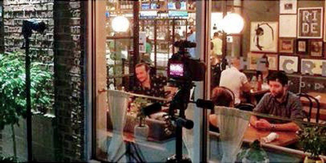
You’ve heard the expression “the best of both worlds”? That’s exactly what I needed to capture on a recent shoot for The Crest restaurant. It was kind of a unique scenario in that it was both an indoor and an outdoor shoot at the same time. I needed to photograph the details of the new restaurant’s space as well as how customers were interacting with it. The only way to do it was to shoot when it was open for business, during the dinner rush. This meant that space was especially limited, and wherever I stood, I was in someone’s way. I also needed to go up to every table that was in my shot and get the diners’ permission to photograph them. For a natural introvert, this was way outside my comfort zone, so I made my assistant do it for me. (Yes, I sometimes bring assistants on bigger shoots.) That said, I was looking for any excuse I could find to shoot from the recesses of the restaurant, keeping the customers far away and even out of focus, if possible.
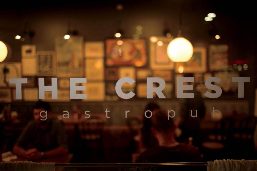
We had actually just wrapped up shooting and were about to head inside, when I noticed the restaurant name on the front window and thought it’d make for a rad shot to have the name highlighted with a full restaurant out of focus in the background. I knew that I was going to need to a strobe to pop out the letters and that I would need to have a thin line of light coming from the side in order to illuminate only the letters, so I added the Rogue Flash Grid to my flash and placed the light parallel to the glass ( Figure 3.15 ). I set the white balance to Flash to cause the tungsten-lit dining room to go more orange than it naturally appeared to the eye. Now, there was a separation between the words on the glass and the background created not only by differing brightness and depth of field but also by the differing color temperatures ( Figure 3.16 ).
Figure 3.15 The setup. I was shooting the lifestyle images for The Crest, a new restaurant in town, and wanted to get the logo on the window with a full dining room out of focus in the background.
Figure 3.16 The raw file. The words are now separated from the background by the contrasting color temperatures, depth of field, and strobe light versus ambient light.
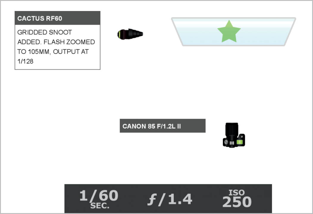
Figure 3.17 The lighting diagram. The dim dining room light and the matching low strobe output results in a really wide aperture.
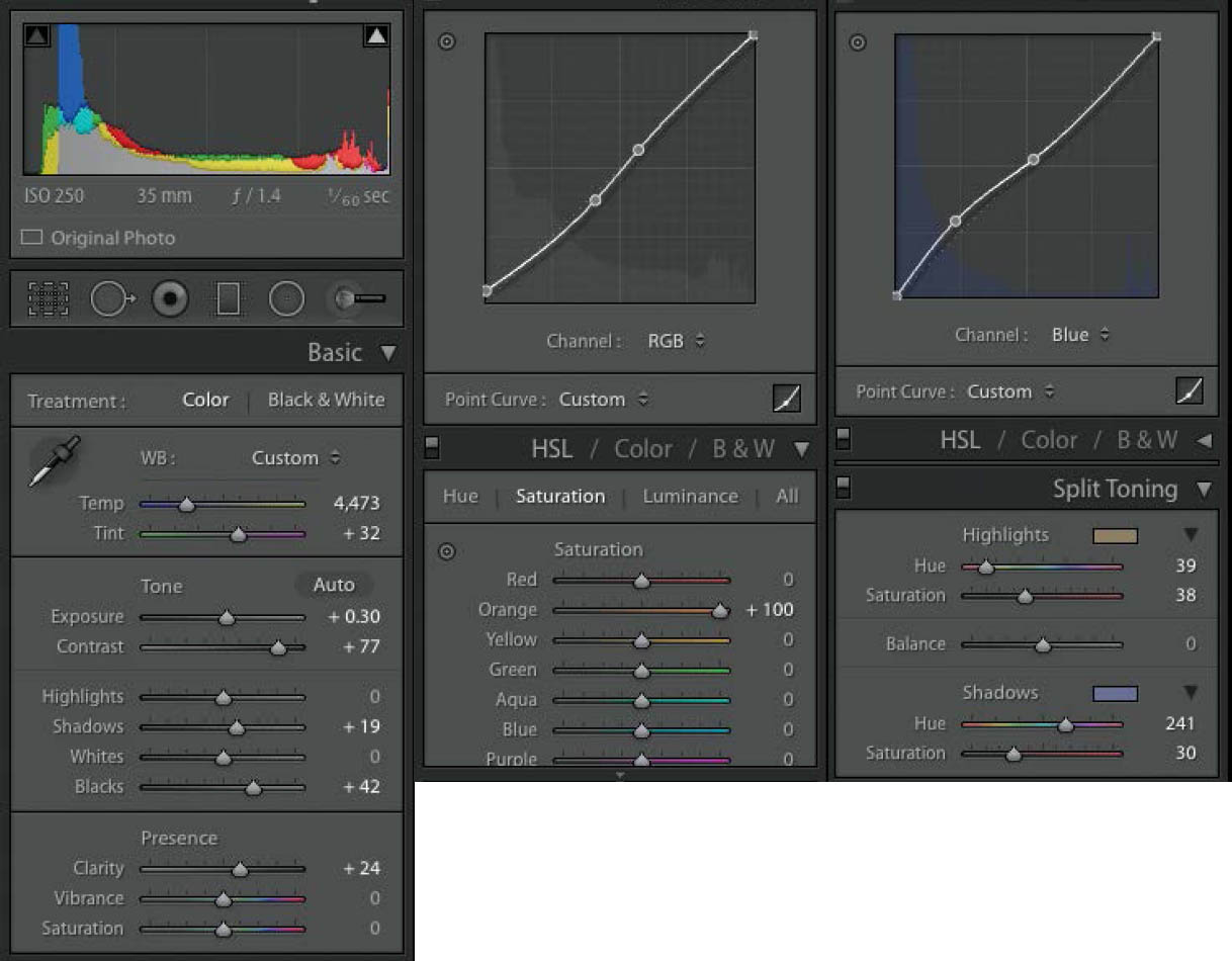
Because of how dim the indoor lights were, my output was all the way down at 1/128, even though I was shooting at f/1.4 ( Figure 3.17 ). In Lightroom, I really pushed the orange of the dining room to communicate a cozy feeling ( Figure 3.18 ). To further flush out this warm feeling, I added a warm tone to the highlights in the Split Toning panel. Finally, to round out the color grading and bring a bit of balance in the overall colors, I added a cool tone to the Shadows slider. The final shot ( Figure 3.19 ) ended up being used by the client as a header image on a design contest submission, which went on to win Best of Category. I’d like to think that my images helped give the restaurant a one-up over its competition, although The Crest didn’t need much help.
Figure 3.18 The Lightroom settings. I wanted to push the warmth of the background, so I increased the saturation in the Orange channel. I also added warm highlights and cool shadows in the Split Toning panel.
Figure 3.19 The final shot. The client ended up loving this image so much that the restaurant used it as a cover for its design contest submission.
You may have heard Chase Jarvis’s expression “The best camera is the one you have with you.” I 100% believe that this is true. When said camera happens to be a smartphone, however, you should know how to make the best of it, because it’s a fairly rudimentary piece of gear.
I have an iPhone 6S. When I am using my smartphone’s camera in optimal conditions—in a well-lit scenario where a wide focal length is needed—and in combination with the app Snapseed, I can get some pretty fantastic images. The only things my iPhone camera can’t do well are low-light scenarios, situations where I want a longer focal length, or when I want a shallow depth of field.
One fantastic feature that my phone’s camera does have (which I only recently discovered) is the ability to do an exposure lock and adjustment. This is essential if you are taking a photo of a shadowy scene, for example, and want to retain the overall mood, rather than getting an average exposure of the midtones, which often results in blown highlights or overexposed shadows.
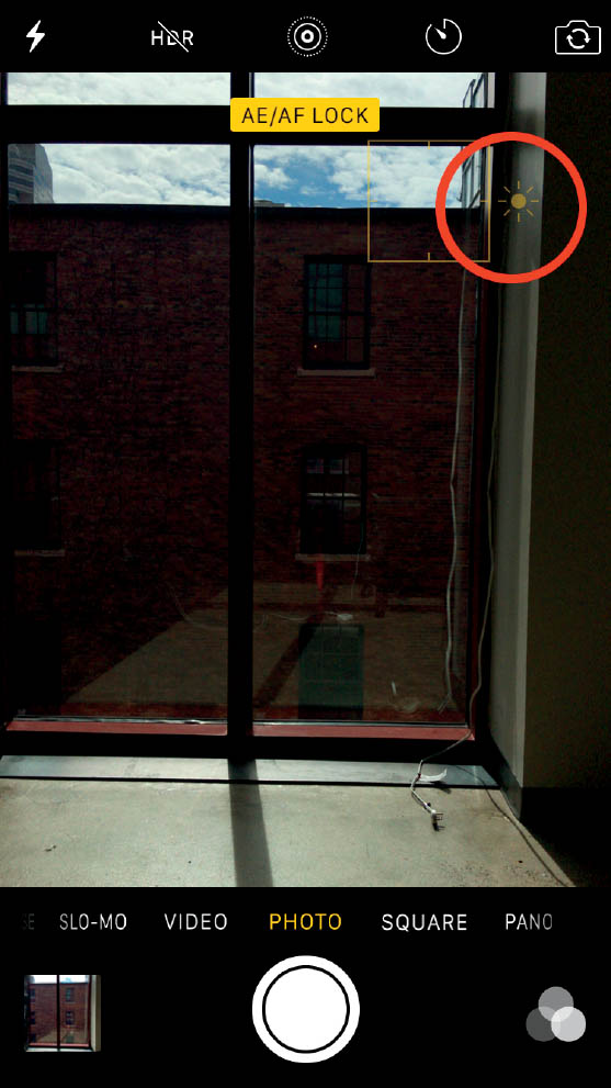
Imagine, for a moment, you are leaving your friend’s house late one evening to find that the moon is especially bright and casting a beautiful glow over the cars on the dark street. You quickly pull your phone out of your pocket to get a shot of the scene. When you take a photo, the image is all blown out and grainy because the camera was metering for the midtones of the dark houses and cars. Not only that, the moon and the rest of the sky is blown out white with no detail. Before you post this fantastically shitty photo to your Instagram with the hash tag #epicmoonrise, try taking another shot using the following directions. Pick up your phone and open your camera. Pick a highlight or shadow that you want to make the focus of your photo, such as the sky area in Figure 3.20 . Touch that area on your phone’s screen and hold it there for three seconds. You will see an exposure lock indicator as well as a sun icon next to a slider ( Figure 3.21 ). By dragging the slider up or down, you can raise or lower the exposure.
Figure 3.20 The “auto” exposure. Note that when the phone does the metering for you, it often results in blown highlights, as seen in this shot.
Figure 3.21 The metered exposure. By touching for three seconds the part of your screen that contains the detail you want to preserve, you can make an exposure lock. By dragging the slider next to the sun icon up or down, you can further adjust the exposure.
Figure 3.22 The setup. If you want to isolate your subject in a black scene, look for a spot that offers both bright light and dark shadows.
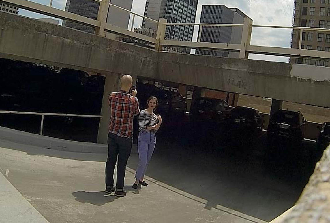
Using the exposure lock technique, you can also make studio-like portraits with an “invisible black” background, using nothing more than an iPhone, as long as you have an existing hard light source. As long the scenario has a spot of bright (typically hard) light and shaded area, you can pull off this technique ( Figure 3.22 ). I found a spot on top of a parking garage, where I could place my subject at the edge of the shade so the sun outlined her hair.
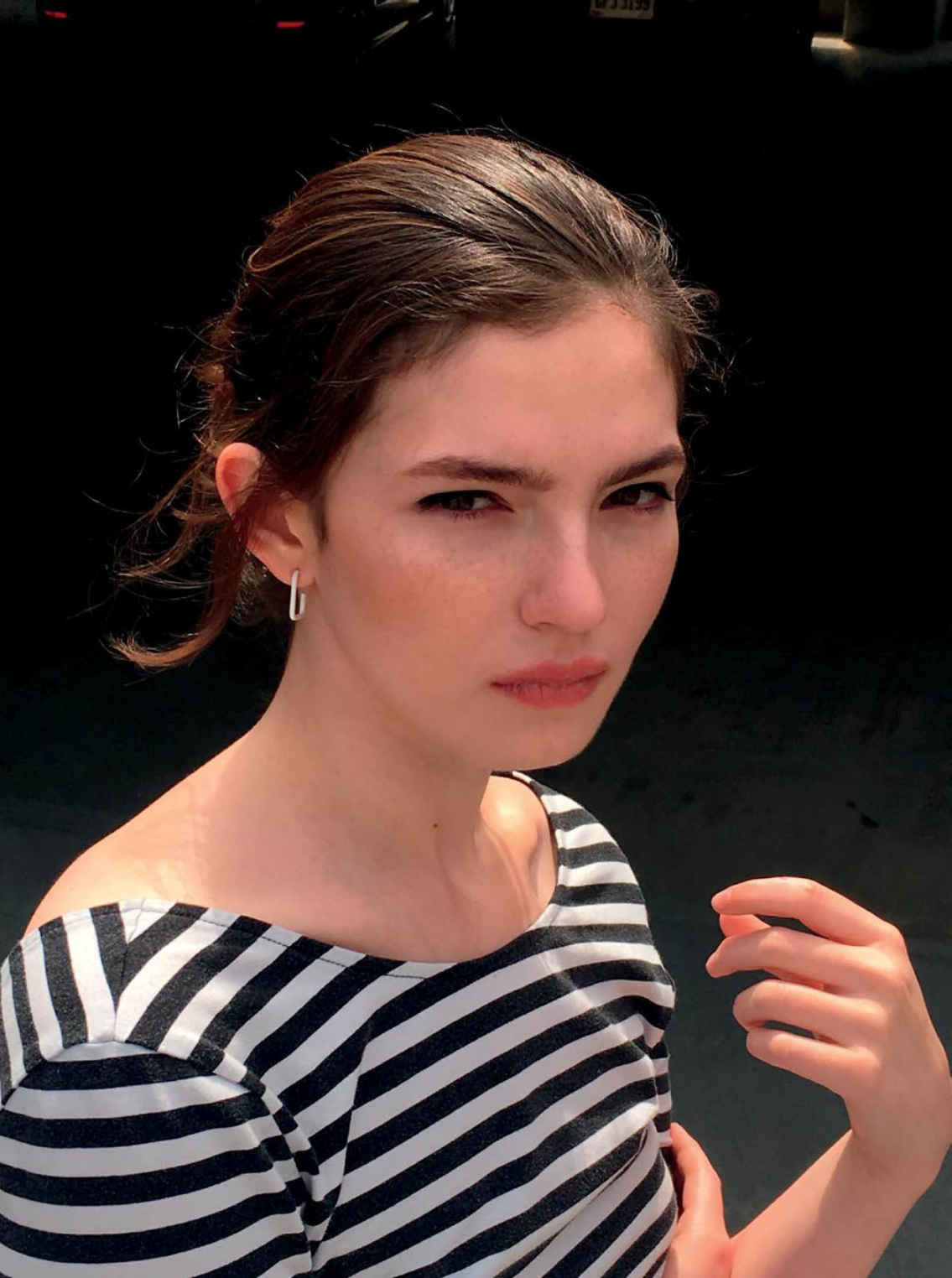
My goal is to get as close as I can to the subject without getting too much lens distortion, due to the wide angle. I also try not to use the phone’s zoom ability, because it is a digital zoom and results in a pixelated final image. Rather, I save much of the composing for post, when I crop any unwanted portions of the resulting photo ( Figure 3.23 ) after the fact.
Figure 3.23 The “raw” file. I moved in as close as I could to the model without getting wide-angle lens distortion. Rather than using the phone’s digital zoom, I will crop the unwanted portion out of the photo after the fact.
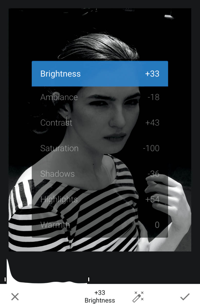
Using the app Snapseed, I am able to quickly crop and edit the image. The features I most often use in the software are found in the Tune Image section ( Figure 3.24 ). In this photo, I reduced Ambiance, Contrast, Saturation, and Shadows, and raised Highlights to give me a polished, studio-like portrait, as you can see in Figure 3.25 .
Now back to our hypothetical moonscape. Recompose your moonlit masterpiece, touching the moon on your phone’s screen and holding it there until the exposure locks. Now you can pull down the exposure until there is adequate detail in the moon and the shadows are black, as they should be. Now you have an image deserving of an epic hash tag.
Figure 3.24 The adjustments. I use Snapseed, adjusting the ambiance, contrast, shadows, and highlights to get a polished result.
Figure 3.25 The final shot. It’s not perfect, but it does just fine for what it is.