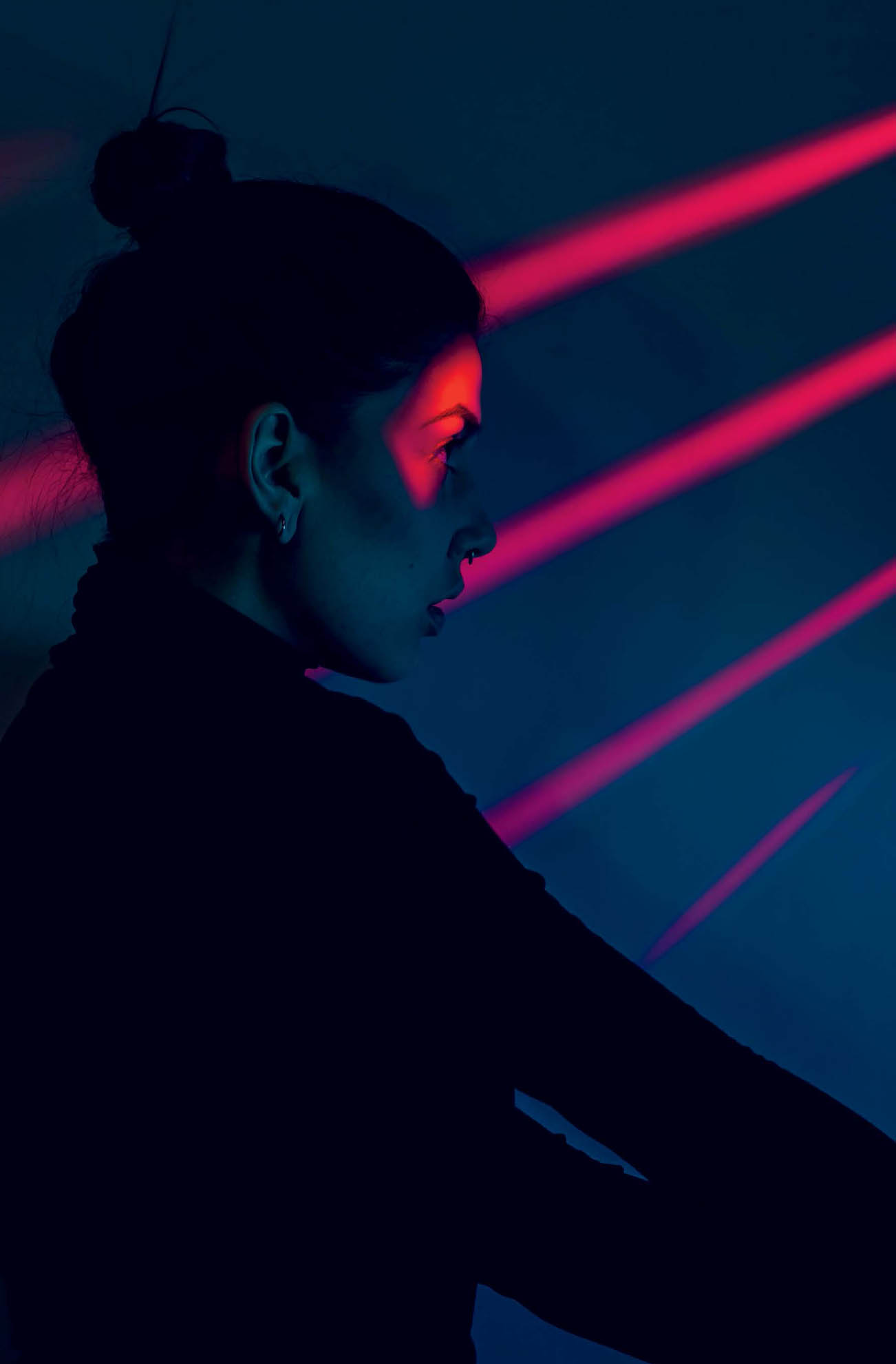
Colored gels are the smallest, simplest, cheapest, and yet most powerful light modifiers. With a single one of these small pieces of acetate, you can transform the entire mood of a portrait. Gels are most commonly used for color correction, such as when you need to reduce the orange glow in a tungsten-lit room. In the previous Studio Anywhere book, I also discussed how to use the situationally opposite corrective gel to push ambient colors to your liking. This chapter on colored gels will go more into color theory and how to stack colored light to get stylized results. Although I most often use gels in a studio-like setting, I also love using them to introduce a pop of color in outdoor scenarios, as seen on the opposite page.
One of my favorite courses in college was actually not even a photography class; it was a color theory class. I was not only fascinated to learn about complementary color combinations and how different color wheels worked (yes, there are more than one kind), but I was also really into learning about the science behind color. I studied this stuff for ten weeks and by no means mastered it, so forgive my brief, troglodytic overview of it.
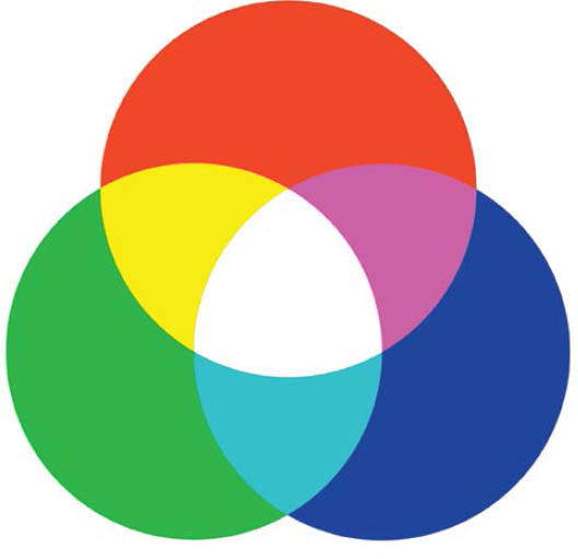
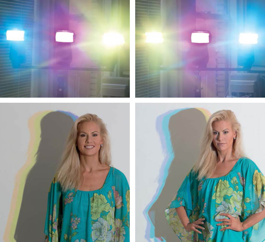
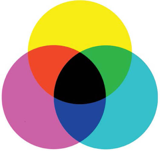
Subtractive color ( Figure 8.1 ) covers the mixing of colored pigments in paint. When these colors are mixed together, black is the end result. This always confused me when I was a kid; I was taught that white was the combination of every color. All I knew was that when I mixed all of my paints together I got a brownish-black. The truth of it is that in order to get white by combining colors, you need to be combining colored light rather than pigment ( Figure 8.2 ). This is known as additive color, which is what we photographers use. It starts with red, green, and blue light. Green and red light overlap to create yellow (grab that gel and set it aside). Red and blue light mixed make magenta (grab that one too). Finally, blue and green make cyan when combined (that’s the final gel you’ll need). Now if you take three flashes and gel them—one cyan, one magenta, and one yellow—and aim them at your subject, “white” or colorless light is created at their intersection.
The other really important (and super cool) takeaway from my color theory course was the idea of neighboring colors and complementary colors. To quote painter Marc Chagall, “All colors are the friends of their neighbors and lovers of their opposites.” A neighboring color is a color that sits on either side of a color on a traditional color wheel. For example, the neighbors of magenta are violet and red. On the other hand, complementary colors sit opposite each other on the color wheel. Try it out. Look up a photo of a traditional color wheel and locate the color red. What color sits across from it? Green. That means that green is red’s opposite. To boot, when two complementary colors are combined, they cancel each other out, making a neutral tone. For example, red plus green equals a brownish grey color. Orange plus blue? Same. Purple plus yellow? Yep. Opposites really do attract. It’s poetic, really.
Figure 8.1 A subtractive color wheel, which encompasses mixing paint pigments. When the colors are combined, black is created.
Figure 8.2 An additive color wheel, which encompasses mixing light (what we’ll be doing). When the colors are combined, white light results.
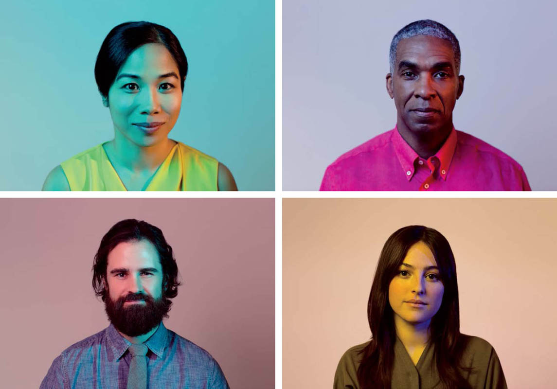
A while ago I did a shoot for a collaboration between The Atlantic and IBM. They wanted to produce a series of portraits that were all lit with two different colors. The images needed to work on their own and as a series. This proved to be a lot more challenging than I had initially anticipated. It’s easy enough to select a color on the color wheel and find its opposite. It’s a whole other task to find a color that works on a certain person’s skin tone. I was photographing a couple Caucasians, an Asian, and an African-American, and each skin tone reacted to the colors differently. Purple proved to be too strong of a color on a white person, but it looked great on the black subject. I eventually stopped trying to strictly follow color theory and just started pairing different cool colors with warm ones until something worked ( Figure 8.3 ).
Figure 8.3 This series of portraits, shot for IBM, needed to incorporate a range of complementary colors that worked together as a series as well as stand-alone images.
Last fall I was in NYC to visit my buds at JackThreads as well as do a bit of shooting, as I do once a year or so. While I was in town, I made sure to line up a few test shoots with models because NYC models. . . . One such is Halle Sobiech, an Ohio girl who made good. After graduating high school, she moved to New York and has since blown up. Now that she’s signed with IMG, she goes back and forth between New York and Milan, killing every shoot in her path. Before her big break I’d worked with her a few times, and lucky for me on this trip, she had a day off and was still willing to work with a bottom feeder like me. The only problem was that I was coming up short when it came to finding a spot to shoot.
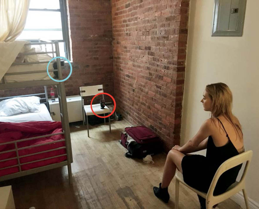
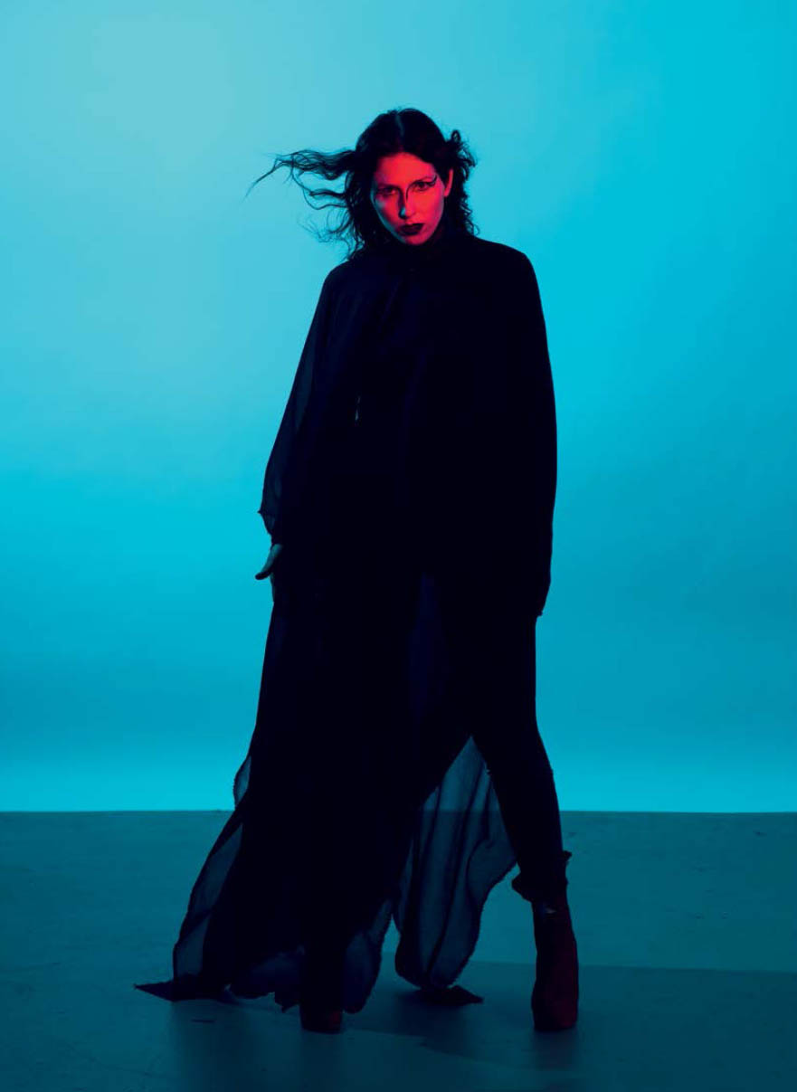
At the time, Halle was staying at an agency dorm and wasn’t allowed to have visitors in the building, so we couldn’t shoot there. I was staying in a cramped hostel in Williamsburg, which, for lack of other options, would have to work as a shoot location. I had white walls, which was a bonus, but not much space (about ten feet from one wall to another). I didn’t want Halle to be positioned against a wall, because I wanted a shadowless image, so the best I could do was to sit her in a chair about two feet in front of the wall ( Figure 8.4 ).
Figure 8.4 The setup. My cramped hostel room ended up being the only spot where we could do our test shoot. The main light was gelled cyan and and the accent light was gelled red.
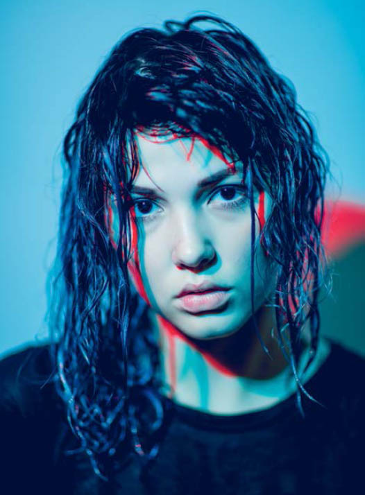
Figure 8.5 My favorite colors to experiment with are cyan and red, which are the colors that make up anaglyph 3D. In this shot I overlapped the colors, creating colored shadows.
Figure 8.6 In this shot, the main light was gelled red, barn doors attached, with a cyan background light.
Figure 8.7 In this shot, the main light was gelled cyan, barn doors attached, with a red background light.
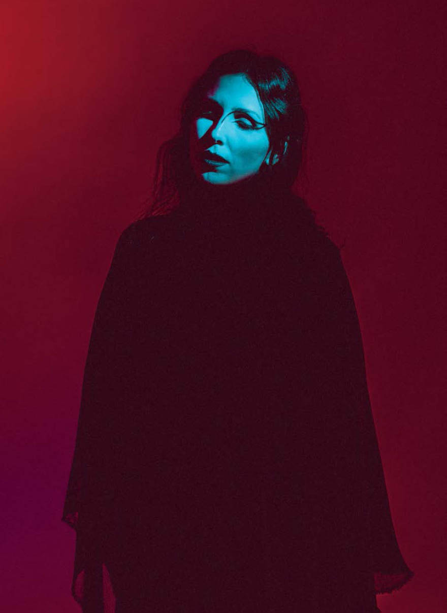
I had a few ideas that I wanted to play with regarding lighting as I went into the shoot, beginning with the colors cyan and red. Cyan and red is the color combination that makes up the anaglyph 3D effect—you know, the old movie glasses? I love experimenting with this color combination more than any other. Depending on how you place the gels in relation to each other and based on how each light is powered, you can achieve a number of very different results. For example, by placing a cyan light next to a red light with the cyan powered at a slightly higher output than the red light, I achieved the image in Figure 8.5 . The black shadows that are created by the cyan light are filled in by the red-gelled sidelight, creating blue light with red shadows. I also love seeing how much an image changes just by swapping the red and cyan gels between the main light and the accent light; compare Figures 8.6 and 8.7 to see what I mean.
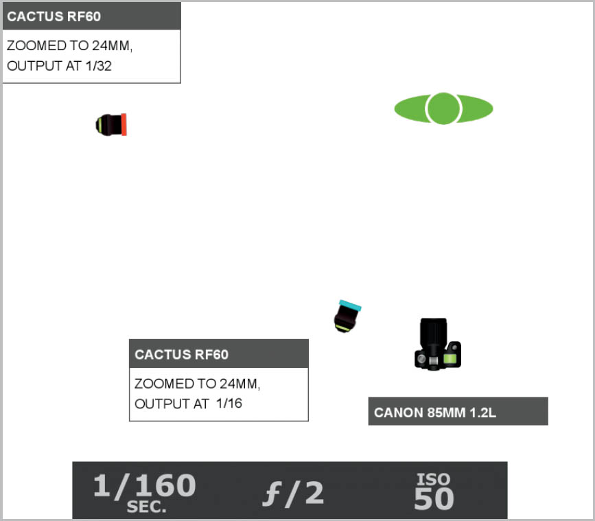
Figure 8.8 The lighting diagram. The cyan light was powered a bit higher than the red so that it overpowered the red, creating an overall blue image.
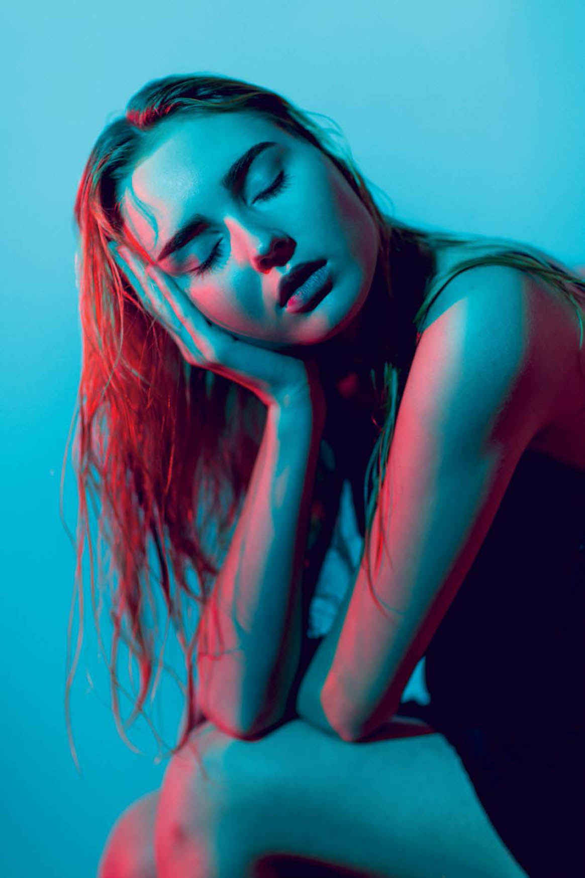
As you can see, my red light is placed off to the side and my cyan light is just left of center ( Figure 8.8 ). The other wall was just out of the frame to the left, and I had my back pressed against it; this is one of those rare times when I could’ve used a lens other than my 35 or 85mm, such as a 50mm. My cyan light was powered a bit higher than the red light in order to outweigh or overpower the red, avoiding a red cast to her face. If you are trying out this technique and too much red is showing through on your subject’s face, increase the difference between the outputs of the two flashes (lower the red output or increase the cyan). And this may go without saying, but if you’re getting colored shadows in your background and don’t want shadow, move your lights and subject further from the background. You can see just the edge of a shadow on the right side of the raw file ( Figure 8.9 ). Had I had a bit more space, I would’ve moved Halle off the wall a bit more, but as it stood, I easily cropped out that area of the image without compromising the composition.
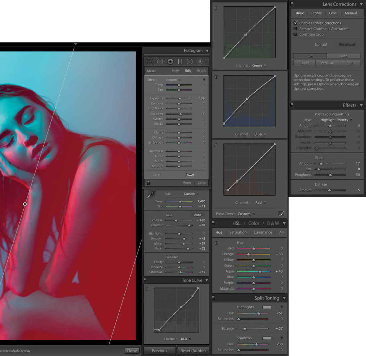
There is one thing I want to mention when it comes to shooting an image that has no neutral-colored area: Set your white balance to anything other than Auto. I typically use the Sun/Daylight setting. The last thing you want is the white balance shifting from shot to shot. This will make your color grading a special kind of hell. The goal is to have the most consistency possible as you move from shot to shot so that you can color grade one image and sync the rest, save for a few minor crops or tweaks, and be done with your editing in an hour or less.
Speaking of color grading, it can get a bit tricky when it comes time to correct a color-gelled image ( Figure 8.10 ). For example, the red in my image isn’t as saturated as I would like, but fixing it isn’t as simple as increasing the Saturation slider. As a starting point, I set the Temp and Tint sliders in the White Balance panel to get the overall colors as close as I can to desirable. Then I go into the HSL panel and tweak the Hue sliders in the necessary color channels; in this case it’s the Orange and Aqua channels. To bring it home, I add a subtle magenta tone by raising the shadow points in the Red and Blue Tone Curves and raising the midtones in the Blue and Green Curves. Given the circumstances, I am more than happy with the resulting image ( Figure 8.11 ).
Figure 8.9 The raw file. The image has the mood I was going for and is nearly shadowless, save for the spot on the right side of the frame.
Figure 8.10 The Lightroom settings. When it comes to color grading color-gelled images, it can get a bit tricky. I start by setting the White Balance and then proceed to adjust the Hue sliders as needed.
Figure 8.11 The final shot. Given the tiny space I had to work with, I am more than happy with the resulting image.
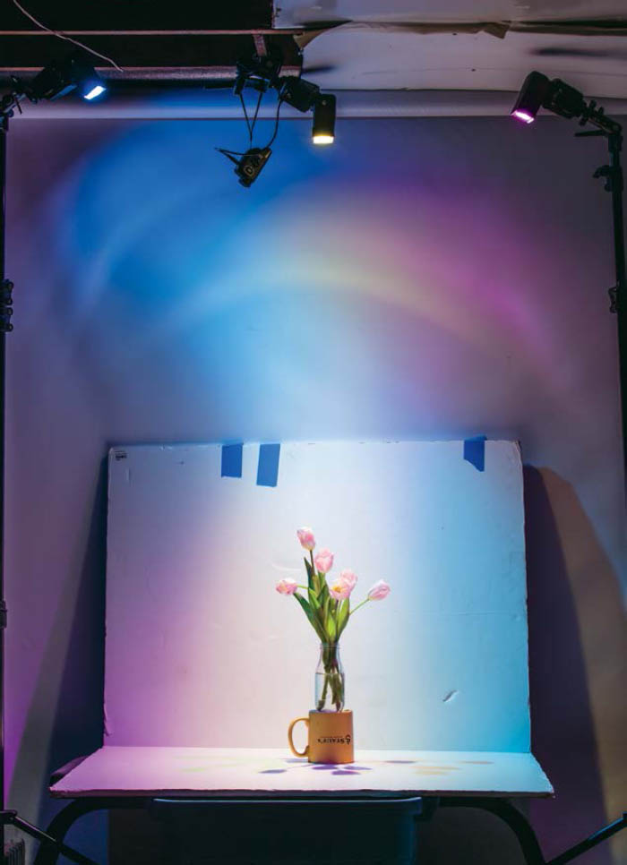
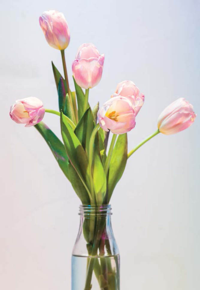
This next technique was the main inspiration behind me writing a sequel to Studio Anywhere . Not too long after I wrapped writing that book, I was sitting in my basement studio, bored, trying to figure out what to do next. I had just recently been experimenting with using three staggered flashes to make a triple shadow, inspiration coming from a recent issue of Interview magazine (remember the last chapter?). I can’t say what exactly motivated me to go upstairs and grab the vase of flowers and set them up below three gelled and staggered lights ( Figure 8.12 ). I just had an idea pop into my head: What would happen if I staggered the three colors that overlap to create white light? Would it actually work for me? Could cyan, magenta, and yellow light overlap to make pure, colorless light? Not only did it work ( Figure 8.13 ), the unintentional results—multi-colored shadows—were the best part. I noticed that there were colored shadows in certain areas, where one of the colored flashes couldn’t light. This meant that some spots were only lit with yellow and magenta light or cyan and yellow or magenta and cyan. When these obstructions and overlaps occurred, magic resulted. Now, to find a model immediately so I could explore the technique on a moving subject.
Figure 8.12 After experimenting with triple shadows in the previous chapter, I had the idea to gel the three lights cyan, magenta, and yellow so that the overlapping light was colorless.
Figure 8.13 Not only did the science behind the technique work (imagine that), the experiment also got my mind working in new ways. Now I had to try it out on a model.
Figure 8.14 The setup. I wasn’t sure how far to space the lights from each other or if the order of the colors mattered.
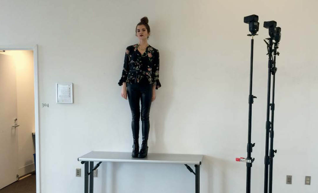
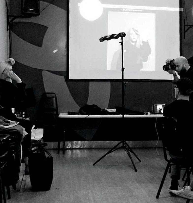
Once again, an art student, this time Alaina Aylward, came to my rescue. She was able to give me a small window of time to try out this technique, amidst her busy schedule. I met her at her school and quickly set up my three lights ( Figure 8.14 ). Since this was the first time I tried the technique, I wasn’t sure how much space should be between the lights or if the orders of the colors made a difference. Once I started placing them side by side, I realized how cumbersome it was to have three separate stands, with the legs all tangled together. (Mental note: Buy or make a bracket to hold three lights, spaced 18 inches apart.)
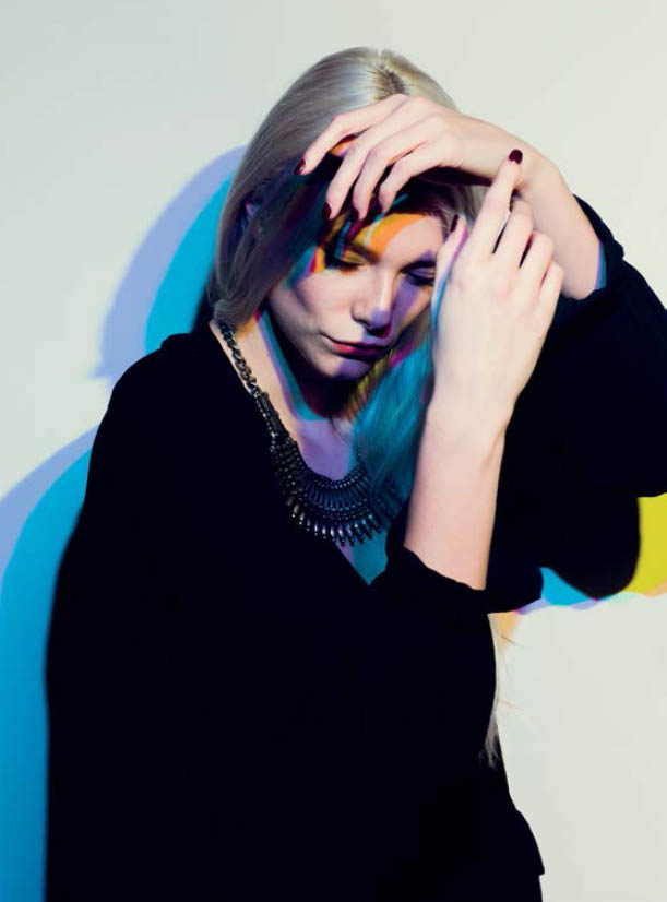
Figure 8.15 The raw file. After giving Alaina a bit of movement direction, she started coming up with cool moves on her own, this one being my favorite.
After snapping a few frames, after I was sure that the technique was still working for me, I asked her to start moving. The part that I was the most excited about was seeing what kind of random colors and shadows started to appear as she moved. I enjoyed introducing a bit of chaos into a world of relative predictability. “Turn to the right. Nice. Now to the left. Try arching your back. Maybe a hand on the hip?” After a bit of direction, she really started to move on her own. She made this Michael Jackson, tiptoe move, that I really liked, so I asked her to do that five to ten times. Figure 8.15 ended up being the money shot.
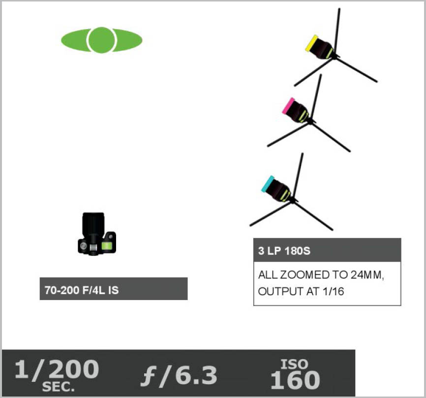
Figure 8.16 The lighting diagram. The three lights were all spaced about a foot apart with the same zoom and output.
The one foot of space that I allowed between each light was sufficient to allow for each colored shadow to appear. The closer the colored lights are to each other, the less tri-shadow you have (then you have only black shadow, which is no fun). However, you could space them further apart, if you like, allowing more space between the colors. The main thing to keep in mind is that you need an area where all three colors overlap that is large enough to cover the subject. Otherwise, the subject won’t be lit with colorless light and will appear more yellow or magenta or cyan. Also note that the lights are all at the same zoom and output ( Figure 8.16 ). You want a wide light spread to avoid a vignette. Finally, don’t forget that the closer your subject is to the background, the sharper the shadow will be, with flashguns being sharper than studio strobes.
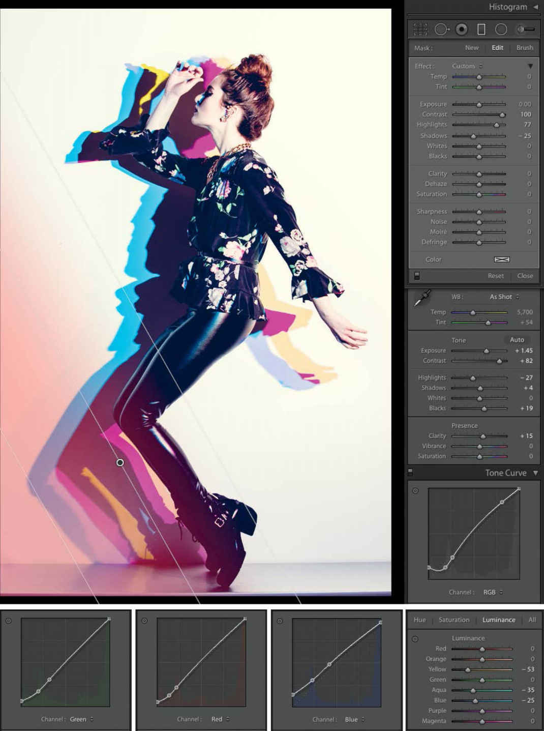
In Lightroom, you will once again need to tweak the quality of the colors to get them optimal ( Figure 8.17 ). This time, I mainly needed to adjust the Luminance of certain colors, specifically the Yellow, Aqua, and Blue. Other than Luminance, my usual Tone Curve tweaks and a significant increase of contrast, my image was pretty similar to what it looked like in camera ( Figure 8.18 ).
Figure 8.17 The Lightroom settings. Other than the normal adjustments, I also needed to adjust the Luminance in the Yellow, Aqua, and Blue channels to get the colors I wanted.
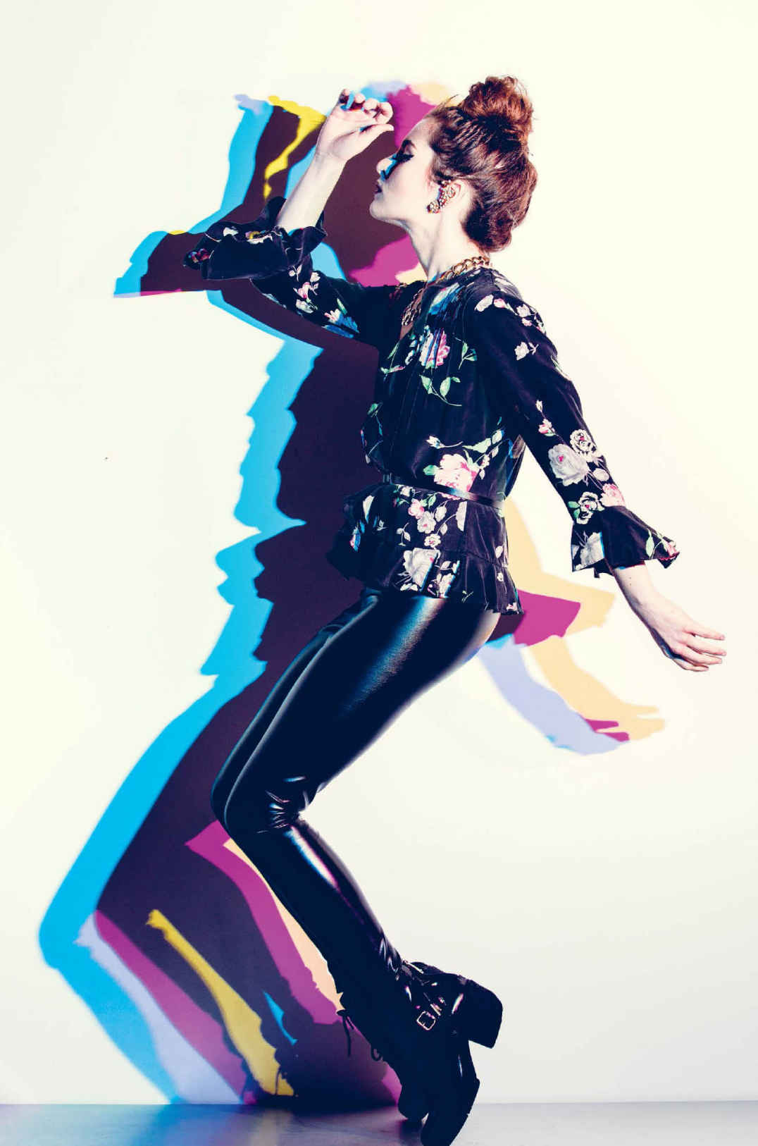
Figure 8.18 The final shot. C-M-Y-Killer.
Over the past year, I’ve since perfected the technique a bit. I now use a 16-inch cold shoe extension rail to hold my three flashes on one stand ( Figure 8.19 ). Although I’d prefer to have at least a foot of space between each flash (meaning I’d need a 25-inch rail), the technique still works; the colored shadows are just closer together ( Figure 8.20 ). I’ve also played around with the order of the colors to see if there is one configuration that I prefer over another ( Figure 8.21 ).
Figure 8.19 I’ve since switched to using a 16-inch cold shoe extension rail to hold three flashes on one stand. Photo by Kelly Prescott .
Figure 8.20 The colored shadows are a bit closer together when I use the 16-inch rail.
Figure 8.21 The order of the colors actually does matter. See how dramatically the shadows shift when the Cyan and Yellow flashes are swapped.
Figure S.4 This is what I had to work with at the shoot location. Where might I place my subject to get a dark, moody portrait using only natural light? Flip to the back of the book to see what I did.