TROMPE L’OEIL PEDIMENT
PIERRE FINKELSTEIN
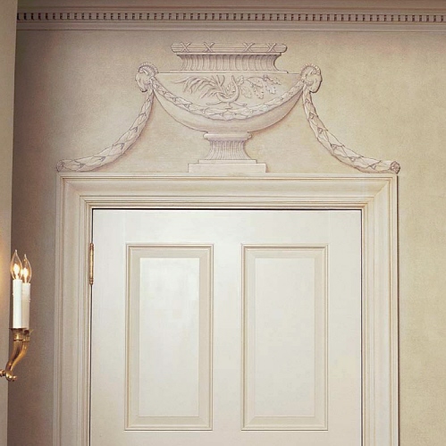
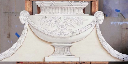
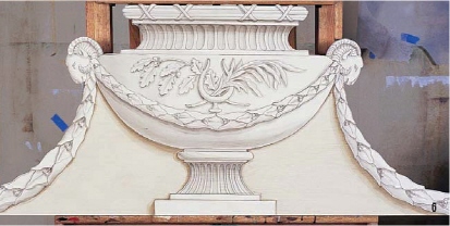
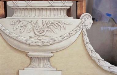
A pediment is an architectural ornament that fits directly above a door casing. Pediments have been used for centuries to increase the grandiose effect of a door. There are many different types of pediments, from the hand-painted easel type of still life, to elaborate woodworking, carvings, low relief and others, all of which serve only as an embellishment to give height to a door opening.
Pediments can be painted directly on the wall above the door space, but creating one on a separate cutout has several advantages: One: You can work in the privacy and efficiency of your own shop; Two: scheduling the project is easier as the work can be done on your schedule (in-between jobs); Three: The overall visual effect will be more dramatic since the cutout casts its own shadow on the wall; Four: The thickness of the wood cutout will sit better on the casing of the door and thus look like an extension of the casing; Five: If there is water damage or the client moves, the pediment can also be moved to a new location. In the case of water damage, remove the pediment, repair the wall, and then replace with minor touch-ups.
This technique could easily be done on canvas instead of a wood cutout and then installed above the door when completed. Painting ornamentation on either a canvas or a cutout is a great opportunity to practice your trompe l’oeil skills in the comfort of your own studio while saving the client extra hassle.
This design and several others can be purchased at www.pfinkelstein.com.
Photographs by Pierre Finkelstein
All of these brushes, acrylic paints, and stencil patterns are available at www.pfinkelstein.com or call 1 (888) FAUX-ART.
Getting Started
Find your field of work by measuring the exact width of the door casing and the area above it. There are no standard rules regarding the height of a pediment. Generally, it is best to leave a few inches of clearance so it doesn’t touch the crown. Architectural books and reference material are excellent sources of inspiration for designs.
Use grid paper to draw your design at the exact scale. Create a pounce pattern (transfer method using tiny holes, outlining the important lines of a pattern) and tap a charcoal bag over it to transfer the pattern contour onto a clean piece of ¾-inch (19mm) MDO board (found in home stores). MDO is plywood coated with a paper-type material that gives you an extremely smooth and ready-to-paint surface. If MDO is not available, MDF or grade A birch plywood will work well, but will require the added step of creating a smooth surface with compound paste.
Retrace the pounce pattern with a 2H pencil (the exact contour only). Cut out the contour with a jigsaw using a fine-tooth blade to avoid splintering the wood. Sand the edges smooth, and spackle any holes or unevenness created by the cutting. Apply two coats of oil primer over the entire surface including the edges and back of the cutout (to avoid warping of the wood). Let dry. Give the surface a light sanding, then dust it. Apply two coats of basecoat (a warm, grayish-white tonality of eggshell latex or oil).
MATERIALS
Surface
¾-inch (19mm) thick Medium Density Overlay (MDO) board
Pierre Finkelstein Brushes
Badger
Oval, synthetic varnish (GLZ:18 s40)
Synthetic round glazer (GLZ:1 s6, GLZ:2 s000)
Square, synthetic basecoat (GLZ:17 s40)
Sable blend filbert (TL:8 s10)
Sable fine-point detail (TL:4 s2)
Sable short-point detail (TL:5 s10)
Samina outliner (TL:15 s2, s4)
Paints
Oil Primer
Eggshell latex basecoat
Ultra Flat latex varnish
Decorative Palette
Products used: Golden Artist Colors and Proceed Slow-Dry Acrylic
Decorative Paints.
B = Black,
BU =Burnt Umber,
RS = Raw Sienna,
RU =Raw Umber,
W = Titanium White,
UB = Ultramarine Blue
MM = Matte Medium
Additional Materials
Easel
Grid paper for sketching
Jigsaw with fine blade
Mylar (thick paper) for pounce pattern
Pounce wheel/pounce bag (filled with graphite) or carbon transfer paper
Spackle and wood glue
2H pencil
150/320 grit sandpaper
BEFORE HE PAINTED

Pierre Finkelstein discovered his interests as a graphic designer and sign painter in New York City at age 19. These interests were temporarily interrupted by a one and a half year service for the French military in the paratrooper division. Pierre saved money for two years to attend the prestigious Van Der Kellen Painting Institute in Brussels. Originally, he was enrolled for the sign painting training, but as fate had it, they just stopped that program which led him to enroll in the decorative painting program. In 1986, Pierre graduated with Gold Medal honor. This training in Europe gave Pierre the confidence to head back to New York City and build his craft, client by client. In 1990, his confidence won big when he was awarded the title of the “Best Craftsman in France,” an honor given out every four years. Pierre has always stood by his motto of success: “It’s five percent talent and 95 percent practice that makes a successful decorative painter.”
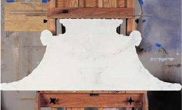
1. TRANSFER THE DESIGN. Pounce the design over the cutout exactly (alternative to pouncing: use regular carbon transfer paper or graphite rubbed on back of design). Remove the excess charcoal with a badger brush. Now that the design is transferred, it is not necessary to retrace in pencil.
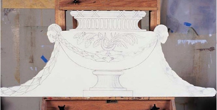
2. OUTLINING. When mixing all of the colors for this project, use a general formula of 1/3 Matte Medium (Matte Medium is best because it dries fast, but a low-viscosity slow-drying medium is OK), 1/3 colors, 1/3 water (this is a recipe that is meant to be modified when needed). First, mix a dark grey color (W+ B + UB + RU). Using a fine-pointed liner brush (TL:15), outline the entire pounced design. This outline will serve as a detailed sketch, but it also will read in the final trompe l’oeil effect. If you must, use a 4H pencil with a light touch.

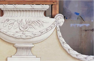
3. HALFTONE. The halftone is the lightest part of the shadow. This step will take the longest, but a successful halftone will make the rest of the painting much easier and more realistic. Mix the halftone by combining RU + UB with a dash of White. Establish a light source and start placing the halftone on the opposite side. Switch between the filbert, short-pointed, and fine-pointed sable brushes. It is important to understand the profile of your piece in order to place the shadow at the right location. Don’t forget to paint the negative space between the garland and the urn base in a similar color to the wall itself.
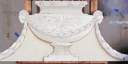
4. MORE HALFTONES. Continue to add halftone where needed to complete the entire “basic shadow” of your piece. Note that the halftone color will be slightly warmer for the cast shadow on the negative shape around the base of the urn. In this case, add more RU + RS to your mix, but remember the overall tonality of any shadow is dictated by the color of the surface it falls on.
5. ACCENT. Create the accent color by adding more RU, UB and a little Black to the halftone. Keep some of the halftone color on your palette for touch-ups. The accent is the darkest part of the shadow. The accent follows exactly the shape of the halftone but is one-third smaller and placed in the inner edge of the shape.
6. MORE ACCENT. Complete all sections with the accent. Add a second coat in the most recessed areas to increase the depth. You’ll see the design will really start to show dimension. Remember, the shadowing system (halftone + accent) creates 80 percent of the overall effect. The highlight is simply an extra bonus.
7. HIGHLIGHT. Create a semiopaque highlight color of White with a tiny dash of RS. Start applying highlights using a short, pointed sable detailing brush. Apply directly on the opposite side of shadow, facing your light source (be sure that the highlight does not touch the halftone). The highlight will be less visible than the shadowing. Finally, create the super highlight with pure White placed only at certain high points of your ornamentation.
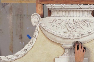
8. AGING. This is an optional step, which adds a slight distress and element of classical realism so your painted trompe l’oeil will look more like a real bas-relief. Mix RU with a dash of UB and glaze the entire surface heavily with a glazing brush. Use a sponge and dab and displace the glaze to create a fine texture, then smooth and soften with a badger to remove any obvious sponge marks. Let dry.
9. VARNISHING AND INSTALLATION. Sand lightly with 320-grit paper to remove lint and specks. Dust off. Apply two coats of acrylic flat varnish. To install the pediment, sand down the area where the pediment will be installed. Put the cutout in place and very lightly trace the outline. Remove the board, apply heavy epoxy-type glue on both the wall and cutout. Let the glue set. Maintain pressure for a few minutes, and voila!

Pierre has owned and operated Grand Illusion Decorative Painting, Inc. since 1987, painting for many residences in Manhattan and beyond. He teaches a few times a year and specializes in painting efficient faux marble, wood, and trompe l’oeil effects. He is dedicated to offering the highest quality brushes and tools for the painter who believes in having the best tools for every job.